Pharmaceutical web design often navigates between two extremes: coming across as too cold, or too decorative. Palladio Group finds a more compelling middle ground—visual precision, editorial flair, and a premium brand feel, all without compromising the trust that the industry demands.
Here, packaging isn’t just an industrial product. It becomes atmosphere, system, visual memory. The website weaves together blue, white, bold typography, and motion as part of a single promise: order, control, and a forward-looking approach. In such a technical B2B category, this instantly elevates perceived value from the very first interaction.
Palladio Group — packaging with scale, structure, and presence
The landing makes a statement. Pharmaceutical packaging objects float in a clean, almost clinical—but never flat—environment. Boxes, blister packs, bottles, and printed materials are arranged as elements in a carefully measured 3D composition. Everything breathes blue, white, and soft gray: a palette that doesn’t shout, but builds calm, precision, and authority.
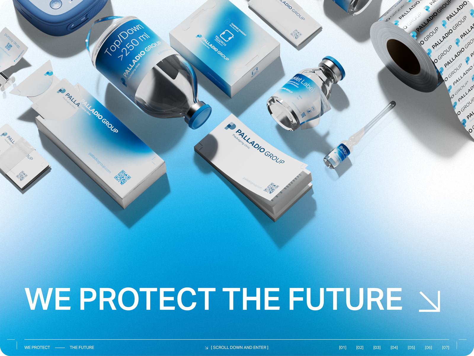
Oversized typography acts as an anchor. It doesn’t just accompany the product—it leads. This choice gives the site an energy closer to a brand campaign than a traditional corporate presentation. In pharmaceutical web design, this matters: it prevents specialization from feeling bureaucratic. The brand feels technical, yes, but also ambitious.
Homepage with guided storytelling
Motion ensures the experience is more than just a static cover. Scrolling sets the visual pace, inviting users into a story told in chapters. There’s no rush to say everything at once. First, a core idea is established: protection, progress, industrial capability. Then come the facts, products, services, and innovation.
This approach makes sense for a complex B2B brand. When your offering can’t be summed up in a single sales pitch, visual direction must focus attention. Here, light interaction turns a technical portfolio into a sequence that’s easier to digest, more memorable, and distinctly premium.
Product pages with clear hierarchy
Product pages take on a different tone. The design remains bold, blue, and impactful, but the layout becomes more practical. Clear hierarchy presents technical information without turning it into a dense catalog. The reading flow is obvious: category, content, downloads, continuity.
This balance is crucial in pharmaceutical packaging. A site can be visually aspirational, but if product details become confusing, trust is lost. Palladio Group maintains a recognizable identity while making room for usability. Visual impact and UX/UI work together, not at each other’s expense.
Innovation Hub as an experimental touch
The Innovation Hub brings a new rhythm—more white space, more quiet, more typographic tension. The layout feels less industrial and more exploratory, like a platform for ideas. This shift broadens the brand’s identity: it’s not just about packaging production, but also research, connection, and envisioning new scenarios.
What’s interesting is that the system remains intact. The visual language is still recognizable, but gains flexibility. For a company focused on sustainability, smart packaging, traceability, and collaboration, this visual elasticity ensures innovation feels like a genuine layer of positioning—not just a marketing add-on.
What a great pharmaceutical packaging website delivers
The most valuable lesson is in the tone. In pharma, aesthetics aren’t just decoration. Used well, they communicate control, quality, precision, and responsiveness—before the user even reads a technical block. Color reduces noise. Typography establishes authority. Motion guides, without turning navigation into empty spectacle.
Palladio Group succeeds because it understands that trust is also designed. A clean structure, intentional composition, and consistent visual identity can make a complex offering feel clearer, more valuable, and ready for serious B2B conversations.
Designing trust without dulling the brand
The best pharmaceutical web design doesn’t have to choose between rigor and desire. It can be precise, readable, and technical—but also memorable. When visual direction is finely tuned, the website stops being just an information container and becomes a true asset for perception, differentiation, and sales.


