An experimental visual identity where typography, movement, and abstraction create a new graphic language
In today’s graphic design landscape, it’s increasingly challenging to craft truly distinctive visual identities. Many brands rely on similar codes, predictable structures, and overly rational graphic systems. That’s why projects like LTN Lab Create Camp stand out immediately: an experimental, emotional, and deeply graphic visual identity that transforms abstract concepts—such as light, movement, and color—into a unique visual language.
Developed by Hangzhou Tmall Chezhan Technology Co., Ltd. for LTN Lab, the project was awarded Silver in the Advertising / Promotion / Other Advertising Graphics category, establishing itself as one of the year’s most compelling visual systems in experimental design and contemporary identity.
From our perspective as a graphic design agency in Barcelona specializing in branding, visual identity, art direction, and web design, this project perfectly illustrates the direction of contemporary branding: flexible, emotionally driven graphic systems that create experiences far beyond the traditional logo.
An identity built from abstract concepts
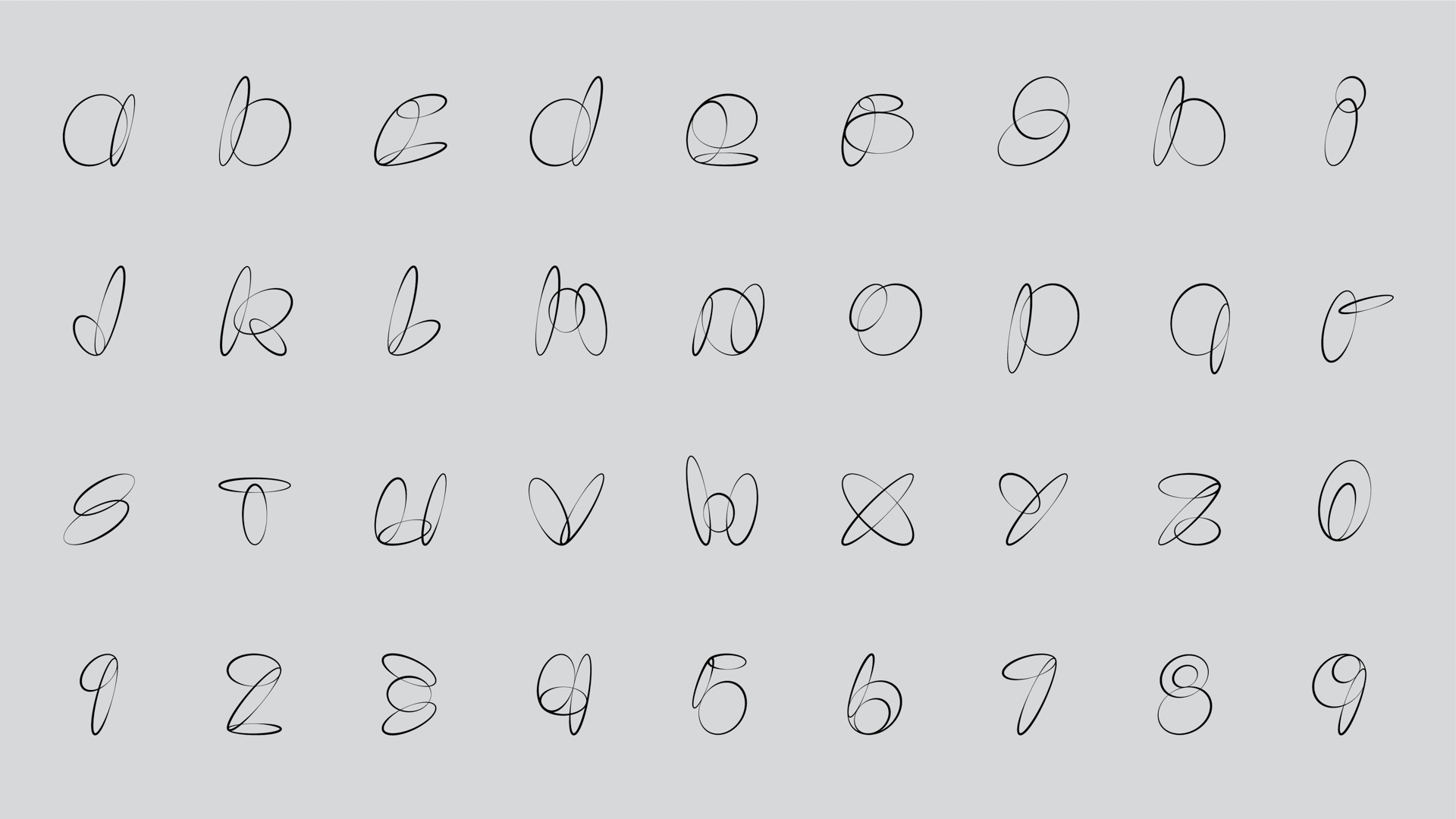
What makes this project especially intriguing is that it doesn’t originate from a recognizable form or classic typographic structure. The identity for the fifth LTN Creation Camp is based on three core elements tied to the brand’s visual and conceptual universe:
- droplets,
- light,
- color blending.
Drawing from these elements, the visual system creates letters and graphic compositions using simple ellipses and curved strokes. The result is a hybrid visual language, somewhere between typography, gestural illustration, and abstract art.
What’s most remarkable is the system’s unwavering coherence. While the compositions appear free and spontaneous, each character is underpinned by precise geometric construction.
Balancing elegance and energy
A key strength of the project is its ability to balance two seemingly opposite qualities: elegance and visual impact.
The identity blends:
- the expressiveness of graffiti,
- the fluidity of cursive handwriting,
- geometric precision,
- the visual lightness of continuous lines.
The result conveys constant movement, creativity, and exploration. The forms feel as if they were drawn in a single gesture, almost like visual choreographies suspended in space.
This approach aligns with a growing trend in contemporary graphic design: less rigid, more emotional identities where visual experience is as important as functionality.
Typography as an expanded graphic system
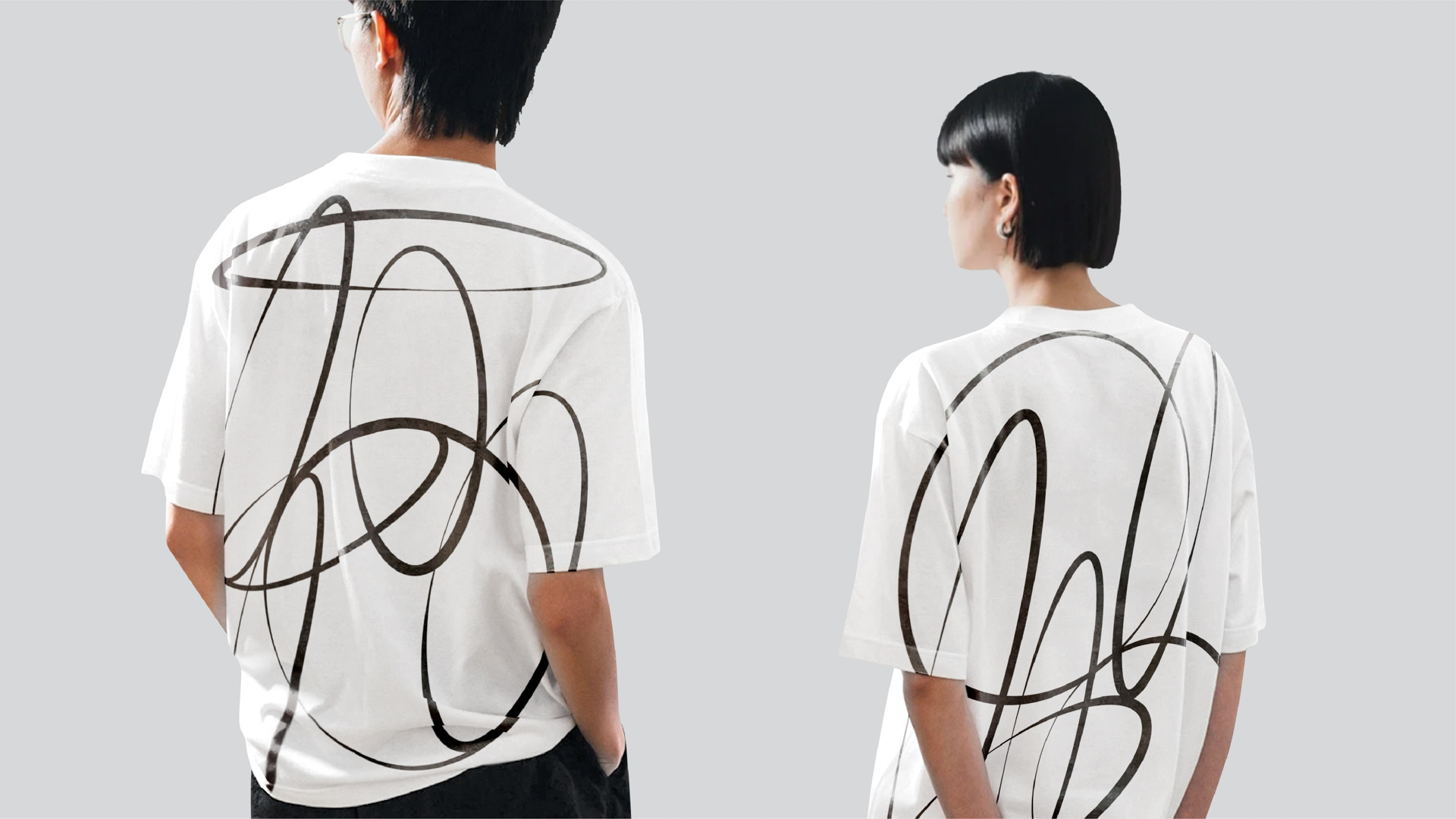
While the project revolves around letters and characters, it would be reductive to describe it as merely a typographic exercise. In reality, the system operates as an expanded visual ecosystem.
Letters transcend their role as reading tools to become:
- textures,
- spatial patterns,
- architectural elements,
- motion graphics components,
- graphics applied to objects and environments.
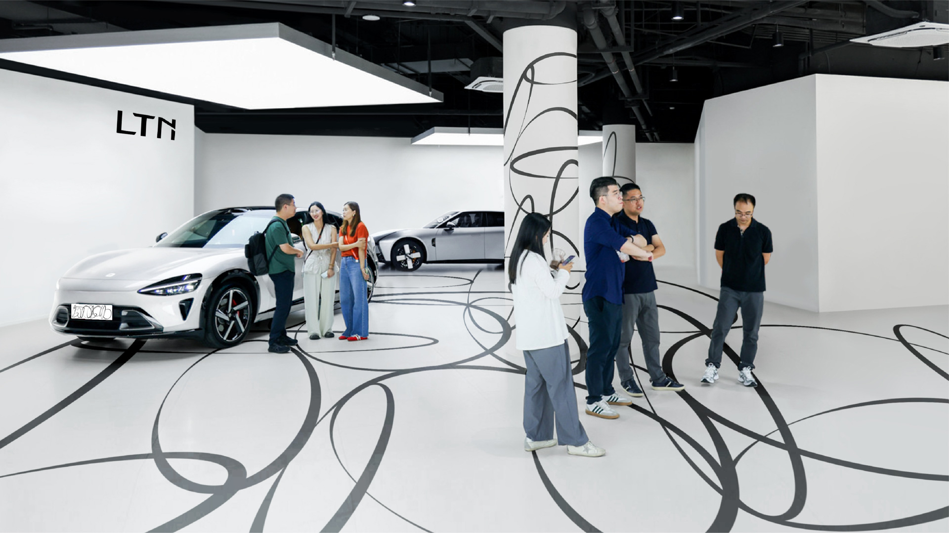
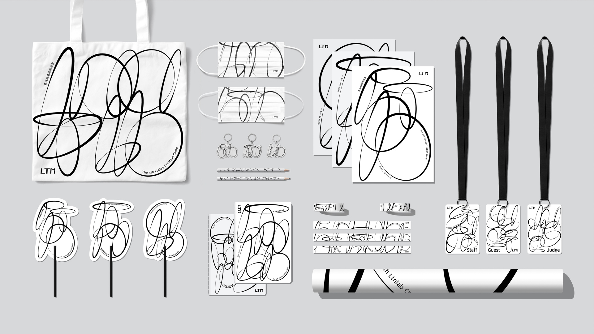
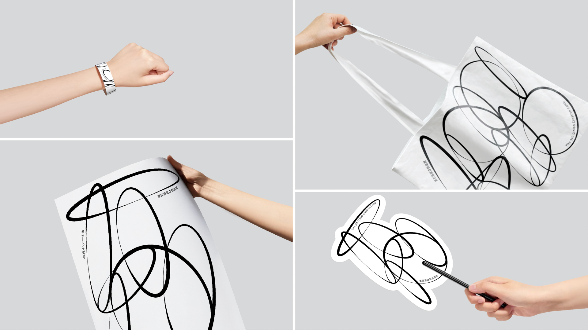
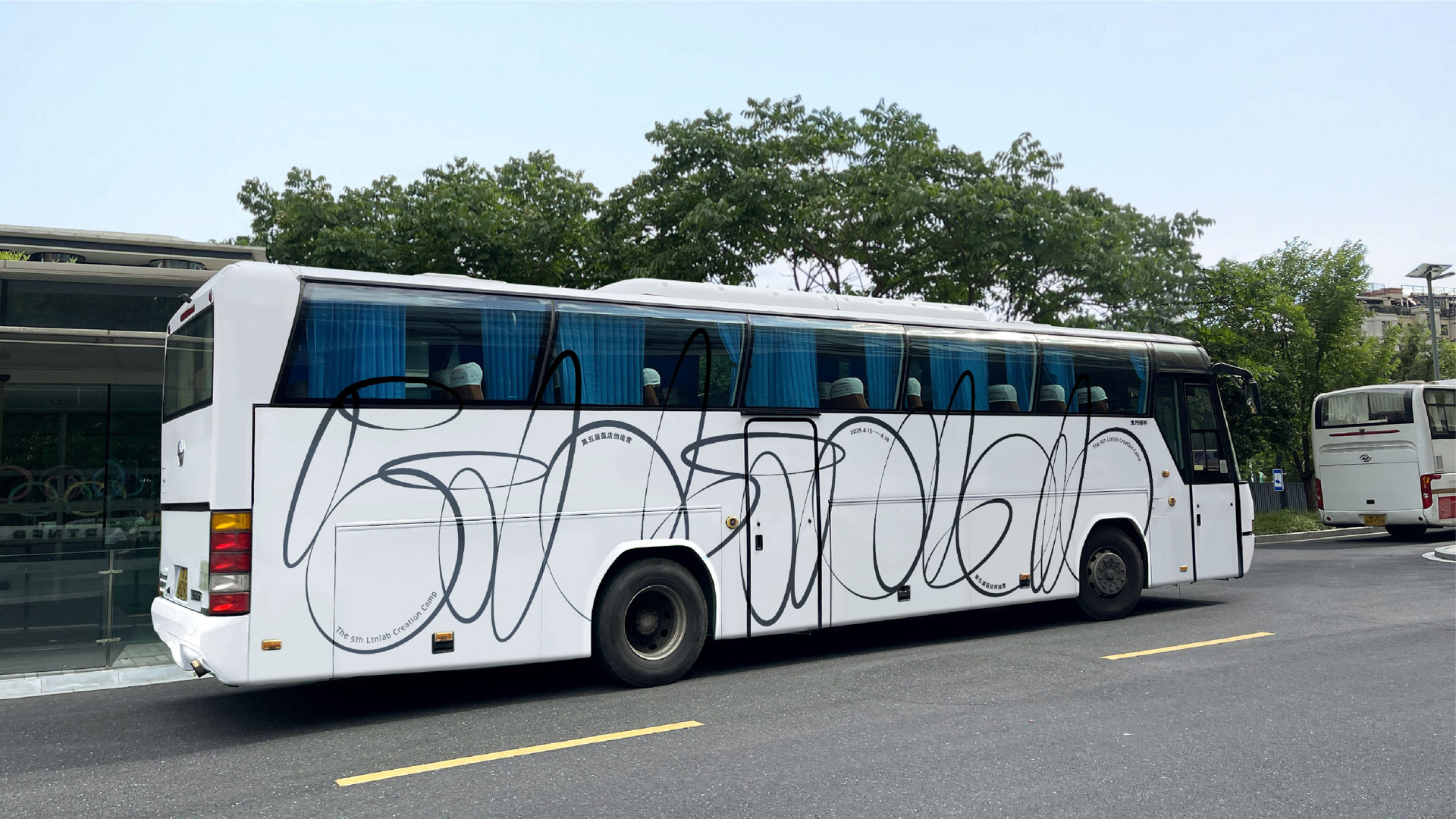
This expansion of typographic language is especially evident in applications such as:
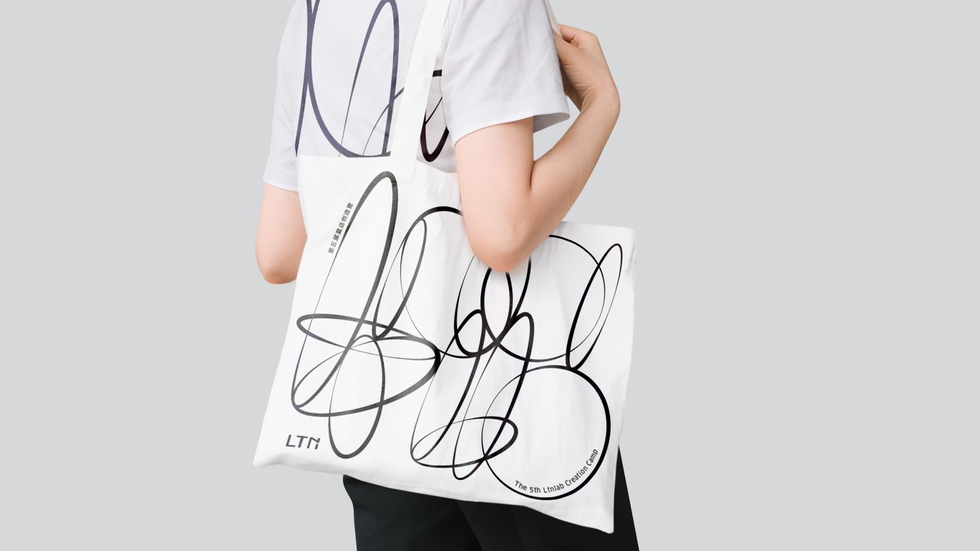
- t-shirts,
- tote bags,
- badges,
- posters,
- signage,
- spatial interventions,
- vehicles,
- exhibition spaces.
The identity doesn’t just “decorate” surfaces—it creates immersive atmospheres.
The role of movement in visual identity
One of the project’s most powerful aspects is its constant sense of motion. Lines intersect, expand, and intertwine, creating compositions reminiscent of light trails or gestures drawn in the air.
This idea ties directly to the project’s original concept:
- the accumulation of droplets,
- the intersection of light,
- chromatic blending.
The entire system exudes fluidity. Even when applied to static media, the compositions feel alive.
From a branding perspective, this is especially significant, as it transforms the identity into a dynamic experience—crucial in today’s world, where brands exist simultaneously in physical and digital spaces.
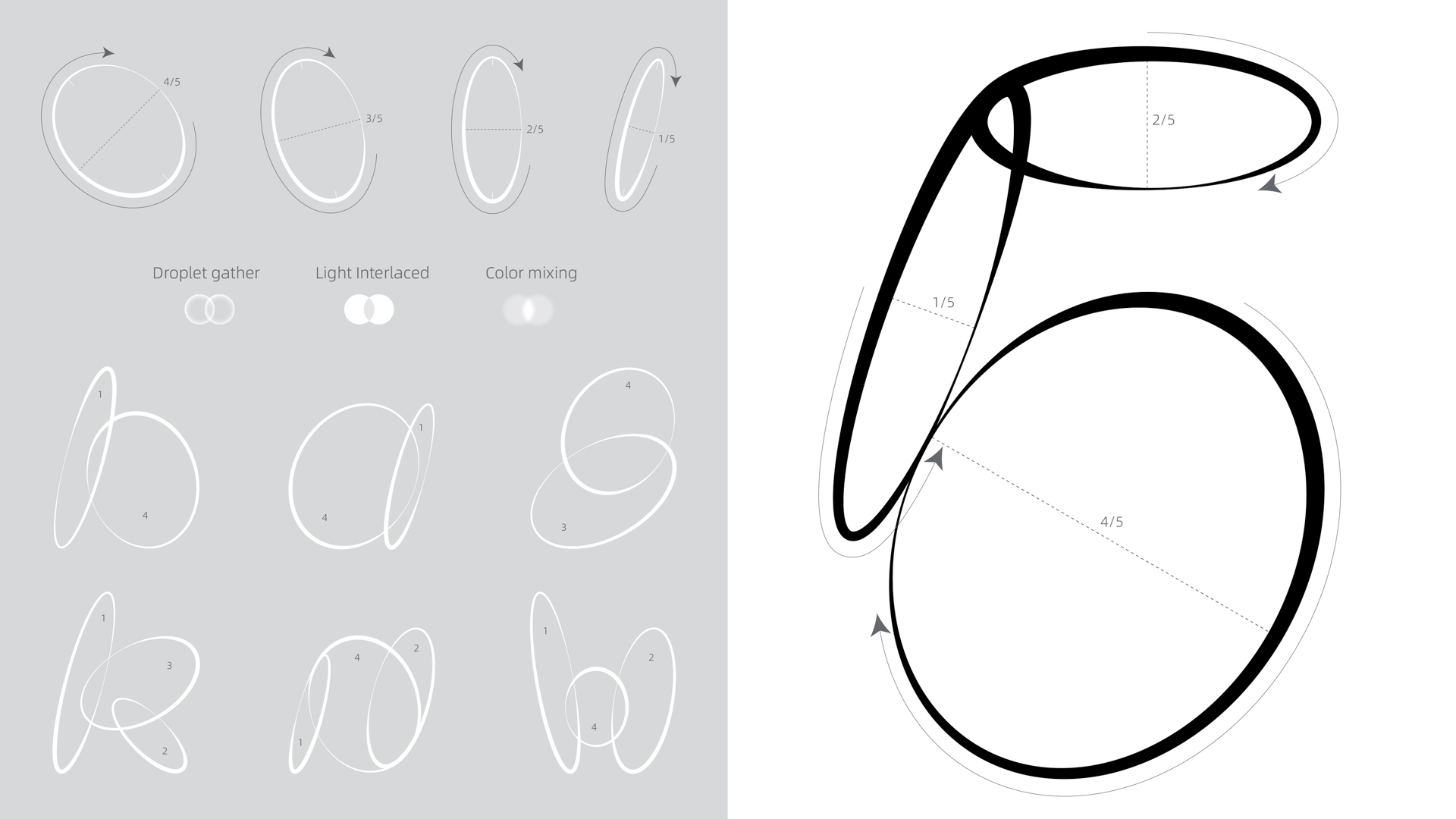
Structural minimalism, maximum expression
Visually, the project relies on very few elements:
- black lines,
- neutral backgrounds,
- simple geometries,
- careful use of space.
Yet the result is highly expressive. This underscores a key idea in contemporary graphic design: visual complexity doesn’t necessarily come from adding more elements, but from building intelligent systems capable of multiple interpretations.
LTN Lab’s identity achieves exactly that. With minimal resources, it creates a visual universe that is recognizable, sophisticated, and adaptable.
Graphic design for contemporary lifestyle
Another compelling aspect of the project is how it connects branding with lifestyle culture and experiential design. The identity goes beyond corporate communication, building a visual narrative rooted in creativity, exploration, and contemporary culture.
This is especially evident in merchandising and physical environments, where the identity functions almost like a fashion statement or an art installation.
The boundaries between branding, graphic art, and product design blur—an increasingly common approach among brands targeting creative communities and cultural experiences.
An identity designed for constant experimentation
The concept behind LTN Creation Camp revolves around ongoing exploration and experimentation. This is precisely where the strength of the visual system lies: it never feels closed or final.
Compositions can:
- expand,
- overlap,
- fragment,
- adapt to new formats.
The identity behaves almost like a living organism, able to evolve continuously without losing coherence.
For any studio specializing in branding, graphic design, and visual identity in Barcelona, this project serves as a valuable reference for building open, flexible systems ready for contemporary environments.
The aesthetics of the continuous line
Formally, the project also connects with an aesthetic rooted in gestural drawing and automatic writing. The continuous lines evoke a sense of spontaneity that humanizes the visual system.
This prevents the identity from feeling overly technological or cold—an important consideration for projects centered on creativity and community.
The interplay between mathematical structure and organic gesture creates a highly sophisticated visual balance.
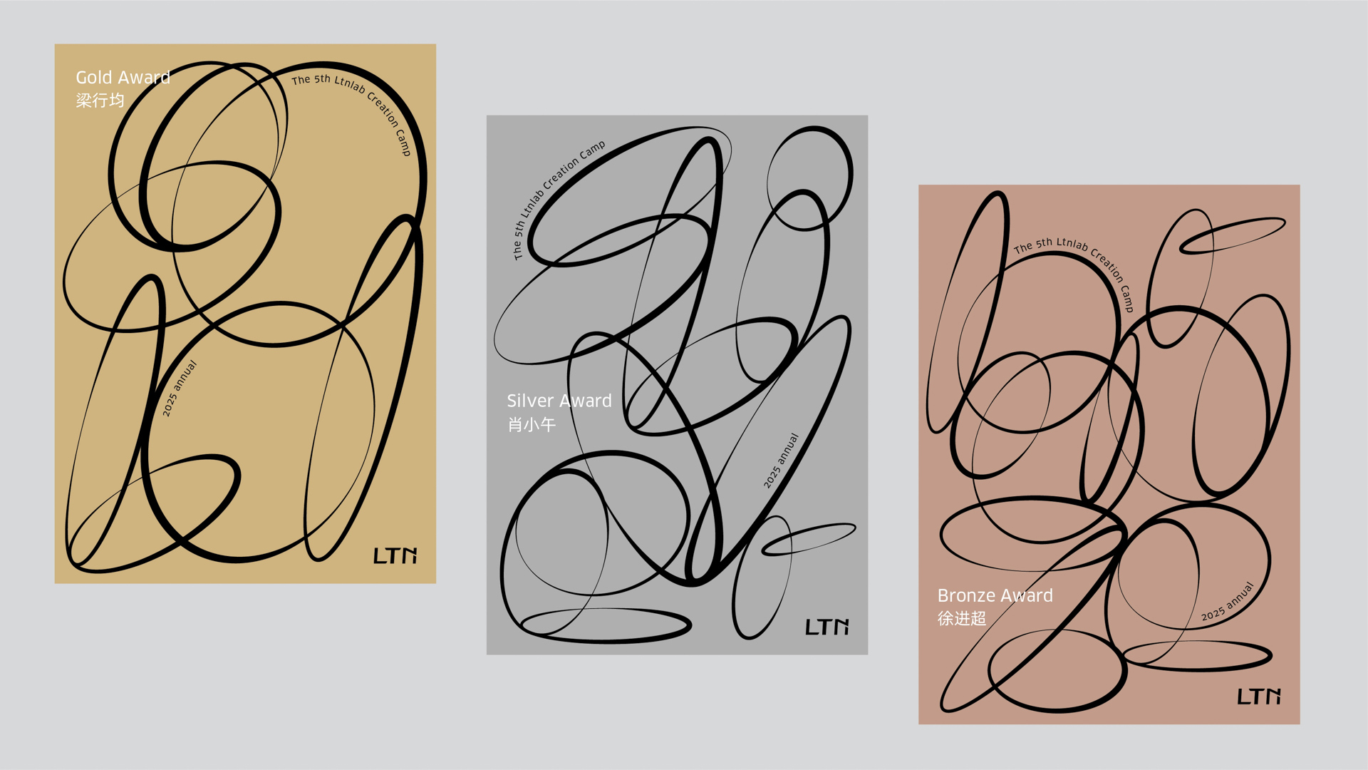
Awards and recognition
- Silver Award — Advertising / Promotion / Other Advertising Graphics
- American Good Design Award
The project has also received international recognition with the American Good Design Award, further cementing its relevance in the global landscape of contemporary graphic design and experimental visual identities.
Credits
- Company: Hangzhou Tmall Chezhan Technology Co., Ltd.
- Lead Designer: Xie Yanguang
- Design Team: Xie Yanguang, Yu Jie
- Client: LTN Lab
Conclusion: when branding becomes experimental visual language
LTN Lab Create Camp proves that contemporary graphic design can go far beyond traditional corporate systems. Through an identity built on movement, abstraction, and typographic experimentation, the project creates a visual universe that is flexible, elegant, and deeply expressive.
For those of us working in graphic design, branding, and visual identity in Barcelona, this project is a clear reference for how today’s brands must create visual experiences that adapt to multiple contexts without losing their unique character.
More than a fixed visual identity, LTN Lab Create Camp operates as a living system: a blend of typography, gesture, light, and movement that turns creative exploration into a graphic language.


