Some cafés are remembered for their coffee; others linger in your mind before the cup even arrives. Call Me Latter belongs to the latter: it doesn’t try to play it safe—it aims for character. And that’s where branding for cafés gets interesting: when identity goes beyond a logo on a cup and turns an everyday pause into a scene with its own voice.
This concept brings a retro vibe, a restrained color palette, and a bold visual attitude. Espresso brown, powder pink, warm cream, a typeface with real presence, and a layout that’s in no rush. Everything breathes coffee, conversation, and a hint of irony. This isn’t a shy identity; it takes up space, looks the customer in the eye, and says: you’re here to take a break.
What’s great is that it doesn’t rely on a single graphic gesture. It works as a system: interiors, palette, typography, packaging, cards, uniforms, menu. Every element adds to the visual memory. And when a hospitality brand achieves that, perceived value rises—without the need for lengthy explanations.
Call Me Latter — bold type, memorable color
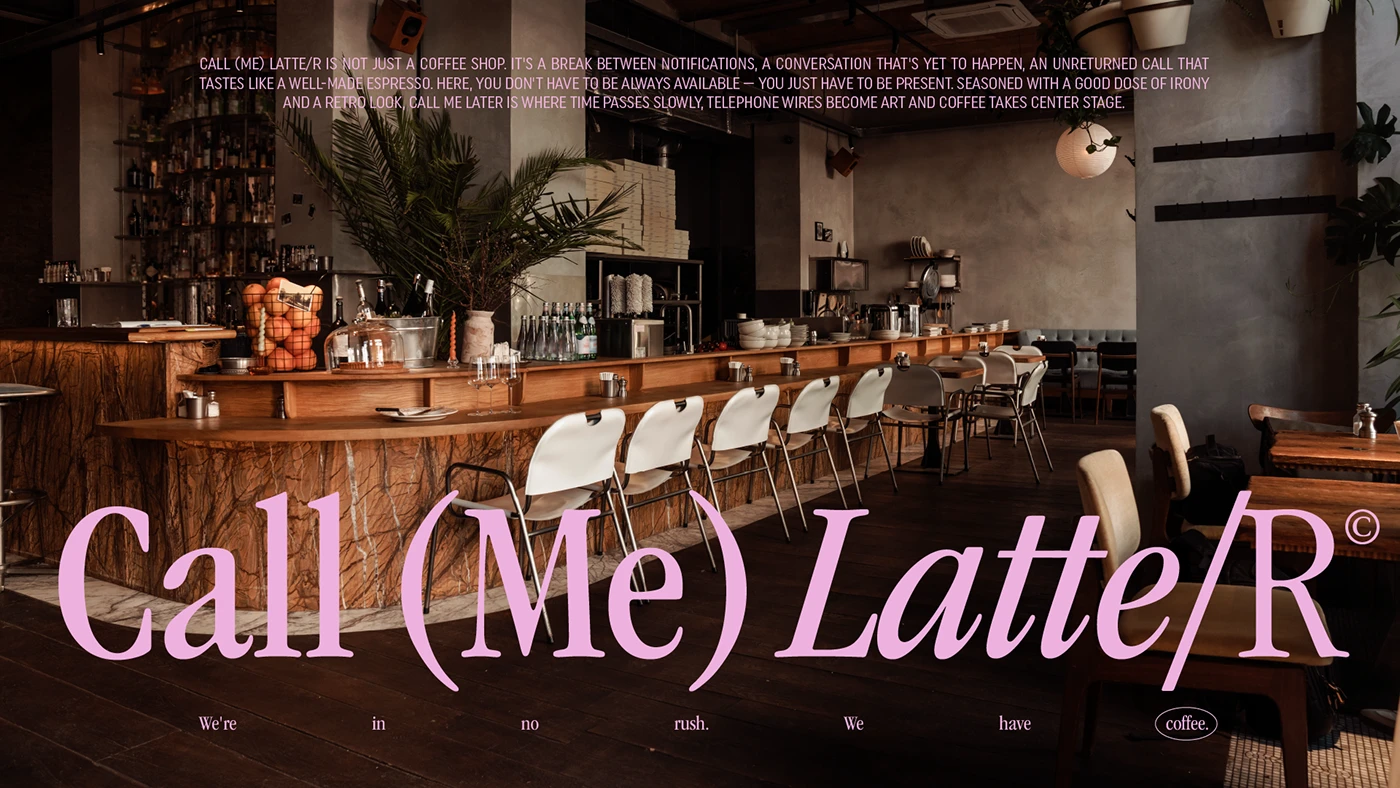
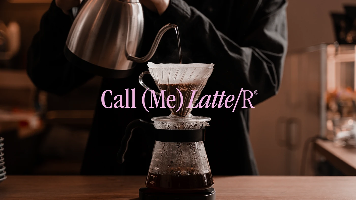
The first impression is part poster, part magazine cover, part European café with a knack for being just a bit too charming. The pink type jumps out, almost as if it’s floating in the air of the space. It doesn’t just accompany the scene—it owns it. That move is key: it puts the brand center stage, not as a secondary signature.
The atmosphere is all about contrast. The interior is warm, dark, inviting; the pink wordmark adds a playful, almost phone-like, pop note. The composition avoids visual clutter and lets the name do the heavy lifting. For a café, this kind of visual hierarchy is gold: if the name sticks, everything else is more likely to be remembered.
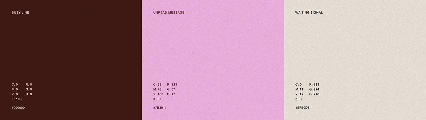
The visual direction has a rare virtue: it says “retro” without feeling like a costume. Brown gives it depth, pink lightens the mood, and cream lets it breathe. It’s a palette with memory—perfect for cafés that want to move away from stark minimalism without slipping into chaos.
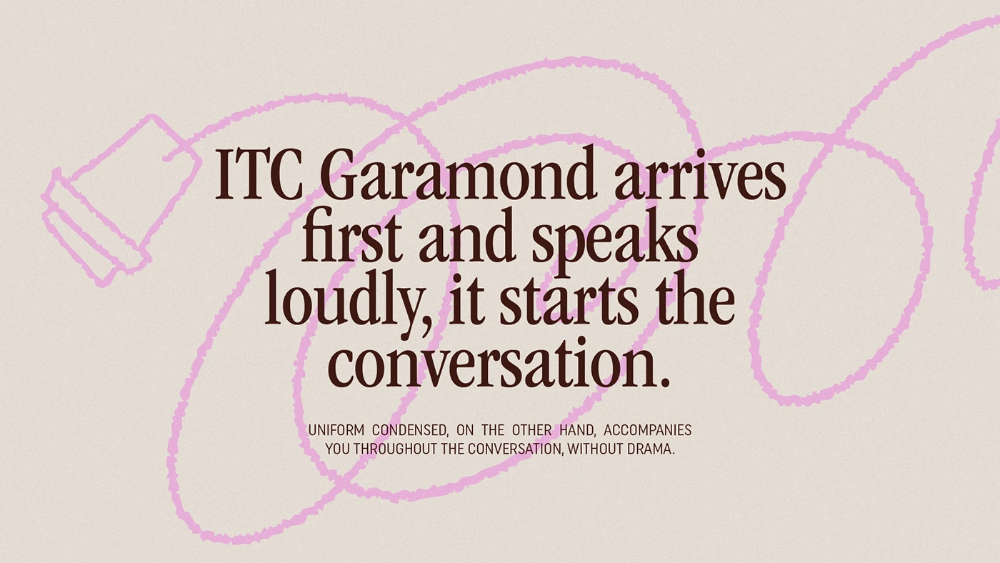
Typography is the emotional core of the identity. The serif brings curves, weight, and a kind of friendly drama; the condensed sans organizes information when it’s time to get practical. That balance matters: a brand can be expressive, but if everything shouts at once, the customer tunes out. Here, there’s personality and visual rhythm.
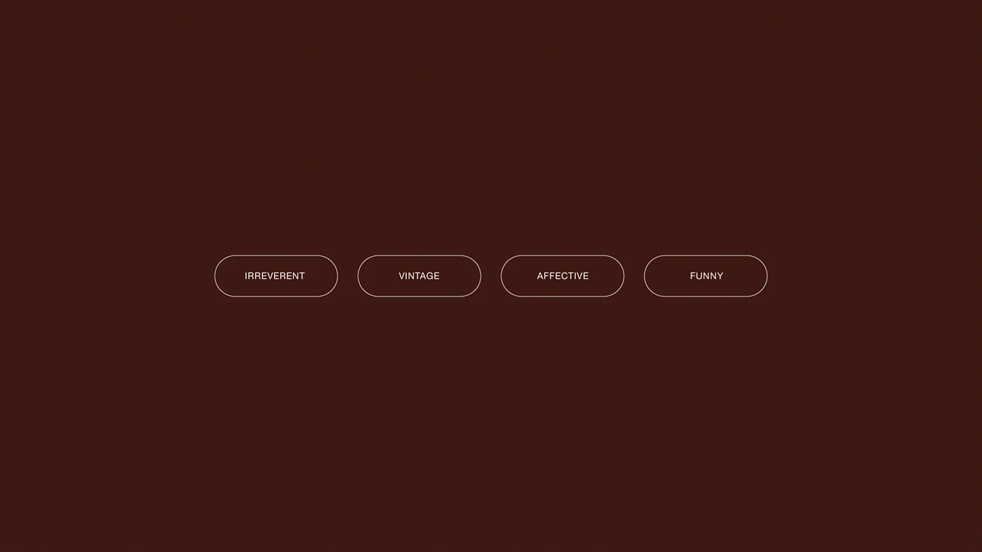
The tone-of-voice board stands out because it doesn’t overexplain. Four attributes, solid background, quick read. It works almost like an internal compass: if a piece doesn’t feel irreverent, vintage, heartfelt, or fun, it’s probably off-brand. For marketing teams, that’s far more valuable than an identity packed with random assets and no direction.
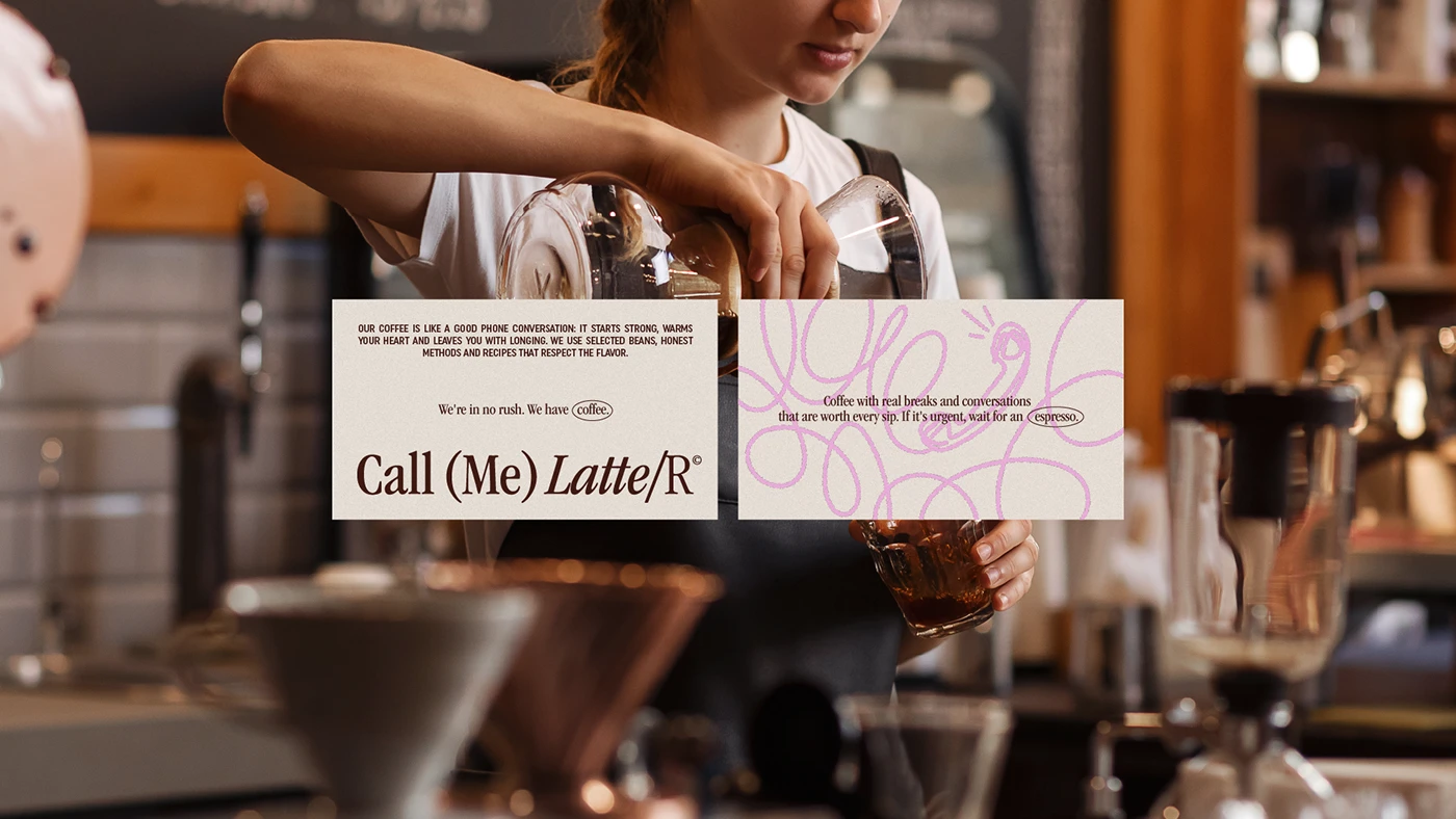
When coffee appears in action, the identity doesn’t step aside. It overlaps, accompanies, integrates. That’s important—many café brands keep the graphic world too separate from the real product: logo here, cup there, space somewhere else. Call Me Latter blends them naturally, making the coffee feel like part of a broader visual conversation.
The idea of pause is ever-present. Not as a solemn claim, but as a feeling. There’s a slowness in the composition, the flat backgrounds, the empty spaces, and a palette that avoids neon impact. That calm has commercial value: a café doesn’t just sell caffeine—it sells permission to linger.
From menu to packaging — the brand in your hand
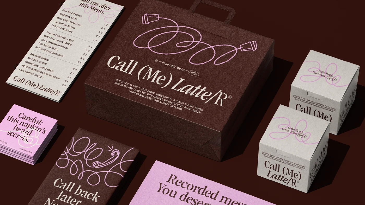
The identity comes alive when it moves to objects. Cups, napkins, cards, boxes, menus, team apparel. That’s when branding stops being just a pretty presentation and becomes a physical experience. The brand is touched, carried, photographed, and leaves the shop with the customer.
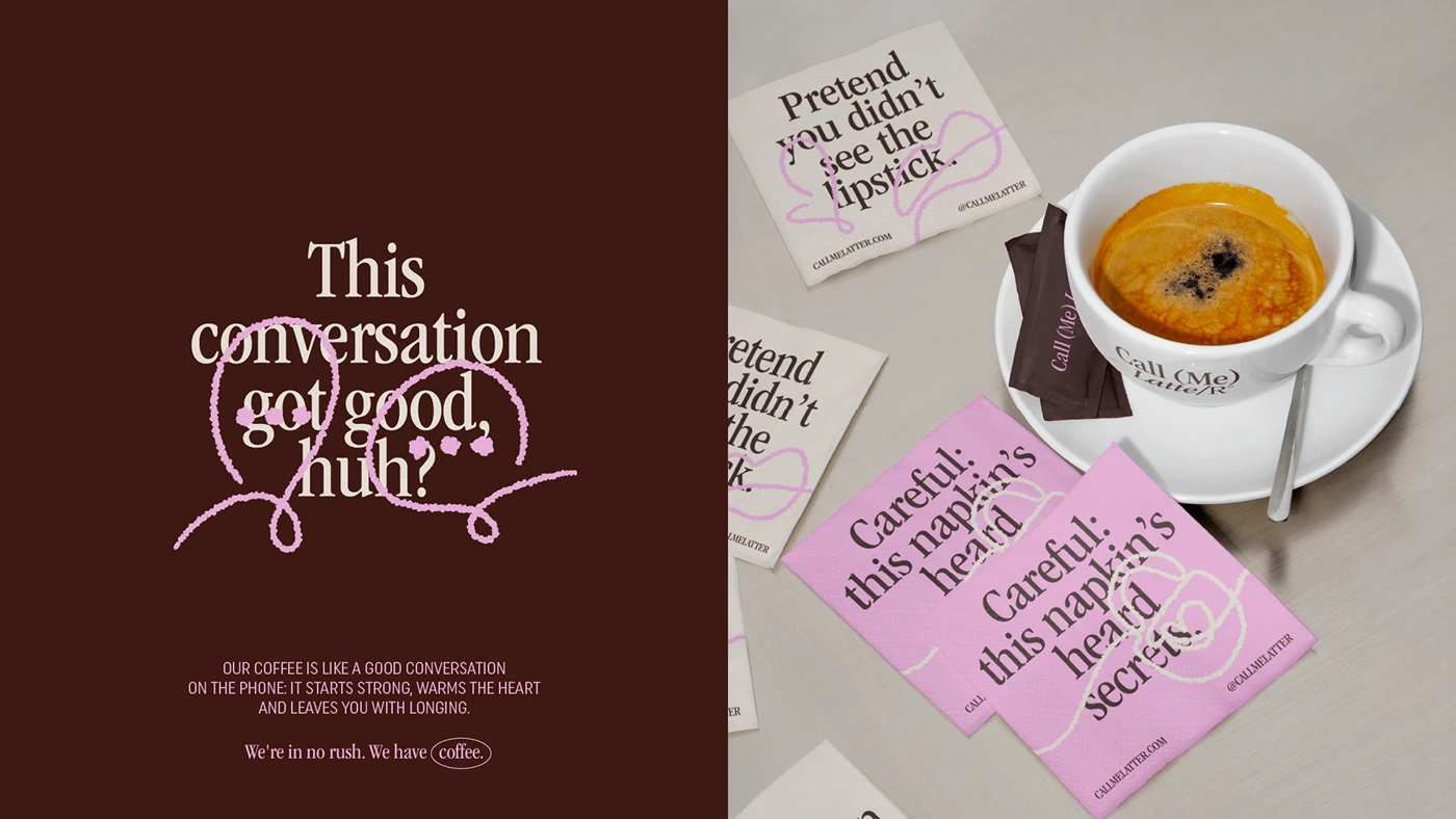
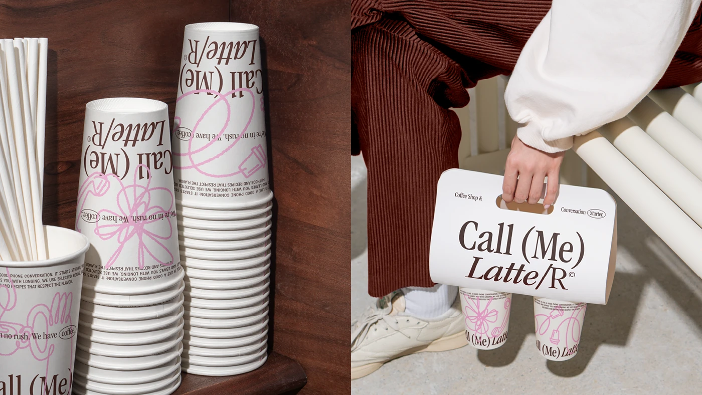
Packaging follows a clear logic: repeat without boring. Pink accents, brown as the backbone, typography as the voice. There’s no need to reinvent the layout for every piece. In fact, consistency is what makes the system feel more premium, more polished, and more trustworthy.
In the café world, the takeaway cup is almost a little walking billboard. If the design stands out, the customer isn’t just buying coffee—they’re carrying a badge of belonging. That badge might end up on an office desk, in an Instagram story, or in the hand of someone who’s never heard of the brand. Packaging doesn’t just wrap—it circulates.
There’s also something clever in the use of flat lay composition. Items are arranged as if on a beautifully curated workspace—airy, balanced, and tactile. The menu and cards don’t look like operational materials; they feel like fragments of a world. It’s a subtle difference, but it changes perceived value.
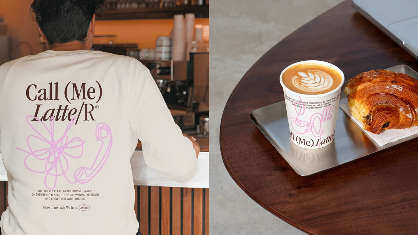
Team apparel is another intentional detail. It’s not just free merch—it’s part of the atmosphere. When the uniform, cup, and menu all speak the same language, the café feels more designed, more self-assured. That coherence isn’t just for designers; it also reduces friction for customers. Everything feels like it belongs.
The key is not to confuse abundance with a system. There are many applications, but only a few core decisions: a recognizable palette, a standout typeface, a voice with humor, and clean layouts. That restraint lets the identity expand without losing its personality. For a hospitality brand, that’s a huge advantage: you can grow across touchpoints without reinventing yourself every week.
A simple lesson for ambitious hospitality brands
Call Me Latter works because it has a point of view. It doesn’t try to please everyone or settle for a generic café look. It builds a recognizable personality and repeats it with enough discipline that every piece feels like part of the same conversation.
The lesson isn’t to copy the pink, use a big serif, or dress everything in nostalgia. The real takeaway is more practical: a café gains presence when it decides what feeling it wants to leave behind. Pause? Humor? Warmth? Ritual? Everyday luxury? Once that’s clear, typography, color, packaging, and UX/UI can all work in sync.
There’s also a gentle warning: the more expressive an identity, the more it needs control. A typeface with a lot of character can be stunning on a poster and overwhelming on a small menu. A memorable color can elevate a brand or exhaust if overused. The trick is knowing when to turn up the volume and when to let the coffee speak.
What lingers after the first look
Great coffee shop branding isn’t measured by how good it looks on a cup. It’s measured by the visual memory it leaves, the trust it inspires, and how it turns a small purchase into an experience with identity. Call Me Latter is a reminder of something simple: when a brand has atmosphere, the customer feels more value—even before the first sip.
Branding for coffee shop: Call Me Latter. Los puntos clave.
How does a comprehensive branding approach benefit a coffee shop beyond just logo design?
Comprehensive branding goes beyond just designing a logo—it creates a cohesive visual and verbal system that extends to interiors, packaging, uniforms, menus, and brand voice. This approach builds a distinctive atmosphere, enhances perceived value, and turns everyday moments into memorable experiences, ensuring the brand stays top of mind even before the first sip.
How does visual consistency impact a café’s perceived value?
A consistent visual identity, applied across every touchpoint—cups, menus, uniforms, packaging—conveys professionalism and strength. This coherence streamlines the customer experience and builds a sense of belonging, helping position the café as a brand with its own vision and personality, not just another face in the crowd.
Why is it important to define the atmosphere and tone of voice in coffee shop branding?
Establishing a distinct atmosphere and tone of voice allows the café to convey a clear feeling—pause, humor, warmth, ritual, everyday luxury—at every touchpoint. This not only sets it apart from generic competitors but also builds loyalty among customers seeking an experience that matches their lifestyle, not just a quick cup of coffee.
What are the risks of creating an overly expressive visual identity for a coffee shop?
An expressive identity can be memorable, but it needs to be applied with care and intention. When every element fights for attention or visual resources are overused, the brand risks losing clarity and becoming overwhelming. Striking the right balance between expressiveness and functionality is essential to ensure the experience remains enjoyable and recognizable over time.
How can packaging become a key element of brand recognition for a coffee shop?
Packaging—especially takeaway cups—serves as a mobile showcase for the brand. A distinctive, cohesive design not only reinforces the brand identity inside the café, but also travels throughout the city, sparks conversation, and catches the eye of potential customers beyond the point of sale. This extends the brand’s reach well beyond its physical space.