Here are the best pharmaceutical logos to date—a curated selection showcasing a variety of creative approaches to designing logos for the pharmaceutical industry.
The pharmaceutical sector is constantly evolving, and its logos are a testament to this, regularly undergoing redesigns and updates.
Best Pharmaceutical Logos
Innovex Pharma
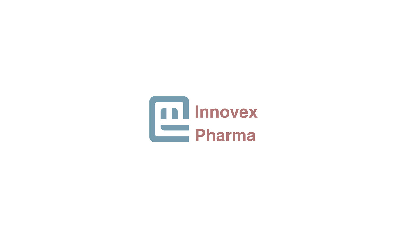
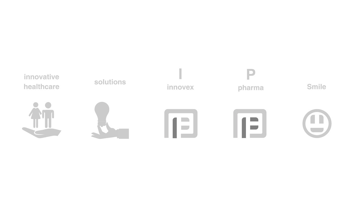
Design by Ammar El Bishlawy.
As explained in the logo description, the design is rich in meaning, with every element carefully considered. Personally, I think it might be a bit overloaded with symbolism, but it’s still a strong logo and deserves a place in this roundup of the best pharmaceutical logos.
To view the full project, click here.
Farmacia Panata
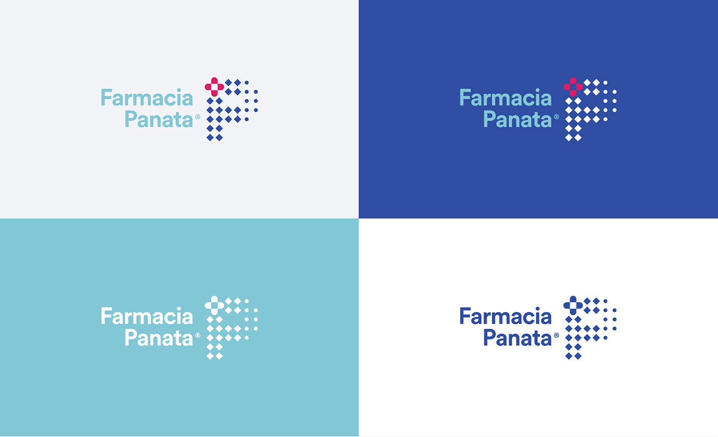
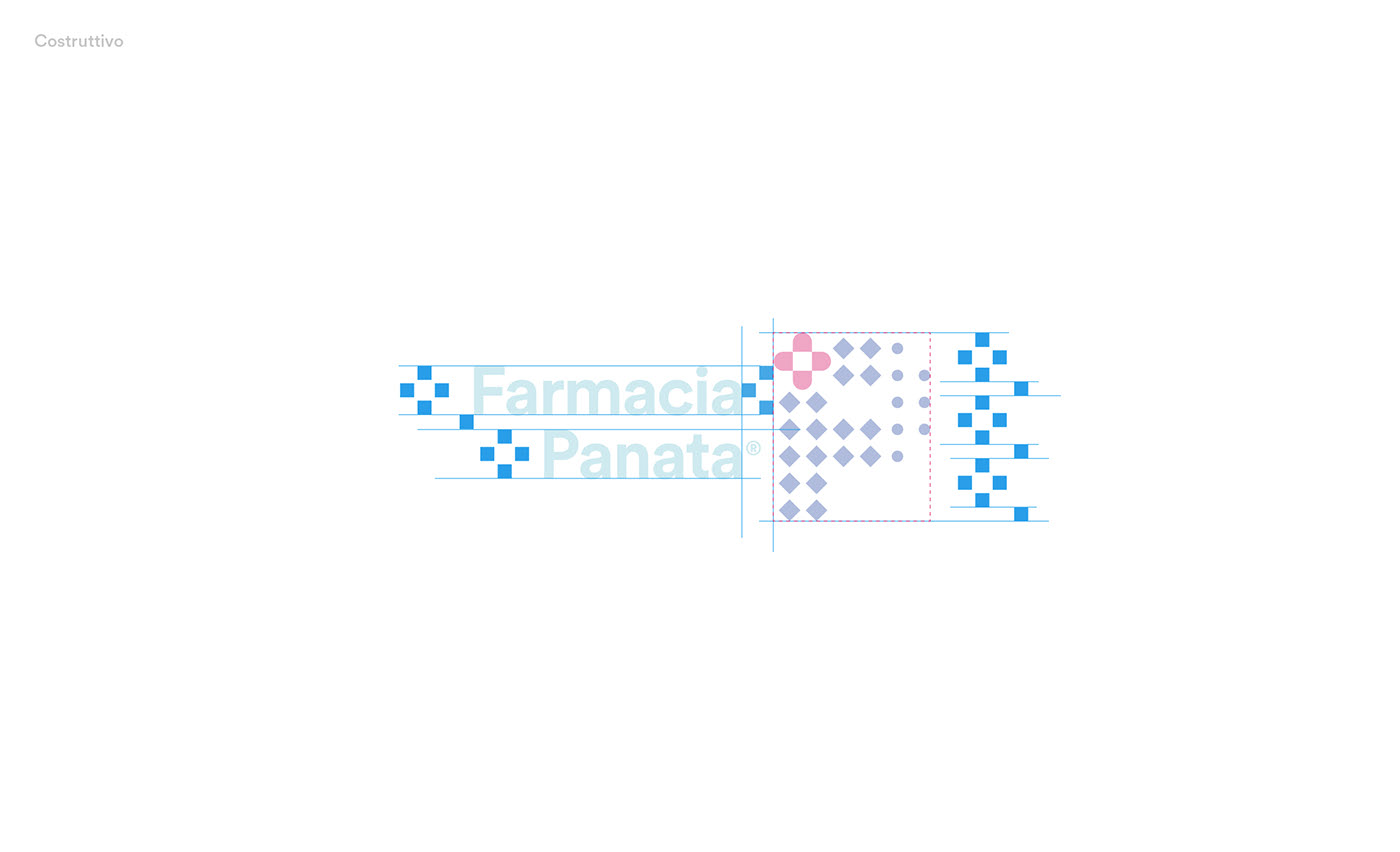
Design by Davide Scarpantonio.
Pharmaceutical company Panata, together with designer Davide Scarpantonio, introduces its new pharmaceutical logo. This contemporary design perfectly captures the communication style of the pharmaceutical sector and highlights how frequently companies in this industry refresh their image as a sign of ongoing innovation.
To view the full project, click here.
Sanofi Degestive Tour
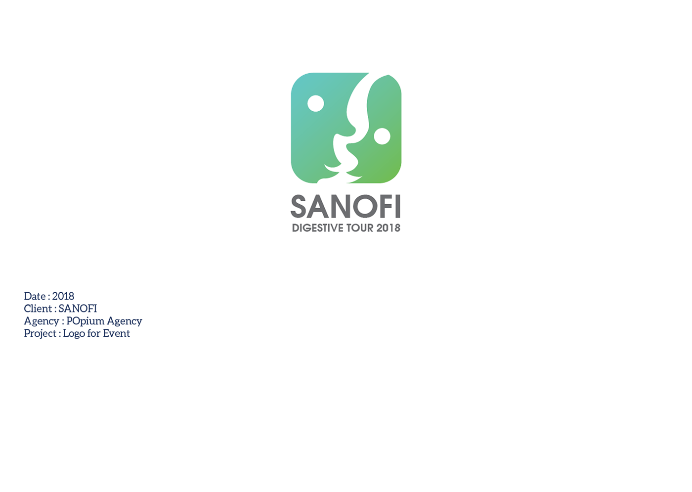
Design by Moumen Fenniche.
A unique logo created by pharmaceutical company Sanofi for its “Digestive Tour” event. The logo cleverly uses negative space to depict two figures forming a stomach, referencing the digestive system.
To view the full project, click here.
Behin Pharma
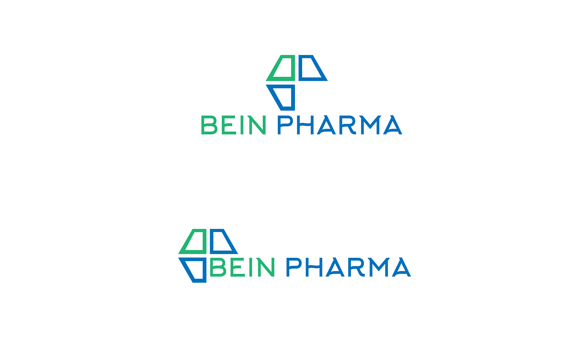
Design by Tuhin Hosen.
This logo features a design based on the brand’s initials, Behin Pharma, with the letters “B” and “P” forming the logo. The negative space subtly frames a medical cross, a nod to the healthcare sector.
The color palette also reflects the typical hues associated with the pharmaceutical and healthcare industries.
To view the full project, click here.
Algesal
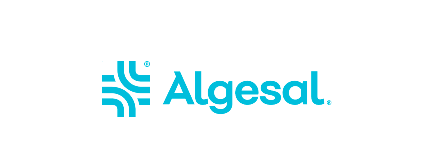
Design by Kwaku Amprako.
In my opinion, this is the standout logo on the list. Kwaku Amprako’s design for pharmaceutical company Algesal is a creative masterpiece. The lines of the logo clearly reference the medical and pharmaceutical cross, crafted with curves that evoke strength and vitality—both of the company and the human body.
The color choices are also perfectly aligned with the healthcare sector.
To view the full project, click here.
Yasusa

Design by Xiang Hailong 项海龙.
This pharmaceutical logo design is one of my favorites because it breaks away from the sector’s traditional style. The bold use of color is daring for the industry, and the initial “Y” is transformed into a graphic element that reflects the company’s focus on chemistry.
To view the full project, click here.
Esteve Teijin
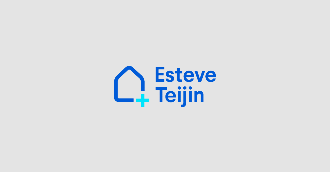
Design by Toormix Design Agency.
The final entry in our list of the best pharmaceutical logos is the design by Toormix Design Agency for Esteve Teijin. This is actually a rebranding project, created to mark the tenth anniversary of the partnership between Esteve Pharmaceuticals and Japan’s Teijin.
The result is a minimalist design with clear references to the pharmaceutical sector.
To view the full project, click here.