August has just begun and we’re all dreaming of the beach—but maybe not with all this body hair! That’s why I’ve put together a selection of the best beauty center logos.
In this article, we’ll take a look at some of the beauty center logos that have really caught our eye, chosen from esthetic centers in some of the world’s most stylish cities.
Our selection is based on originality, creativity, execution, and the overall graphic design of the logo.
The best beauty center logos
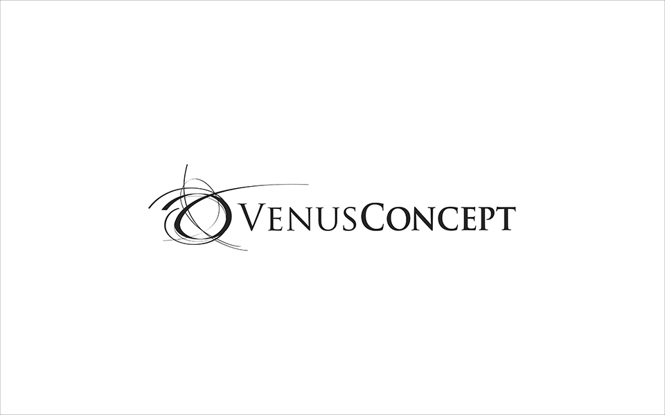
1. Venusconcept
This logo breaks away from the typical concepts you see in beauty center logos.
With a striking black-and-white palette, this logo plays with contrast in both color and form.
It’s a highly distinctive and appealing logo that perfectly conveys its concept through hand-drawn shapes.
A truly fitting beauty center logo for this list of inspiring best beauty center logos.
When it comes to typography, the designer has played with the contrast between “Venus” and “Concept,” using a different typeface for each to add character and reinforce the brand’s message.
2. Advanced aesthetic center
Here’s a more classic approach: Advanced Aesthetic Center has chosen a lotus flower as the basis for their logo—a popular motif in the world of aesthetics.
What sets this apart as one of the best beauty center logos is the elegant way they’ve used the lotus flower.
Many esthetic centers use this graphic element, which symbolizes birth and beauty.
In Hindu mythology, the goddess Laxmi is born from a lotus flower that springs from the head of the god Vishnu.
What stands out in this logo is its ability to move beyond the typical use of this symbol.
They’ve opted for a single, sophisticated color, with bold, confident lines and no color gradients.
The typography complements the design with a strong, elegant choice.
3. Living earth crafts
This is one of my personal favorites—the logo for Living Earth Crafts.
It’s an ultra-minimalist concept: just a circle and a few lines.
The overall effect of this logo is almost sensory.
My only critique is the typography, which I feel doesn’t quite match the logo itself.
It’s a very conceptual logo—you probably know what it’s about even if you’re not consciously aware of it, right?
Definitely a strong contender for the best beauty center logos list.
4. Guangzhou ibeauty technology
Quite a name, right? This Asian company brings us its logo.
Of course, you have to view it through an Asian lens, since artistic language varies by region—and even more so when cultural differences come into play.
Asia has an artistic tradition that’s often hard to interpret from a Western perspective.
Still, I thought it was worth including this Asian entry in our list of best beauty center logos.
It’s a clear concept that plays with:
- form
- message
- color
—all key elements in Asian design.
5. Bella corpo esthetic center spa
This logo is another example of the power of line and form.
With a clear concept, Bella Corpo Esthetic Center uses the flow of the word and the line to convey refinement and beauty.
It’s a very “skin care” logo that leaves no doubt about the center’s mission and vision.
A great addition to our list of best beauty center logos.
Do you have a favorite you think deserves a spot on this list? Send it in—we’d love to include it.
Conclusions:
A quick search online shows just how saturated the beauty center industry is.
It’s safe to say that, along with the world’s oldest profession, the human desire for self-care was born.
It’s part of our evolutionary nature—the need to be attractive, to reproduce, and to please others.
That’s probably why it was so challenging to find truly innovative and appealing references for this list of best beauty center logos.