It’s time to take a tour through the fascinating world of logo design with our annual roundup of the best logos of 2020–2021.
Once again, we’re committed to delivering high-quality content at the end of the year with this series of articles, which continues to attract more readers and followers every season.
That’s why we strive each year to refine our selection process and showcase only the very best.
[superfeatured]7076[/superfeatured]
In this article, we’ll highlight 10 of the best logos of 2020–2021, analyze what makes them stand out, and showcase a wide range of images demonstrating how each logo is applied across different elements of the brands’ visual identity.
Let’s dive into the top logos of 2021.
The Best Logos of 2021
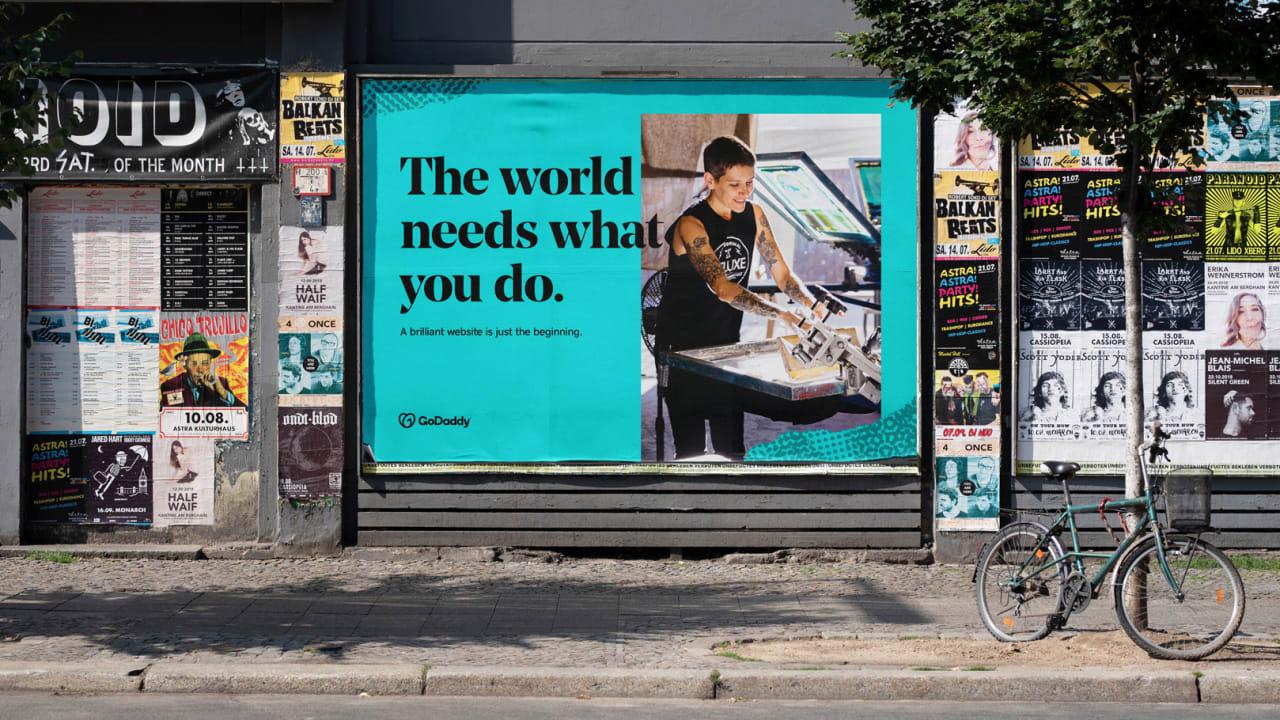
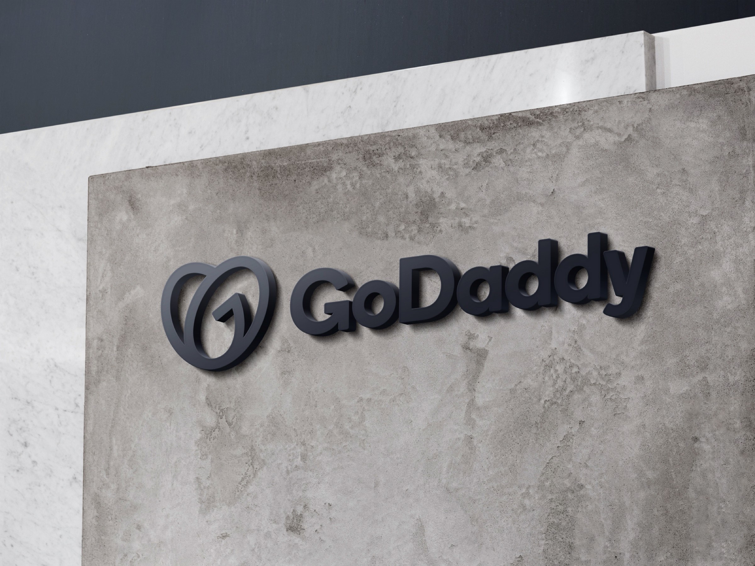
GoDaddy Logo by GoDaddy Team
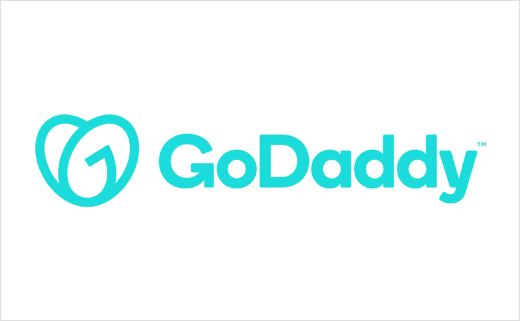
The new company logo for web hosting and digital products provider GoDaddy is a standout—one of the best logo designs of the year. Its sky blue brand color creates an approachable, user-friendly feel.
The graphic element of the logo cleverly references three ideas:
- A heart, symbolizing warmth and passion
- A smile, representing freshness and trust
- A handshake, signifying partnership and agreement
The chosen typography also aligns perfectly with the company’s mission and values.
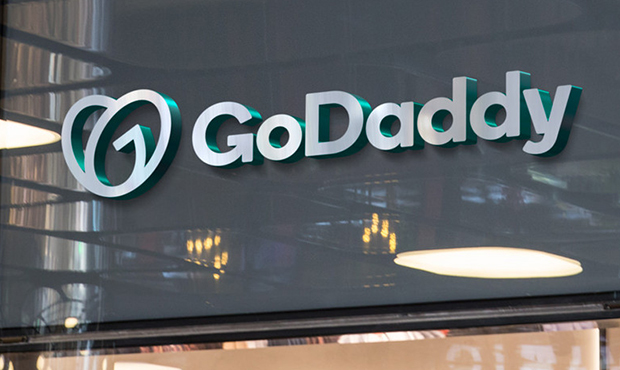
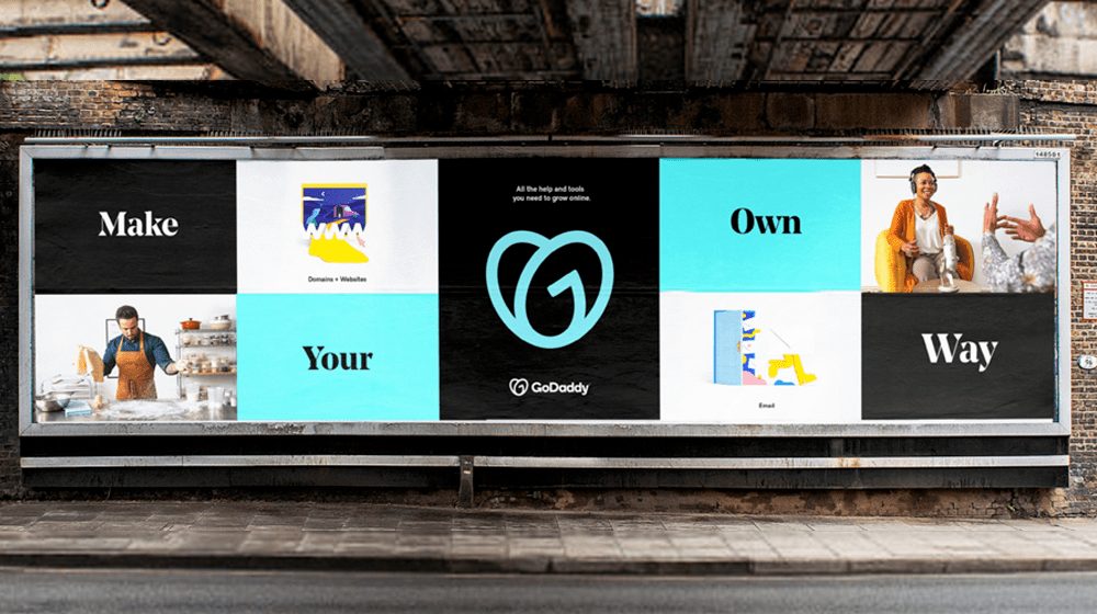
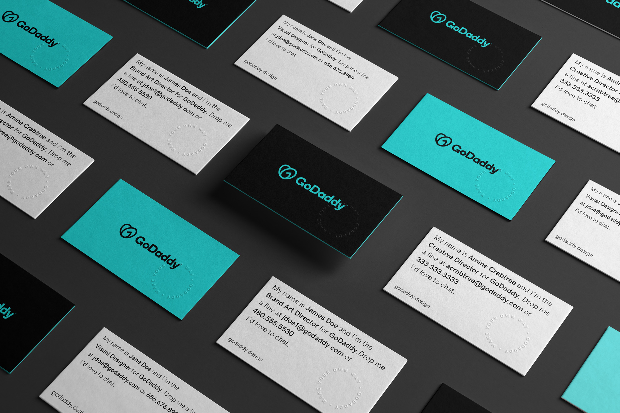
Logo Application
GoDaddy’s new corporate identity is flawlessly executed, as seen in the images below, which show the logo applied across various media and color schemes.
With this new branding, the company has achieved a much more professional and trustworthy image, without alienating its existing audience.
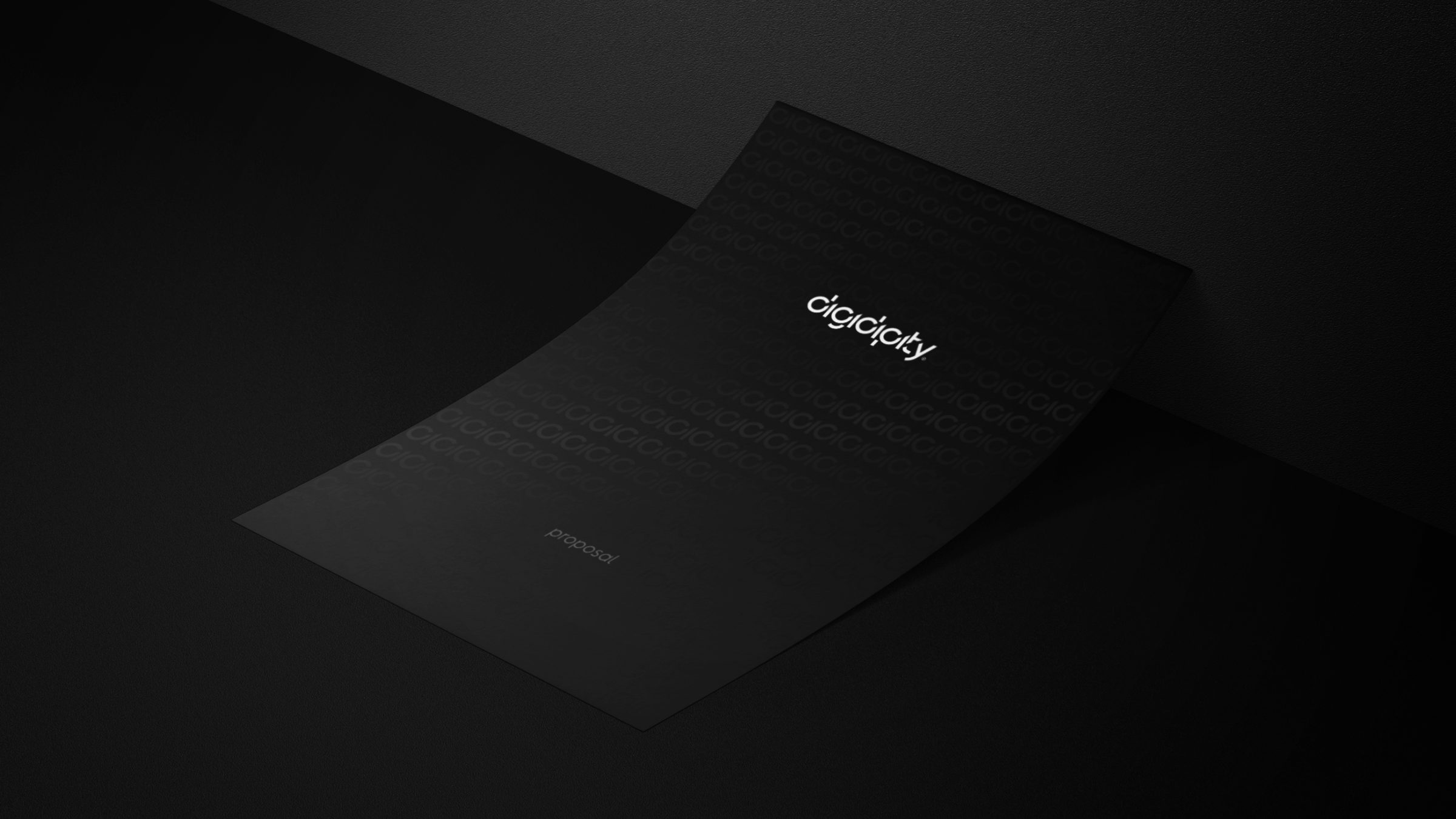
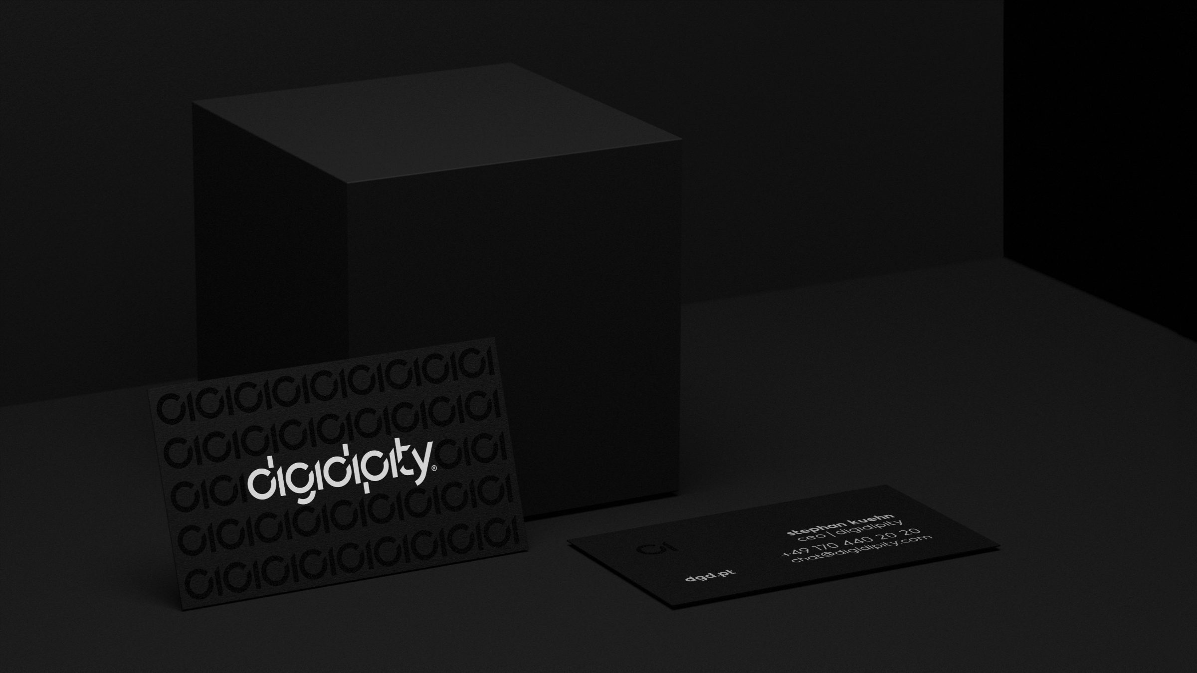
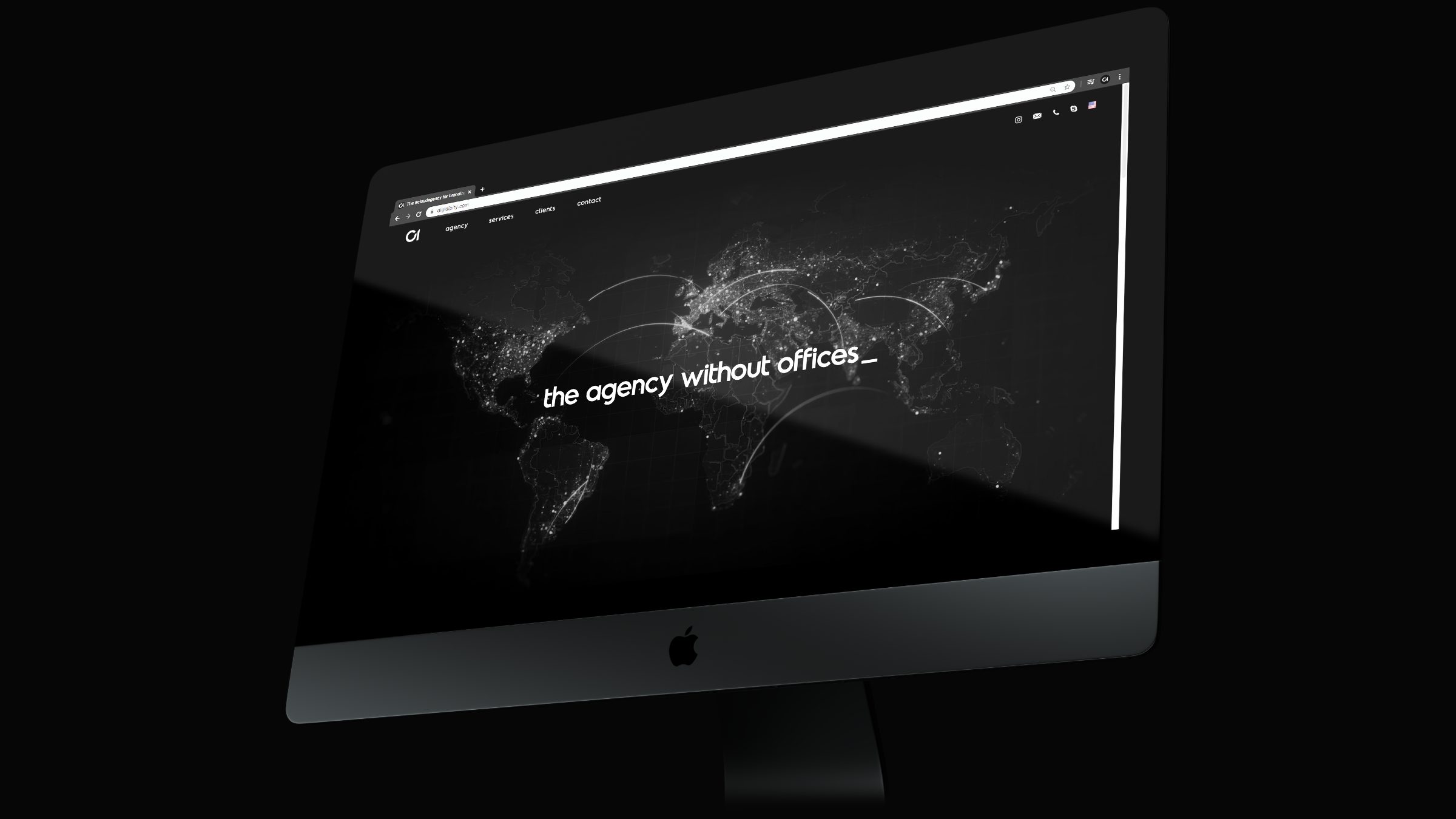
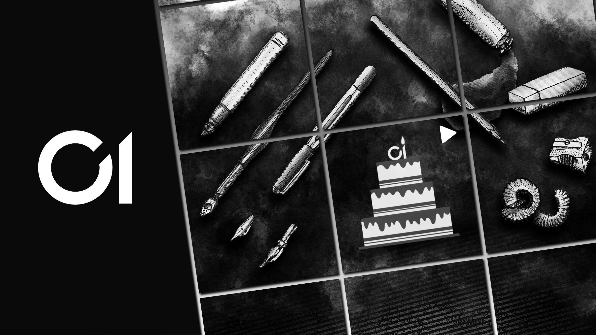
Digidipity by Eirini Seresli
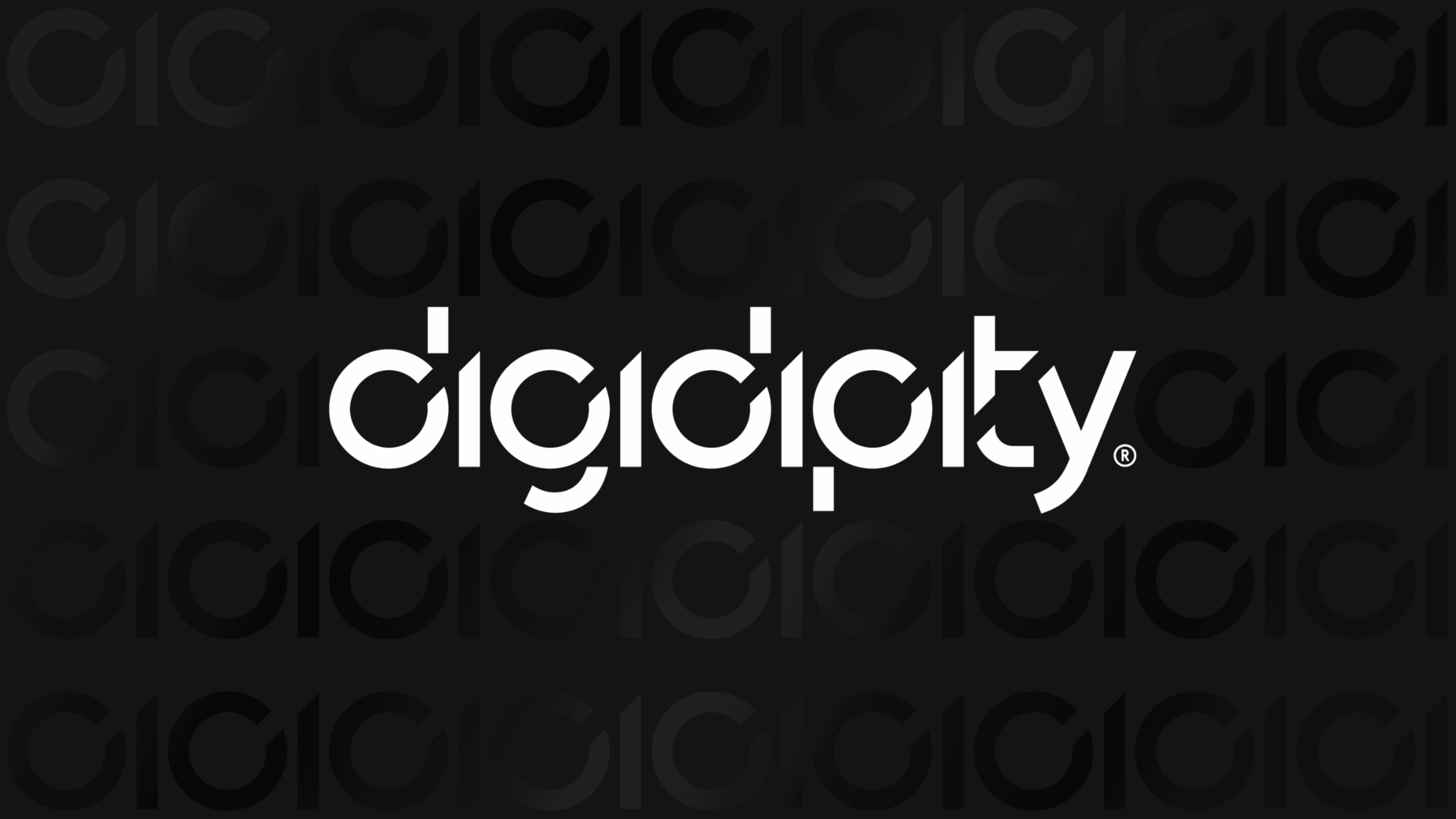
This logo is a showcase for the latest graphic design trends in logo design.
A truly fascinating logo from a creative standpoint, it’s built around representing the brand and company name using the binary code system of computers.
In addition to the full logo design featuring the complete name, there’s also a minimalist version using just two elements—the zero and one, or the “d” and “i” from the name. It’s easily one of the best logos of 2021 and will be hard to top.
Logo Application
The logo is brilliantly applied across the rest of the brand identity elements.
A multi-award-winning logo design, it has received honors including Gold in Logos 2020 and Silver in Branding 2020 at the Indigo Awards.
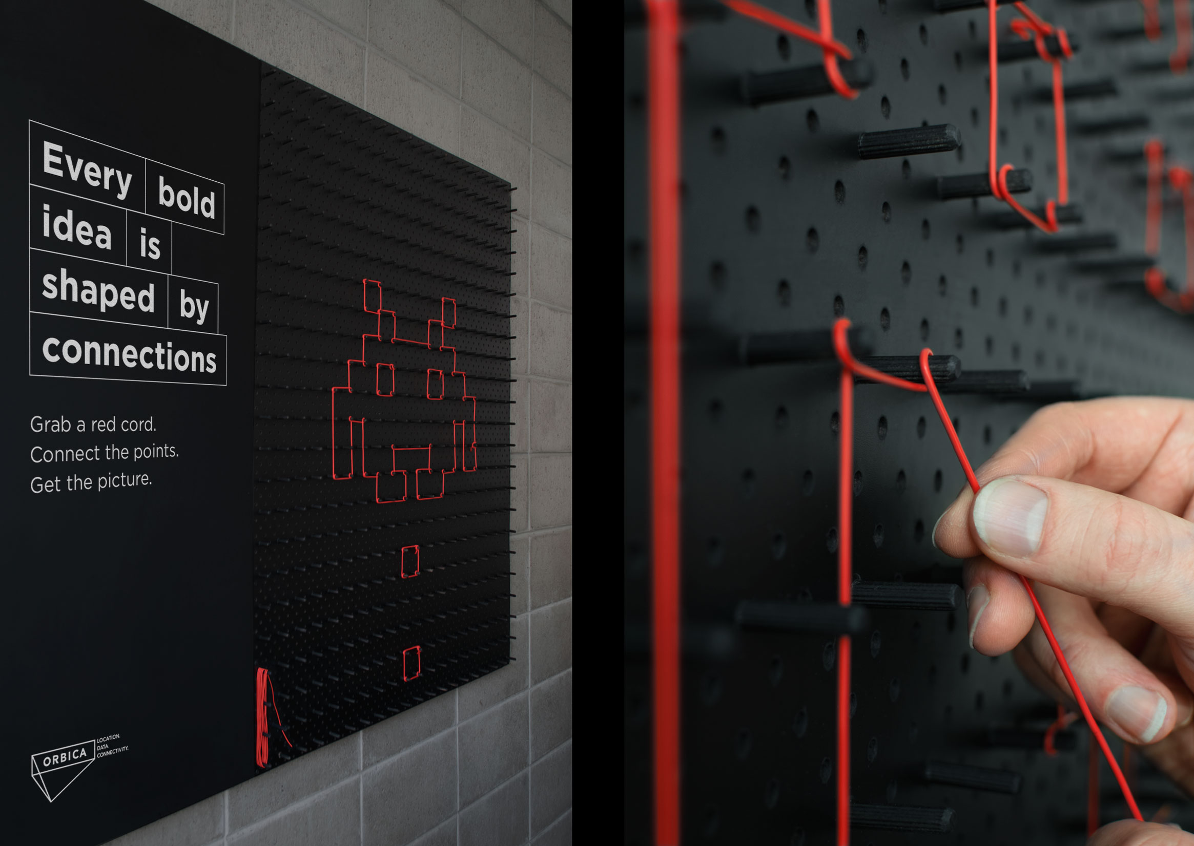
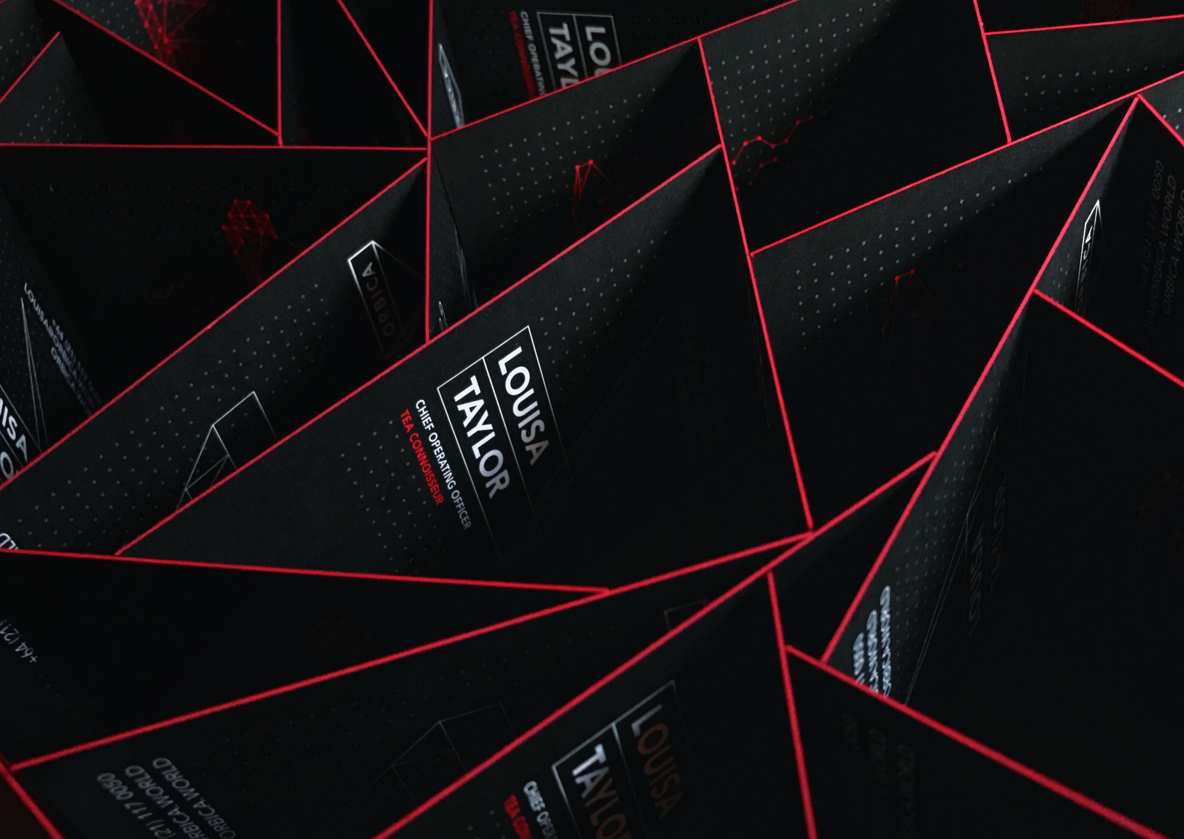
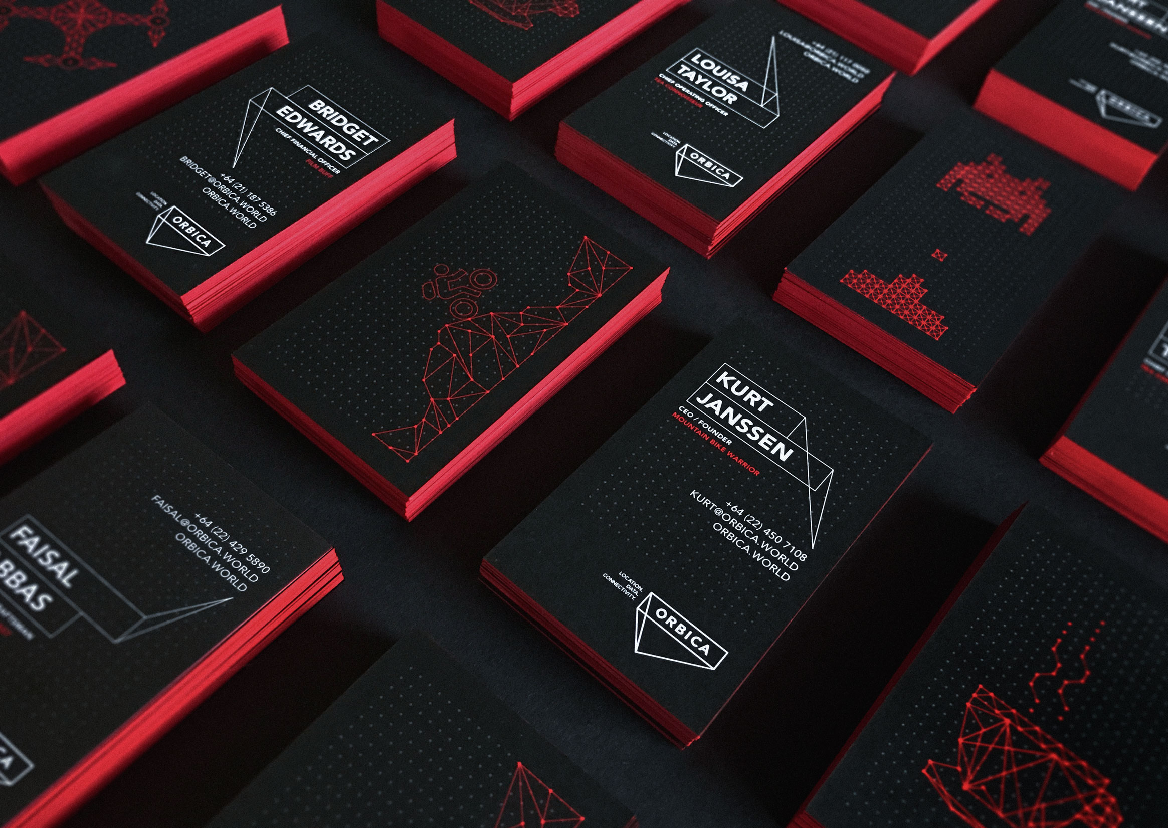
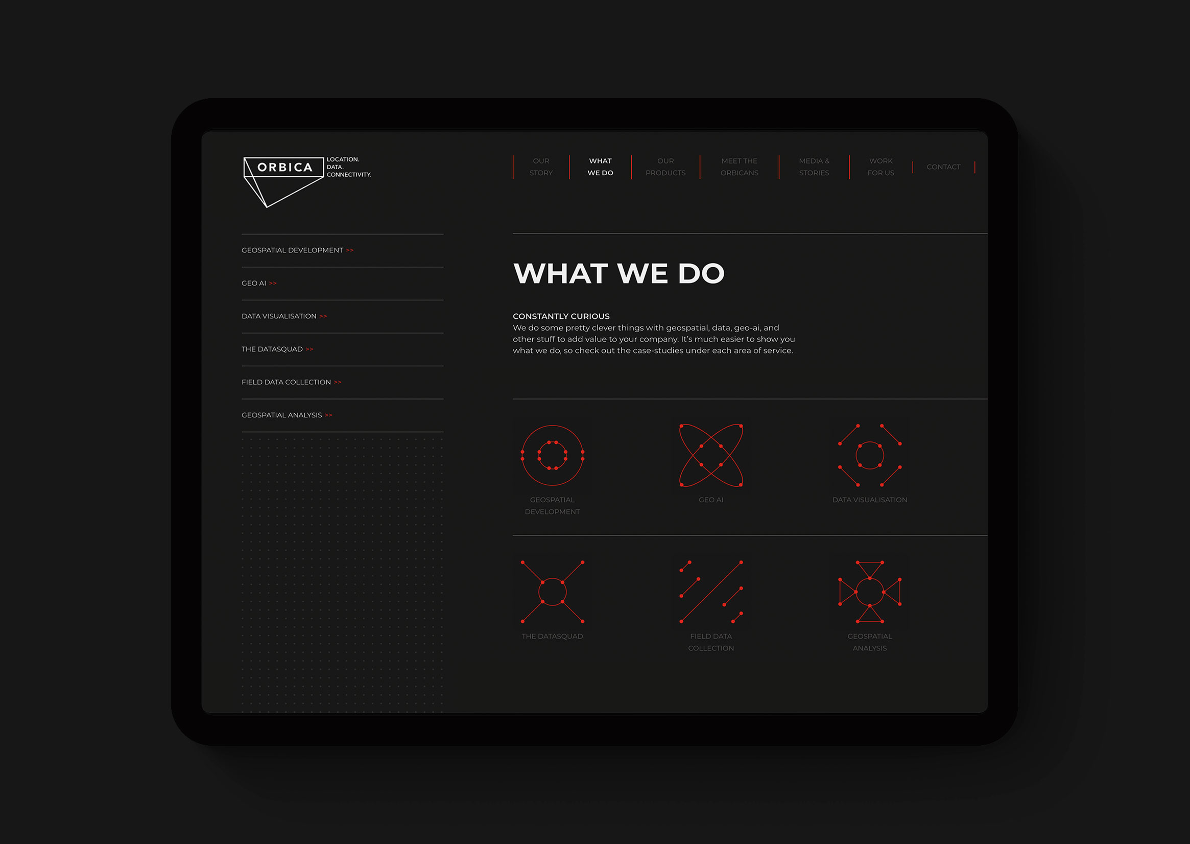
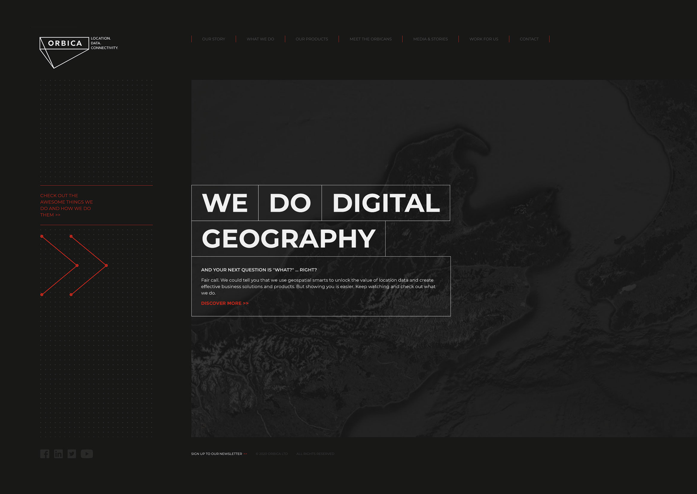
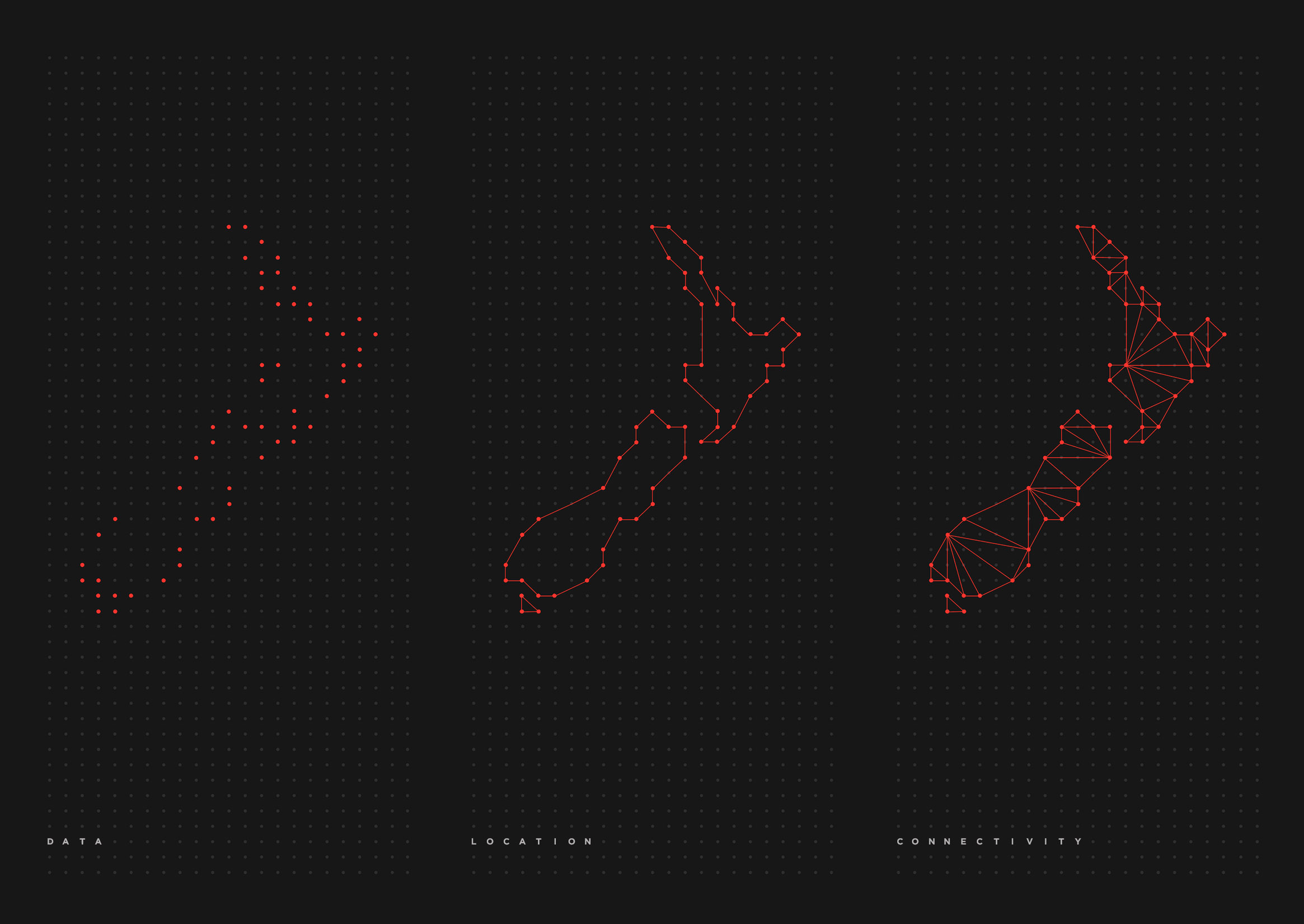
Orbica by Friday Creative
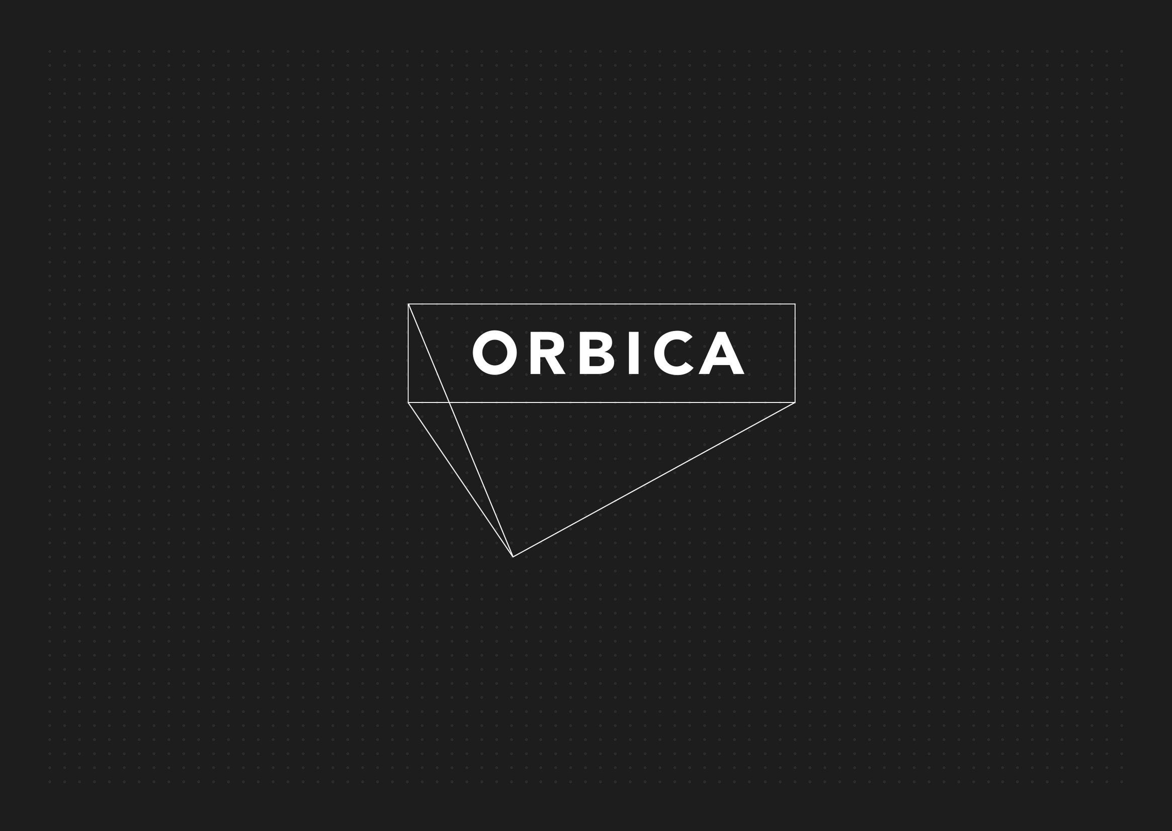
Another top logo of 2021 is this masterpiece for Orbica.
The secret to this logo’s success lies in its use of fine lines and a 3D element, contrasted with bold, all-caps sans-serif typography.
Orbica’s logo was awarded Best Small Brand Identity in New Zealand.
Logo Application
The logo is complemented by a well-developed brand identity that maintains the company’s branding cues and corporate colors.
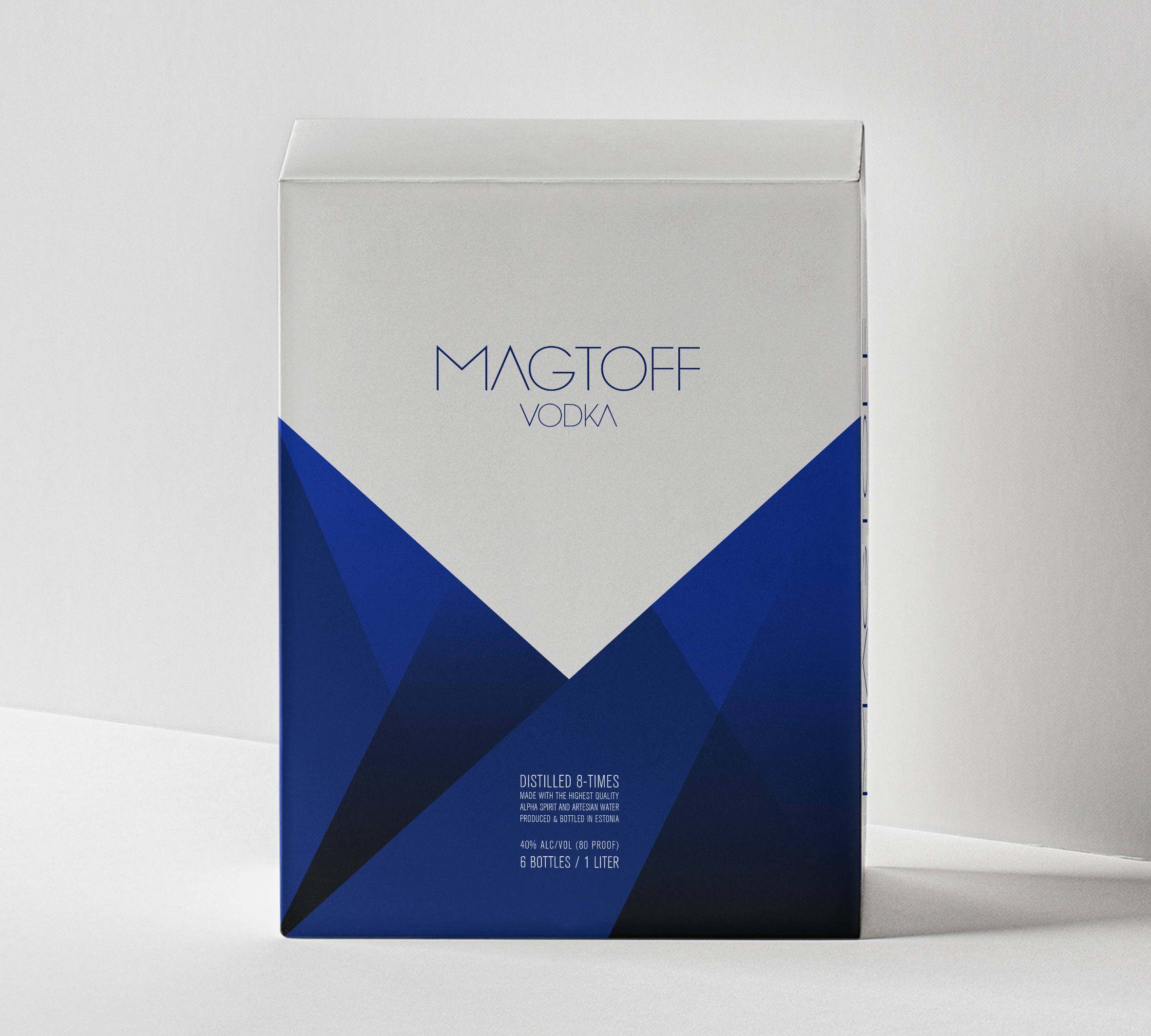
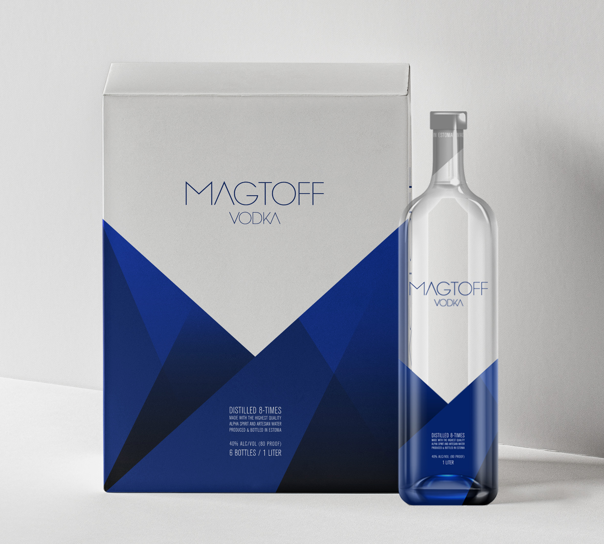
Magtoff Vodka by Phoenix Lifestyle Marketing Group
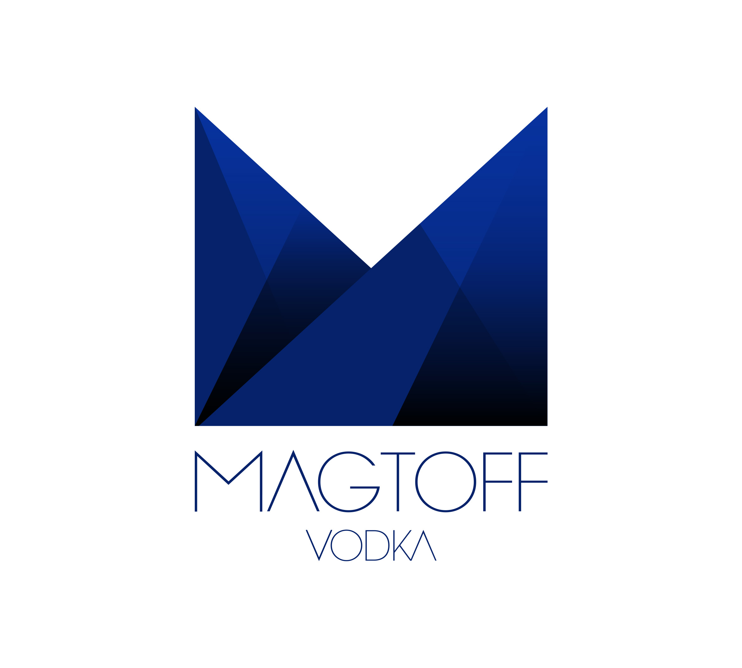
A bold, avant-garde design that stands out in the traditionally classic vodka market.
Design elements were chosen to highlight and elevate the brand’s premium nature, giving Magtoff a distinctive look that sets it apart from competitors.
The logo uses simple yet refined geometric shapes to create a unique “M,” representing the brand’s initial.
The logo also leverages a rich brand color palette to convey a masculine yet sophisticated image.
Finally, the custom-designed typography further enhances Magtoff’s premium feel and reinforces its differentiation from other vodkas on the market.
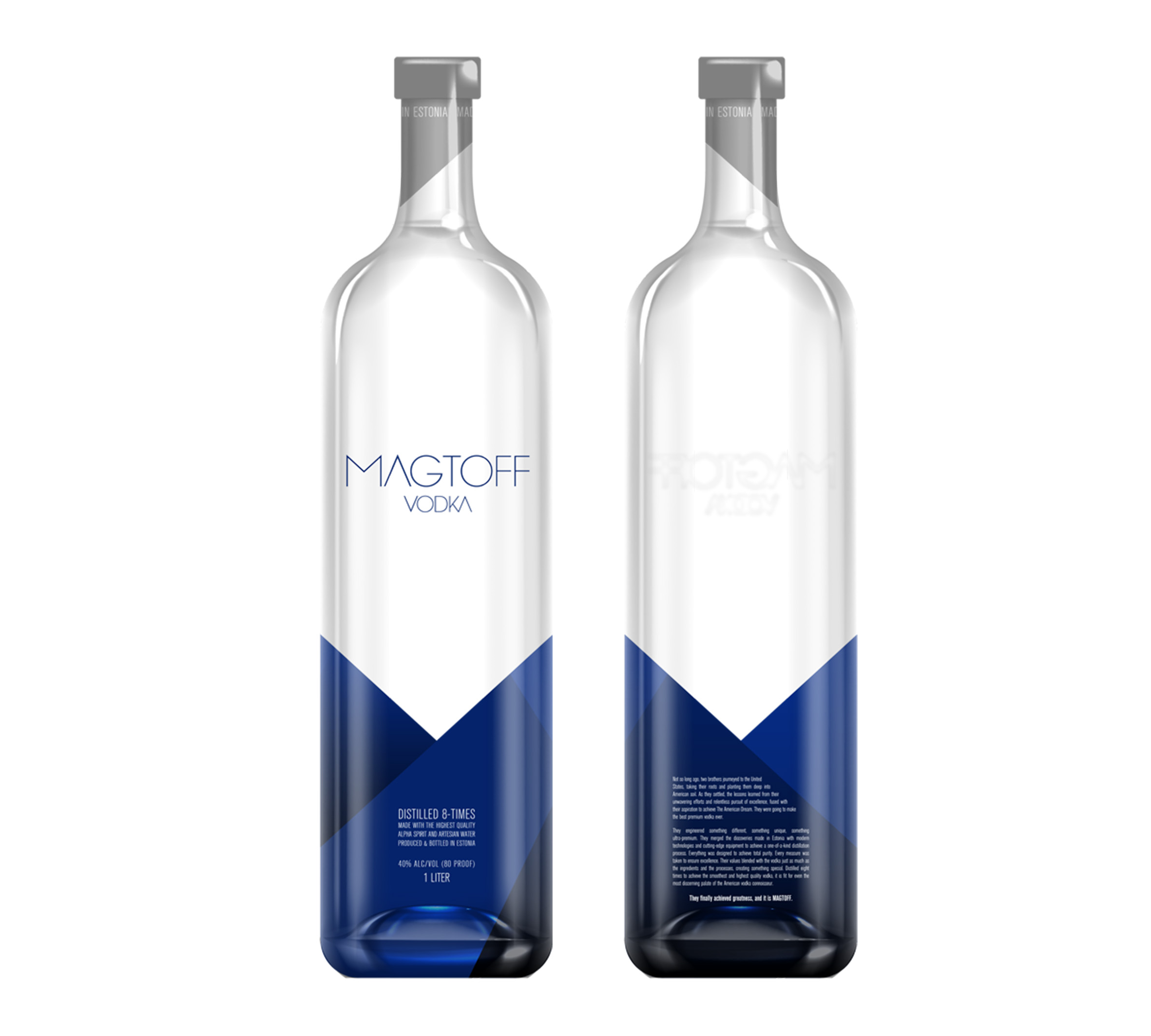
Logo Application
The logo design is completed by its application to the brand’s core assets—the bottle and packaging.
The result is one of the best logos of 2021.
[superfeatured]7076[/superfeatured]
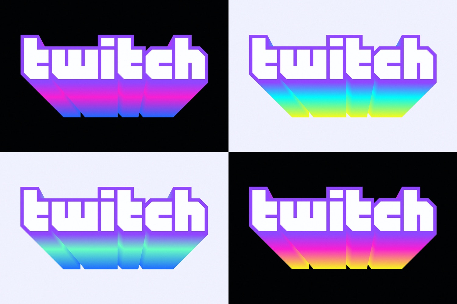
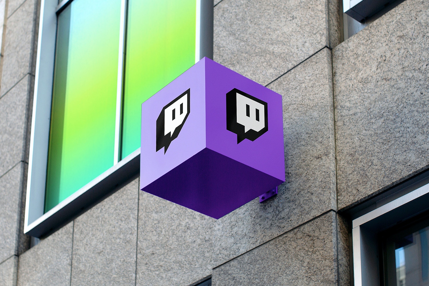
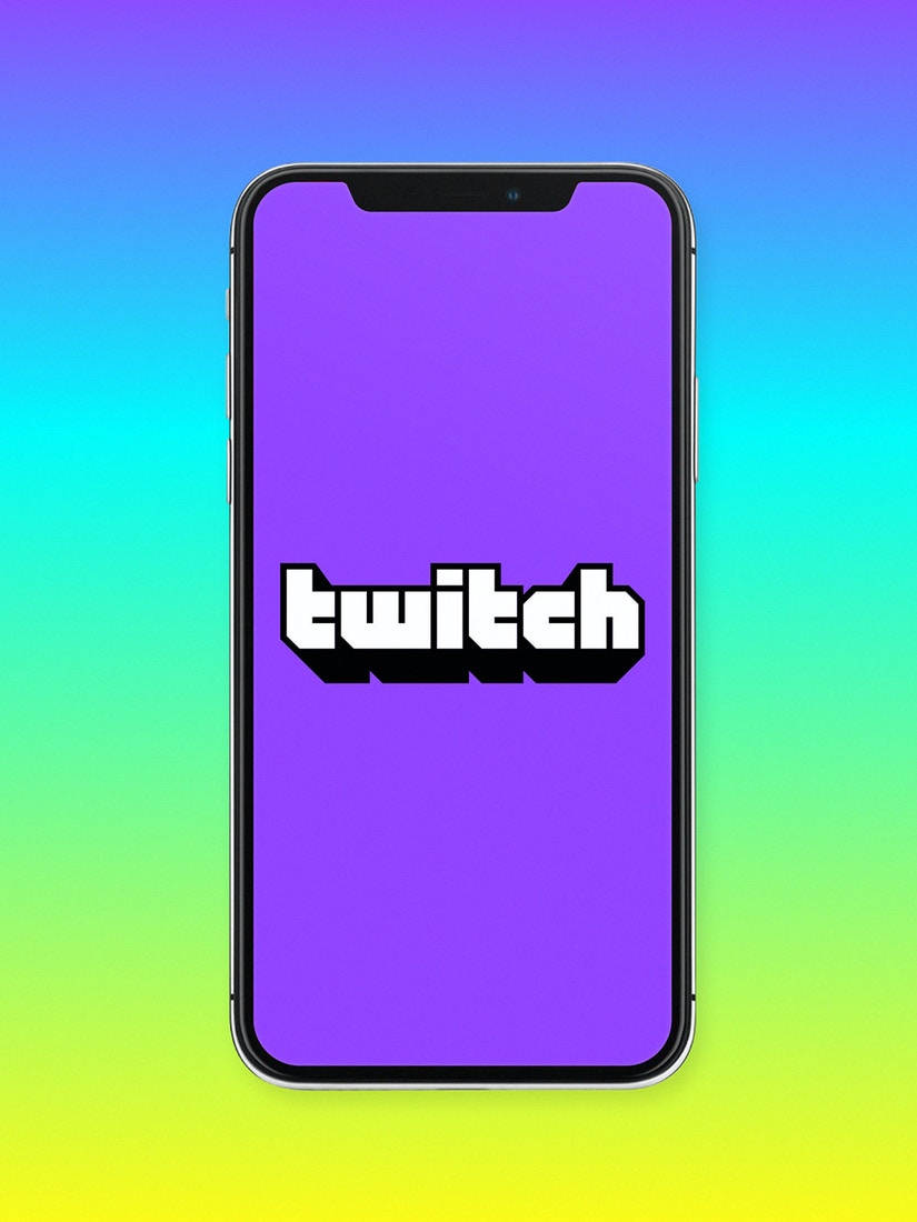
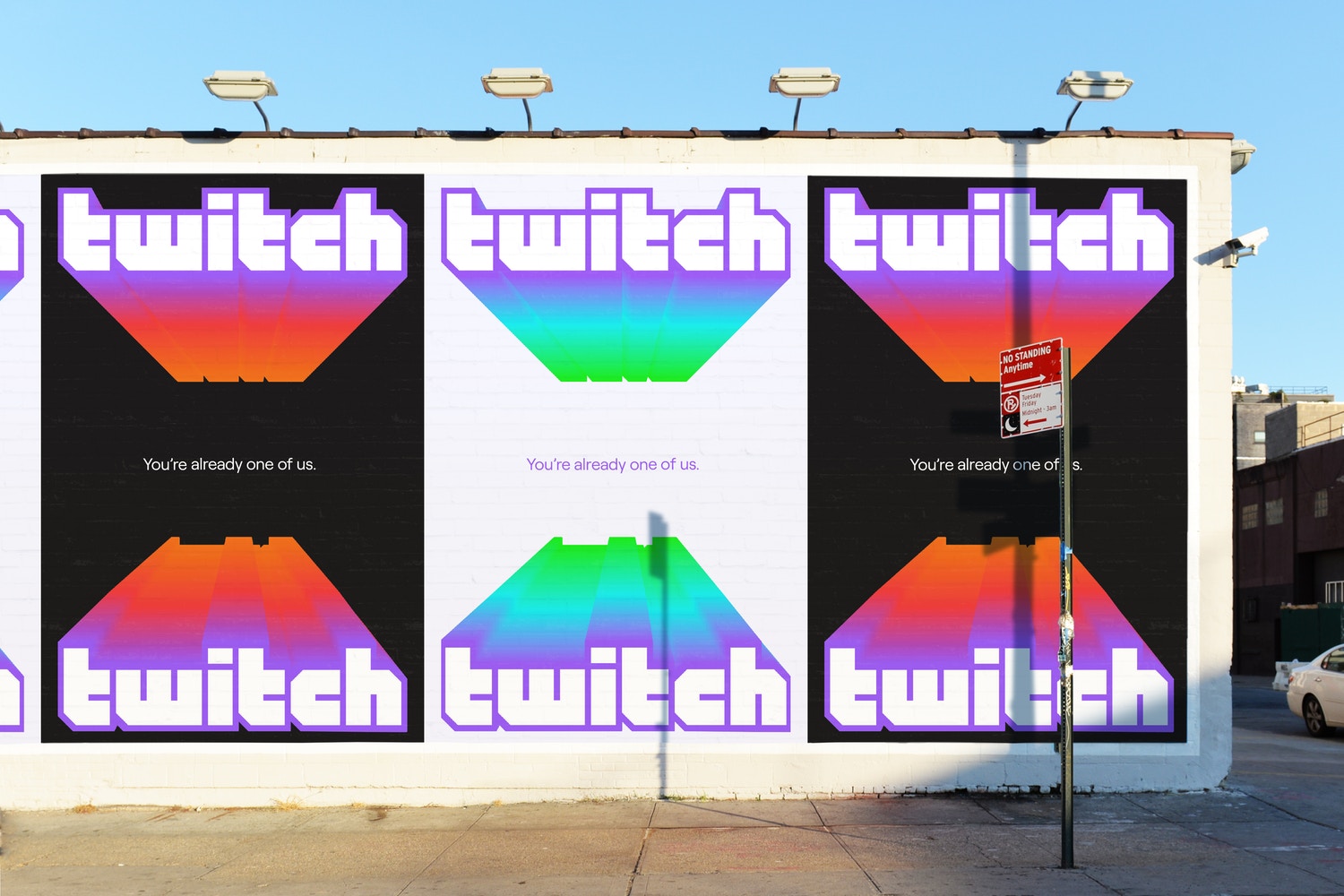
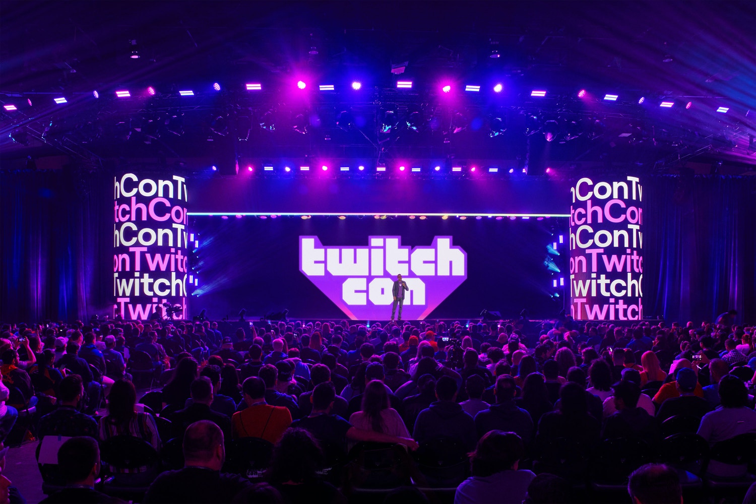
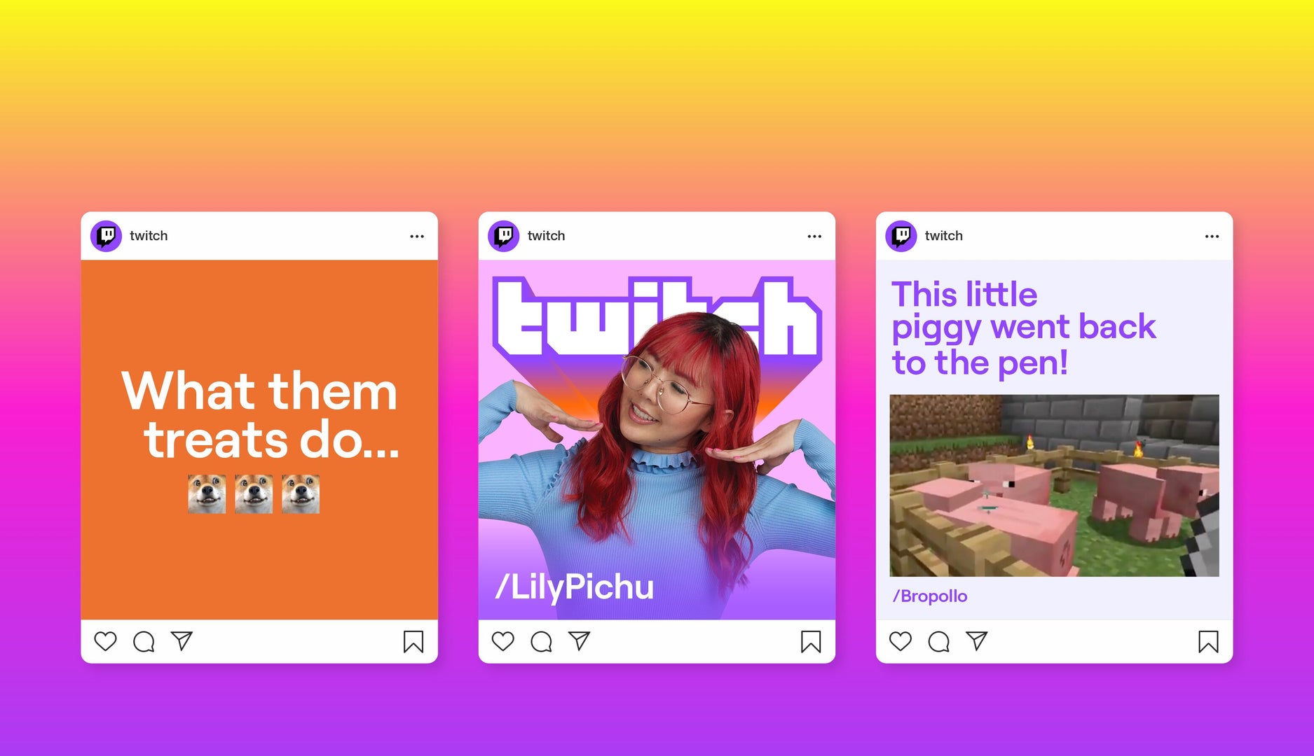
Twitch by Collins
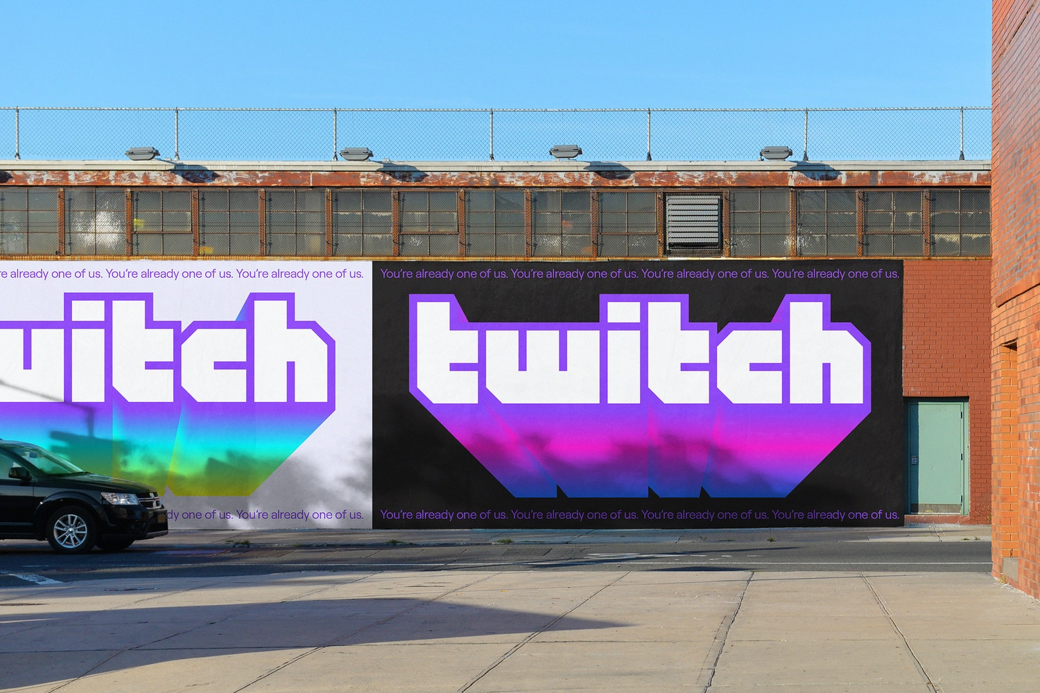
Twitch, the leading live gaming platform, underwent a rebrand and introduced a new logo—another of the best logos of 2021 and one of the boldest, most contemporary projects of the year.
Embracing the graphic design trend of oversized, unique typography and shapes, this logo features daring, youthful, and dynamic forms and colors.
The signature purple palette from the previous logo remains, but now with brighter tones to reflect the platform’s energy and the diversity of talents and audiences joining from around the globe.
The project won Best In Show, with branding experts praising it as one of the year’s most daring initiatives.
The typography is entirely new and custom, creating a graphic language with icons that work seamlessly together.
As the judges put it: “The conceptual direction was itself a bold move—a calculated risk. This identity understands its audience, speaks to them directly and confidently, and makes them feel part of something bigger. Flawless execution and a clear tone of voice.”
Logo Application
The following images show the logo in various forms and applications. Take a look and see why it’s one of the best logos of 2021.
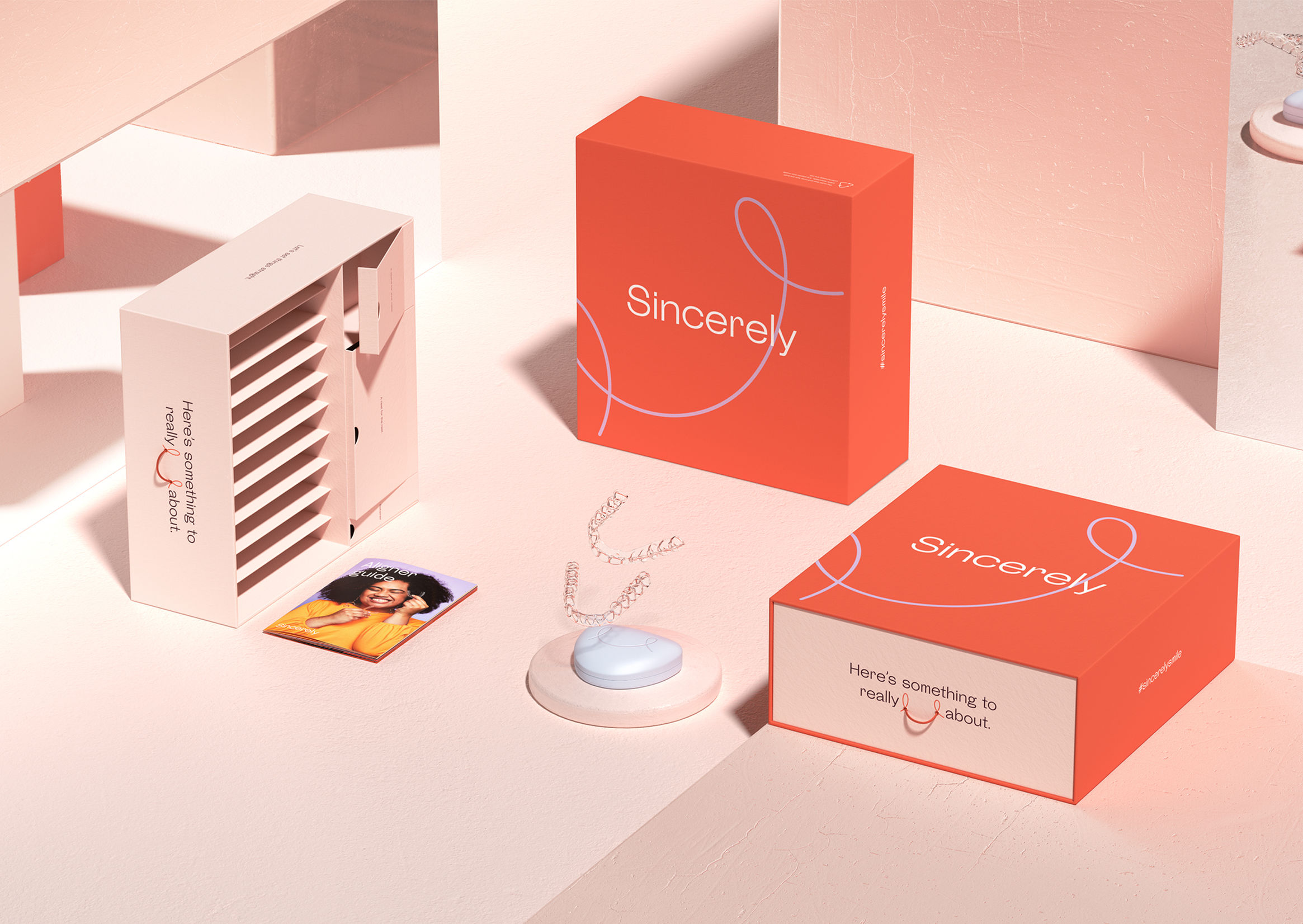
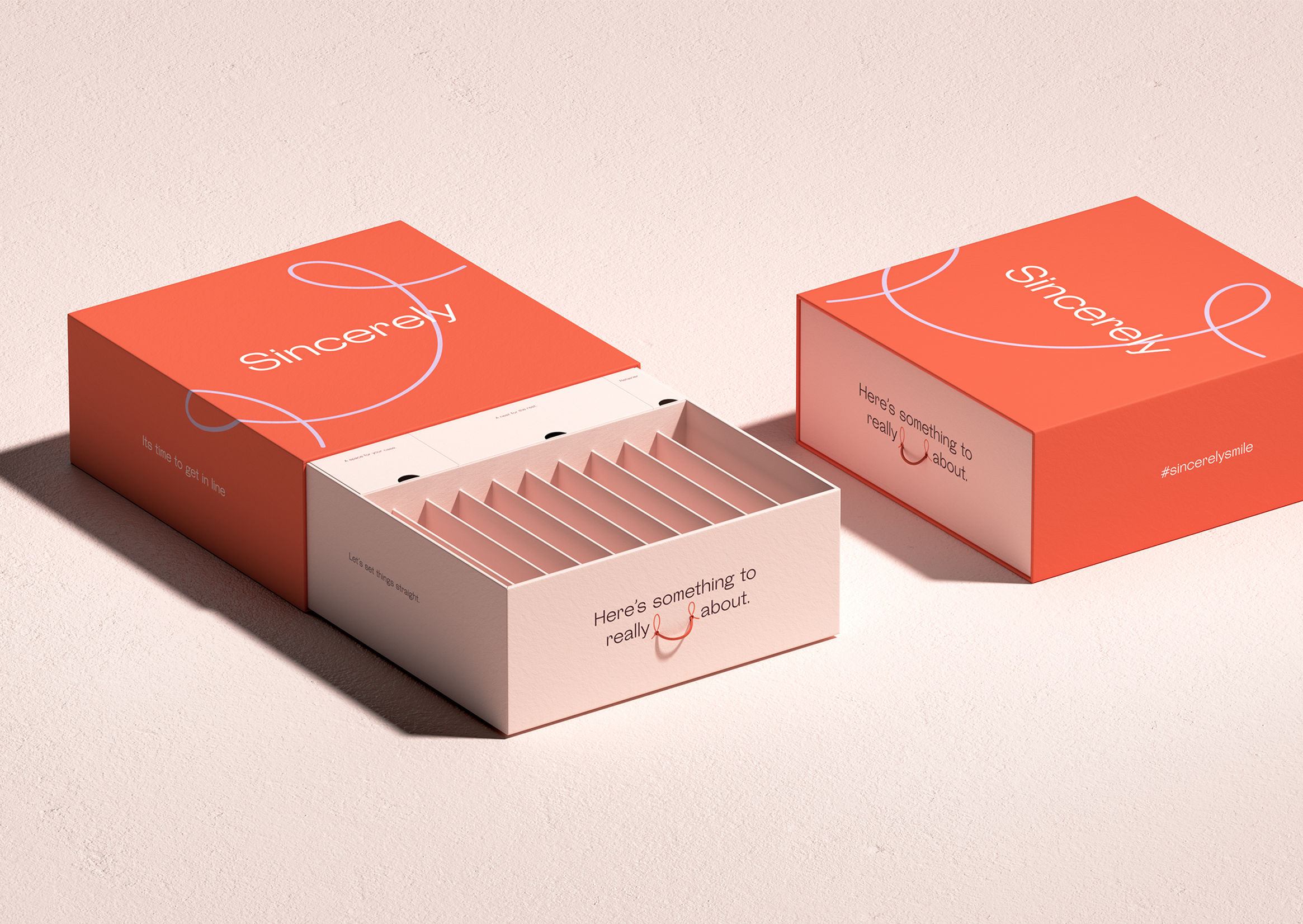
Sincerely by Dari Israelstam
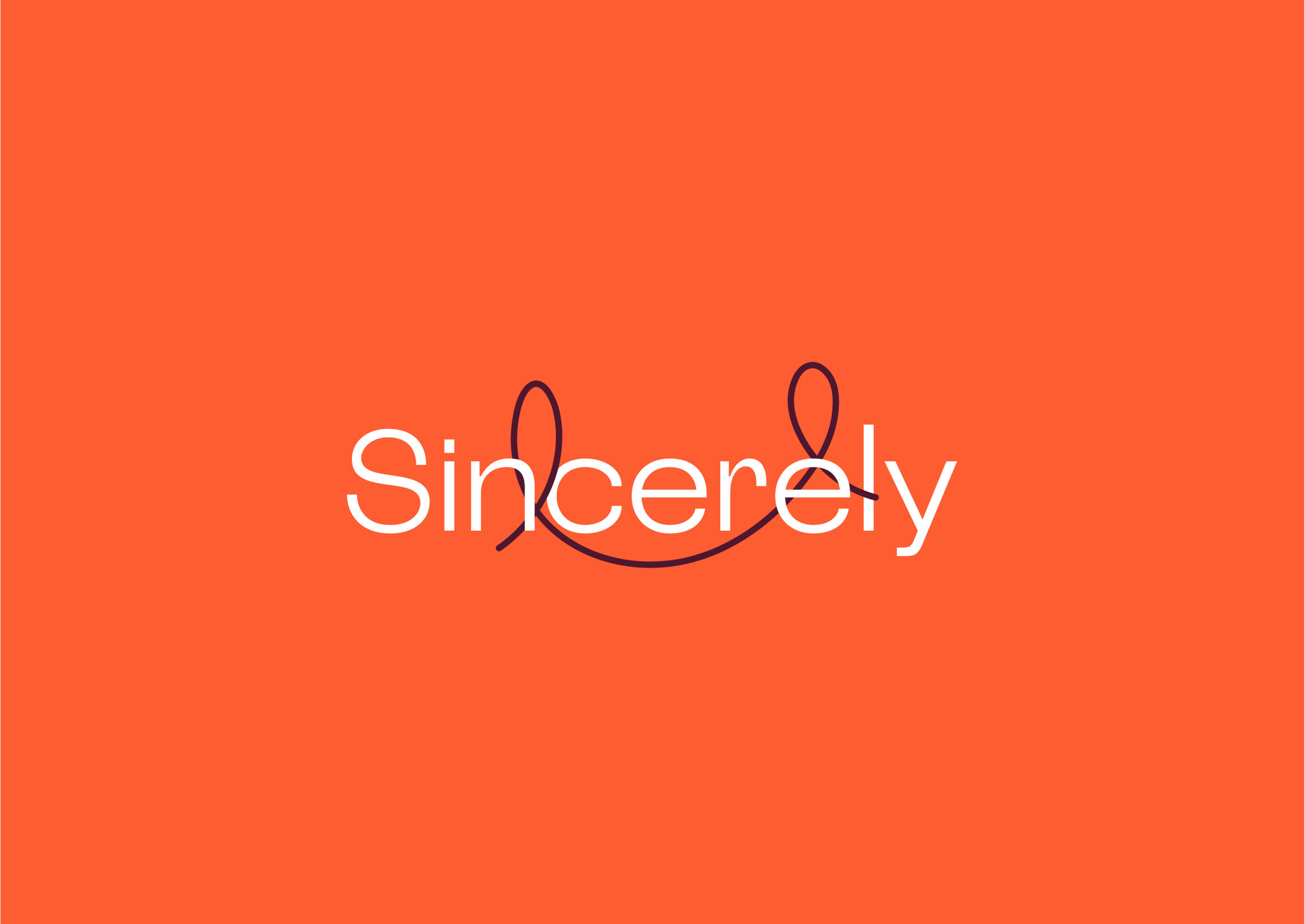
A design that feels natural and organic, conveying warmth and spontaneity.
The logo stands out for its hand-drawn line placed between the typography—a playful and versatile element.
The typography is fully custom, designed specifically for the brand. The logo is completed with a distinctive color palette that invites everyone to be part of the project.
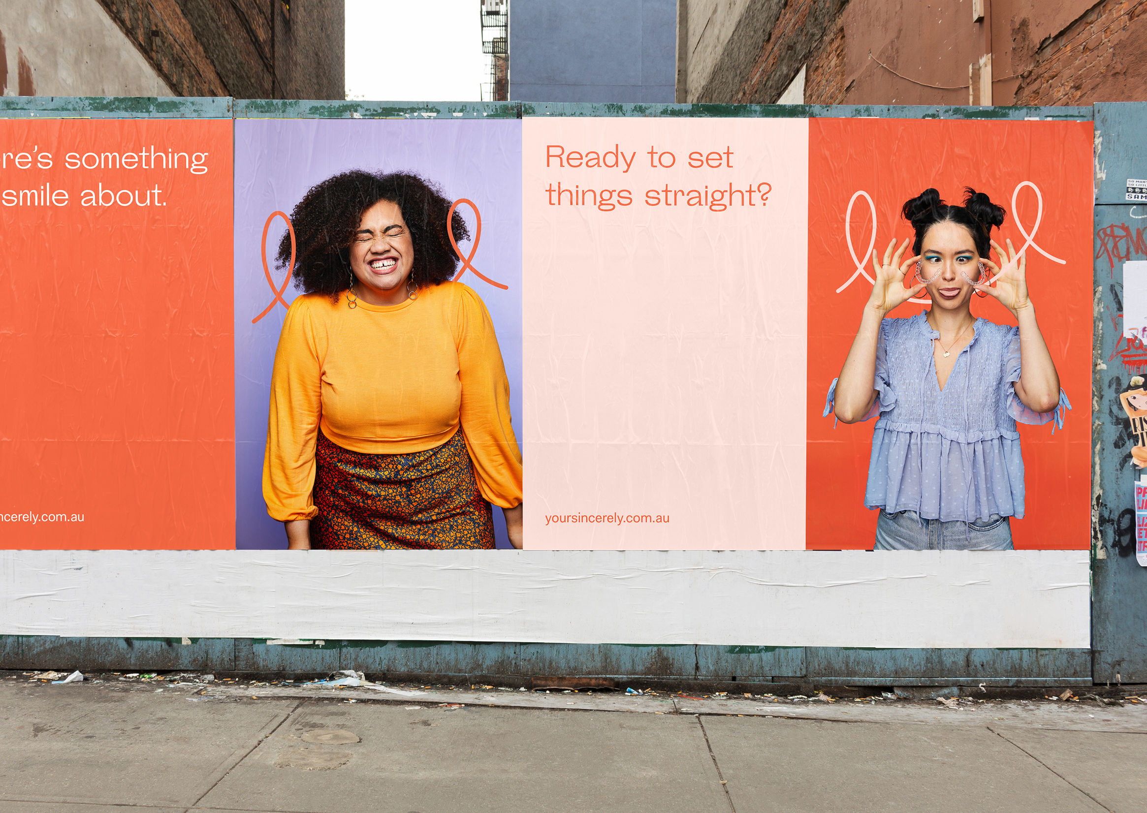
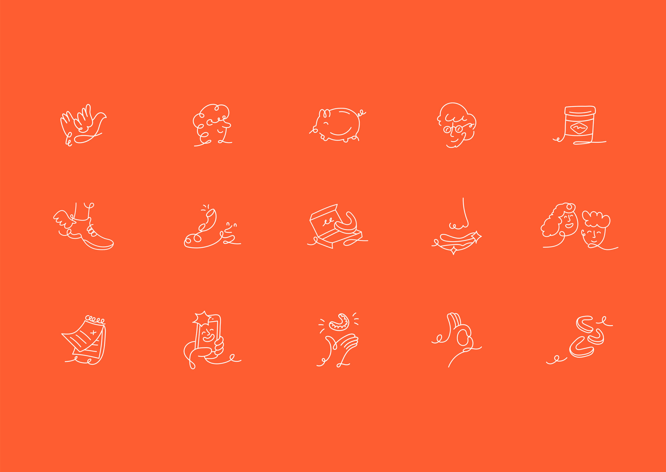
Logo Application
Let’s take a look at how this logo is applied.
The brand’s communicative tone is evident across all branding elements.
your project?
We assess your current situation and outline the next steps.
Contact nowWe will review your current digital situation. We will get in touch to understand your context and jointly assess which areas to analyze, after which we will prepare an audit including key findings and recommendations.