10 Graphic Design Projects Shaping the Visual Future of 2025–2026
Graphic design is undergoing a profound transformation. Artificial intelligence, environmental awareness, inclusivity, and typographic technology are not only changing the tools we use—they’re redefining the very purpose behind each project. In a world searching for balance between humanity and digital progress, the best work of recent years proves that creativity remains the driving force that gives innovation its meaning.
From cultural identities that blend tradition with modernity to social campaigns that challenge contemporary values, design asserts itself as both critical thinking and a catalyst for change. International awards—such as the A’ Design Awards, iF Design Awards, and Best Design Awards—recognize not just aesthetics, but the impact and coherence of a well-executed idea.
At Code Barcelona, we’ve curated ten outstanding projects awarded in 2025 and 2026—works that stand out for their conceptual clarity, flawless execution, and ability to connect with people. These are proof that contemporary design can be emotional, functional, and strategic all at once.
Here are the 10 most inspiring graphic design projects of the moment—a selection that reflects where global visual communication is headed, and why design remains essential to understanding the world ahead.
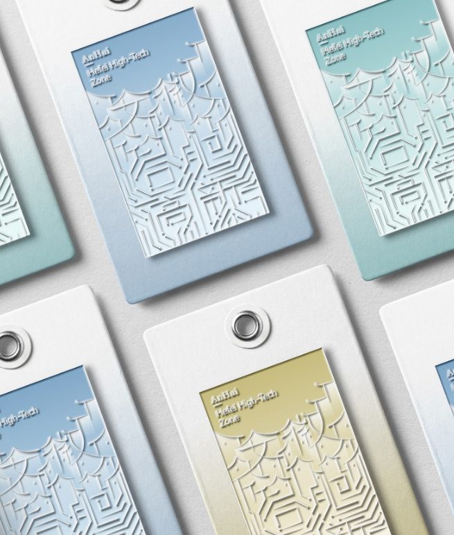
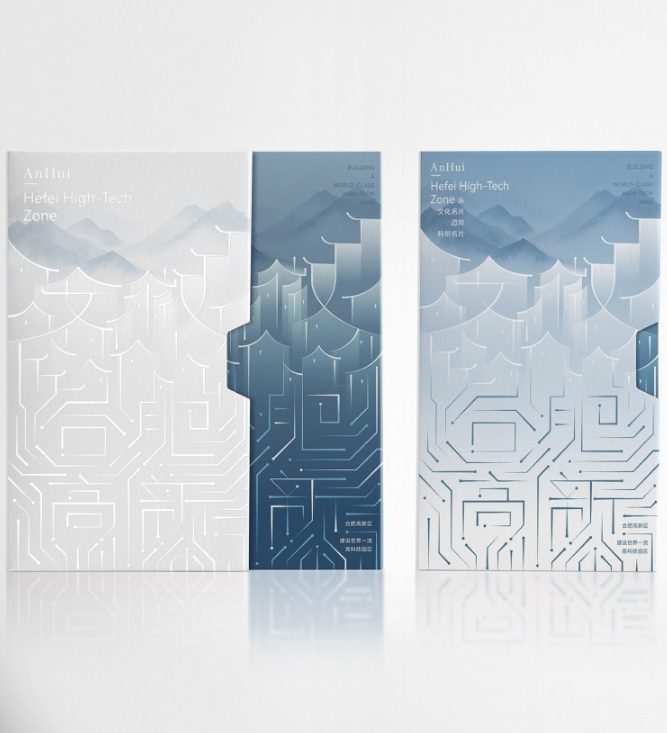
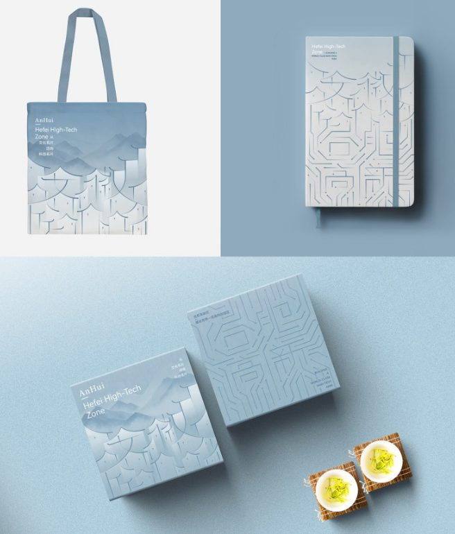
Culture to Technology Identity — Hefei High Tech Digital Technology Co., LTD.
https://competition.adesignaward.com/gooddesigner.php?profile=368190
In the heart of Anhui, a Chinese province with a cultural heritage as deep as its drive for innovation, one of 2025’s most significant graphic design projects emerges: “Culture to Technology Identity”. Conceived as a poster for Hefei’s high-tech zone, this piece distills a complex idea—the journey from an ancient culture to a scientific future—into a visual statement that is clear, symbolic, and elegant. It’s a perfect example of graphic design as a bridge between tradition and progress.
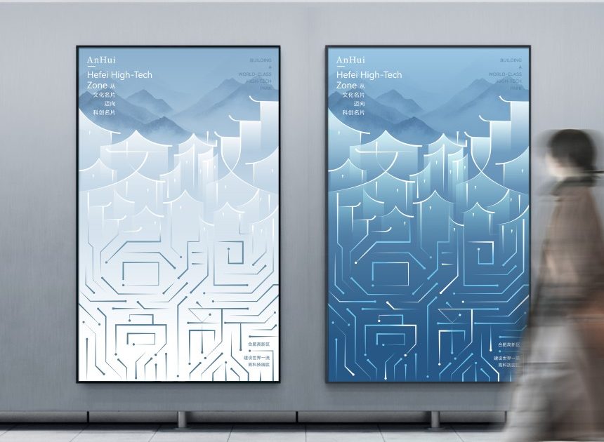
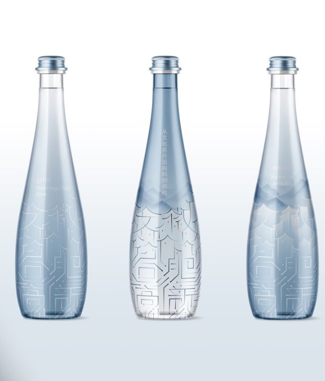
The poster begins with a simple gesture: the Chinese character for “Anhui,” framed by the classic outlines of Huizhou architecture. From there, the composition gradually transforms. Architectural lines dissolve into electronic circuit traces, and the cultural symbol becomes a technological metaphor. This transition, executed with near-artisanal precision, visually narrates the evolution of an entire region—from legacy to future, from heritage to innovation. It’s a design that is not just seen, but read as a story.
The art direction, led by Ji Chao and Xu Ning, reveals a deep understanding of the visual balance between the tangible and the conceptual. The use of gradient blues—a nod to Jiangnan, the historic region where Huizhou culture flourished—creates a serene, almost poetic atmosphere. In contrast, the circuit lines, highlighted with spot UV varnish, add shine and texture, evoking energy and technological precision. The interplay of these layers builds a visual identity where the ancestral and the digital don’t clash—they complement each other.
What makes this project truly remarkable is not just its technical mastery, but its conceptual synthesis. In just a few square centimeters, the poster encapsulates a cultural story, a political stance, and an economic aspiration. The design breathes modernity without abandoning its roots. In a country where rapid technological development threatens to dilute the symbolic, this work restores dignity and meaning to public visual identity.
The Hefei High Tech Digital Technology Co. team elegantly solves a complex challenge: fusing traditional architectural profiles with the digital geometry of circuits. Proportion, rhythm, and light are orchestrated with almost architectural discipline. Nothing is superfluous, nothing disrupts. The result is a design that feels inevitable—as if culture and technology were always destined to meet at this precise point.
“Culture to Technology Identity” stands out not only for its aesthetic quality, but for what it represents: a new kind of visual patriotism that celebrates modernization without forgetting history. It’s a reminder that graphic design can serve as a diplomatic language, communicating the essence of a place and its vision for the future. Between tradition and modernity, this project achieves something rare: balance, elegance, and purpose.
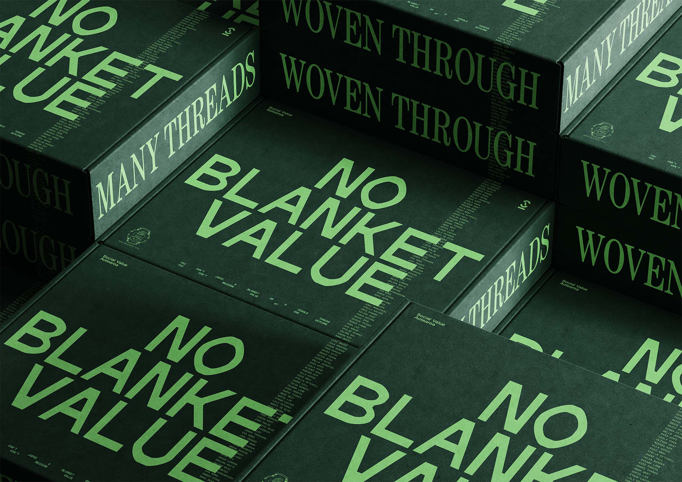
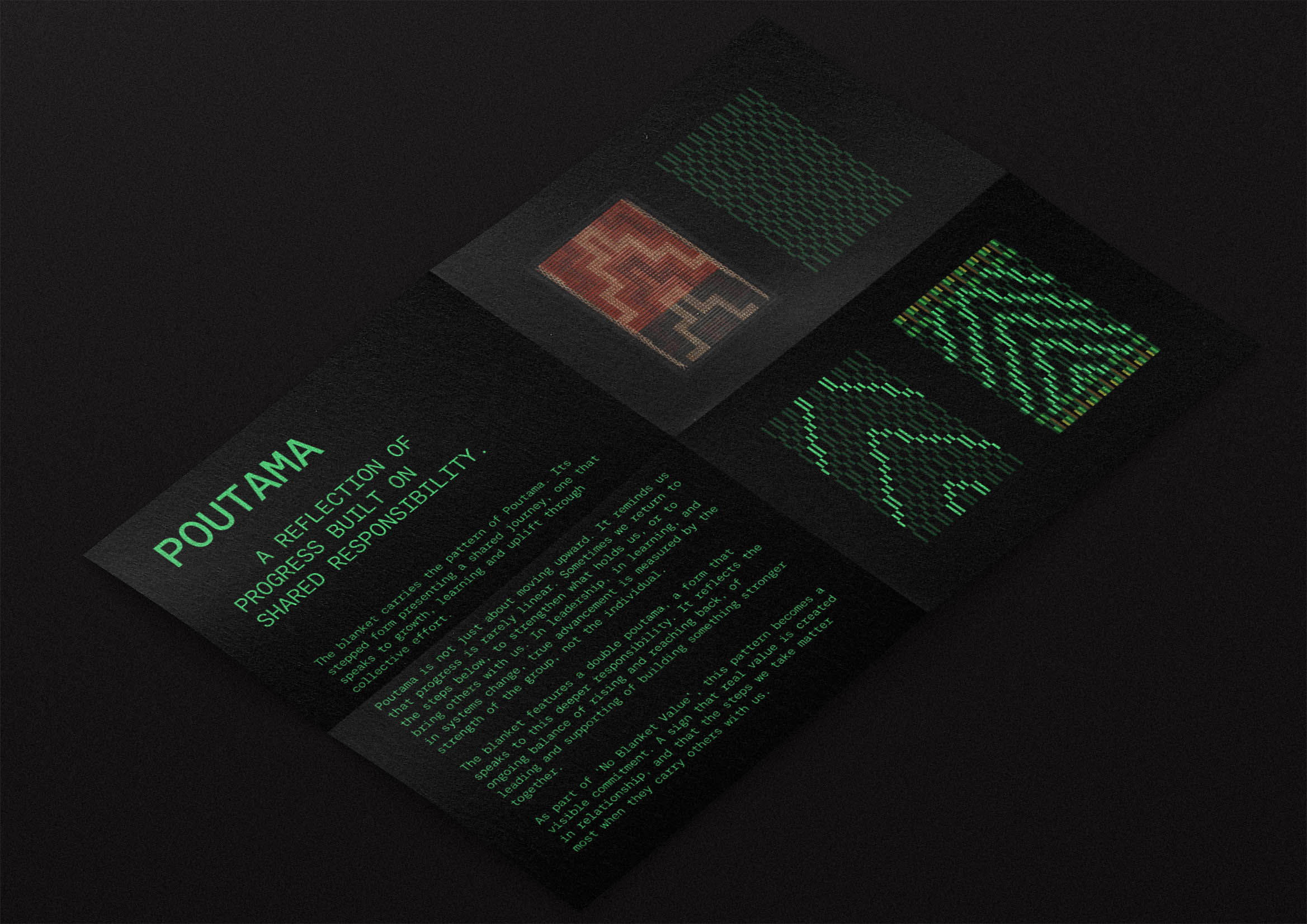
No Blanket Value — Social Value Aotearoa x Noa Blanket Co x Motion Sickness
Winner of the Gold Award in Business Communication at the Best Design Awards 2025, “No Blanket Value” redefines how design can embody a social message. Created by Motion Sickness Design Office in collaboration with Noa Blanket Co for Social Value Aotearoa, this campaign challenges how we understand and measure value in impact investment. It’s a powerful example of design as a tool for cultural repair and contemporary dialogue.
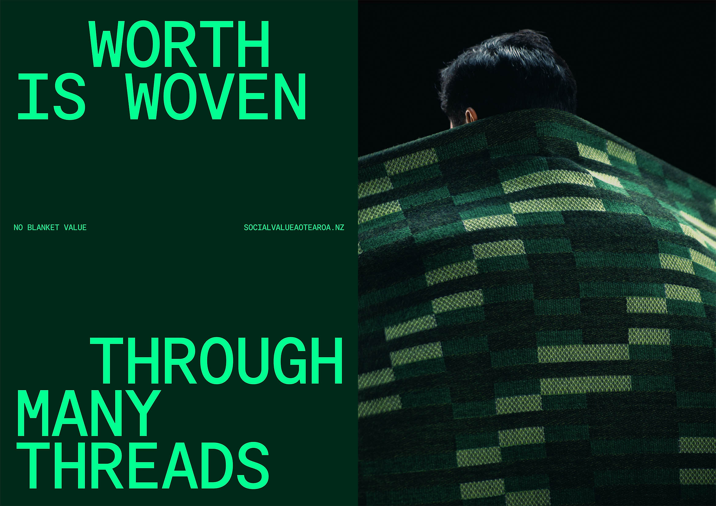
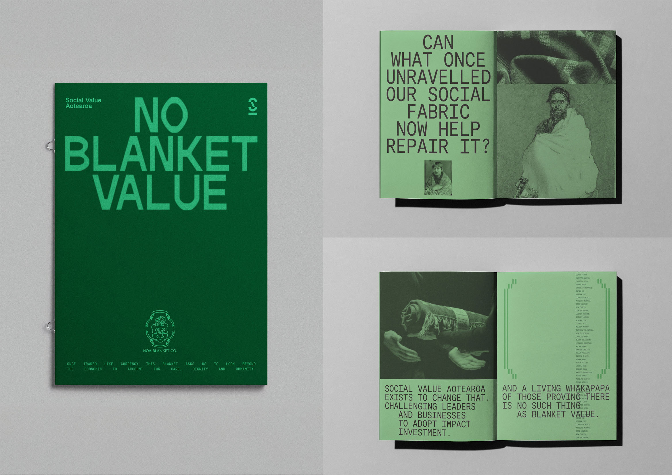
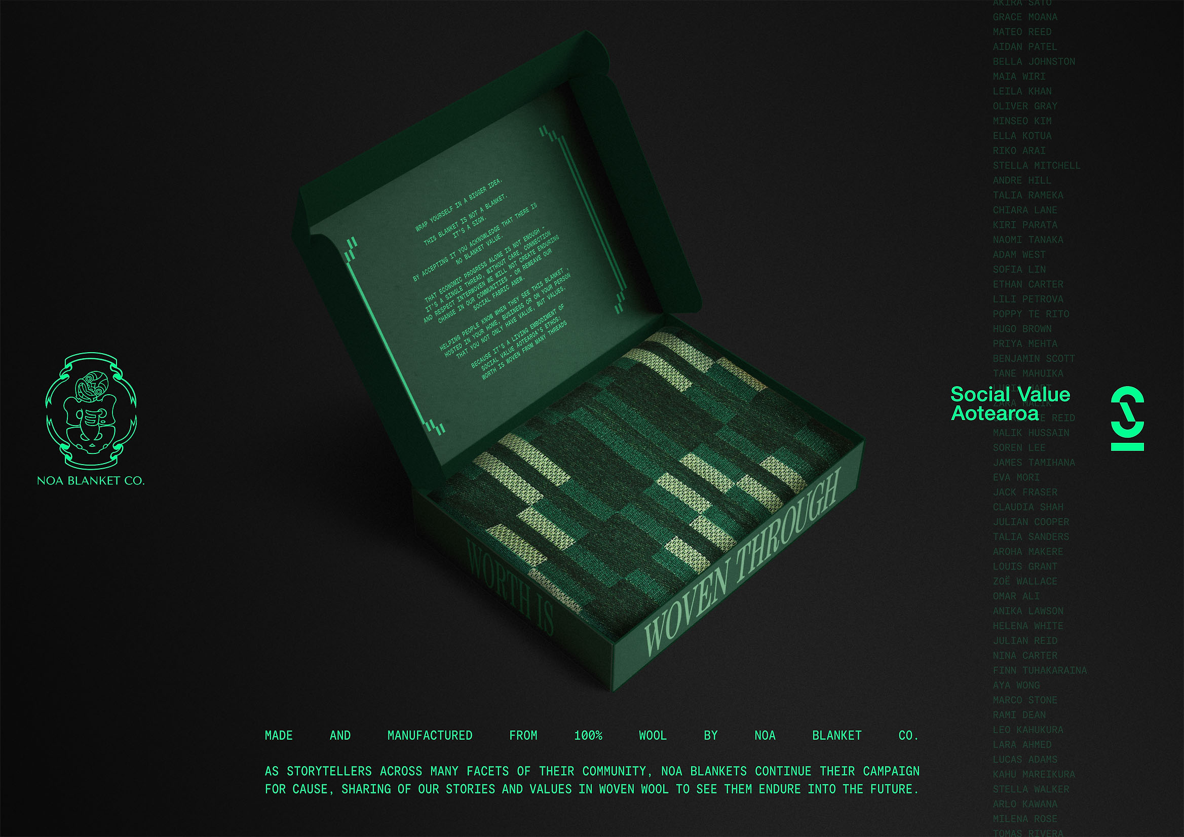
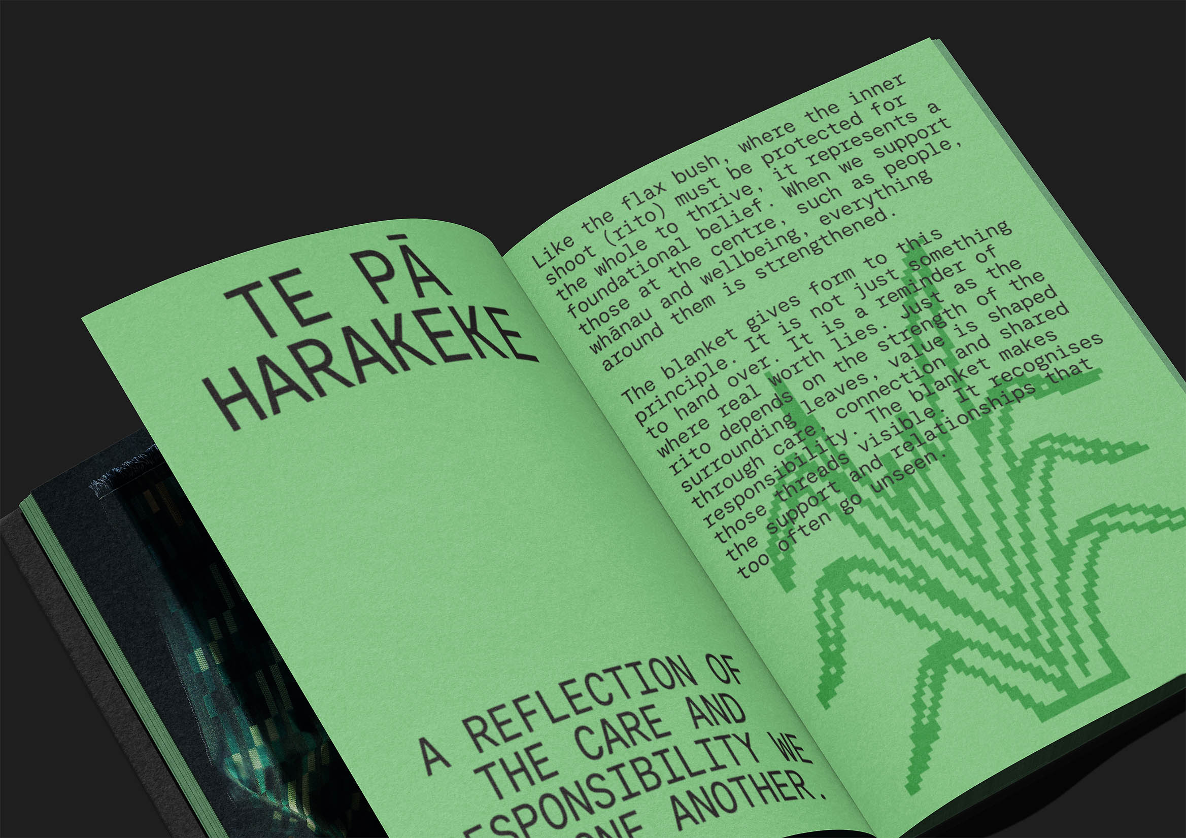
Instead of releasing a traditional report or media campaign, the team—led by creative directors Jordan Stent and Sam Stuchbury, with Katene Durie-Doherty as cultural lead (Pou Taketake) and Patrick Hickley as design director—turned a critique into a tangible object: a woven blanket. In Aotearoa’s (New Zealand’s) colonial history, blankets symbolized unequal exchange, used by colonizers to acquire land, resources, or taonga (cultural treasures). Here, the blanket is redefined: it’s no longer a bargaining chip, but a gesture of reciprocity. It isn’t given—it’s accepted. It doesn’t signify loss, but alliance.
The work of Noa Blanket Co, rooted in care, community, and cultural integrity, ensures the object is not just a visual metaphor but a living symbol. Every woven fiber embodies the idea that value is measured not by capital, but by commitment and relationship. The blanket itself is an ethical statement. It’s not a communication medium—it is the communication.
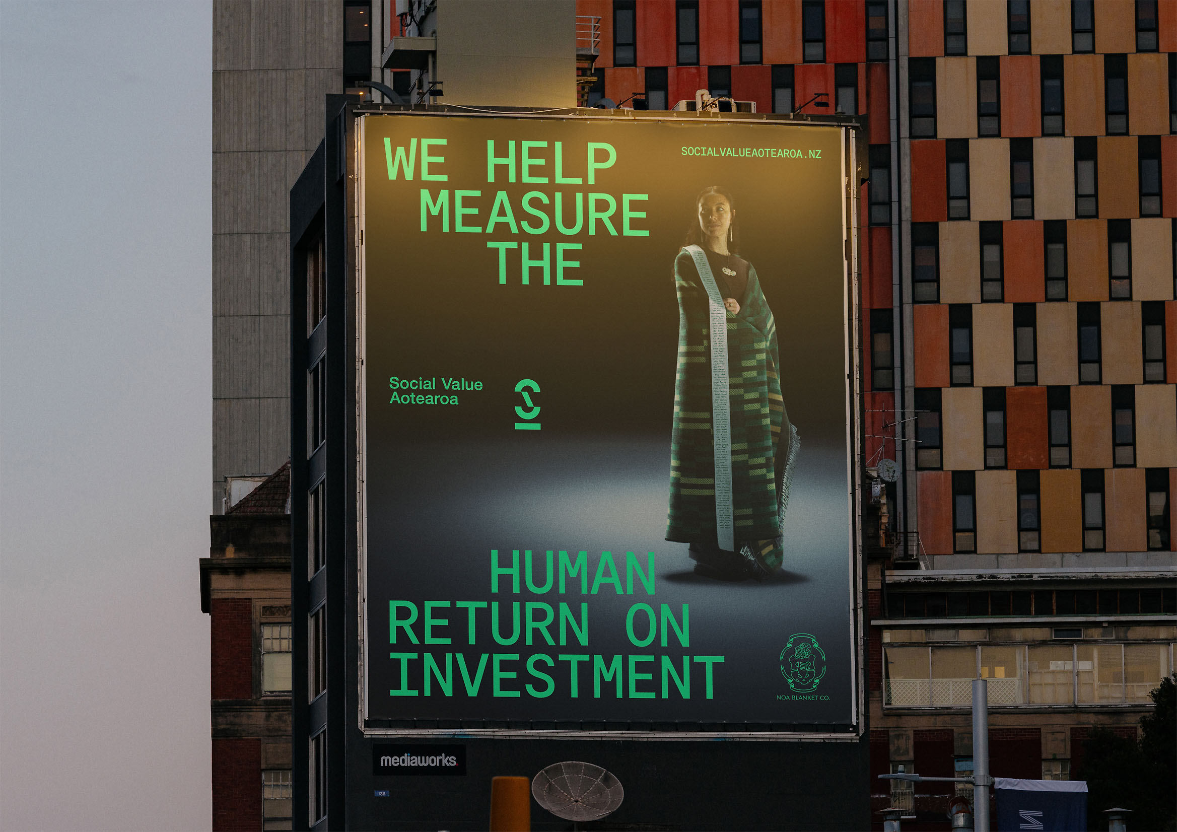
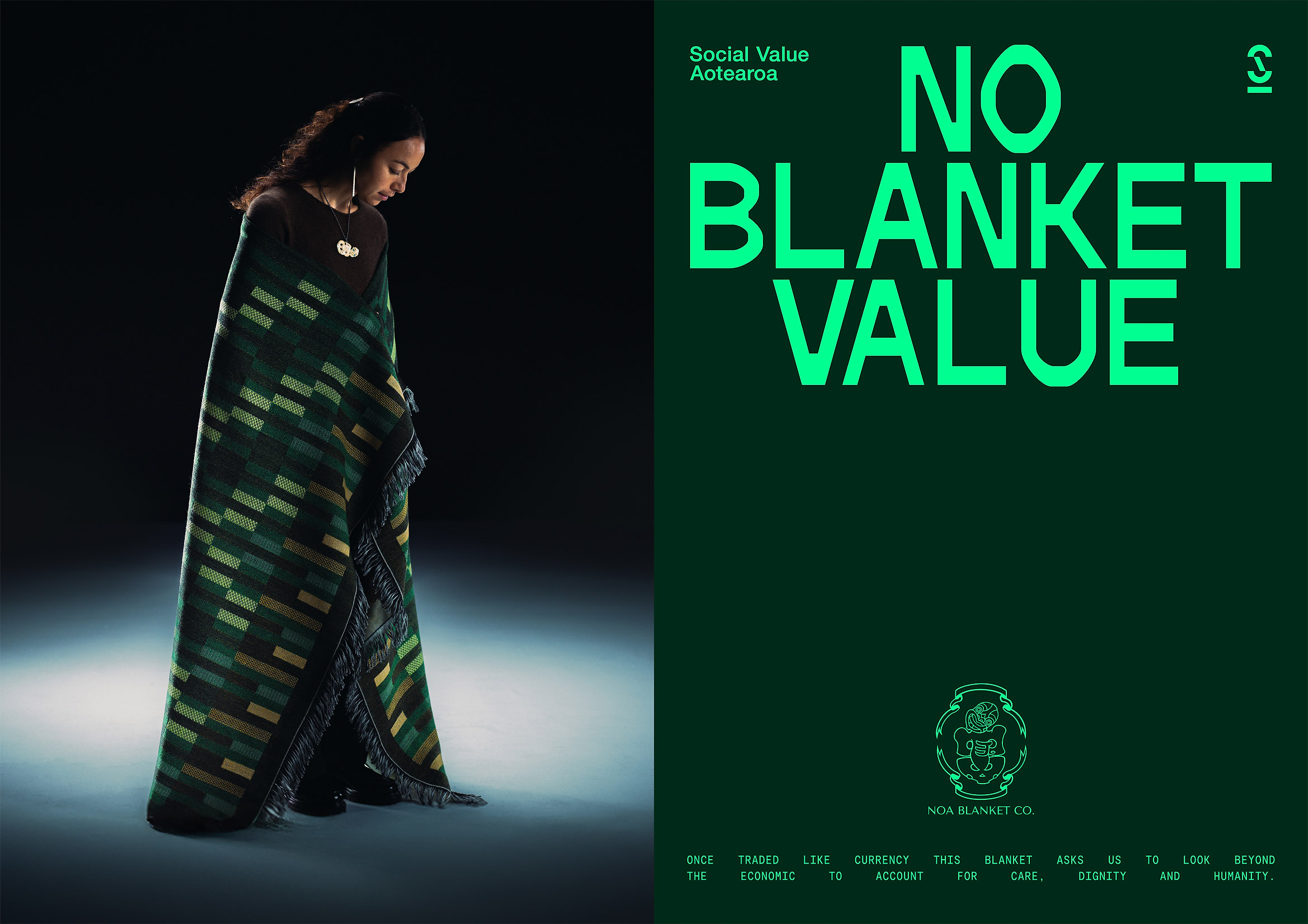
The campaign’s visual language is understated, intentional, and ceremonial. Warm-toned photography, natural light, visible textures. The composition avoids advertising rhetoric, letting the object’s presence speak for itself. This deliberate silence is powerful. In a world where corporate communication is measured in noise, “No Blanket Value” is measured in meaning. This project doesn’t try to persuade—it invites us to reflect on what we value, and how we express it.
The Best Design Awards 2025 jury called it “an incredibly smart way to unite people around a cause, deeply connected to a country’s history and the evolution of contemporary design language.” It’s no exaggeration. This work proves that design can bridge economy and ethics, history and future, symbol and action. It’s a lesson for everyone who believes design should not only communicate, but repair, connect, and transform.
“No Blanket Value” is part of a new generation of projects where corporate communication becomes more human. The team—including Sylvia Humphries (copywriting), Joshua and Whakaawa Te Kani, Joseph McAlpine, Matthew Campher, Scott Hardy, Oliver Johnston, and James Gibb—has achieved something greater than an award: they’ve shown that when design is woven with purpose, it can change how a society understands the word “value.”
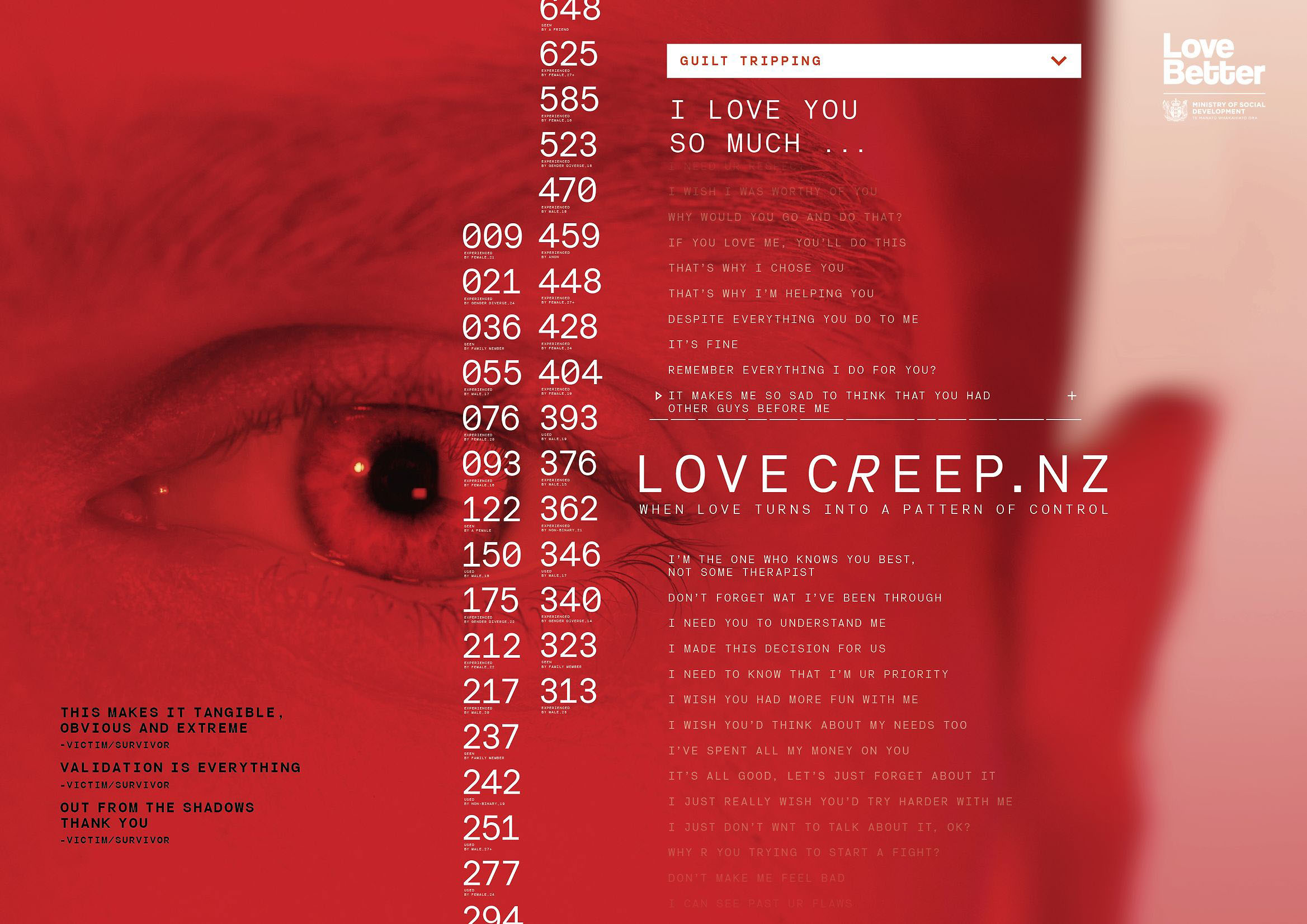
Love Creep — Clemenger BBDO x Assembly Ltd x Ministry of Social Development
https://bestawards.co.nz/graphic/colour-award-graphics/clemenger-bbdo-1/love-creep-5/
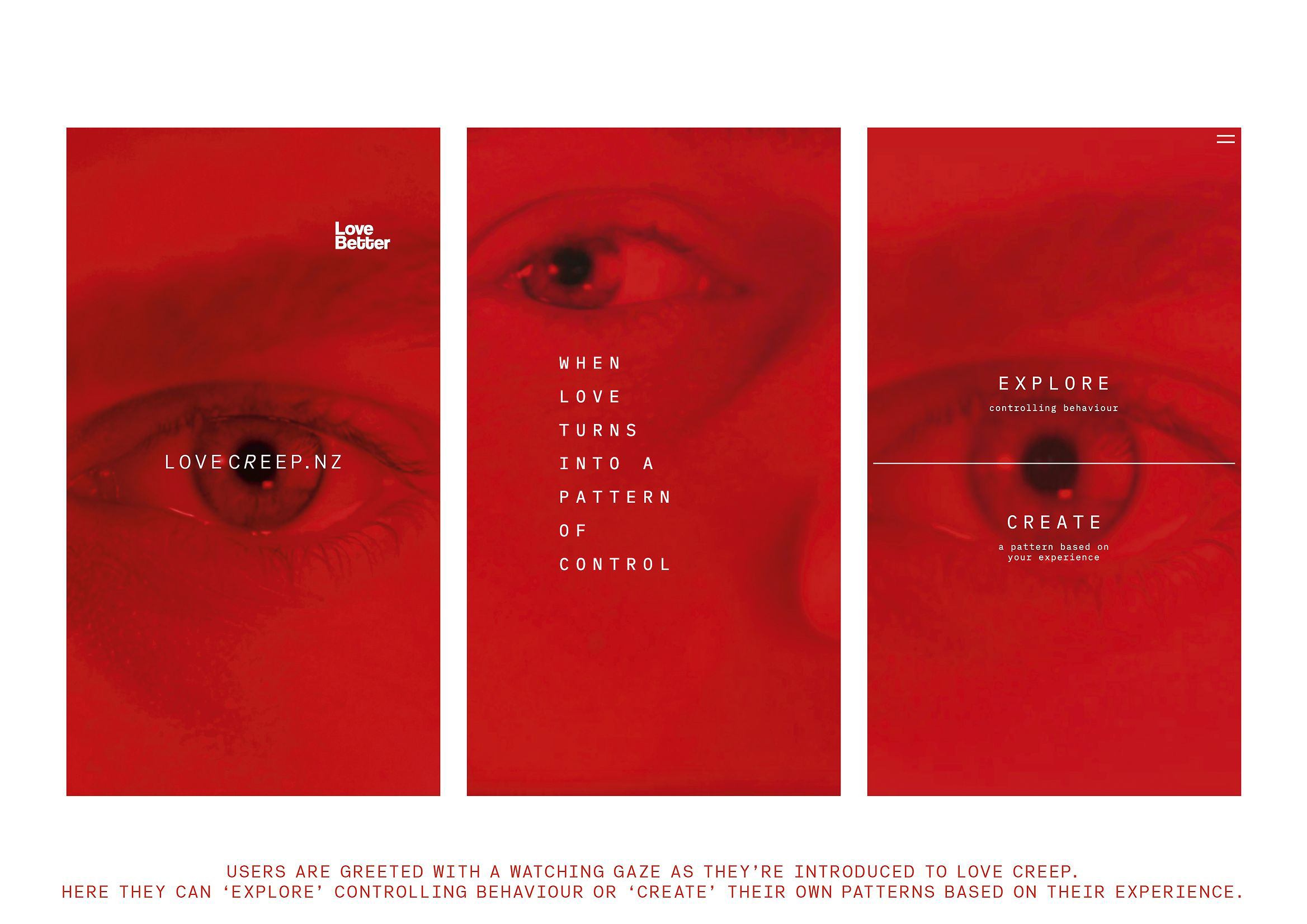
Winner of the Colour Award Graphics at the Best Design Awards 2025, “Love Creep” is one of the year’s most impactful and courageous campaigns. Created by Clemenger BBDO and Assembly Ltd for New Zealand’s Ministry of Social Development, the project is part of the Love Better program—a national initiative aimed at helping young people recognize the signs of coercive control in relationships. Its goal is as clear as it is urgent: to transform the visual language of love, making it more conscious, honest, and safe.
The cultural context is alarming: New Zealand has the highest rate of domestic violence in the developed world; one in three women experiences abuse at some point in her life. In this context, “Love Creep” doesn’t just communicate—it educates. It invites young people to ask a crucial question: where does love end and control begin?
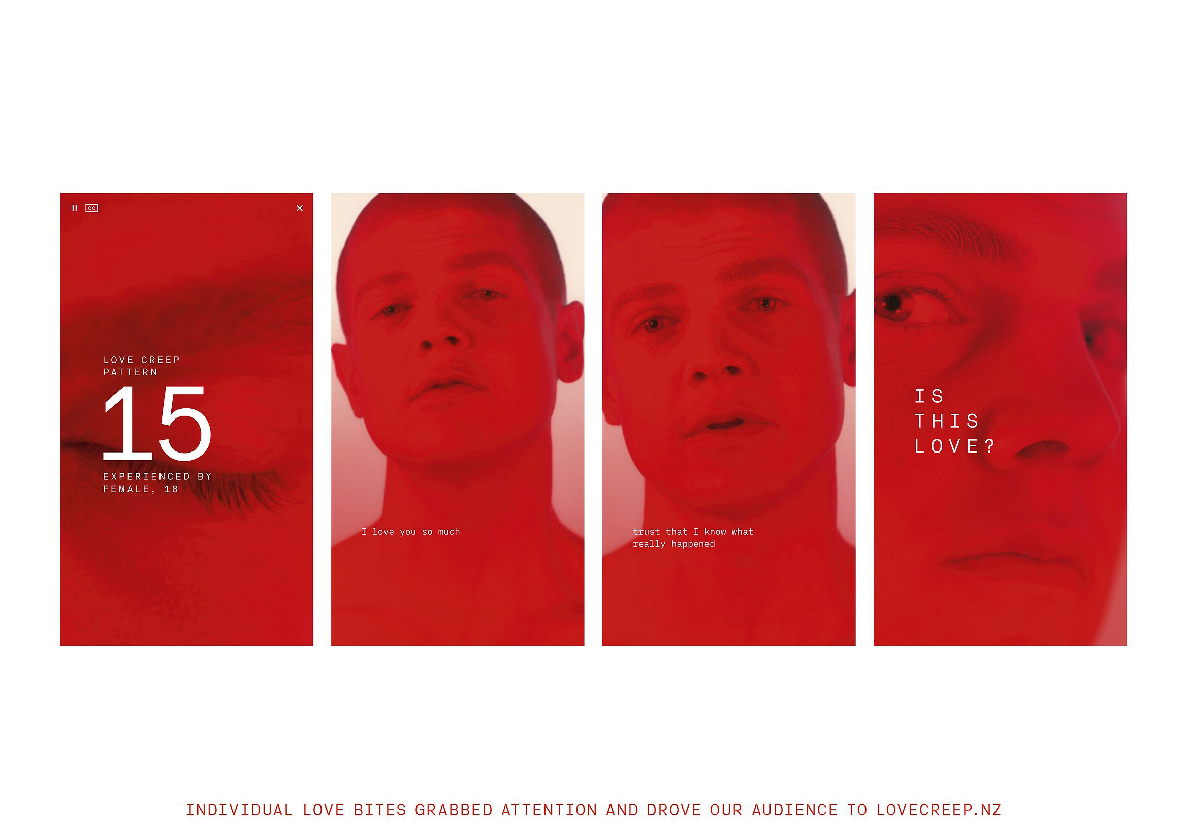
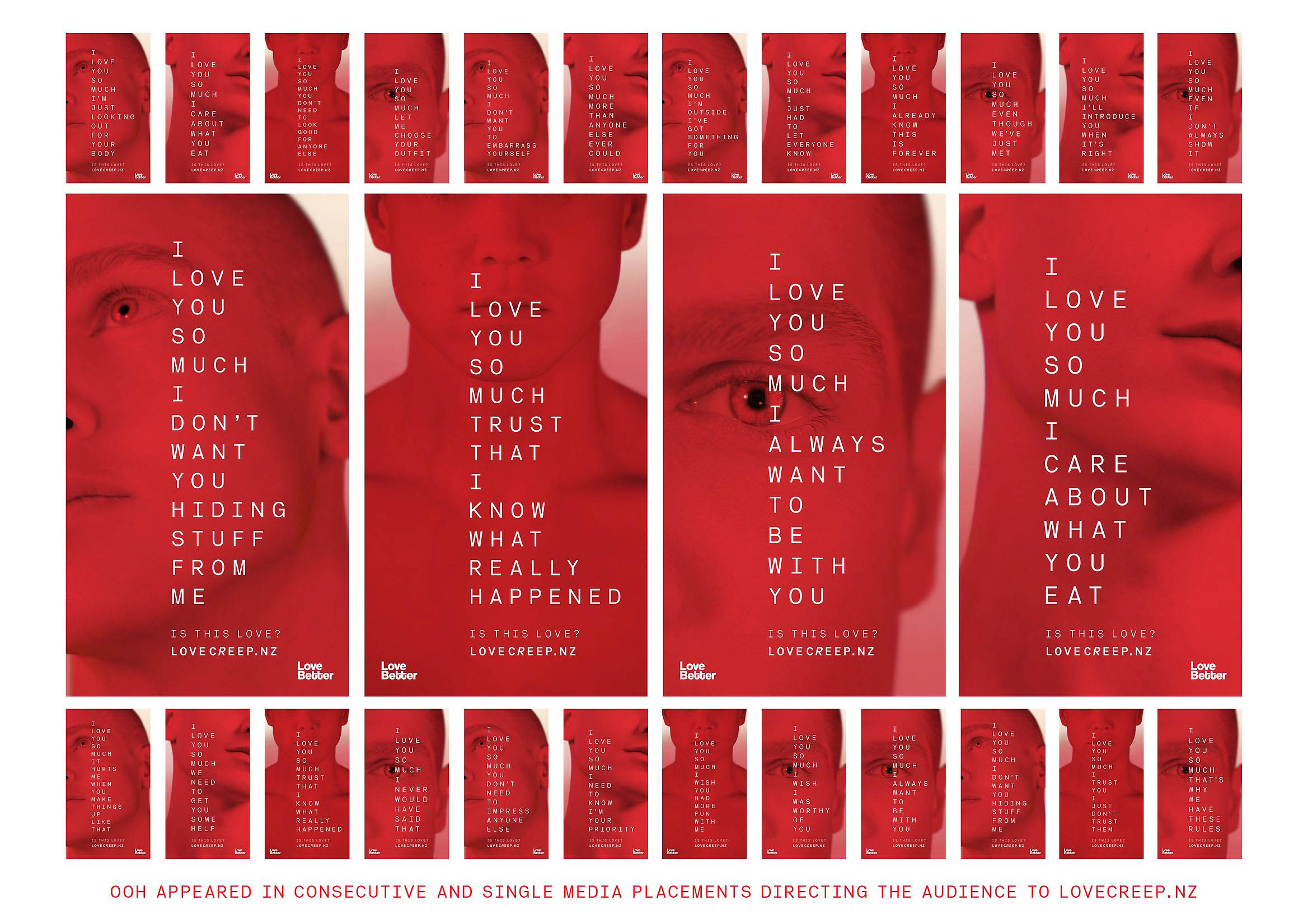
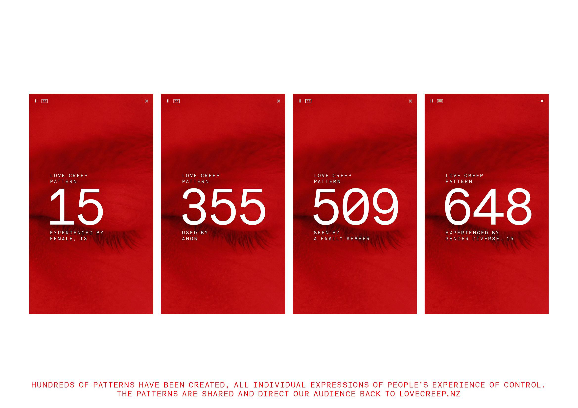
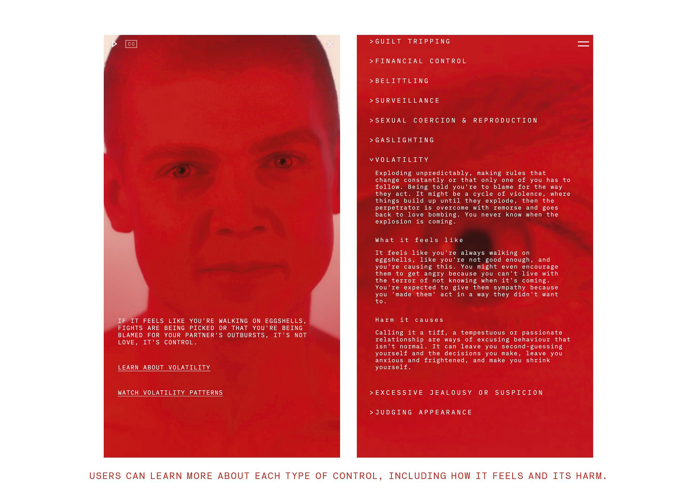
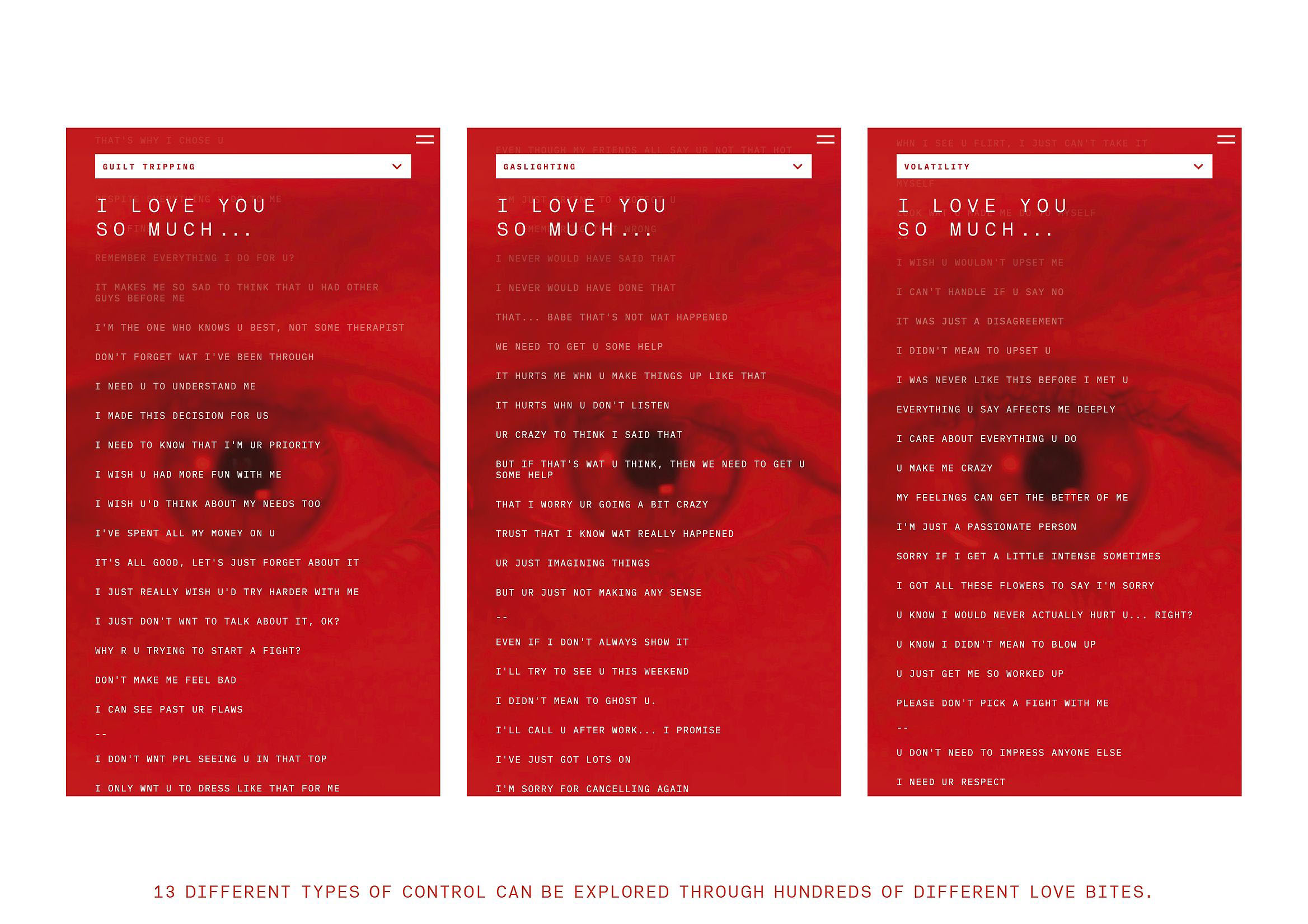
The creative team—led by Brigid Alkema, Alex Metson, Julia Ferrier, and Emily Beautrais as creative directors (Pou Auaha), with Jake Firman as strategy director (Pou Rautaki)—developed a radically immersive visual narrative. The LoveCreep.nz digital experience uses a deliberately claustrophobic mobile environment, dominated by a single color: red. No gradients, no visual respite. Everything vibrates with the tension between desire and danger. Love and warning share the same color.
Red, omnipresent in every asset—website, short films, social media, outdoor posters—serves as both metaphor and trigger. It’s the thread that connects emotion and alarm. Inspired by brutalist architecture, the art direction strips away ornamentation to expose the rawness of the subject. The rough aesthetic, bold color blocks, and direct typography create a deliberate discomfort: the design doesn’t seduce, it unsettles to awaken. Here, love isn’t soft or idealized; it’s a space where violence can emerge if not recognized in time.
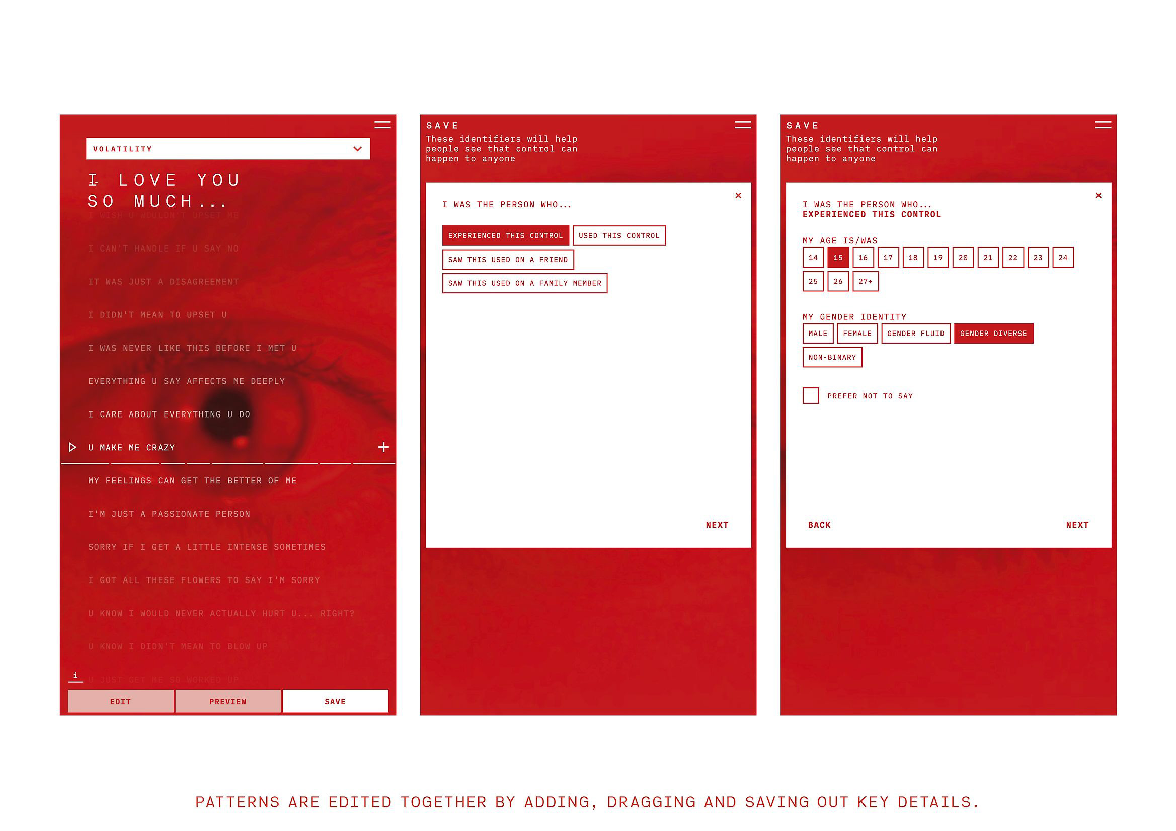
The digital strategy turns emotional education into an interactive experience. Through “Love Bites”—quotes and fragments collected from interviews with hundreds of survivors—users can identify patterns of control and reflect on their own behavior. They aren’t told what’s right or wrong; they’re invited to discover it for themselves. This empathetic approach turns the campaign into an exercise in collective self-awareness. Design stops instructing and starts accompanying.
The results speak for themselves. In the months following launch, the number of young people able to recognize controlling behaviors in relationships rose by 5%, while those normalizing such behaviors dropped by another 5%. Calls to Youthline—a youth support helpline—increased, with a new common question: “Am I being controlling without realizing it?” Since then, LoveCreep.nz has been adopted as an educational tool in schools nationwide. The impact of design moved beyond the screen to spark a national conversation.
The Best Design Awards jury praised the project for its “masterful use of color as a narrative and emotional language” and its ability to “translate a complex social issue into a visceral visual experience.” In a landscape where many social campaigns soften their messages, “Love Creep” chooses intensity, risk, and discomfort as vehicles for