Month after month, we get to work to bring you our shortlist for the best web design of July.
We’ll be jumping from one site to another, reviewing each contender to determine which one truly deserves the title of Best Web Design of July.
Without further ado, let’s meet the candidates.
Inspiration: Best Web Design of July
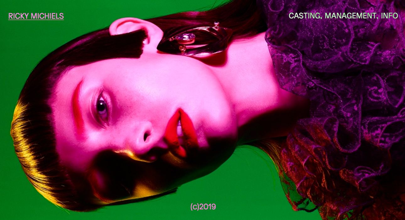
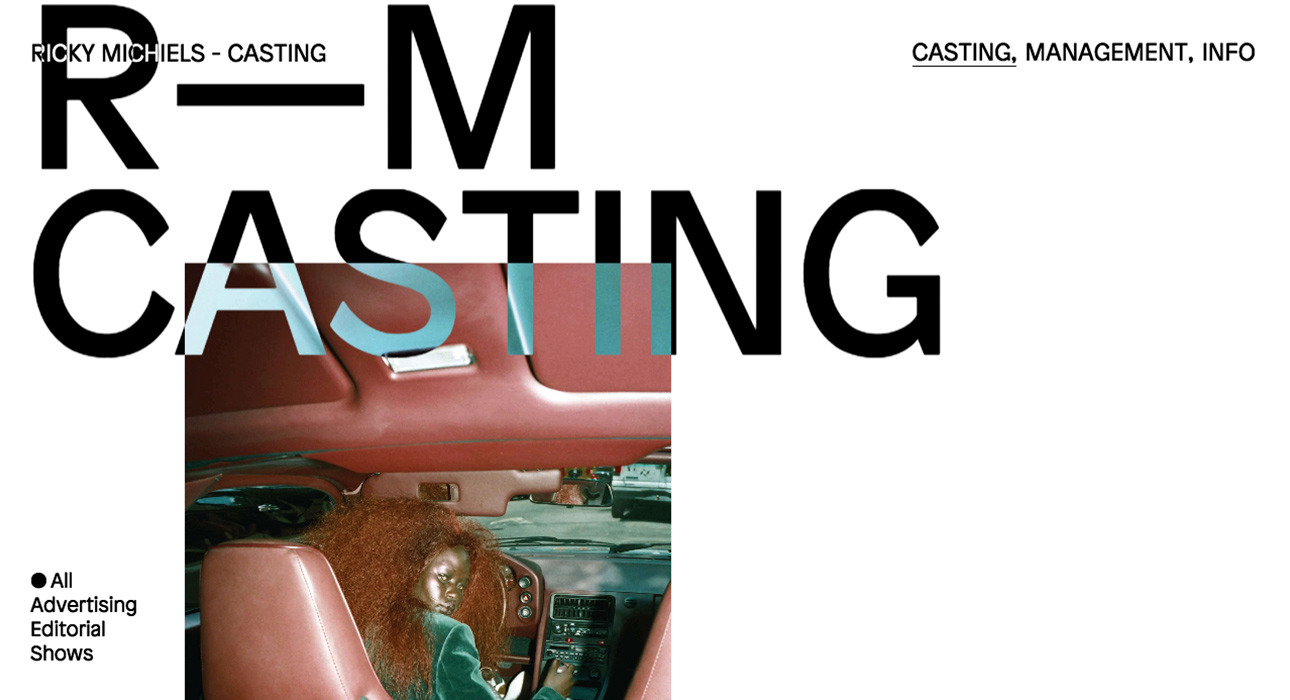
Ricky Michiels by Jason Bradley
Our first contender for Best Web Design of July is the website of Ricky Michiels, a site showcasing his work as a New York-based casting director.
The goal of this website is to present Ricky Michiels’ casting director portfolio to potential clients.
The web design is fresh and dynamic, with a cutting-edge, advertising-inspired look—exactly what you’d expect for this line of work.
Large, sans-serif typefaces dominate the design—bold, oversized, and clean—making the content both eye-catching and easy to read.
With its headline-style layout, you never feel overwhelmed by text. And since this is a casting agency, it makes perfect sense to let big, expressive visuals do the talking.
The first thing that grabs your attention is a fast-paced, asynchronous intro sequence—images flash by in a visually stunning display. This is not a site for tired eyes.
Visit the website at:
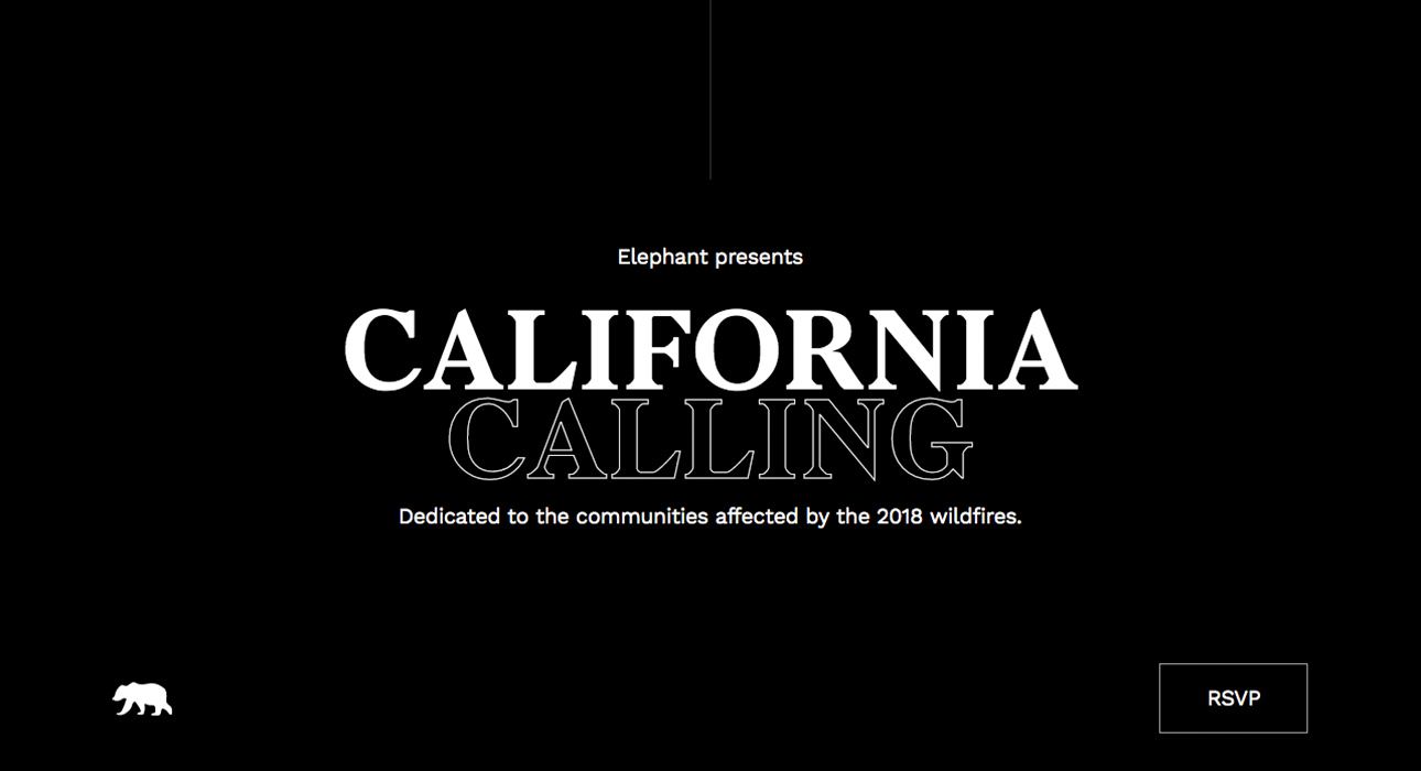
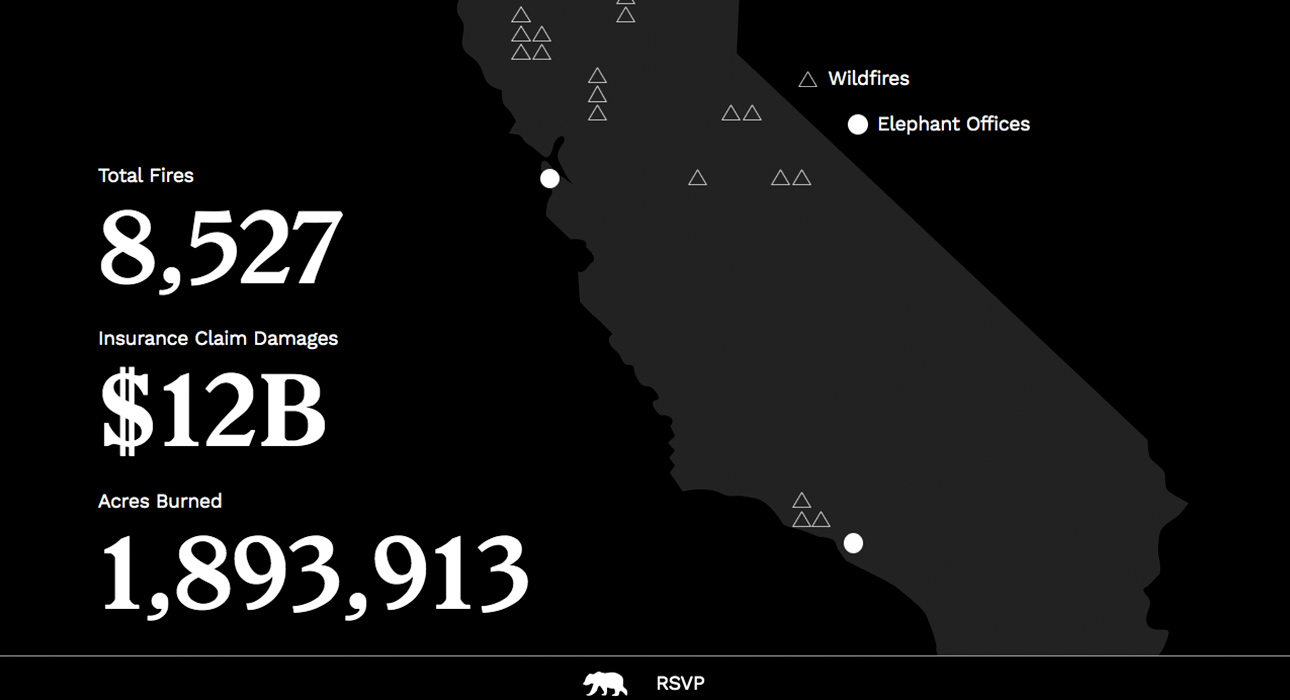
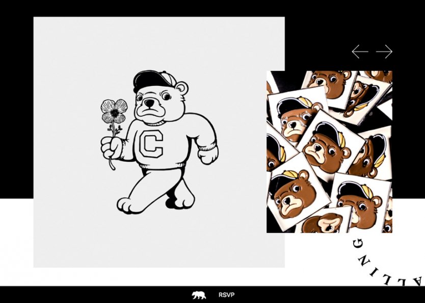
California Calling by Elephant
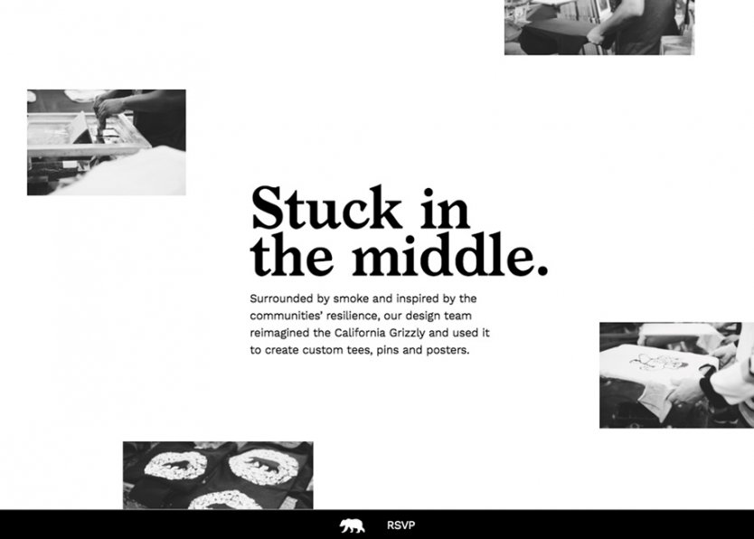
Next up is California Calling, an initiative by the City of San Francisco during San Francisco Design Week, aimed at raising funds for victims of the 2018 California wildfires.
This Best Web Design of July nominee is all about typography and navigation style. At first glance, a web design with almost no images might seem outmatched in a list like this—but that’s a mistake.
Creating a website worthy of this competition without relying on the usual visual assets is a real challenge, and when it works, it deserves recognition.
Navigation is one-page, with vertical scrolling. As you move through the site, information is delivered in concise, well-structured text.
The entire website uses a black-and-white palette—simple, effective, and perfectly symbolic of ash: black and white.
Visit the website at:
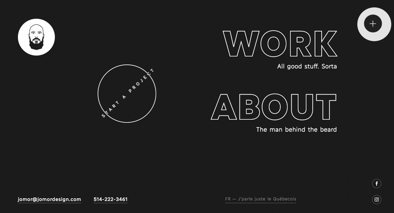
Jomor design
Now for the pros: Jomor Design studio presents their brand new website, which—naturally—serves as a showcase for their creative expertise. It would be a shame if they weren’t in the running for Best Web Design.
Once again, we see a web design that leans heavily on bold, oversized typography and headline treatments—long live the 2019 web design trends we predicted in our crystal ball.
The hamburger menu leads to a streamlined set of inner pages—just “work” and “about”—and honestly, what more do you need?
On top of that, the site’s design strips away unnecessary elements and color saturation for a minimalist look.
The design practically says: “Pay attention to what I’m telling you, and see how well I do it. Trust me—I’ve got the solution.”
Navigation is vertical scroll, with unnecessary clicks eliminated, resulting in a site that’s clean and user-friendly.
Visit the website at:
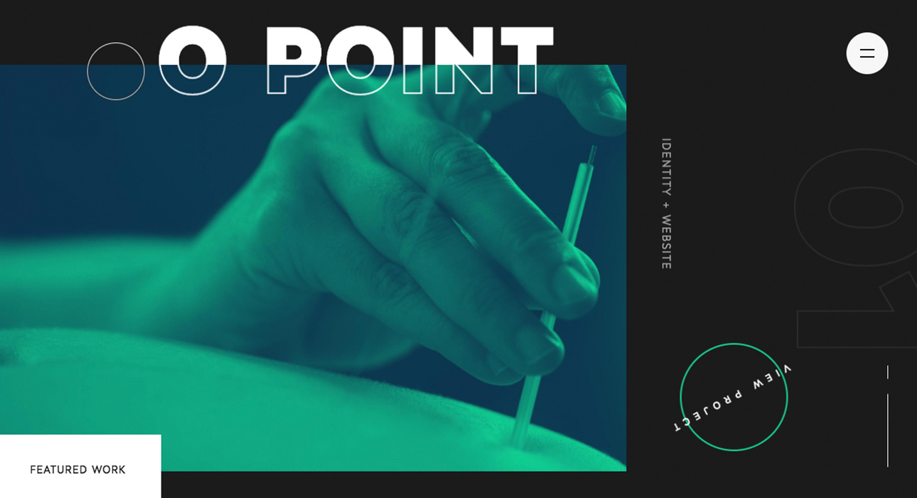
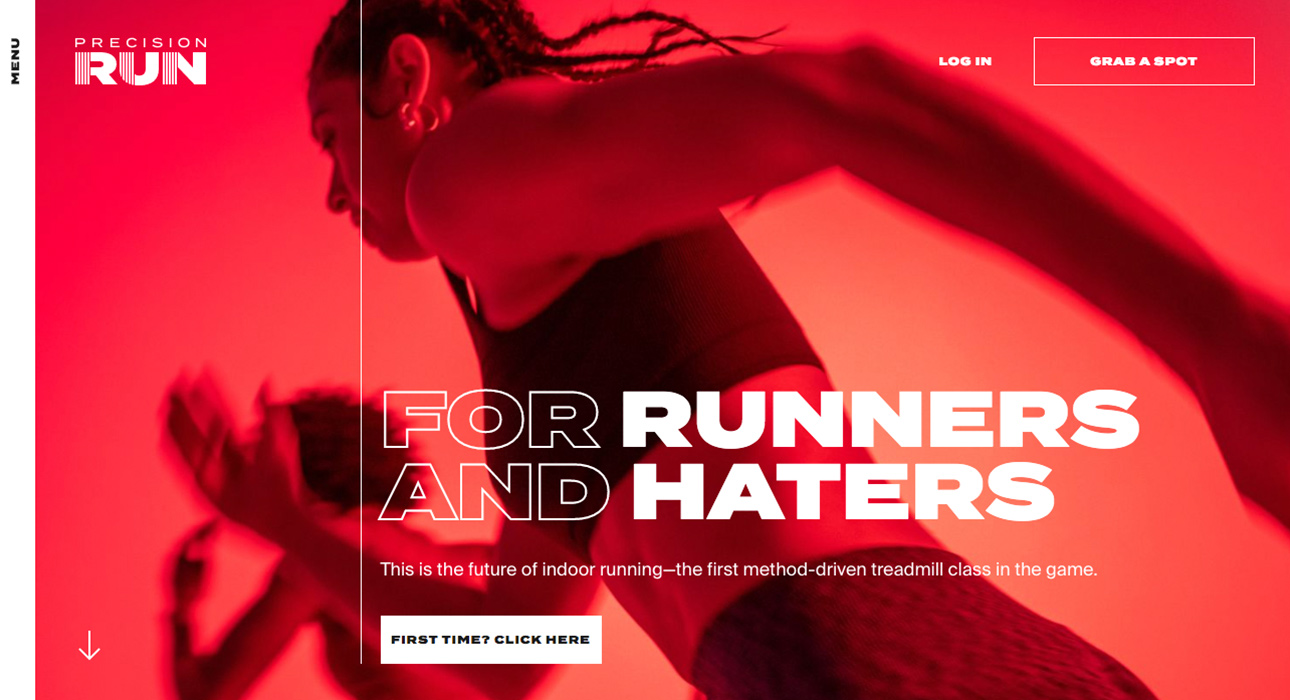
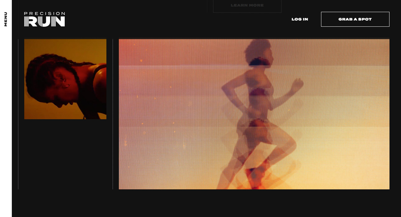
Precision Run by Area 17
Fourth on our list is the website designed by web design studio Area 17 for Precision Run.
Precision Run aims to redefine indoor running and change your perception of treadmill workouts.
The web design is energetic, bold, and full of movement. Striking visuals, vibrant colors, and oversized typography leave no doubt—typography is king this year. The messaging is so clear, you almost don’t need to read to understand what’s being communicated; the design speaks for itself.
You’ll want to reach out, book a session, and start running—mission accomplished. Precision Run is a worthy contender for Best Web Design of July.
Visit the website at:
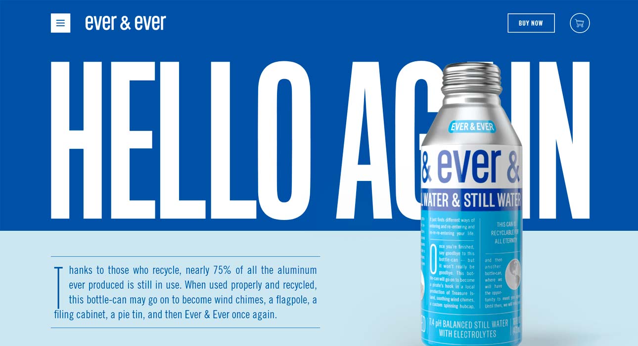
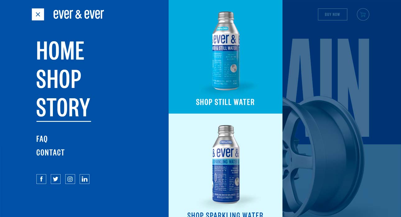
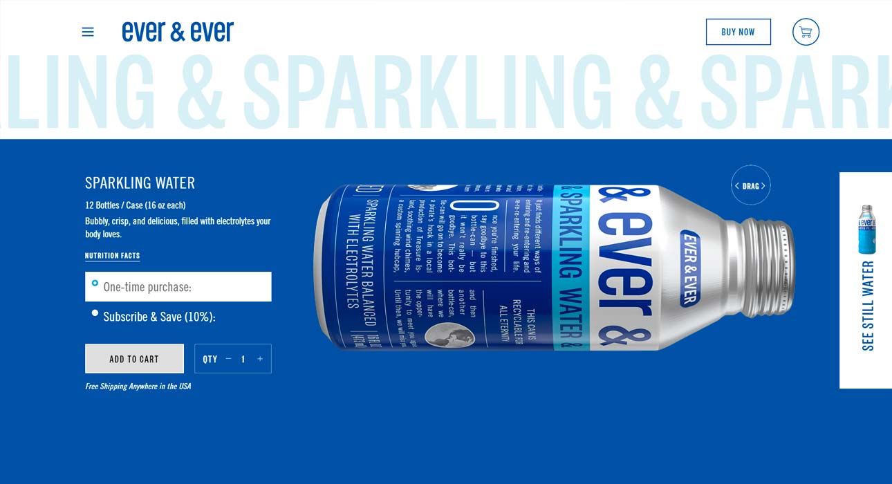
Ever & Ever by Interesting Development
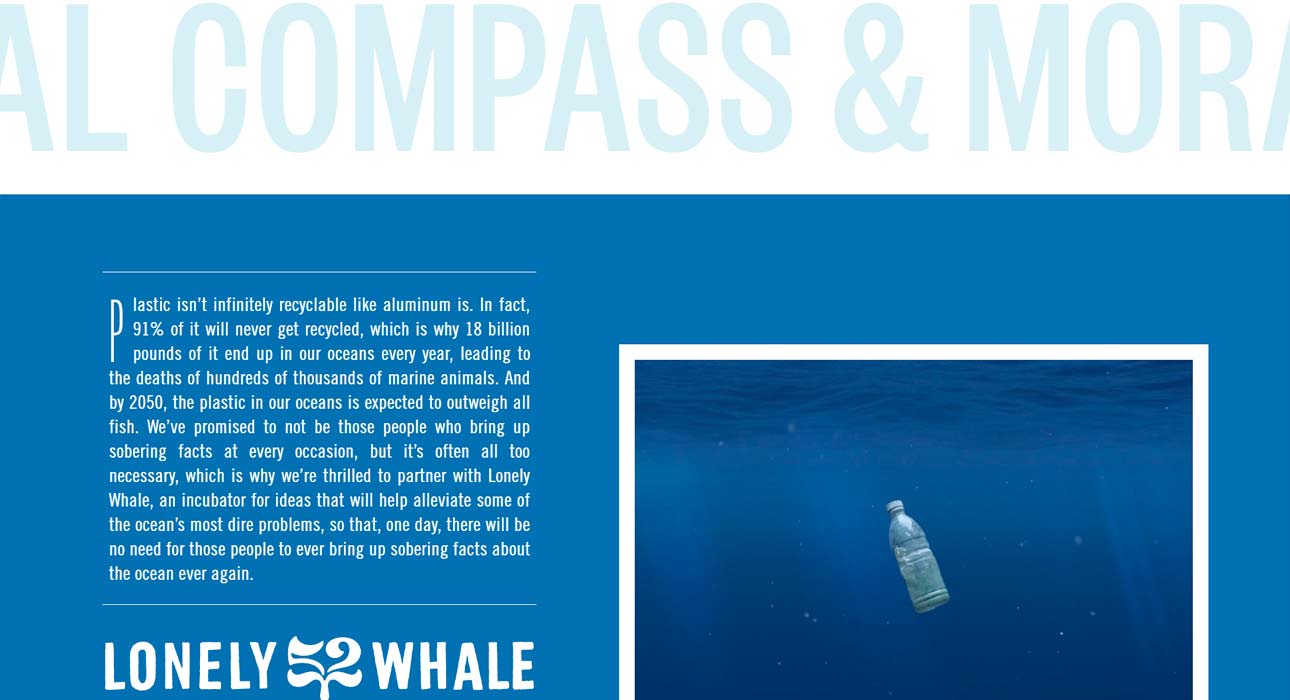
Our final entry this month is the project by Interesting Development for Ever & Ever—a website promoting a more sustainable, endlessly reusable alternative to plastic that’s fully recyclable and leaves zero waste.
With a web design that’s as simple as its navigation, you can explore this website in just a few seconds—and that’s a good thing. That’s all the time you need to get a clear idea of what’s on offer and decide if it’s right for you.
This is a web design aimed squarely at digital natives—people who don’t want to waste time on anything that isn’t about them. It’s also perfect for impulse purchases, capturing attention in those crucial first seconds before doubts or second thoughts creep in.
Visit the website at:
Results
Now that we’ve reviewed all the contenders for Best Web Design of July, it’s time to pick our winner.
Let’s get down to the verdict.
There are five nominees for Best Web Design of July, but personally—and with all due respect to the others—our pick is Precision Run by Area 17.
It’s the project that best embodies the web design trends of 2019.
With its use of graphic elements like typography, images, video, transitions, and navigation, Precision Run is our clear winner for Best Web Design of July. What about you—which is your favorite?
If you enjoyed this, check out the ⚡⚡ June nominees for Best Web Design. ⚡⚡