In recent years, olive oil has rightfully earned its place as an essential ingredient in fine cuisine. That’s why we’ve curated a selection of today’s best olive oil label designs.
In this article, we’ll explore some of the most outstanding examples, highlighting the key features of olive oil label design that can serve as inspiration for your next artisan olive oil project.
The Best in Olive Oil Label Design
Metáfora Olive Oil
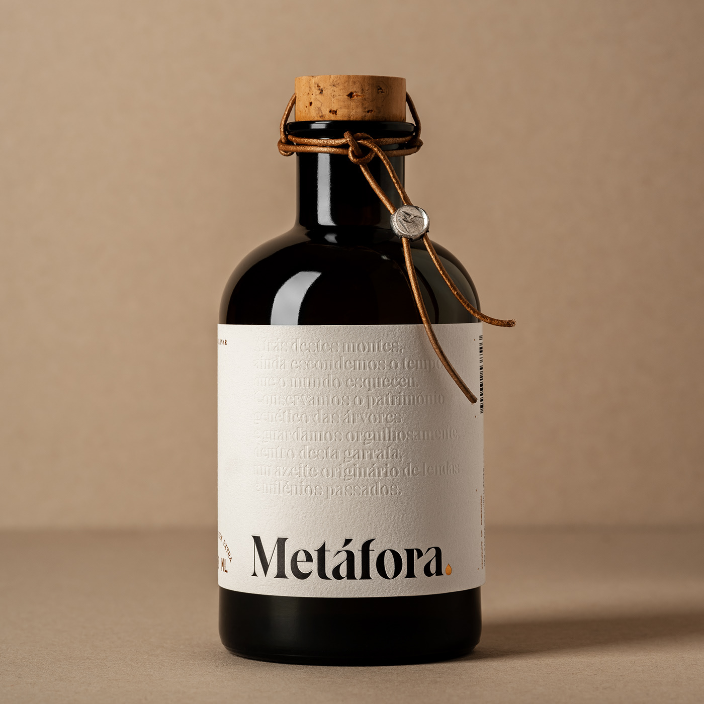
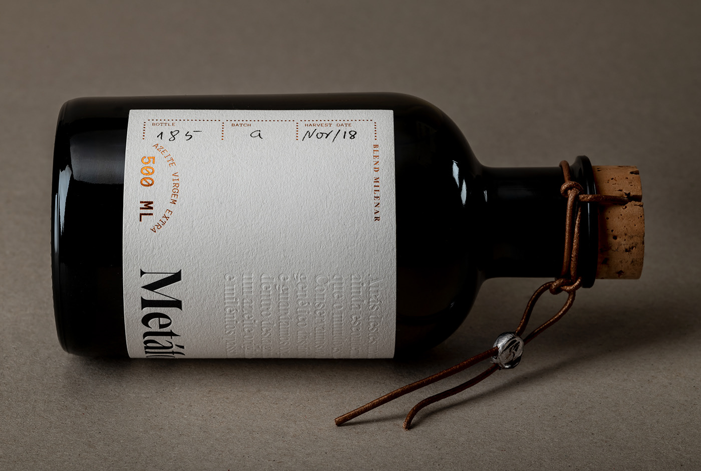
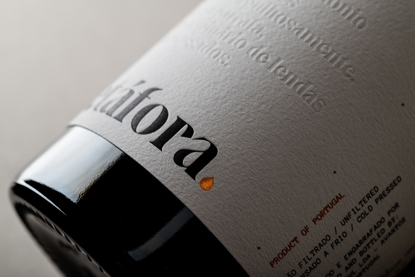
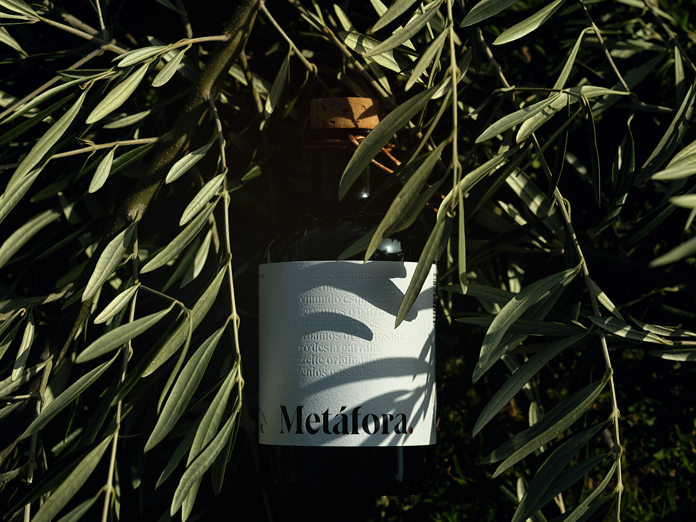
Design by This is Pacifica.
Our first olive oil label design comes from the creative team at This is Pacifica, who crafted this identity for the Metáfora olive oil brand.
The label design stands out for its strong personality and distinctly artisan look, echoing the handcrafted nature of the oil itself. The charismatic, screen-printed typography evokes handwritten script, emphasizing the product’s artisanal roots.
The text is embossed and features words related to the product, referencing the brand’s manual oil-pressing process.
To complete the look, the olive oil label is applied to a unique bottle with a cap and closure that further highlight the craftsmanship behind the product.
The result is a personalized, artisanal packaging that adds value to both the product and the olive oil brand.
To view the full project, click here.
Haza del Fresno
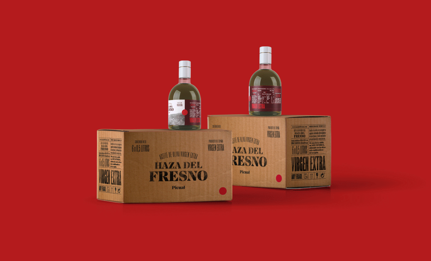
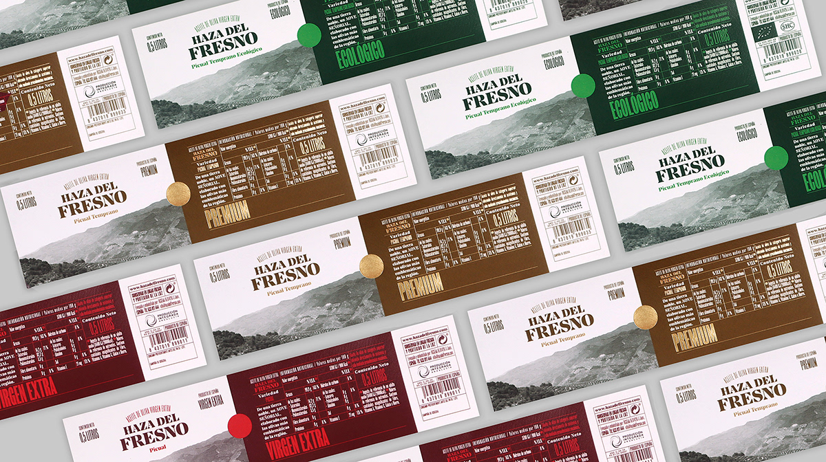
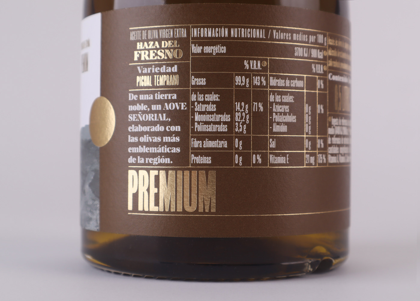
Design by estudiopg – Branding & Packaging.
Another standout design on our list of the best olive oil label designs is the work by Estudiopg – Branding & Packaging for the Haza del Fresno olive oil brand.
What makes this design unique is how the label presents nutritional information. With a clear focus on health-conscious consumers, the label combines a striking front image with detailed data on the back.
The color palette is perfectly matched to the oil inside, featuring brown, white, and gold lettering.
These colors, along with the bottle and cap, create a distinctive and appealing result that sets it apart from traditional olive oil packaging.
To view the full project, click here.
Elisso – Olive Oil
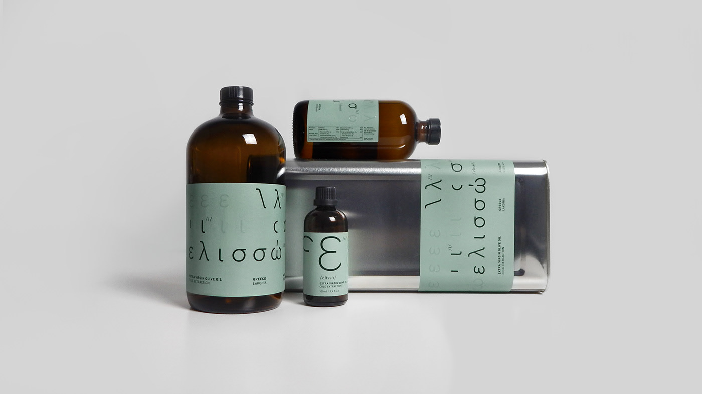
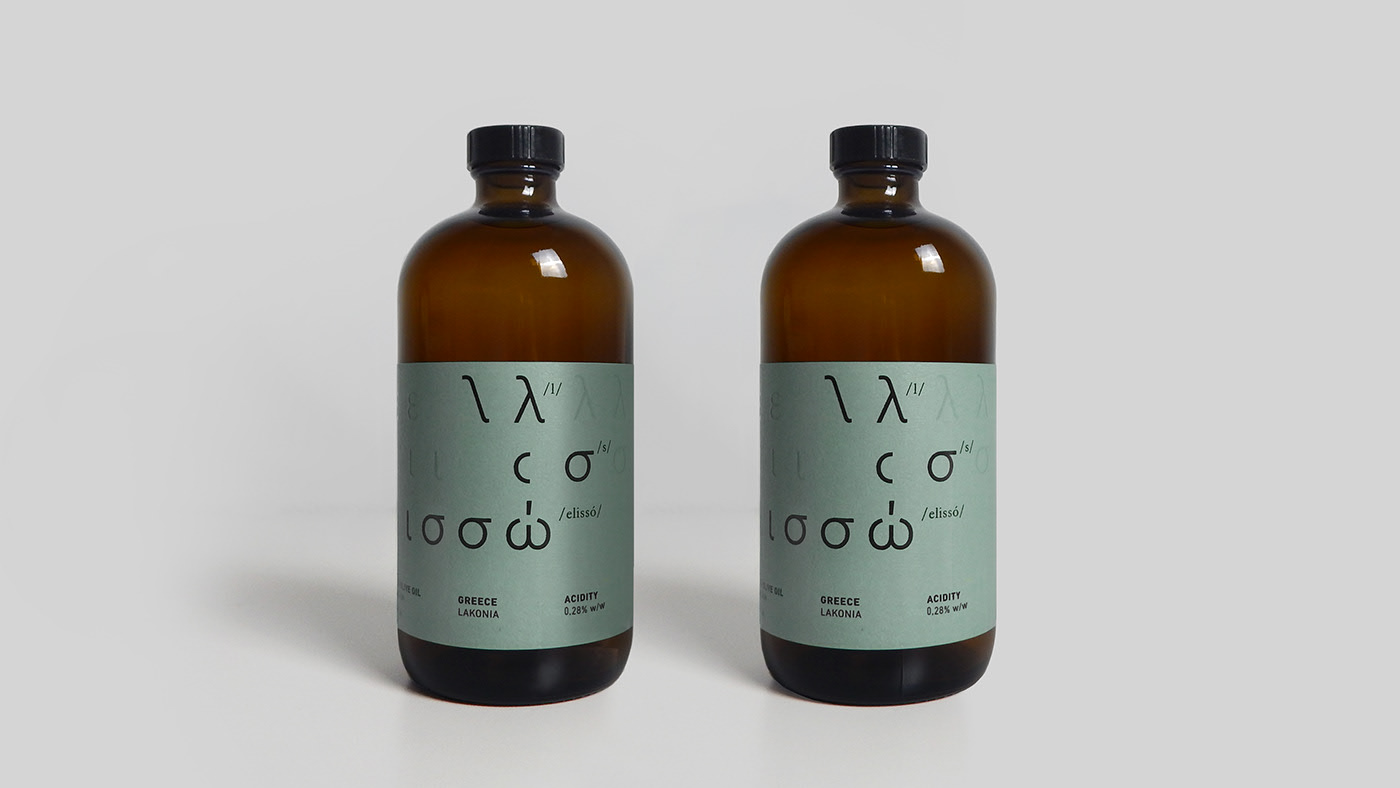
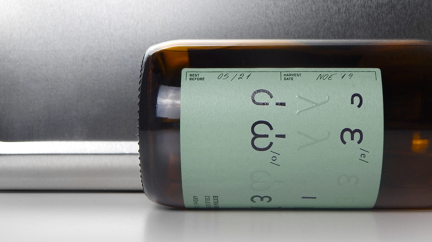
Design by Makrina Oikonomidou, Artemis Sierra & Linescape Design.
This design is truly avant-garde, breaking away from the traditional handcrafted label design.
This Greek olive oil uses typography that invites you to discover Greek culture, incorporating rotating Greek letters throughout the label, with some characters rendered almost transparent.
The olive oil label is applied to a very distinctive bottle, clearly referencing the unique, artisanal and carefully crafted nature of the product. It’s the kind of bottle you might find in an old apothecary, here used to emphasize that this precious liquid is almost medicinal.
The result is an olive oil label and packaging design that is striking, cutting-edge, and elegant.
To view the full project, click here.
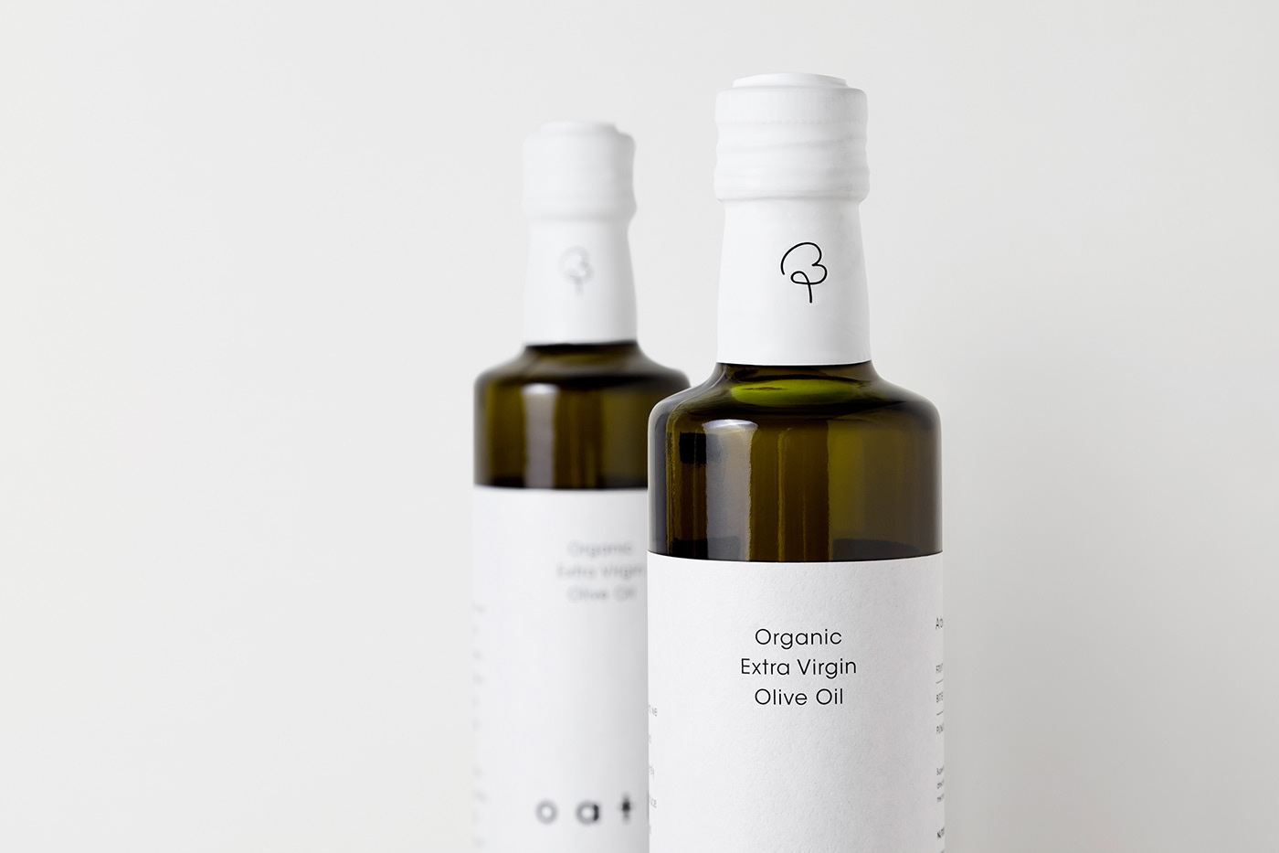
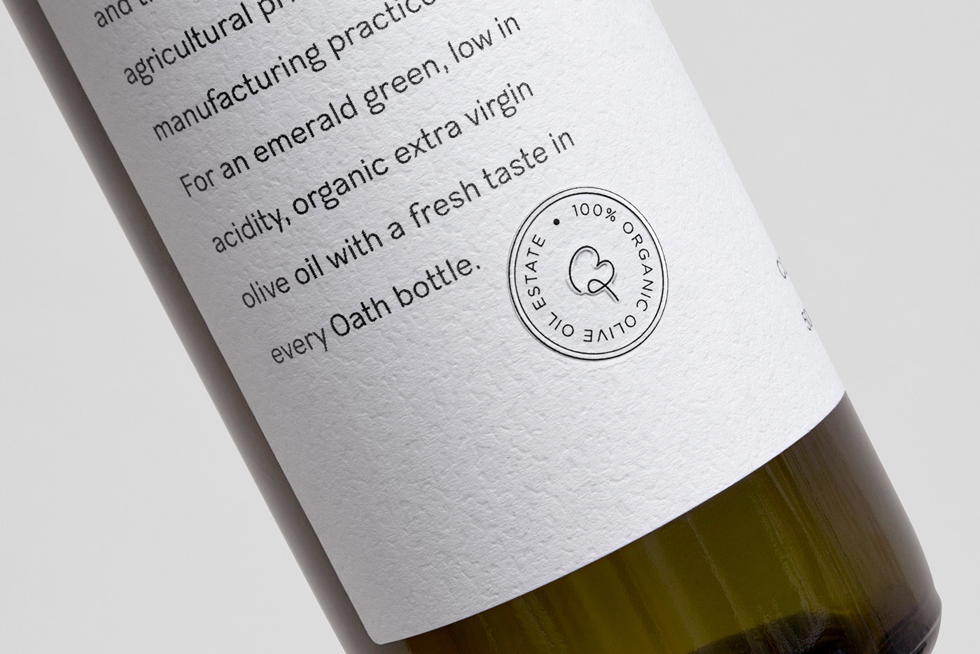
Oath
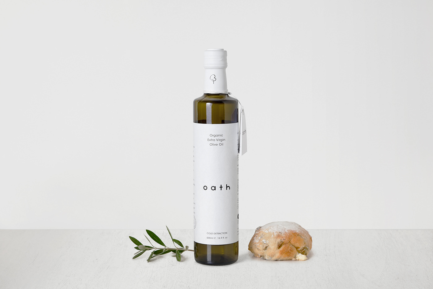
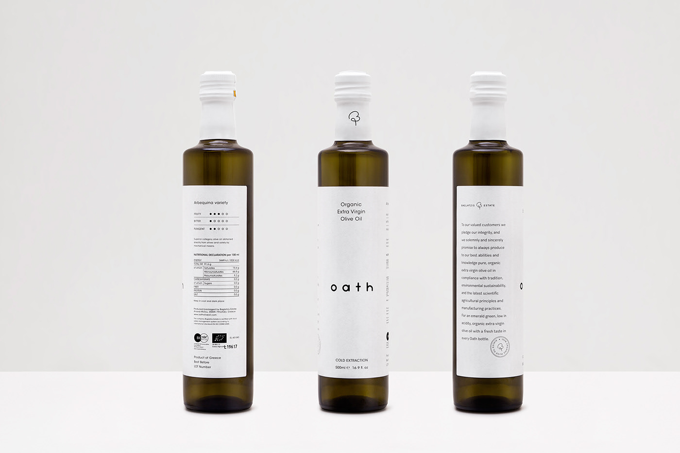
Design by S & Team.
The “Oath” olive oil is a statement of intent from this olive oil brand, making their commitment to quality clear—a true promise to their customers.
In terms of design, the logo is intentionally understated, balancing the visual weight of the word “Oath.”
This design was created with cost-effectiveness in mind, using a classic Dorica bottle. The label is printed on textured white paper to convey purity, with the logo taking center stage.
A portion of Baglatzis’ oath is embossed and hot-stamped, adding an artisanal touch.
The result is a minimalist, heartfelt, and affordable design—undoubtedly among the best olive oil label designs today.
To view the full project, click here.
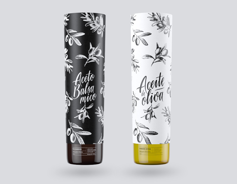
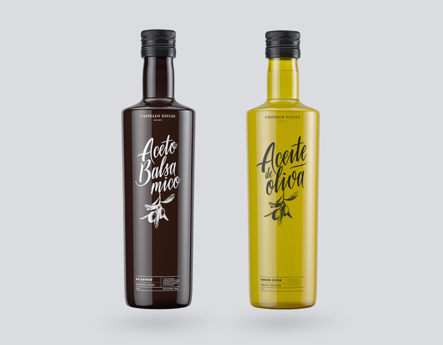
Castello Giulia
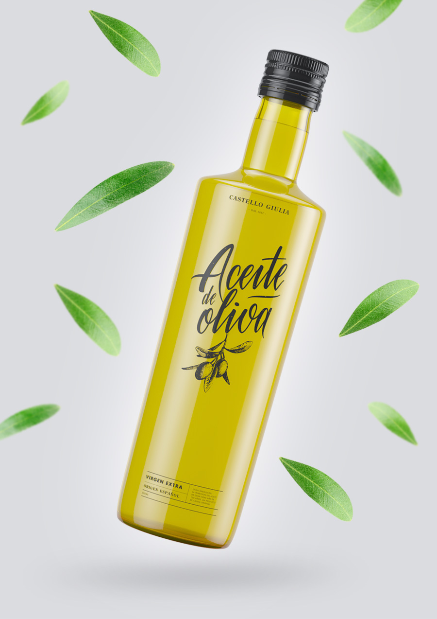
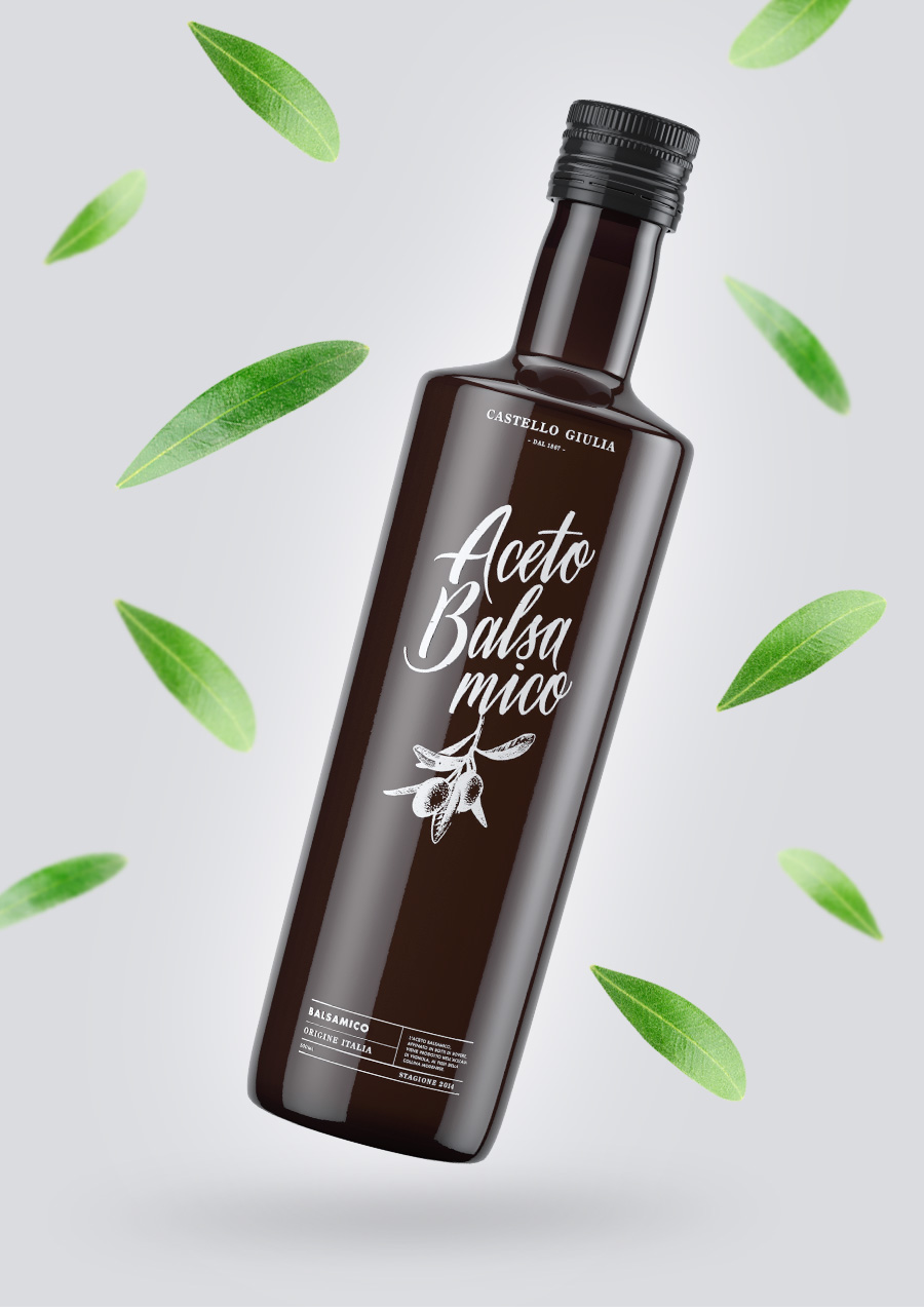
Design by simon spring.
Unlike the previous examples, this olive oil label design features a wraparound label that covers the bottle, decorated with repeated illustrations of the product’s source. The elegant color scheme—white on black, and its inverse for the balsamic variety—adds sophistication.
The result is a truly original label design that stands out for its desire to surprise with its final packaging.
To view the full project, click here.
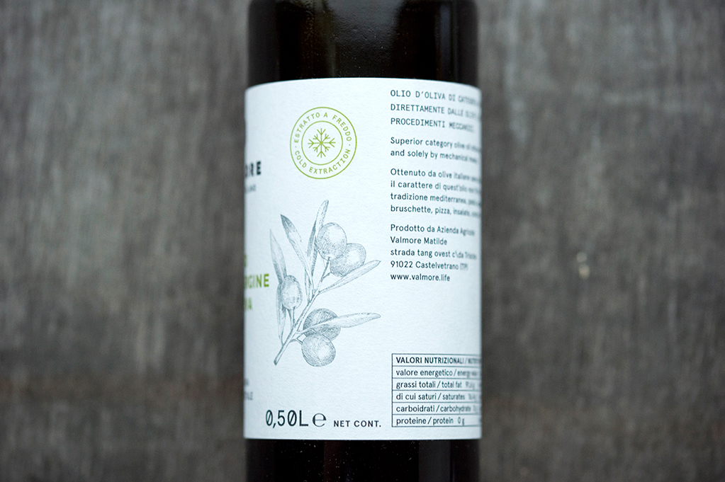
Valmore
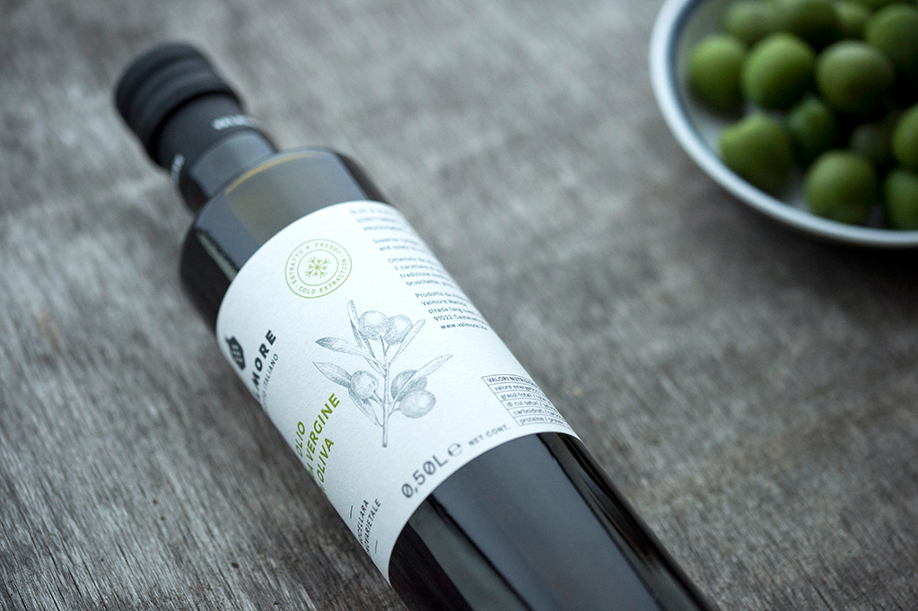
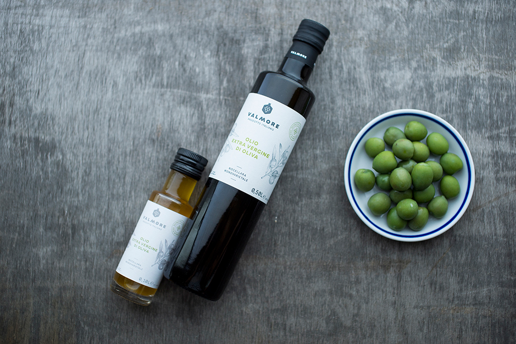
Design by Eszter Laki.
This olive oil label design centers on a hand-drawn portrait of the brand’s founder, emphasizing the craftsmanship behind the oil—a limited annual production, made with care and attention to detail.
The label uses textured paper and a highly technical typeface, once again blending artisanal production with the highest production standards.
The result is an olive oil bottle with a highly appealing label design that conveys both passion for the craft and professional quality—truly among the best in olive oil label design.
To view the full project, click here.
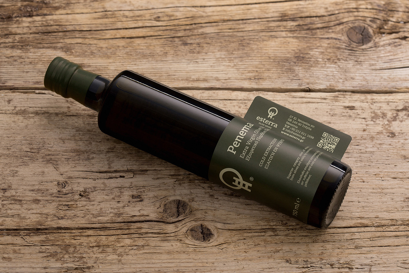
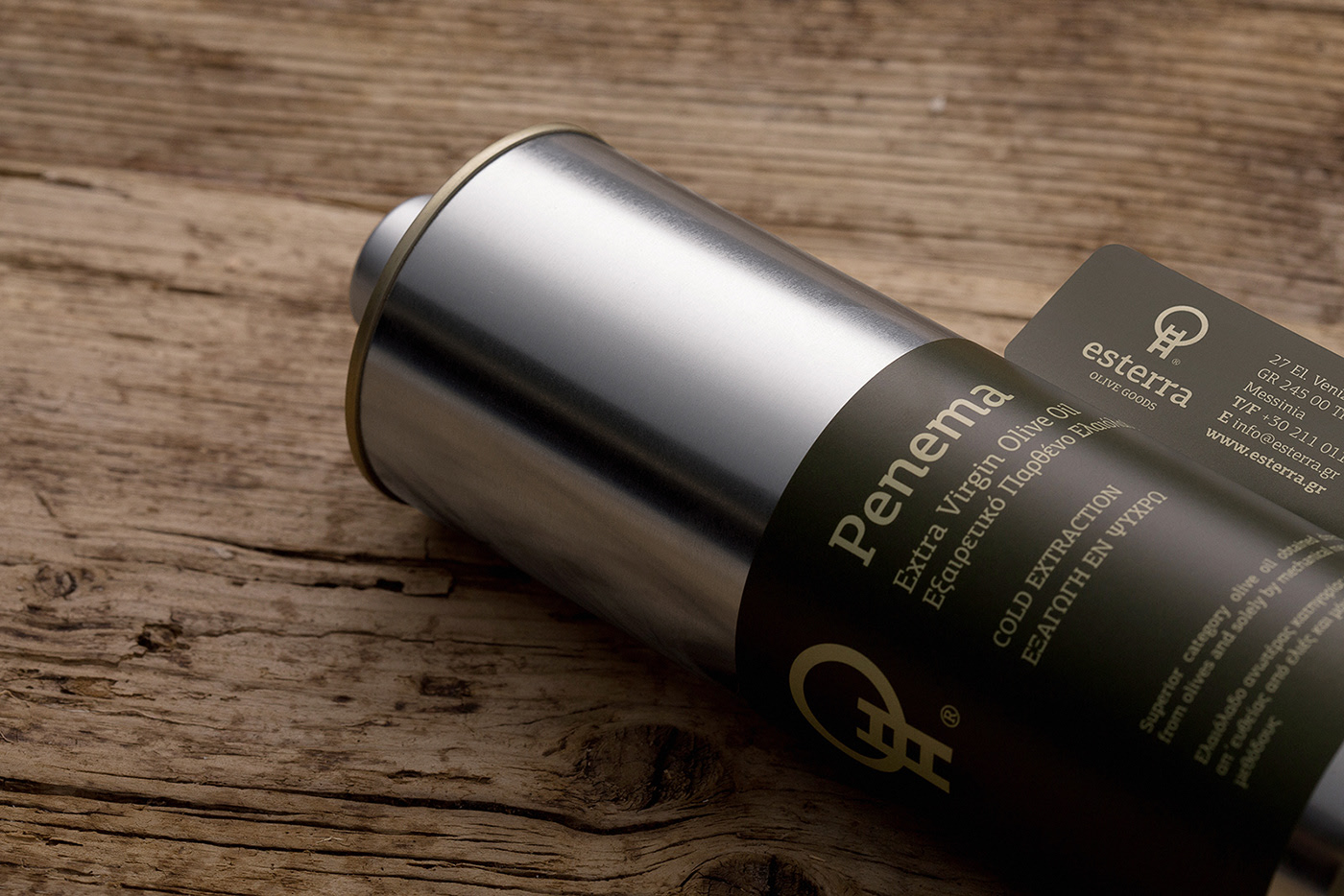
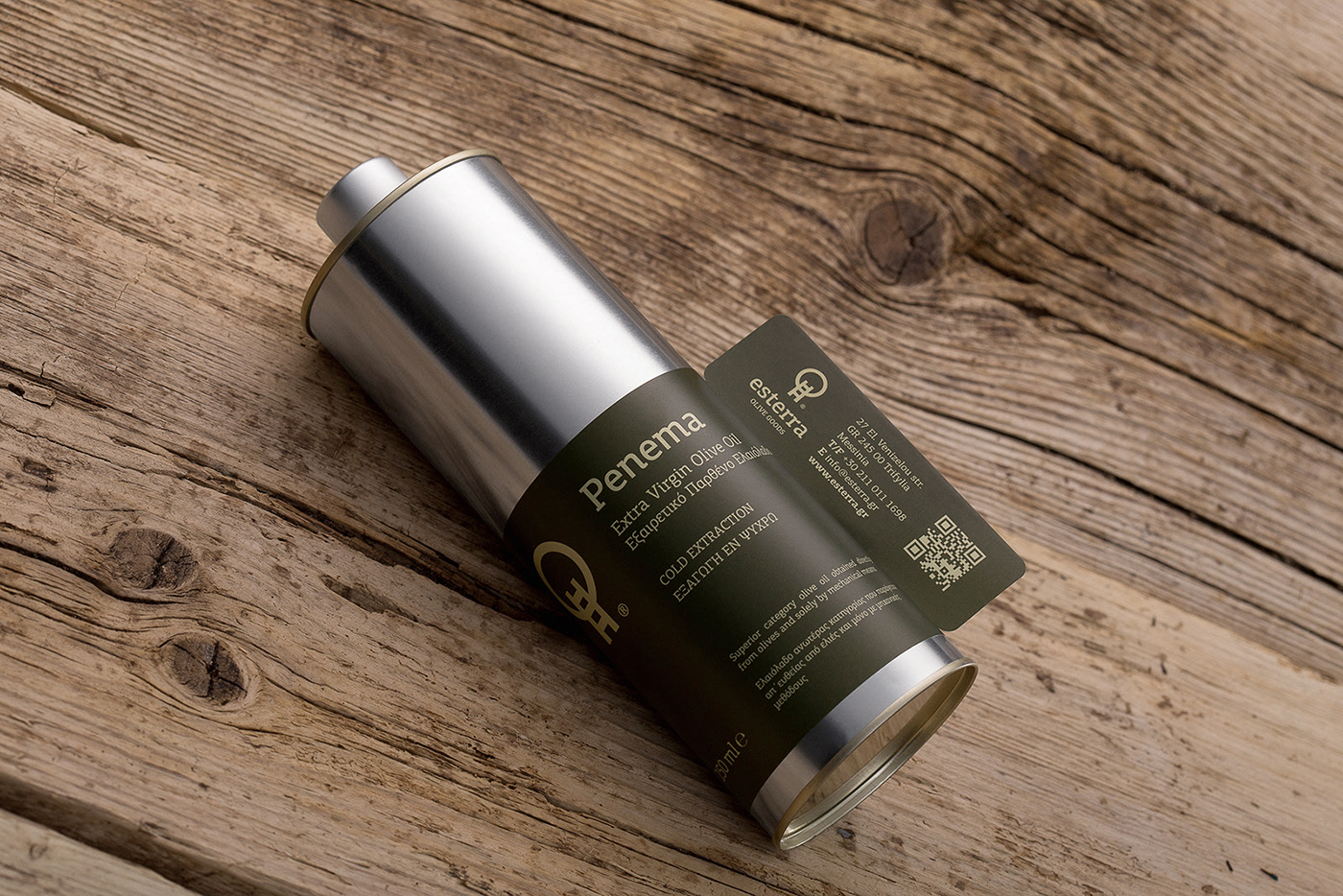
Penema® | Esterra Olive Goods
Design by Chris Trivizas.
Esterra, a company specializing in cultivation, marketing, and export, teamed up with graphic designer Chris Trivizas to create the olive oil label design featured here.
This design is applied to a metal canister available in various sizes, with a label that stands out for its green, yellow, and brown color palette.
Another unique feature is the ear-shaped handle on one side, adding a distinctive touch.
The result is a packaging and olive oil label design that’s highly personal. Departing from the typical glass bottle, it opts for a metal can and a refined overall image that adds value to the product while demonstrating a modern edge without losing its essence. A perfect example of the best in olive oil label design.
To view the full project, click here.
Olivia packaging concept
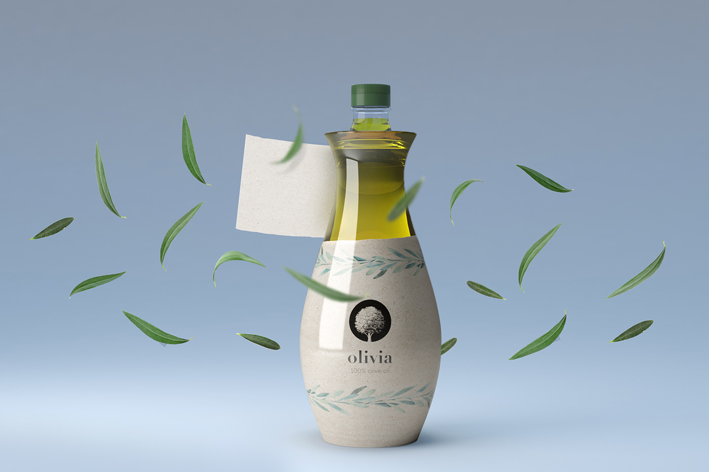
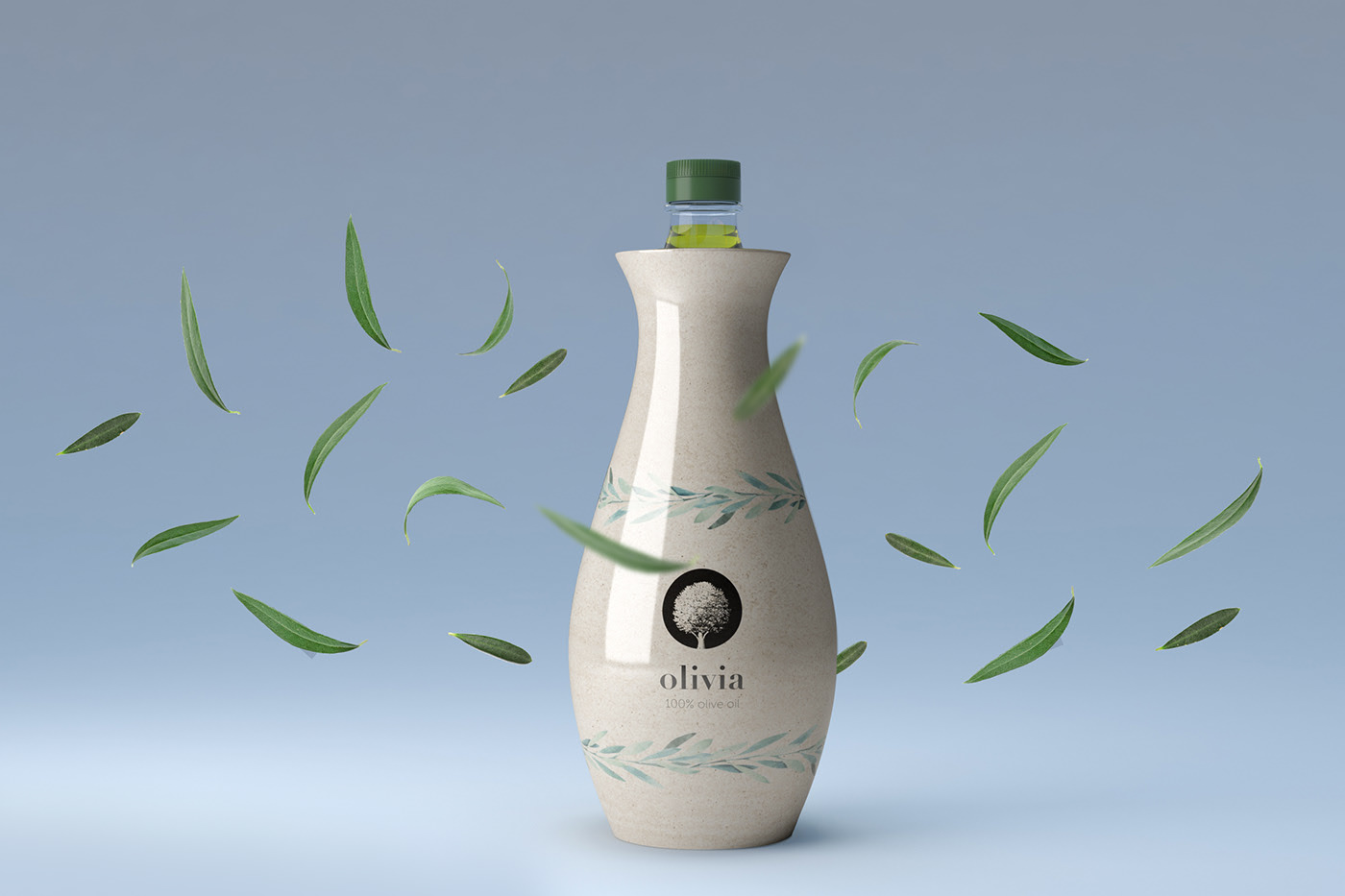
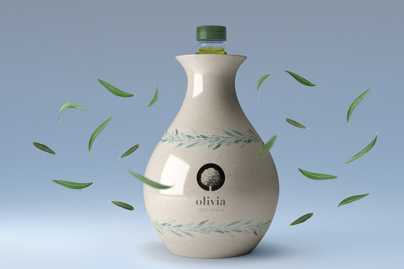
Design by Marcel Sheishenov & Adilet Asanaliev.
We wrap up this article on the best in olive oil label design with a look at Olivia olive oil.
Here, the label doubles as a wrapper for the glass bottle—one of the boldest packaging concepts on this list, evoking a time when clay was used to transport liquids. The label features olive leaf illustrations and a central logo—a stylized olive tree on a black background—for an elegant finish.
The result is another creative piece that truly deserves its place among the best in olive oil label design today.
To view the full project, click here.