Golden ratio, golden number, divine proportion, golden mean… Chances are you’ve heard these terms before. In this post, I’m going to dig into the concept and try to answer the big question: is it fact or fiction?
If you spend any time online, follow a few graphic design Instagram accounts, or look up the story behind a famous logo, you’ve probably come across the golden ratio being overlaid on a design.
It’s happened to me. And I doubt I’m the only one who looks at it with a healthy dose of skepticism.
I’ve never really taken sides on the debate, mostly because I haven’t looked into it deeply enough.
So I’m dedicating this post to a bit of pseudo-research, to draw my own conclusions. Next time I come across the golden ratio, I want to be able to look it in the eye and say I know exactly what it is, where it comes from, and how it works.

At first glance, it’s easy to fall into one of two camps. You can treat it as gospel and believe it’s a universal truth. You can even wave the golden ratio flag to justify a logo design, even if you’re not entirely sure what it means. Or you can dismiss it as overhyped nonsense—about as real as a Kardashian’s curves.
If you haven’t done your homework, you’re just guessing—no matter which side you pick.
Let’s dive in!
What is the golden ratio?
A quick overview
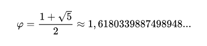
Represented by the Greek letter φ (phi), the golden ratio is an irrational number, typically expressed as a never-ending decimal.
Did that mathematical formula make things any clearer? Didn’t think so.
Bringing it back to our world—if you’re into graphic design or art, you’ve probably seen the iconic spiral associated with the golden ratio.
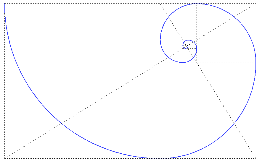
This spiral is often called the “divine proportion.” Supposedly, it appears in nature, in art, and even in our perception of beauty.
In theory, objects that follow the golden ratio are said to be more visually pleasing than those that don’t.
So, if this concept is actually true, shouldn’t we be applying it to design?
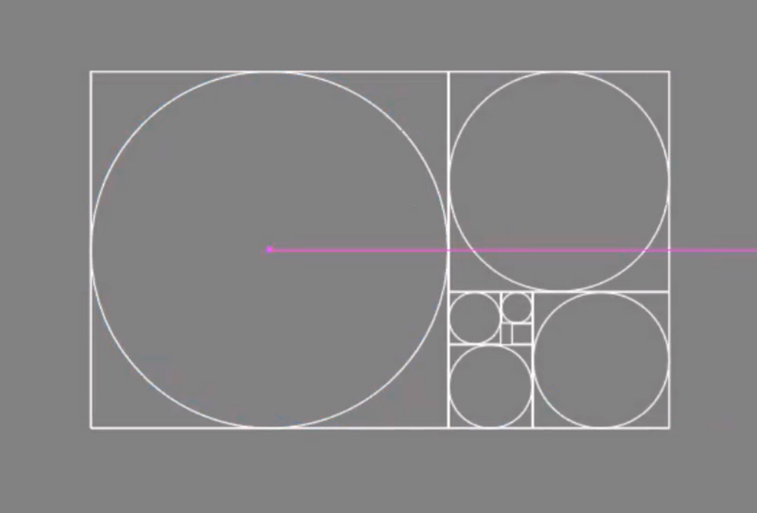
Using the spiral above, you can map out proportional grids.
The golden ratio in design and art
In both design and art, you’ll find the golden ratio cropping up in works from antiquity as well as in more contemporary pieces.
The golden ratio in art
Let’s look at a few examples you might recognize and see how the golden ratio is supposedly incorporated.
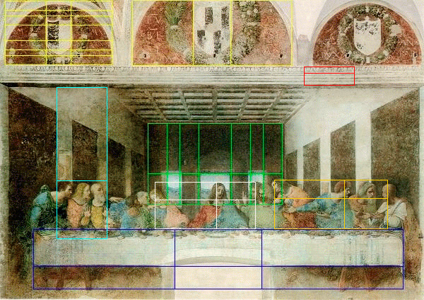
In the famous painting of The Last Supper, you can see the golden ratio applied geometrically in several sections.
Both the groups of people and the spaces around them are arranged in line with the golden ratio.
The table, viewed from the front, is divided so that the lower half is exactly half the height of the upper half. If you look at the center, the width is half that of the adjacent sections.
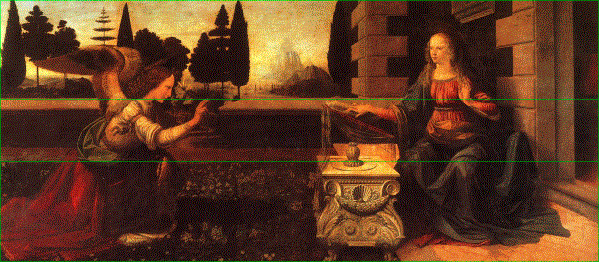
In this other work by Da Vinci, you can see the painting is divided into several layers of depth, each separated according to the golden ratio.
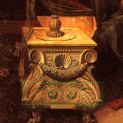
Even the small table’s decorations are said to follow the divine proportion.
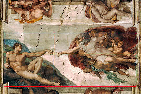
In another masterpiece—this one by Michelangelo—you can also spot the golden ratio in the way the main figures are arranged.
The golden ratio in design
We’ve seen that the golden ratio pops up frequently in art. I could give you more examples, but this post would get way too long. If you want to find more, Google is your friend. Now let’s see how it’s used in design.

When it comes to the golden ratio, you can’t ignore the Apple logo. I actually wrote a post not long ago about why the Apple logo is one of the best logos in the world. And no, I’m not an Apple fanboy—I’m not even writing this on a Mac.
You can see the logo is made up of several circles. These circles are based on the golden ratio.
Check out this YouTube video that breaks down the logo—you’ll see exactly what I mean.
And it’s not just Apple. You’ll find the same approach in the logos of many global brands.
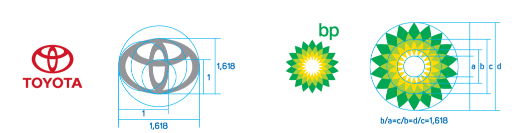
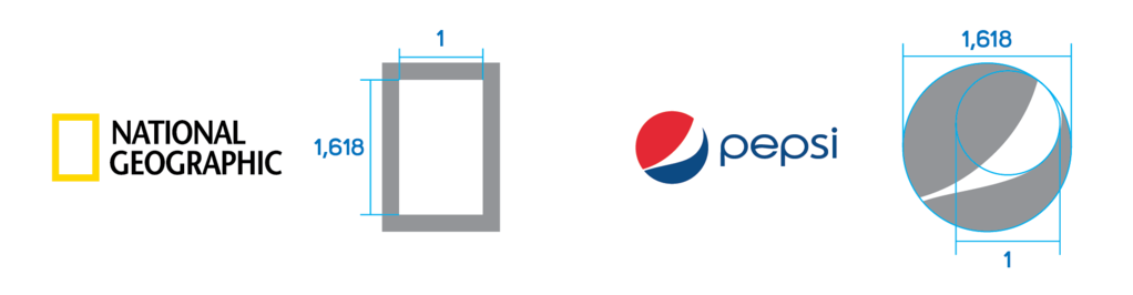
Toyota, BP, National Geographic, Pepsi… all these logos are said to follow the golden ratio.
The golden ratio in nature
So, we’ve seen that the divine proportion seems to show up in art and design. Let’s take a quick tour through nature, architecture, and beyond.
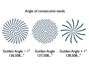
The golden angle
To get a deeper understanding, let’s talk about the golden angle, which is derived from the golden ratio.
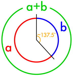
You’ll find this angle in the plant world—more often than you might think.
Honestly, this blew my mind a bit. Remember, I’m writing this post as I research.
Why is the golden angle important for plants?
As you’ll see, the golden angle is crucial for plant growth.
Think about how odd it would be to find a plant like the one on the left.
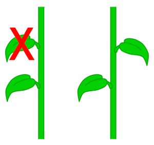
Most plants spread their leaves to maximize exposure to sunlight. The most efficient way to do this is by following a pattern where each new leaf or petal leaves space for the next—on and on, indefinitely.
You’ll see this more clearly in the following breakdown.

A leaf sprouts from the plant.
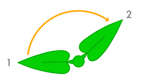
Then, using the golden angle, a second leaf appears.
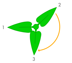
Same idea—a third leaf grows.
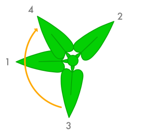
A fourth leaf…
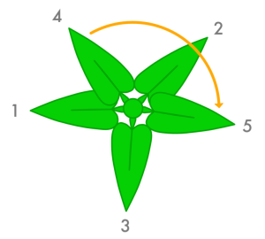
A fifth leaf. Notice how none of them overlap so far.
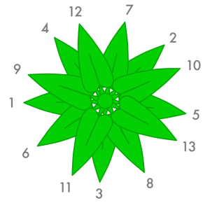
Keep going, and you get this pattern. Pretty impressive, right?
No matter how many leaves grow, they’ll always be spaced to maximize the available area.
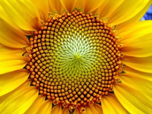
You can see the same thing in flowers.
If you want to dig deeper, here’s a link about Fibonacci numbers.
http://gofiguremath.org/natures-favorite-math/fibonacci-numbers/fibonacci-in-nature/
The golden ratio in other fields
Beyond nature, let’s look at other areas where the golden ratio appears.
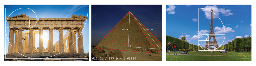
You can spot it in architecture.
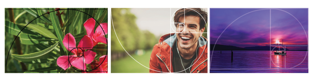
In photography.
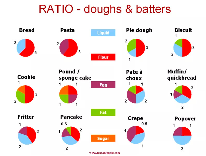
Even in cooking. The proportions of the ingredients here follow the golden ratio.
Is the golden ratio a myth or reality?
Now that we’ve covered what the golden ratio is—whether you call it the golden number, divine proportion, or something else—it’s tempting to believe it’s real, not just a myth. But to be objective, there are some questions we need to answer.
Is it coincidence or intention?
In classical art, did artists deliberately seek out the golden ratio? Did knowing about the divine proportion actually drive them to create works based on it?
If it’s just coincidence, is that coincidence a sign of genius? Whether in nature or in the work of a designer who’s never heard of the golden ratio—is it simply an innate sense of “good taste,” a natural way to balance proportions or maximize resources (as in nature)?
If it’s intentional, meaning artists consciously used it, we can see that while the golden ratio appears in some elements of a painting, there are plenty of others where it doesn’t—so maybe it’s just chance.
The more elements there are in a painting, the more likely you’ll find the golden ratio in one of them. But you’ll also find plenty of places where it doesn’t show up. So maybe it’s all in the eye of the beholder.
For every one, two, or three elements where it appears, there are hundreds where it doesn’t—but we choose to ignore those.
Evidence that it’s a myth
To show why it might be a myth, let me give you a few examples where the golden ratio is applied after the fact.
Now that I’ve gathered all this information, I’m at least curious to see if any of my own designs fit the golden ratio. I should point out that, while I’ve known about the concept in passing, I’ve never consciously used it in my graphic design work.

In the website design for Dabeer, you can see the divine proportion is present. I just found out myself.
What about the cases where it doesn’t fit?
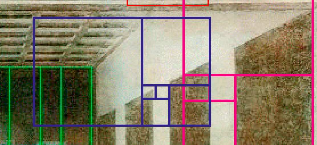
As you can see, the golden ratio (in magenta) fits the element on the right, but not the next one, shown in blue.
It’s actually pretty easy to make the pattern fit any design—you just have to find the right proportion.
You could even argue that an element is divided into sub-golden ratios to make it work, right?
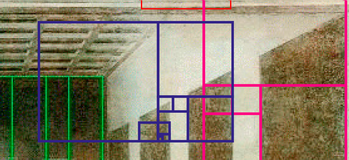
Now it fits.
I know this might sound a bit like sophistry, but in the Last Supper example, the golden ratio overlays that are highlighted:
Each reference is applied based on whatever measurement fits that particular element, but there’s no real relationship between the proportions themselves.
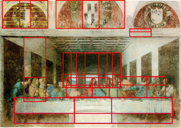
Once you group all the shapes together from a common starting point, it doesn’t really make sense.
Of course, you could keep searching until you find a way to make it fit.
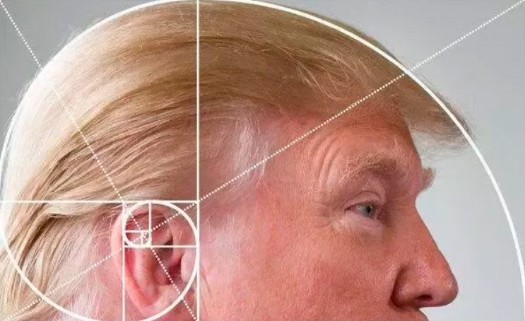
By that logic, does Trump have the divine proportion?
Is the golden ratio “inevitable”?
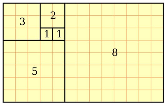
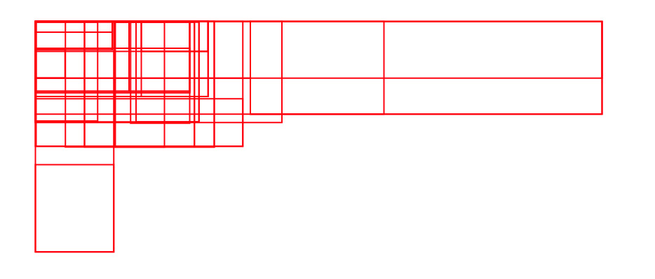
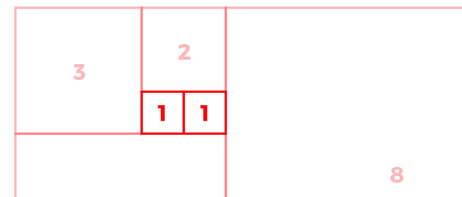
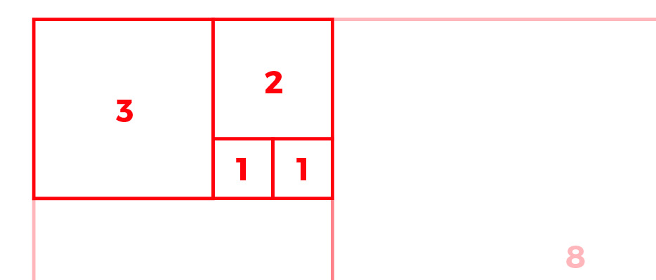
Let’s go back to the grid I showed at the start.
The shapes and proportions are extremely basic. We have several rectangles, each formed by multiplying the number of squares it covers.
1 x 1 = 1
2 x 2 = 4
3 x 3 = 9
5 x 5 = 25
8 x 8 = 64
What I mean is, 1 is the most basic unit. You can take any element and make it 1×1 in proportion—width or height. You can do this with any rectangle, depending on which one you start with.
From there, it’s easy for the element next to it to be the same size as the first…
Or twice as big.
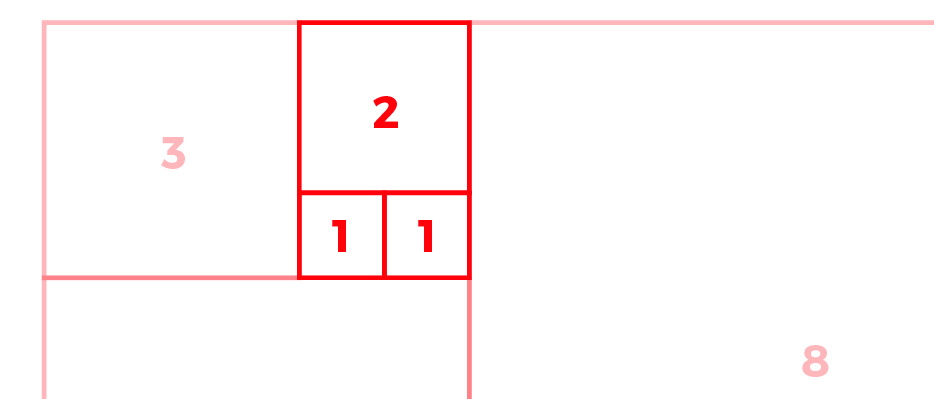
Or in a 3:2 ratio… or 3:1:1.
You can flip the object, change the angle, resize it however you want—the possibilities are endless.
Results and conclusions
Now that everything’s laid out, it’s time to draw some conclusions—if that’s even possible.
In nature, it’s pretty clear