In this post, we’ll break down all the essential keys to creating a cool, standout logo that stands the test of time.
After a long break from blogging, I’ve finally found a moment to tackle one of the topics that’s been sitting on my Wunderlist for a while.
The goal here is to cover every aspect that makes a logo truly memorable.
Check out this post—you’ll find it interesting: Logo Design Trends for 2019: The Most Creative Forecast #ever
Almost all globally recognized brands have logos that are instantly identifiable, even without the accompanying wordmark. That’s because, among other factors (like branding and brand image), their logos have been designed the right way.
The list of characteristics I’m about to share covers a lot of ground. It’s worth noting that it’s nearly impossible for a logo to tick every single box, but if it meets several and the execution is solid, you’ve got yourself a great logo.
Alright, let’s get to it!
How to create a logo: keys to designing a truly standout logo
Keep it simple, clean, and catchy
A logo should be instantly recognizable and easy to remember. This isn’t exactly groundbreaking, but it’s one of the most important principles.
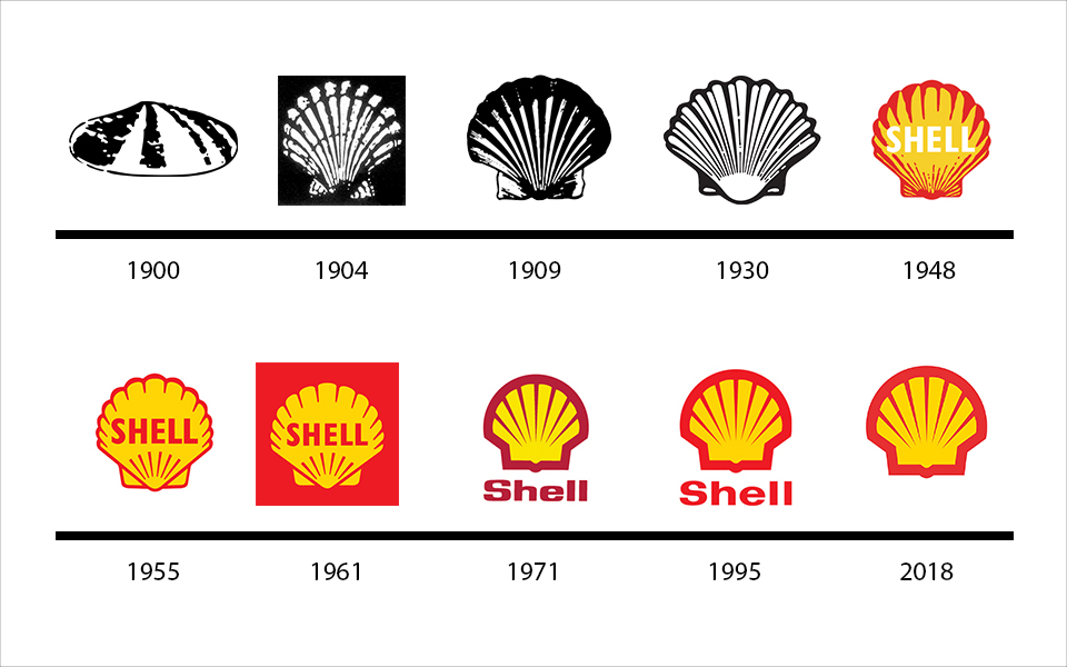
If you look at the evolution of the world’s most famous logos, the trend is clear: simplicity is king.
If you want to dive deeper into how logo design has evolved, check out this post we published not long ago.
You might wonder: is this just a trend, or a passing fad? In my opinion, it’s neither. It’s a matter of usability and logic.
Let me draw a parallel: whenever we’re in a conversation, we subconsciously pick out the most important words or ideas from each sentence. By the end, we remember only a handful of key points—maybe just one or two phrases, or even a single word. A logo should be like that one “impactful” word in a long conversation: the word that sums it all up, captures every concept, and grabs our attention.
If you want your logo to be memorable, don’t overload it. Overly complex designs just make it harder for people to process and remember.
Nike, Adidas, McDonald’s, WhatsApp… I don’t even need to show you their logos—just reading the names, you can picture them perfectly. See what I mean?
Does that mean an illustrated or more detailed logo is automatically bad? Not at all. A logo should be judged not just by its shapes, but by the concept it conveys.
Avoid generic concepts
If you’re an interior designer and your logo could just as easily be used by the local fishmonger down the street… that’s a problem.
Aim for concepts that make your logo unique—this will give your entire brand identity a solid foundation.
Ask yourself these questions to help define the concepts you can play with:
- What does the company do—the one you’re designing the logo for?
- Is there something that sets it apart from the competition?
- Can you incorporate that, even subtly, into the logo design? How?
- Can you use the letters in the brand name to create a connection between the icon and the typography?
- Can you create a double meaning?
- Can you give a logical explanation for the logo, beyond just “it looks nice”?
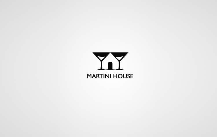
Here’s a logo with a double meaning. You can actually explain the thought behind it.
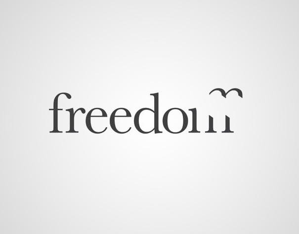
A logo that cleverly combines typography and iconography. Again, there’s a clear rationale behind the design.
You get the idea, right?
Another way to give your logo personality is to use custom-made typefaces
Whether hand-lettered or digitally created, having a unique typeface for your logo adds an extra layer of personality to your design.
![]()
Check out this post—you’ll find it interesting: Logo Design Trends for 2019: The Most Creative Forecast #ever
Works across different formats
Versatility is crucial. Ideally, your logo should be adaptable enough to work seamlessly on any material or medium.
Your logo should look great on a business card, but also on a t-shirt, a cap, or a smartphone screen. It’s also a good idea to have a single-color version ready.
Let’s break it down:
How can you make sure your logo works in every possible format?
Appropriate sizing. Make sure your logo is legible at all sizes. Thin lines may disappear when scaled down. If your logo includes multiple words, avoid big differences in size between them—otherwise, the smaller ones might become unreadable at small scales.
What’s a single-color version, and why do you need it?
A single-color (or “one-ink”) version is simply your logo rendered in just one color. Imagine you want to embroider your logo on a cap and it has to be done in a single thread color. That’s when you need a single-color version. Here’s an example to make it clearer:
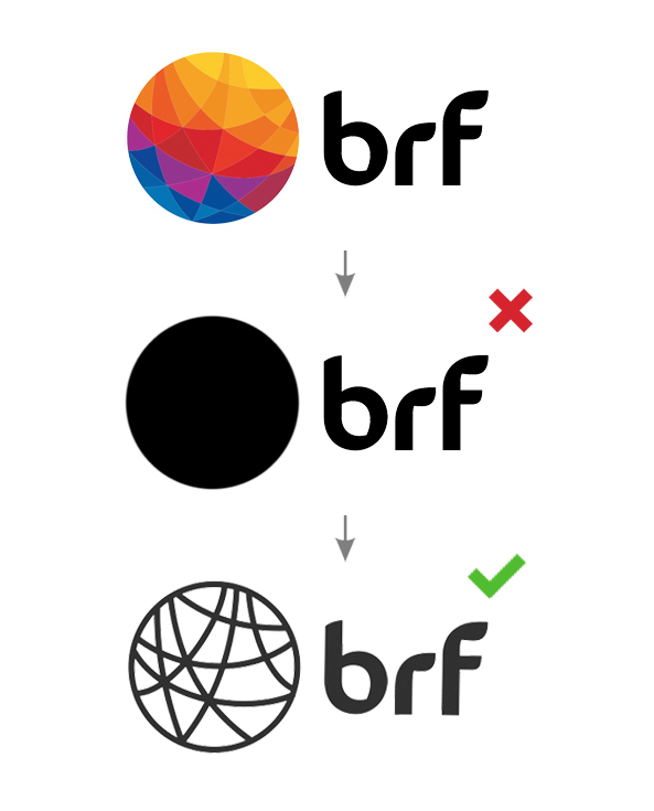
The first image is the original logo; the third is the single-color version. As you can see, it’s still recognizable even in just one color.
If you want to learn more about single-color or monochrome logo versions, here’s a post by Brandemia that covers the topic in depth.
Symmetrical shapes
Symmetry makes logos easier to remember and more visually appealing. In fact, research shows that our perception of beauty is closely linked to facial symmetry.
That said, your logo doesn’t have to be perfectly symmetrical. Sometimes, playing with symmetry is exactly what makes a logo more interesting.
Take the Nintendo Switch logo, for example. It’s not perfectly symmetrical, but the way symmetry is used makes it visually striking.
![]()
Here’s a post about how symmetry is used in famous logo designs. It’s in English, but if you’re comfortable with the language, you’ll enjoy it—it’s very well explained, even from psychological and evolutionary perspectives.
Conclusions
Let’s recap with a quick summary for the impatient. How to create a logo:
- Keep it simple and easy to remember
- Avoid generic concepts—if a totally unrelated business could use your logo, you’re off track
- Make sure it works across different formats—can you use it on both a business card and a cap?
- Use symmetry—play with symmetrical elements. It doesn’t have to be perfectly symmetrical, but visual balance is key.
Check out this post—you’ll find it interesting: Logo Design Trends for 2019: The Most Creative Forecast #ever
If you made it all the way to the end, I’d love to hear your thoughts in the comments below—and don’t forget to share this post with your friends!