Some products do not sell well when they are presented like a technical data sheet. A modular shelter, a construction solution or a system designed for demanding conditions needs more than features: it needs a scene, a sense of scale and a first impression that conveys capability before anyone even reads the details.
Vaulk operates precisely in that space where web design for construction intersects with the visual direction of a premium product. It does not soften itself too much, nor does it try to feel approachable at any cost. It builds a dark, precise and restrained atmosphere, with that quiet edge that makes the brand feel more confident in itself.
The strength lies in how everything adds up without becoming heavy-handed. The composition guides the eye, the color adds weight, the typography holds the tone and the motion brings depth without turning the experience into a technical demo. There is visual rhythm, but also control. And in a complex B2B brand, that raises the perception of value very quickly.
Vaulk works because it understands a very simple idea: trust also has texture. When a technical solution is presented with identity, judgment and a well-directed interface, it stops feeling difficult to explain and starts occupying a clear place in the user’s visual memory.
Vaulk — a technical product with an editorial pulse
Vaulk creates a very clear first impression: it is not selling an isolated object, but an idea of protection designed with precision. The scene has something of a premium workbench, a confidential presentation, a serious project that does not need to raise its voice. The monitor, the desk, the wood, the dark tones and the outdoor landscape place the product in a very different territory from a flat technical website.
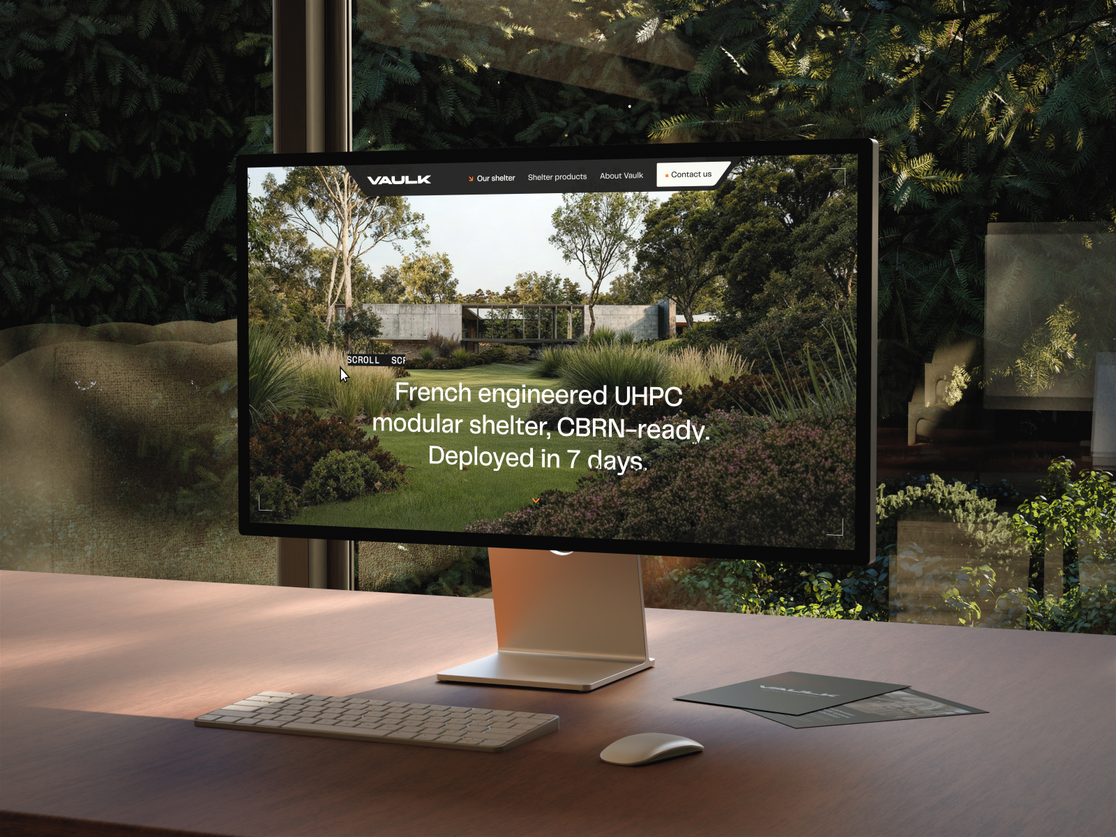
The composition works because it does not separate product, context and identity. Everything appears within the same scene: the modular shelter integrated into a natural environment, the restrained interface, the clean top navigation and a central message that speaks of resistance, deployment and technical readiness. Together, these elements create a strong perception of value without relying on an aggressive aesthetic.
Color does much of the work. The dark background adds weight; the light typography supports readability; the wood and vegetation soften the more rugged side of the product. It is a fine balance: technical enough to build trust, atmospheric enough not to feel like a soulless industrial catalogue.
The typography does not compete with the image. It appears with a direct, almost institutional presence, but without losing elegance. In a website for construction, shelters, engineering or industrial solutions, this decision matters more than it may seem: when the text does not try to fill every space, the brand conveys confidence. There is breathing room, there is hierarchy and there is a proposition that is understood quickly.
There is also a very clean UX/UI reading. Logo at the top, restrained navigation, a visible contact prompt and a hero that does not scatter attention. The experience does not need to show ten things at once to feel complete. That restraint helps the user perceive order, and in complex products, order translates into trust.
Landing page with a premium product atmosphere
The moving hero reinforces that sense of presence. It is not looking for spectacle for its own sake: it supports the reading, adds depth and turns the first scroll into a more cinematic entry point. For a B2B brand, that visual rhythm can be the difference between “just another supplier” and “this has a clear direction.”
Vaulk — technical motion without losing elegance
The most interesting part of Vaulk appears when motion stops being decoration and becomes product language. A modular shelter, a construction solution or a technical system often needs explanation. But explaining does not mean filling the screen with paragraphs. Sometimes it is enough to show structure, layers, parts and relationships in a visually precise way.
3D wireframe to explain without overwhelming
The 3D wireframe has that engineering-drawing quality that is appealing because it reveals without becoming cold. The piece shows internal logic, modularity and construction. It is a highly effective way to elevate perceived quality: when a brand shows how it thinks through its product, it does not just sell it; it demonstrates mastery.
This type of resource fits especially well in web design and web development for construction, technical architecture or industry. The user does not always need to understand every detail at first glance, but they do need to feel that there is a system behind it. Used well, 3D reduces the distance between promise and reality.
Transitions with digital texture
The pixel transition introduces character. It does not change the value proposition, but it does change how moving through the website feels. It is a small detail that can keep a sober interface from becoming rigid. There is texture, there is pulse, there is a kind of controlled visual friction that leaves a memory.
The key is restraint. When a transition weighs more than the content, it gets in the way. When it supports the change of state and maintains the visual rhythm, it adds perceived quality. Vaulk moves within that territory: motion with intent, not fireworks.
Microinteractions that humanize the interface
Microinteractions soften the experience. On a technical product website, animated components can make navigation feel more approachable without reducing the brand’s authority. Not everything has to be monumental: a card that responds well, an illustration that supports the message, a content reveal with good timing… these gestures build identity.
And here an important idea appears: light interaction also sells. Not by pushing the user, but by conveying care. If a brand takes care of how its interface behaves, it is easier to imagine that it also takes care of its product, its installation, its logistics or its service.
Vaulk — a visual lesson for complex B2B brands
The reference leaves a fairly clear idea: a technical website does not have to look like technical documentation. It can be precise, sober and commercial without losing atmosphere. In fact, when the product is expensive, sensitive or difficult to explain, visual direction carries even more weight.
Vaulk does not rely on an aesthetic of excess. It does not need icons everywhere, endless blocks or stacked claims. Its strength lies in building a credible scene. First it places you inside a world; then it lets you access the information. That order is very useful for brands selling high-value solutions: before asking for attention, it is worth generating respect.
For a construction, engineering, modular architecture or industrial equipment company, the lesson is not “make a dark website with 3D.” That would be too literal. The real lesson is something else: turn your technical capability into a visual experience with intent. If the product has structure, show it. If the service requires trust, create an atmosphere that supports it. If the sale requires contact, keep the CTA visible without turning it into a shout.
There is also a question of positioning. When clarity and atmosphere work together, the brand feels more solid. Not because it is better decorated, but because everything communicates the same direction: precision, control, discretion, speed, protection. That coherence helps filter users more effectively and attract leads that are more aligned with the real value of the offer.
Visual memory matters a great deal in markets where almost everyone says the same thing. “We are experts,” “we have experience,” “we offer tailored solutions.” Fine. But if the website does not leave a strong mental image, the brand fades. Vaulk makes the product memorable as a presence: technical, quiet, integrated into the landscape, with a finely tuned digital layer.
A simple idea, well dressed
Vaulk works because it understands something basic: trust is also visual. The composition brings order, the color adds character, the typography contains the tone and the motion turns a complex product into an experience that is easier to imagine.
For any B2B brand working in construction, industry or technical solutions, the inspiration is there: it is not about making a more spectacular website, but about building a digital presence with judgment. One that explains less all at once, but makes the value felt from the very first second.