Good Morning doesn’t launch like your typical restaurant. It launches with a hunger for visuals: bold red, electric blue, hefty lettering, and a cast of products turned into quirky little characters. There’s a touch of street poster, a bit of comic book, a hint of collectible packaging. And it works because it’s instantly recognizable.
The secret is balance. The identity is packed, yes, but never lost. There’s composition, visual rhythm, and a clear direction behind every burst of color. Everything feels spontaneous, but nothing is left to chance. That’s what separates a brand with energy from one that’s just noisy.
Red, blue, and white create an immediate visual code. The typography brings character. The illustrations add humor. The packaging turns every order into a branded experience you want to look at, touch, and remember. Good Morning understands something powerful for hospitality: when the identity shapes the entire experience, perceived value starts before the first bite.
Good Morning — Taiwanese breakfast with graphic flair
The first impression hits hard: bold typography, high contrast, and an energy that feels straight off the street. The name doesn’t hide. It takes up space, sets the visual rhythm, and establishes hierarchy at first glance. This is an identity that doesn’t ask for permission to exist.
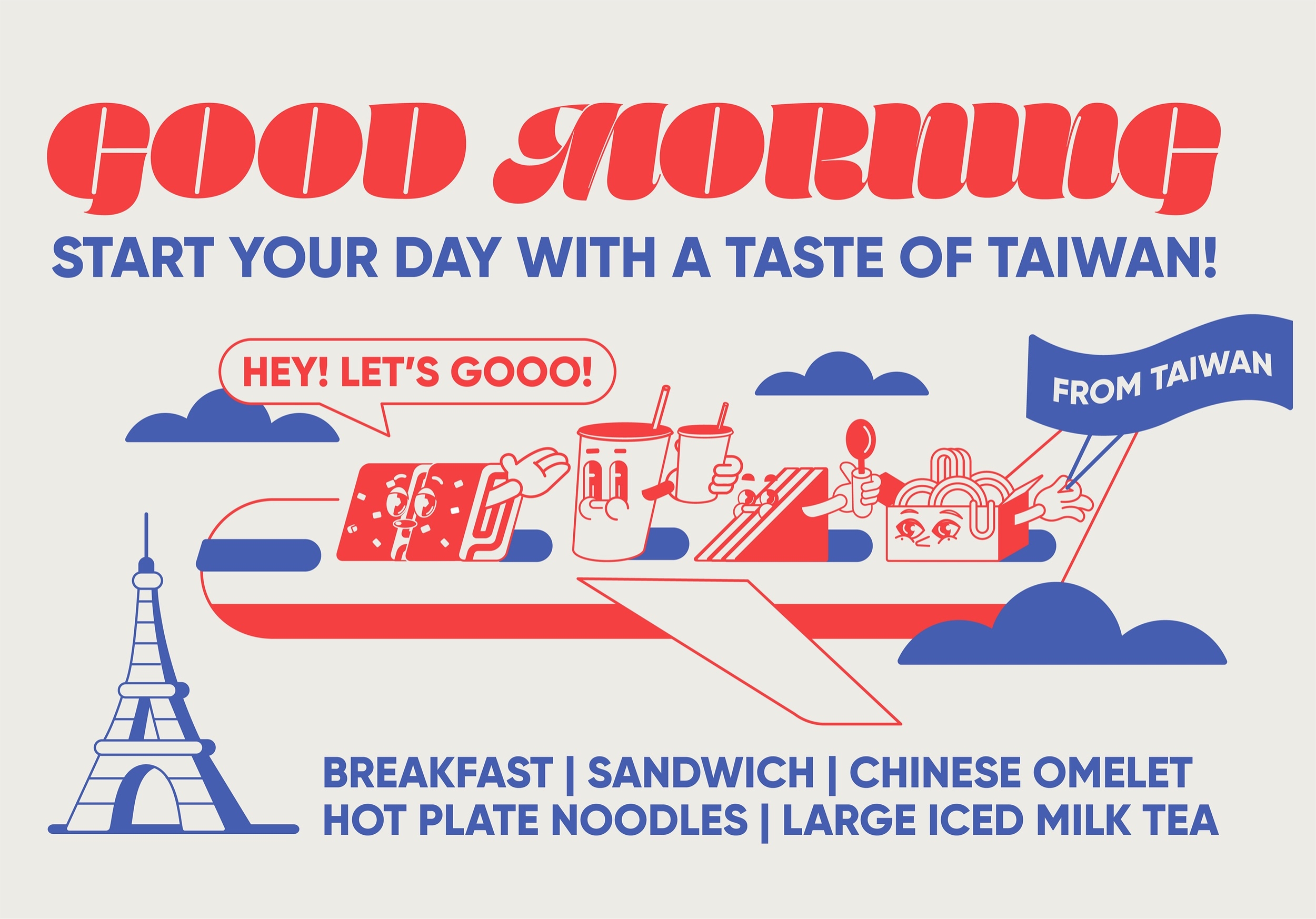
Here, red and blue have a clear purpose: to energize and organize. They’re not just there to “brighten things up”—they’re a graphic signal, repeated until it becomes familiar. In food branding, that repetition is crucial: when a brand is recognized in seconds, the decision gets easier.
The typography has a strong, physical personality. It’s weighty, gestural, almost like a classic sign reimagined. This choice pushes the identity into a more editorial, memorable, and less generic space. It doesn’t look like a brand that just picked the “right” font; it looks like a brand that knows exactly how it wants to sound.
The characters are the most delightful touch. Sandwich, omelette, noodles, milk tea—each product gets its own personality, humor, and a little scene. The food stops being a list and becomes a cast. That simple move does wonders for visual association. A restaurant brand that turns its products into icons has a much better shot at sticking in your mind.
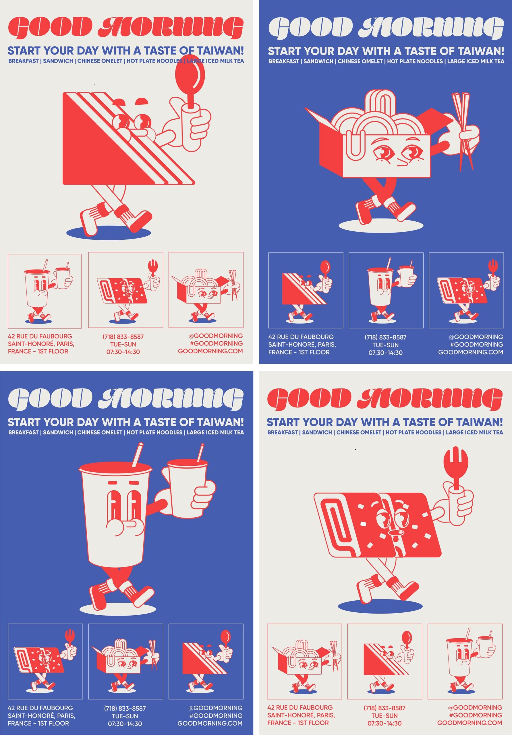
What’s interesting is that the composition is dense, but never overwhelming. There are lots of elements: headlines, taglines, small illustrations, cultural references, products, decorative shapes. Yet everything reads clearly because each piece knows its role. The identity has visual noise, yes, but it’s noise with direction.
That’s key for any brand that wants character without losing credibility. An expressive identity sells better when the internal structure is solid. The audience feels the energy, but also the order. That mix usually translates into higher perceived value: the product feels more cared for because the world around it is, too.
Posters, the street, and physical presence
When an identity works beyond the perfect digital canvas, it gains credibility. Here, the posters don’t feel like isolated portfolio pieces—they’re made for walls, neighborhoods, shopfronts, and quick glances. The brand is built to withstand the impact of the street.
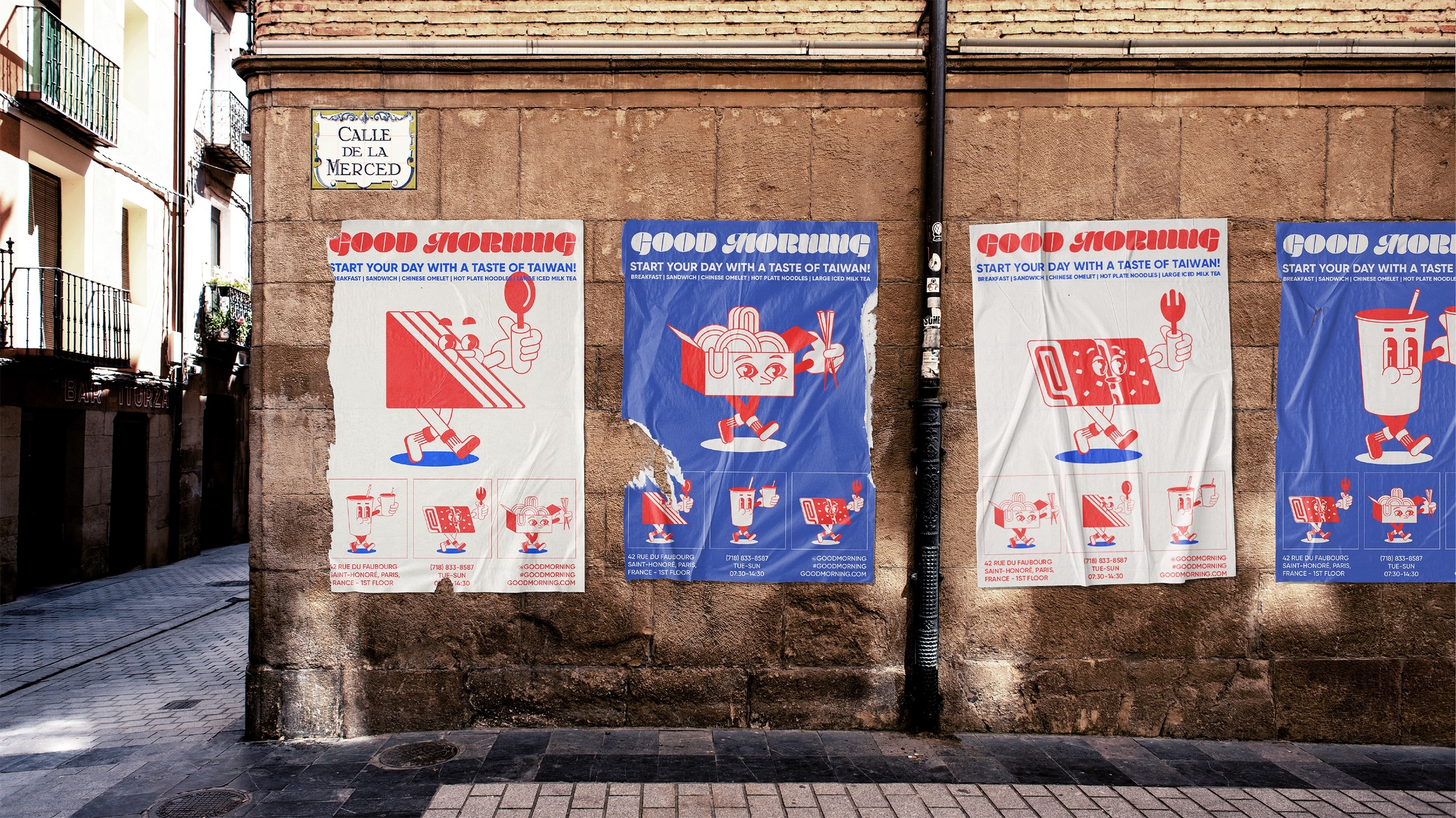
Urban application gives it authenticity. A poster breathes differently on a wall, with texture, scale, and context. The identity stops being a closed composition and starts behaving like a living brand. For restaurants, that transition is delicate: what works digitally or in a presentation can lose impact in the real world. That’s not the case here.
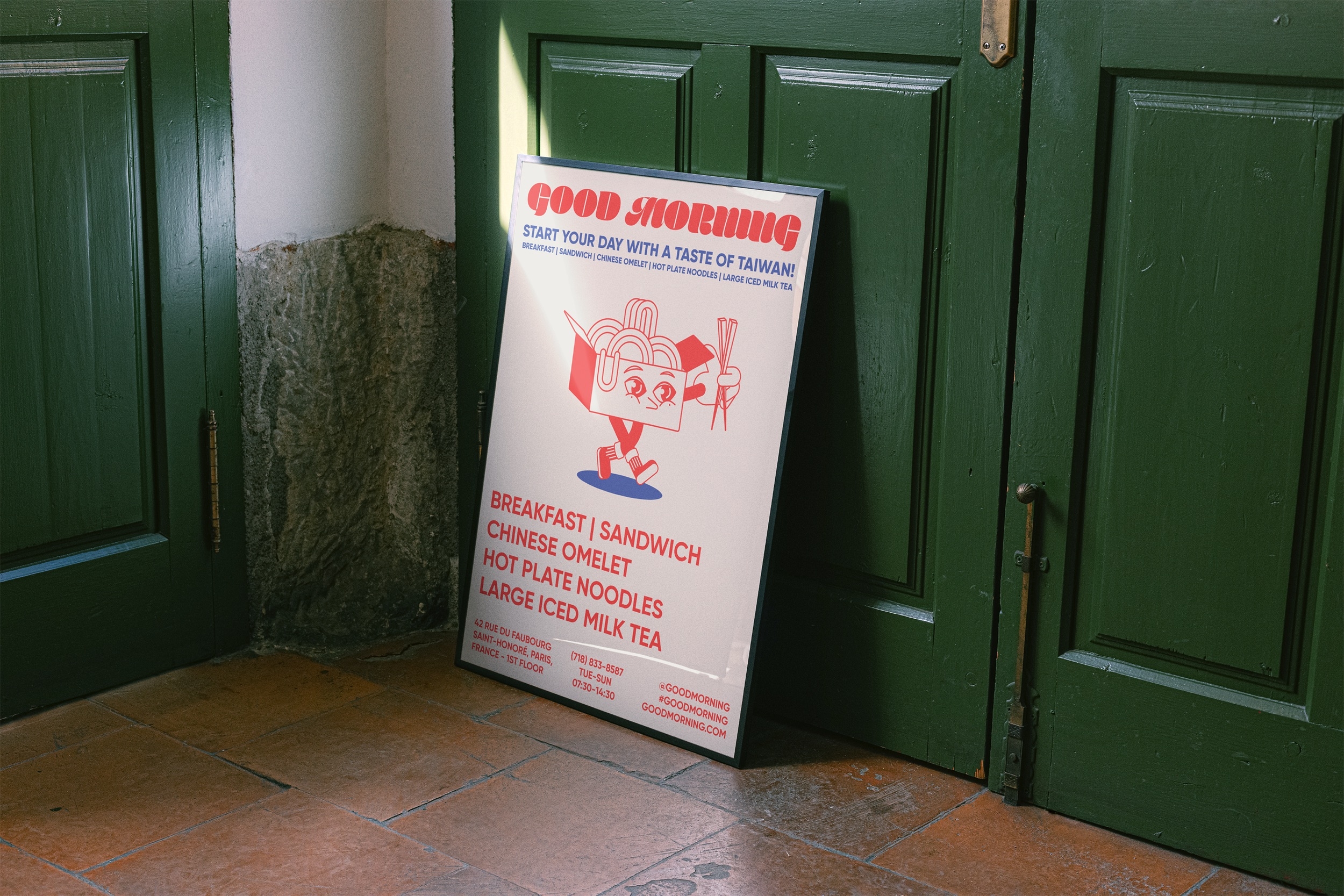
There’s also something irresistible about the contrast between bold graphics and more understated physical spaces. Deep green, real surfaces, framing, shadow—all of it grounds the identity. The brand stays playful, but never childish. It’s intense, but never feels improvised.
Good Morning — packaging that turns every order into an experience
The identity shines brightest when it moves into packaging. That’s where you see if a brand has depth or just a flashy hero piece. Good Morning holds up because its codes can be folded, wrapped, repeated, cut, and adapted without losing their essence.
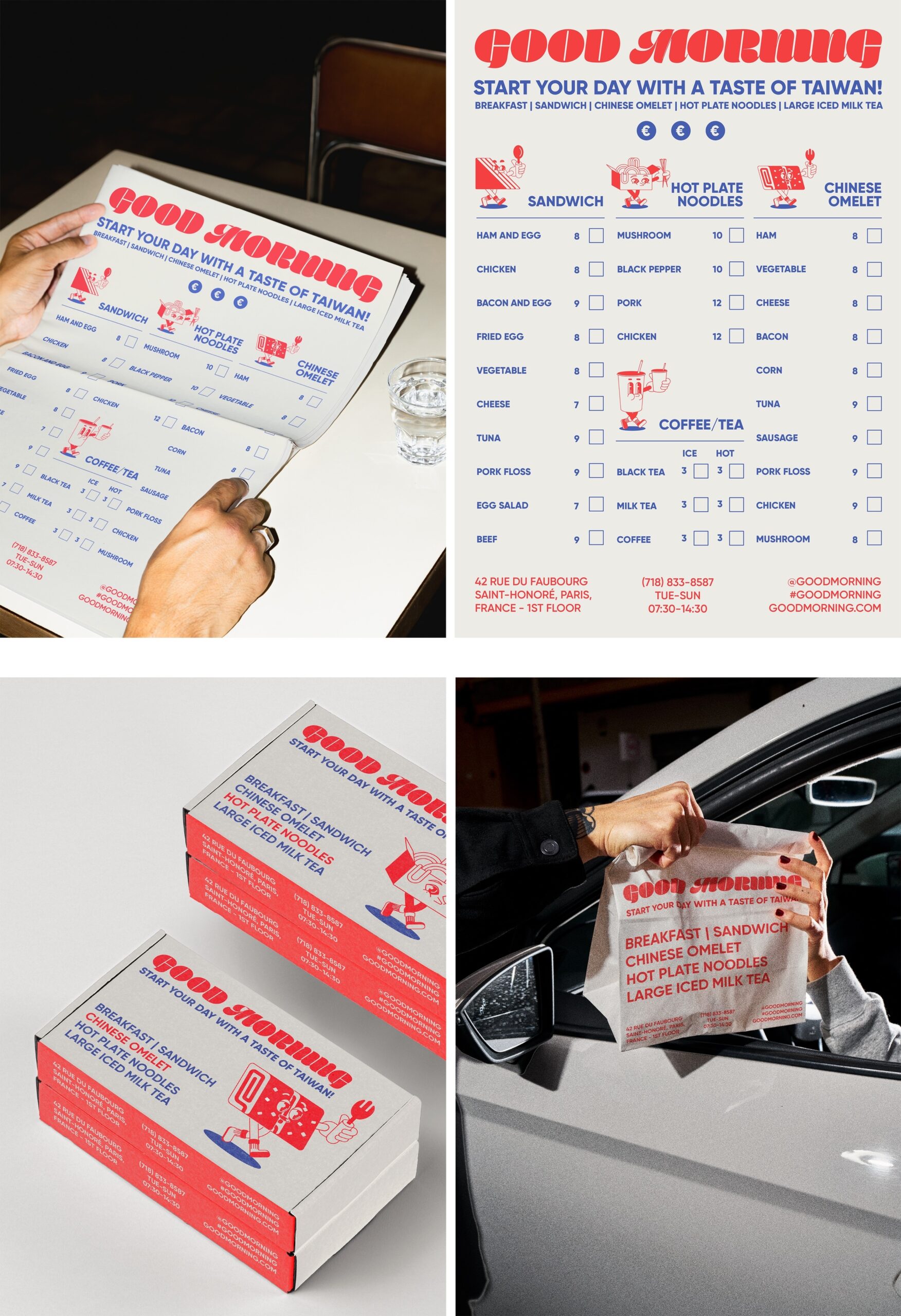
The menu isn’t just information. It’s the first step in the restaurant UX: it helps you decide, organizes products, and sets expectations. When the same language appears on menus, boxes, and delivery items, the experience feels seamless. There’s no disconnect between what the brand promises and what the customer touches.
Takeout has a huge advantage: every order becomes a brand touchpoint. A well-designed box travels—showing up on tables, in offices, in stories, bags, and hands. If the packaging is distinctive enough, every delivery also works as a visual reminder.
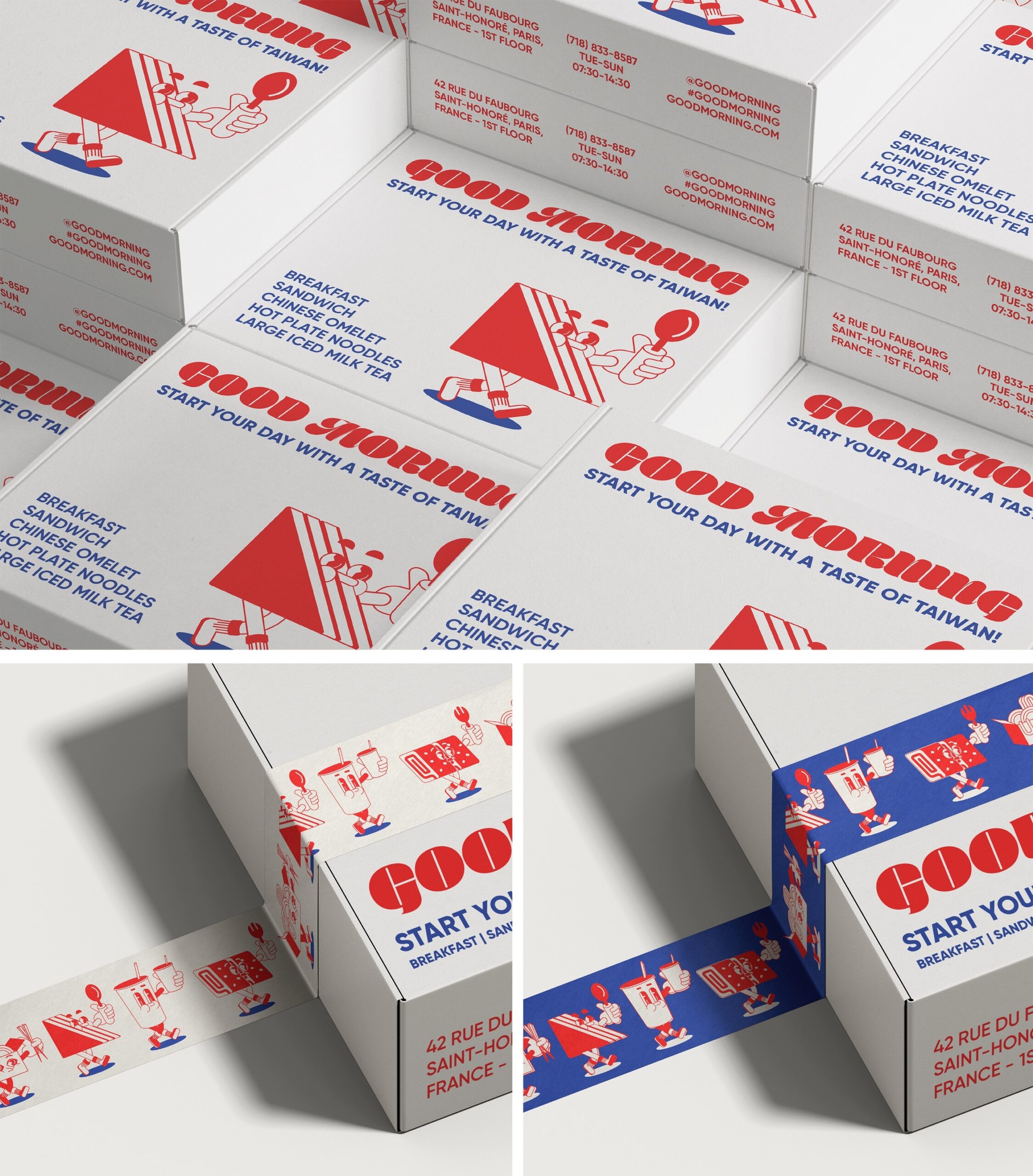
The boxes are easy to read because they don’t rely on a perfect front face. The identity wraps the object, repeats on the edges, appears in layers, creates rhythm. It might seem like a graphic design detail, but it’s good for business: the more recognizable the packaging from every angle, the easier it is for the brand to be remembered and shared.
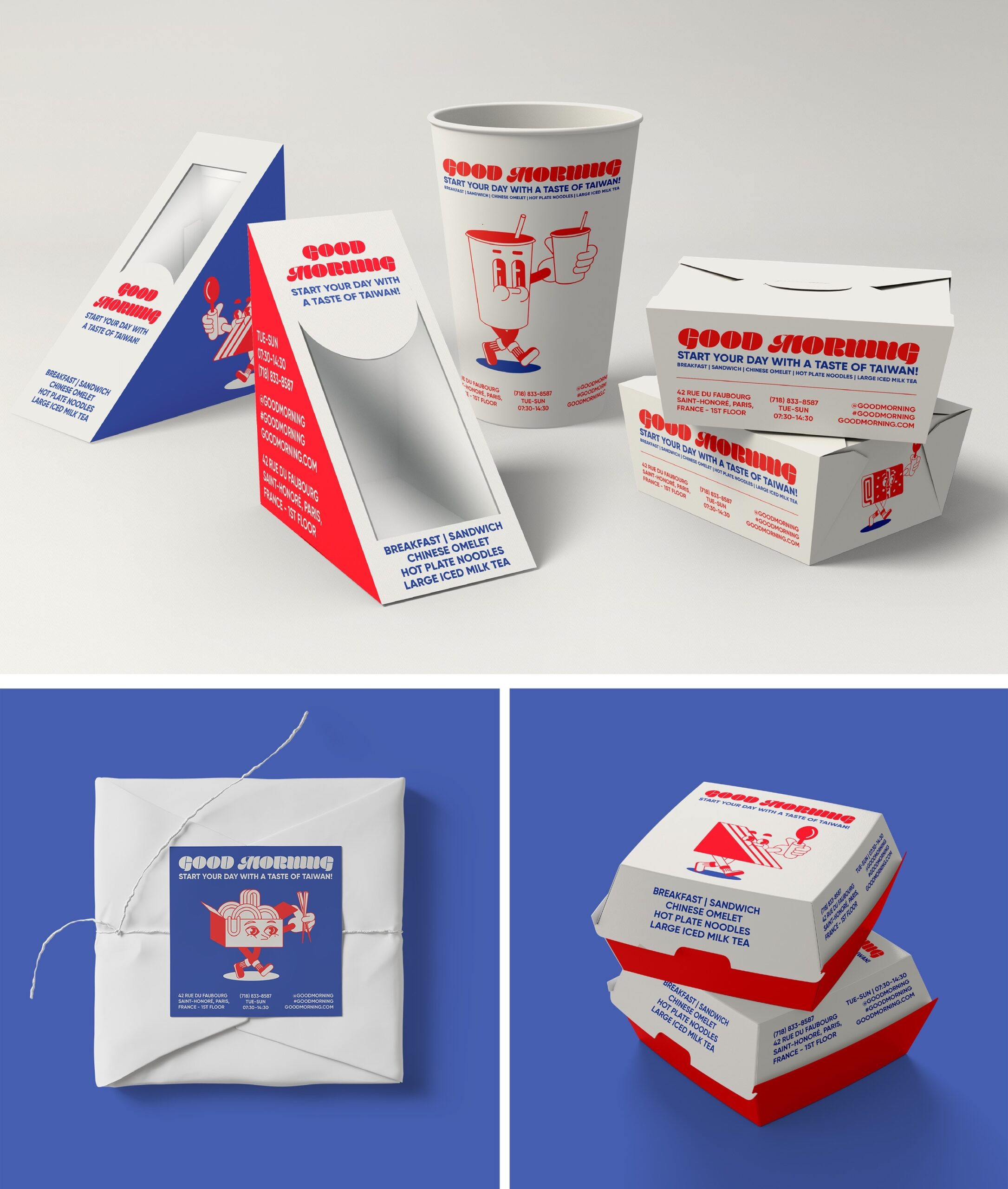
The set of cups, bags, and boxes proves this isn’t a one-shot identity built for a single hero image. There’s a system. And with a system, a brand can grow: open more locations, launch new products, run campaigns, sell merchandise, or boost its online presence without reinventing itself for every channel.
The limited palette is a huge asset. Red, blue, and white allow for variety without chaos. It’s a practical, smart decision: enough character to stand out, enough restraint to stay coherent. In hospitality, that consistency builds trust even before the first taste.
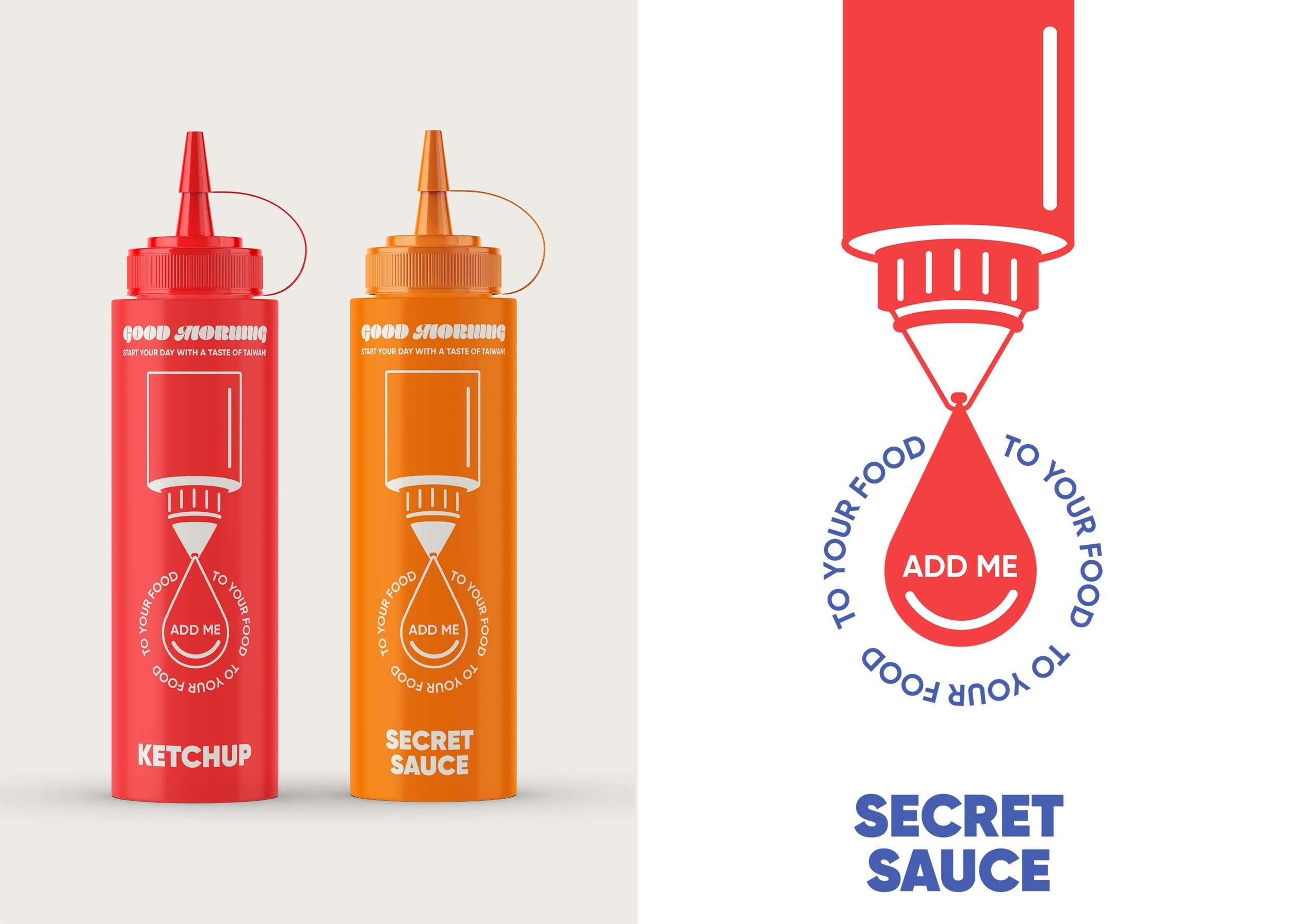
Condiments are a small but intentional detail. When the identity extends to a ketchup bottle or a house sauce, the brand stops feeling like “just a place with nice design” and starts to feel like an ecosystem. That kind of extension elevates perceived value by signaling care, consistency, and a more considered experience.
There’s also an interesting angle for ecommerce and delivery. Online, customers decide with incomplete information: photos, names, reviews, price. If the identity already communicates appetite, order, and personality, it reduces friction. Not because design sells by itself, but because it makes the brand feel clearer, more reliable, and more desirable.
A reference for brands that want to be remembered
Good Morning leaves us with a simple idea: a strong identity isn’t just about the logo. It’s about how it repeats, adapts, touches the product, and shows up in small moments. Visual memory is built through smart repetition, not just one brilliant piece.
For marketing directors, founders, or creative teams, the lesson is actionable: if your brand has personality but every channel speaks a different language, you lose value. If the packaging goes one way, the menu another, and digital communication yet another, customers perceive less solidity. Consistency doesn’t kill character—it makes it more recognizable.
This is a reference that combines visual delight with structure. It has color, humor, composition, and atmosphere, but also a system that supports the business. The result isn’t just a more expressive brand: it’s a brand that’s easier to spot, easier to remember, and more ready to sell with confidence.
In the end, great restaurant branding isn’t just about looking appetizing. It’s about turning every touchpoint—poster, box, menu, bag, product—into a small proof of identity. And when all those pieces push in the same direction, the brand leaves a lasting mark.