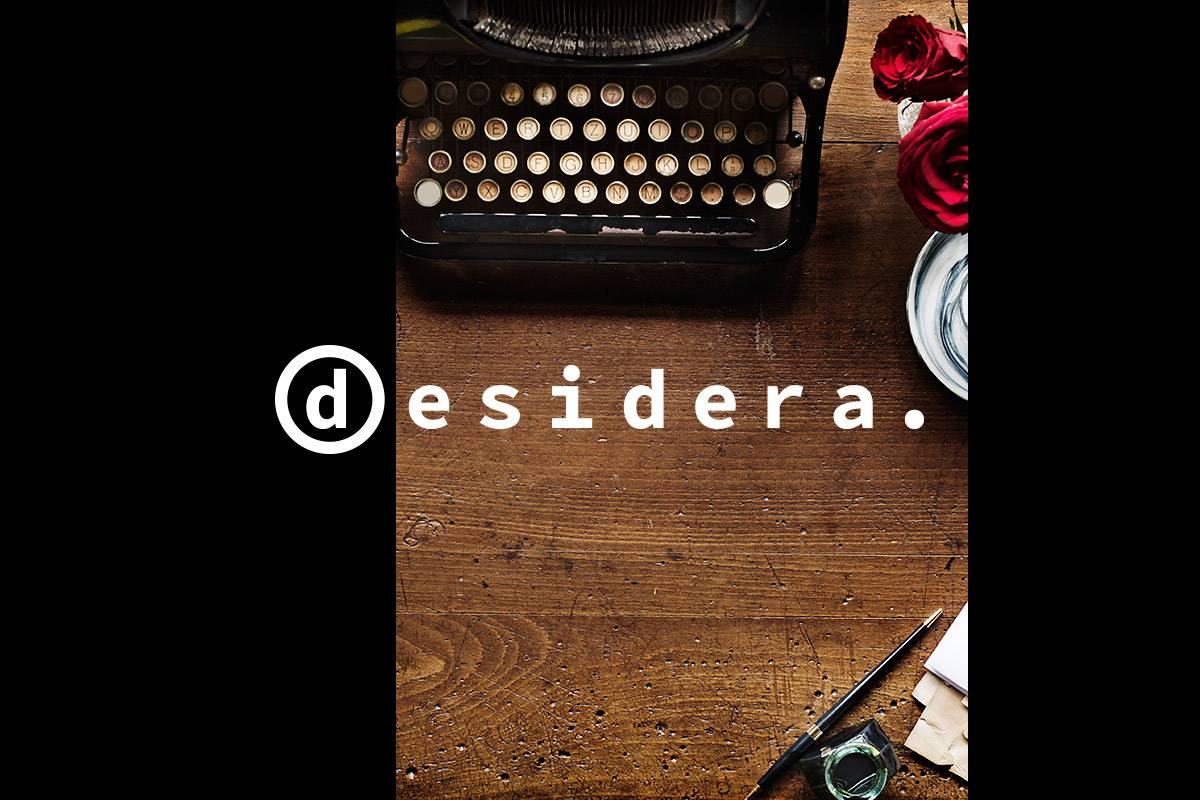
Logo design for a Barcelona-based publishing company. The project creates a brand identity that blends classic editorial references with a contemporary approach, striking a balance between tradition and modernity.
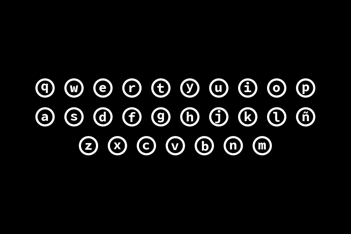
The brand draws on elements associated with writing, featuring the initial “d” enclosed in a circle as a nod to typewriter keys. The period at the end reinforces the sense of closure and structure inherent to a written text.
The chosen typeface draws inspiration from console fonts, reminiscent of early digital environments. This approach positions the brand identity at the intersection of analog and technology.
The result is a brand with character, able to stand out without relying on excessive elements. Its clean, simple design ensures versatility across a wide range of editorial formats.
We review your current situation and define the next step.
Contact now
We analyse your context, objectives and digital presence. We define the architecture and key priorities before design begins.
We create the visual identity and organise the content—always focusing on clarity, consistency and an optimal user experience.
We implement the project to high standards of performance and stability and, where needed, ensure integration with other systems.
We continuously monitor, optimise and improve your digital project to support its growth alongside your business.
We will review your current digital situation. We will get in touch to understand your context and jointly assess which areas to analyze, after which we will prepare an audit including key findings and recommendations.