Corporate identity design for Adalia, a company specializing in integrated pest management using natural, environmentally friendly methods. The project develops a visual system that conveys ecological balance, control, and sustainability, in line with their technical and environmental approach.
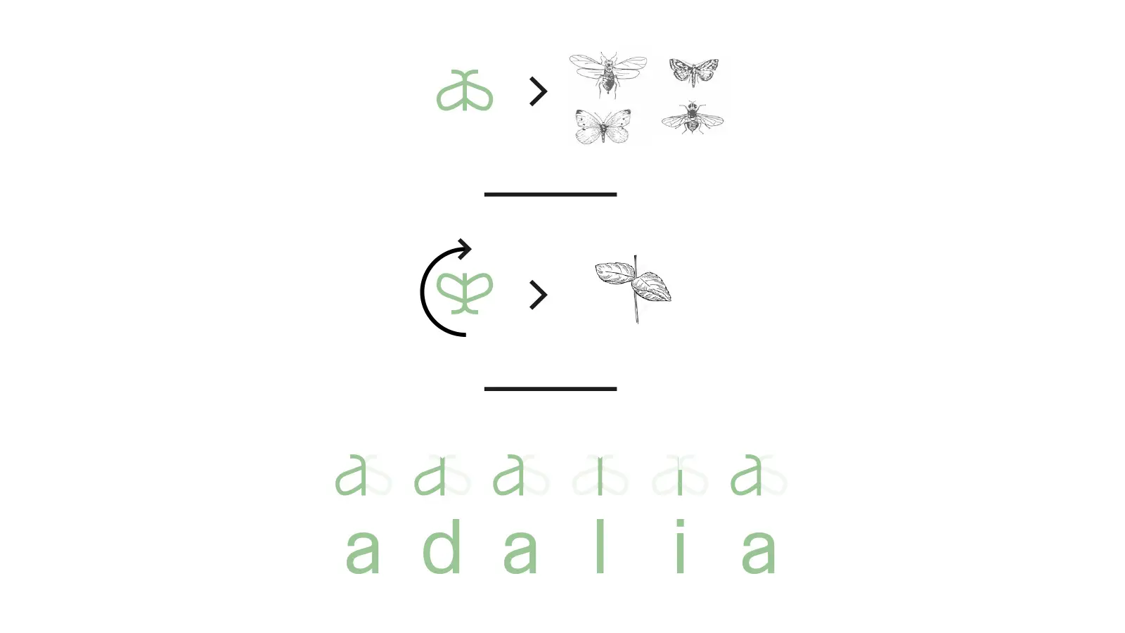
The logo is designed for dual interpretation: in its original orientation, it evokes the shape of an insect, while rotating it 180º reveals the outline of a plant. This duality encapsulates the connection between biological control and natural balance.
The symbol is crafted from the very letters that make up the name “adalia”, creating a cohesive system between the brand and its visual representation. This integration strengthens the identity and adds an extra conceptual layer.
The use of simple shapes and a soft color palette conveys approachability, respect for the environment, and technical precision. This identity clearly communicates the company’s positioning within a sector that is increasingly focused on sustainable solutions.
We assess your current situation and outline the next steps.
Contact now
We assess your company’s context, objectives, and digital presence. Before starting the design phase, we define the core architecture and set key priorities.
We craft your visual identity and structure your content, always prioritizing clarity, consistency, and an outstanding user experience.
We implement your project to the highest standards of performance and stability, ensuring seamless integration with other systems whenever required.
We continuously monitor, optimize, and enhance your digital project to drive its growth alongside your business.
We will review your current digital situation. We will get in touch to understand your context and jointly assess which areas to analyze, after which we will prepare an audit including key findings and recommendations.