Gurrowa Place makes its mark where most place identities hesitate: through appetite, street life, human gestures, and a color palette that refuses to blend in.
Its strength isn’t just a well-crafted graphic system. It’s about transforming an urban project into a scene with its own atmosphere. Photography, illustration, typography, and color all work together as if part of the same conversation—approachable, cultural, a touch festive, and instantly recognizable.
For brands connected to place, hospitality, retail, real estate, or community, there’s a valuable insight here: when visual direction has personality and discernment, perceived value emerges before a single word is spoken. The sense of place comes first. Everything else follows.
Gurrowa Place — a visual story with warmth and memory
Gurrowa Place’s introduction works because it sidesteps the cold language of urban development. Instead of leading with architecture, renders, or institutional promises, it grounds itself in the everyday: food, a table, wine, shared plates. On this foundation, the name appears in bold, vibrant yellow—large, curved, almost ceremonial.
That move shifts the entire tone. The brand isn’t just a logo stamped on a photo; it’s a voice that fills the scene. The typography feels warm, imperfect, human. It doesn’t aim to look premium from afar—it wants to feel alive up close.
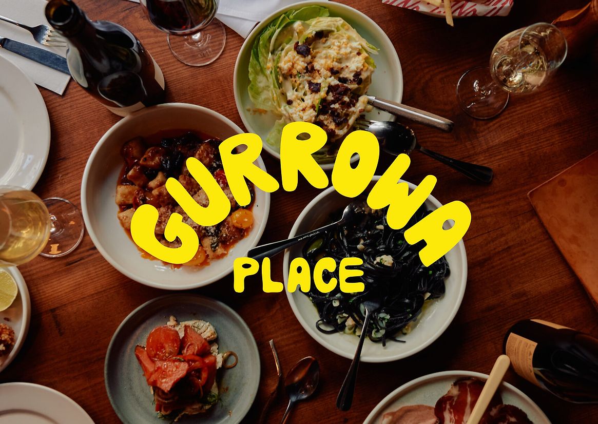
The composition has an editorial quality: a textured, abundant, top-down view with visual rhythm. The yellow doesn’t ask permission. It cuts across the image, organizes the noise, and turns a familiar moment into a brand statement. For a brand, that kind of association is gold: food, gathering, place, name. Everything connects in seconds.
Then comes the illustrated system, adding depth to the identity. Characters, symbols, gestures, urban icons, cultural references, and graphic frames build a flexible language. It doesn’t feel like decorative elements tacked on at the end; it’s a visual grammar ready to tell countless stories without losing recognition.
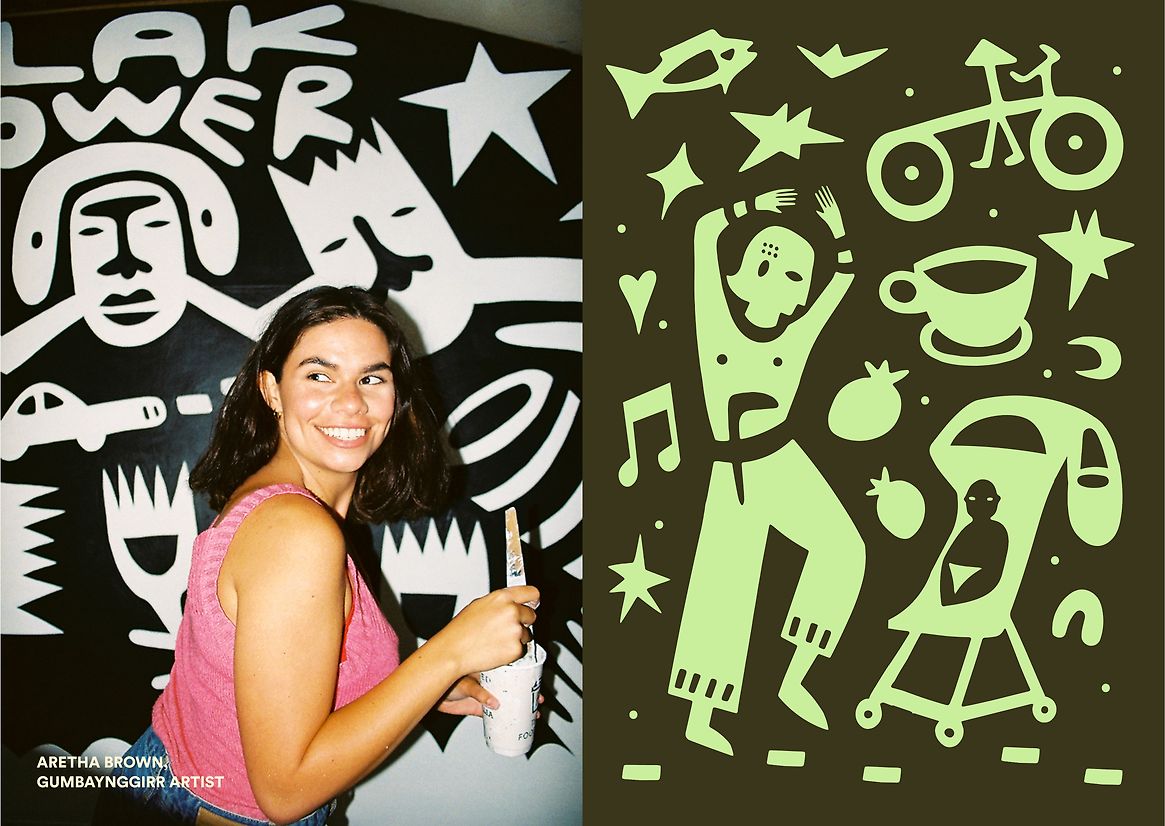
The balance between portraiture and graphics is especially strong. The identity doesn’t stay abstract: people, expressions, bodies, presence come through. It grounds the brand. Many large-scale identities feel flawless but distant; here, illustration opens the door to something more approachable, more shareable, less corporate.
The palette is intentional too. Oranges, olive greens, creams, yellows, and browns create a warm, almost tactile visual temperature. There’s no obsession with pristine white or aspirational neutrality. There’s substance. There’s texture. There’s a sense of place that translates to posters, walls, digital assets, or campaigns—without losing character.
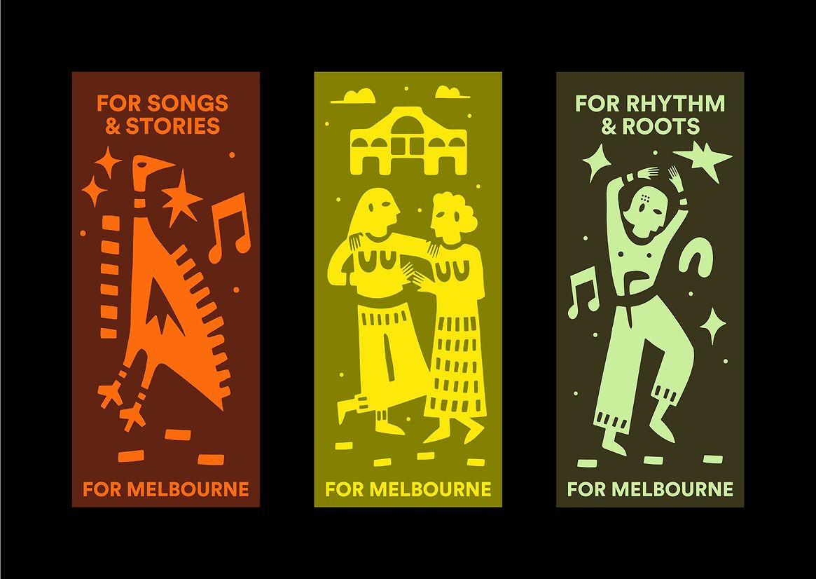
The poster series proves that graphic design doesn’t rely on a single hero image. Each piece has its own visual center, but all share the same pulse: bold typography, direct illustration, distinctive color, and a composition that owns the format. That flexibility is key for an identity that needs to live across many touchpoints.
From a light UX/UI perspective, there’s a useful lesson: hierarchy doesn’t have to be dry. Here, the main message leads—but with character. The eye knows where to go, even in a system full of detail. That kind of textured clarity is one of the hardest things to achieve in branding, campaigns, and editorial web design.
The street as a canvas for identity
Gurrowa Place becomes even more compelling when it leaves controlled environments and enters public space. That’s where many brands lose impact: what looked great in a clean presentation fades on a wall, a fence, or in a visually noisy setting. Here, the opposite happens. The scale works in its favor.
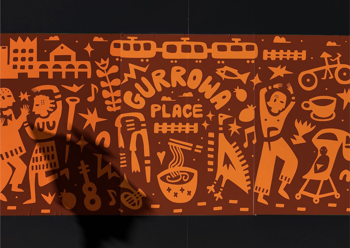
The orange mural has the energy of a street poster: direct, visible, packed with symbols, and the brand name woven into the system. The repetition doesn’t feel mechanical because the forms have expression. There’s visual rhythm, but no template. There’s composition, but no rigidity.
This kind of identity understands a core principle of place branding: a place brand can’t live only in a style guide. It has to behave like part of the landscape. It must withstand distance, movement, distraction, and context. If it’s recognizable from afar and discoverable up close, it starts to build trust.
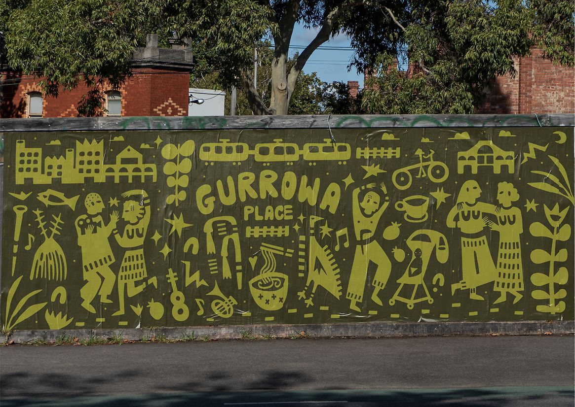
The green fence is another standout moment. The identity stretches horizontally, spans meters, and accompanies the journey. The pattern isn’t just decorative background—it’s a narrative surface. For someone walking by, there’s no need to grasp every detail; it’s enough to sense a recognizable voice behind it.
That’s a point many brands underestimate. Consistency isn’t about repeating the logo ad nauseam. It’s about building a language that can show up on different platforms and still feel like the same brand. Gurrowa Place succeeds because its system has elements simple enough to scale and expressive enough to avoid becoming generic.
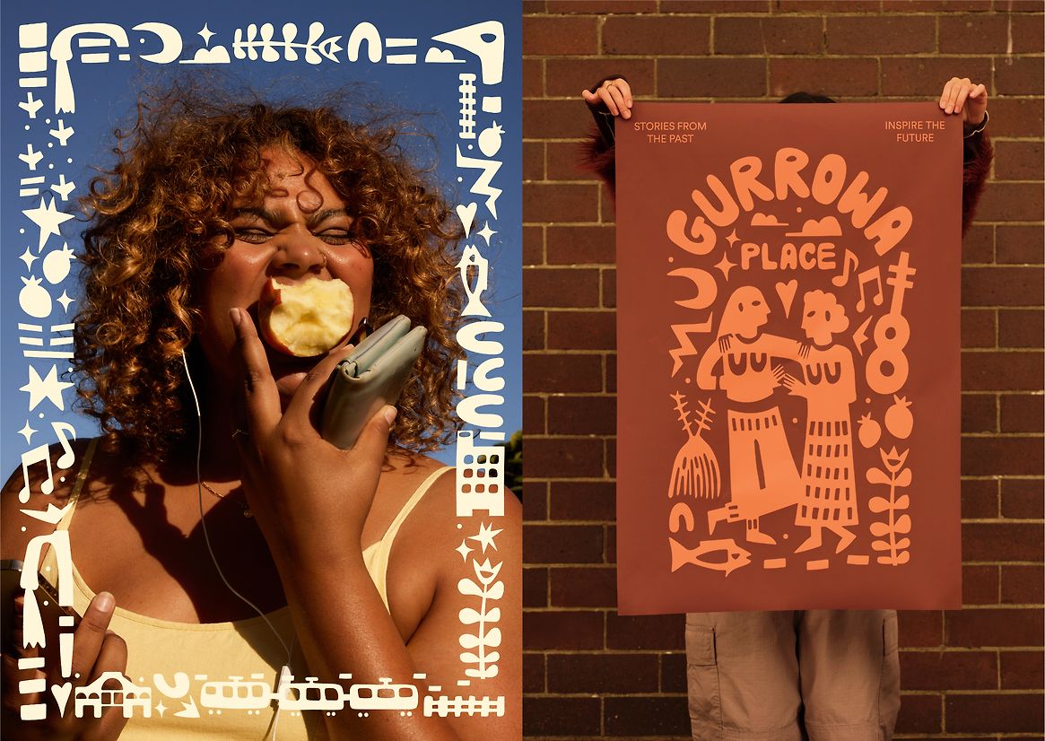
Portraits framed by illustration add a more human layer. The identity isn’t just about the place—it leaves room for those who inhabit, activate, or represent it. Visually, that ornamental frame is a powerful resource for campaigns, social content, and editorial pieces. It turns a photograph into a branded asset without overwhelming it.
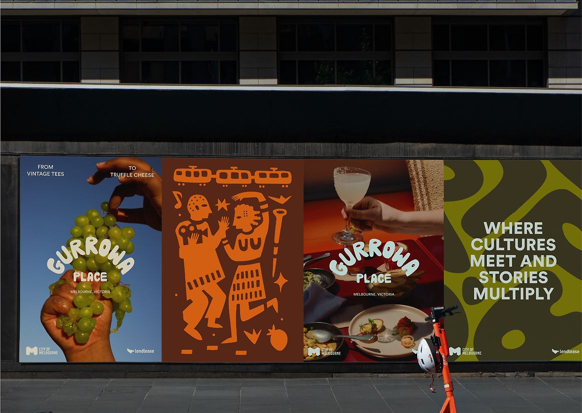
The poster wall delivers a simple, effective idea: the campaign doesn’t try to look like a standalone marketing piece. It blends into the environment. The brand adds layers to the neighborhood instead of covering it with generic messaging. That sense of care is tangible—and care sells far more than you might think.
A visual lesson for brands that want to make a mark
Gurrowa Place’s greatest strength is its ability to move seamlessly from physical to digital without losing its atmosphere. On a screen, a poster, a wall, or a social composition, the identity keeps the same DNA: warm color, standout typography, illustration with memory, and editorial composition.
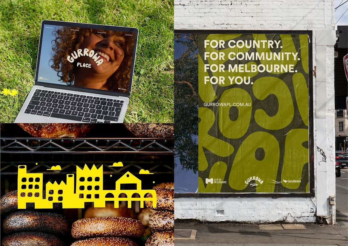
This kind of consistency is especially valuable for marketing teams. It doesn’t require reinventing every asset from scratch. The system allows for play, but always maintains a clear visual direction. That boosts efficiency, streamlines multichannel campaigns, and avoids the all-too-common feeling of a fragmented brand—one look on social, another on the web, another on the street.
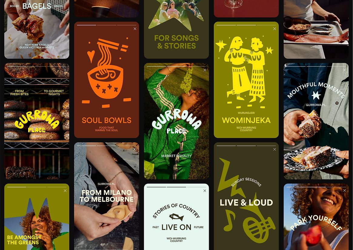
The social grid achieves what many brands seek but few manage: variety without losing cohesion. There’s photography, bold type, illustration, flat color, messaging. Yet everything breathes within the same universe. For digital content, that flexibility is crucial—it lets you publish with rhythm without sacrificing recognition.
The lesson isn’t to copy the illustrated style or fill a brand with icons. The lesson runs deeper: a memorable identity needs a visual point of view. Gurrowa Place doesn’t look like it was designed to politely please everyone. It looks like it belongs to a specific place, with a specific atmosphere and a specific story.
It also proves that personality and clarity aren’t mutually exclusive. The brand can be expressive and still legible. It can have texture and still function as a system. It can speak of community without falling into institutional tone. That mix is what elevates perceived value: we don’t just see thoughtful graphic design—we see a brand with a world of its own.
For digital projects, the takeaway is clear. A website, campaign, or visual identity gains strength when it doesn’t rely solely on pleasing aesthetics, but on a recognizable system: purposeful typography, a palette with character, rhythmic composition, and a narrative that connects product, culture, and experience.
Gurrowa Place leaves a lasting impression because it doesn’t shout for attention. It earns it by building a scene. And in design, that’s usually far more enduring than any passing trend.


