LUXEZONE doesn’t take the usual route when it comes to real estate branding. Instead of leading with square meters, renders, and sales pitches, it opens with something far more inviting: a place where you’re tempted to slow down. Greenery, shade, strolls, community. First, it sets the scene; the architecture comes later.
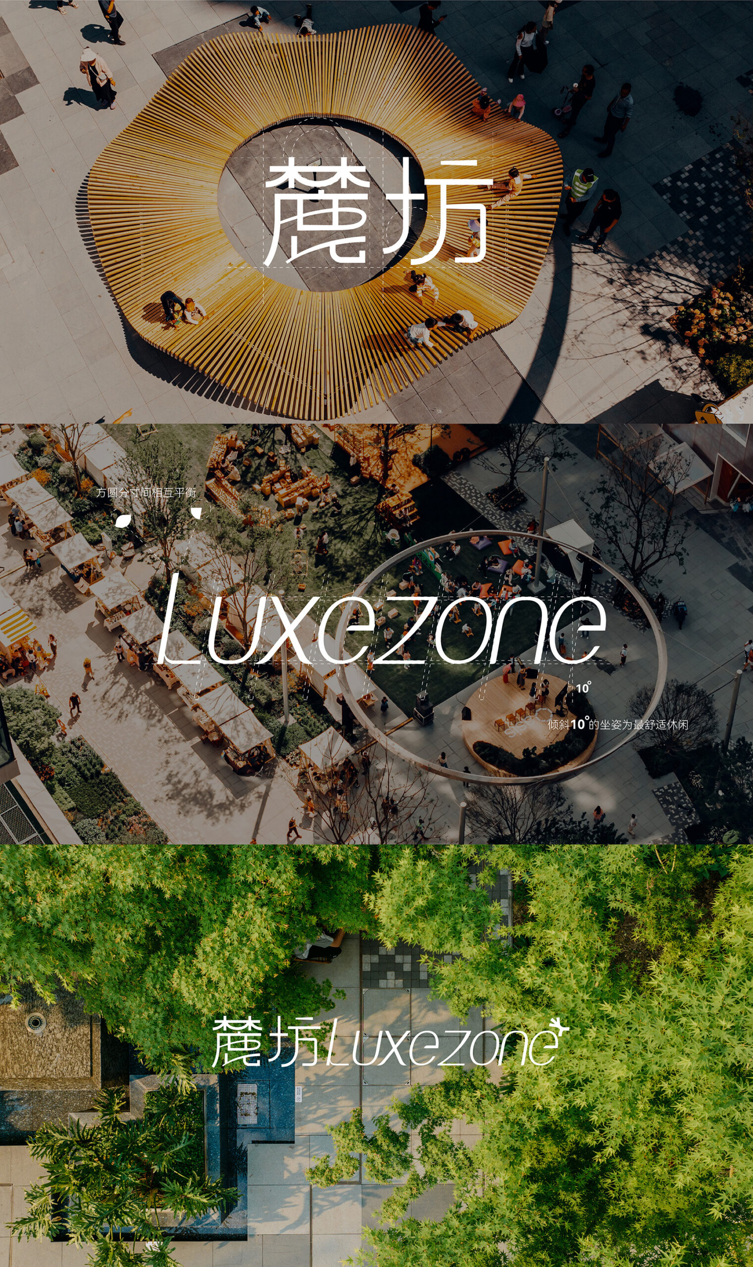
The identity works best when it’s seen as a landscape, not just a logo stamped on a development. The circular composition creates a welcoming center, the botanical color palette softens the commercial edge, and the light typeface adds a lifestyle touch without falling into generic postcard territory. There’s a clear visual direction, but also a business strategy: if the project feels lived-in before it’s even explained, its perceived value rises.
That’s the interesting move from LUXEZONE: building visual memory through atmosphere. It’s not just selling space; it’s selling a possible routine. And for a real estate brand, that difference is significant. Trust begins when a place stops feeling like an asset and starts feeling like a life you can picture yourself living.
LUXEZONE LOGO by CHENGDU TRY DESIGN Co., Ltd. — an identity with the flavor of landscape
The first impression is clear: LUXEZONE doesn’t want to look like a cold, closed-off, financial real estate development. It wants to feel like an urban escape. The symbol uses organic lines, branches, offshoots, and a subtle animal silhouette, as if the logo emerged from a walk in the park rather than a boardroom.
It’s a thoughtful approach. In real estate branding, “natural” often slips into mere decoration: generic leaves, predictable greens, icons with no visual memory. Here, the concept works because it becomes a system. Green isn’t just an accent; it shapes the atmosphere. The italic, slender typeface dials down the commercial intensity. The composition gives the elements room to breathe. Everything pushes toward a calm, aspirational, and distinctive identity.
There’s also a smart visual rhythm: alternating wide scenes with cleaner layouts. Aerial photography provides context, scale, and aspiration. White blocks introduce pauses, hierarchy, and a sense of considered branding. This mix keeps the project from becoming just another green postcard and instead brings it closer to an editorial brand board—with intent, narrative, and real-world applications.
Aerial photography is key because it turns the identity into a place. This isn’t a logo floating on a white background—it’s a brand tested directly on plazas, walkways, and gathering spaces. That integration builds credibility. For a real estate or commercial project, showing the identity within its environment helps the audience quickly grasp the kind of experience being offered.
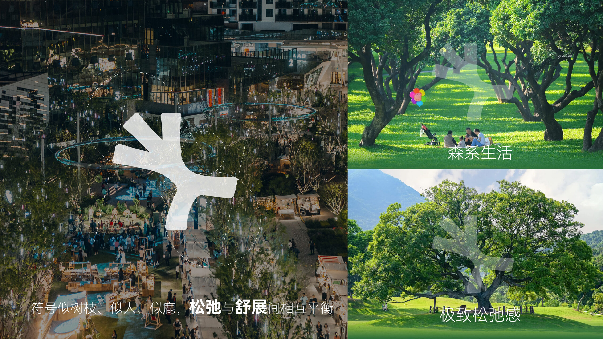
The visual direction is built on a beautiful tension: on one hand, a very clean, almost premium aesthetic; on the other, a warm narrative of dogs, people, trees, and everyday moments. This blend softens the aspirational message. It doesn’t feel like distant luxury, but rather an accessible, thoughtful lifestyle.
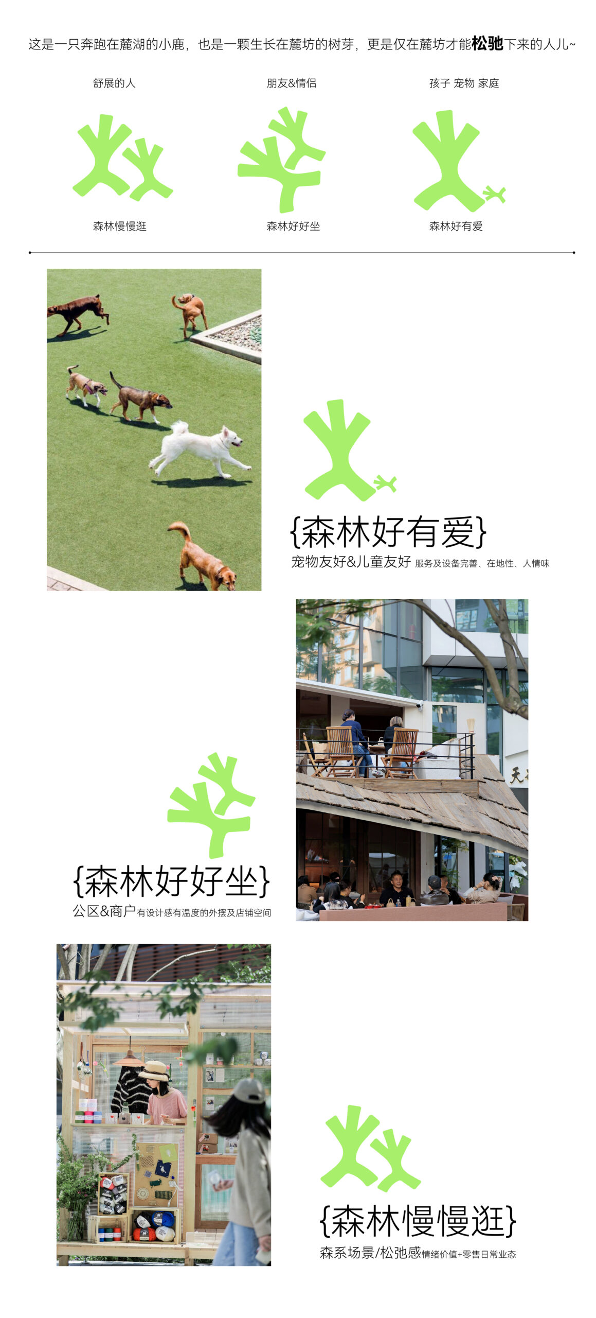
The community aspect adds a particularly valuable layer. Scenes with pets, green walkways, and people in everyday settings shift the brand’s focus from architecture to habits. In mixed-use projects, that transition matters: you’re not just selling a space, but a possible way of life.
The diagrammatic layer adds even more. Not by over-explaining, but by organizing the story without sacrificing aesthetics. Green icons, small photos, lines, and white blocks create an editorial UX/UI feel: there’s no dominant interaction, but a clear visual hierarchy that guides the reader naturally. The design isn’t just about looking good; it helps clarify who the project is for and what kind of experience it promises.
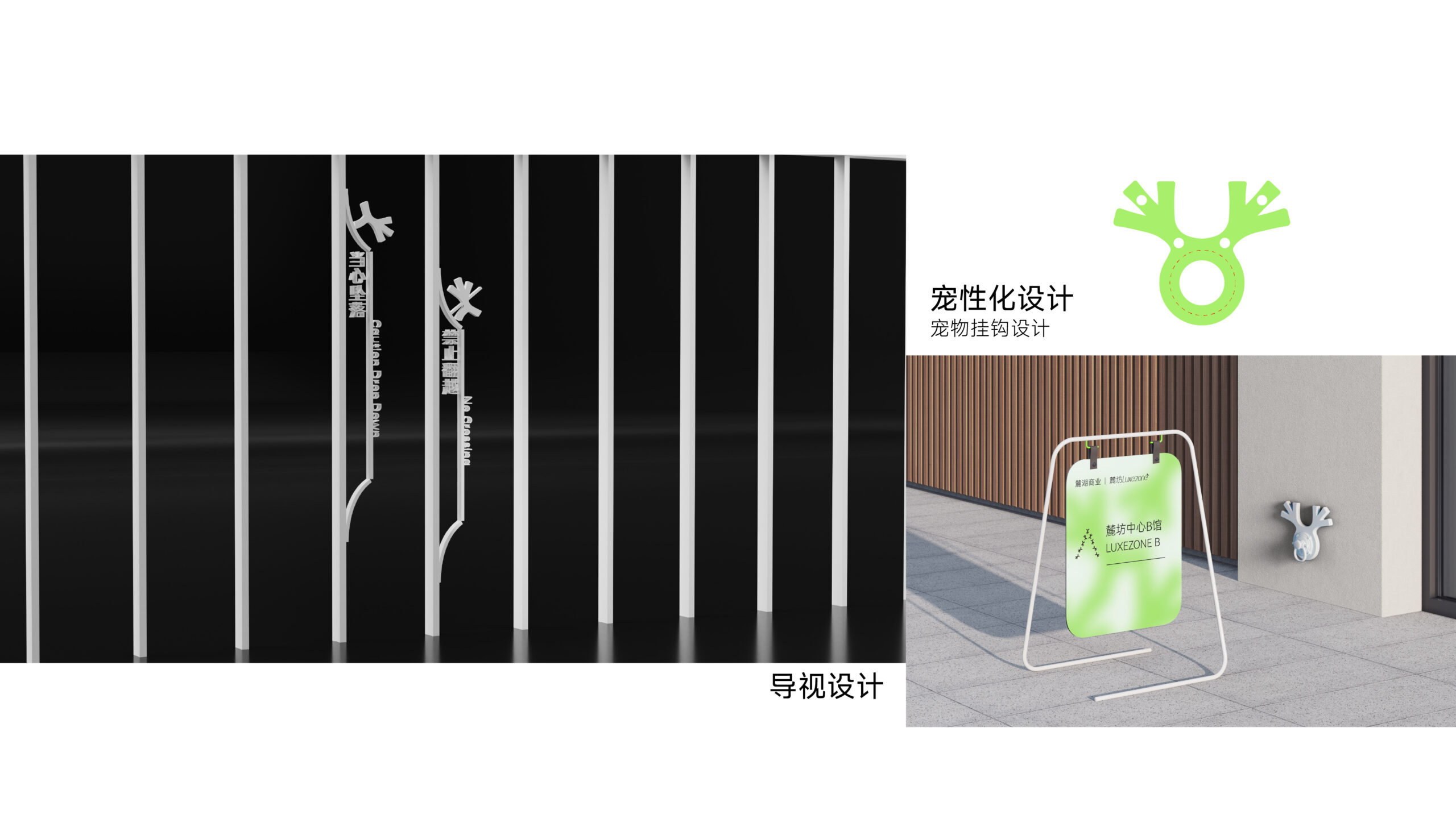
From logo to environment: signage, retail, and street
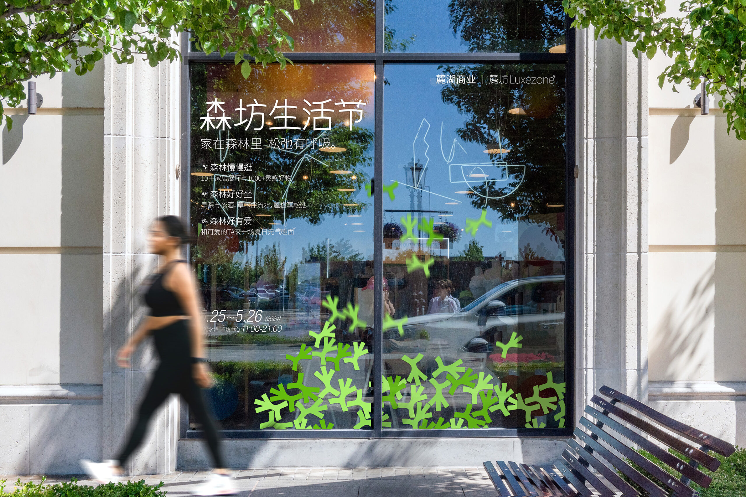
A real estate identity gains real strength when it leaves the drawing board. LUXEZONE does this with signage, totems, storefronts, banners, promotional displays, and mobile pieces. That’s where the system becomes truly operational: the brand no longer relies on a pretty layout—it lives in entrances, pathways, facades, and touchpoints.
Signage is one of the most interesting aspects because it transforms the identity into orientation. Users don’t just recognize a brand—they encounter it as they move through the space. In commercial, hospitality, or real estate environments, this spatial presence builds trust: if the brand is well integrated into the physical journey, the project feels more solid, more invested, and more cared for.
These applications strike a balance between contrast and calm. White, black, and green create a system that’s easy to recognize without relying on too many elements. The organic symbol acts as an accent and a visual navigation code. There’s no need to overload the design for it to feel cohesive and part of the same universe.
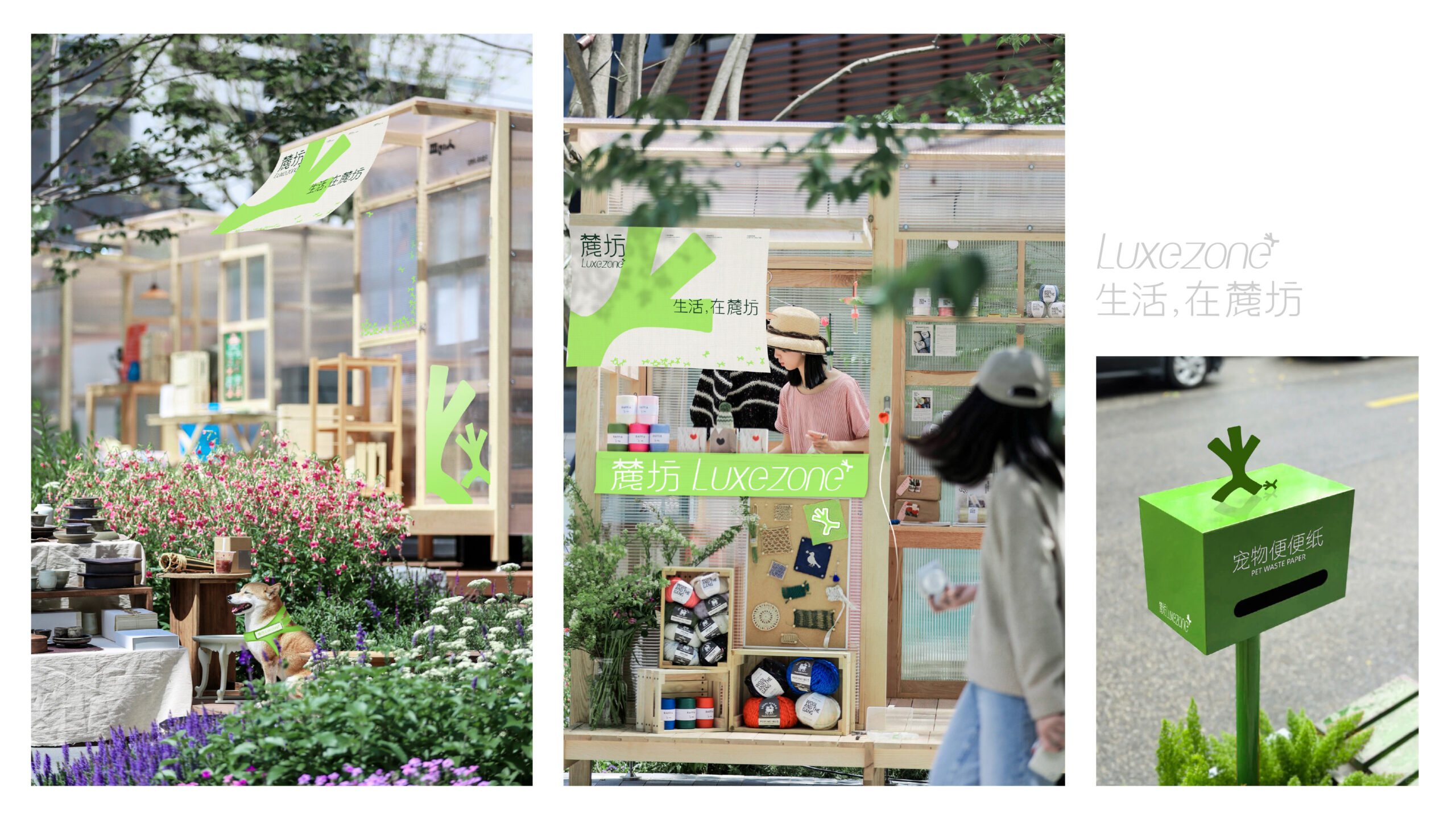
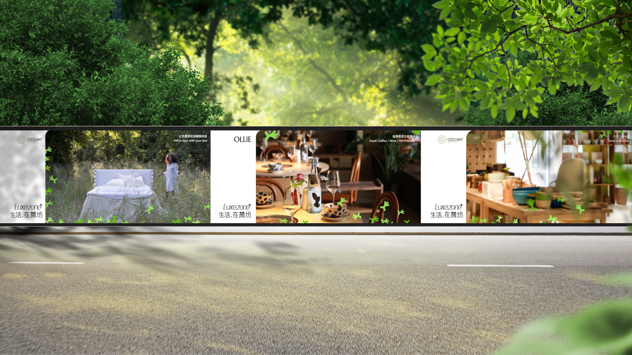
The storefront brings in a more commercial read without breaking the atmosphere. The identity naturally extends to shop windows, packaging, displays, and signage. This is valuable because it brings branding into activation: a place-based brand shouldn’t just look good in a presentation—it needs to support campaigns, events, sales, signage, and everyday interactions.
The recurring use of green prevents fragmentation across formats. It could have become monotonous, but the variety of scales keeps it lively: sometimes it’s a symbol, sometimes a visual mass, sometimes a botanical backdrop. That flexibility is what allows the identity to work across outdoor, retail, and communications touchpoints without feeling like a last-minute patchwork.
LUXEZONE feels at home on the street because the project is rooted in a landscape logic. Outdoor panels and displays don’t try to dominate the surroundings—they extend the sense of a stroll. That’s one of the most valuable lessons for real estate brands: when branding respects the atmosphere of a place, communication feels less like advertising and more like part of the experience.
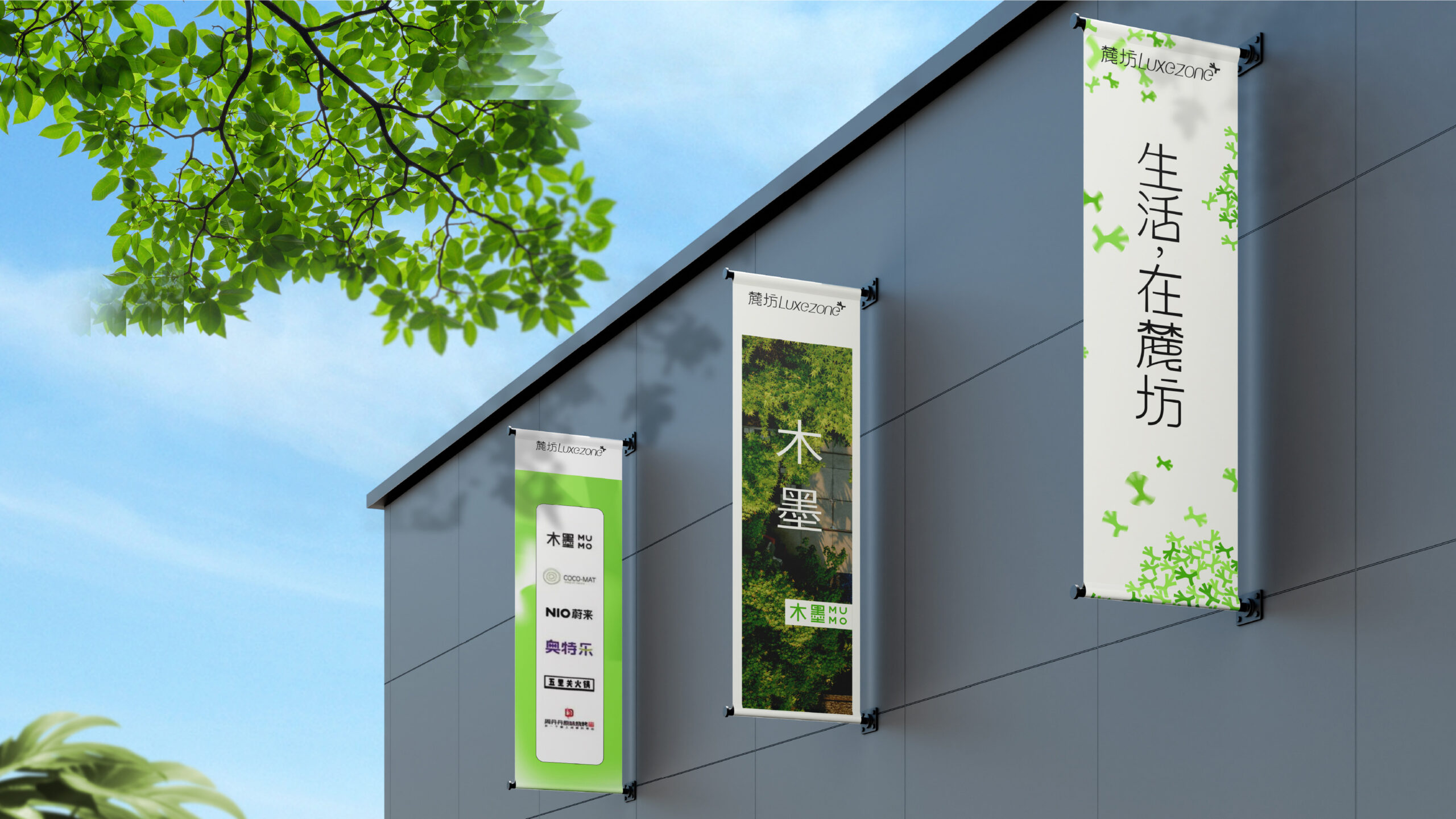
Vertical banners reinforce this sense of scale. The brand doesn’t lose legibility as it grows, nor does it become aggressive. It maintains its eco-lifestyle pulse with a carefully controlled language: nature, light typography, crisp contrast, and just the right presence. For a project that needs to be memorable from a distance, that combination is invaluable.
When presentation also creates desire
Some projects use presentation just to document. Here, the presentation entices. The layouts unfold like an editorial sequence: impact, pause, detail, application, context. This visual rhythm makes the case read almost like a brand campaign, not just a corporate identity handoff.
The mix of collage, aerial photography, infographics, and mockups adds depth to the system. Each element serves a distinct purpose: photography creates desire, diagrams organize, mockups ground the concept, signage demonstrates scale, and mobile pieces put the brand in your pocket. There’s no motion in the strict sense, but there is a sense of narrative movement: the identity travels from park to street, from poster to storefront, from physical space to digital format.
The mobile piece closes the loop perfectly. It doesn’t feel like a forced tech add-on, but a natural extension of the campaign. The same color, the same atmosphere, the same sense of community—all adapted to a quick-access format. For UX/UI, the lesson is simple: a strong visual system ensures every touchpoint feels like part of the same story, even as the format changes.
There’s also a compositional approach worth noting. The project uses plenty of visual density, but manages it with large blocks, white space, and clear hierarchies. This keeps the reading experience light and prevents the whole from becoming overwhelming. In real estate branding, where there’s often too much information to convey, knowing how to pace things is almost as important as having a strong identity.
LUXEZONE’s value lies in understanding that a place-based brand isn’t built on a symbol alone. It’s built on visual memory, consistent applications, photographic tone, spatial presence, and subtle interactive gestures. All of this adds up to a perception: this is a project with a world of its own.
The takeaway is both simple and powerful: selling better starts with looking better—but not in a superficial sense. Looking better means aligning identity, atmosphere, journey, and communication so that the proposition feels desirable before any arguments are made. LUXEZONE achieves this by turning branding into ambiance, not just decoration.
For marketing teams, founders, or real estate brands seeking inspiration, the message is clear: when real estate branding is conceived as a living system—capable of spanning street, retail, signage, and digital—trust grows. And with it, so does perceived value.