Tresmares Capital makes its entrance with a confidence rarely seen in the financial sector. There’s no need to crowd the interface with messages about trust, stability, or experience—the design itself does the talking. Generous white space, bold typography, red accents for tension, and a structure that makes complex services feel much more approachable.
The site commands presence without being overbearing. Every section is carefully measured to maintain a sense of control: data is woven into the design, animations guide rather than distract, and the hierarchy steers clear of endless corporate presentations. The result strikes a balance between institutional and editorial, with enough personality to stand out from the sea of lookalike investment firms.
That’s what makes this reference so compelling. It doesn’t try to disguise finance as something else; it presents it with visual precision. When a B2B brand aligns strategy, interface, and motion, complexity feels lighter and perceived value starts building even before you dive into the details.
Tresmares Capital — finance with editorial flair and a red edge
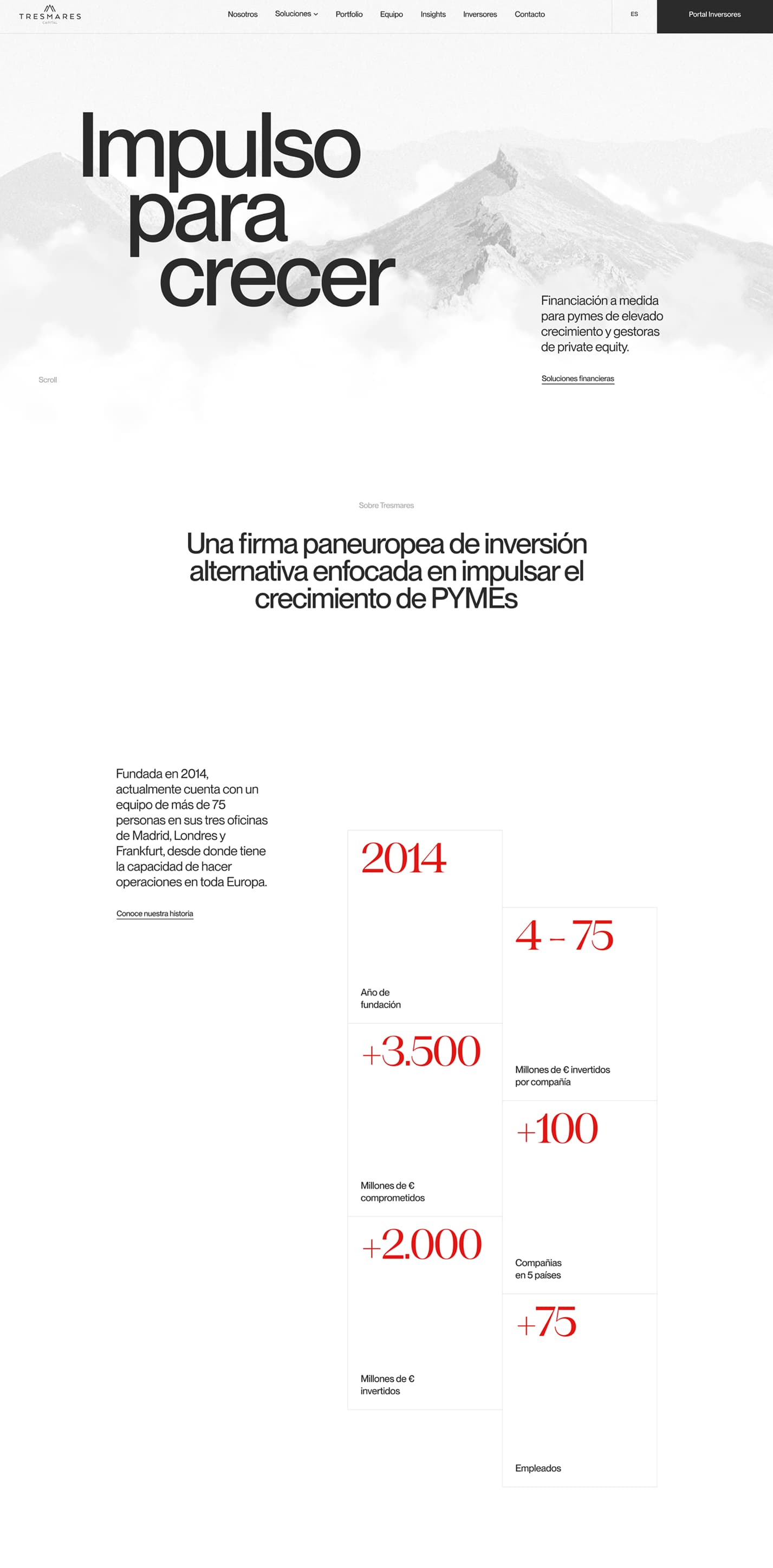
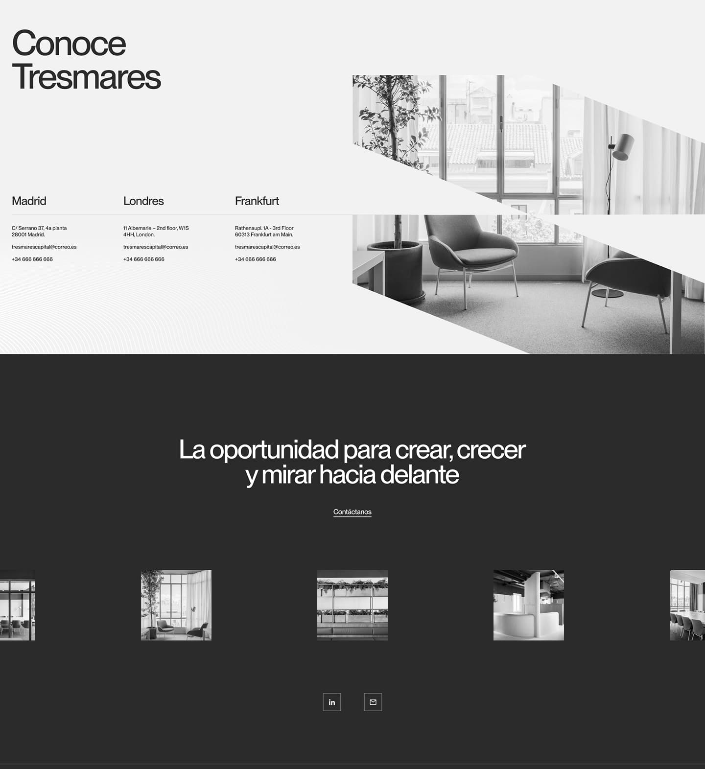
The first impression is one of calm: a light background, restrained palette, and plenty of breathing room around each element. But tension quickly emerges—red blocks, black lines, shapes cutting across the layout, and a no-nonsense typeface that commands the screen without embellishment. This interplay of quiet and graphic gesture gives the site its character.
A beginning with scale and landscape
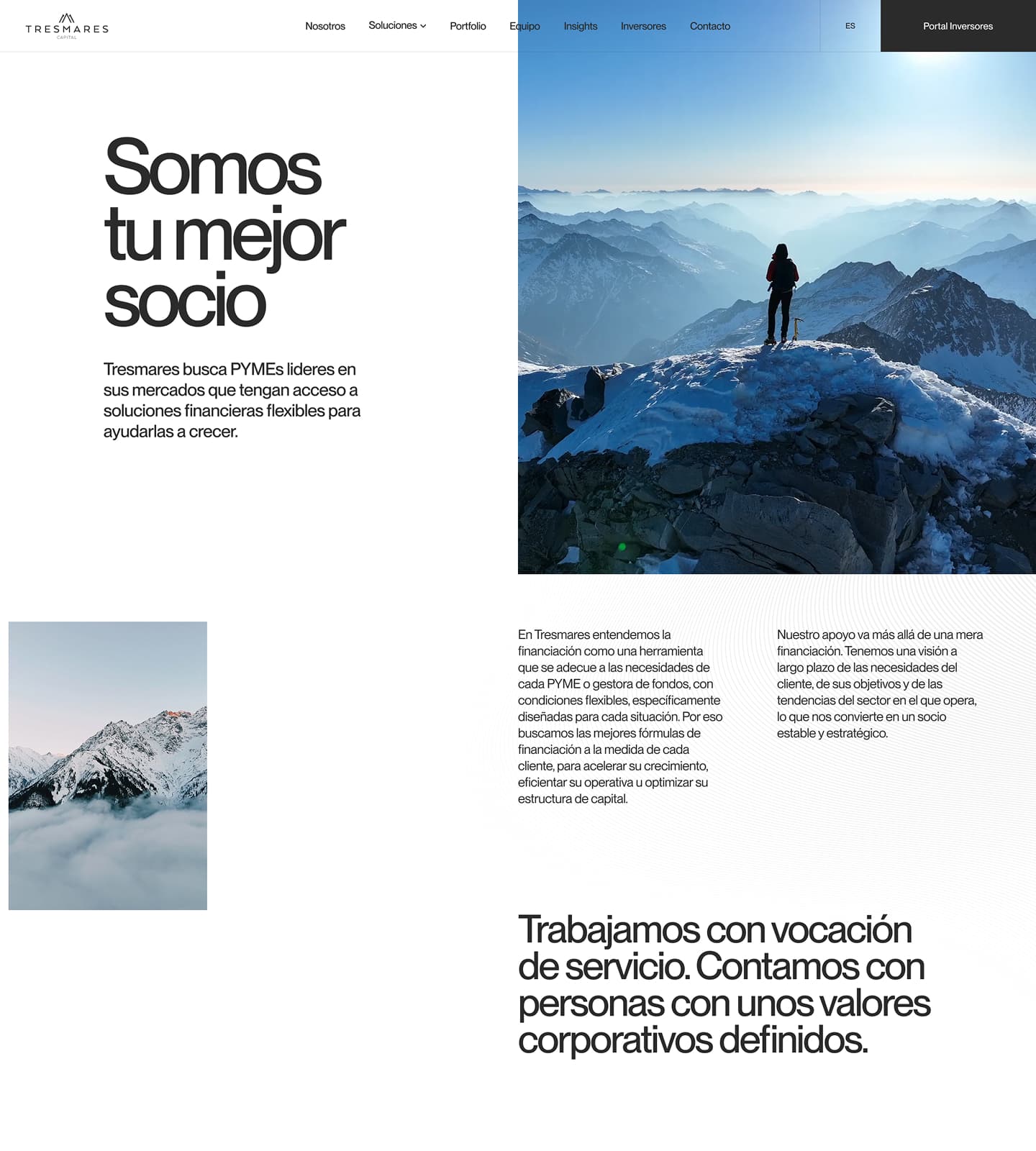
The use of landscape works because it avoids the easy metaphor. The mountain isn’t a motivational postcard—it’s a backdrop for scale: depth, horizon, journey. For an investment brand, that feeling matters. It speaks to perspective, growth, and long-term vision without spelling it out in bold.
Motion is introduced with a calm cadence. It doesn’t rush or overwhelm the user. The headline has space to breathe, turning the first screen into a scene. Here, animation serves a clear purpose: to create presence. A financial firm’s digital entry gains perceived value when it feels like an experience with its own atmosphere, not just a service template.
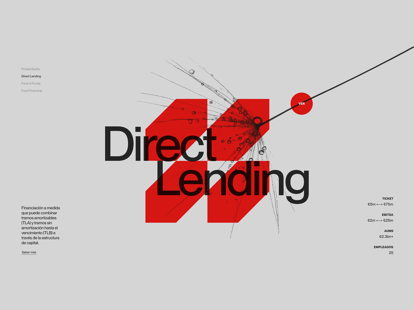
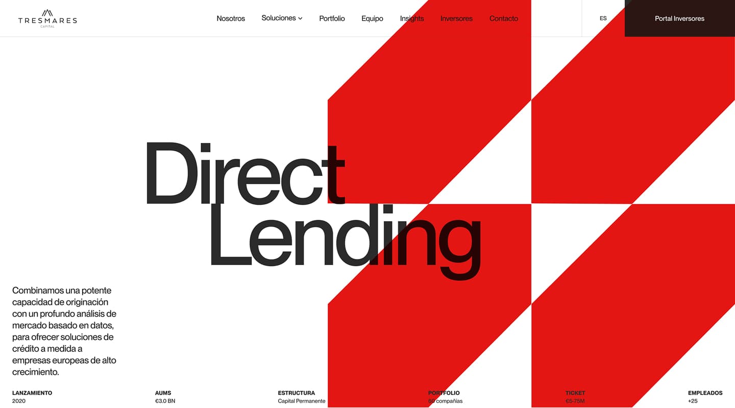
The Direct Lending module is perhaps the most rewarding to examine closely. Typography takes center stage, like a magazine cover. There’s no overreliance on icons, explanatory illustrations, or fragmented text blocks. The service name leads. And when the service leads visually, understanding improves—the user knows where they are before getting into the details.
The interplay of gray, black, and red creates a sharply defined identity. Gray cools and stabilizes. Black establishes hierarchy. Red injects energy, focus, and a subtle visual tension that keeps things from feeling flat. This red isn’t decorative—it acts as a decisive accent. In a sector where most interfaces default to “safe” blue, this color choice sets the brand apart without sacrificing professionalism.
The layout has an almost architectural quality. Discreet navigation and supporting text on the left. A bold headline and graphic gesture in the center. Metrics to the right, reinforcing credibility. Nothing competes for attention. The screen works in layers: first identity, then service, then credibility. It’s a sequence that’s invaluable for any B2B brand needing to explain a lot without turning the interface into a wall of information.
Numbers play a key role, but they’re not presented as heavy-handed “trust us” blocks. They’re integrated into the visual rhythm—ticket size, EBITDA, assets, team: data that conveys operational scale and commercial context, but with a light graphic touch. Instead of looking like a table, they’re part of the visual direction. That shift changes perception: data stops being bureaucratic and starts signaling authority.
There’s also an interesting choice in the call-to-action button. It’s small, almost understated. It doesn’t break the elegance or force conversion with aggressive contrast. This restraint fits a premium experience—not everything needs to feel urgent. Still, there’s a practical lesson in balance: if a brand wants to generate leads aggressively, it’ll need more support. If the goal is to build trust and qualify interest, this subtlety can be an advantage.
Services that move as a visual system
The second wave of motion shifts the energy. Services stop feeling like a list and start behaving as a system. Large red shapes, fine lines, transitions between investment areas, a sense of mapping. It’s an elegant way to make something potentially dry—strategies, financial products, investment categories—navigable.
This kind of animation adds a valuable layer of light interaction. It doesn’t turn the experience into a game, but it does give it visual rhythm. The user doesn’t just read “Private Equity” or “Direct Lending”—they feel that each area has its own weight within a shared universe. This helps build visual memory, especially on sites with complex services where every page can otherwise blur together.
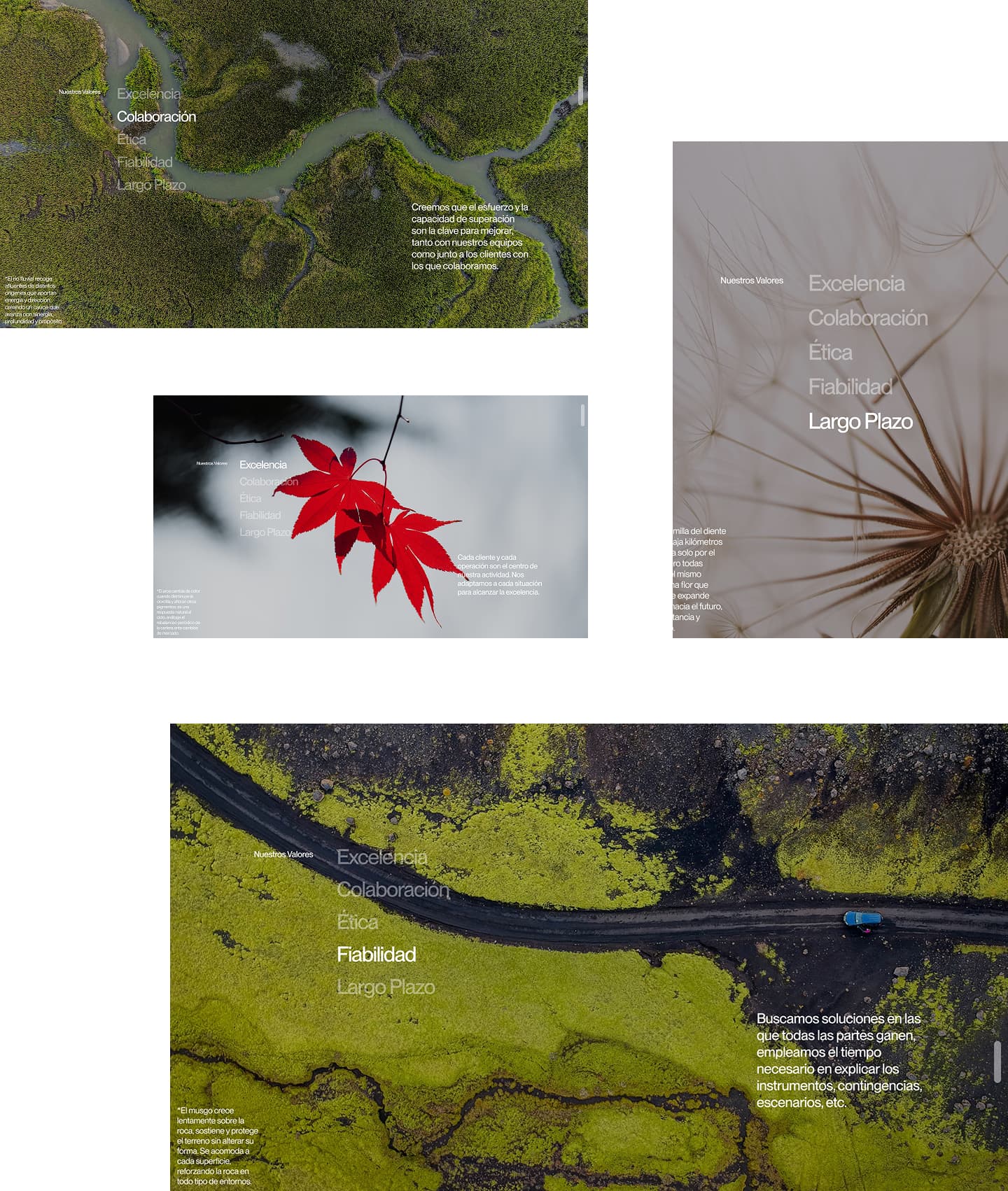
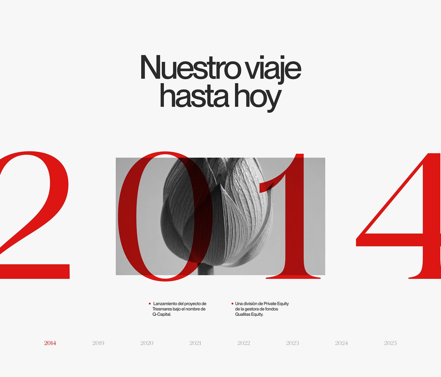
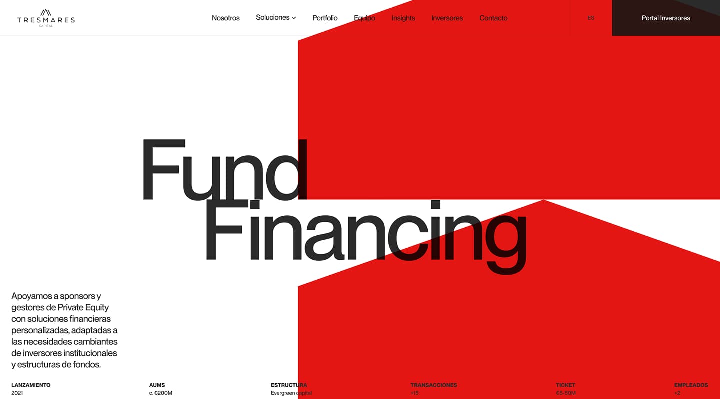
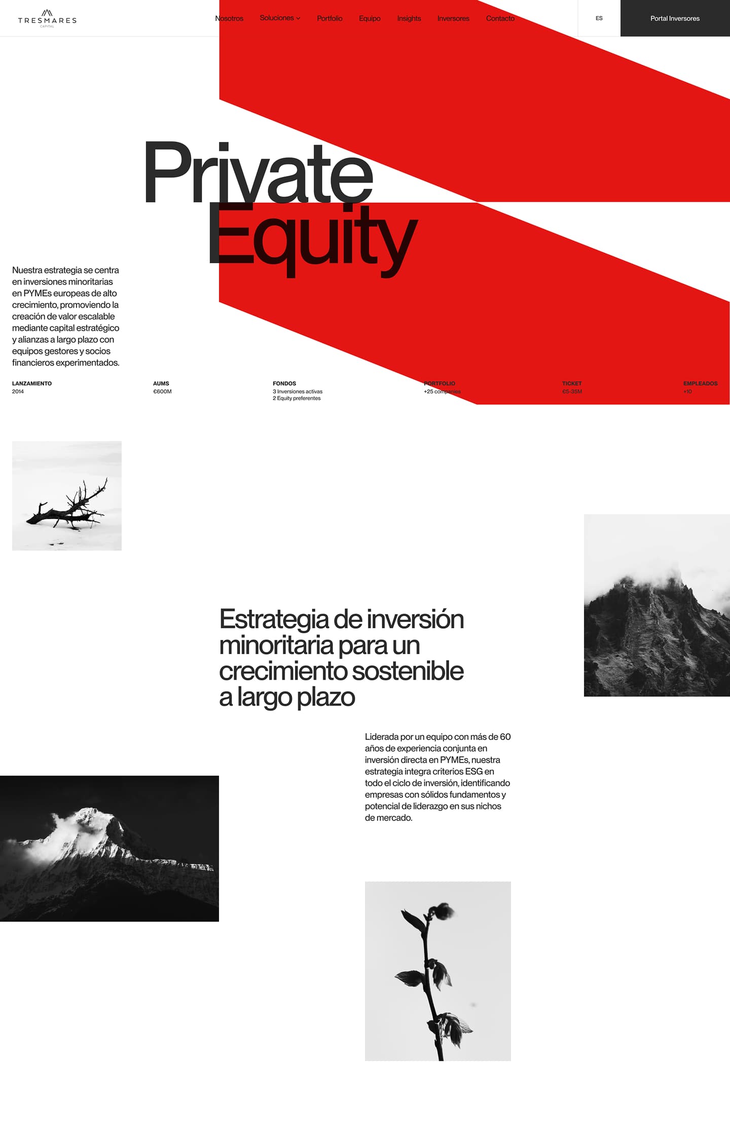
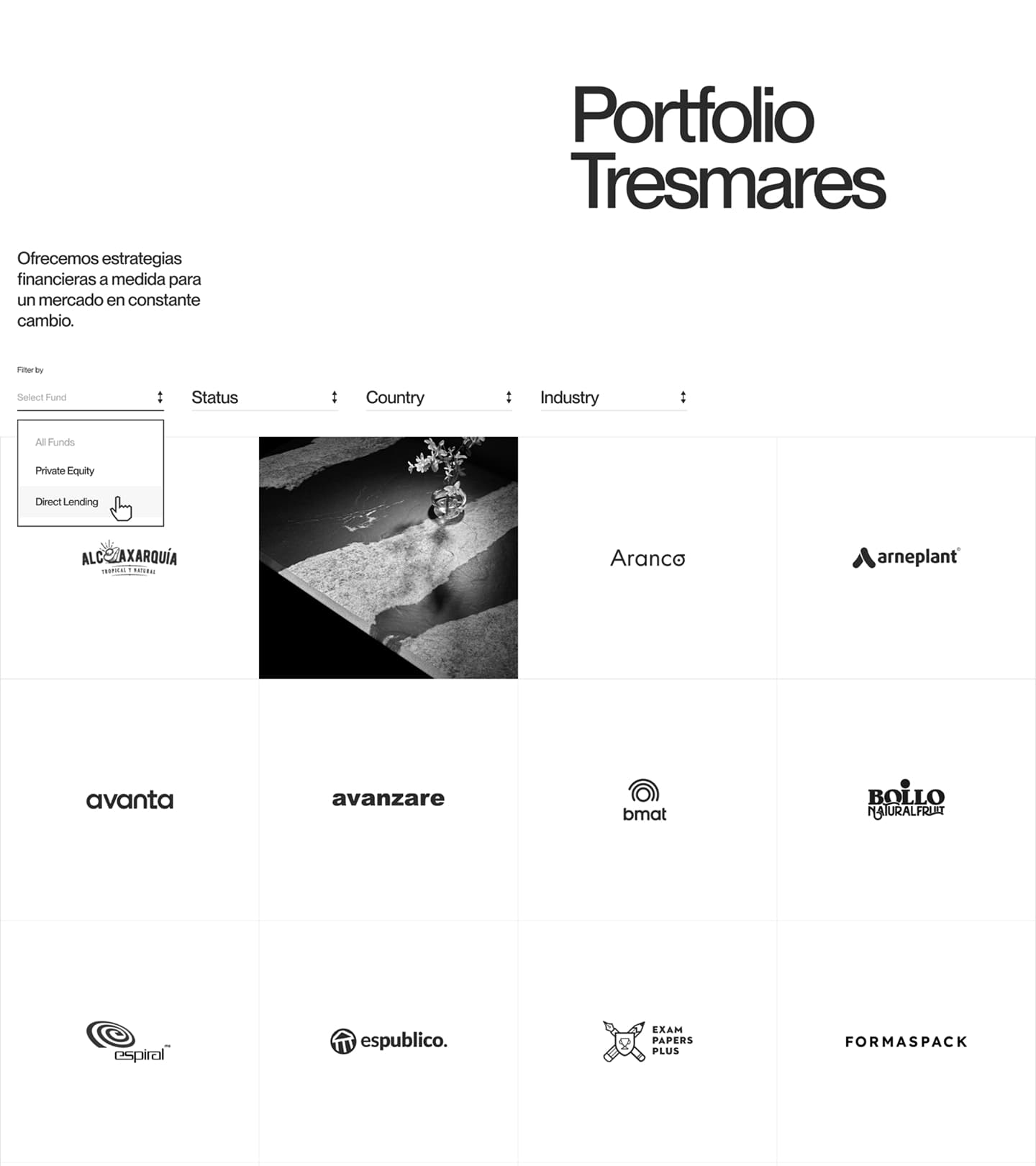
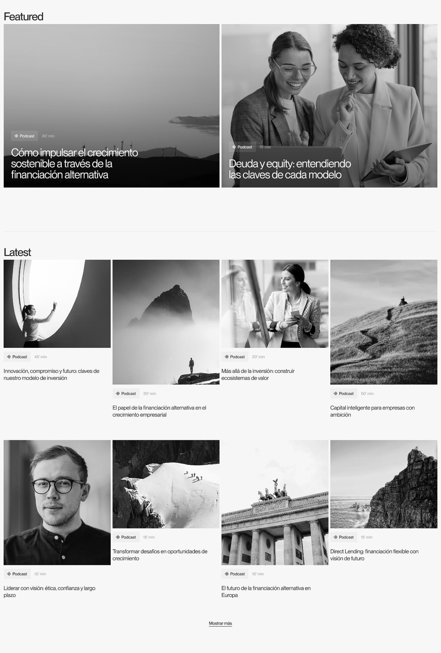
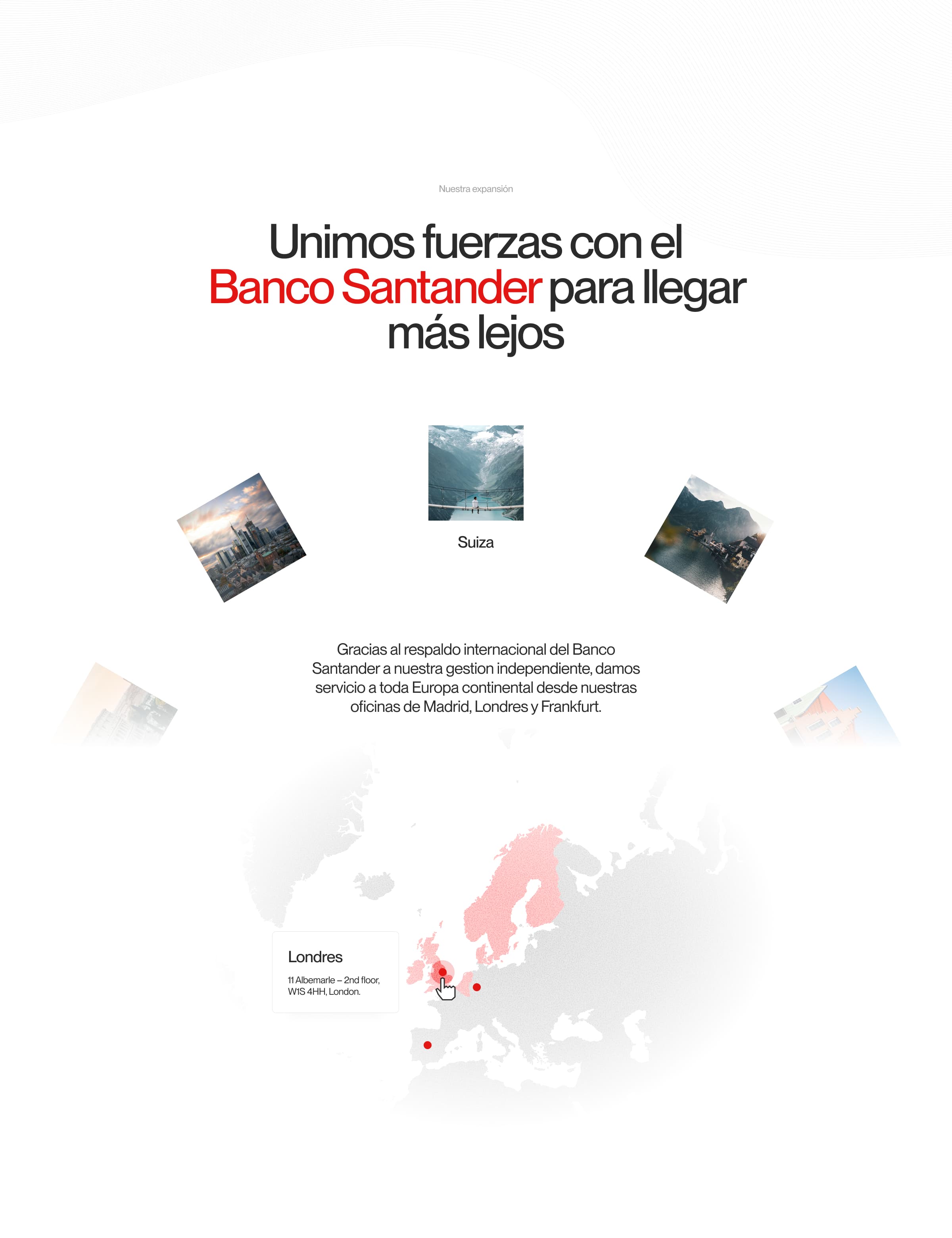
The key is that motion isn’t just decorative. It respects the brand identity. Red remains the signature gesture, the sober typography is consistent, and movement reinforces the structure rather than distracting from it. Many B2B brands stumble here—adding animation for the sake of seeming advanced, but without any connection to the narrative. At Tresmares, motion feels like a natural extension of the graphic system.
There’s a clear takeaway for visual direction and UX/UI: when a service is complex, you don’t need to oversimplify it to the point of blandness. You can design a structure that makes it more readable, more desirable, and easier to navigate. The interface doesn’t have to explain everything at once; it can set a pace, create pauses, guide the eye, and turn content into a purposeful sequence.
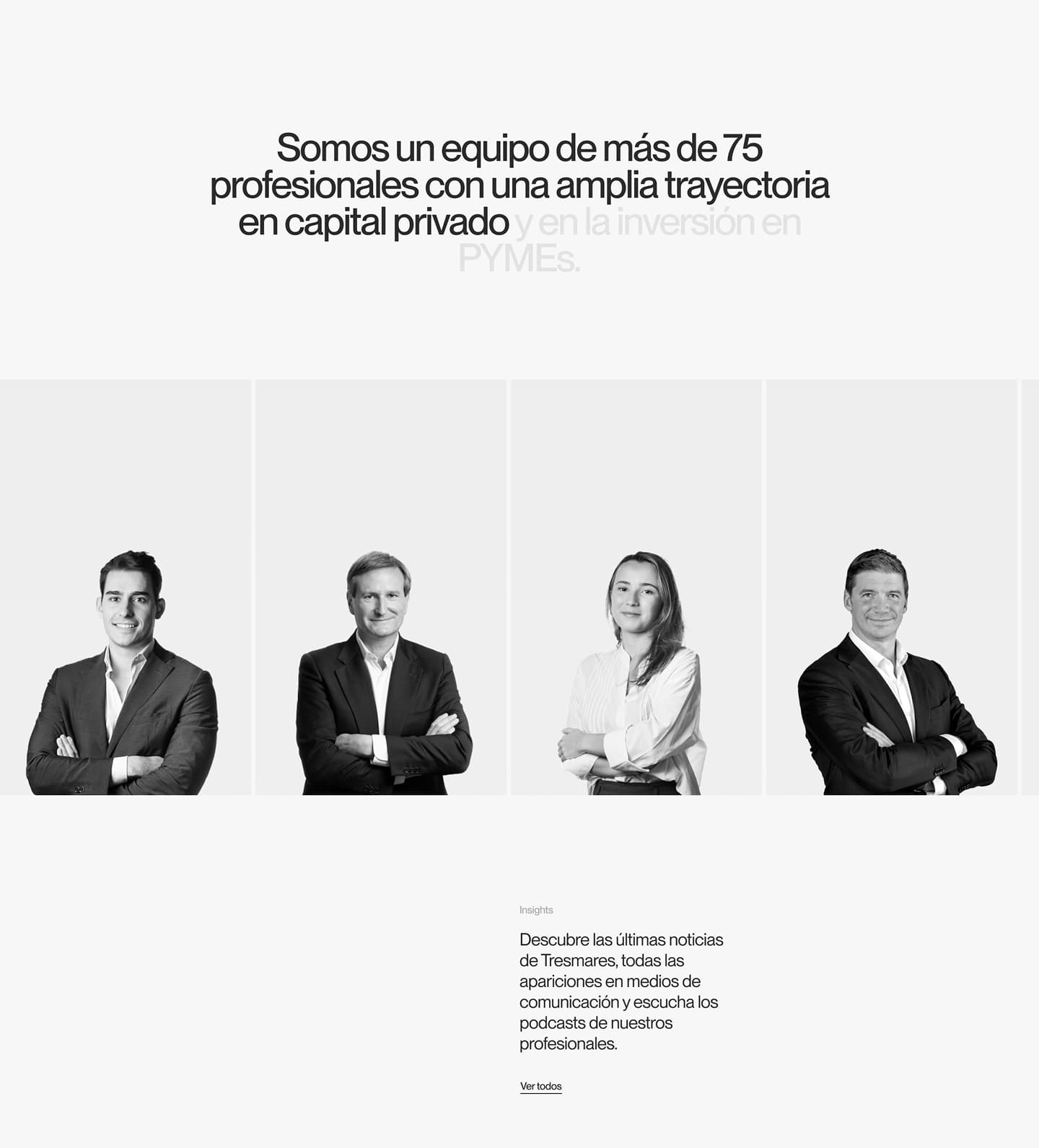
Another notable identity choice: the brand doesn’t rely on generic corporate photos or stock smiles to convey trust. It builds trust through visual language. That’s powerful. A well-controlled composition, a coherent palette, and a clear typographic hierarchy can communicate more credibility than a dozen recycled institutional phrases.
The takeaway: less noise, more presence
The best thing about this reference is that it doesn’t try to be “creative” at every turn. It has character, but it knows when to hold back—and that restraint is part of its strength. In B2B web design, especially in finance, law, industry, or tech, personality is often sacrificed for fear of losing credibility. Here, the opposite happens: personality builds trust because it’s applied with intent.
This project is a reminder: perceived value starts before you read the details. It starts with composition, color, typography scale, the way data is arranged, the flow of transitions, the atmosphere of the first screen. If everything feels generic, the service feels generic. If the experience has visual direction, the business gains presence.
For brands with complex offerings, the inspiration lies in daring to design content as a scene, not a document. Let the service take center stage. Use data as a signal of trust. Let motion set the rhythm. Build a recognizable identity without crowding the screen with effects. It’s not about making more noise; it’s about making every visual decision intentional.
And perhaps that’s the most useful idea to take away: a B2B website can be precise without being cold. It can convey capability, experience, and solidity without blending in. When visual direction is well considered, the interface doesn’t just organize information—it shapes how a brand is remembered.