A typographic identity that transforms local culture, music, and DIY attitude into a unique visual system
In contemporary graphic design, few tools are as powerful —and at the same time as difficult to master— as typography. The Music venue IDUNA project, developed by the agency Dizain and awarded a Bronze at the European Design Awards 2025 in the 503 — Applied Typography category, is a brilliant example of how a custom typeface can become the central axis of a visual identity.
From our perspective as a graphic design agency in Barcelona, specialized in branding, visual identity, and web design, this project stands out for its ability to translate cultural values, local history, and musical attitude into a coherent, recognizable, and meaningful typographic language.
Iduna: a venue with history and attitude
Iduna is not simply a music venue. It is a cultural institution in Drachten (Netherlands) that, since the 1980s, has been a meeting point for the pop, rock, and metal scene. A space where passion, experimentation, and a strong DIY ethos come together.
This character —independent, energetic, and rooted in underground culture— was the starting point for the new visual identity. The challenge was not only to update the venue’s image, but to capture its essence: a combination of history, local community, and rebellious spirit.
The challenge of designing for music venues
Graphic design for music venues presents a particular difficulty: 90% of communication is dominated by band names, dates, and programming. This greatly limits the ability to build a distinctive identity.
How can a venue stand out when its communication is constantly “taken over” by other names and visual styles?
Dizain’s answer was both radical and effective: to make typography the core identity system. Instead of competing with the content, they integrated it.
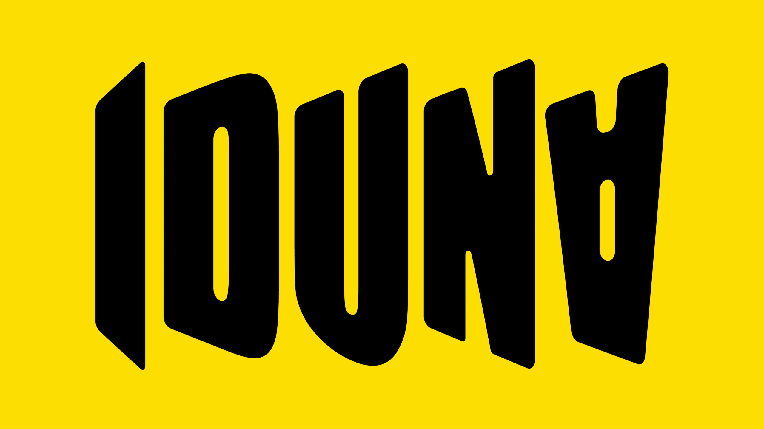
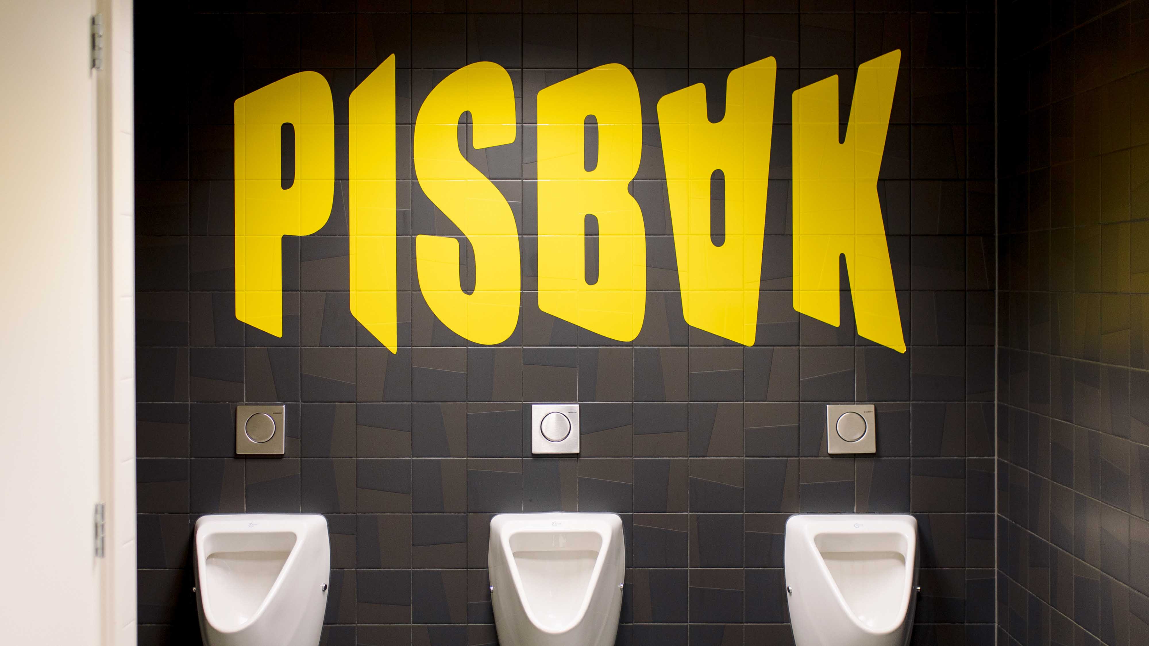
A typeface that shouts: the birth of the IDUNA Typeface
The typeface designed for Iduna is neither neutral nor subtle. It was created to “shout from the rooftops”, reflecting the energy of the space and the intensity of the music it hosts.
It is an expressive, dynamic typographic system with a strong personality, where every character is designed to convey:
- visual strength,
- rebellious attitude,
- distinct identity,
- consistency across all platforms.
The result is a typeface that not only communicates information, but builds a recognizable aesthetic even as content constantly changes.
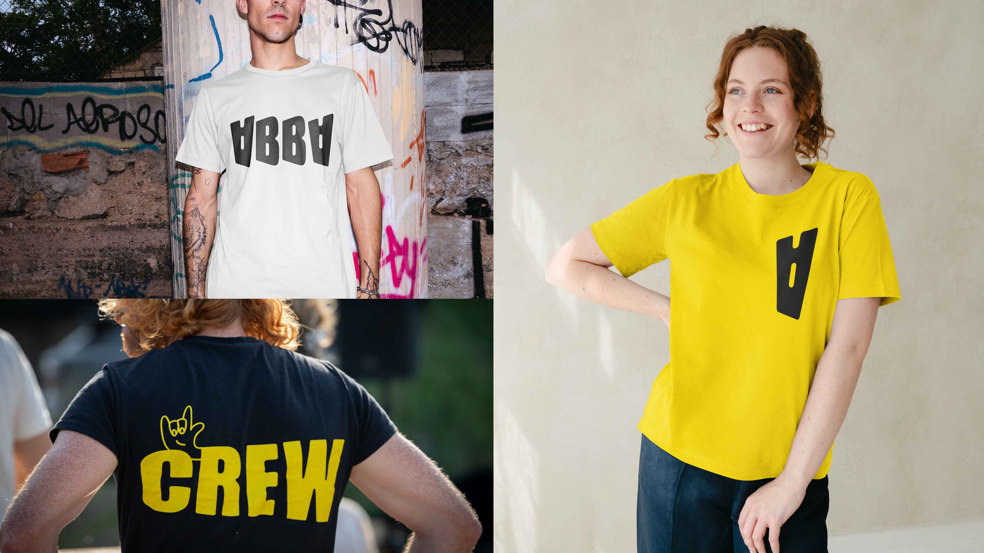
The inverted “A”: typography as a cultural tool
The most striking feature of the system is undoubtedly the inverted “A” — a seemingly simple gesture that carries a powerful conceptual meaning.
In Dutch, “music venue” is translated as poppodium. However, in Frisian —a minority language spoken by approximately 425,000 people in the northern Netherlands— it is written as poppoadium.
The inclusion of this inverted “A” is not a stylistic choice: it is a cultural statement. It makes a linguistic identity visible, integrating it directly into the visual communication of the venue.
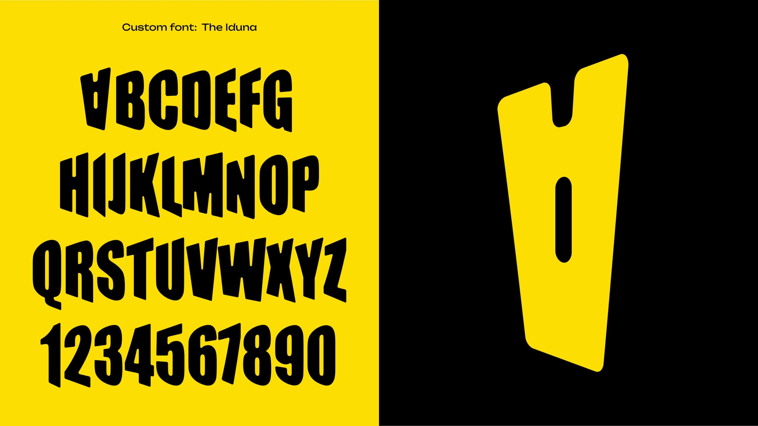
This gesture connects graphic design with broader cultural policies, aligning with efforts to preserve and promote the Frisian language. The project received recognition from the Council of the Frisian Movement for its contribution to making this language visible in public space.
From a branding perspective, this is an outstanding example of how a typographic decision can become a powerful tool for cultural positioning.
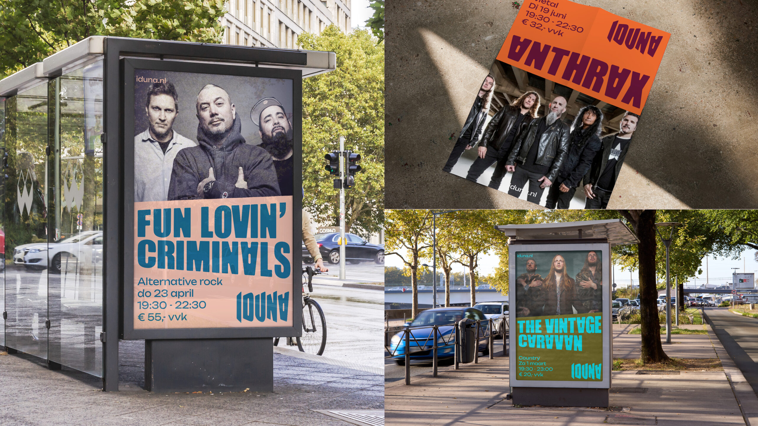
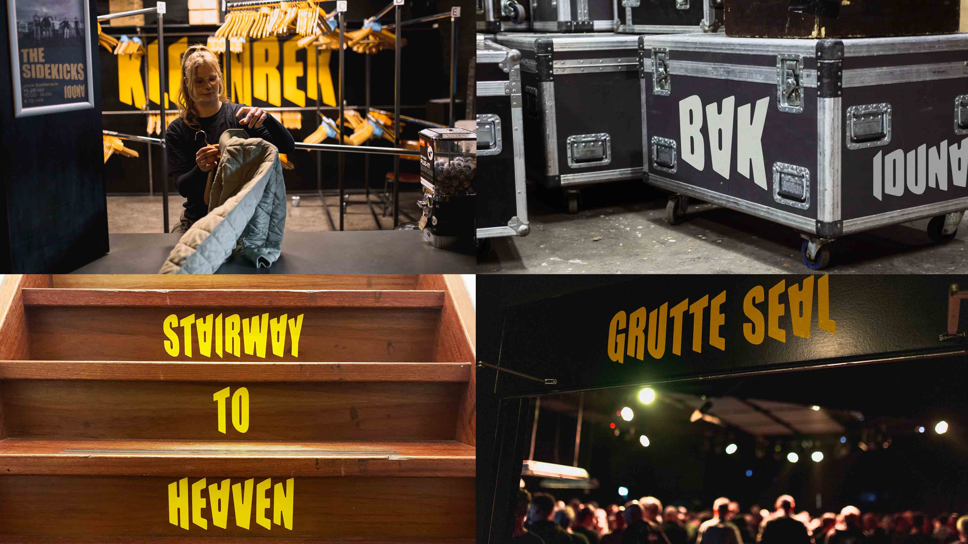
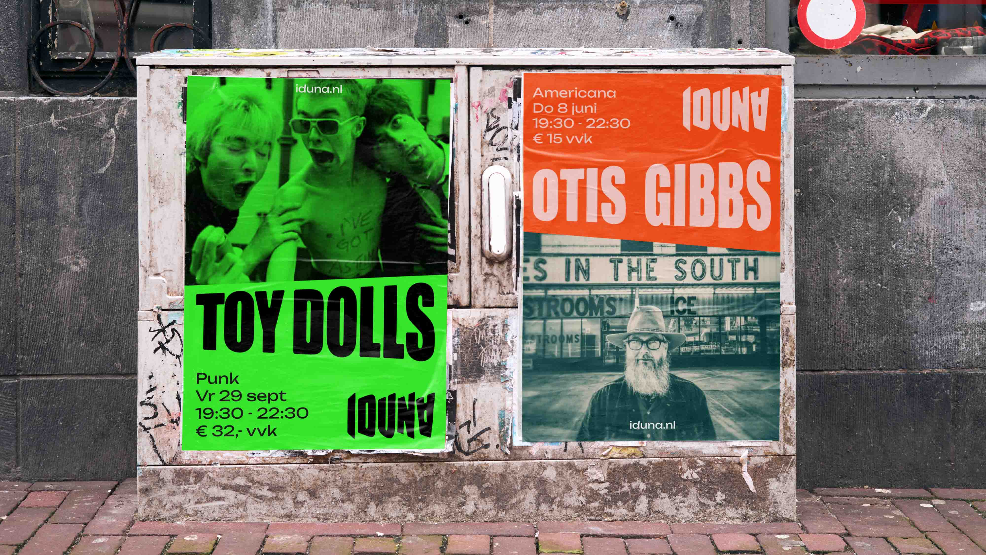
Typography as a system: when content becomes identity
One of the most intelligent aspects of the project is how band names —which usually disrupt visual consistency— become part of Iduna’s visual language.
Thanks to the custom typeface:
- posters maintain visual coherence,
- programming reinforces the brand,
- every communication piece contributes to identity building.
This turns a limitation into an advantage. The identity does not compete with content: it absorbs and transforms it into its own language.
A self-made aesthetic for a self-made venue
The defining concept of the project is clear: “A self-made typeface for a self-made venue.”
The typeface perfectly reflects Iduna’s essence:
- independent,
- passionate,
- rooted in DIY culture,
- contemporary while respecting its past.
This alignment between concept, form, and application is what makes the project a benchmark in graphic design for cultural spaces.
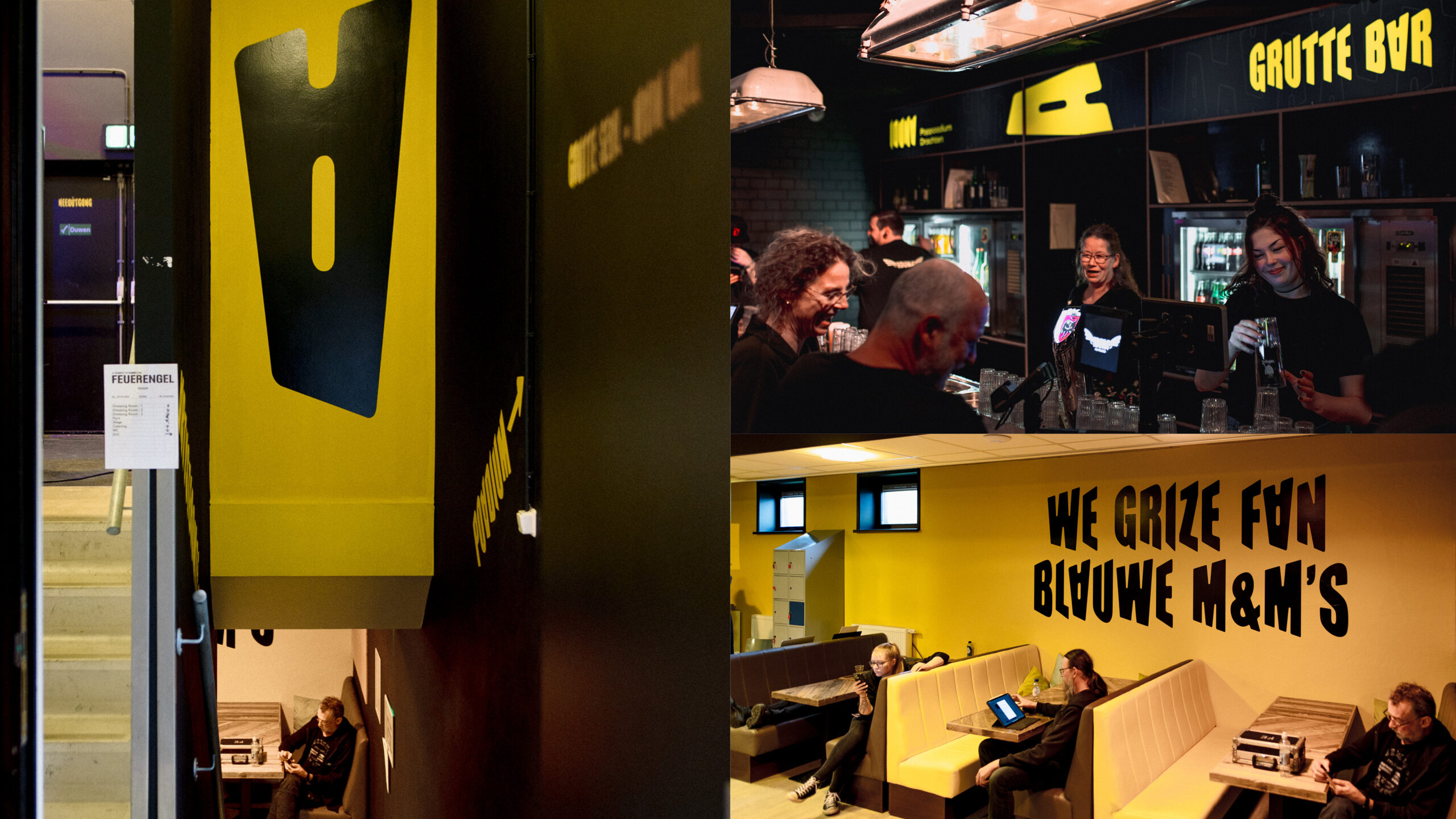
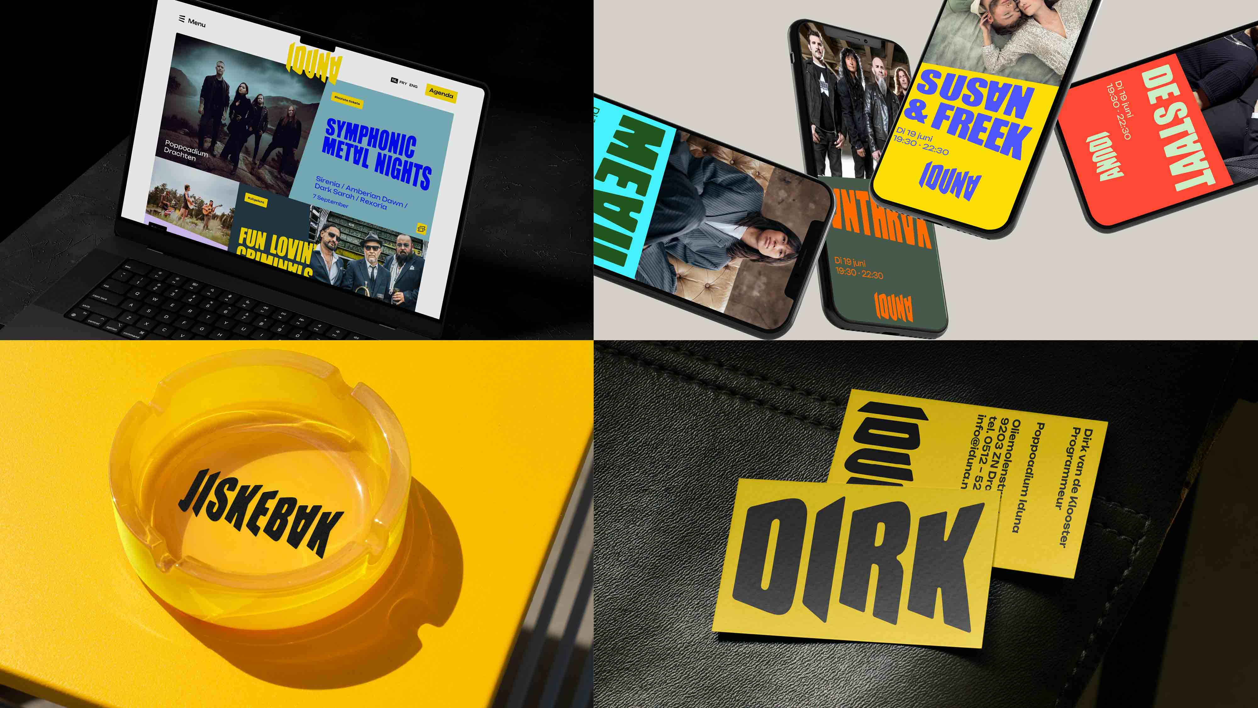
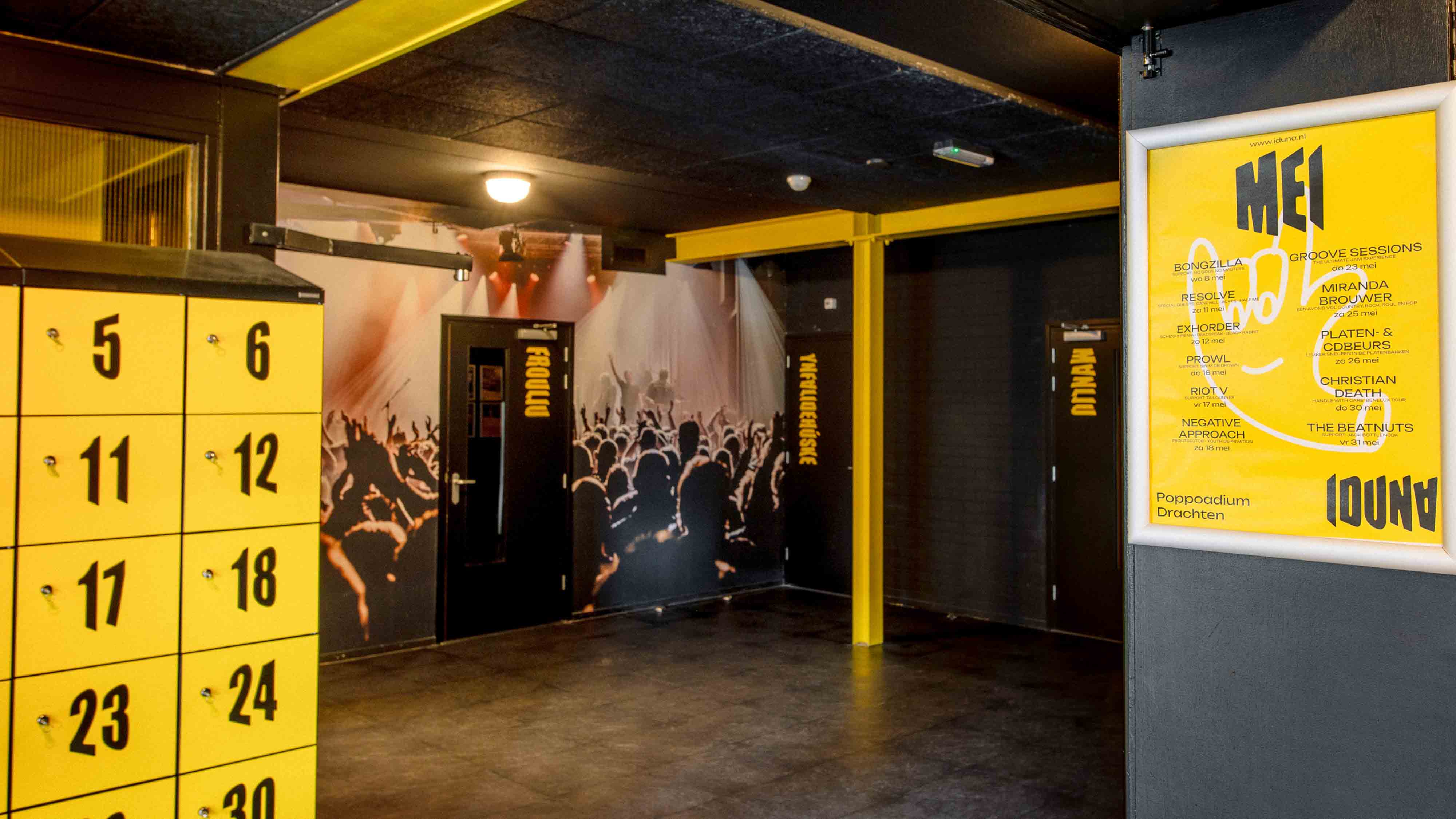 Applications: consistency across all touchpoints
The typographic identity is consistently applied across:
- posters,
- signage,
- event programming,
- digital communication,
- motion graphics.
This consistency is essential in any branding project, especially in cultural environments where content is constantly changing.
For a graphic design and web design agency in Barcelona, this type of system demonstrates the importance of creating flexible identities that can adapt without losing personality.
Making the intangible visible
Iduna has always been a space of energy, creativity, and community. What this project achieves is making that energy visible.
The typeface is not just a visual tool —it is a direct translation of the experience of the venue. It makes the intangible tangible, turning the identity into an extension of its culture.
Award and recognition
- European Design Awards (ED Awards) 2025 — Bronze
- Category: 503 — Applied Typography
- Country: Netherlands
Credits
- Agency: Dizain
- Creative Director: Sjoerd Kooistra
- Art Director: Sjoerd Kooistra
- Designer: Sjoerd Kooistra
- Copywriter: Sjoerd Kooistra
- Illustrator: Gealt Waterlander
- Motion Design: Klaas Jacob Kort
- Client: Iduna
Conclusion: when typography becomes cultural identity
The Music venue IDUNA project demonstrates that typography can be far more than a functional element. It can be the core of an identity, a tool for cultural expression, and a powerful way to stand out in saturated environments.
For those of us working in graphic design, branding, and visual identity in Barcelona, this project is a clear reference on how to build strong, coherent, and meaningful visual systems.
Iduna doesn’t just sound. It is now seen, read, and felt like never before.