Healthcare branding often plays it safe: surgical white, corporate blue, predictable icons, and a seriousness so proper it fades into the background. ClickClinicals takes a more interesting path. It keeps the calm the sector demands, but adds brightness, visual rhythm, and an identity designed to stick in your mind.
What’s clever is that it doesn’t feel like a brand built just for a pretty presentation. It acts like a living system—ready to fit into a landing page, an app, a lead campaign, a registration flow, or editorial content without losing its voice. That consistency isn’t just a visual whim; it raises perceived value by organizing the experience before users have to read a word.
This spotlight looks at ClickClinicals as a benchmark for graphic design in health tech: clean color, straightforward typography, spacious layouts, concise messaging, and subtle UX/UI touches that make complexity feel approachable. Professional, not stiff. Digital, not cliché. Human, without the sugarcoating.
A healthcare brand that doesn’t sound like a hospital
ClickClinicals stands out because it doesn’t lean on the usual healthcare tropes. There’s no forced solemnity or endless lab coat aesthetic. The visual direction opts for a clean atmosphere, yes, but with more energy: soft gradients, generous color blocks, a friendly symbol, and typography with just the right presence.
The balance is spot on: it needs credibility, but also approachability. For a B2B or healthcare tech brand, that balance isn’t just for show. If the design feels too clinical, it creates distance. Too much of a startup vibe, and trust can slip. Here, the system finds a useful middle ground: professional, accessible, memorable.
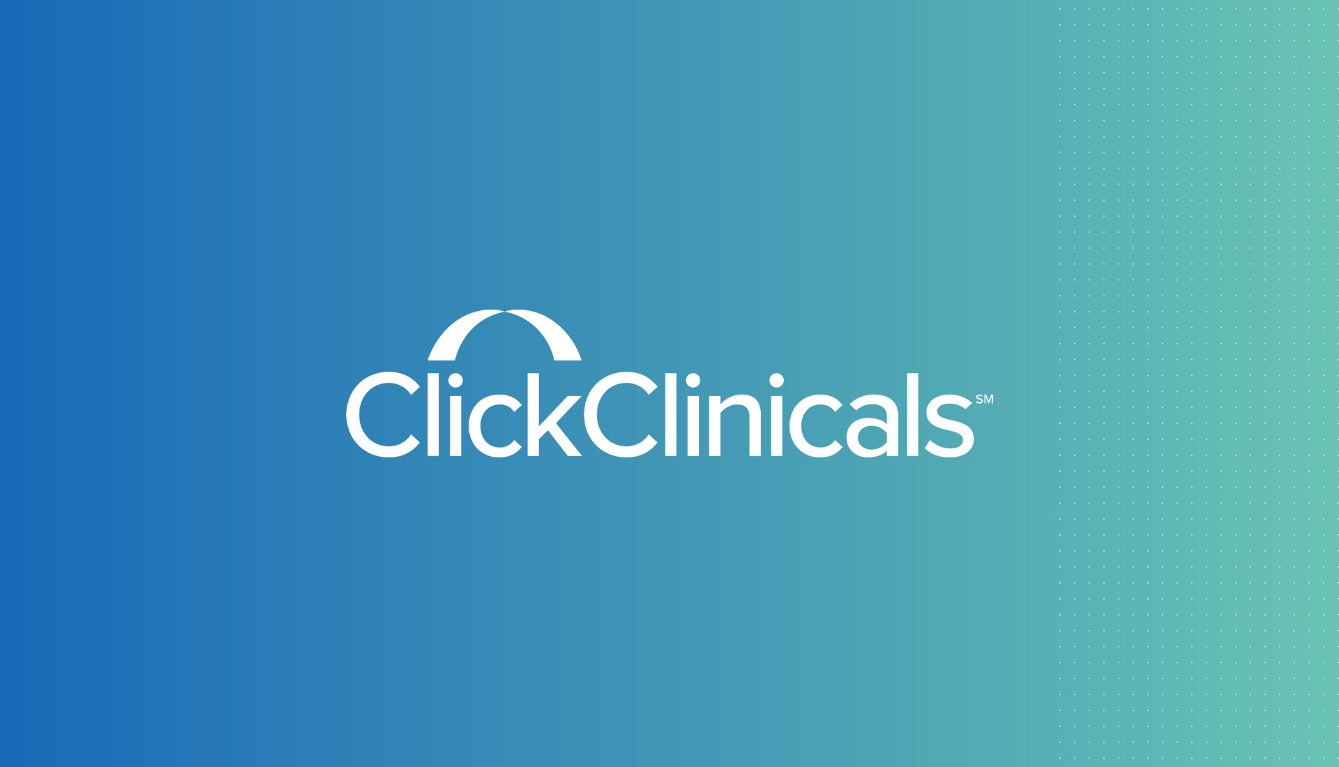
The first visual impression works because it lets the brand breathe. The logo sits centered, with no distractions, set against a blue-to-mint background that softens the clinical tone without losing confidence. The dotted pattern acts as a system texture, not random decoration: it suggests connection, flow, data, matching. Small cues that add up without stealing the spotlight.
ClickClinicals — visual clarity with a system feel
The logo is instantly readable. The wordmark claims its space with a compact layout, while the symbol above adds recognition without clutter. In healthcare branding, that ease matters: if users have to work to decipher the brand, trust comes too late.
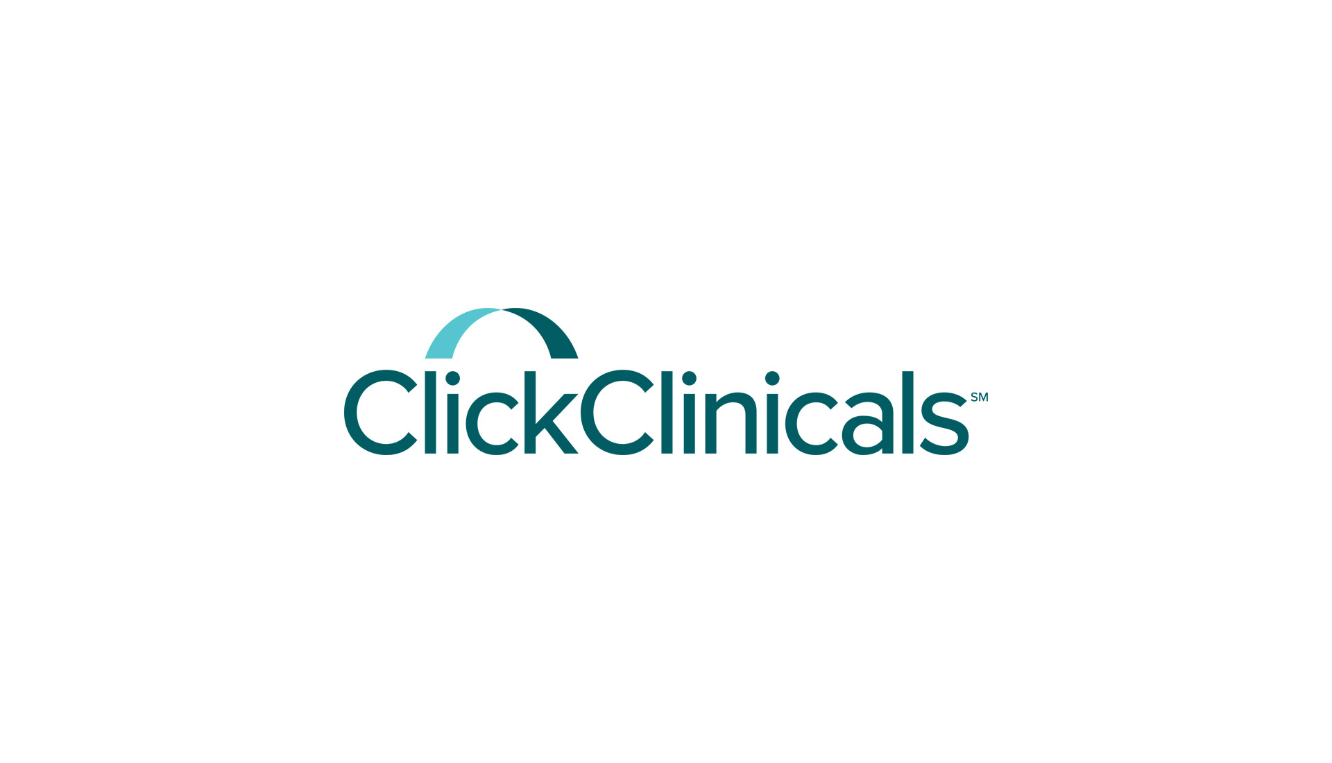
The white background version proves something important: the identity doesn’t rely on the backdrop. The teal color alone carries the brand’s character. It’s a smart choice, allowing the brand to move seamlessly across digital products, sales materials, presentations, emails, and onboarding—without losing coherence.
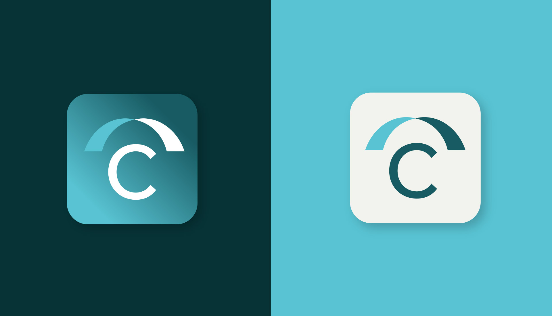
The app icon has that quality every digital identity needs: it scales down without losing impact. The brand condenses into a recognizable piece, with rounded corners and enough contrast to work as an app icon, avatar, favicon, or product element. That’s no small feat. Many identities look great in presentations but fall apart in real interfaces.
Color: trust without visual anesthesia
The palette moves between blue, turquoise, white, and deeper backgrounds. It’s healthcare, but not flat. Blue brings stability; turquoise adds freshness; dark backgrounds provide contrast and elevate perceived value. The result avoids two common traps: looking like a generic insurer or a bland medical app.
There’s also a clear compositional choice: large blocks, minimal competing elements, and generous hierarchies. This kind of visual order helps the message land quickly. In marketing, it shows: less friction to understand, more room for trust.
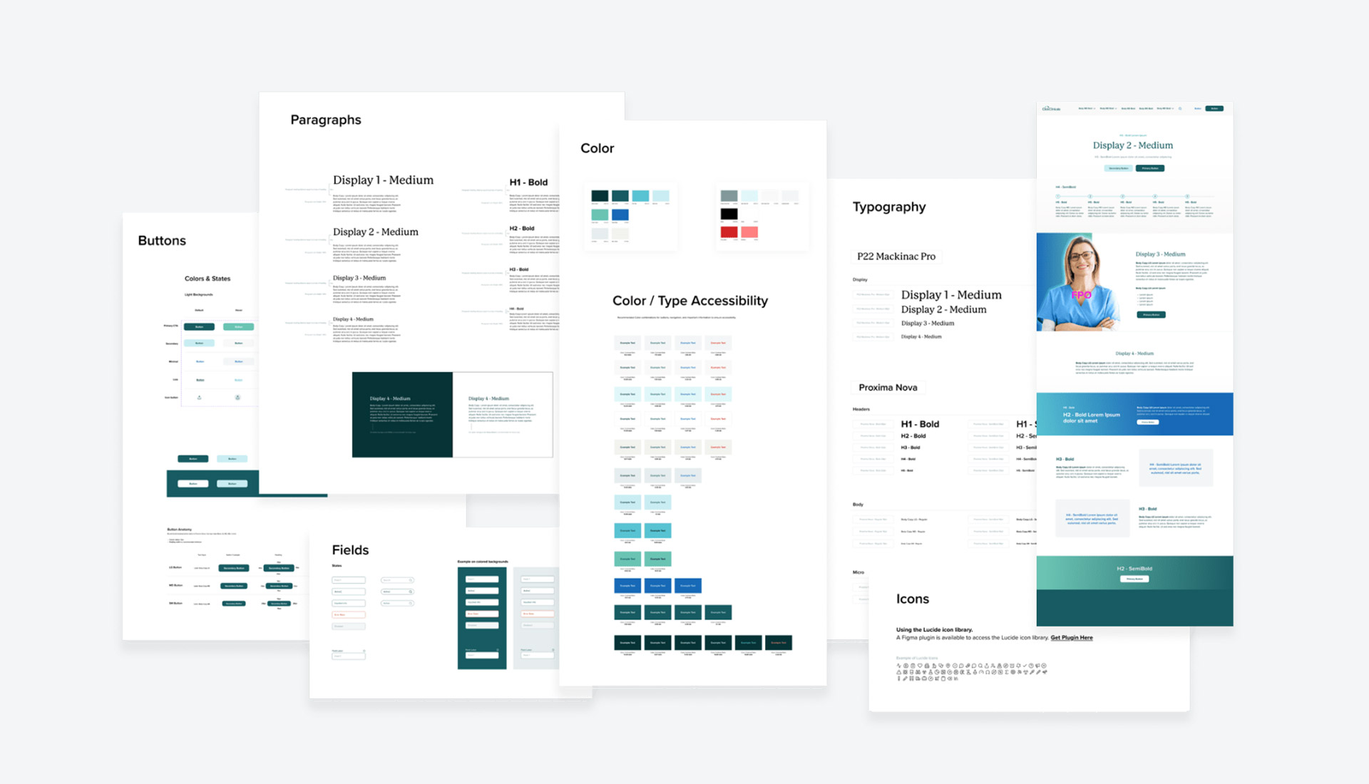
This example is especially rich because it shows the brand as an ecosystem. Typography, buttons, fields, iconography, and interface samples are all connected by the same logic. That’s where branding stops being just a visual layer and starts acting as digital architecture. For a marketing team, that means efficiency: campaigns, landings, and products can grow from a shared foundation.
Messaging: short headlines, direct tone, and a human face
The identity doesn’t hide behind jargon. When a photo of a healthcare professional appears, the system gains warmth. The human face grounds the service in a real situation: someone who needs to move forward, complete a stage, find the right connection. The design recognizes that health isn’t sold on functionality alone; it also needs calm, empathy, and reassurance.

The layout balances the weight: human image on one side, strong message on the other. There’s no copy overload or over-explained narrative. The headline acts as a prompt, almost a micro-decision: take a step, move forward. That verbal economy gives the piece visual rhythm and makes the promise memorable.

This hero lowers the emotional barrier even further. The smile, the blue uniform, the light background, and the direct headline all work together to make the process feel achievable. In a service tied to paperwork, requirements, and professional searches, that sense of ease has real commercial value.
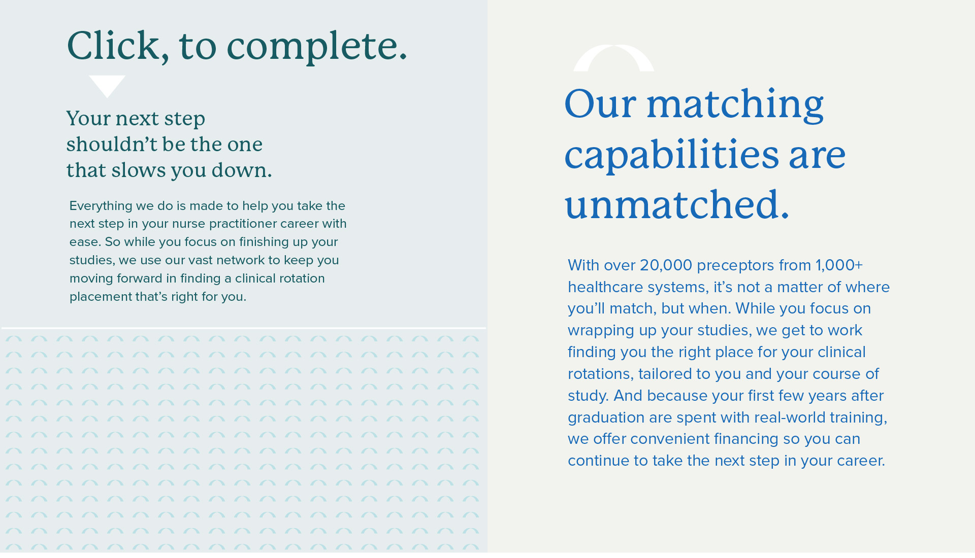
The system’s editorial side adds another layer: weighty headlines, clean columns, and enough breathing room so the text doesn’t feel like fine print. The typography works for clarity. It doesn’t try to impress with quirks; it supports a promise that needs to be understood quickly and sound trustworthy.
From branding to product: onboarding that feels breathable
When the identity moves into forms, steps, and states, one of the project’s most interesting signals appears. The visual system doesn’t stop at campaigns; it suggests interaction. Buttons, fields, validations, and step sequences all keep the same tone: clear, guided, drama-free.
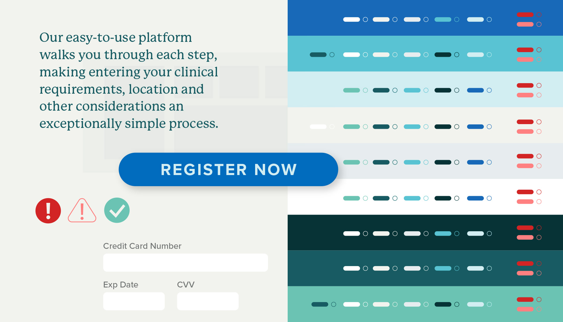
The form makes a clear visual promise: signing up shouldn’t feel like filling out endless paperwork. The main button stands out, fields stay organized, and states provide feedback. It’s light UX, but it matters. In healthcare or education services, trust is also built in those small details: knowing where you are, what’s missing, and what happens next.
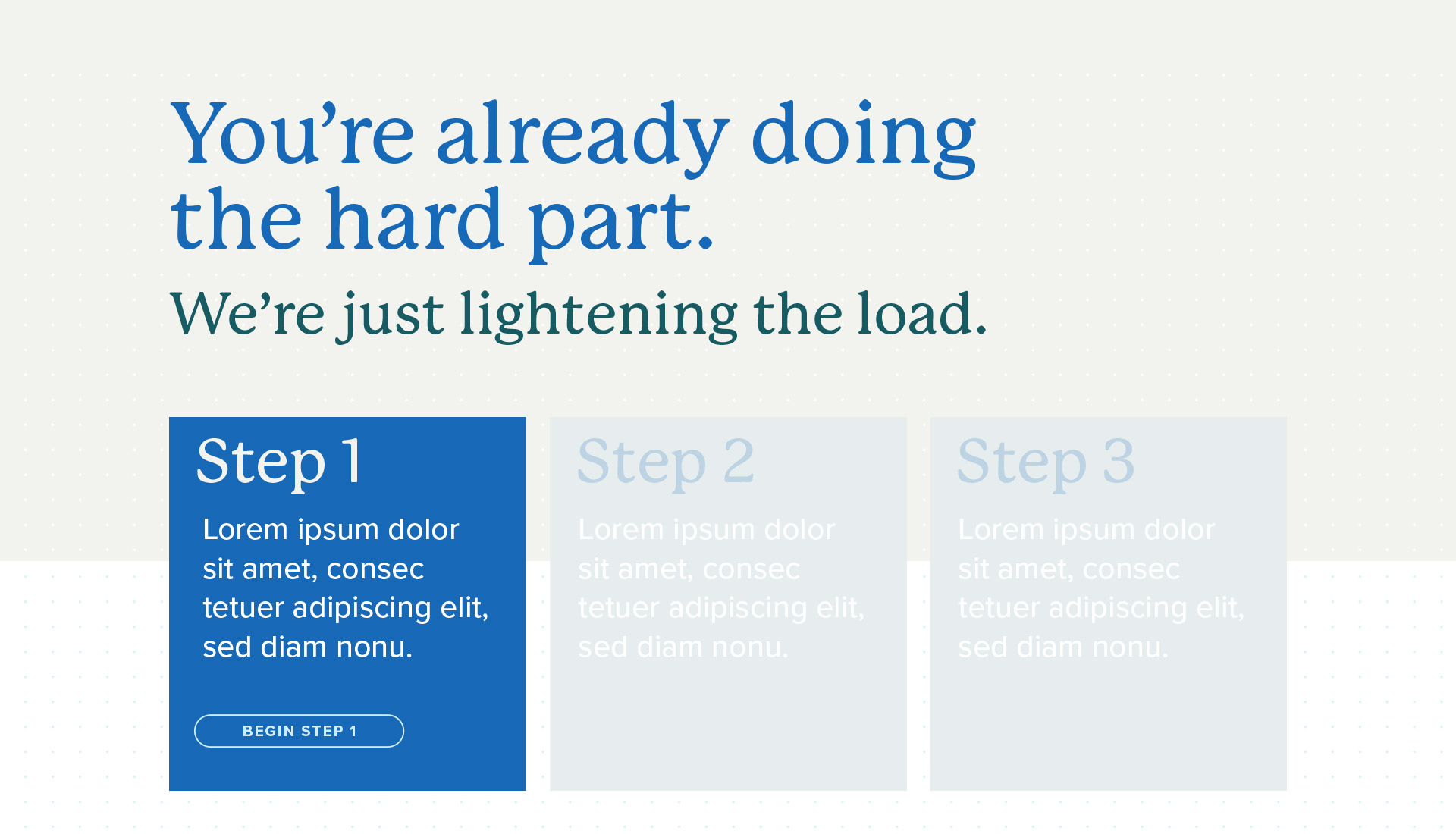
The three-step structure turns a potentially dense task into a digestible path. This kind of layout helps reduce mental load and improves the sense of control. There’s no need to promise speed with fireworks—just organize the sequence well and give users a clear direction.
There’s a practical takeaway here: a strong identity doesn’t end at the logo. If the system can support buttons, messages, forms, campaigns, and editorial pieces with the same atmosphere, the brand gains consistency and the team gains speed. Less reinvention for every piece. More accumulated visual memory.
What ClickClinicals leaves behind when you look closely
ClickClinicals works because it doesn’t confuse technology with coldness. The brand feels digital, but not distant. Healthcare, but not rigid. Professional, but not bureaucratic. That mix is hard to achieve—and precisely for that reason, it’s compelling for any team working in health, education, professional services, or B2B platforms with complex processes.
The combination of color, typography, spacious composition, and human photography builds an identity with real depth. There’s recognition in the symbol, clarity in the message, and a solid foundation for interaction. Not everything needs to move to have rhythm; sometimes the motion is in how your eye moves from block to block, from promise to action, from brand to product.
The most valuable lesson is simple: when the service is complex, design shouldn’t add more complexity. Clarifying the message, organizing the hierarchy, and building a flexible visual system can elevate perceived value far more than flashy aesthetics. ClickClinicals leaves you with that satisfying sense of a well-designed brand: easy to engage with, memorable, and ready to grow without losing its identity.