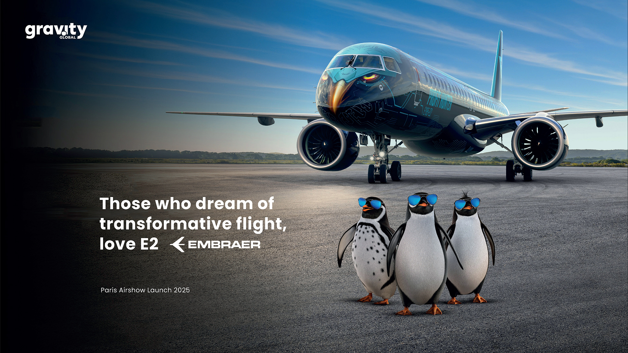
Aerospace tends to speak in a deep voice: polished metal, data, efficiency, engineering, and a lot of corporate sky. That’s why a campaign featuring penguins in sunglasses next to a commercial jet lands with a different energy. It doesn’t abandon technical muscle, but it sheds the stiffness. And when that mix is well executed, it sticks in your mind.
This campaign design gets one thing right: even an industrial brand needs a stage. The product can be flawless, but if the image doesn’t create atmosphere, everything starts to look the same. Here, the aircraft maintains presence, scale, and authority, while the visual universe injects humor, color, and identity—without turning the piece into a joke.
The magic lies in the tension. There’s a clean composition, direct typography, purposeful blue, and an editorial touch that makes the campaign feel bigger than a simple promo. The visual wink draws you in; the art direction sustains the sense of value. It’s not just about looking at a plane, but about remembering a new way to present innovation.
Those who dream of transformative flight, love E2 — aerospace with wit and editorial flair
The first big visual decision: don’t hide the product behind the concept. The aircraft stands out with presence and scale, its blue livery acting almost as a moving identity system. The fuselage isn’t just a graphic canvas—it becomes part of the campaign, a branded surface, a photo opportunity.
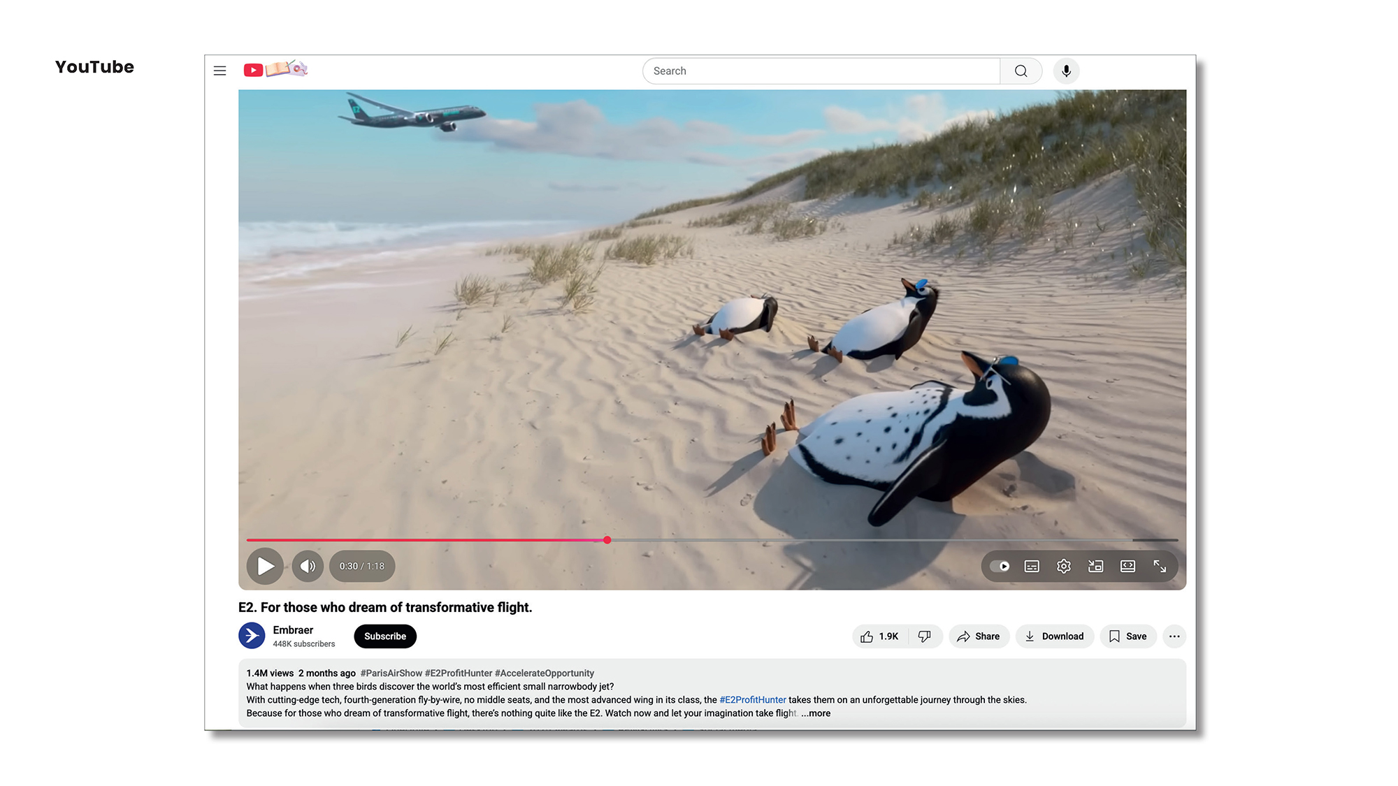
The main scene reads instantly: plane, runway, open sky, and three unlikely characters up front. The penguins in sunglasses add a layer of gentle, almost cinematic irony. They don’t compete with the product—they humanize it. In a category used to technical specs, that detail shifts the visual rhythm and lets the campaign breathe.
The headline acts as an editorial anchor. Aspirational but focused, long yet memorable, it’s closer to a global campaign line than a performance claim. That choice matters: when a brand sells complex technology, perceived value isn’t just born from rational arguments—it’s shaped by how the story feels before you read a word.
The palette pushes in the right direction: crisp whites, electric blues, well-placed blacks, and plenty of space. The result is a blend of freshness and precision that suits an aerospace brand—sky, speed, engineering, but with a pop edge that avoids the usual corporate tone.
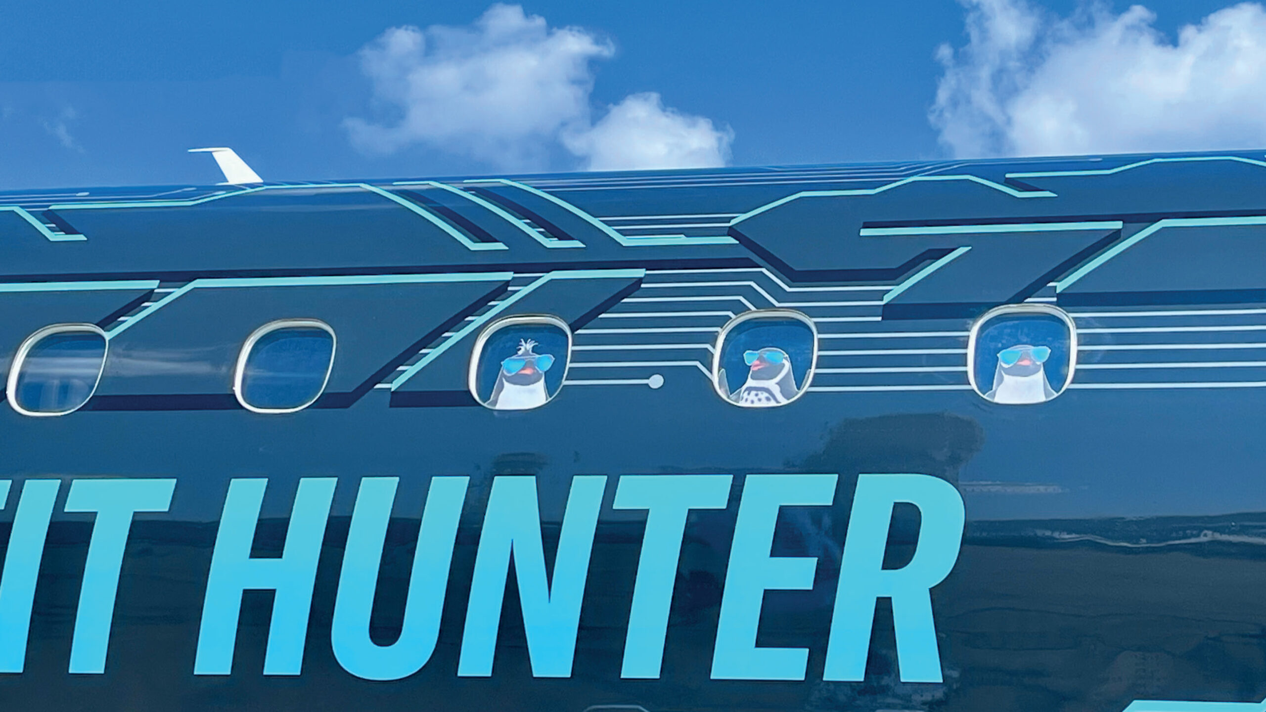
The fuselage detail is especially interesting for art direction: the identity isn’t confined to a poster or digital asset—it jumps onto the aircraft itself. That signals real investment, a campaign built with ambition, not just creativity tacked on at the end. In B2B marketing, that difference is clear: a brand feels more credible when its visual idea is carried consistently across every touchpoint.
There’s also a bold typographic move: using large words on a physical surface. “HUNTER” and “PROFIT HUNTER” aren’t decorative—they’re brand presence at a distance. The typography acts almost like signage, strong enough to be read on the tarmac, in photos, or on video.
 Hero visual for the “Those who dream of transformative flight, love E2” campaign.
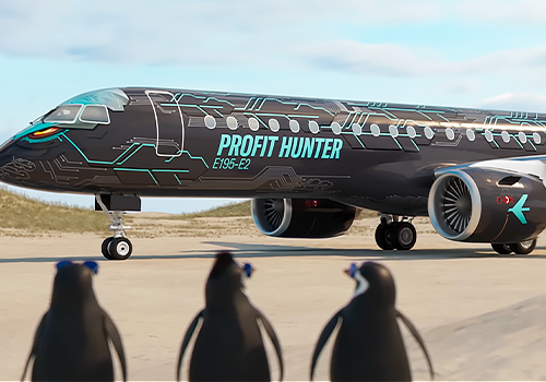
The runway composition has a reveal moment. The plane is shown side-on, in full, with almost product-sheet clarity, but the penguins in the foreground break the rigidity. It’s a mix ready to travel: clean enough for press, quirky enough for social, premium enough to maintain authority.
Here’s a simple lesson: humor doesn’t lower a brand’s stature—lack of visual direction does. When used with intent, it boosts recall, softens a tough category, and opens conversations the product alone might not spark.
Motion and distribution — a campaign built to move
While the focus here is visual, the campaign is designed for motion. You see it in how scenes are sequenced: beach, runway, cockpit, aircraft, characters, brand. There’s no single, static image—there’s a small narrative world ready to unfold in video, on social, at trade shows or festivals.
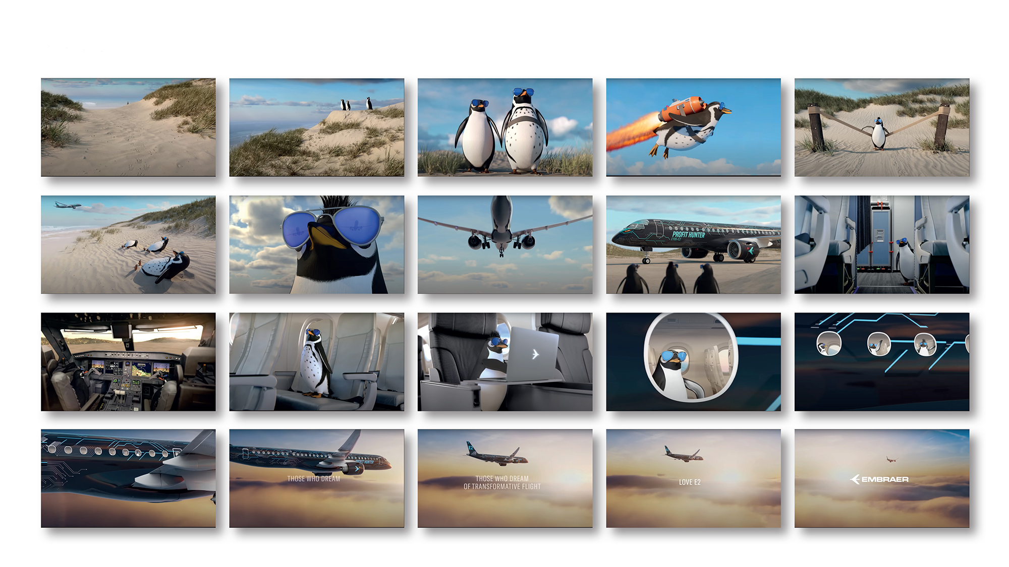
The scene grid works like an editorial storyboard. It lets you grasp the campaign at a glance, no long explanation needed. That’s a huge plus for any marketing team: the faster an idea is understood, the easier it is to sell internally, share with partners, and turn into reusable assets.
There’s variety without chaos. The penguins appear in different settings, the plane stays front and center, blue ties everything together, and the mood keeps that light sense of adventure. The campaign doesn’t hinge on a single visual gag—it builds a recognizable system. That’s what separates a one-off idea from a true campaign identity.
The approach also aims for a light-touch user experience: assets that are easy to scan, scenes that are instantly recognizable, and a narrative that doesn’t require technical context to engage. For a brand with a complex product, that ease of entry is gold. It doesn’t replace the commercial argument, but it opens the door for it to land more effectively.
The recognizable player bridges the gap between brand asset and real-world consumption. This isn’t just a launch visual—it’s a campaign designed to circulate. That touch adds familiarity: viewers instantly understand where the piece lives, how it plays, how it could be shared.
For art direction, this part may be less glamorous than the hero shot, but it’s just as vital. A campaign doesn’t earn recall from its main image alone; it wins when every format keeps the same pulse. Hero, video, grid, social post, and presentation should all feel like the same brand, even if each channel has its own rhythm.
The video-first approach also encourages a more emotional read. Aerospace products can get lost in specs, but motion lets you sell sensation: travel, takeoff, lightness, scale. When motion is well crafted, it doesn’t just decorate the campaign—it makes it more memorable.
A lighthearted lesson for serious brands
This case offers a valuable takeaway: a memorable campaign doesn’t always need to be more complex, just better told. Here, the power isn’t in message overload, but in building a scene with enough personality for the product to stick.
The design blends three layers that rarely coexist smoothly: product precision, visual humor, and a premium finish. The composition stays controlled, color reinforces the sense of air and technology, typography upholds authority, and the characters add an unexpected spark. Nothing feels random.
For a B2B or industrial brand, the message is clear: art direction isn’t window dressing. It’s a way to build trust faster, elevate perceived value, and make a technical proposition more desirable. If a campaign gets people to remember the brand before they even see the product sheet, it’s already won a big part of the battle.
There’s also an invitation to loosen up. Serious sectors don’t always have to communicate with solemnity. They can use atmosphere, characters, motion, color, and narrative without losing credibility. The key is judgment: creative choices should serve the brand, not the campaign’s ego.
In the end, what remains isn’t just a plane with striking graphics. It’s a campaign identity with visual memory, a story that’s easy to share, and a brand that feels more alive. And when you’re selling innovation, that can be worth as much as pages of technical argument.