Some brands don’t need an explanation—they catch your eye with color, communicate through visual rhythm, and stick in your memory. That’s exactly what Picky Juice & Smoothies does. It doesn’t try to look sophisticated by keeping its distance; instead, it bursts with energy, fruit, bold typography, and a visual direction that turns every bottle into a mini editorial piece.
What’s interesting isn’t just that the packaging stands out. The real strength is how everything works together as a system: composition brings order, color distinguishes, typography signs off, and photography whets your appetite. First, it draws you in. Then, it guides your eye. And here’s the less obvious part of design: when an identity is instantly understood, it sells better too.
An identity that doesn’t ask for permission
Picky has something every food brand dreams of: instant recognition, even before you read the label. The logo takes up space with a round, soft, almost chewable presence. It doesn’t behave like a discreet stamp; it’s the main voice. That choice makes it approachable, but also gives it visual authority in a world where many juice brands stick to generic codes: pretty fruit, clean labels, healthy promises, and not much else.
Here, there’s more personality. The identity is bold without losing structure. There’s saturation, but no noise. Humor, but no chaos. A fresh, almost summery vibe, held together by carefully controlled compositions. That balance is what makes the brand feel spontaneous, never improvised.
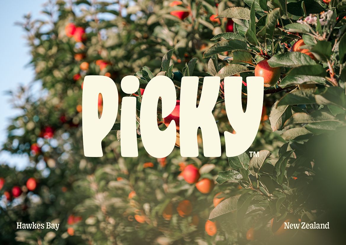
Referencing origin works as a trust anchor. It doesn’t fall back on agricultural clichés or overly literal rural storytelling—the landscape is filtered through a bold identity. It’s a smart way to connect provenance and desire. The brand talks about ingredients and place, but does so with a graphic layer that feels more at home in contemporary retail than in niche artisanal products.
Picky Juice & Smoothies — color with editorial appetite
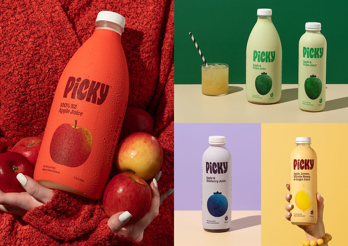
Picky’s biggest win is using color as a visual navigation tool. Each flavor has its own temperature, making the range easy to scan. Orange, green, red, purple, yellow: the palette doesn’t just decorate, it organizes. On shelf, in ecommerce, or in a campaign, that clarity reduces friction. You see, you distinguish, you choose.
The orange bottle is a great example of how the system creates appetite without resorting to obvious illustration. A saturated background, fruit up front, a hand holding the product, and a label that doesn’t hide. The composition feels studio-polished but keeps a human touch. The hand adds scale, tactility, and approachability; color does the rest.
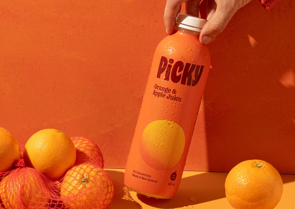
Typography is another key element—big, friendly, full of character. It’s not chasing cold elegance; it’s about presence. This choice shifts the perceived value, making the brand feel confident. When a name has this scale and personality, the packaging stops being just a container and becomes a brand asset.
With color-blocked compositions, the product family reads as a system. Each variant stands on its own, but none break away. This is a valuable lesson for any multi-line catalog: differentiation doesn’t mean fragmentation. If each product has its own color, fruit, and energy, but all share the same structure, the brand gains flexibility without losing recognition.
Lining up the full range reinforces that sense of order. Here, the design dials down the intensity to showcase the catalog. A more neutral background lets the bottles breathe and makes the visual architecture clear: brand at the top, flavor next, attributes below. There’s no need to over-explain. The hierarchy does the work.
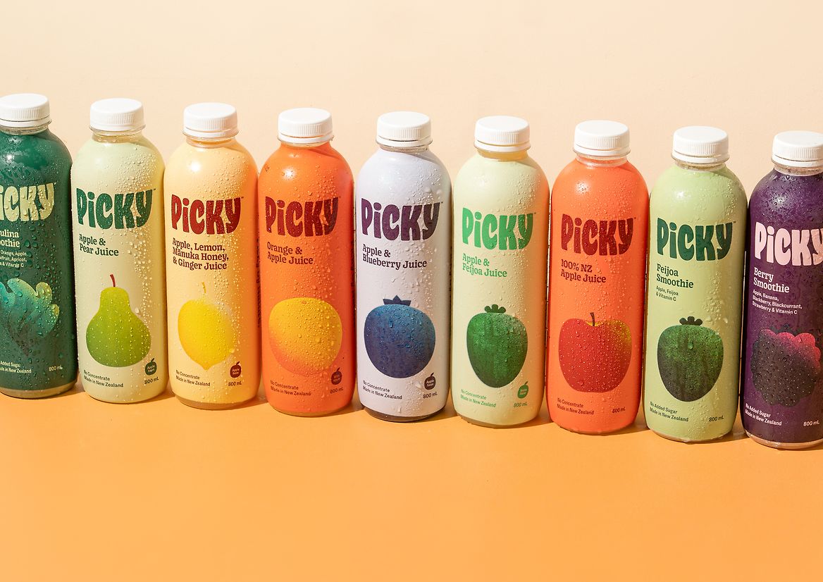
That kind of clarity directly impacts perceived value. A product that’s easy to read feels more considered. A well-organized range feels more solid. And a brand that keeps a steady rhythm across packaging, photography, and visual tone communicates something very commercial: trust, without being boring.
From bottle to brand universe
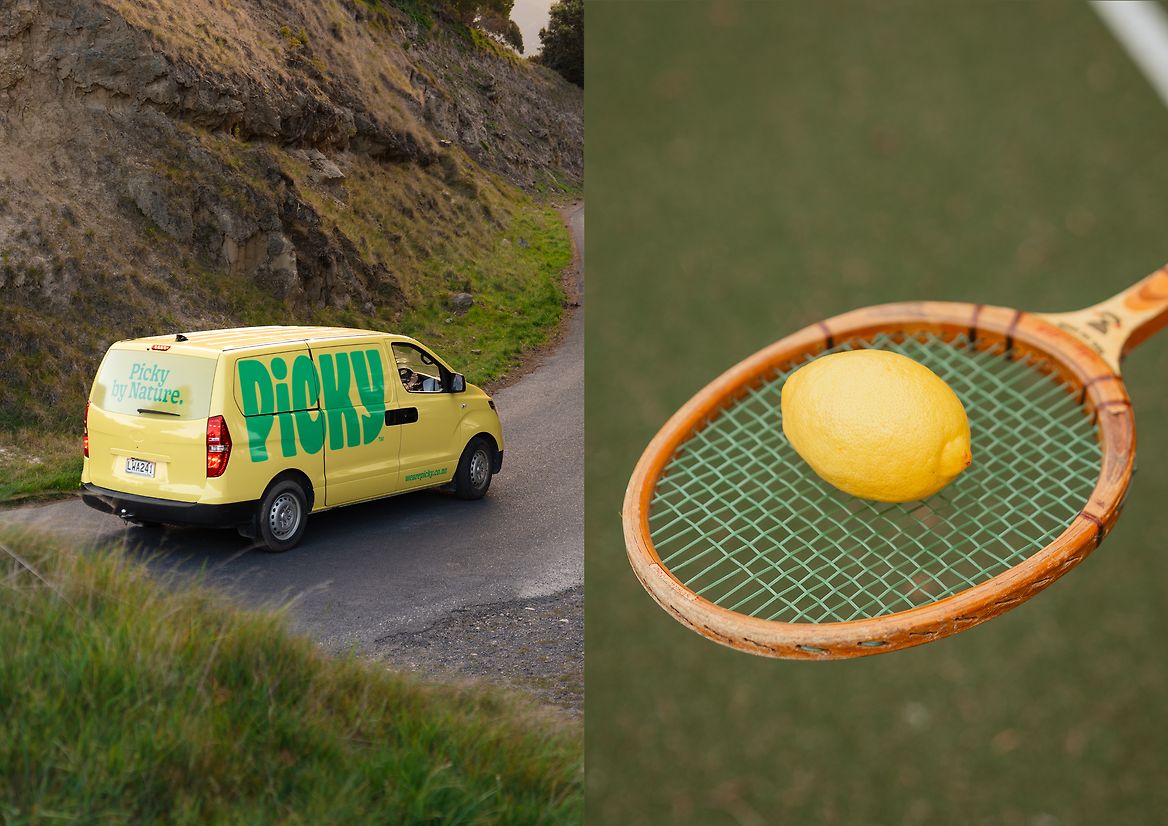
The real fun begins when Picky steps off the bottle and into the world. Merch, vehicles, environmental graphics, campaign pieces—the identity holds up across formats because it doesn’t rely on a single trick. It has color, typography, fruit icons, and a visual tone flexible enough to move between touchpoints without losing its face.
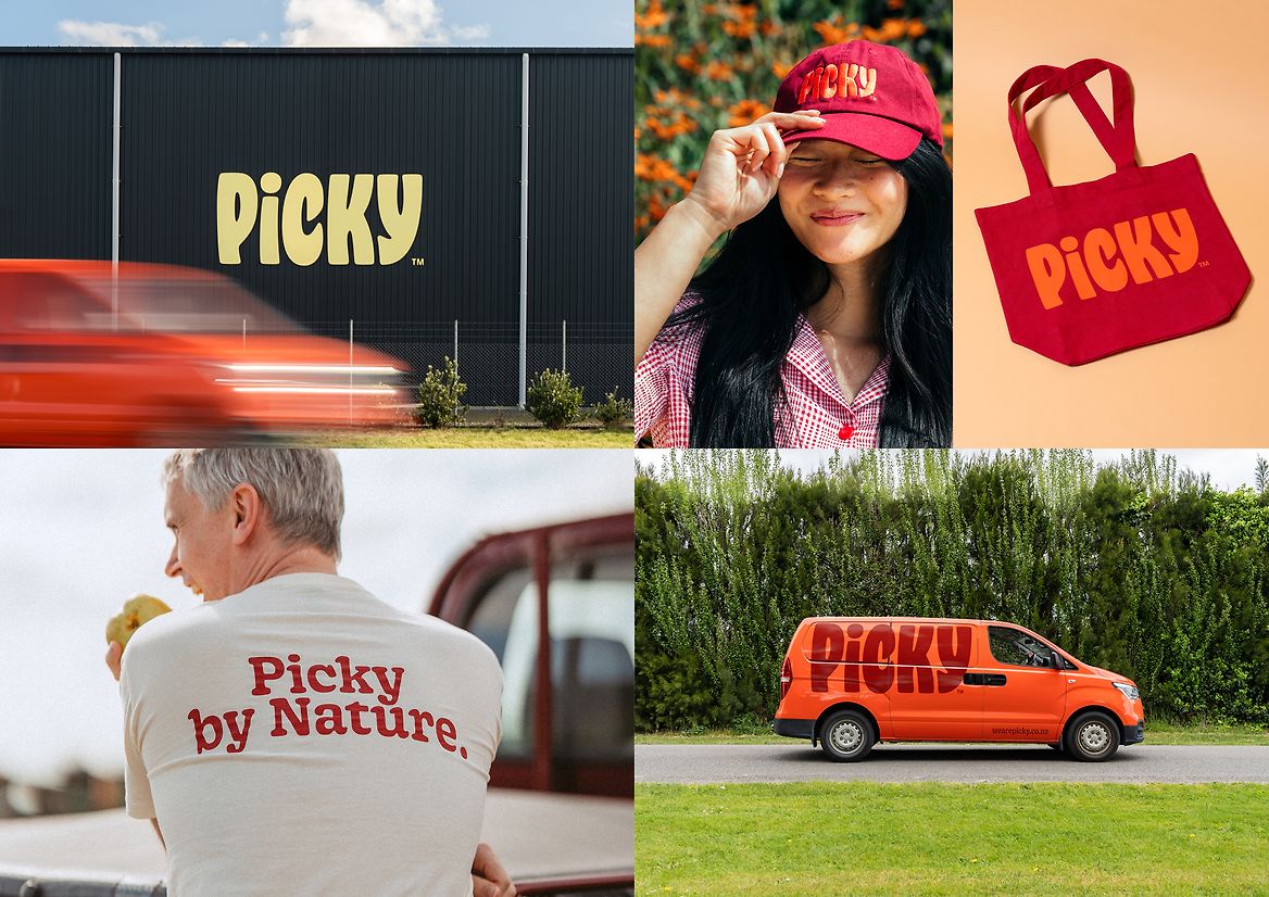
There’s something delightful about this expansion: the brand doesn’t just get printed, it behaves. The yellow truck, the fruit motif, the road, the playful tone—it all adds up to a little narrative of movement. Even without animation, the visual direction has an implicit sense of motion. It feels like the brand travels from the fields, through the city, and ends up in the consumer’s hand.
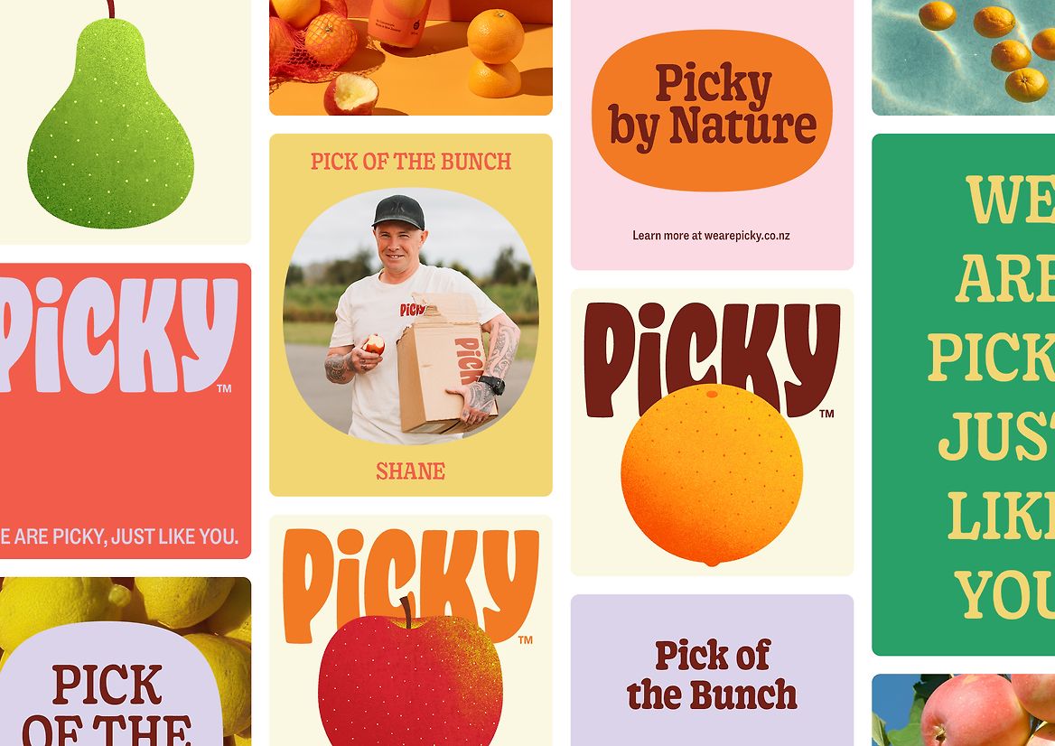
The campaign graphics keep that same visual appetite. Posters, fruit, color blocks, and typography build a repeatable memory. It’s not flat repetition—it’s consistency with variation. That difference matters. An identity that repeats without rhythm gets heavy. One that varies without purpose gets diluted. Picky finds a highly effective middle ground.
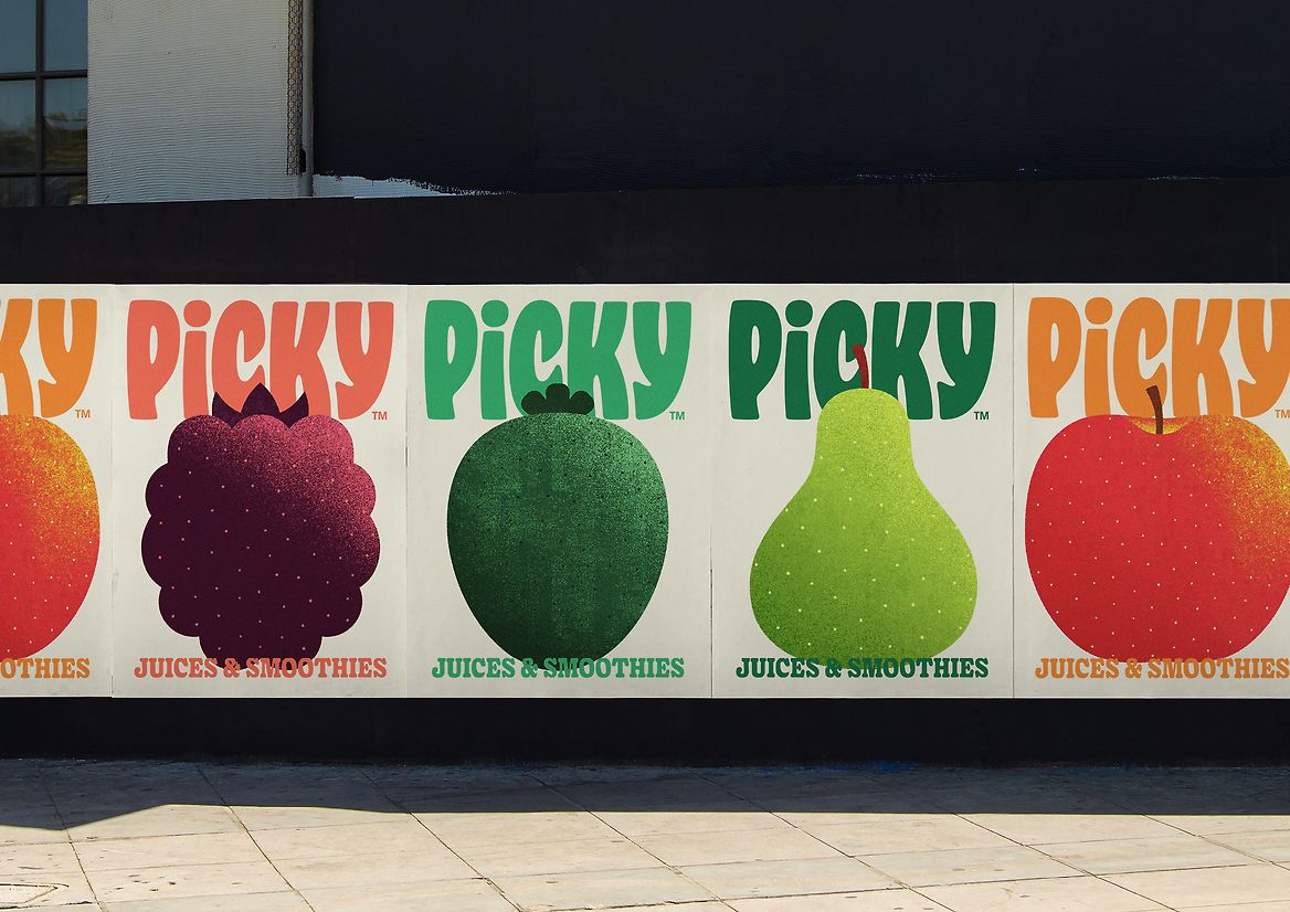
When the system scales up to a mural, the brand proves something important: it doesn’t need the bottle to stay recognizable. That’s real identity. The icons, the color, and the word Picky are strong enough to anchor an environmental piece. For retail, activations, or events, that ability multiplies presence without having to redesign every touchpoint from scratch.
When the identity goes digital
The digital presence follows the same logic: bold color, product front and center, and layouts that keep things easy to read. Both desktop and mobile versions maintain a clean hierarchy—essential when such an expressive brand moves to interface. The challenge isn’t cramming every graphic element onto the screen; it’s knowing what to let breathe so the interaction doesn’t become visual noise.
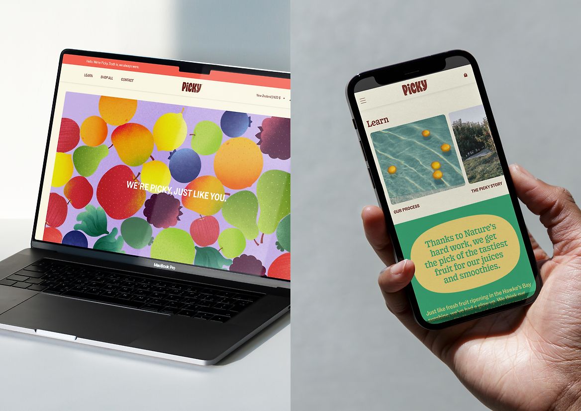
Here, a light UX/UI approach continues the brand’s feel. The interface doesn’t need to steal the spotlight—the visual system already has plenty of character. Digital’s role is to support: organize products, sustain desire, and keep the identity recognizable even at small sizes. For a brand with commercial ambitions, that adaptation is crucial. Visual memory shouldn’t get lost in the jump from pack to screen.
What a well-crafted brand leaves behind
Picky works because it doesn’t treat identity, packaging, and communication as separate pieces. Everything seems to come from the same energy: purposeful color, typography with a voice, clear composition, and a fresh atmosphere that never sacrifices legibility. That mix makes the product more desirable—and easier to understand.
The lesson isn’t about using bold colors or oversized labels. It’s about building a visual system that holds up in every context: on the shelf, in campaigns, in ecommerce, on mobile, on vehicles, posters, and brand assets. When that happens, identity stops being decoration and starts working as a commercial advantage.
And maybe that’s the most interesting part: a memorable brand doesn’t always need to say more. Sometimes it just needs to organize what it already has, choose a signature visual gesture, and repeat it with purpose until people recognize it effortlessly. Picky does it with fruit, color, and plenty of presence. Simple, direct, and designed to stick in your mind.