An identity that goes beyond the logo
Some brand identities look flawless in a presentation, only to lose impact once they step into the real world. CYCLADICA plays in a different league: it feels designed from the outset to live on paper, fabric, walls, objects, and spaces. It doesn’t stand still. It moves.
Its charm isn’t just in the Mediterranean vibe, the warm palette, or a distinctive typeface. It’s in how everything feels lived-in. There’s space to breathe, lines that enter quietly, compositions that are orderly but never rigid, and a visual direction that creates a serene, almost editorial atmosphere.
That calmness is a brand asset. When an identity doesn’t need to shout, perception shifts: it feels more confident, more refined, more attuned to its own visual rhythm. CYCLADICA doesn’t fill every surface just to be seen; it repeats with intention, letting visual memory build gradually.
This spotlight is about enjoying an identity with substance. The kind of brand that understands branding doesn’t end with the logo, but is proven when the system holds up across materials, scales, shadows, daily use, and subtle gestures. That’s where it gets interesting: an identity that’s not just seen, but remembered.
CYCLADICA — Mediterranean identity with texture, order, and personality
CYCLADICA embraces a concept that’s tough to pull off without slipping into tourist cliché: the Mediterranean as a refined, elemental, and approachable experience. The secret is steering clear of the obvious. There’s no overuse of blue, no unchecked decorative illustration, no parade of “local” motifs lined up for effect. The identity breathes through restraint.
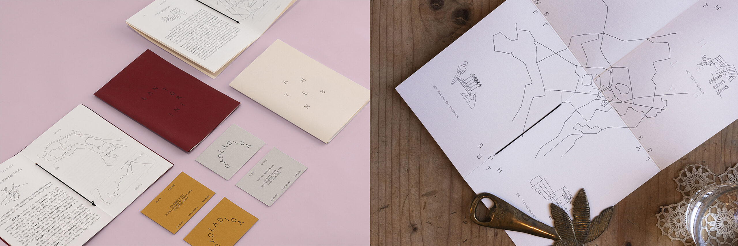
The first major visual decision is the palette. Off-whites, warm neutrals, soft blacks, and terracotta accents create a premium look without feeling cold. Color isn’t just decoration; it sets the mood. It gives context, suggests a sense of place, and connects the pieces without relying on the same graphic gesture every time.
The composition has a distinctly editorial feel: cards, maps, notebooks, and print pieces form a small constellation of objects. Nothing feels random, but it’s not so precise that it loses its naturalness. That balance is gold for a visually ambitious brand identity—it conveys method without sacrificing a human touch.
Typography carries much of the character. It’s clear, understated, and strong enough to work across sizes, formats, and distances. It doesn’t need to be flashy to be recognizable. Sometimes great branding is just that: a typographic voice that doesn’t compete with everything, but brings everything together.
There’s also an interesting UX/UI perspective, even though the project is primarily physical and graphic. The visual experience unfolds as a journey: first the system, then its extensions, then the environment. This progression helps people grasp the brand without over-explaining. For users, clients, or marketing directors, that visual clarity reduces friction: it’s immediately clear this isn’t just a standalone logo, but an identity with depth.
Typography as object
One of the most striking moments comes when the letters stop behaving as flat text and become sculptural elements on the wall. The identity gains shadow, volume, and dimension. The brand is no longer just read—it’s encountered.
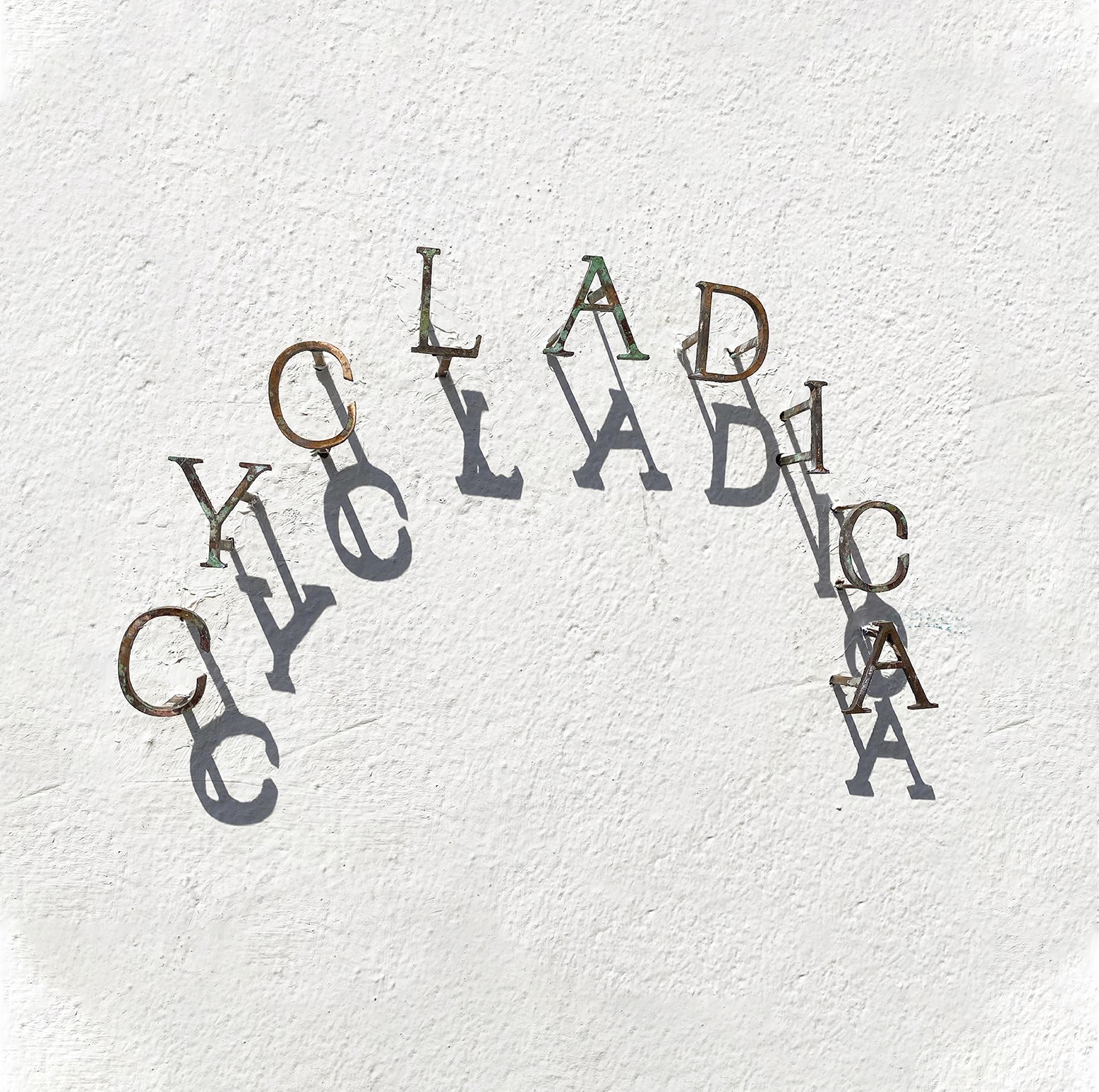
This kind of application is powerful: it turns the identity into a physical presence. It doesn’t depend on a screen, a card, or a fleeting campaign. It lives in the space. And when a brand inhabits a place naturally, visual memory becomes much stronger.
The arrangement of the letters strikes a compelling balance between order and dispersion. It’s not rigid; there’s air, spacing, small irregularities. That visual movement adds personality without breaking the overall elegance of the system.
Merchandise without the promo feel
Applications on tote bags, textiles, and t-shirts are especially noteworthy because they avoid the usual pitfall of branded merchandise: looking like soulless corporate giveaways. Here, the objects don’t feel like afterthoughts. They could stand alone, with their own visual appeal.
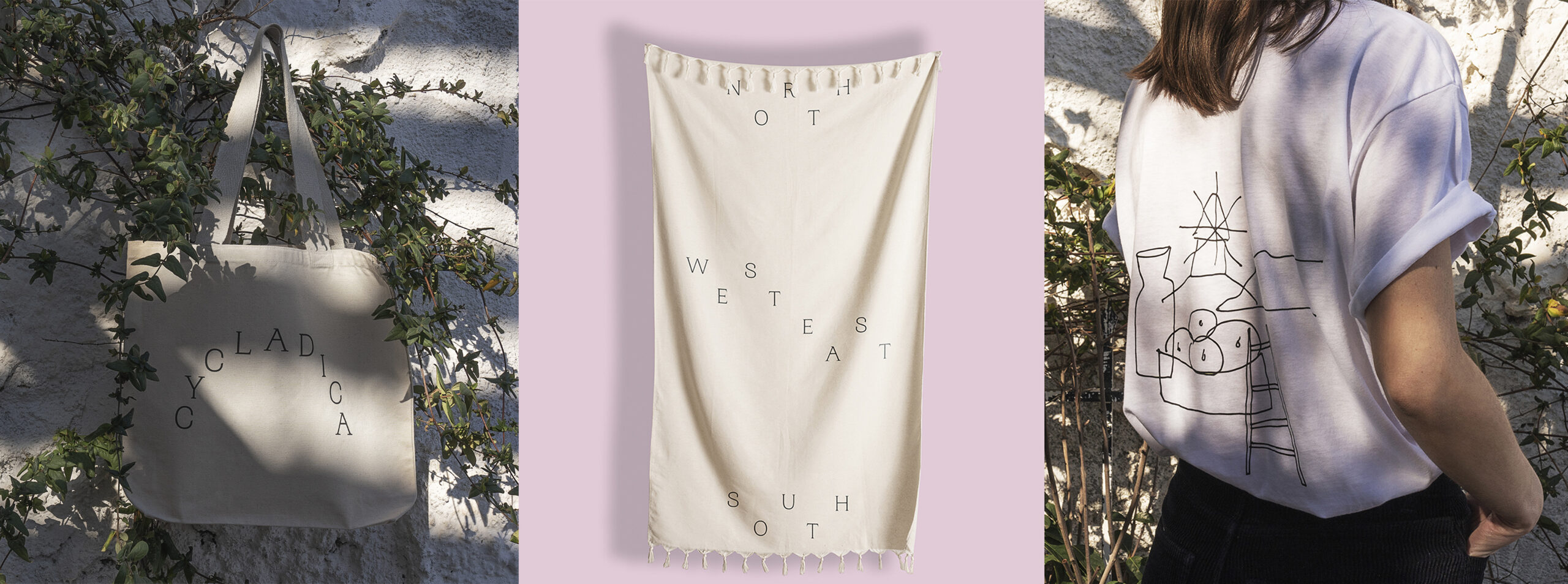
The line illustration plays a big role. It has a hand-drawn quality, almost like a found sketch, that softens the typographic structure. The mix of lettering, line, and textile creates a more intimate atmosphere. The brand becomes usable, wearable, part of daily life.
For hospitality, lifestyle, or experience brands, this is especially powerful. A well-designed object doesn’t just accompany the guest—it extends the brand relationship beyond the service. And if the object has visual integrity, it stops being a souvenir and becomes a badge of belonging.
Architecture, façade, and sense of place
When the identity reaches architecture, the system gains another layer. Letters applied to walls and façades aren’t just signage—they’re gestures of welcome. There’s a careful blend of wayfinding, identity, and scenography.
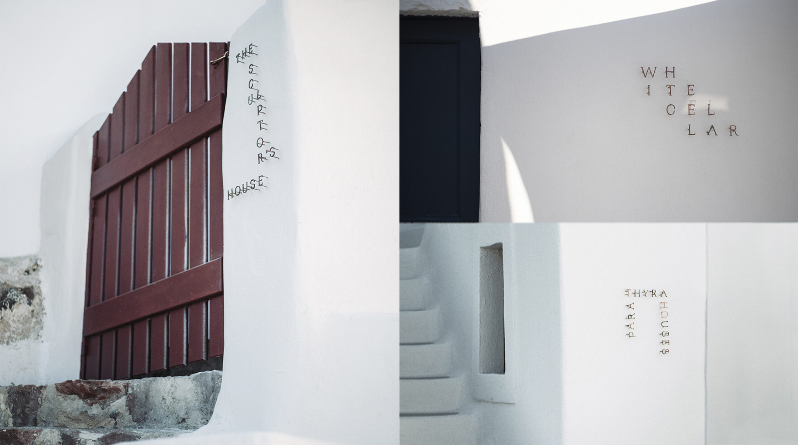
The beauty is that the brand doesn’t overwhelm the space. It complements it. The typography adapts to the scale of the wall, the white of the architecture, and an aesthetic where light matters as much as form. That respect for the environment makes the identity feel more solid and less forced.
In terms of perceived value, this kind of application carries real weight. A brand that knows how to behave in architecture feels more prepared, more consistent, and more aware of its total experience. It doesn’t just sell a visual promise—it shows how that promise is realized.
The system returns to print, with more depth
The final visual layer brings back stationery, cards, textiles, and graphic pieces in a more understated composition. Here, the system’s flexibility is clear: it can be editorial, spatial, textile, or object-based without losing its tone.
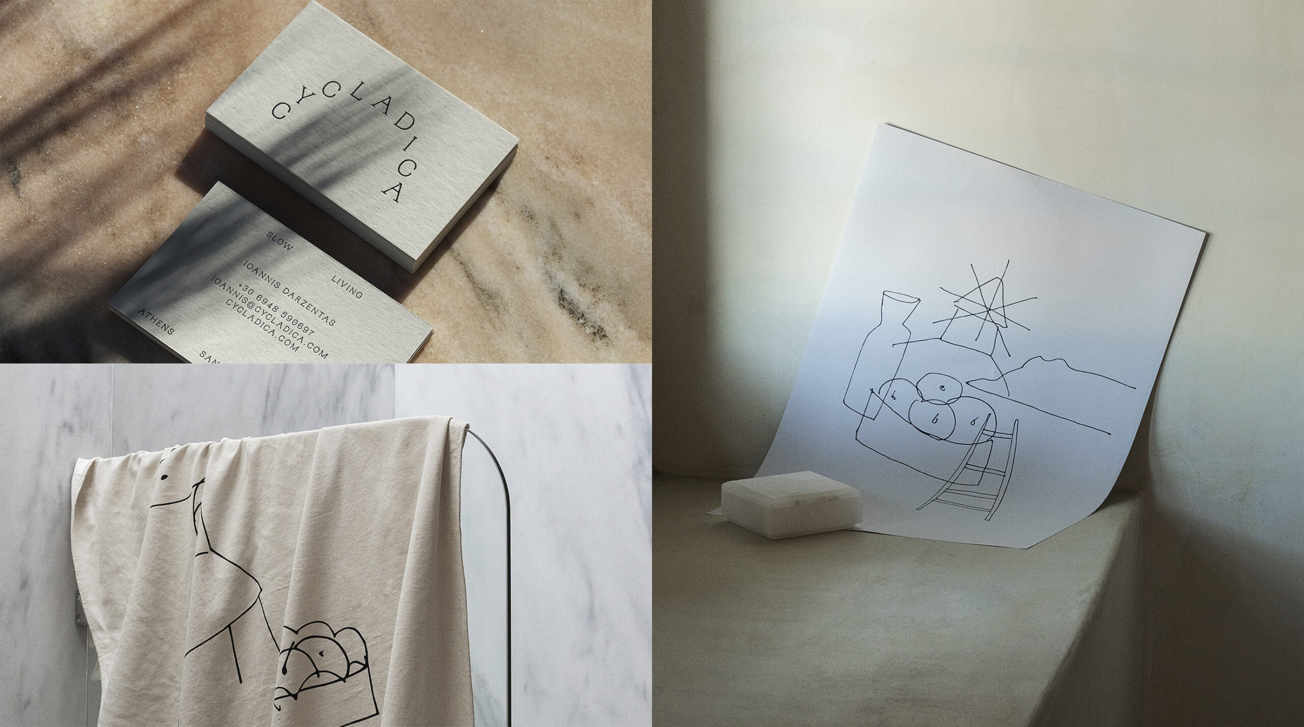
The composition again plays with soft backgrounds, well-spaced objects, and a calm hierarchy. There’s no rush to show everything at once. That measured visual rhythm is part of the luxury: leaving space, letting each piece have presence, and building an identity that doesn’t need to overwhelm to persuade.
There’s also a clear lesson for digital projects. A brand website can learn a lot from this approach: fewer generic blocks, more visual sequencing; less over-explanation, more tangible demonstration; fewer decorative flourishes, more coherence between what’s said and what’s shown. Light UX often starts with organizing the visual narrative.
What this reference offers brands with visual ambition
CYCLADICA’s big idea is simple and powerful: a brand identity is more memorable when it has substance. It’s not enough to design a flawless logo or a pleasing palette. The brand needs variations, formats, texture, real-world uses, and a visual direction that holds its tone as formats change.
For marketing teams, founders, or brands looking to elevate perceived value, this case leaves a crucial question: does your identity hold up beyond the initial presentation? Does it work on a card, in an email, on a bag, on a wall, in a sales piece, on a website, in a physical experience?
When the answer is yes, the brand becomes more credible. Not through sheer number of applications, but through coherence. Each format confirms the same visual universe from a different angle. That well-designed repetition builds trust without needing to spell it out.
And maybe that’s the real pleasure of this project: it feels calm, but it works hard. It organizes, suggests, accompanies, and leaves a mark. An identity with Mediterranean flavor, yes, but above all, with the vision to turn graphic design into brand experience.