Some hotel brands try to look expensive by piling on gold accents, marble, and grandiose language. Then there’s this approach to hotel branding: quieter, more editorial, more self-assured. La Corte plays a different game. It doesn’t force luxury—it lets it breathe.
The magic lies in how it turns a stay into a feeling before ever mentioning rooms. Landscape, air, deep greens, skilled typography, and a layout designed to slow the pace. For a hospitality brand, that sense of calm isn’t just decoration—it’s perceived value.
LA CORTE — serene luxury with visual memory
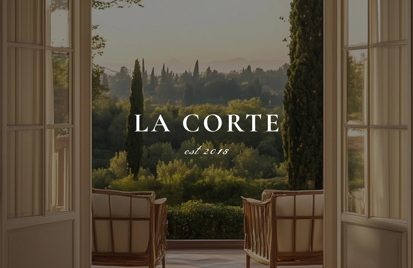
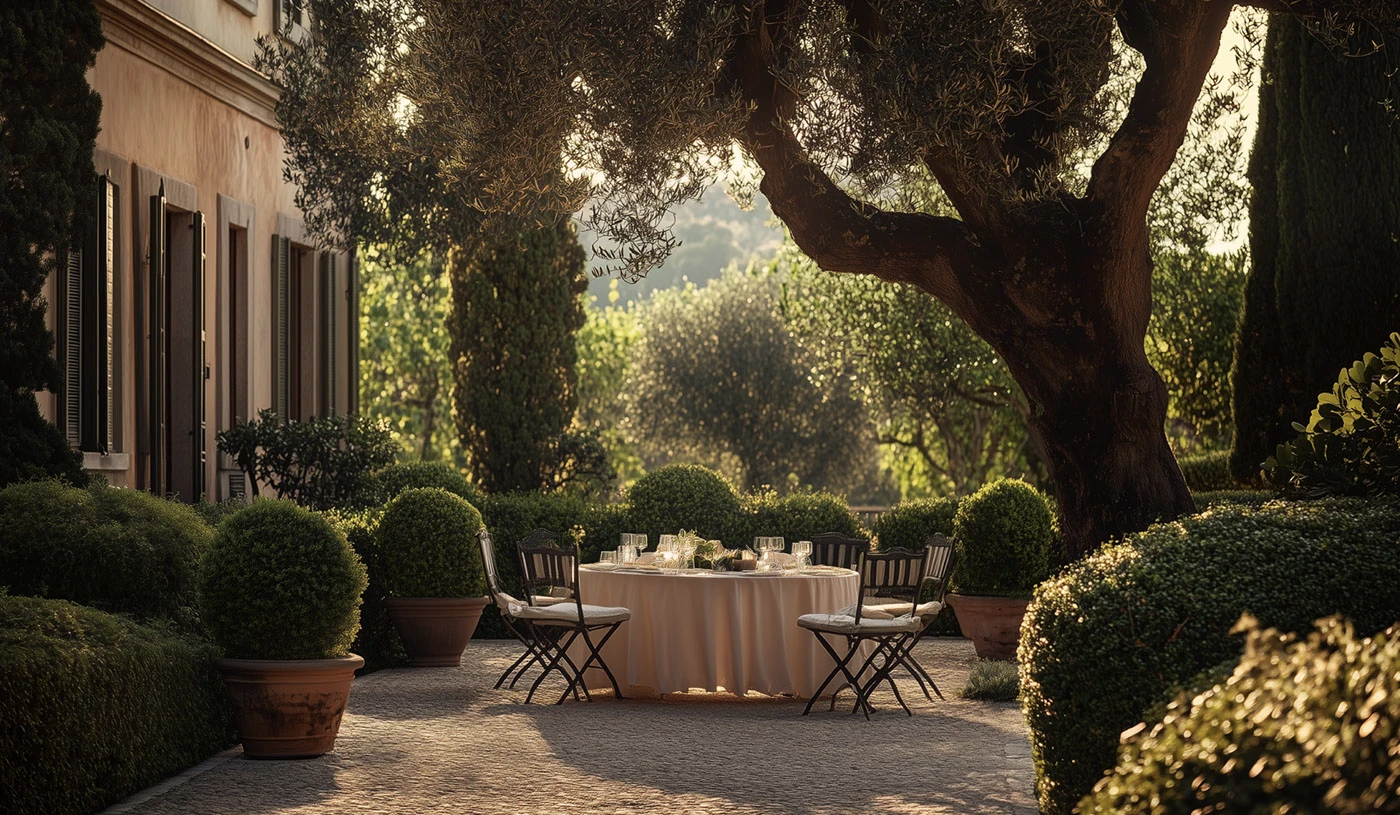
The first impression works because it doesn’t over-explain. Open doors, a Tuscan view, and the name confidently centered—almost classical in its poise. The composition feels like a private postcard, but never slips into the touristy. Rather than showcasing a hotel, it creates the sensation of entering a secluded retreat.
Color does much of the heavy lifting. Cream, muted greens, warm shadows, and restrained light. No saturation, no urgency. This palette makes the identity feel premium without having to spell it out. In hotel branding, this distinction matters: premium isn’t always about shine, but about creating desire with subtle gestures.
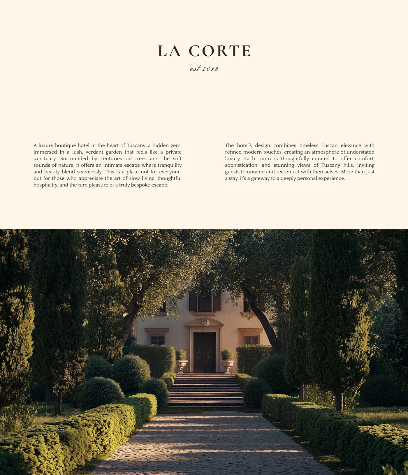
The visual direction has an editorial rhythm. Clean blocks, airy text, images as pauses, and a hierarchy that doesn’t compete for attention. This is especially relevant for boutique hotels: when the brand knows how to structure its story, guests don’t feel like they’re being sold a room, but a way of being.
The landscape isn’t just a pretty backdrop—it’s a statement. The greenery, the entrance, the villa’s scale, and the path inward all promise distance, quiet, and care. This atmosphere positions the hotel before any commercial message appears.
LA CORTE — typography, symbol, and a system with classic pulse
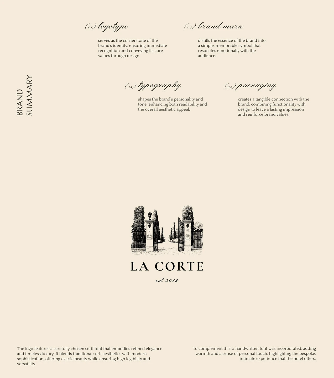
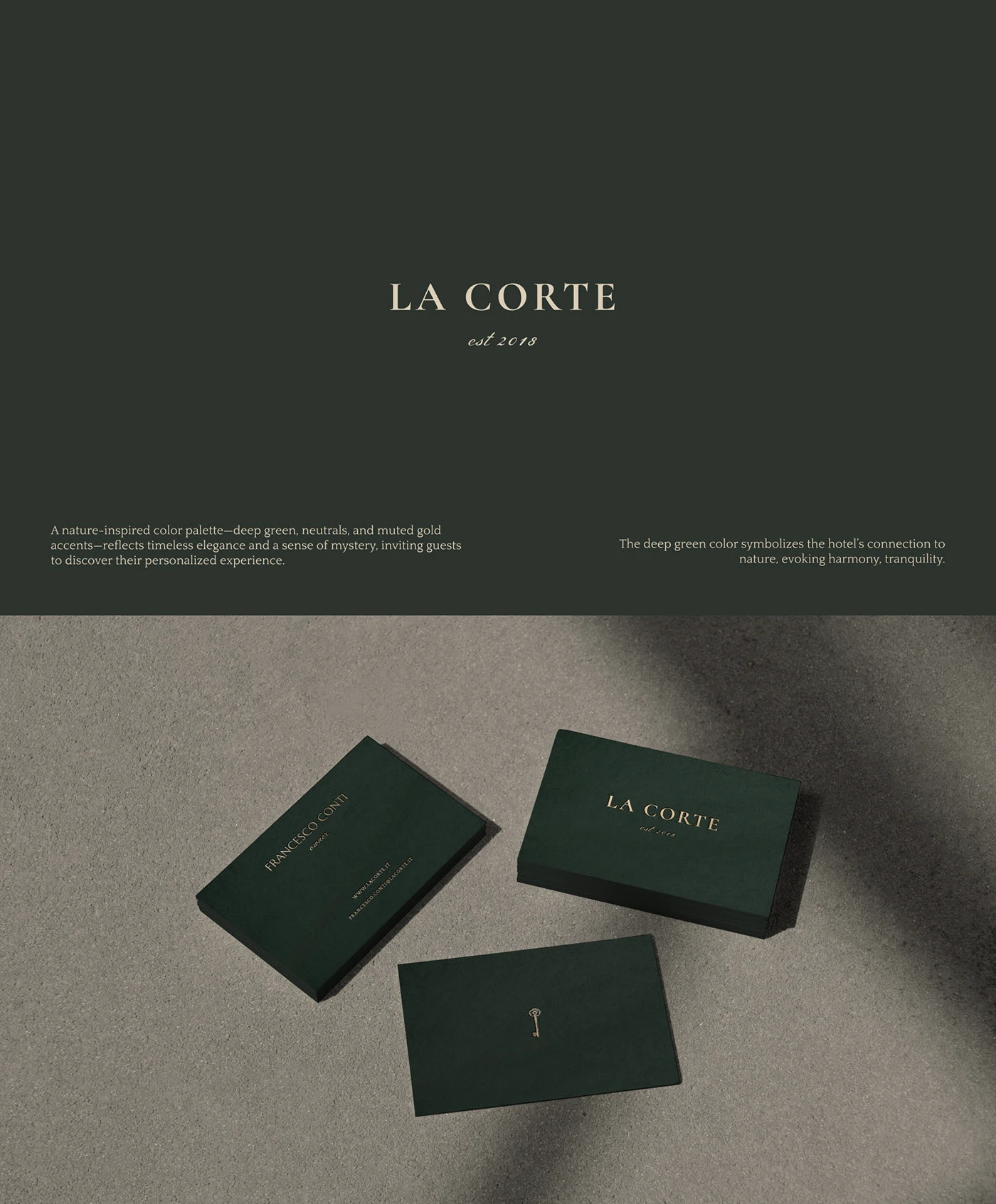
The identity gains strength as it moves from ambiance to system. The logo has a timeless elegance, anchored by a strong serif and a handwritten touch that adds warmth. This combination works because it blends two essential codes for hospitality: tradition and approachability.
The brand mark isn’t just decorative. It acts as a small gateway into the visual universe: architecture, garden, entry, ritual. This kind of symbol has longevity, seamlessly living on stationery, amenities, cards, labels, or signage without losing its tone.
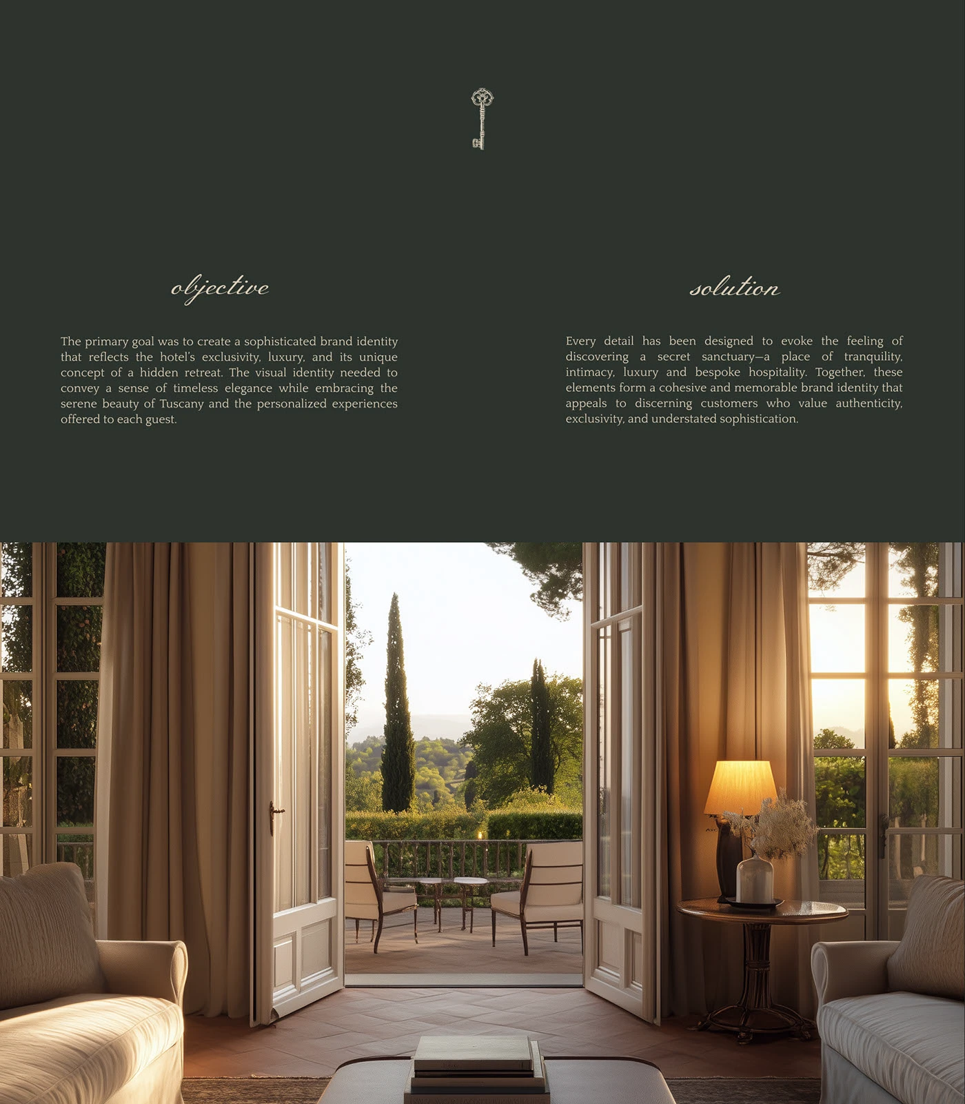
There’s also a clear visual UX/UI lesson: when the identity is well-structured, reading becomes effortless. There’s no need to overload the screen with messages. The user senses the brand’s level through composition, typography, and the silence between elements. That silence sells more than you’d think.
Typography doesn’t just dress the brand—it sets the visual tempo. Headlines have presence, body text breathes, and images arrive as moments of contemplation. On a real hotel website, this logic could translate into a more desirable booking experience if paired with clear, frictionless interaction.
LA CORTE — the identity in the guest’s hands
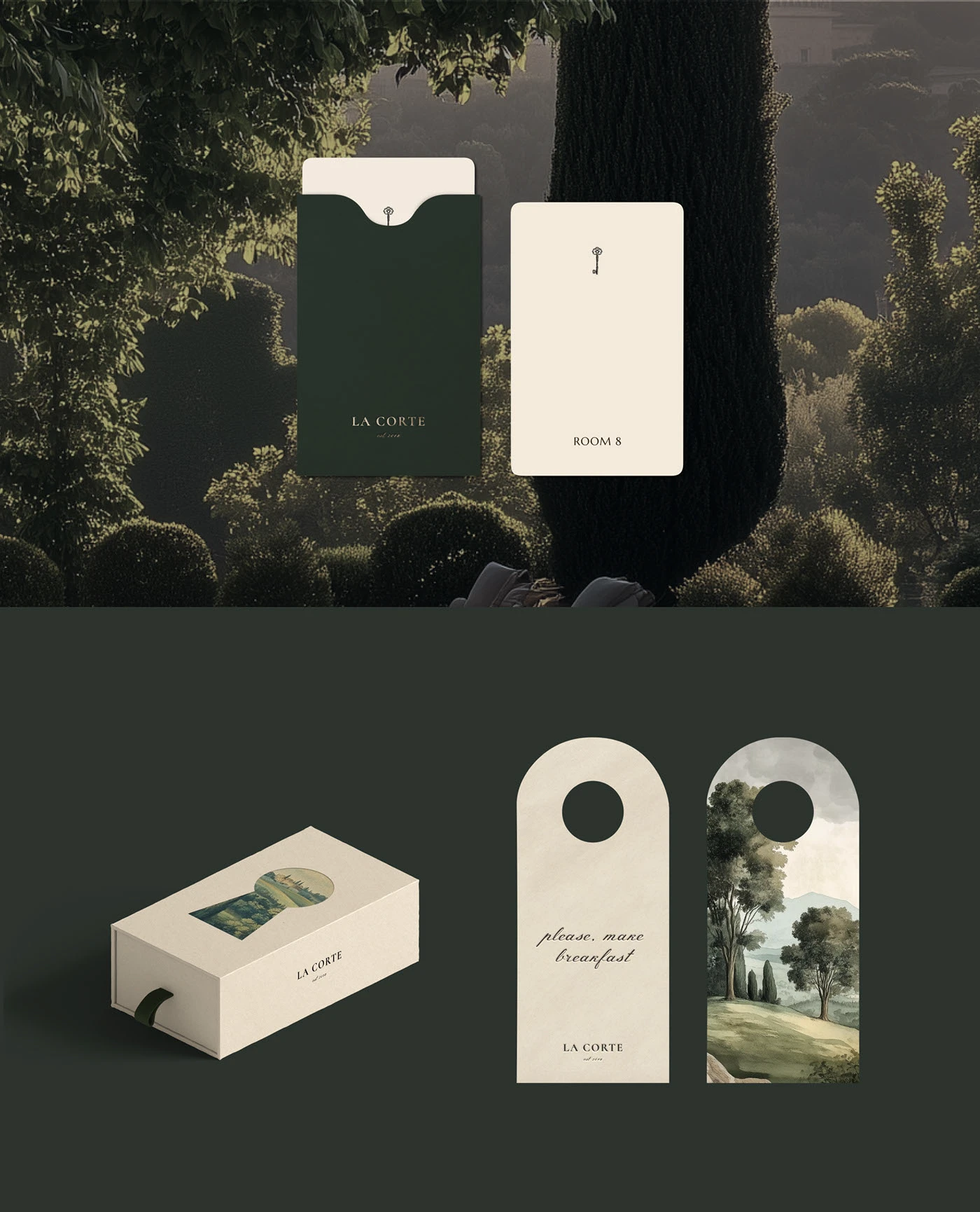
The most enjoyable part comes when the brand becomes tangible. Cards, boxes, labels, and printed pieces all carry the same atmosphere as the landscape. They don’t feel like afterthoughts, but as small extensions of the experience.
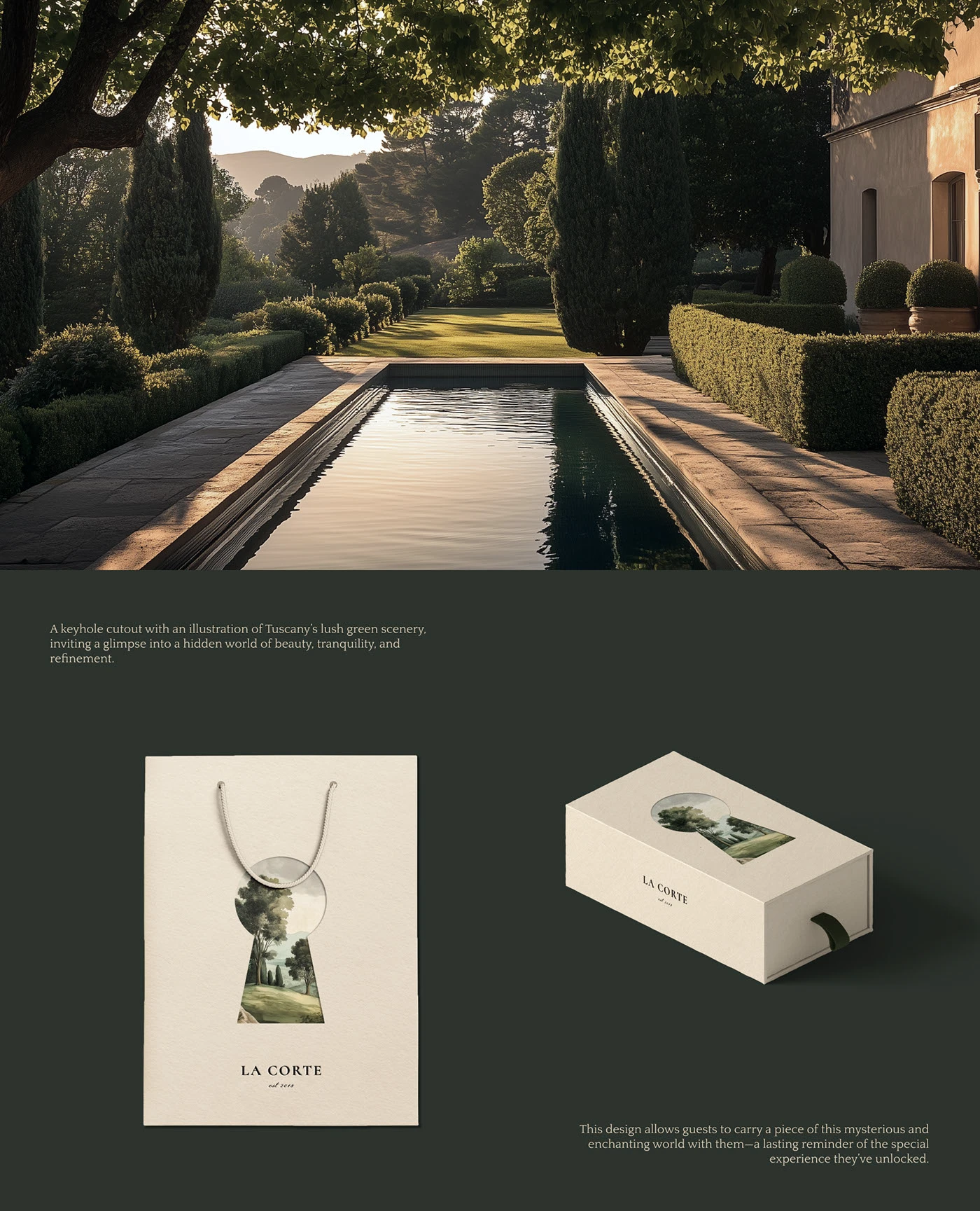
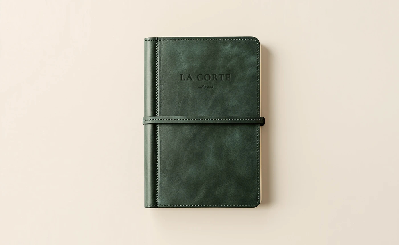

These touchpoints may be small, but they carry weight in visual memory. A guest doesn’t just remember the check-in or the bed; they remember the texture of a card, the color of a label, the way everything felt like it belonged to the same world. That coherence builds trust and makes the service feel more attentive.
La Corte leaves us with a beautiful, practical idea: convincing luxury doesn’t need to shout. It needs discernment. A well-crafted hotel identity can elevate desire, recognition, and perceived value through composition, color, typography, and atmosphere. Less excess, more intention. Less decoration, more a world of its own.


