How to transform urban stress into a living and participatory visual identity
Every week we analyze international projects that show how branding can become a strategic tool capable of transforming experiences, behaviors, and perceptions. This time, we travel to Milan to explore one of the most interesting and conceptually solid visual identity projects of the year: Specialty, a coffee shop chain designed by Denormalized, internationally recognized and awarded with a Red Dot Award for its deeply human, emotional, and contemporary branding approach.
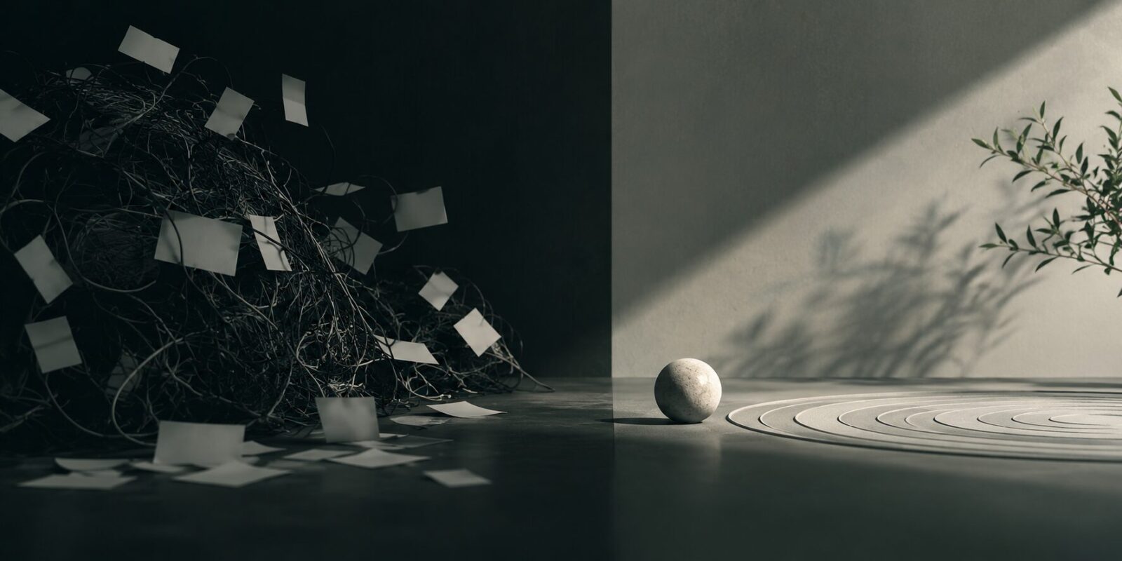
Beyond creating a visually appealing coffee shop, the project starts from a very specific question: how do you design a space for rest in a city that never stops? The answer was not built from aesthetic trends or the usual codes of coffee shop branding, but from human behavior, urban anxiety, and the need to disconnect in a fast-paced environment like Milan.
The result is a visual identity that turns stress into creative material and transforms customers themselves into active designers of the brand.
Milan as a starting point: a fast, industrial, and demanding city
Before developing any visual system, the Denormalized team decided to study the emotional and cultural context of Milan. To do so, they interviewed local residents, trying to understand how the city is truly experienced beyond its stereotypes linked to fashion or design.
The conclusions were clear: Milan is a work-oriented city, marked by a fast rhythm, a business mindset, and constant industrial energy. An environment where speed dominates everyday life and where finding real moments of pause becomes increasingly difficult.
From this observation, the main insight of the project was born: people in Milan need a place where they can breathe.
- Not just another coffee shop.
- Not an aesthetic café designed for Instagram.
- But an emotional refuge.
- A safe room.
The strategic concept: Specialty as a “safe room”
Specialty’s identity is built around a very powerful idea:
the coffee shop as a “safe room”.
A place where people can stop, reduce mental noise, and temporarily escape the obsessive rhythm of the city. This idea completely redefines the usual positioning of the coffee shop sector, which often revolves around productivity, dynamism, or fast consumption.
Here, the opposite happens.
Specialty proposes:
- calm instead of saturation;
- presence instead of speed;
- rest instead of hyperstimulation;
- humanity instead of urban automation.
This approach turns branding into a much deeper emotional experience. The brand does not only sell quality coffee: it sells a sense of pause and wellbeing.
An “anti-stress” identity based on human behavior
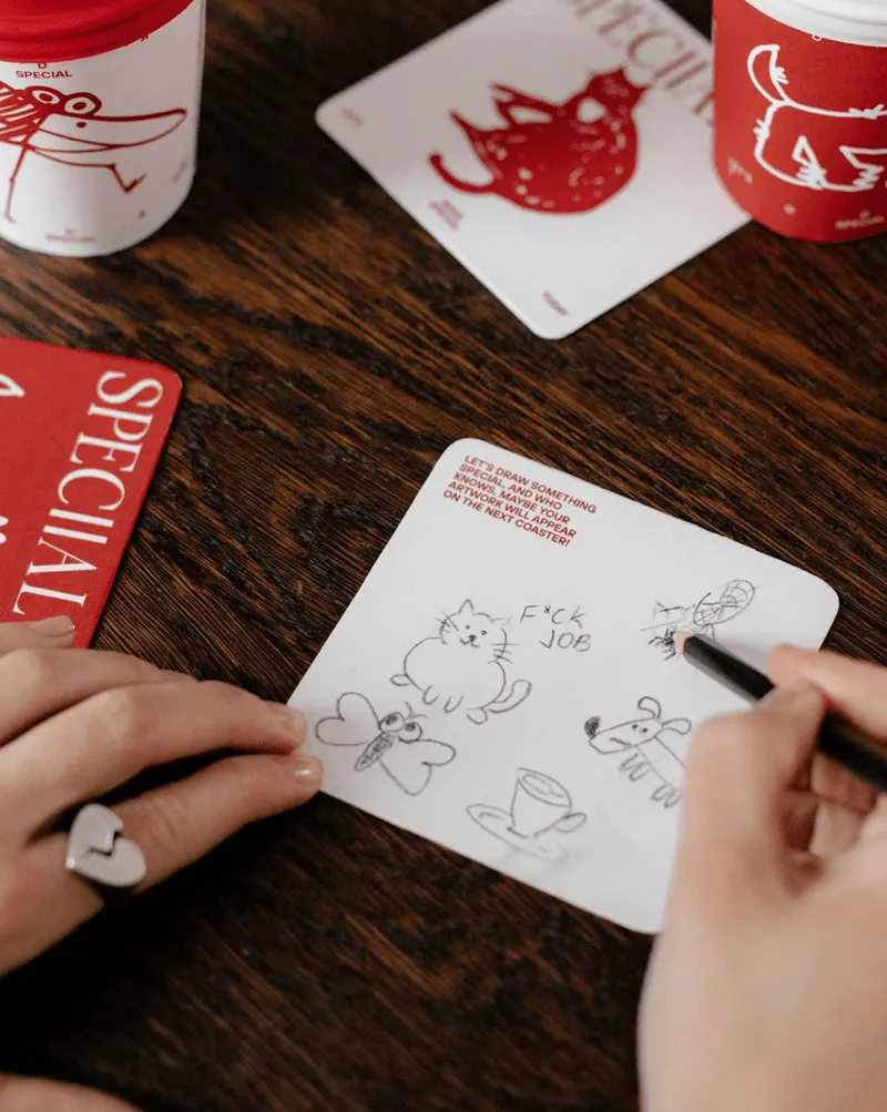
One of the most intelligent aspects of the project is how the visual system is born directly from human psychology. The creative team researched how people react when trying to escape intrusive thoughts or anxious situations.
They detected something very interesting: when the brain seeks calm, it often turns to repetitive motor activities.
- Drawing.
- Doodling.
- Moving a pen.
- Shaping objects.
- Knitting.
- Repeating patterns.
These actions help reduce stress, support focus on the present, and create a sense of emotional regulation.
From this observation, the creative core of the project was born:
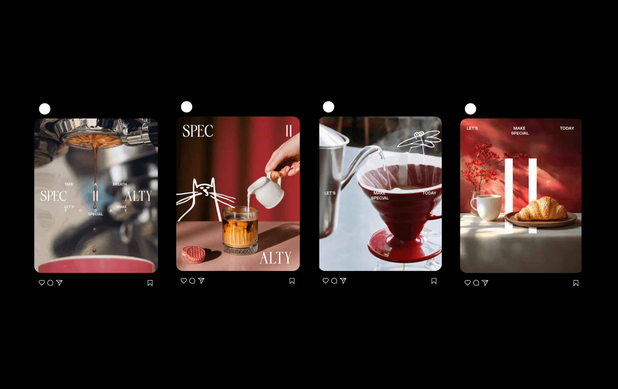
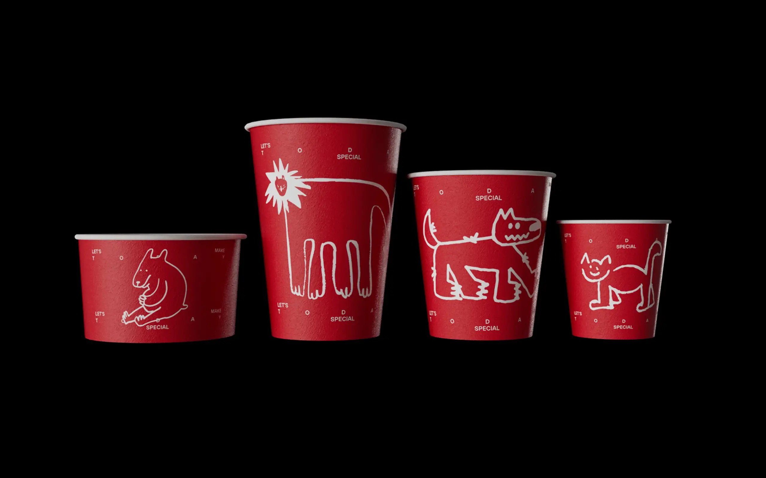
turning spontaneous customer doodles and drawings into visual identity elements.

Customers as active designers of the brand
This is where Specialty becomes truly interesting from the perspective of contemporary branding.
- The identity is not static.
- It is not closed.
- It is not a rigid system imposed by the studio.
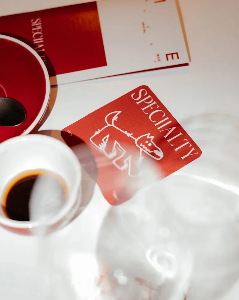
The brand is built in a participatory way from the drawings customers create on:
- napkins,
- coasters,
- paper,
- physical materials inside the space.
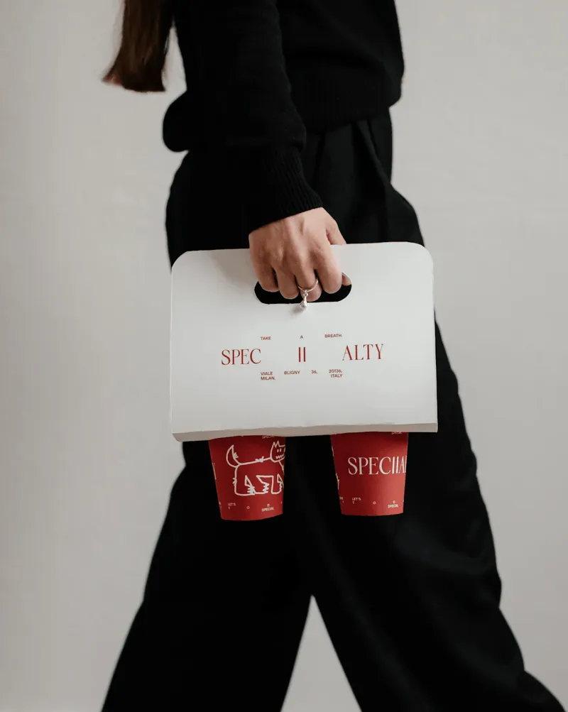

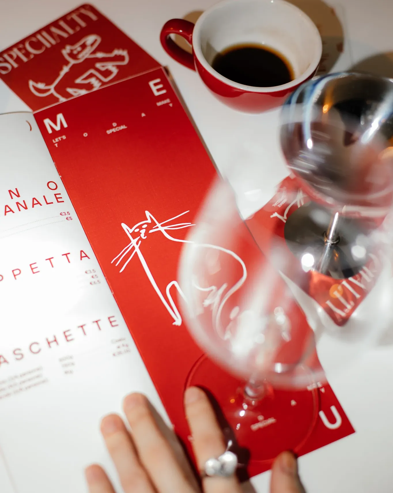
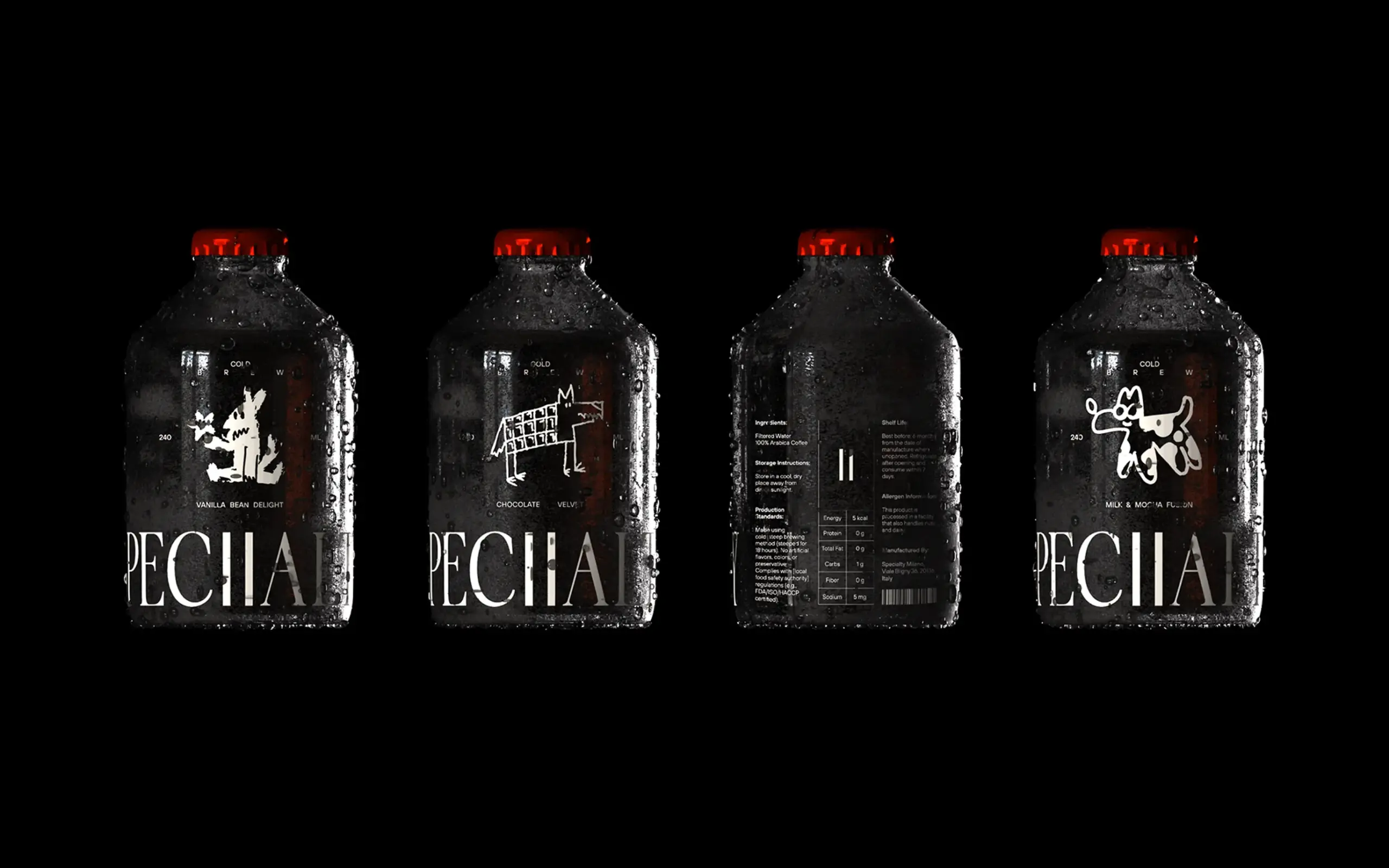
These doodles are later transformed into:
- brand graphics,
- illustrations,
- animations,
- digital elements,
- resources for social media,
- merchandising,
- visual communication.
It is a brilliant idea because it turns relaxation into creative production and transforms the customer experience into an active part of the branding.
The identity stops being something designed only by an agency and becomes a living collective construction.
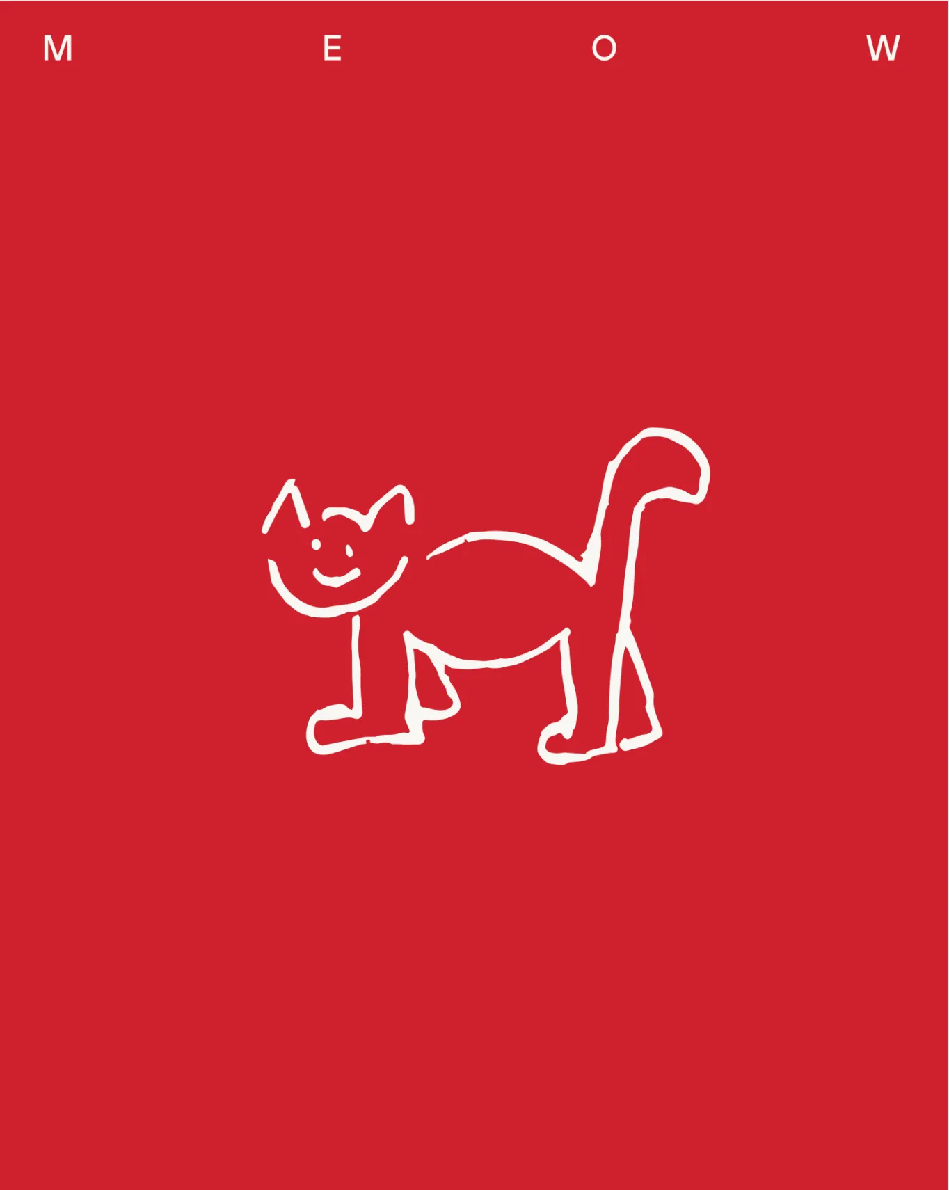
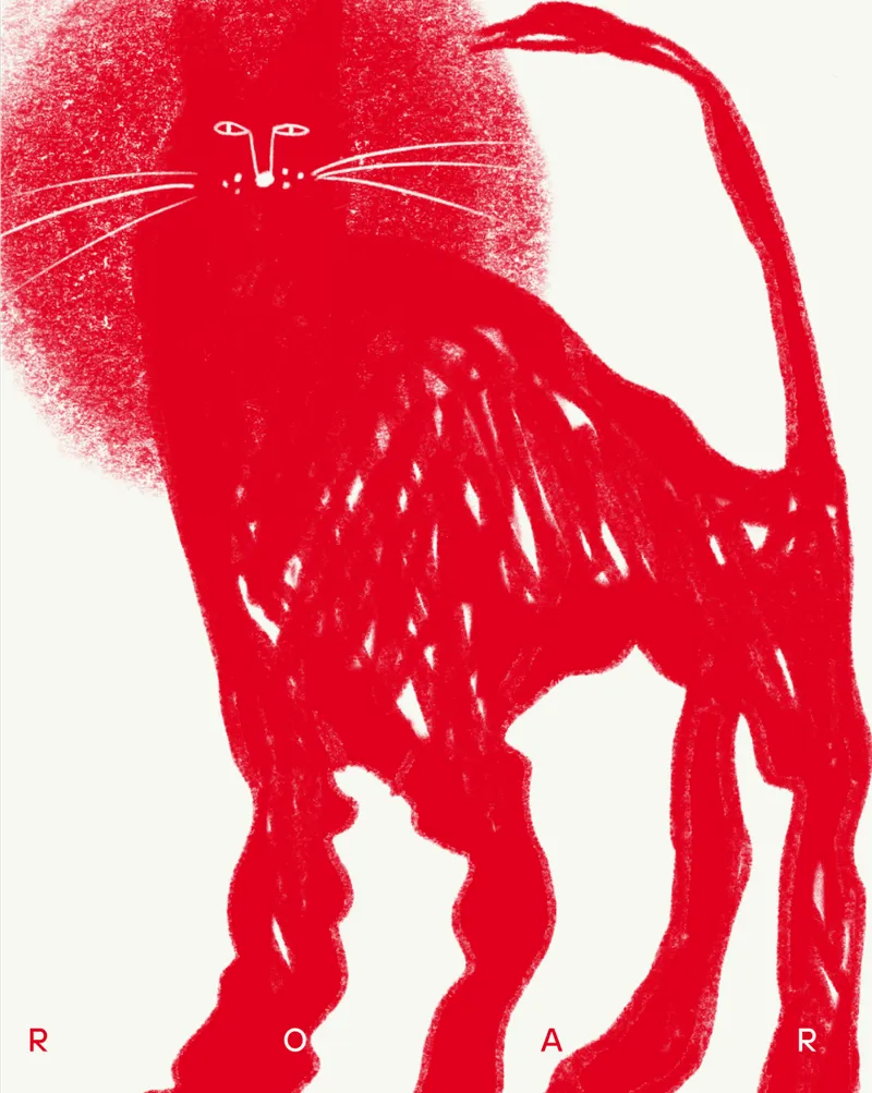
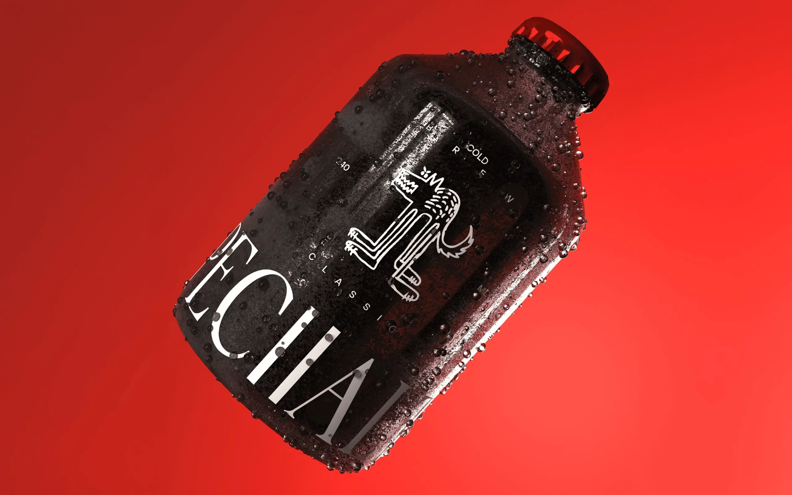
The Italian wolf as the main symbol
Within this mutable visual universe, there is one constant element: the Italian wolf.
This character works as Specialty’s main symbol and connects directly with the brand’s cultural roots and its location in Italy. However, the wolf is not used in a literal or aggressive way. Its presence is subtle, adaptable, and emotional.
On a conceptual level, it functions as:
- a symbol of protection;
- a representation of refuge;
- a silent companion;
- a recognizable element within the visual system.
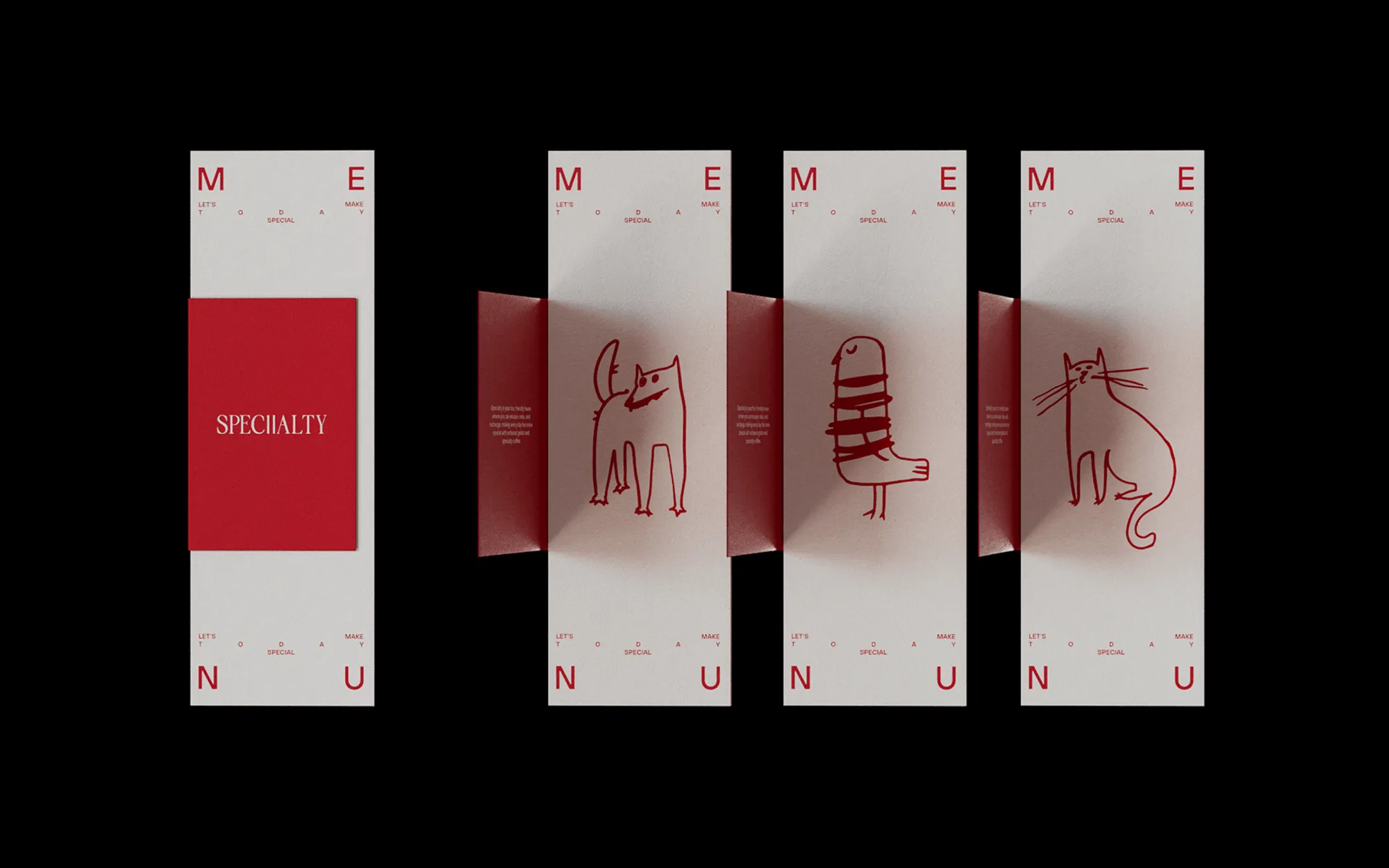
Around this character, other drawings, creatures, and graphic forms generated by users appear, creating an organic and changing visual ecosystem.
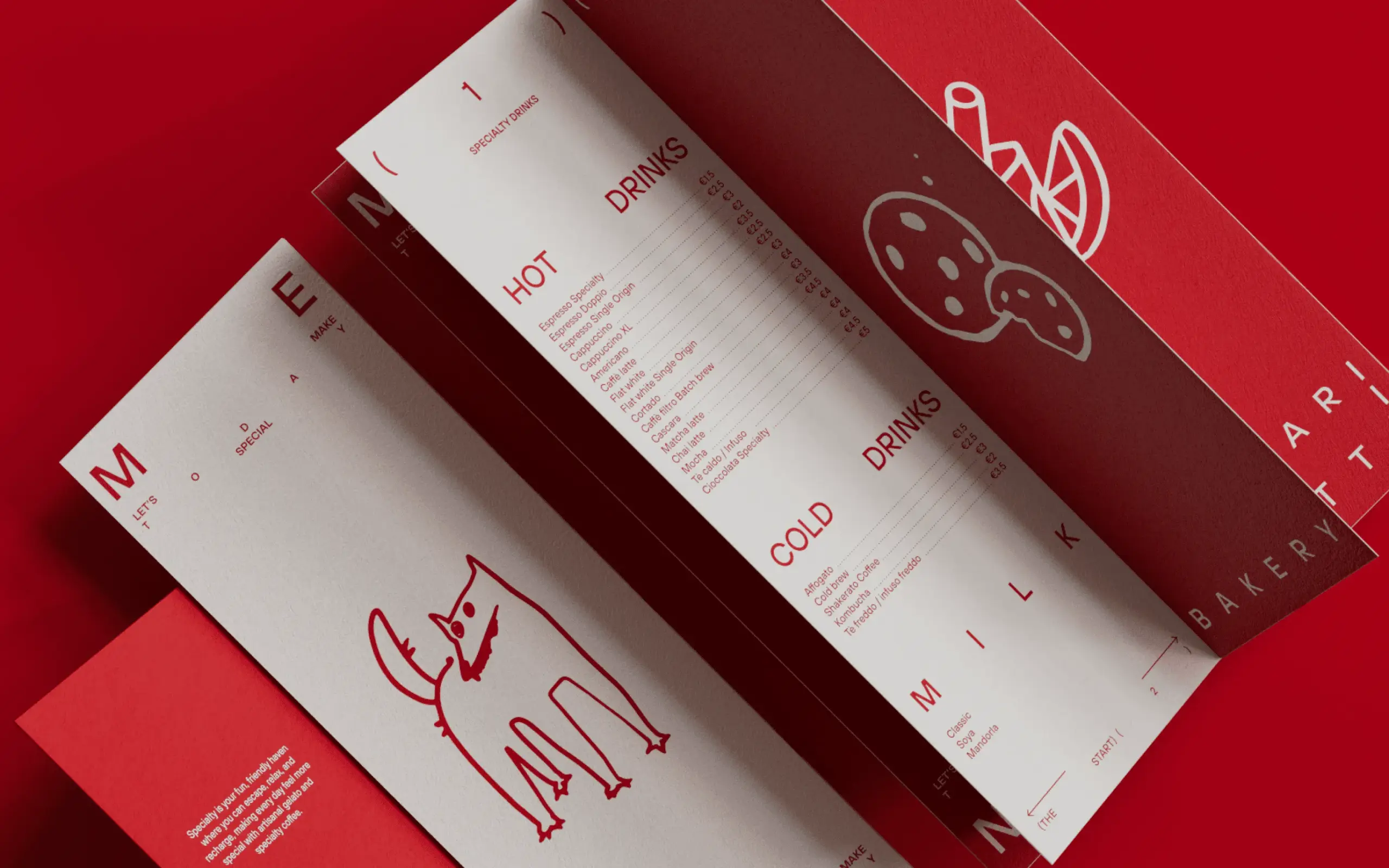
Contemporary graphic design with an emotional focus
Visually, Specialty avoids many of the usual codes of contemporary coffee shop branding. It does not rely on an overly artisanal, vintage, or hipster aesthetic. Nor does it fall into cold corporate minimalism.
Instead, Denormalized builds a flexible, expressive, and deeply human identity.
The visual system combines:
- contemporary typography;
- organic illustrations;
- soft motion graphics;
- clean composition;
- breathable visual spaces;
- spontaneous graphic elements.
Everything conveys a feeling of emotional lightness and absence of pressure.
Even the verbal language and tone of communication follow this same direction. The concept: “Take a breath” perfectly summarizes the essence of the brand.
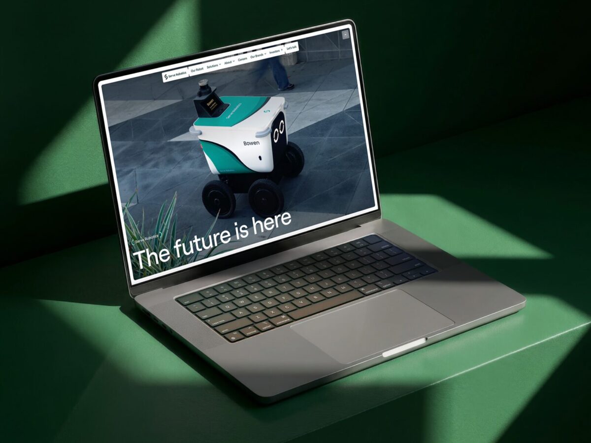
Branding designed to grow across digital and retail
One of the initial challenges of the project was to create an identity capable of working across both physical and digital environments, while also being ready for the future expansion of the chain.
The system developed by Denormalized solves this challenge through an extremely flexible structure.
The identity can easily adapt to:
- social media,
- motion design,
- packaging,
- merchandising,
- physical spaces,
- audiovisual content,
- digital campaigns.
The constant participation of users also ensures that the visual content never becomes repetitive or rigid.
From a strategic point of view, this is especially valuable for contemporary brands that need to maintain visual freshness without losing coherence.
Design as a wellbeing experience
One of the most relevant aspects of the project is how branding stops being understood as decoration and starts functioning as an emotional experience.
Everything in Specialty is designed to reduce tension:
- the visual rhythm,
- the graphic composition,
- the empty spaces,
- the spontaneous illustrations,
- the manual participation,
- the communication tone.
It is branding designed from user psychology, not only from aesthetics.
This makes it a particularly interesting example for any branding agency, graphic design studio, or strategic consultancy interested in:
- emotional branding,
- experiential design,
- participatory visual identity,
- retail branding,
- flexible brand systems.
A living and scalable visual system
Many visual identities fail when they need to grow. Systems that are too rigid end up limiting communication or losing freshness over time.
Specialty solves this problem by creating a living identity from the start.
The customer doodles and drawings generate:
- constant variability;
- infinite content;
- emotional participation;
- a sense of belonging;
- organic brand evolution.
This turns branding into something dynamic and adaptable without sacrificing conceptual coherence.
Project credits
- Design Direction & Digital Design: Sam Tipikin
- Design Direction & Brand Design: Roman Myronov
- Creative Development: Kate Alatorceva
- 3D Design: Roman Myronov
- Brand Strategy: Ivan Grankin
- Art Direction: Roman Myronov
- Designers: Roman Myronov, Anastasiia Datsiuk
- Illustration: Anastasiia Datsiuk, Roman Myronov
- Motion Design: Serge Sprenne, Anastasiia Kushnarenko
- Creative Copywriter: Olha Shevchuk
- Year: 2025
- Award: Red Dot Award
Conclusion: when branding stops being static and starts breathing
Specialty by Denormalized demonstrates how contemporary branding can be built from empathy, human behavior, and real emotional experience. Instead of creating a closed and controlled identity, the project proposes an open, living, and deeply participatory system.
The brand does not only represent a coffee business; it represents a contemporary cultural need: finding spaces of pause in increasingly fast and saturated cities.
Its great strength lies in understanding that design should not be imposed on the user, but should accompany them. Specialty transforms small everyday gestures — doodling absent-mindedly on a napkin — into a tool for collective identity and emotional expression.
At a time when many brands are constantly trying to attract attention, Specialty does exactly the opposite: it invites people to stop, breathe, and slow down.
And that is precisely where the extraordinary strength of this project lies.