Today we ventured into the forest for a photo shoot of the brand identity we created for Shido Hàbitat, one of our latest studio projects. Shido Hàbitat is a furniture store located in the upper part of Barcelona, and we highly recommend a visit if you’re considering new furnishings.
Since this project draws inspiration from organic forms and nature, we felt the forest in its most natural state was the perfect setting.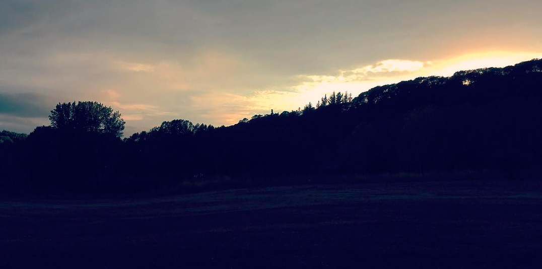
We chose the ideal location: Montseny. Once there, we headed into the undergrowth to find a spot that matched exactly what we had in mind.
We wanted an open area with enough space, minimal unevenness, and at the same time, a place that showcased the wild, untamed side of the forest.
Soon you’ll be able to see the full photo session in our projects section, but for now, here’s a preview to give you a sense of the results.
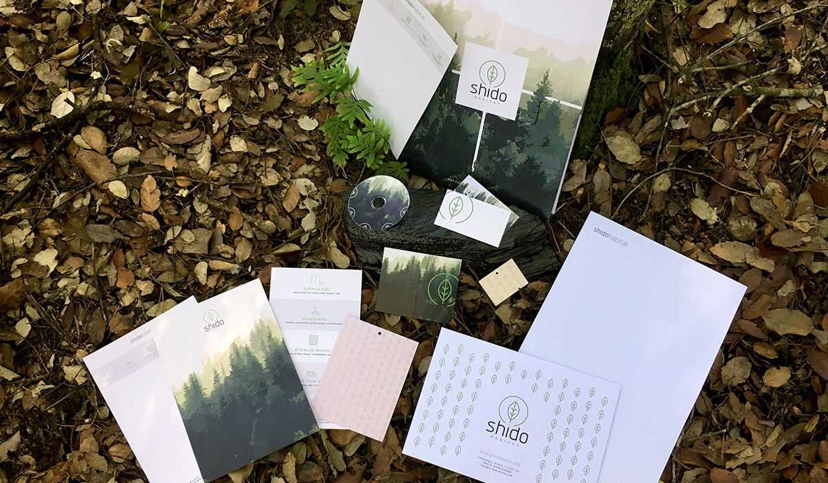
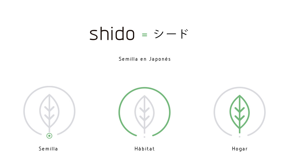
Brand identity for Shido Hàbitat
A look at the concept
When developing the brand identity for Shido Hàbitat, we knew from the start that, given the name “Shido,” the project needed to embody nature. “Shido” means seed in Japanese, so the logo features a seed encasing the leaf that grows from it.
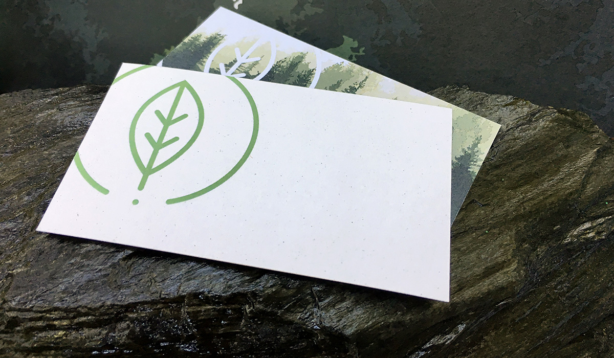
Materials
For the brand materials, we selected recycled paper with a distinctly organic look and feel, reflecting the essence of nature.
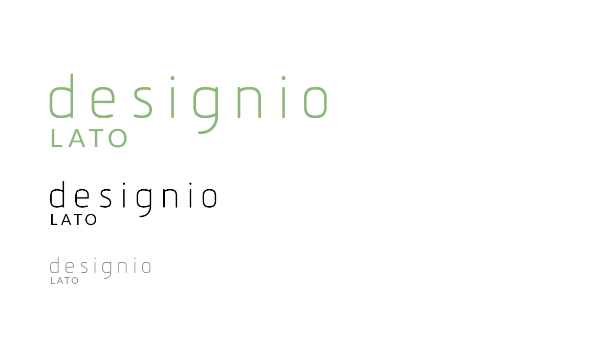
Typography
We chose Designio as the primary typeface for the logo, thanks to its strong personality. For the tagline, we opted for Lato for its clean neutrality.
A glimpse of the photo shoot
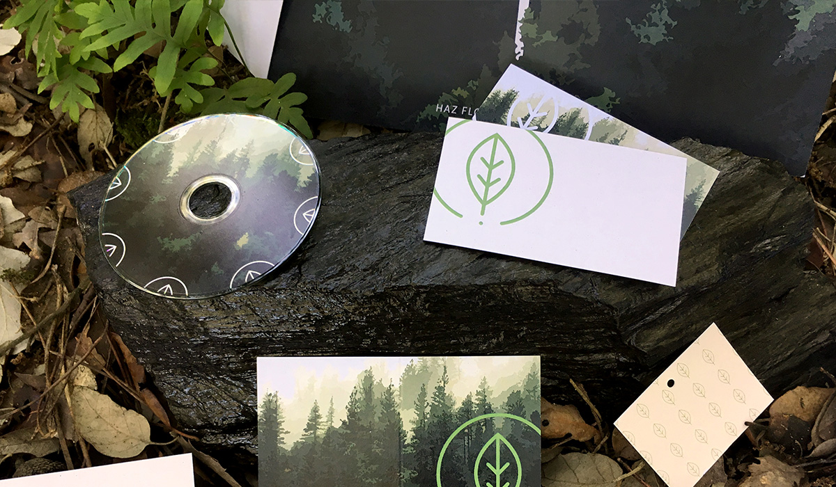
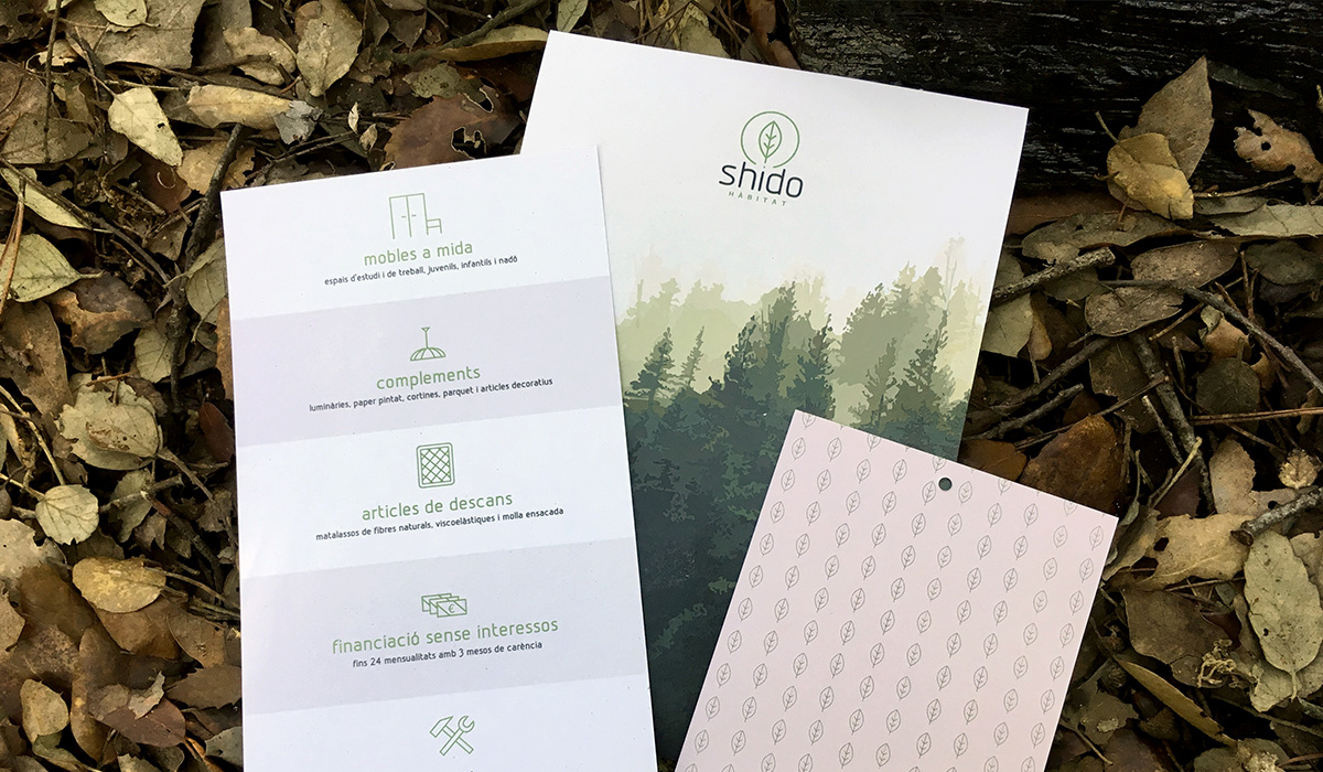
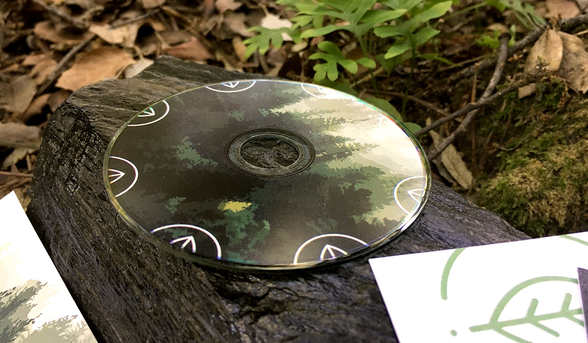
Branded materials designed for Shido Hàbitat
This was a comprehensive branding project, so we handled the graphic design for all necessary materials, including:
- Logo design
- Design of various business cards in different versions
- Label design in two different sizes
- Flyer design
- Notecard design for customer notes to take away
- Corporate folder design
- Envelope design
- Mini CD design
- Website design
- Shopping bag design