In our monthly interview, we’re honored to feature a true master of typography and lettering.
With over 15 years of experience, he’s a benchmark in his field—and if you don’t know him yet, you’re in for a treat.
Interview with Ivan Castro, a true lettering artist
Code: First of all, congratulations on your work in the world of lettering design. For us, you’re a real reference point. So, tell us—where and how did it all begin?
Ivan Castro: Well, even as a kid I was fascinated by the lettering in Bruguera comics, the opening credits of classic Disney movies, the signs on shops and bars… I actually learned to read very young just by looking at signs in the street. I guess that was the seed, and as soon as I could, while studying design, I took calligraphy classes with Keith Adams. That’s when I really got into typography and lettering. I worked for a few years as a graphic designer, but since 2010 I’ve been dedicated exclusively to letterforms.
Code: You’ve said you don’t have a specific style, but I see a lot of old-school type influences from my childhood, and even a bit of B-movie flair. What’s your take on that? Tell us about your creative influences.
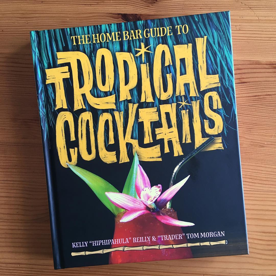
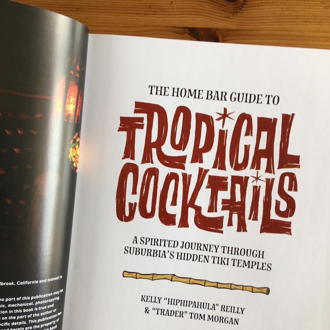
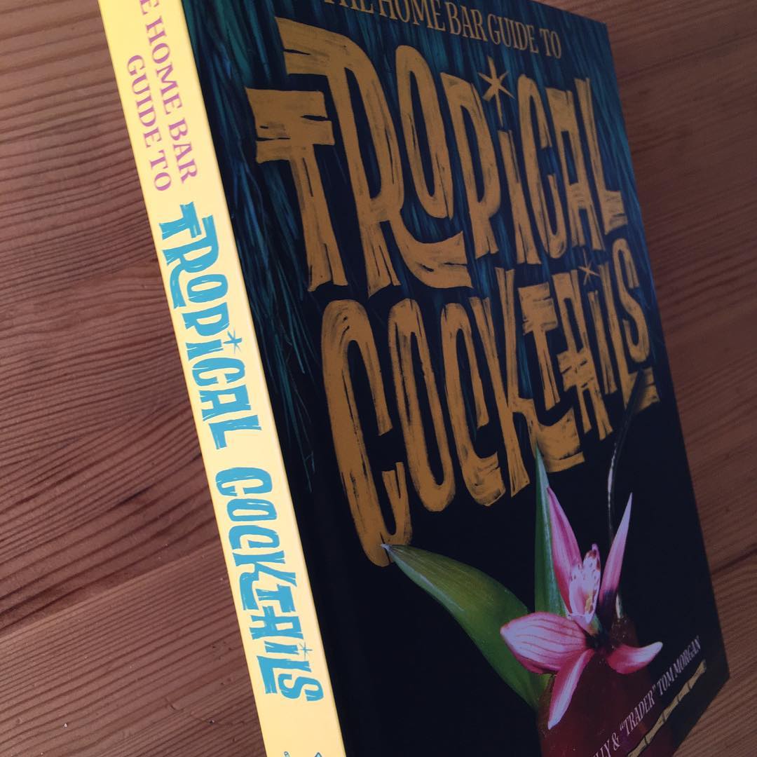
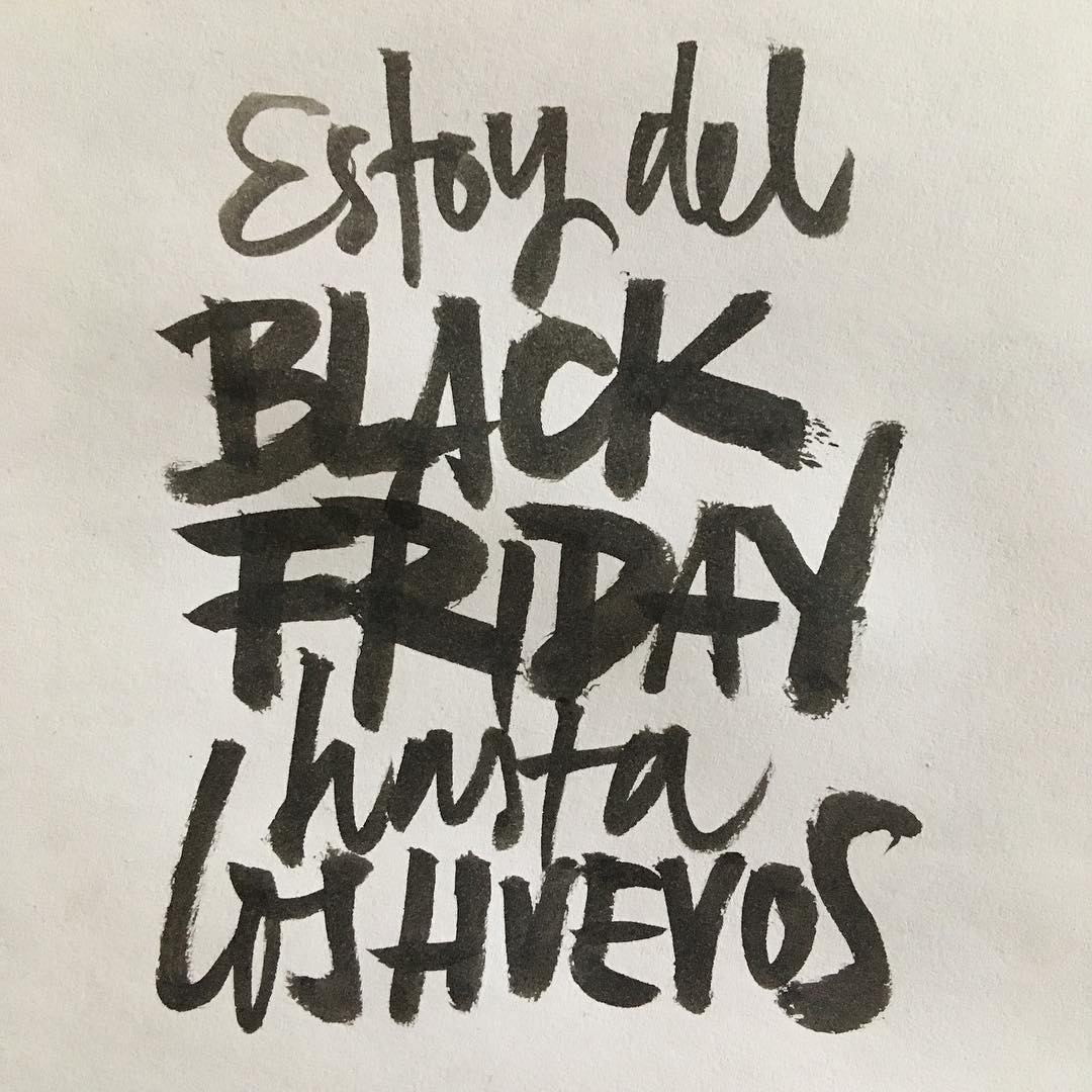
Ivan Castro: Yes, that’s true. Sometimes my work does lean toward the vintage side, but only when the project calls for it. I also take on projects with no nostalgic vibe at all—like a logo for a women’s fragrance or a yogurt campaign. But when the brief is more retro, like an album cover or a tiki cocktail book, that’s when I bring out all my vintage tricks. Mid-20th-century graphics are fascinating, especially their use of lettering. Back then, it wasn’t a stylistic or intentional choice like it is now—a hand-drawn sign was just the default. It was cheaper and faster to have someone drawing letters in-house at a publisher or agency than to commission a custom typeface.
Code: To get a sense of your process, how do you approach a new project? Can you walk us through your creative process for lettering?
Ivan Castro: In the end, it’s not so different from any other design process. You have to understand the project’s needs, the tone you’re aiming for, and start with an exploratory phase—sketching out different ideas. From there, the client chooses a direction, which is then developed into the final piece. The main difference is that the decisions revolve around letterforms, and the process is usually hands-on, but at its core, it’s the same—we’re designing letters. Good research and reference gathering is also key.
Code: Your work is beautifully crafted. I’m sure our readers would love to know more—anything you’d like to highlight about your work?
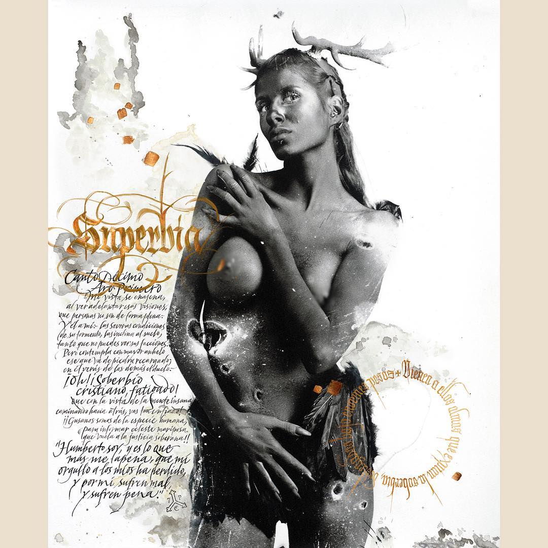
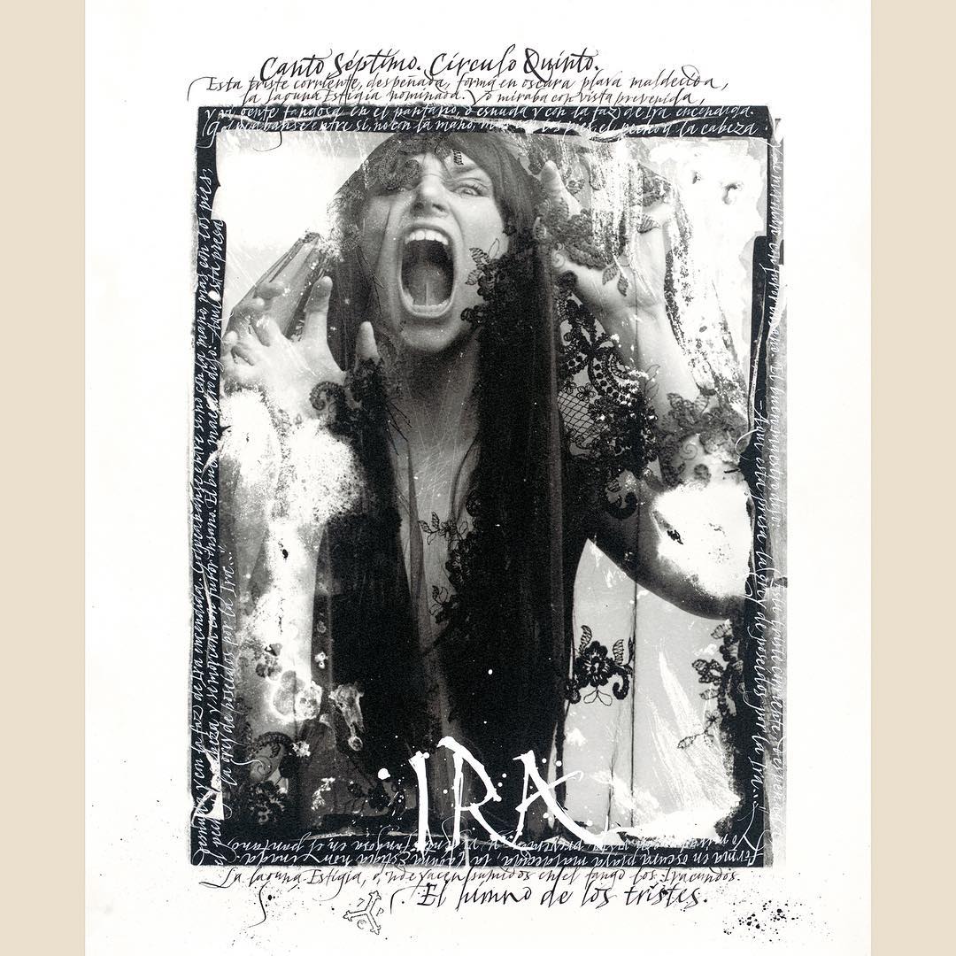
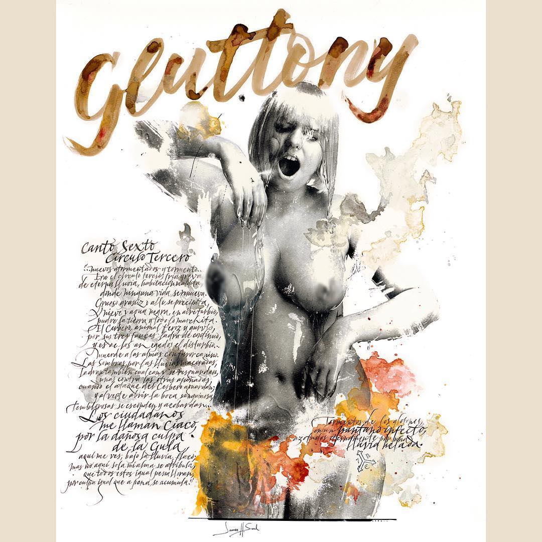
Ivan Castro: Even though calligraphy and lettering are very different disciplines, handwritten forms always take precedence. Calligraphy is the root of all letterforms—whether written, hand-drawn, or digital. So, whenever I’m unsure about a shape, how two strokes should connect, or how to link two letters, I ask myself how it would look if it were written, what the sequence would be. Keeping this in mind helps ensure the work flows naturally and, most importantly, that the letterforms feel comfortable and organic.
Code: And to wrap up, here are the three classic questions we ask all our guests:
Code: What’s the best thing about being a creative?
Ivan Castro: Working in a creative field is usually a calling. So, in principle, we love what we do. When a project turns out well, it’s incredibly rewarding, especially since we put so much of ourselves into it.
Code: And the worst?
Ivan Castro: Not every project ends well. Sometimes you lose creative control, but you still have to finish the job, no matter what. That’s when it’s less satisfying.
Code: How do you see the state of the industry?
Ivan Castro: When I started doing calligraphy twenty years ago, I was just a nerd with ink-stained fingers. I still am, but now there are lots of people discovering calligraphy and lettering as tools for visual communication, not just as a nostalgic exercise. So, I think things are looking good.
Code: What are you working on now? Any new projects?
Ivan Castro: Yes, I’ve got several things on the go. I can’t share details yet, but for example, I’m working on the branding and packaging for a rum brand, designing a typeface, and I have a few public space projects lined up. Lately, I’ve been doing things that are a bit out of my usual comfort zone, and I’m really enjoying it—it’s fun, challenging, and helps me grow as a professional.
Code: We’ll be keeping an eye out for those! In the meantime, before we say goodbye, I invite all our readers to check out the links below to discover more of your work. I hope we’ll continue to feature artists like you among our favorites.
Thanks for the kind words and for featuring me on your blog! I’m not very active on social media, except for Instagram:
You might also enjoy our interview with…..(I’ve got a lottery ticket!)