QuietCubes – immersive minimalism for a new concept of silence
QuietCubes positions itself as a brand specializing in soundproof pods for working, relaxing, or holding private meetings in any environment. Their value proposition blends acoustic engineering, minimalist design, and a sensory experience centered on light. The new website—internationally recognized—translates this philosophy into a subtle, quiet, and elegant digital experience, designed to evoke calm from the very first moment.
In this review, we explore how the project transforms a physical product into a cohesive digital universe, analyzing design decisions, visual language, user experience, interaction, color, rhythm, and technology. It’s a benchmark for any studio aiming to create premium web experiences that communicate through sensation rather than words.
A brand introduction through light: from darkness to silence
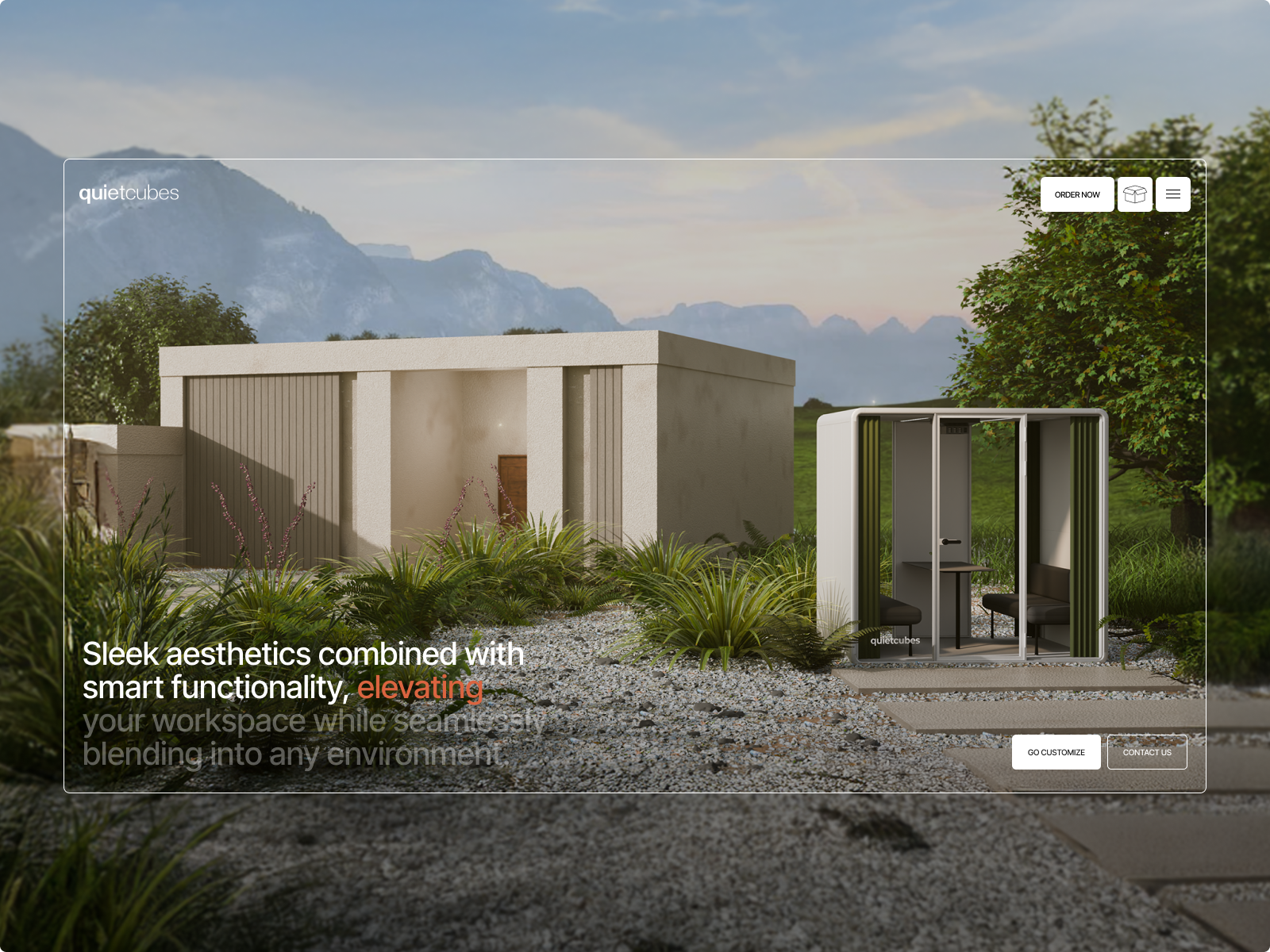
Light is the central conceptual element. The website is built around how illumination reveals surfaces, textures, and volumes. This visual narrative directly echoes the product: pods that, in the physical world, guarantee mental clarity amid noise. Here, the digital journey mirrors that transition—we literally move from darkness to focus—creating a direct metaphor between brand and experience.
The initial deep black aesthetic (#0A0A0A) sets a silent canvas, focusing attention on transitions. Soft entrances, controlled fades, and progressive lighting evoke the “QuietCubes atmosphere”: functional calm, understated sophistication, and a sense of space that breathes.
UX: clarity, focus, and frictionless decisions
The user experience is meticulously orchestrated to convey mental order. Nothing appears by chance; each block emerges quietly, guiding navigation effortlessly. The flow is designed to be linear, contemplative, and uninterrupted, avoiding intrusive elements or unnecessary distractions.
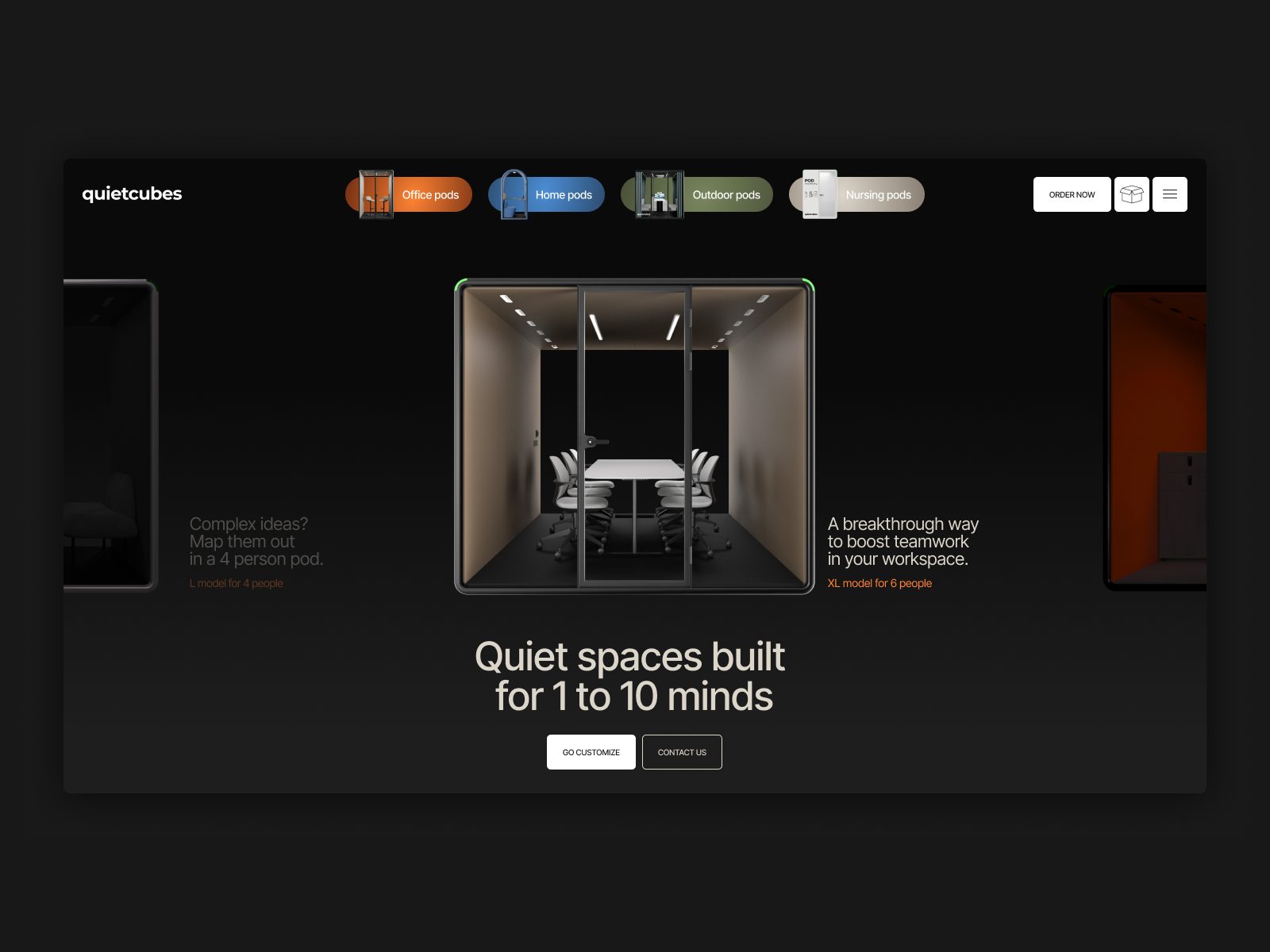
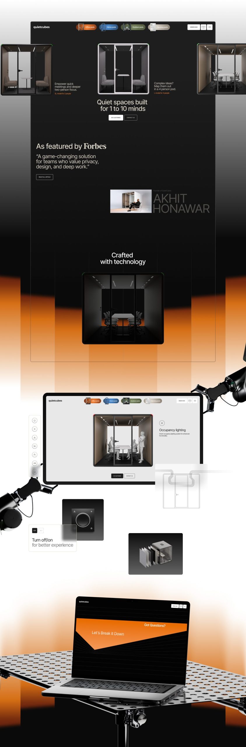
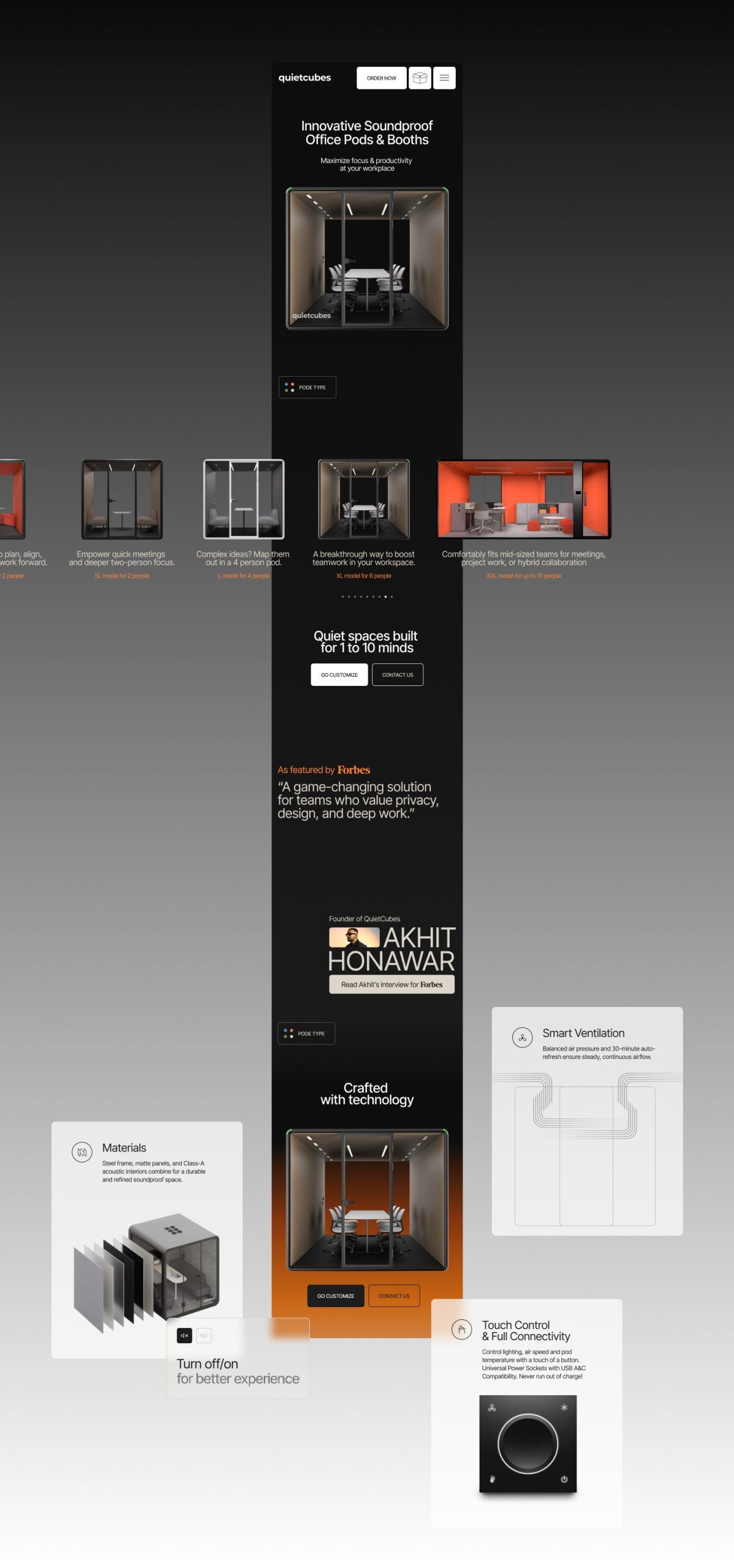
The information architecture reinforces this approach: overloaded menus are eliminated in favor of a visual navigation system reminiscent of the product’s industrial design. The pod’s story unfolds in layers, just like its acoustic insulation: first the idea, then the form, followed by materials, and finally the option to configure.
The result is a UX that breathes serenity. The brand doesn’t just sell pods; it sells the experience of silence. And the website delivers on that promise.
UI: expressive minimalism and a tightly controlled color palette
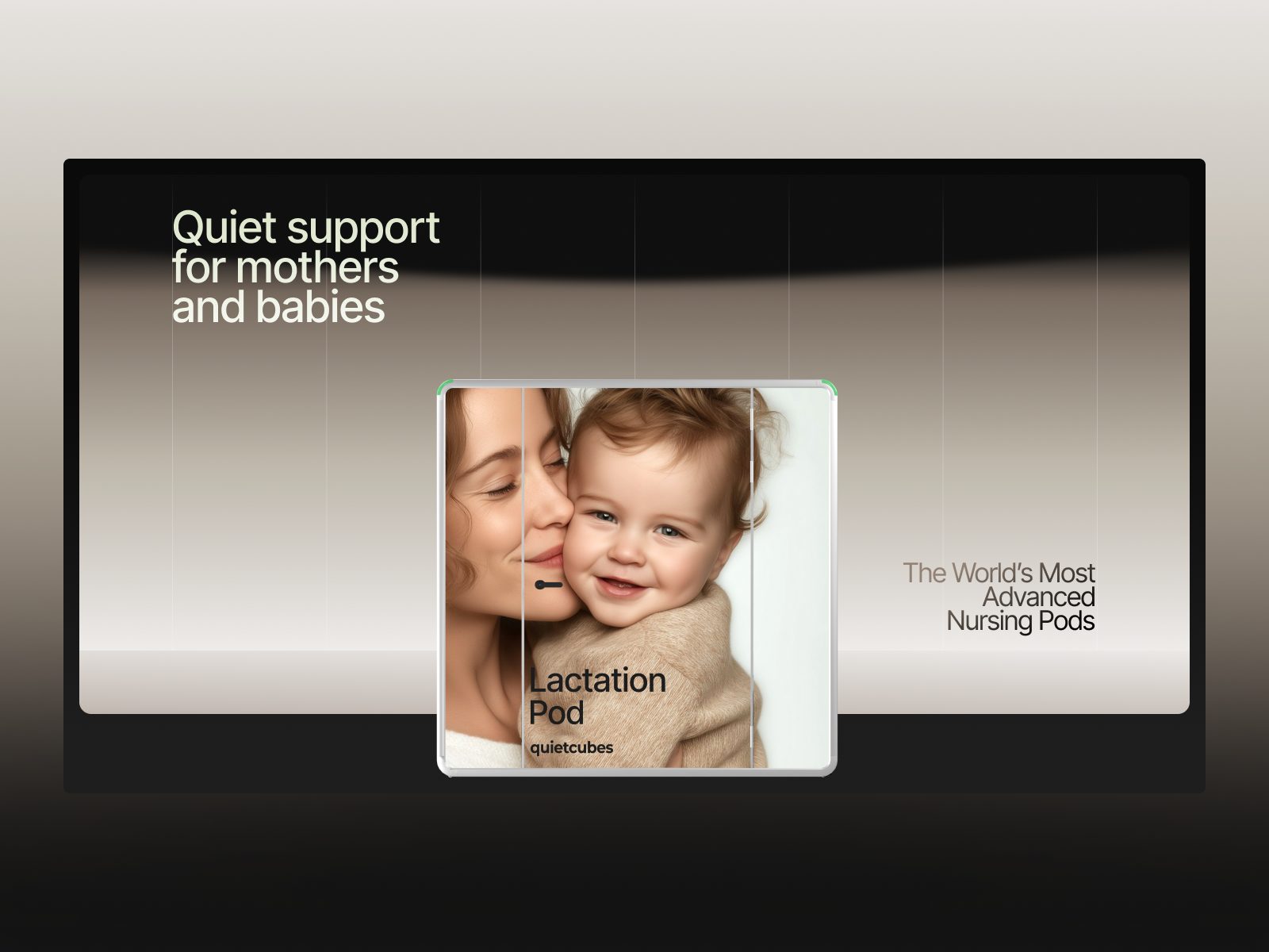
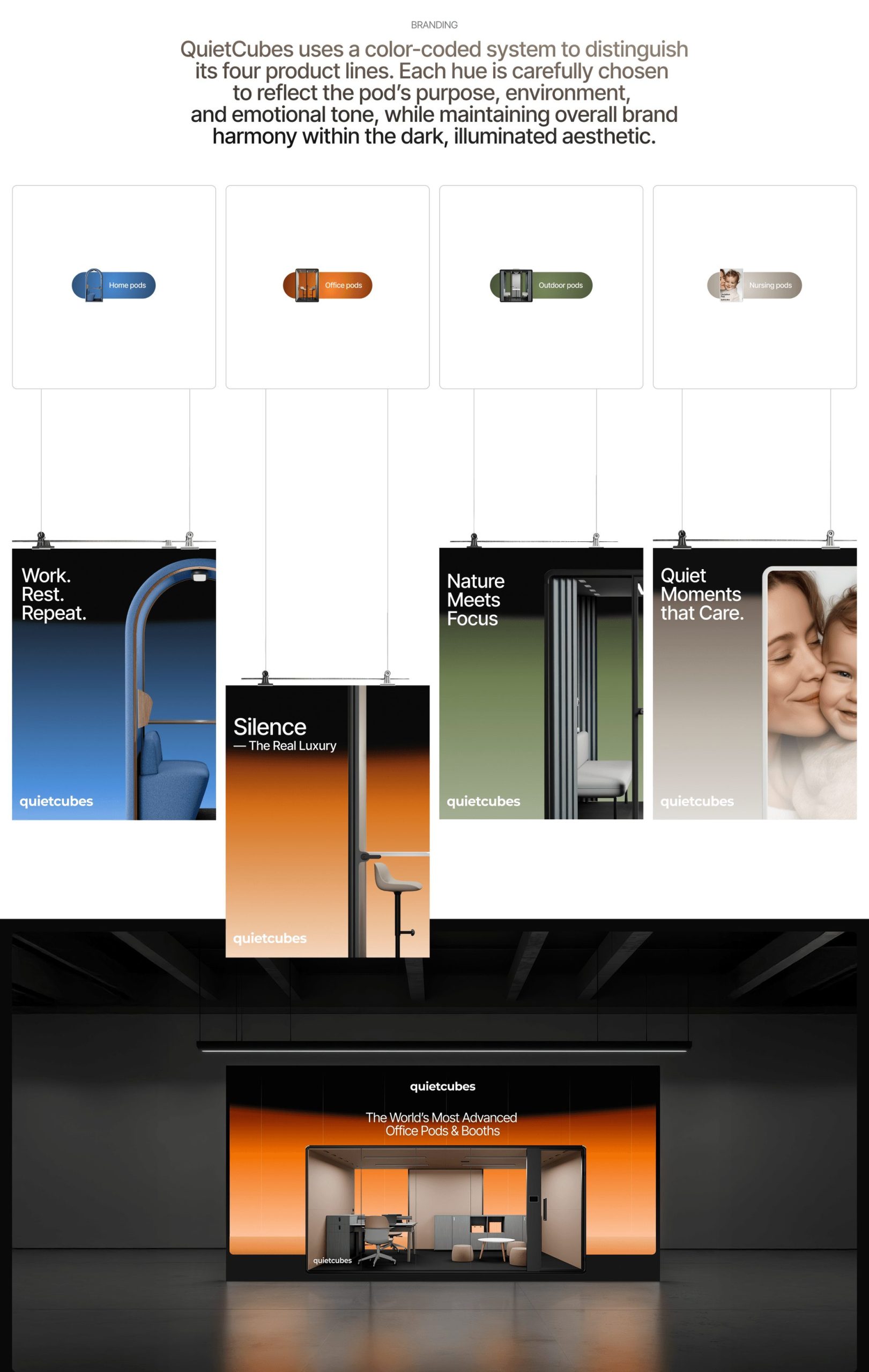
QuietCubes employs an ultra-restrained palette, pairing deep black (#0A0A0A) with a vibrant orange (#FF8333). This warm accent acts as an emotional counterpoint within a muted visual universe, highlighting key interactions without disrupting the serene atmosphere.
The interface is clean, measured, and quiet. Graphic elements are pared down to the essentials: rounded typefaces, generous layouts, centered compositions, and a perfect balance between space and content. The orange becomes the digital embodiment of light filtering into the pods, bringing life without oversaturation.
In a landscape where many sites opt for visual overload, QuietCubes proves that elegance lies in restraint. Everything feels premium, tactile, and intentional.
Motion design: micro-interactions that simulate the experience of entering a pod
Motion design is one of the core pillars that make this website stand out. Animations aren’t decorative—they’re narrative. Each transition mimics gestures associated with the product: closing a door, absorbing noise, revealing an interior space.
Scrolling is smooth, with an almost meditative rhythm. Elements emerge from the shadows, as if illuminated by a focused beam of light. The site’s visual construction feels architectural: light enters, texture appears, content materializes.
This approach turns navigation into a sensory, almost physical experience—where users don’t just observe, but actually “feel” what the brand is offering.
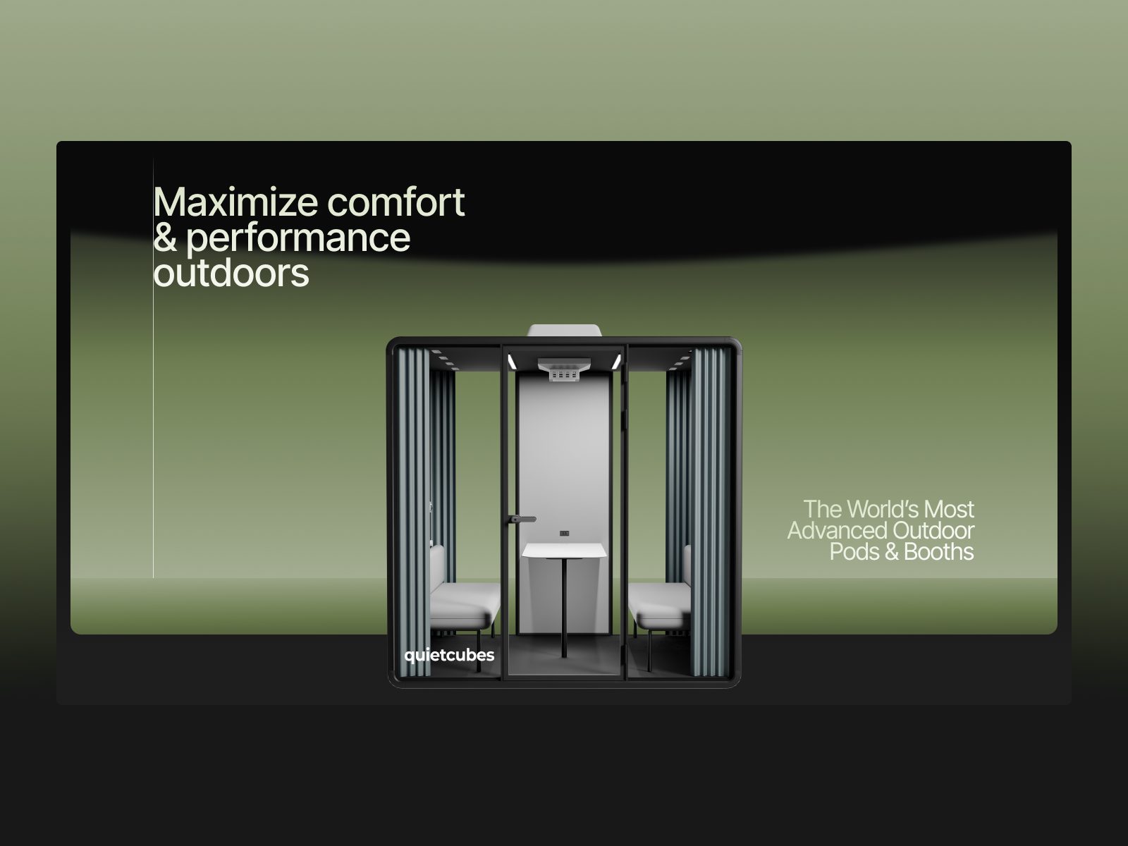
3D & visual storytelling: flawless spatial narrative
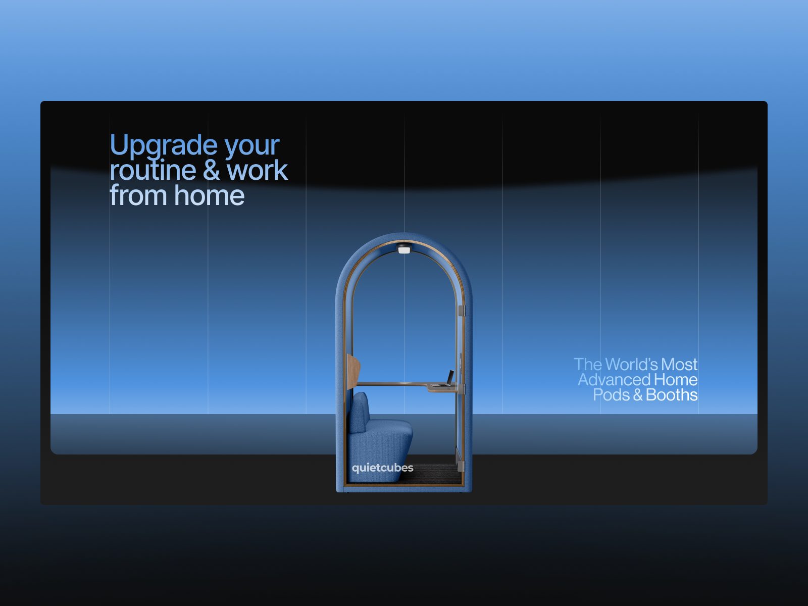
The integration of 3D is one of the project’s greatest achievements. Models are presented with meticulously crafted lighting, designed to highlight volumes without excess. Camera movements have the precision of industrial design, creating a narrative built on space and light.
The product isn’t described—it’s shown. And it’s shown with the naturalness of an object that breathes, that invites, that fits anywhere. The three-dimensional representation is essential to convey the pods’ promise: functional silence, refined design, and durability.
This level of detail reinforces the brand’s premium perception, elevating the product to an aspirational category.
Digital branding: absolute alignment with the brand’s physical values
QuietCubes’ identity is rooted in the aesthetics of silence: soft materials, pure geometry, minimalist comfort. The website translates these pillars into its digital language with remarkable consistency.
The graphic identity doesn’t compete with the product—it complements it. The texture of sound transformed into light, stillness as a visual device, order as narrative… Every detail is designed to reinforce the core message: a space created to reconnect with focus, calm, and productivity.
The result is a brand experience that’s integrated, robust, and memorable.
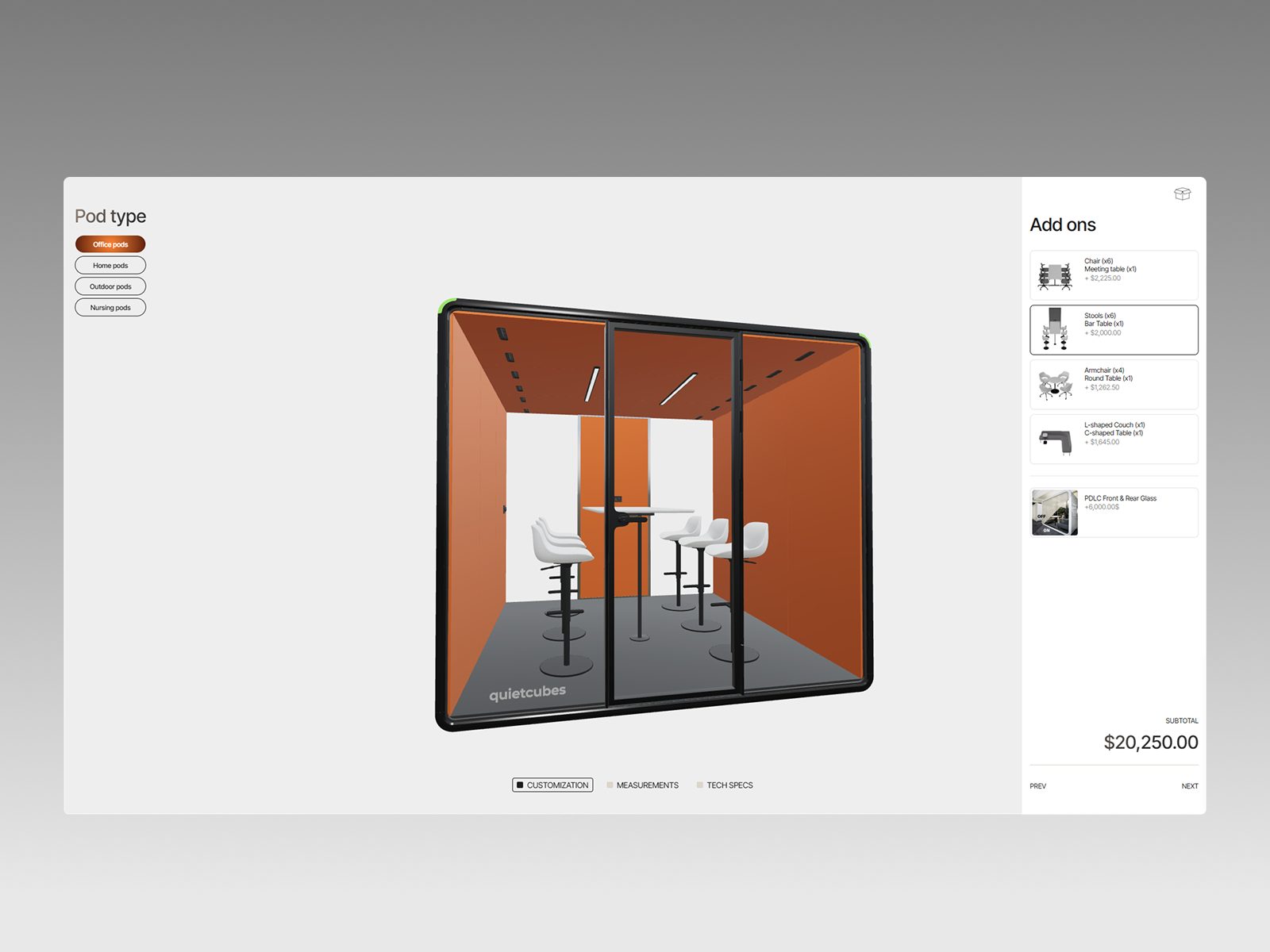
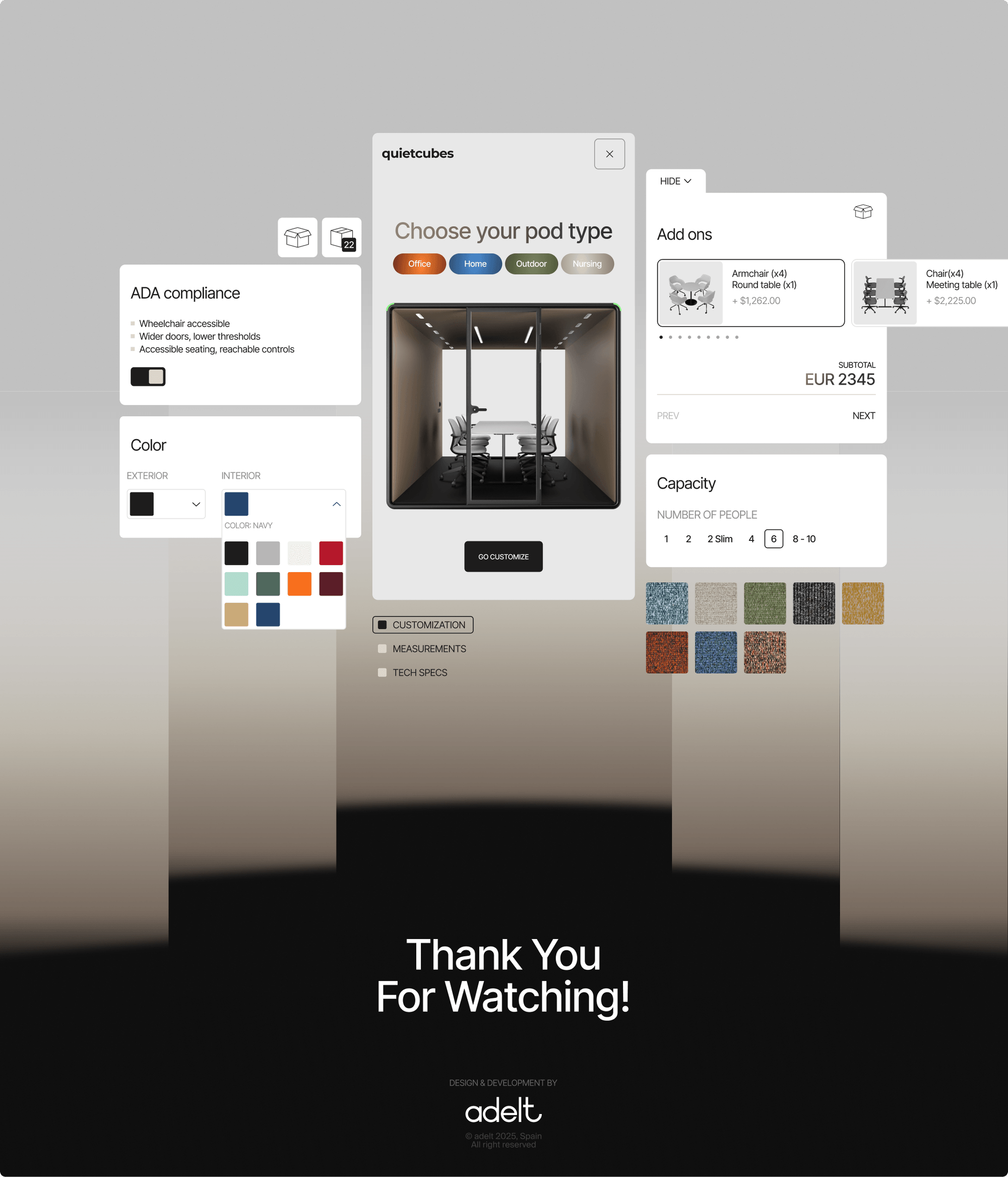
Configurator and product experience
One of the site’s highlights is the section where users can explore different models and configurations. Though understated, this configurator maintains the site’s overall minimalist approach, allowing users to visualize variations without disrupting the aesthetic.
Interaction is smooth, fluid, and focused on displaying only the strictly necessary information. It’s a well-executed example of how to integrate functional tools into a visually delicate environment.
A website that becomes a space: experience, emotion, and precision
QuietCubes is more than a digital showcase. It’s a spatial experience designed to convey sensations: calm, intimacy, mental clarity. Its immersive narrative is crafted with subtlety and precision, proving that web design can become emotional architecture when executed with intent.
From a professional perspective, it’s a benchmark for studios specializing in premium web design, advanced interaction, motion design, and product-driven narrative experiences.
Credits
Author: ADELT Agency
Client: QuietCubes
Award: Awwwards — Site of the Day (December 6, 2025)