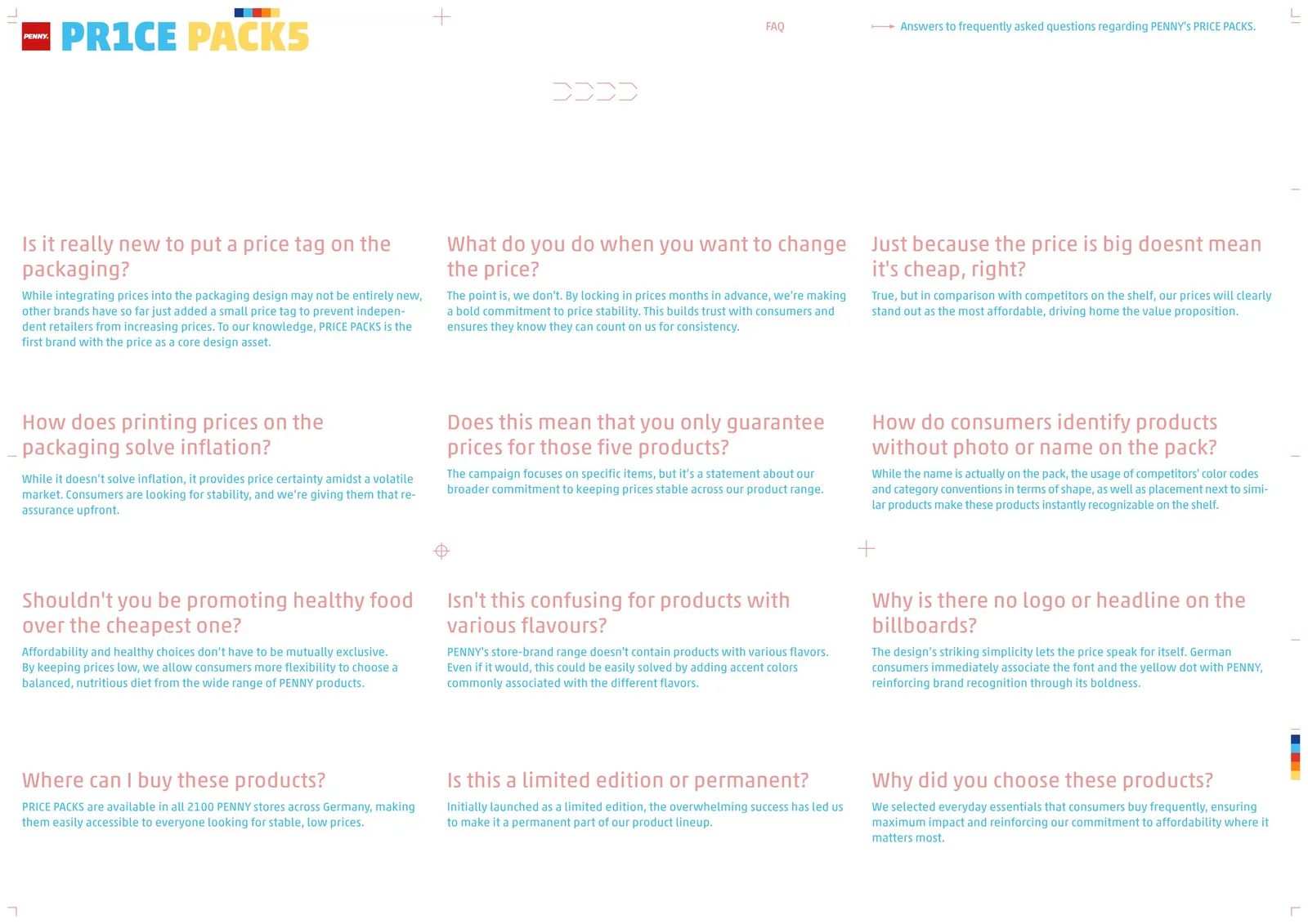
When Price Becomes Brand Identity in the Age of Inflation
Each week, we spotlight a branding project that proves design can be far more than aesthetics—it can be a powerful business strategy. This time, Price Packs for PENNY, created by Serviceplan Germany and Serviceplan Design, stands out as one of the boldest, smartest, and most relevant examples of contemporary branding in the mass market.
Against a backdrop of inflation, shrinking purchasing power, and growing distrust of fluctuating prices, PENNY made an unconventional move: making price the core of its visual identity. Price Packs is more than a packaging redesign—it’s a clear statement of positioning, trust, and consistency.
An Economic Climate That Demands Clarity, Not Promises
In the years following the COVID-19 pandemic, Europe has faced one of the most severe cost-of-living crises in decades. Inflation, supply chain disruptions, and widespread price increases have left consumers in a constant state of uncertainty.
Many brands have responded with emotional messaging or aspirational storytelling disconnected from daily reality. PENNY, on the other hand, chose to address what truly matters to its audience: price. And to do so as directly as possible.
The Key Insight: Packaging as a Contract of Trust
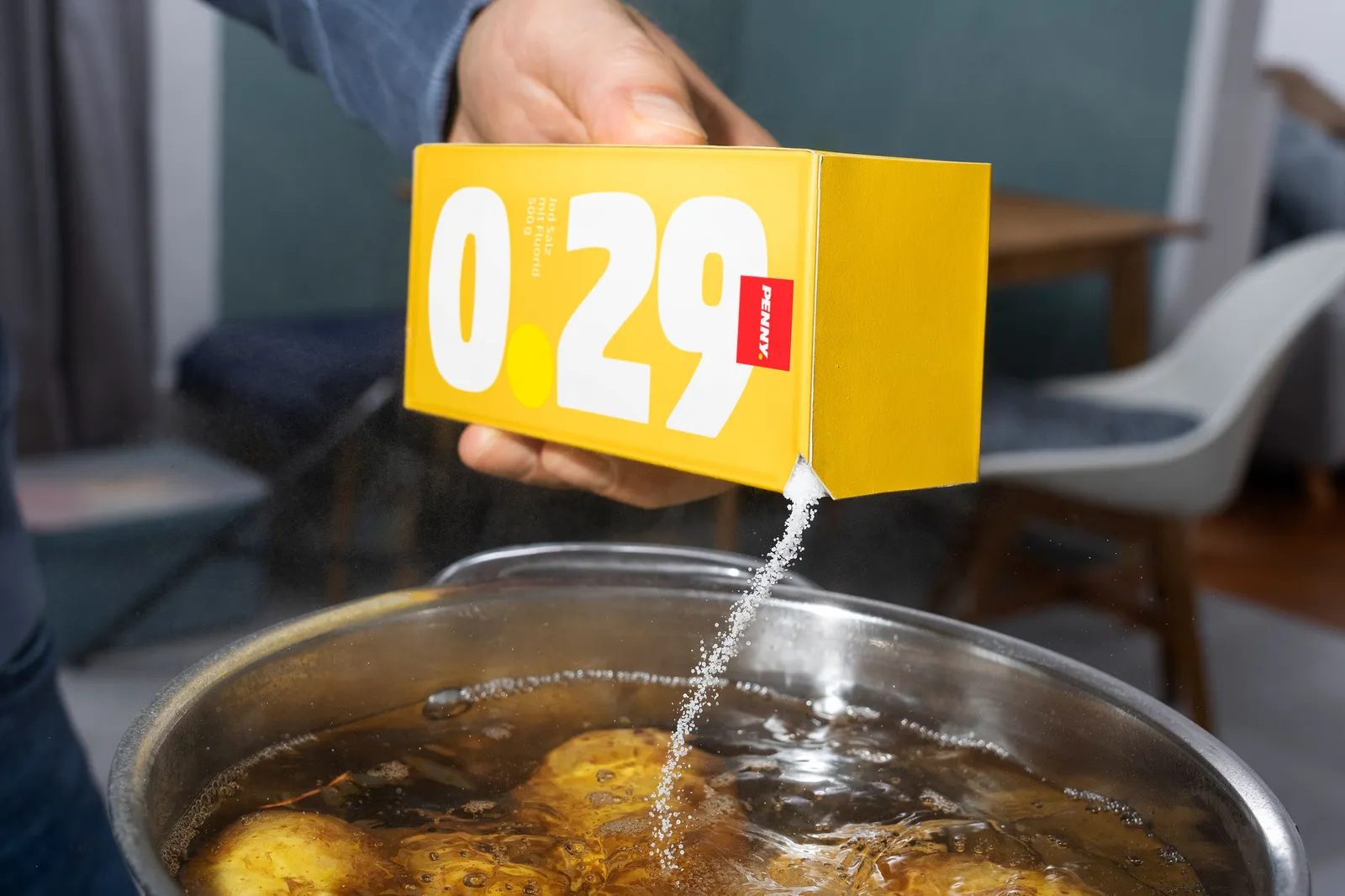
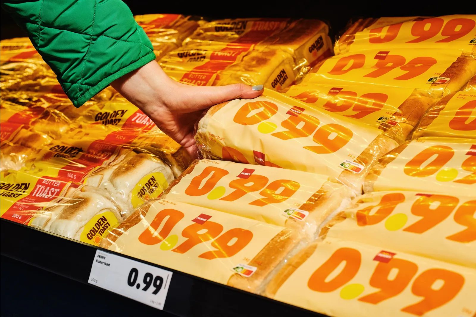
The strategic brilliance of Price Packs lies in treating packaging as a tangible promise. Designing and producing packaging takes months of planning and manufacturing, making any printed information a medium-term commitment.
By printing the price directly on the packaging, PENNY removes any suspicion of sudden changes. The pack itself becomes a guarantee of stability. This isn’t a marketing claim or a temporary promotion—it’s a structural decision impacting design, production, logistics, and retail.
As Matthäus Frost, Creative Director at Serviceplan, explains, making price the main graphic element was the most honest and impactful way to communicate reliability in an uncertain economic climate.
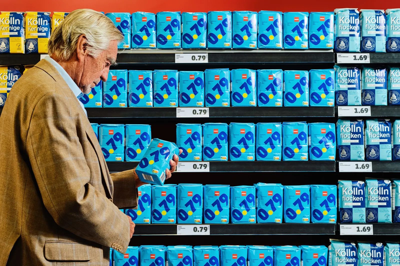
Radical Graphic Design: When Less Is Truly More
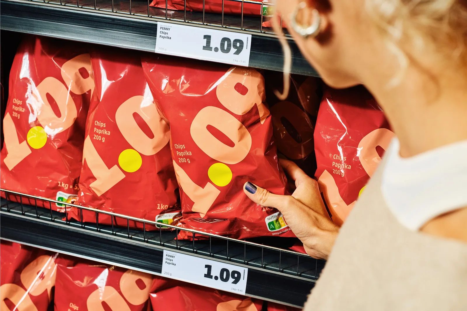
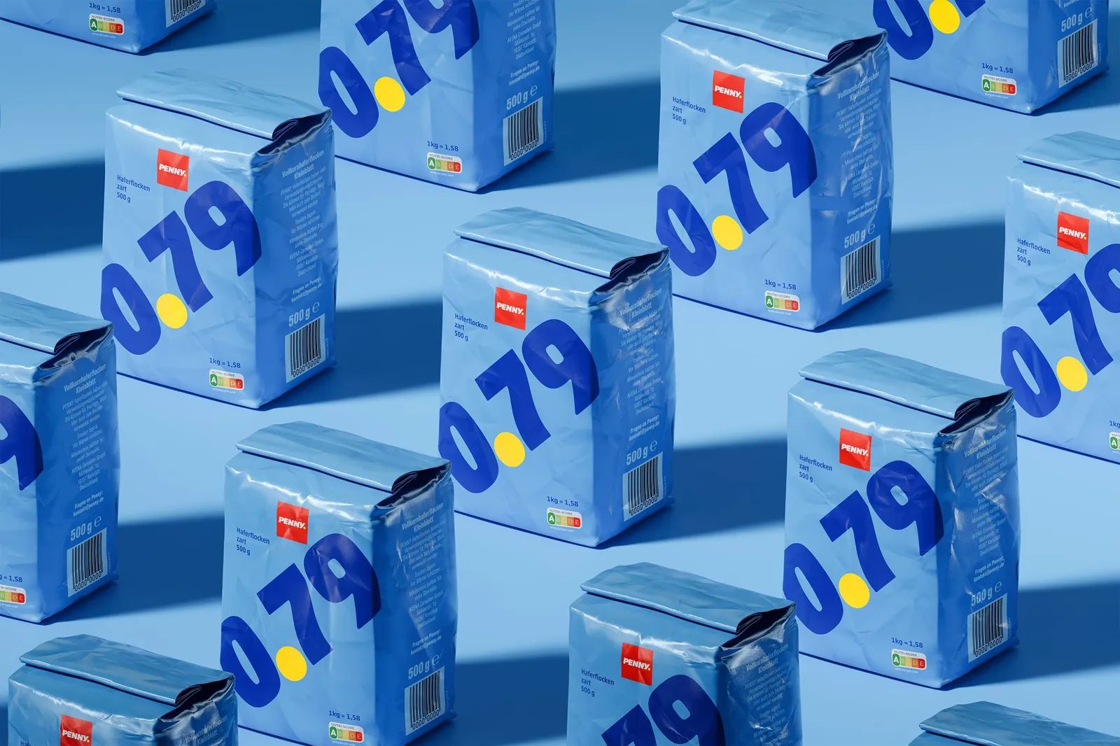
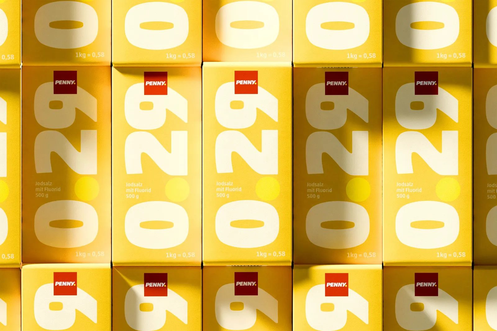
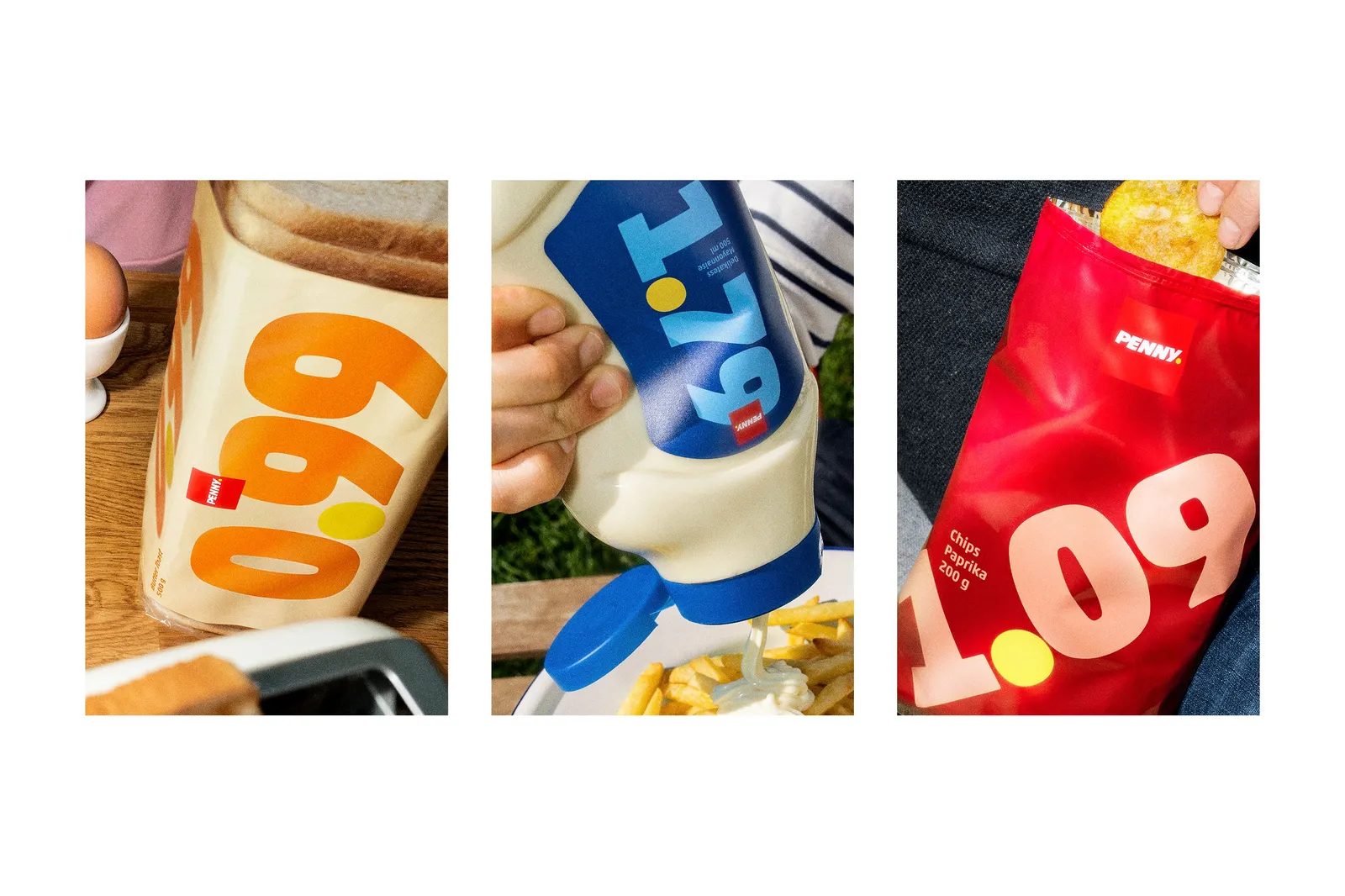
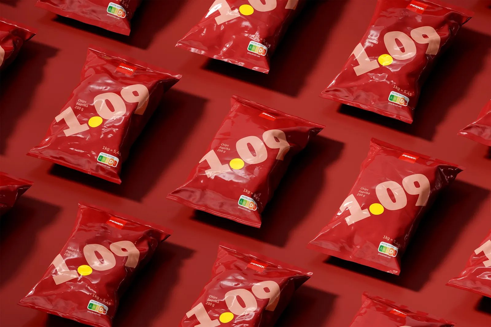
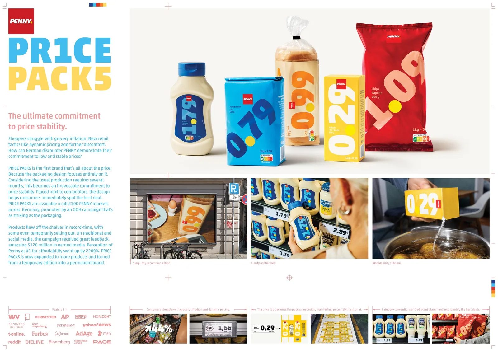
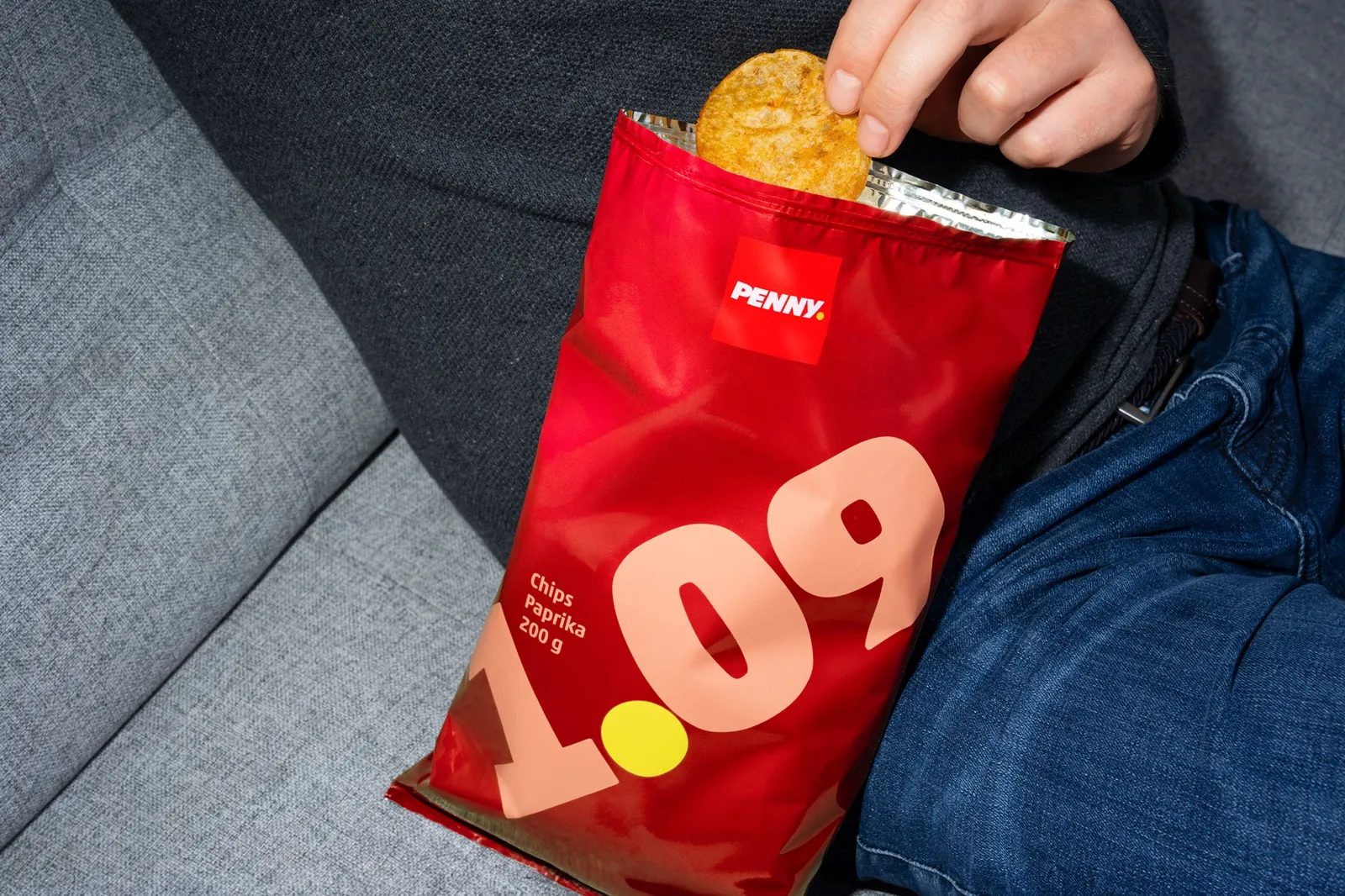
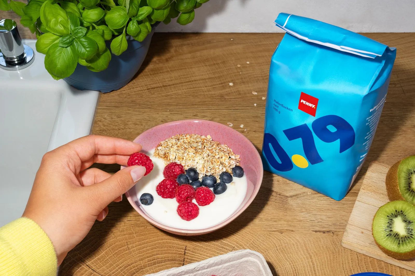
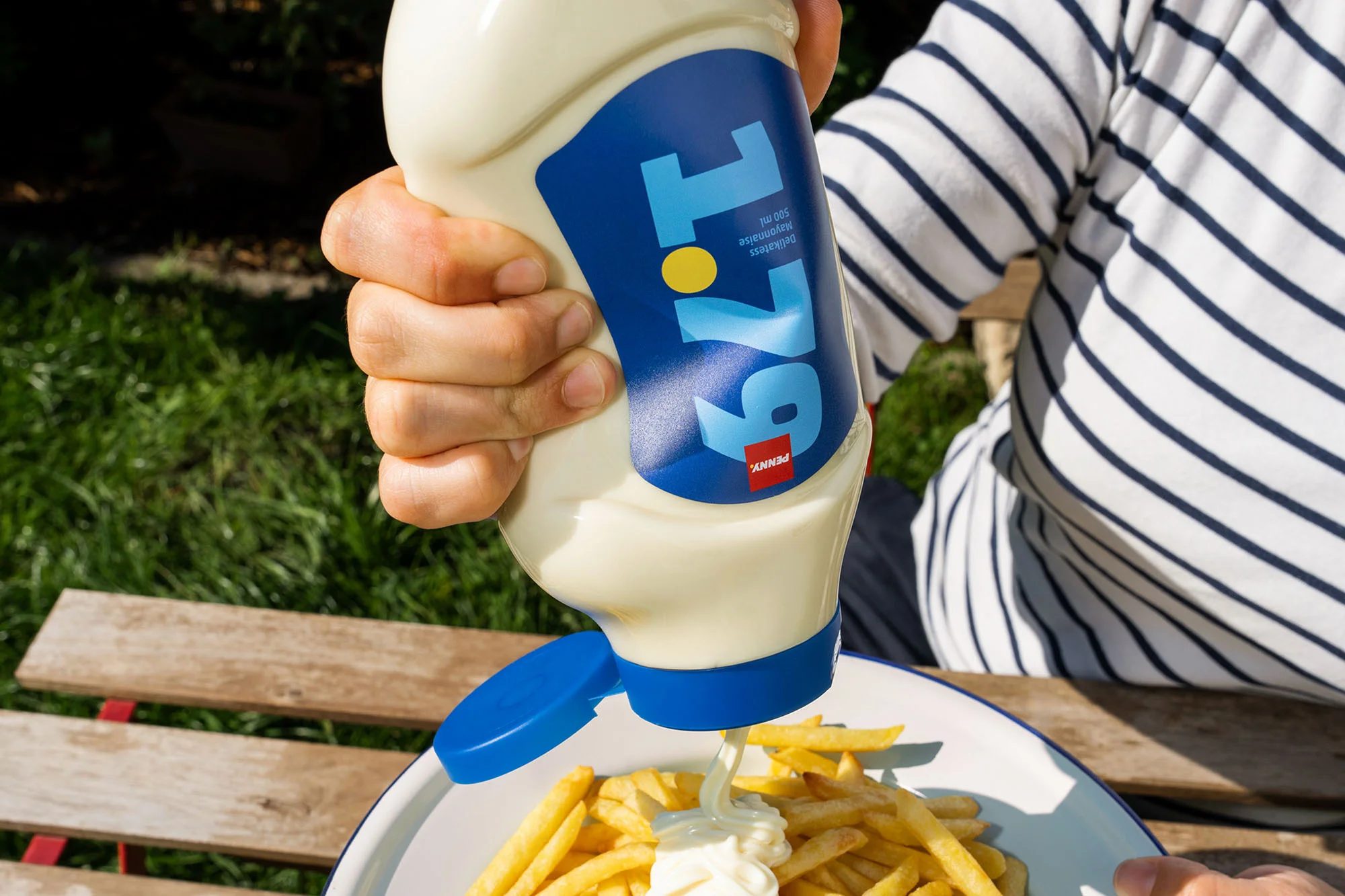
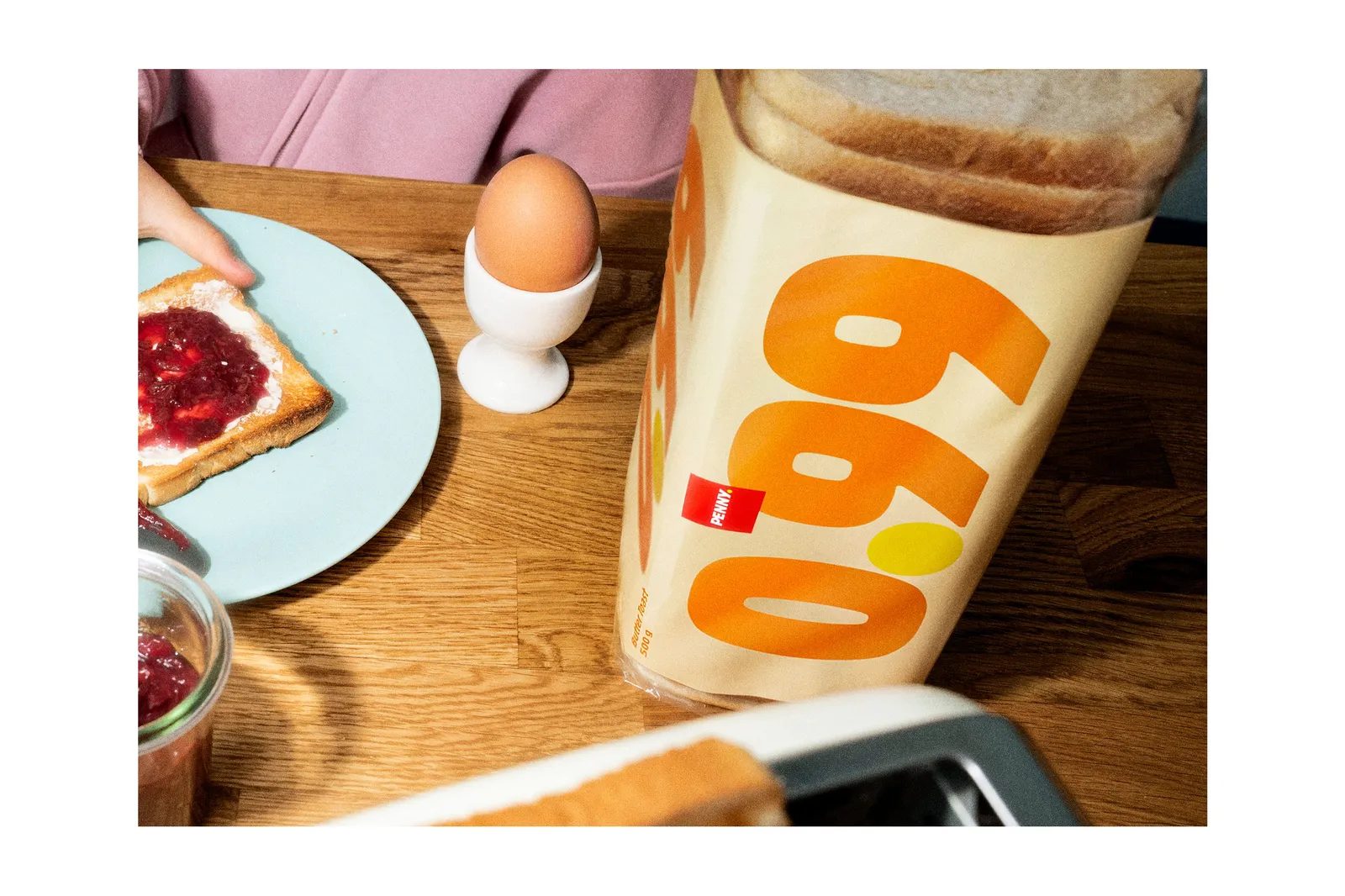
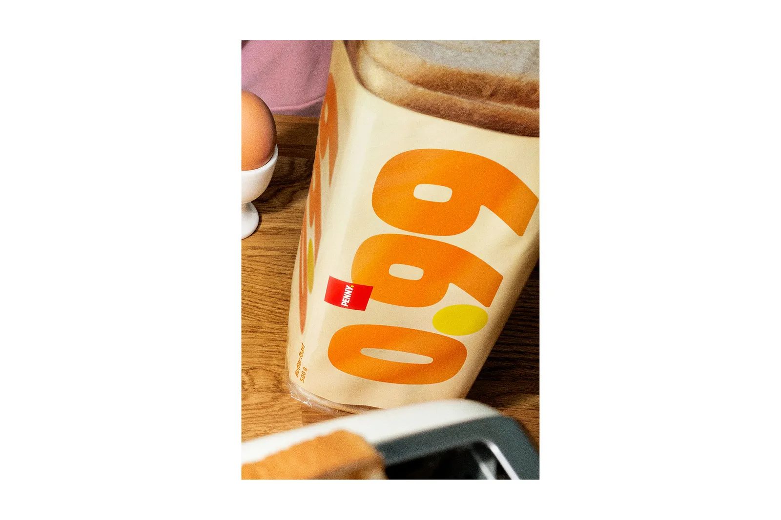
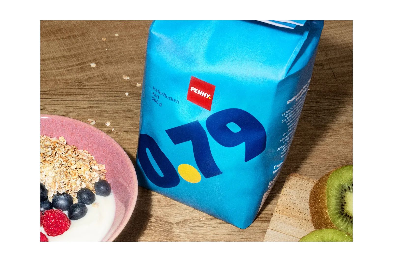
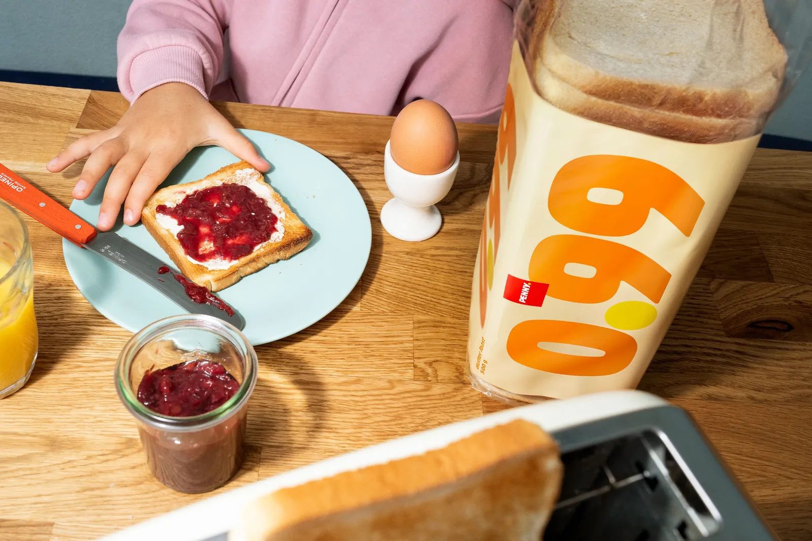
Visually, Price Packs embraces an ultra-minimalist aesthetic. Price dominates the pack with absolute hierarchy. There are no images, no elaborate visual storytelling, no unnecessary embellishments.
All essential product information is integrated functionally into the packaging itself. This approach allows the system to work across any format—boxes, bottles, bags, or flexible packs—without needing to adapt the concept.
The result is a brutally clear design, where the product becomes its own message.
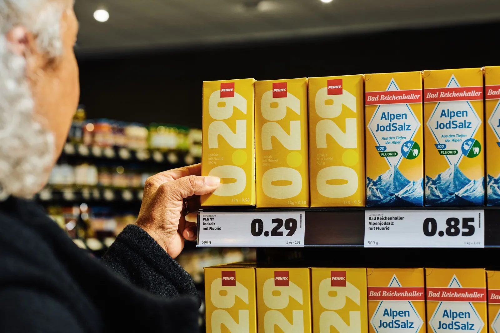
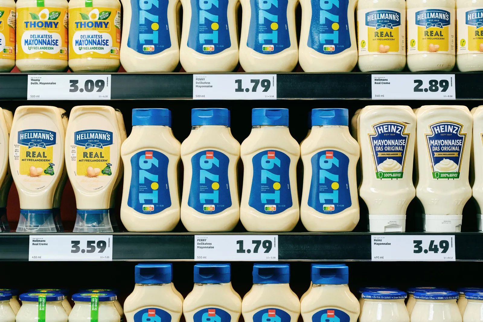
Color as a Navigation Tool on the Shelf
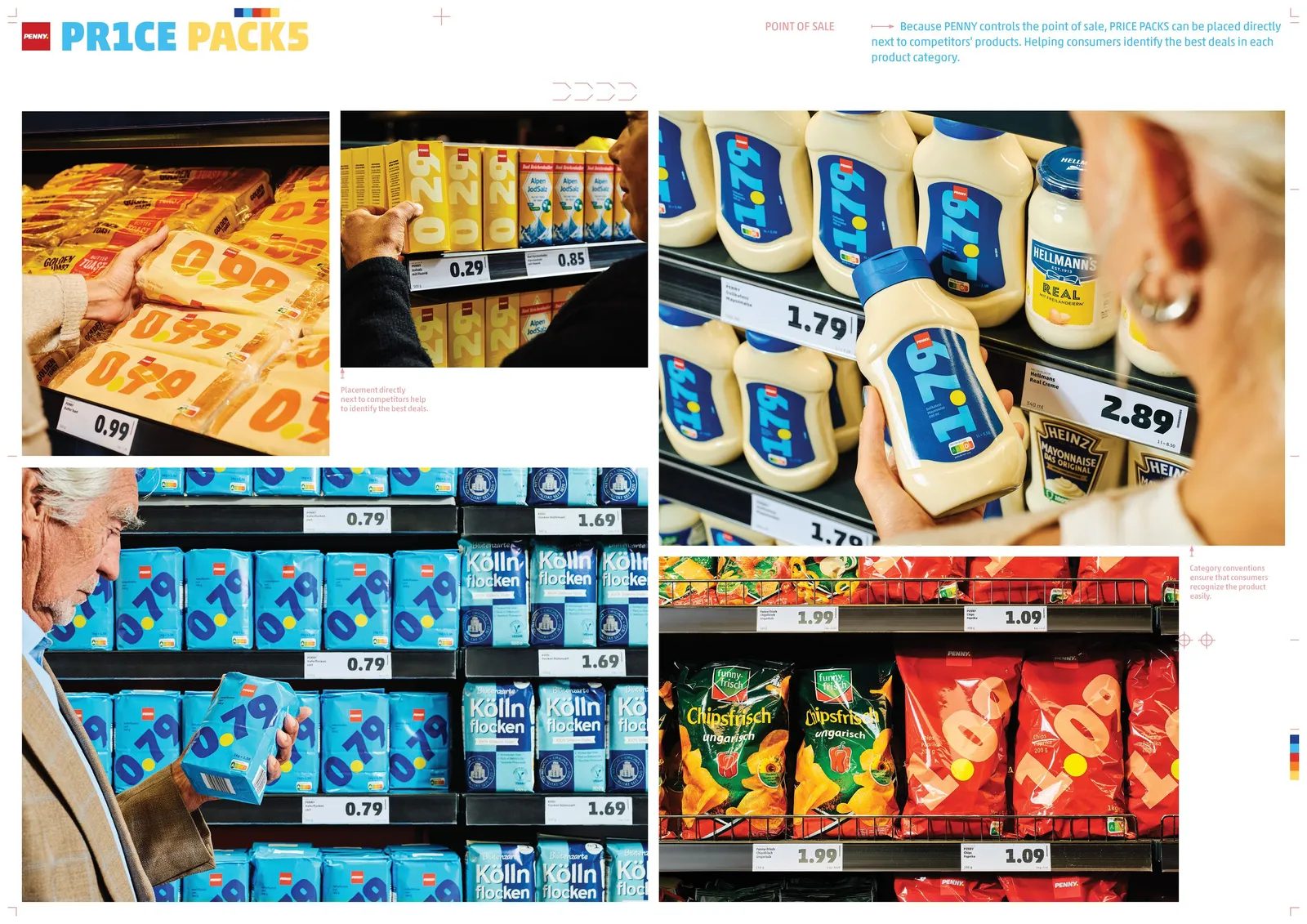
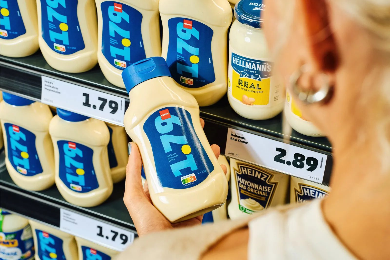
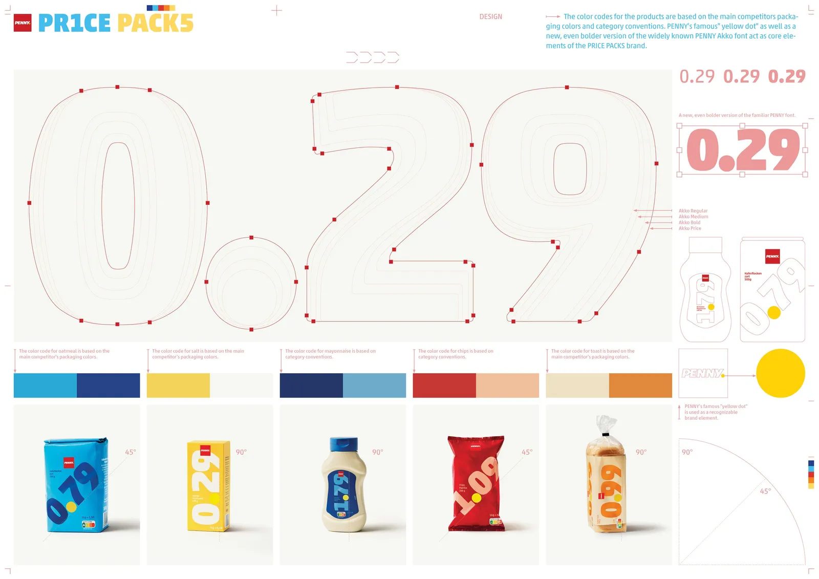
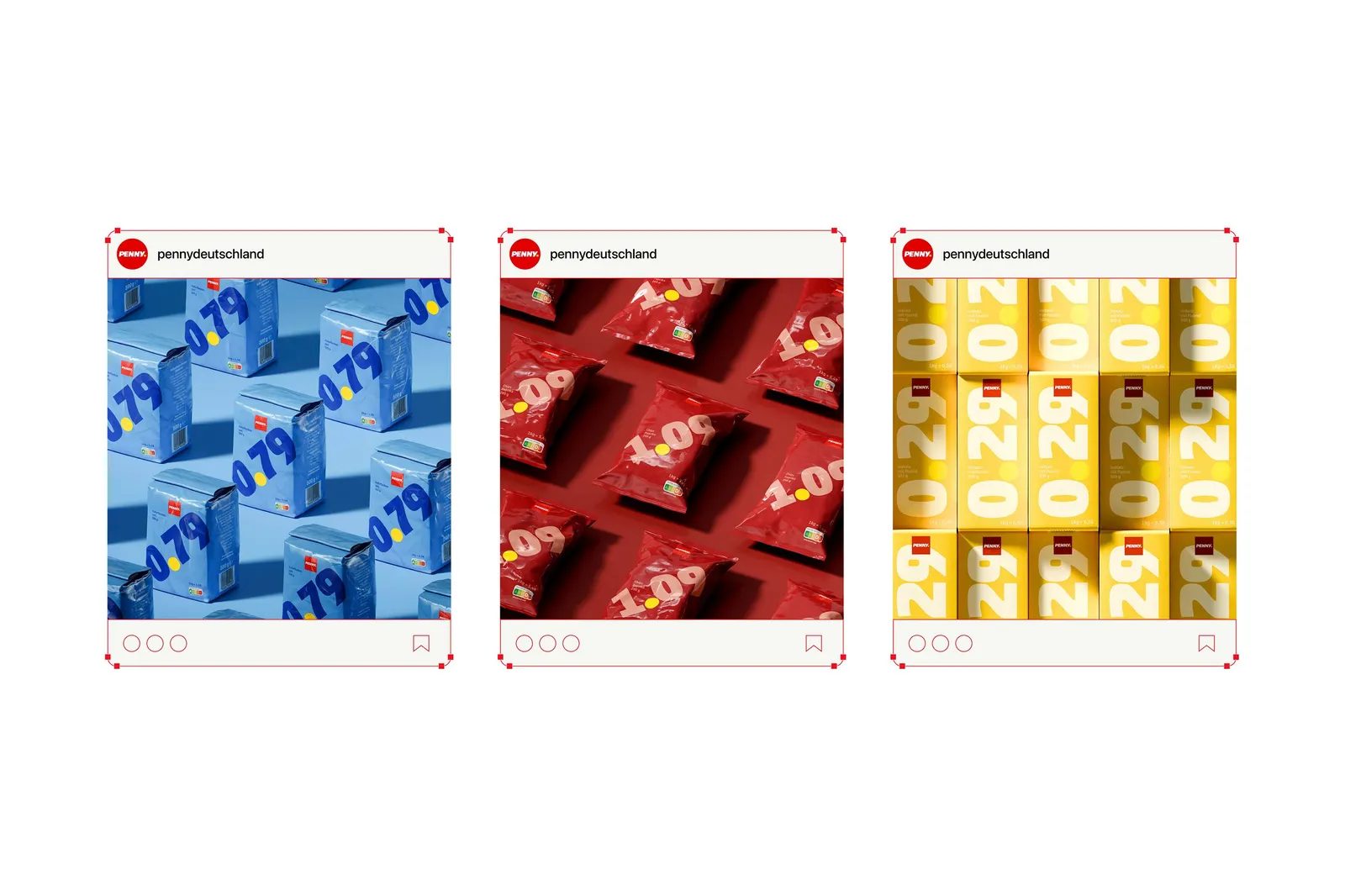
While the design is radically simple, color plays a crucial role. Serviceplan conducted an in-depth analysis of color codes used in each product category within German retail.
Based on this research, the most recognizable colors were chosen for each product type, enabling shoppers to quickly identify the category and spot the most affordable option.
Color isn’t used for decoration, but to streamline the shopping experience and reduce cognitive load for the customer.
PENNY Identity: Consistency Amid Disruption
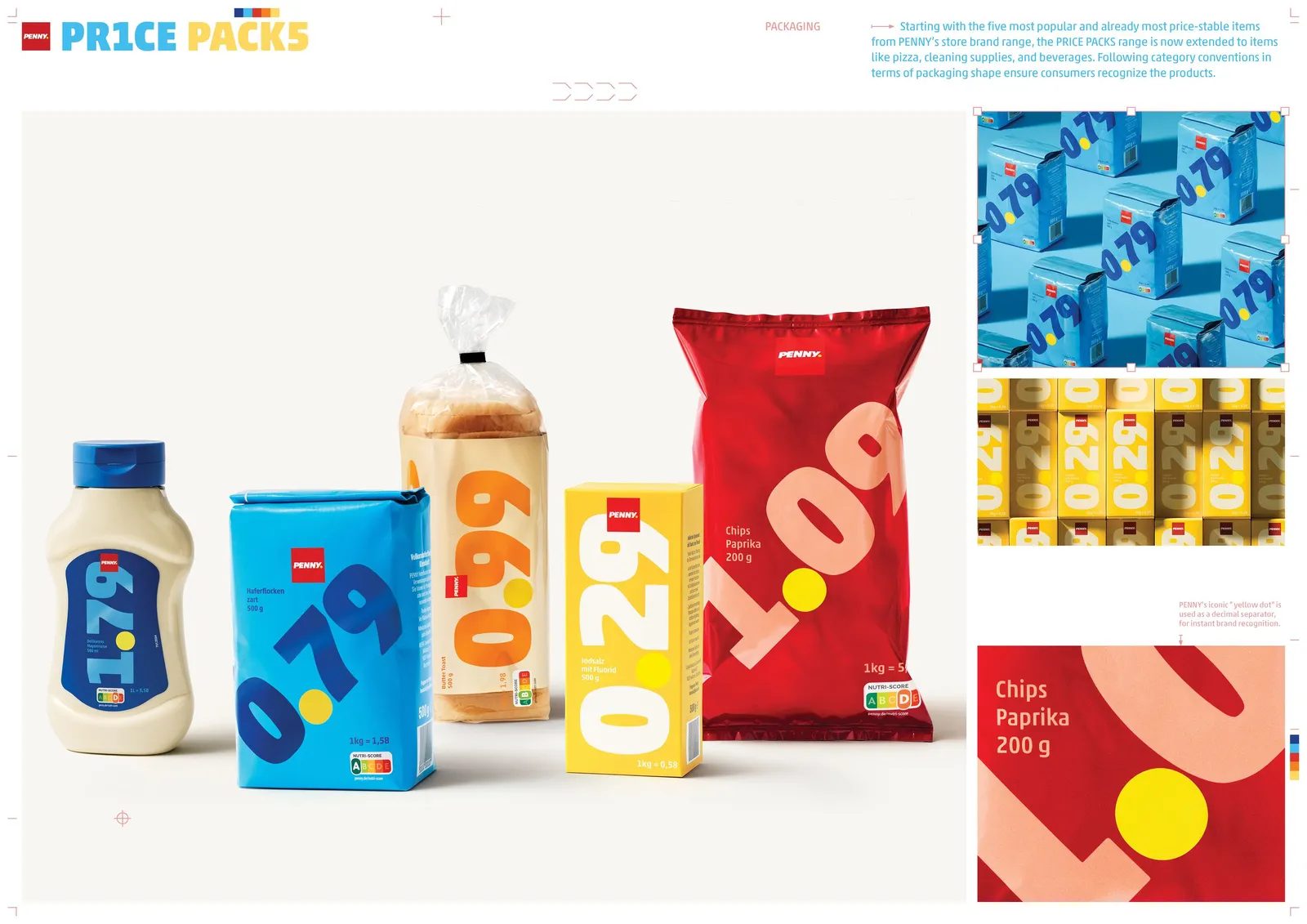
Despite its radical approach, Price Packs doesn’t break with PENNY’s brand identity. Key elements, like the signature yellow dot and Akko typeface, remain as visual anchors.
The typeface is used in a bold black weight to enhance price legibility and maximize visual impact. This way, the brand stays recognizable without overshadowing the main message.
It’s a textbook example of brand evolution without losing identity.
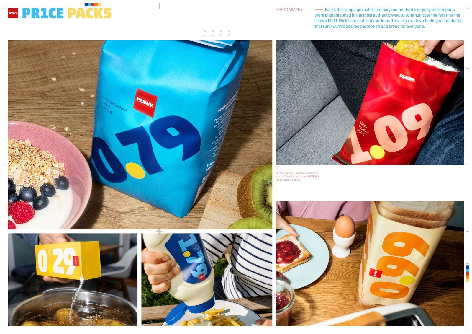
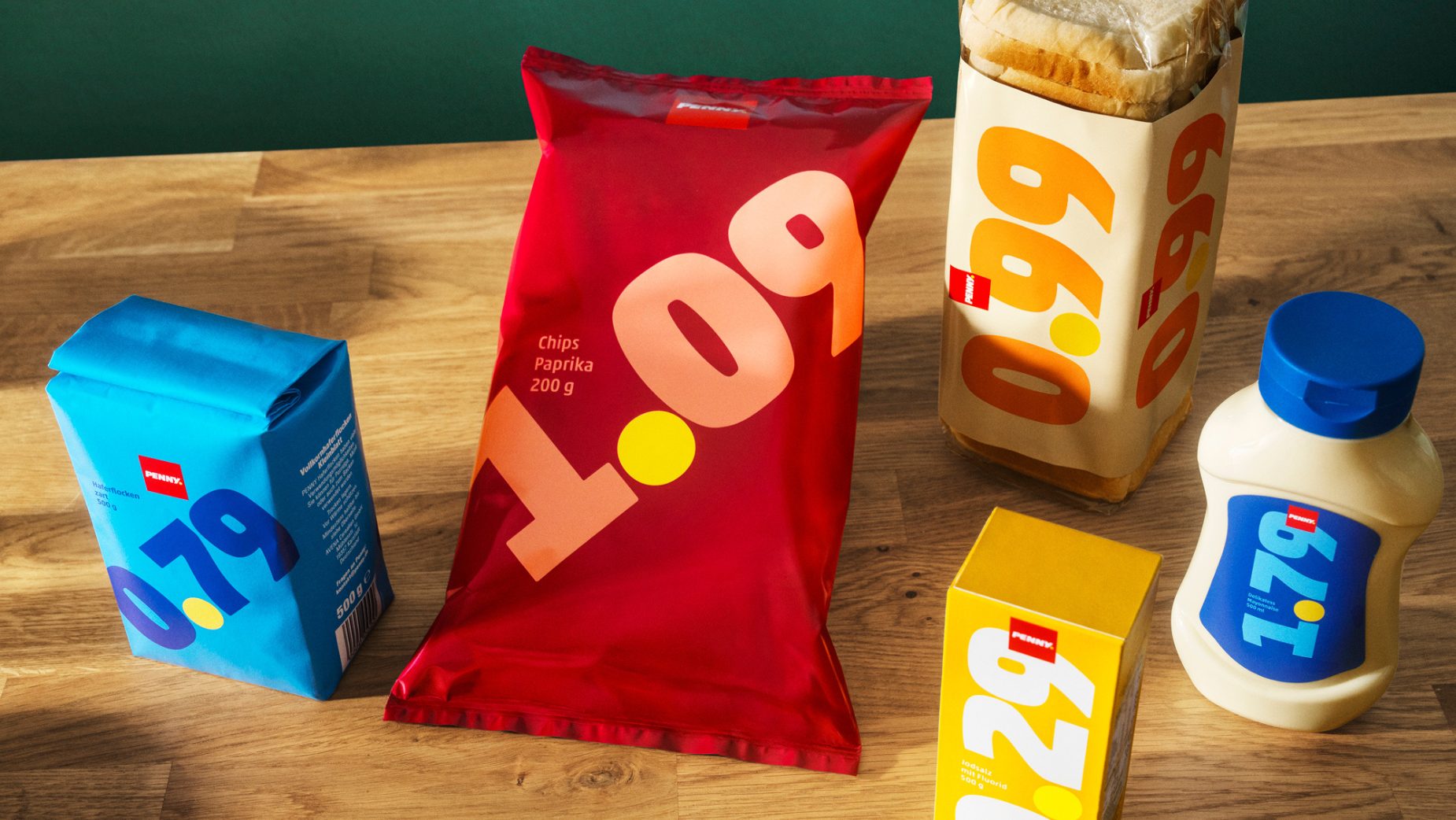
Strategic Selection of Everyday Essentials
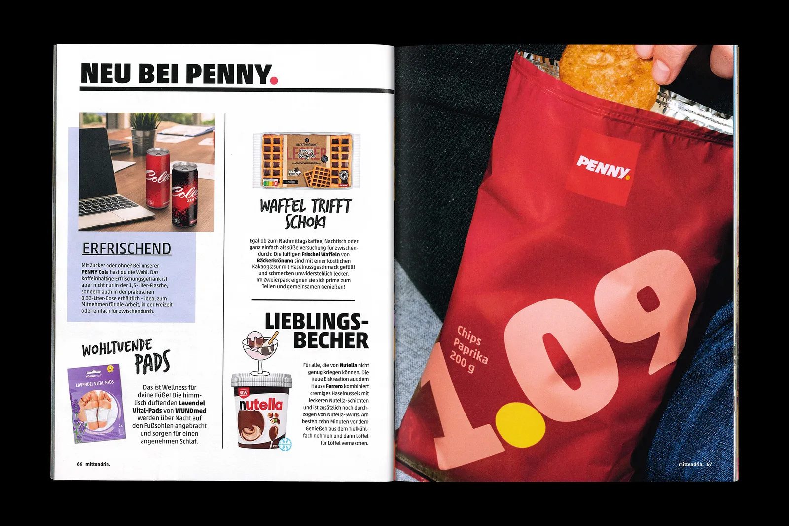
For the initial launch, PENNY and Serviceplan chose five staple private-label products: salt, mayonnaise, oats, sandwich bread, and potato chips. These are high-turnover, frequently purchased items with historically stable prices.
This selection reinforces the credibility of the concept and shows that Price Packs is not a one-off stunt, but a genuine commitment to the consumer’s daily life.
A System That Goes Beyond Packaging
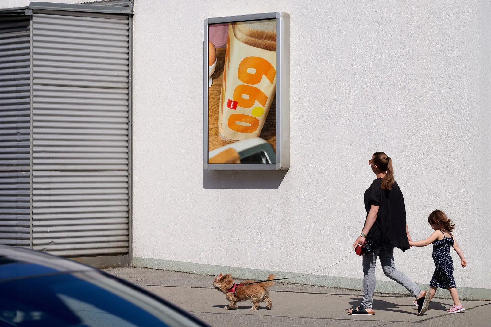
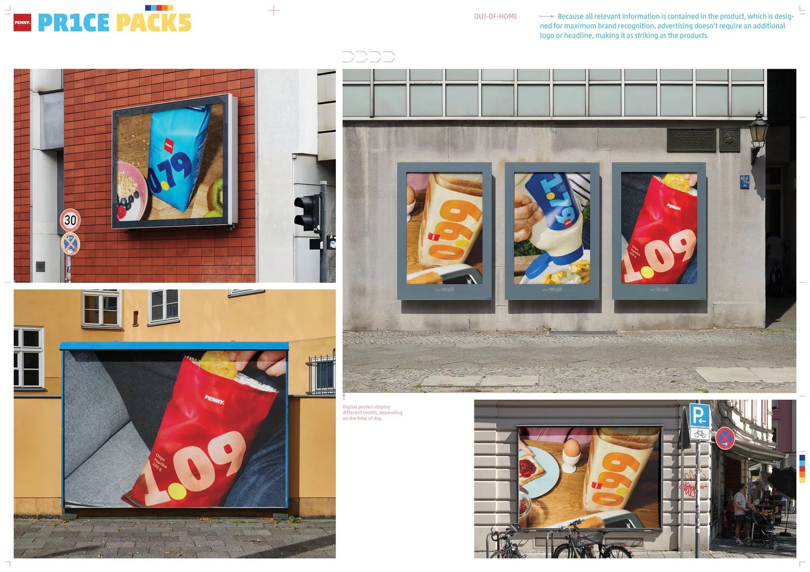
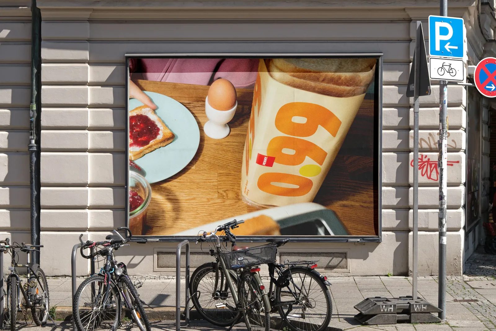
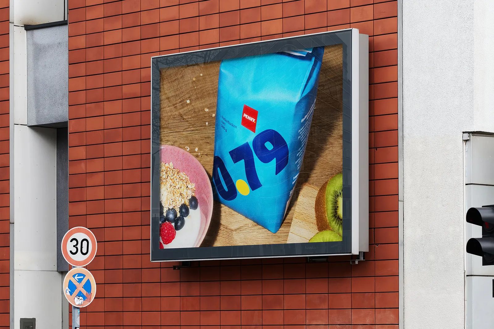
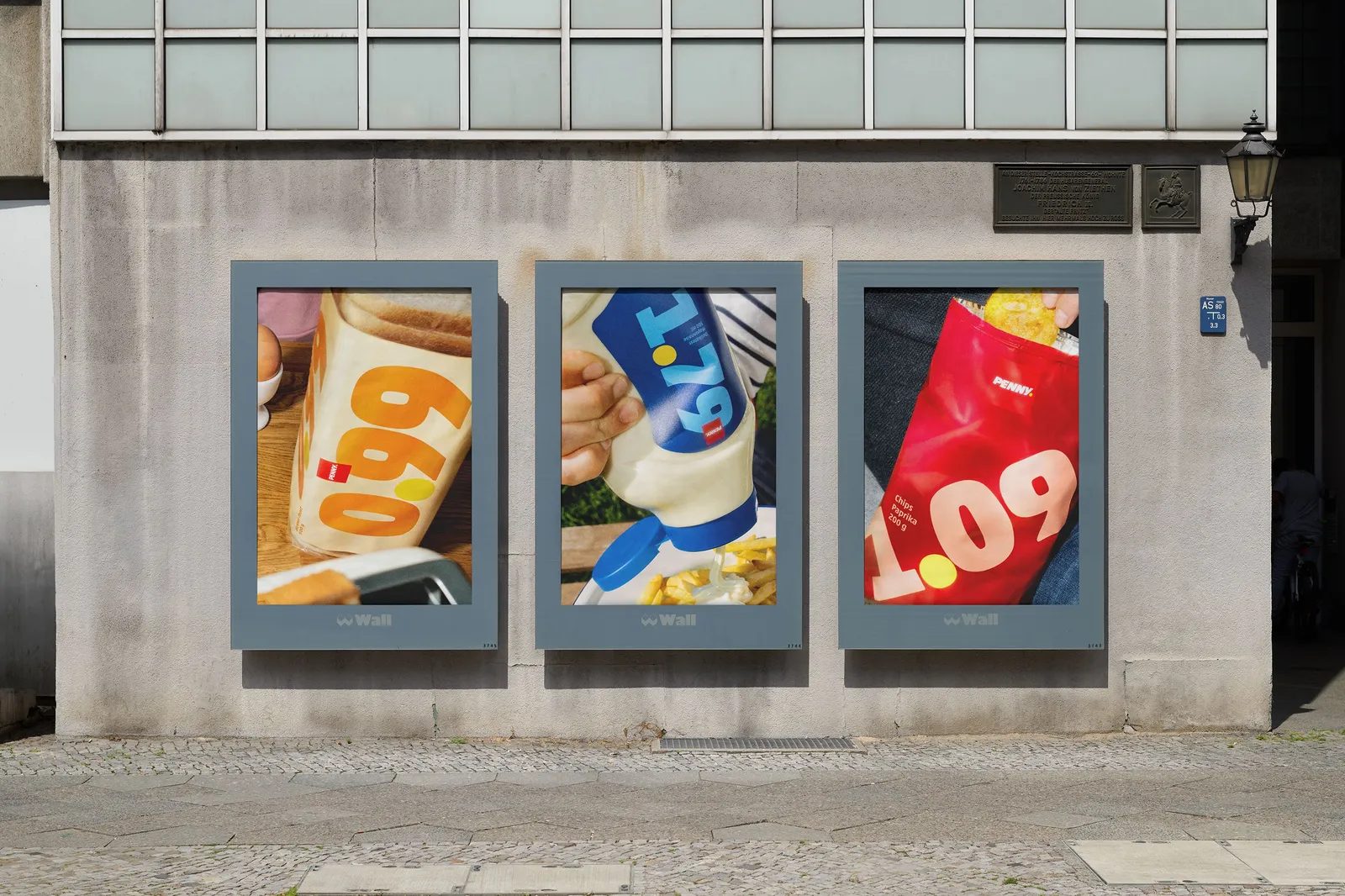
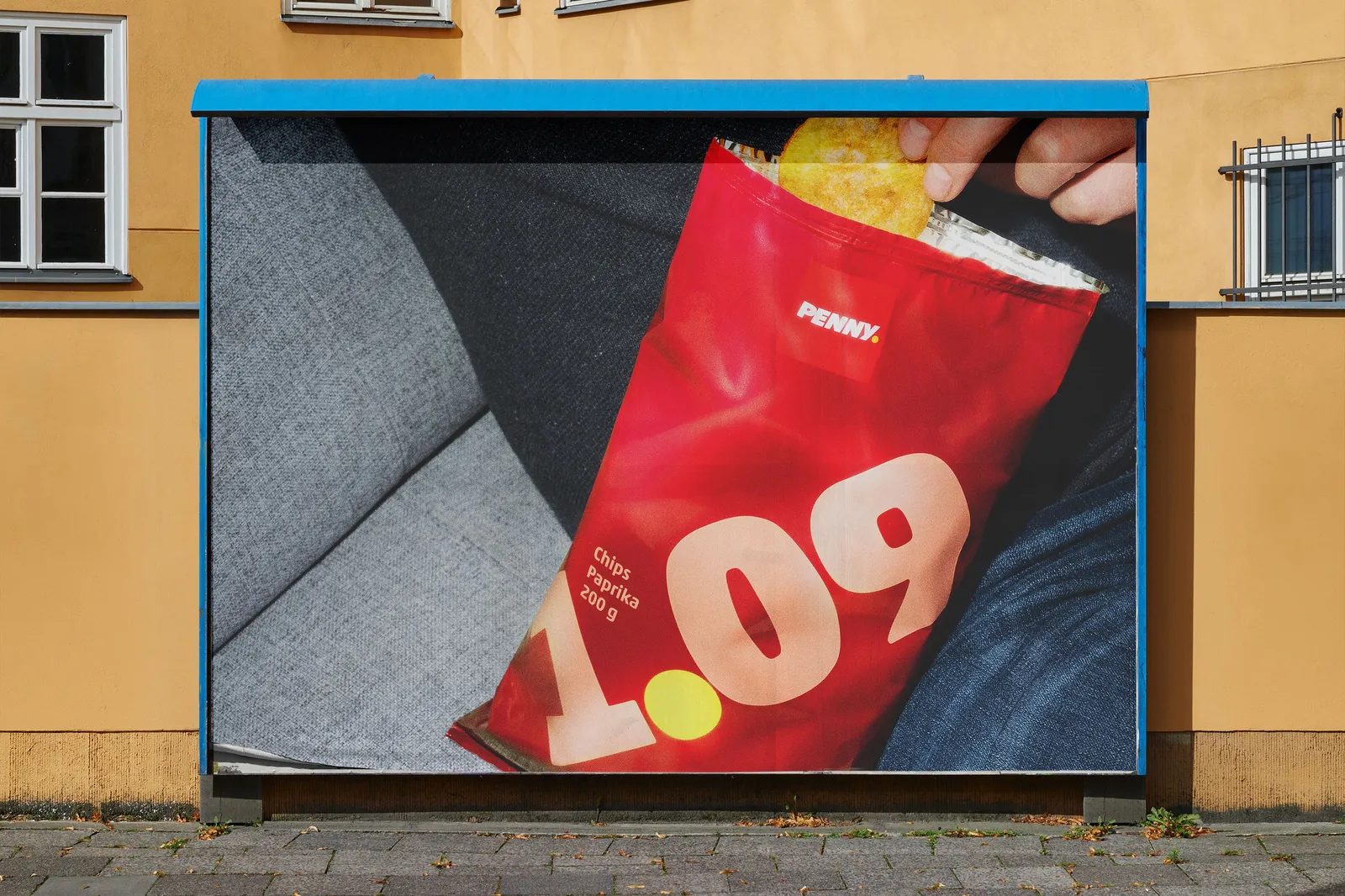
The Price Packs visual system extends seamlessly to outdoor campaigns, point of sale, and social media. Price remains the hero across every touchpoint.
The OOH campaign amplifies the packaging’s impact, scaling up the same graphic language. The message is clear, recognizable, and direct: small prices, big impact.
International Recognition: Multiple D&AD Pencils
Price Packs has earned widespread acclaim on the global creative stage, winning several D&AD Pencils—Yellow, Graphite, and Wood—in categories such as Packaging Design, Graphic Design, Brand Identity Refresh, Commerce, Press & Outdoor, and Direct.
These awards recognize not just the project’s aesthetics, but its strategic intelligence and ability to solve a real business challenge through design.

Project Credits
Entrant Company: Serviceplan Germany
Advertising Agency: Serviceplan Germany
Design Agency: Serviceplan Design
Production Company: We Make Them Wonder
Client: PENNY
Year: 2025
Country: Germany
Conclusion: When Branding Stops Promising and Starts Delivering
Price Packs is a compelling example of branding as a tool for building trust. Instead of making promises, it delivers. Instead of persuading, it commits.
By making price the brand, PENNY and Serviceplan have redefined the role of packaging and graphic design in the mass market. The result is an honest, functional, and courageous system that speaks directly to the real concerns of today’s consumer.
In a market saturated with empty messages, Price Packs proves that simplicity—when rooted in genuine insight—can be the most sophisticated form of communication.