Some rebrandings shout for attention; others take a subtler approach—refining the brand so everything fits better, without losing what’s already familiar. Transavia falls into the latter camp. It doesn’t try to look like a different airline or put on an overly formal façade. Instead, it strengthens what’s recognizable, streamlines the system, and amplifies its visual presence.
Green is no longer just a corporate color—it becomes a signature. Whether on the aircraft, in campaigns, throughout the booking experience, in editorial pieces, or in subtle design touches, the identity comes through with striking clarity. Fresh, commercial, optimistic. Energetic, but never noisy.
What’s impressive is how the system adapts to different tempos: bold scale on the fuselage, quick readability outdoors, clear hierarchy in the interface, aspirational tone in travel content. There’s a valuable lesson in visual direction here: when color, typography, motion, and interaction all speak the same language, the brand is more memorable and perceived value increases—without ever feeling forced.
Transavia — identity in flight and a clear signal
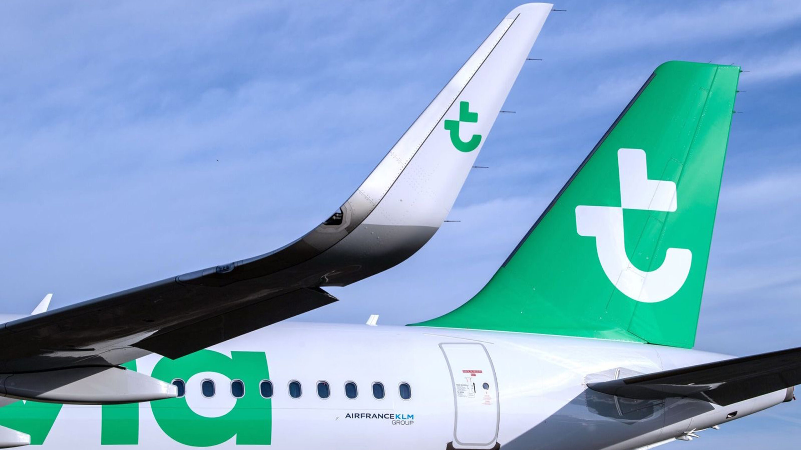
The aircraft is the truest canvas for an airline. There’s no room for tricks: either the brand reads at scale, or it vanishes among metal, sky, and airport. Here, green acts as a block of visual memory. It doesn’t need a sophisticated gesture to work; it needs presence, contrast, and a composition that makes sense in motion, from a distance, and in real-world context.
The tail and fuselage turn daily operations into brand identity. That’s one of the boldest moves in this rebrand: treating the aircraft not as a place to “stick” a logo, but as a full brand surface. White keeps things clean and airy; green claims the territory. The result feels approachable, yet more assertive. Friendly, but more organized.
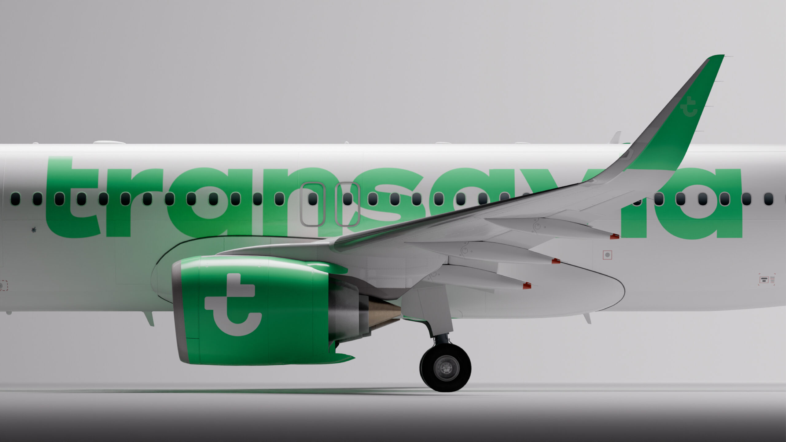
The side view has an almost editorial quality: plenty of white space, a large logo, direct readability. It’s a composition that doesn’t try to look more complex than it is. In a sector where many airlines end up looking alike, bold color makes it easy to stand out—without unnecessary layers.
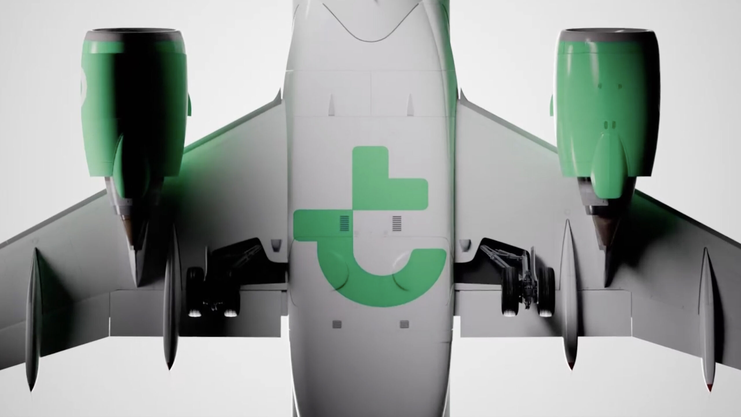
Details matter, too. Engines, tail, proportions, and color zones hold the system together when the plane is seen as a three-dimensional object. That continuity builds trust—not because users consciously analyze it, but because they sense a brand that’s cared for, consistent, and confident. In high-volume services, that perception is crucial.
Transavia — color, typography, and brand rhythm
Green has a clear mission: to refresh without feeling childish. It’s bright, distinctive, and energetic enough for commercial use. The identity doesn’t rely on a palette full of nuances to feel rich; it bets on a simple, repeatable signal. That’s a smart move, because a brand that lives across so many touchpoints needs flexibility, not fireworks.
The typography brings weight and quick readability. It doesn’t try to disappear, but it doesn’t steal the show either. It’s functional—perfect for an airline: informing, organizing, selling, guiding. Combined with bold green and destination photography, the system achieves a direct, almost wayfinding-like visual rhythm.
There’s also a sense that the identity is built for motion. The symbol can act as an active element: pointing, entering, highlighting, supporting messages. That’s key for a brand that lives as much in digital as in airports, campaigns, and screens. Good motion isn’t about moving things for the sake of it; it’s about giving the identity its own behavior.
The takeaway is simple and practical: a brand doesn’t need a thousand assets if its fundamentals are well chosen. Characterful color, clear typography, modular iconography, and a composition that works across campaigns, interfaces, and products. Less repertoire, more consistency.
Transavia — campaigns that sell with style
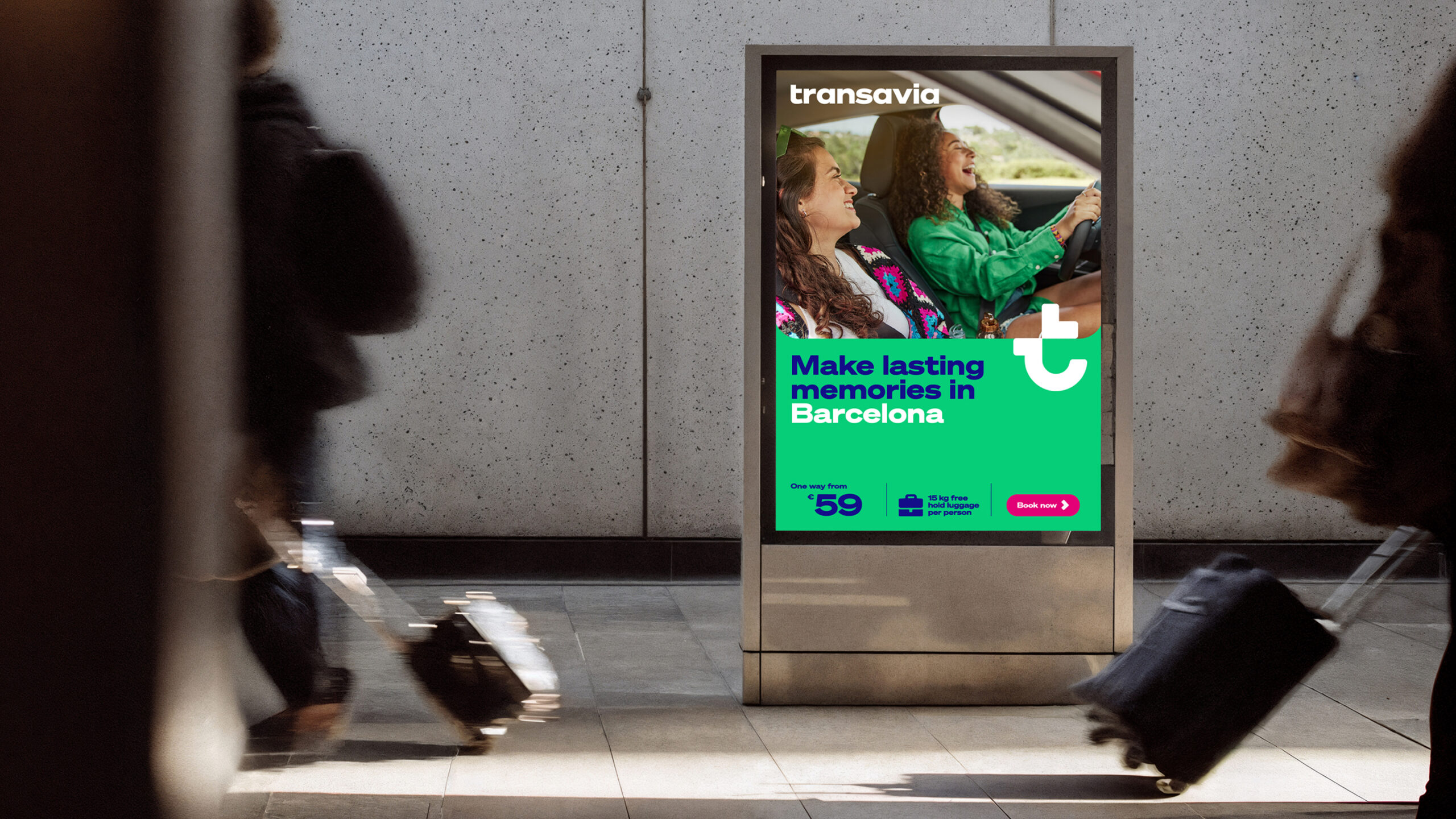
The Barcelona campaign has all the hallmarks of great outdoor advertising: quick to read, easy to remember, and it stands out from the noise. The layout blends travel aspiration with direct sales, without one overpowering the other. There’s a destination image, an emotional promise, a price, and a call to action. Everything coexists naturally.
The real win is not downplaying the commercial side. Many brands try to hide the sales pitch to look more editorial; here, the system embraces the fact that selling flights is part of the deal. “Book now” doesn’t break the aesthetic, because the visual direction is already designed to integrate performance messages without looking like a rushed banner.
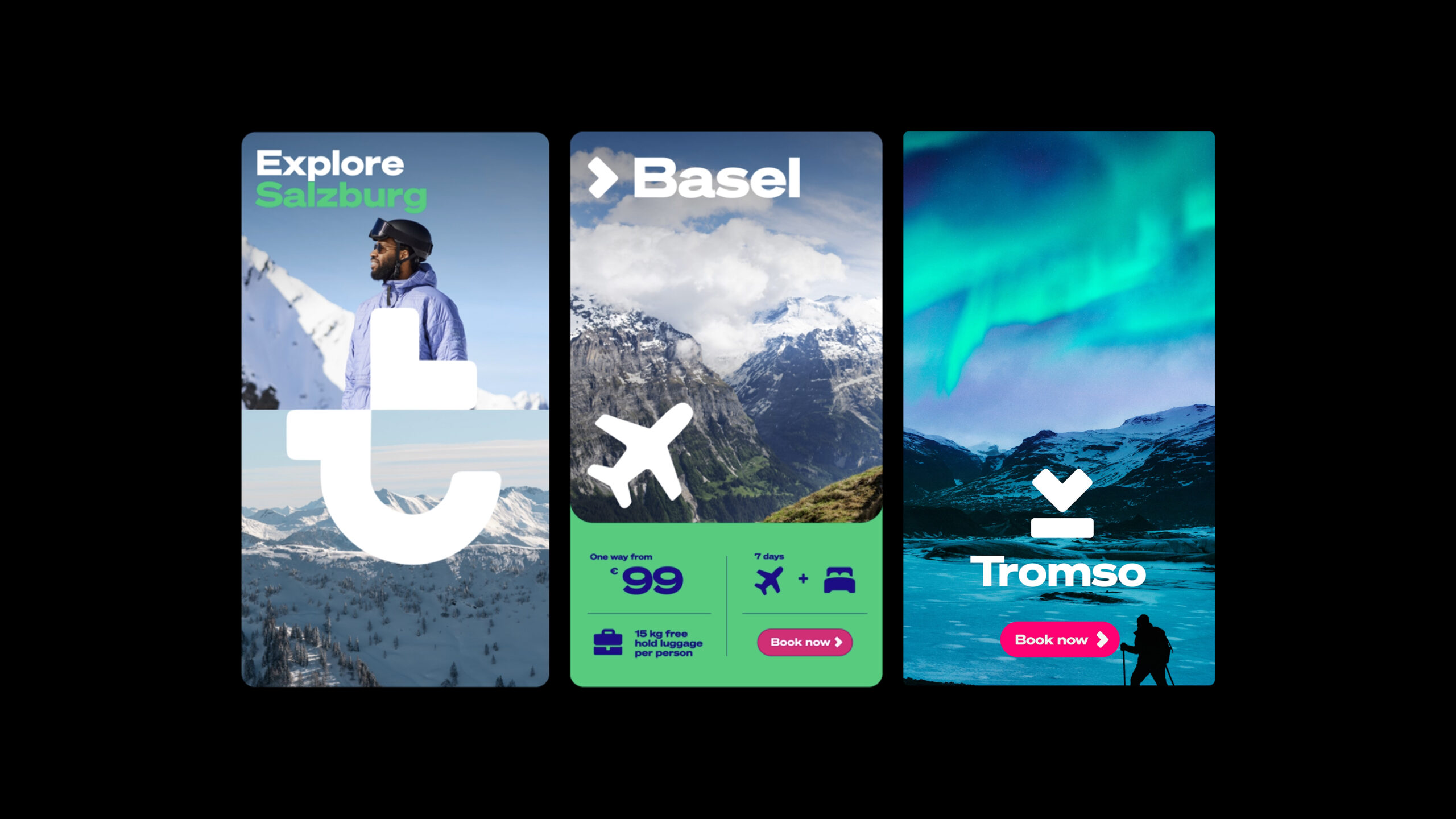
The destination posters follow a practical structure: large type, atmospheric photography, and highly visible information blocks. The identity adapts to different cities, climates, and travel moods without losing coherence. Salzburg, Basel, or Tromsø may evoke different images, but the brand keeps a steady pulse.
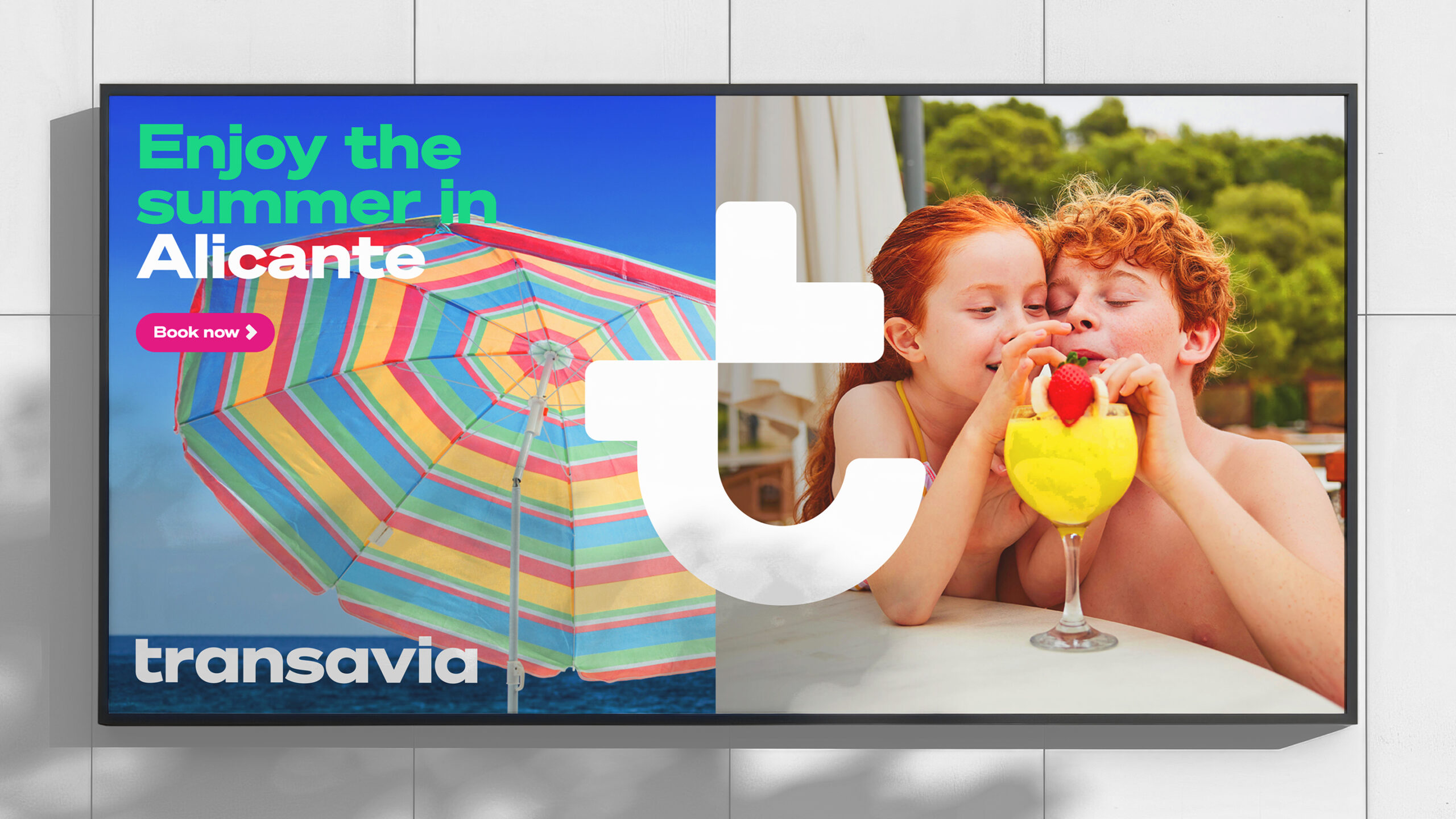
The most vacation-focused piece turns up the color and lets in a lighter mood—beach umbrellas, family, sun: familiar territory. What’s interesting is that the branding doesn’t get lost in tourist clichés. Green still anchors the composition, preventing the image from becoming just another generic summer promo.
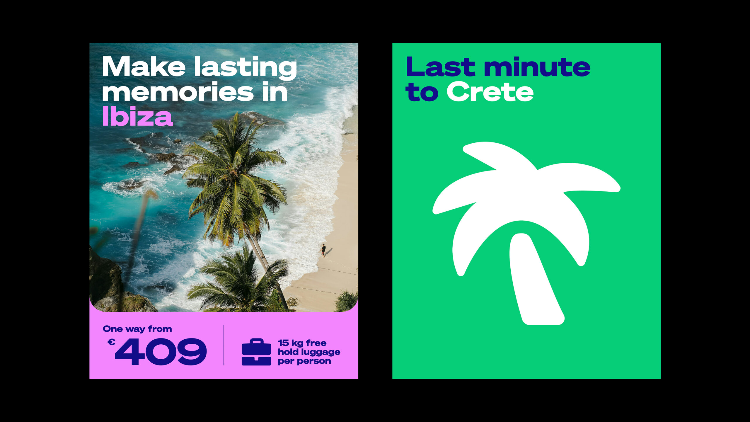
For marketing, the lesson is clear: a well-built identity doesn’t get in the way of sales—it organizes them. It enables faster campaign rollouts, maintains recognition across assets, and sustains a sense of value even when the message is promotional.
Transavia — booking UX with a direct approach
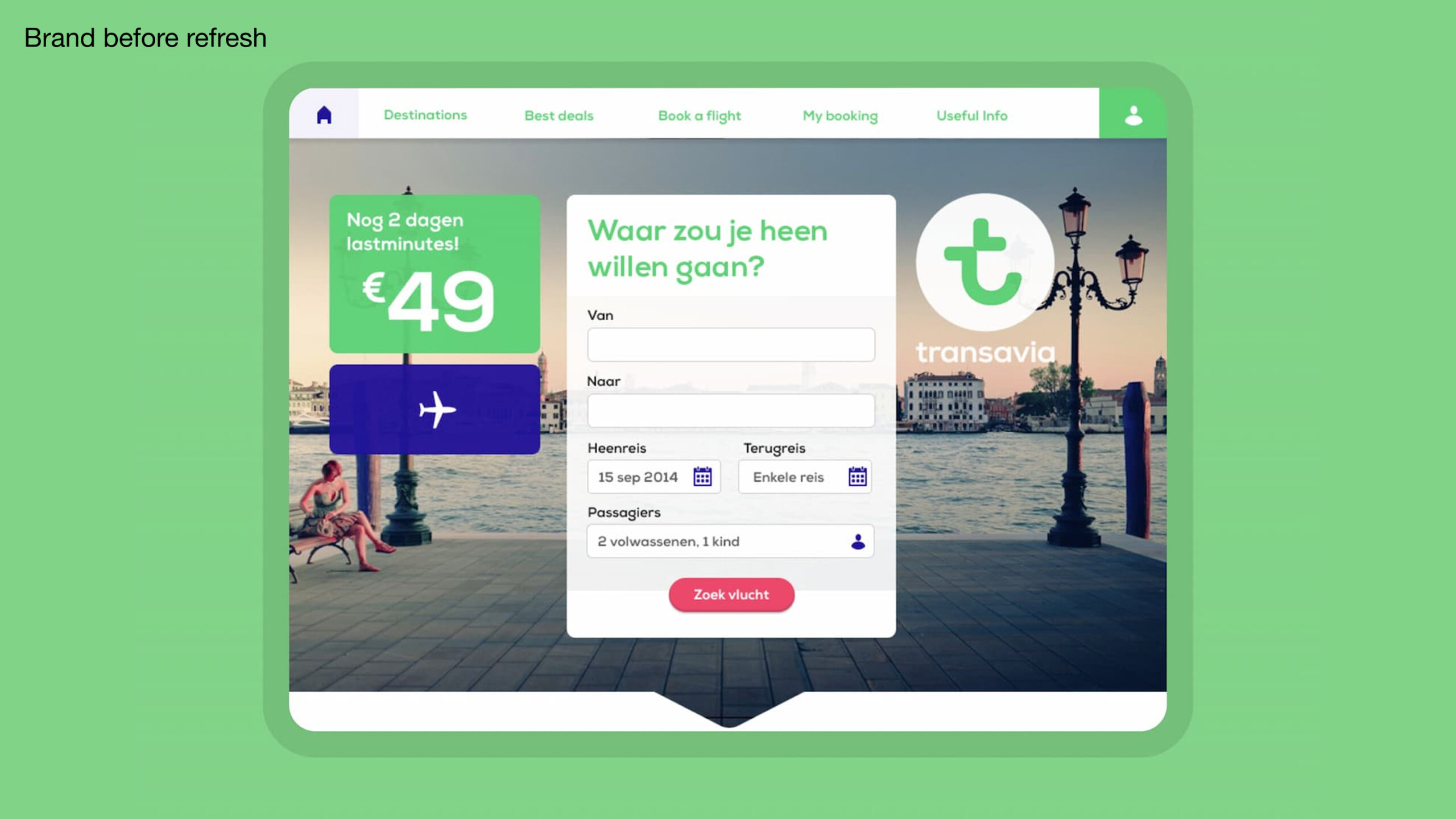
The digital side brings the identity into a space where recognition isn’t enough—you have to help users decide. The booking homepage relies on a straightforward hierarchy: search flights, view fares, understand your starting point, and move forward. There aren’t layers of visuals competing for attention, which is gold in travel ecommerce.
The map and price blocks add a sense of exploration without complicating the main action. The interface keeps the color, brand, and tone, but never at the expense of clarity. That’s a sign of good UX/UI: when the visual system supports conversion instead of competing with it.
The more form-focused version has its own appeal: less scenery, more decision-making. Visible fields, promos close at hand, simple structure. For an airline, reducing cognitive load is no small thing. Every extra doubt can cool a purchase; every clear hierarchy brings the user closer to the next step.
What’s great is that the experience doesn’t feel disconnected from the branding. It keeps the color, tone, and composition. The brand is still present, but it serves the task at hand. That builds trust and efficiency—without turning the interface into a visual showcase.
Transavia — travel editorial with its own identity
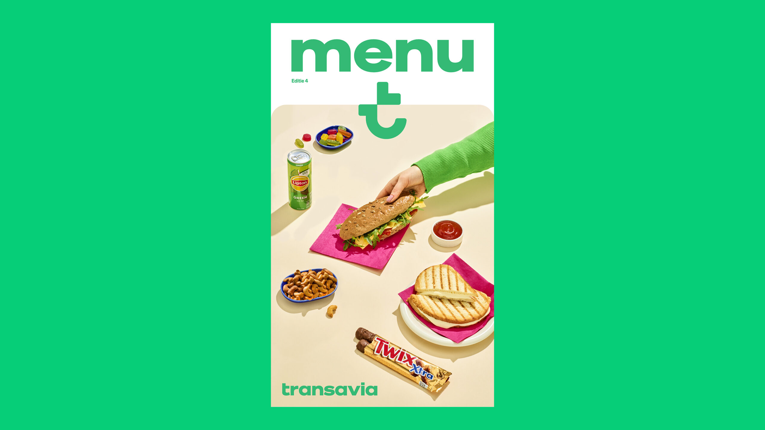
The editorial cover opens up another dimension: the brand isn’t just about selling flights—it can also build desire around travel. The modular layout, destination blocks, and magazine-style composition add a more cultural, less transactional layer. It’s a smart way to broaden the atmosphere without straying from the business.
There’s something compelling about this balance between content and conversion. A travel brand needs to sell, yes, but it also needs to fuel the imagination. If it’s all about price, it becomes interchangeable. If it’s all inspiration, it loses commercial focus. Here, the balance works because the identity ties both worlds together.
Large typography and modular structure create visual rhythm. There’s no cluttered cover or overly precious editorial gesture. It’s accessible, clear, and has enough personality to feel branded. In terms of perceived value, that’s a win: the company comes across as more polished, coherent, and present.
Less noise, more visual memory
This rebrand works because it doesn’t try to erase Transavia’s past. It sharpens it. It gives green more weight, brings order to the typography, makes campaigns sell more clearly, and ensures the interface speaks the same language as the aircraft. That continuity may be the least flashy part—and probably the most valuable.
The identity is strongest when it’s fully deployed: on surfaces, posters, booking, editorial, motion, iconography, and tone. Not as a collection of pretty pieces, but as a system that helps people recognize, trust, and decide. That’s the difference between decorative design and visual direction with real impact.
For any brand selling services, products, or experiences, the lesson is clear: when the visual system is well defined, everything gets easier. It’s easier to explain, easier to remember, easier to convince. And while it may look like just color, composition, and typography, it ultimately drives business.