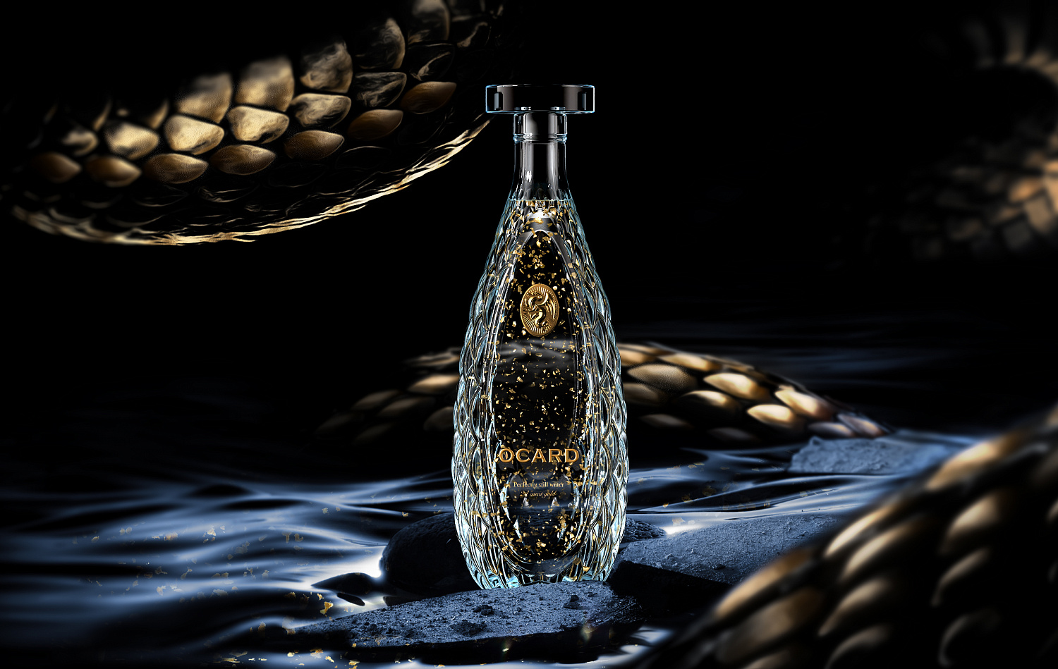
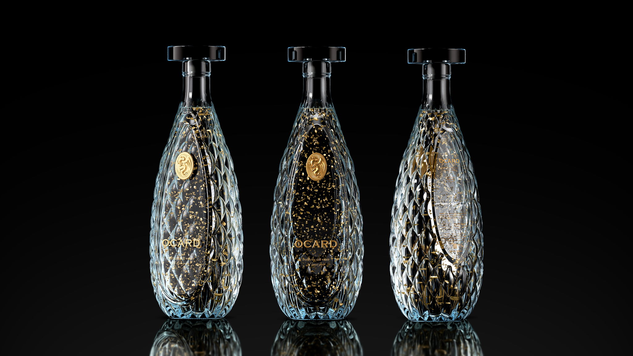
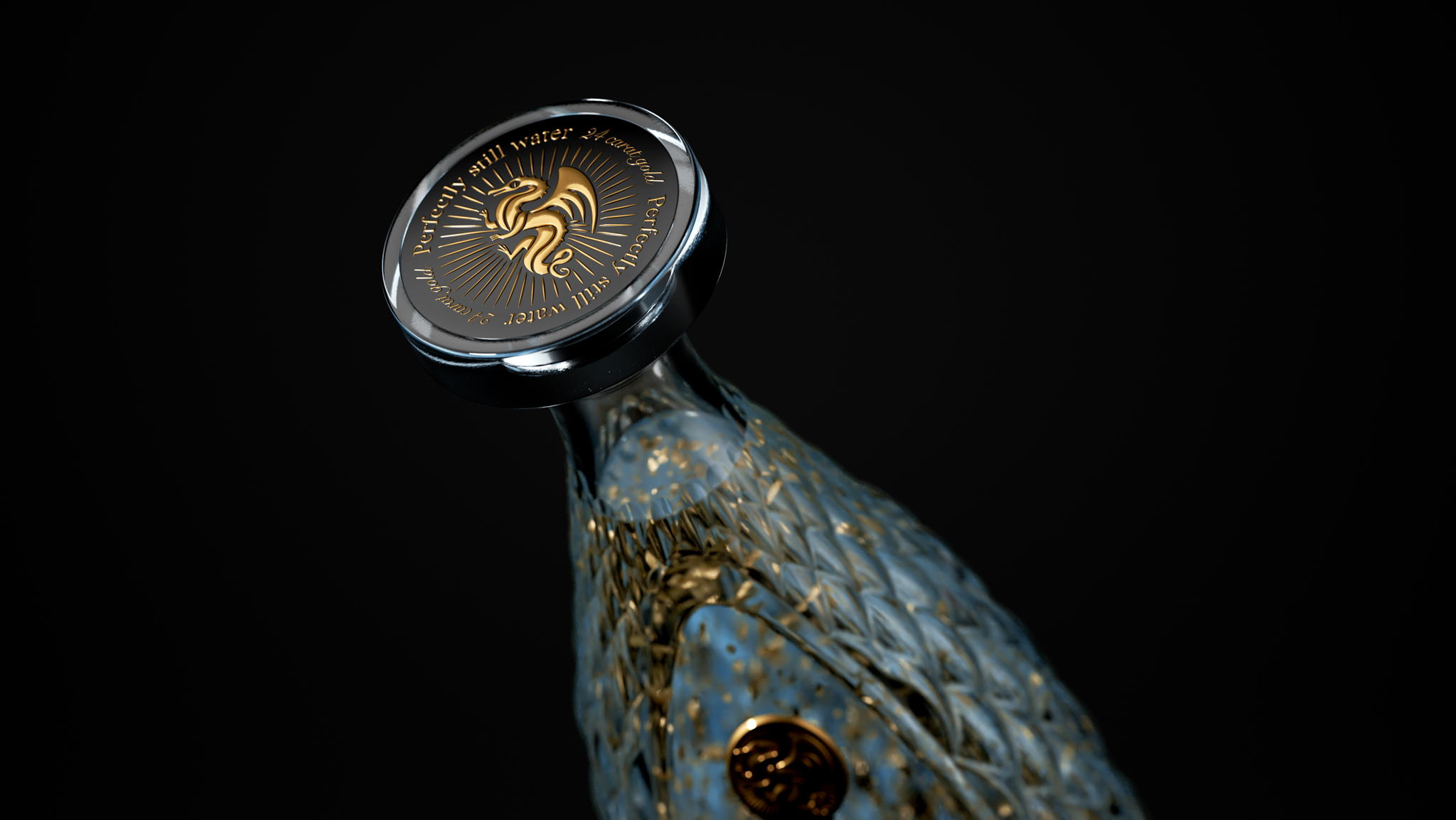
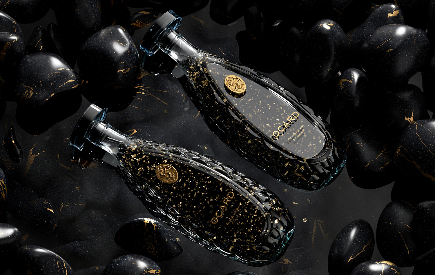
OCARD
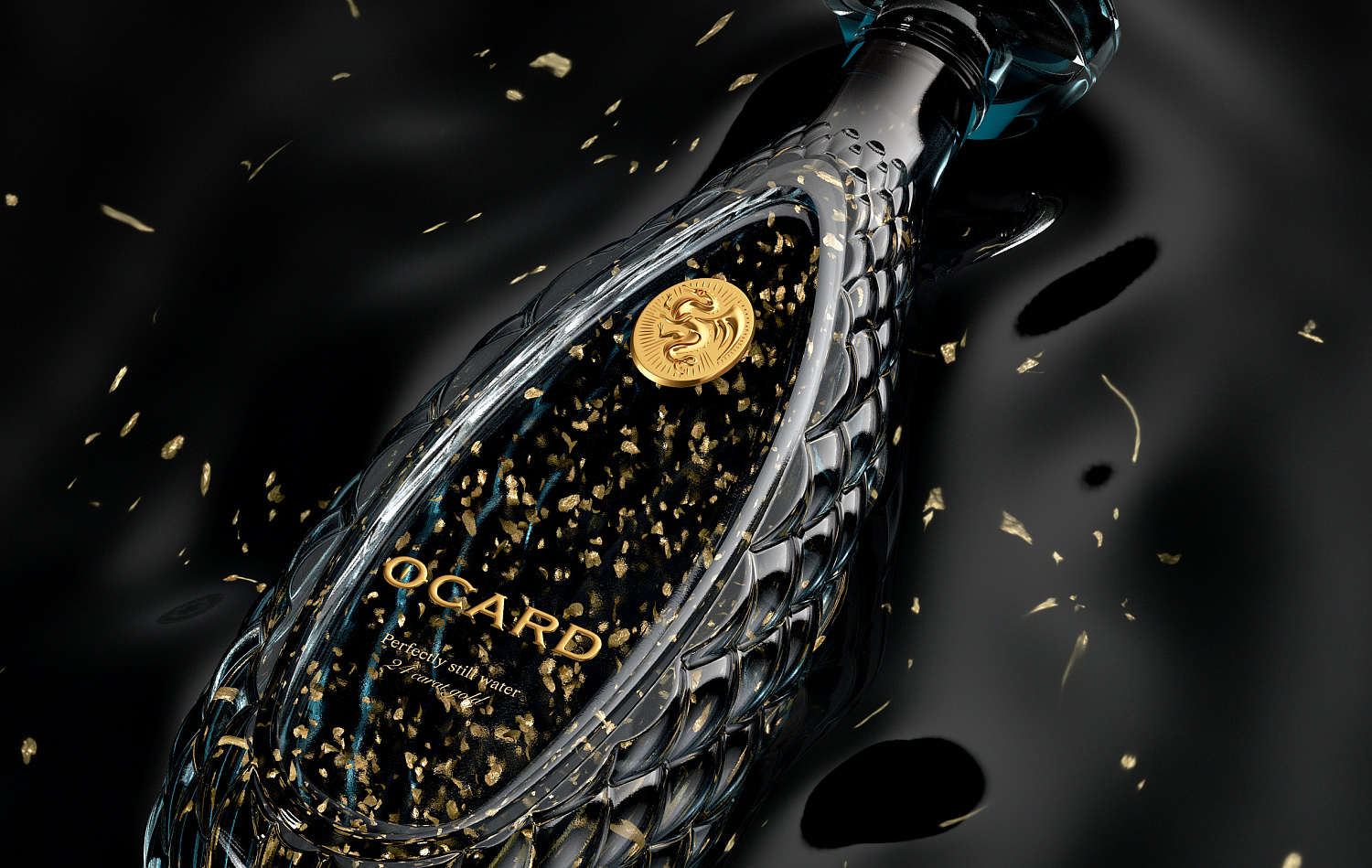
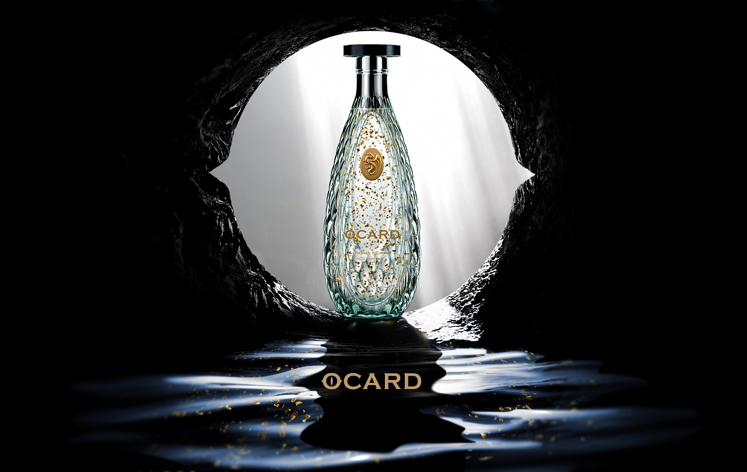
Hotel branding design by the creative studio INHOUSE
https://www.depotwpf.com/portfolio/ocard/
https://thedieline.com/blog/2021/1/15/-ocard?
This is one of the most impressive hotel visual identities we’ve seen in a long time, thanks to its highly personalized approach and perfect alignment with the hotel’s character.
The hotel is located in central Auckland, within a complex of nine square-shaped floors.
The hotel’s corporate identity takes inspiration from the square form, using it as a key element throughout the hotel’s branding.
As a result, square shapes and right angles are present in every aspect of the hotel’s visual identity, creating a hotel brand identity that is both memorable and cutting-edge.
This project stands out for:
- Translating the physical square element into the brand identity
- Consistent application across all branding elements
- The elegance of the branding
- Creating a memorable brand experience
- Respecting the surrounding environment
- Achieving a personal touch through a square, angular identity
An award-winning example of hotel branding:
- Best Design Awards: Gold in Large Brand Identity
- Best Design Awards: Gold in Environmental Graphics
- Best Design Awards: Copper in Environmental Graphics
One of the best hotel branding case studies we’ve come across in recent months.
Tips for creating a hotel’s brand identity
This first hotel branding example highlights the importance of consistency.
A brand identity should always be coherent with what it represents.
If a hotel aims for elegance, its branding must reflect that elegance. Leveraging the hotel’s architecture and surroundings as part of the brand identity is one of the most effective graphic resources available.
https://www.depotwpf.com/portfolio/ocard/
https://thedieline.com/blog/2021/1/15/-ocard?
Project highlights
The luxury suites at Hotel Britomart are named after The Landing resort in the Bay of Islands.
Beyond the visual identity, the project was supported by a published book telling the story of both the bay and the hotel, further emphasizing the hotel’s unique and personal character.
The hotel’s location is one of the first places settled by the Māori people from Polynesia.
During the hotel’s construction, a series of posters were designed to attract the attention of passersby, already featuring the square motif from the logo.
Click here to view the full project
Interested in a similar project? Let’s talk.
[superfeatured]7076[/superfeatured]
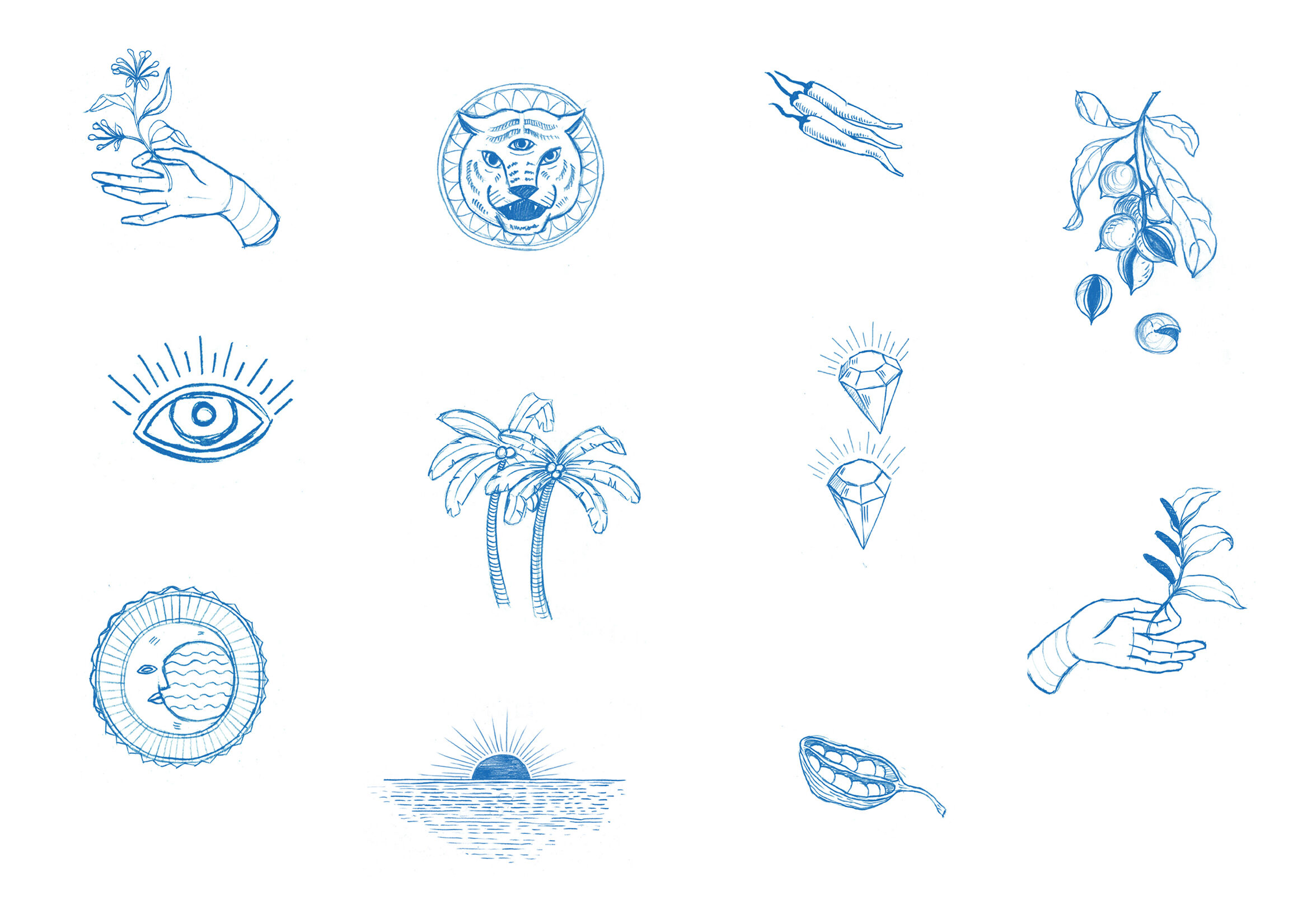
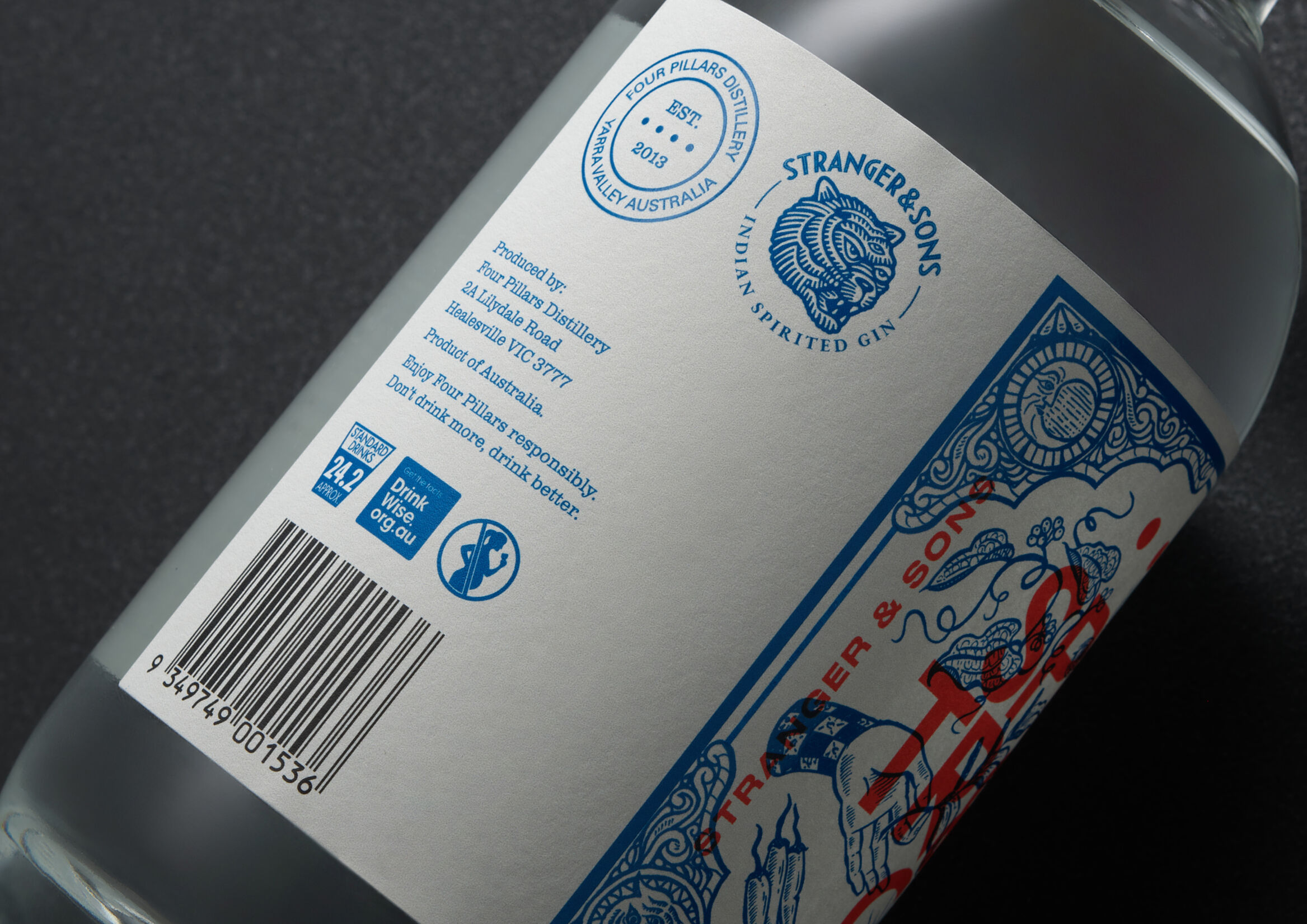
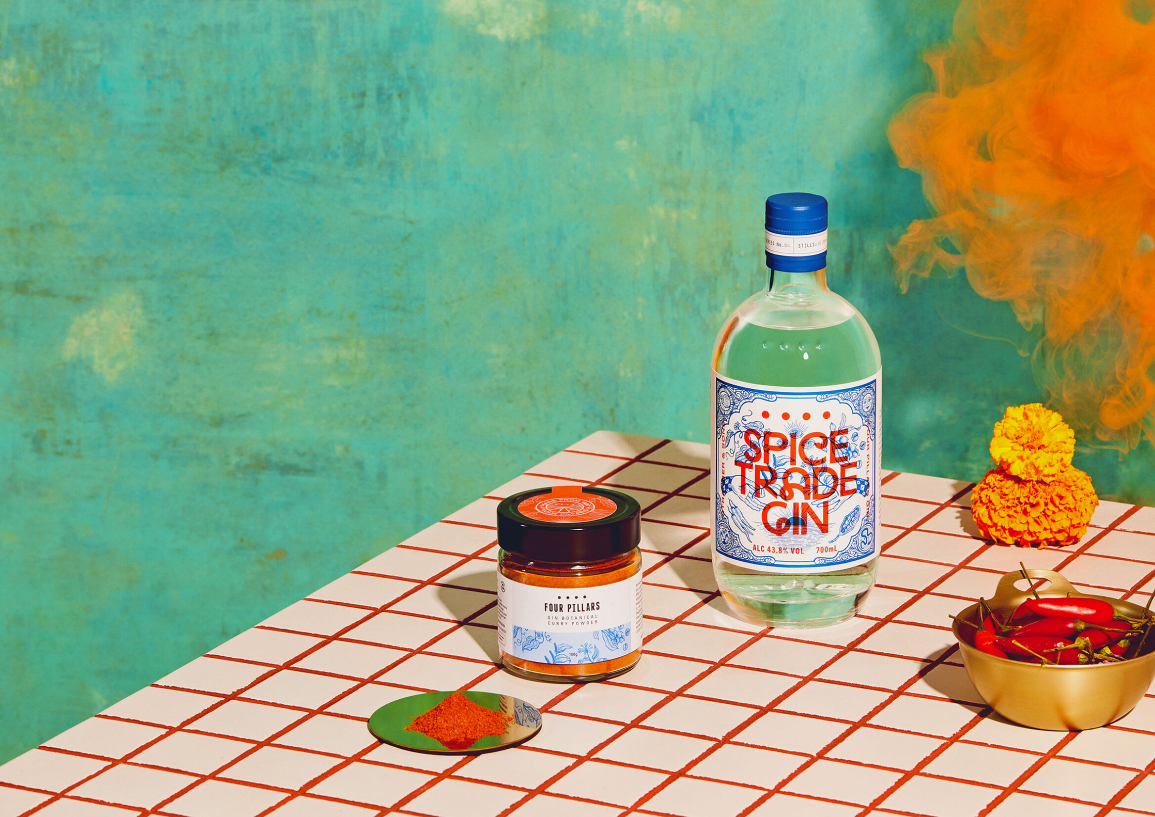
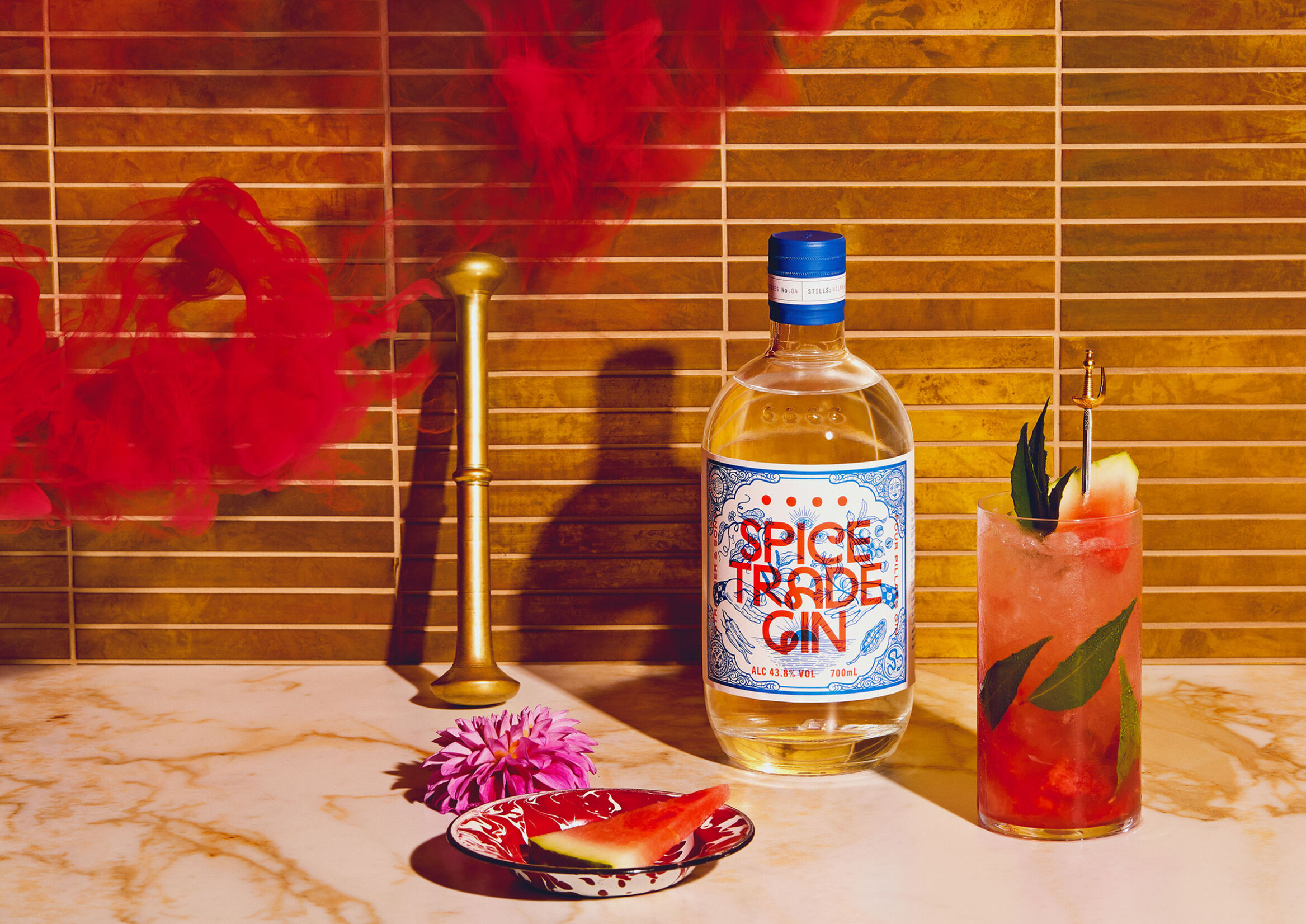
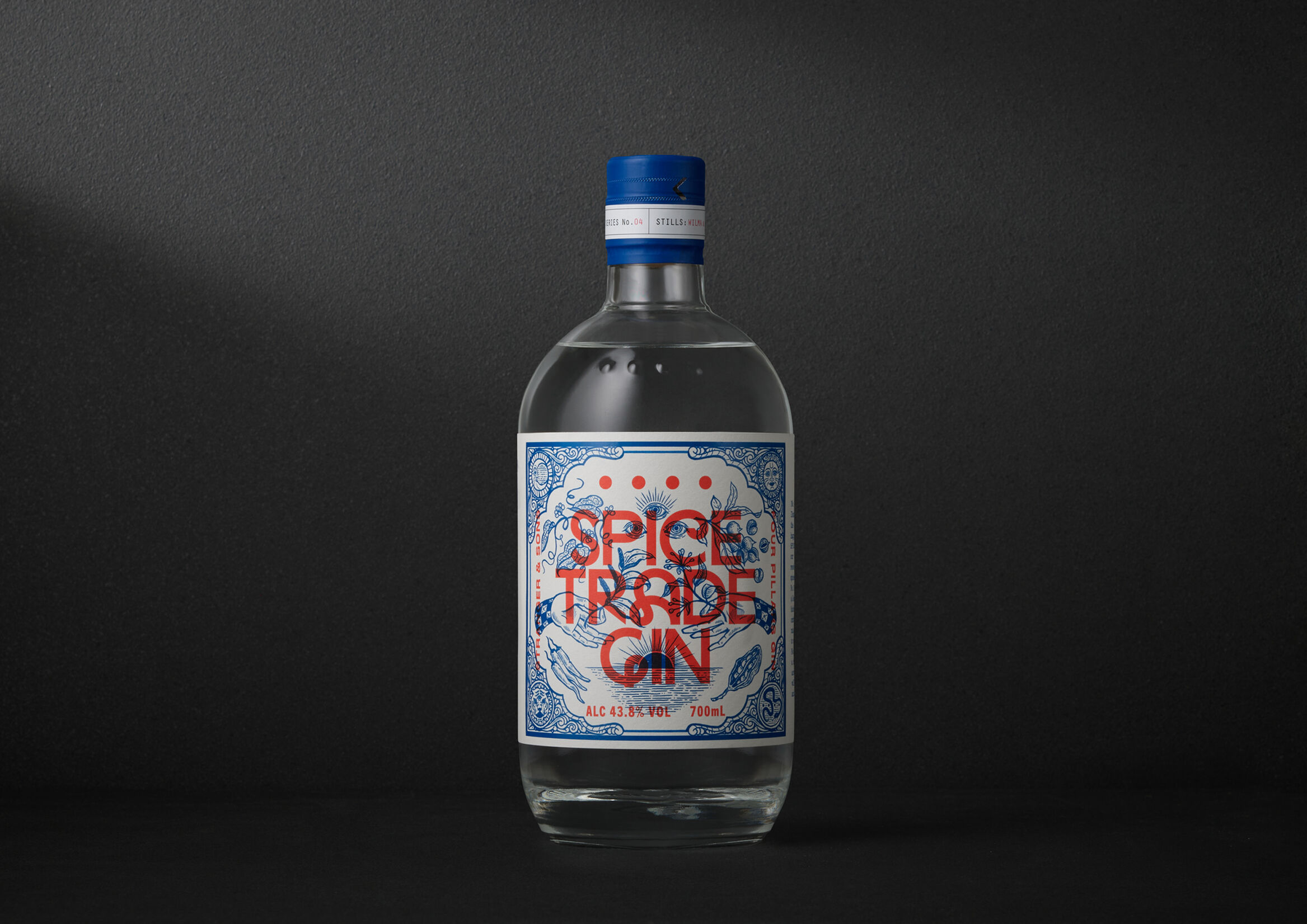
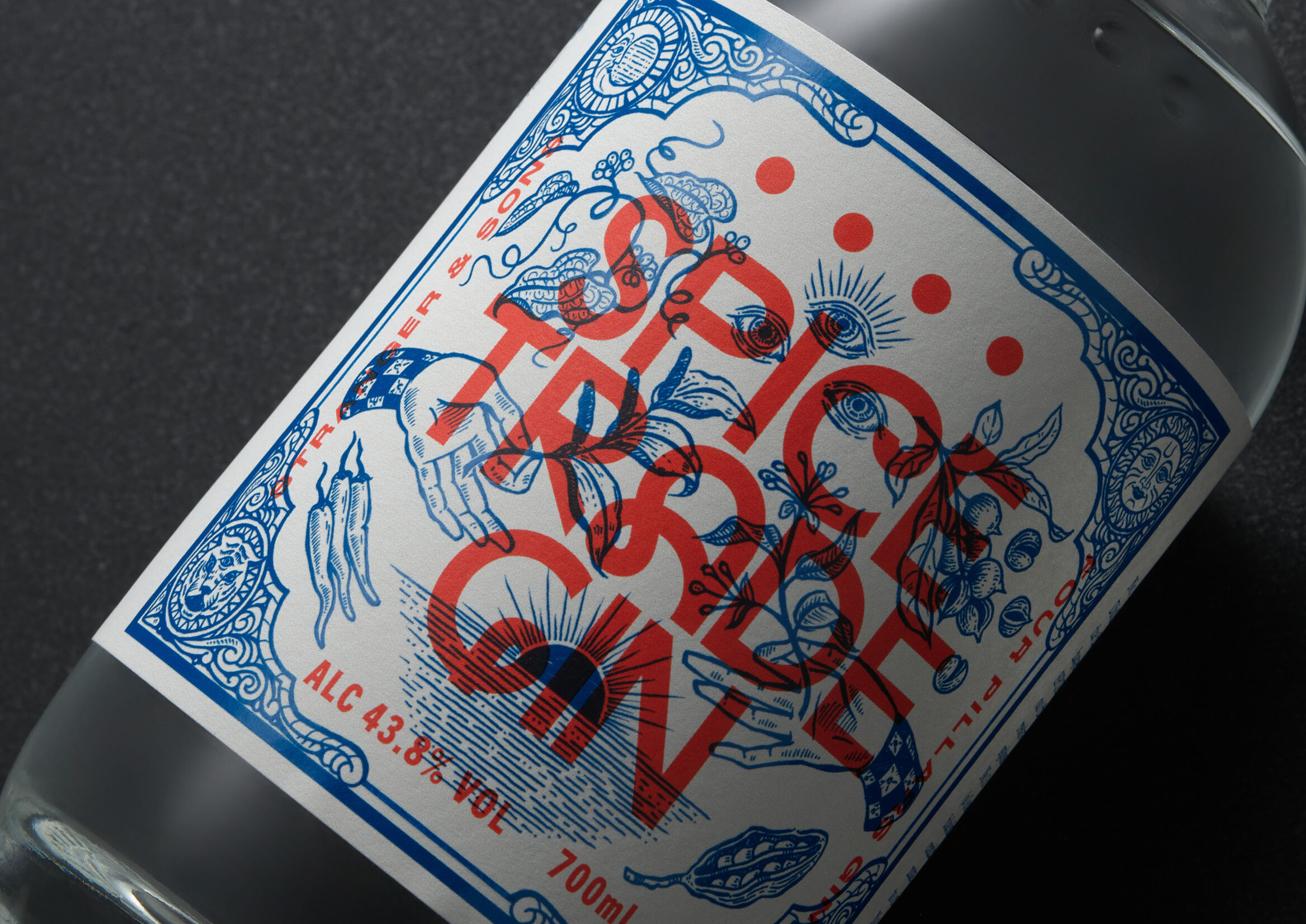
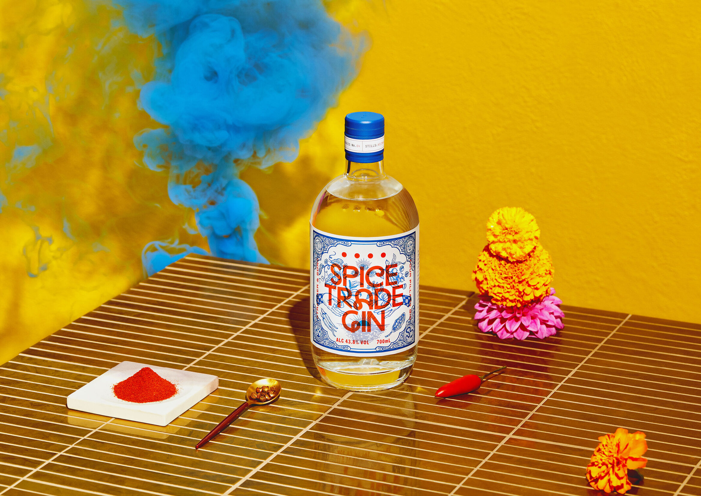
FOUR PILLARS SPICE TRADE GIN
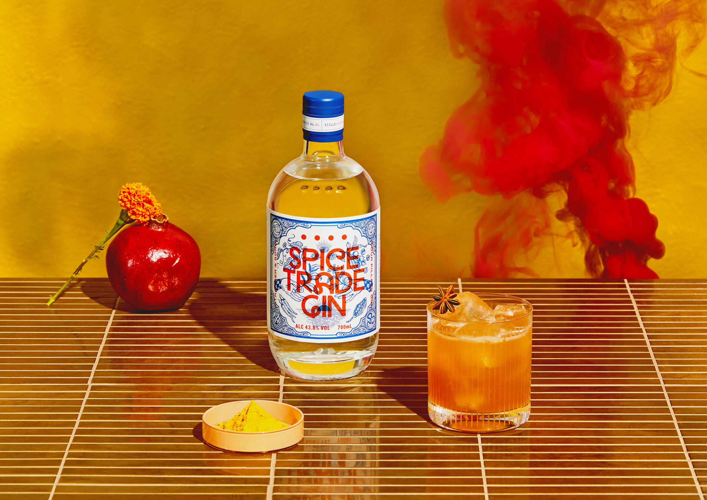
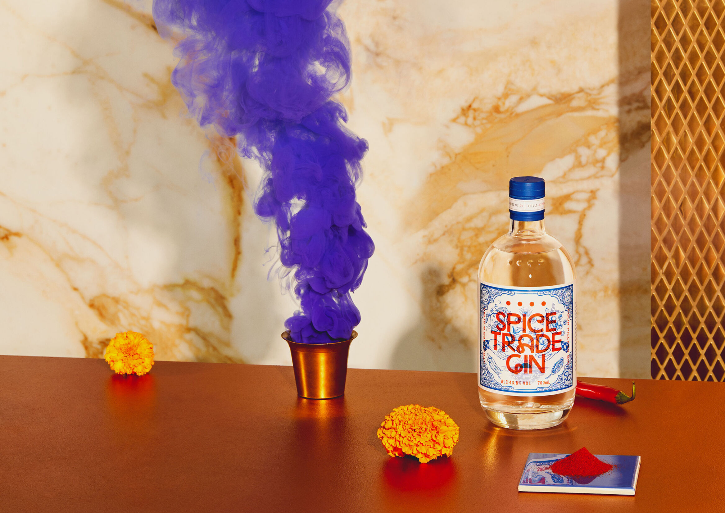
Hotel branding design by the creative studio INHOUSE
https://bestawards.co.nz/graphic/packaging/interweave-group/four-pillars-spice-trade-gin-bottle/
https://www.delicious.com.au/drinks/spirits-cocktails/article/four-pillars-gin-launch-indian-inspired-spice-trade-gin/53c3zwid
This is one of the most impressive hotel visual identities we’ve seen in a long time, thanks to its highly personalized approach and perfect alignment with the hotel’s character.
The hotel is located in central Auckland, within a complex of nine square-shaped floors.
The hotel’s corporate identity takes inspiration from the square form, using it as a key element throughout the hotel’s branding.
As a result, square shapes and right angles are present in every aspect of the hotel’s visual identity, creating a hotel brand identity that is both memorable and cutting-edge.
This project stands out for:
- Translating the physical square element into the brand identity
- Consistent application across all branding elements
- The elegance of the branding
- Creating a memorable brand experience
- Respecting the surrounding environment
- Achieving a personal touch through a square, angular identity
An award-winning example of hotel branding:
- Best Design Awards: Gold in Large Brand Identity
- Best Design Awards: Gold in Environmental Graphics
- Best Design Awards: Copper in Environmental Graphics
One of the best hotel branding case studies we’ve come across in recent months.
Tips for creating a hotel’s brand identity
This first hotel branding example highlights the importance of consistency.
A brand identity should always be coherent with what it represents.
If a hotel aims for elegance, its branding must reflect that elegance. Leveraging the hotel’s architecture and surroundings as part of the brand identity is one of the most effective graphic resources available.
https://bestawards.co.nz/graphic/packaging/interweave-group/four-pillars-spice-trade-gin-bottle/
https://www.delicious.com.au/drinks/spirits-cocktails/article/four-pillars-gin-launch-indian-inspired-spice-trade-gin/53c3zwid
Project highlights
The luxury suites at Hotel Britomart are named after The Landing resort in the Bay of Islands.
Beyond the visual identity, the project was supported by a published book telling the story of both the bay and the hotel, further emphasizing the hotel’s unique and personal character.
The hotel’s location is one of the first places settled by the Māori people from Polynesia.
During the hotel’s construction, a series of posters were designed to attract the attention of passersby, already featuring the square motif from the logo.
Click here to view the full project
Interested in a similar project? Let’s talk.
[superfeatured]7076[/superfeatured]