There are restaurant brands that simply serve sushi, and there are brands that create an entire scene. Ebisumaru belongs to the latter: it doesn’t just stay on the plate, doesn’t rely on tired Japanese clichés, and doesn’t try to look “premium” through visual silence. Quite the opposite—it turns up the volume, mixes codes, loads the typography with personality, and transforms sushi restaurant branding into a small editorial universe.
What’s interesting isn’t just the impact—it’s that the impact feels intentional. The identity is built on a delicious tension: Mexican Nikkei sushi, Japanese references, dark tones, symbols of abundance, illustration, patterns, and product photography. Everything comes together in a bold, almost poster-like visual direction that makes the brand memorable before you even start reading.
For a restaurant brand, that’s money in the bank. A visually memorable identity boosts perceived value, makes the concept feel more robust, and helps justify a more curated experience. It’s not just selling rolls: it’s selling taste, atmosphere, and a recognizable brand promise.
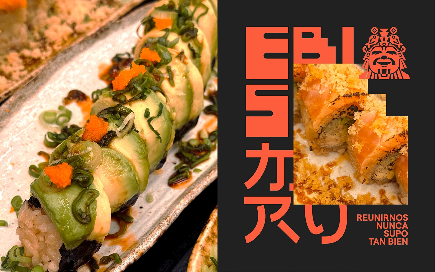
Ebisumaru Sushi — bold type, dark palette, and a hunger for branding
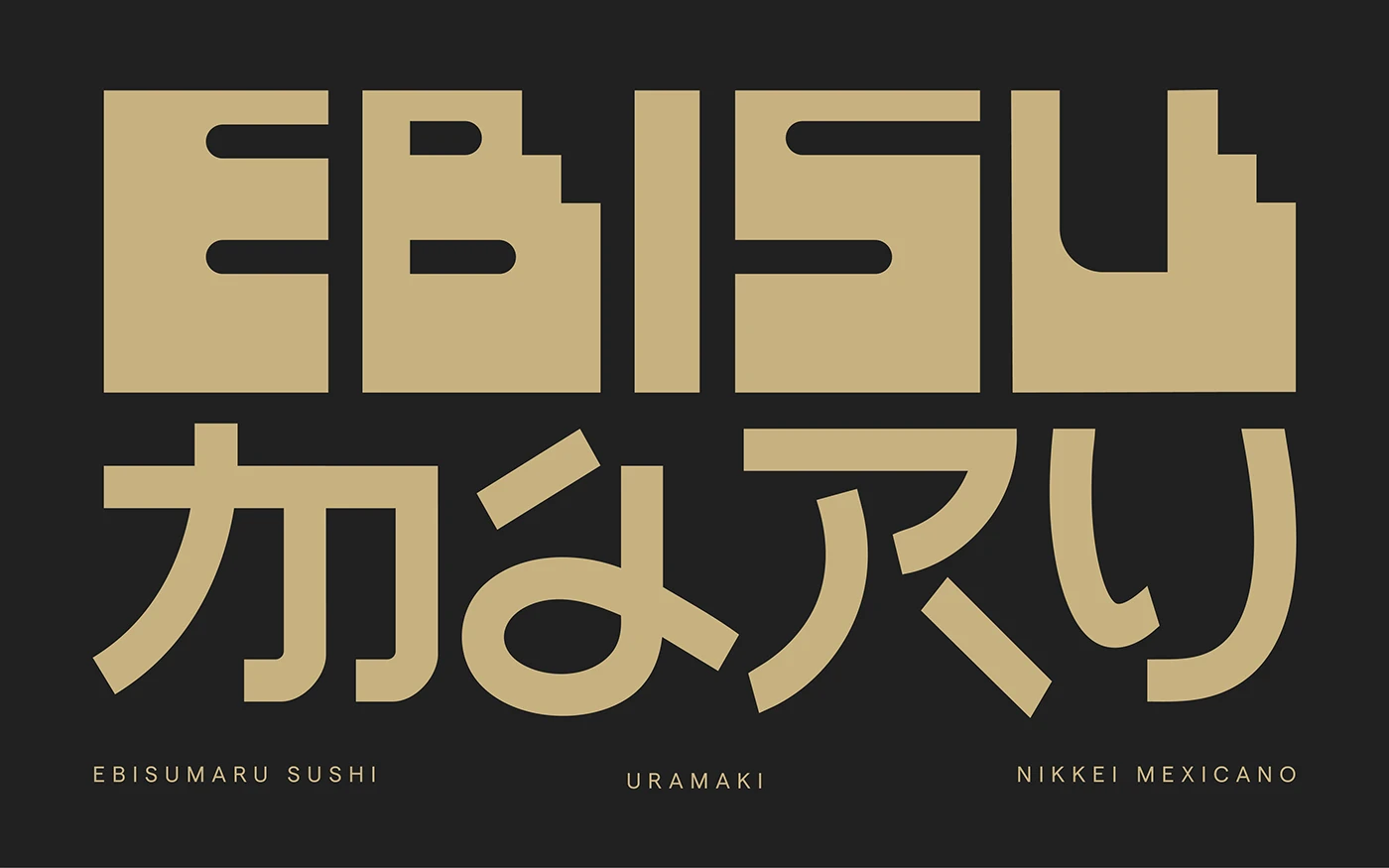
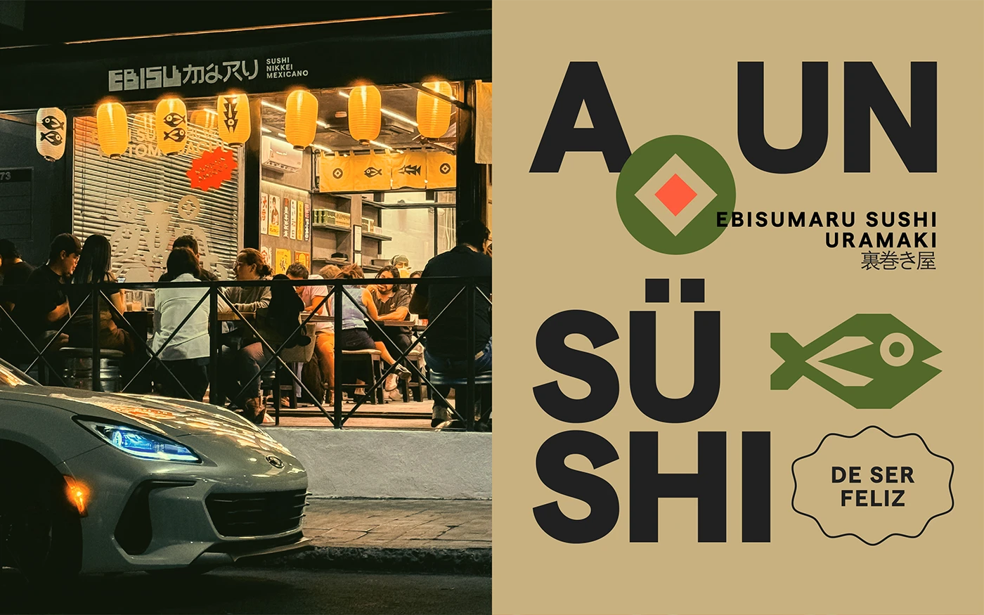
Ebisumaru’s visual entry is direct, oversized, and anything but shy. The name dominates the space like a street poster, a magazine cover, or a piece of merch—far more than a simple logo. That choice shifts perception instantly: when typography leads, the brand feels more authoritative, more self-contained, and better positioned to command a higher average ticket.
The dark background sets a nocturnal mood, almost like a low-lit food bar. It’s not cold luxury or textbook minimalism; it’s a textured darkness designed to let beige, olive green, and coral orange pop with flavor. The palette isn’t trying to please everyone. It has character—and in hospitality, that’s often better than being flawless but forgettable.
The composition is bold, too. There’s no fear of scale, blocks, or contrast. The visual hierarchy is clear: brand first, then concept, then layers of detail. This logic is powerful for building recognition, especially in a market where many sushi brands end up looking alike.
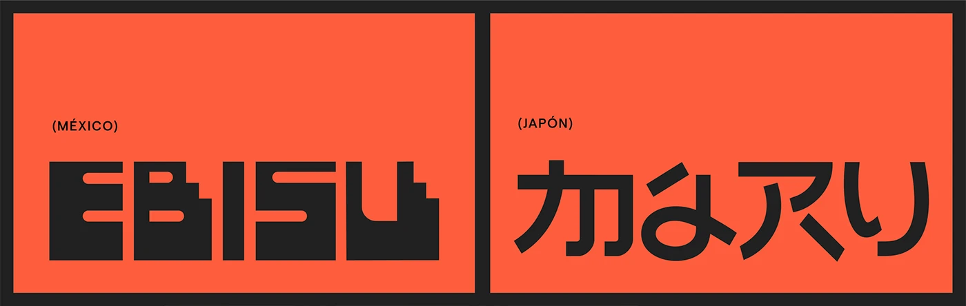
The logo isn’t alone: there’s a mythology around it
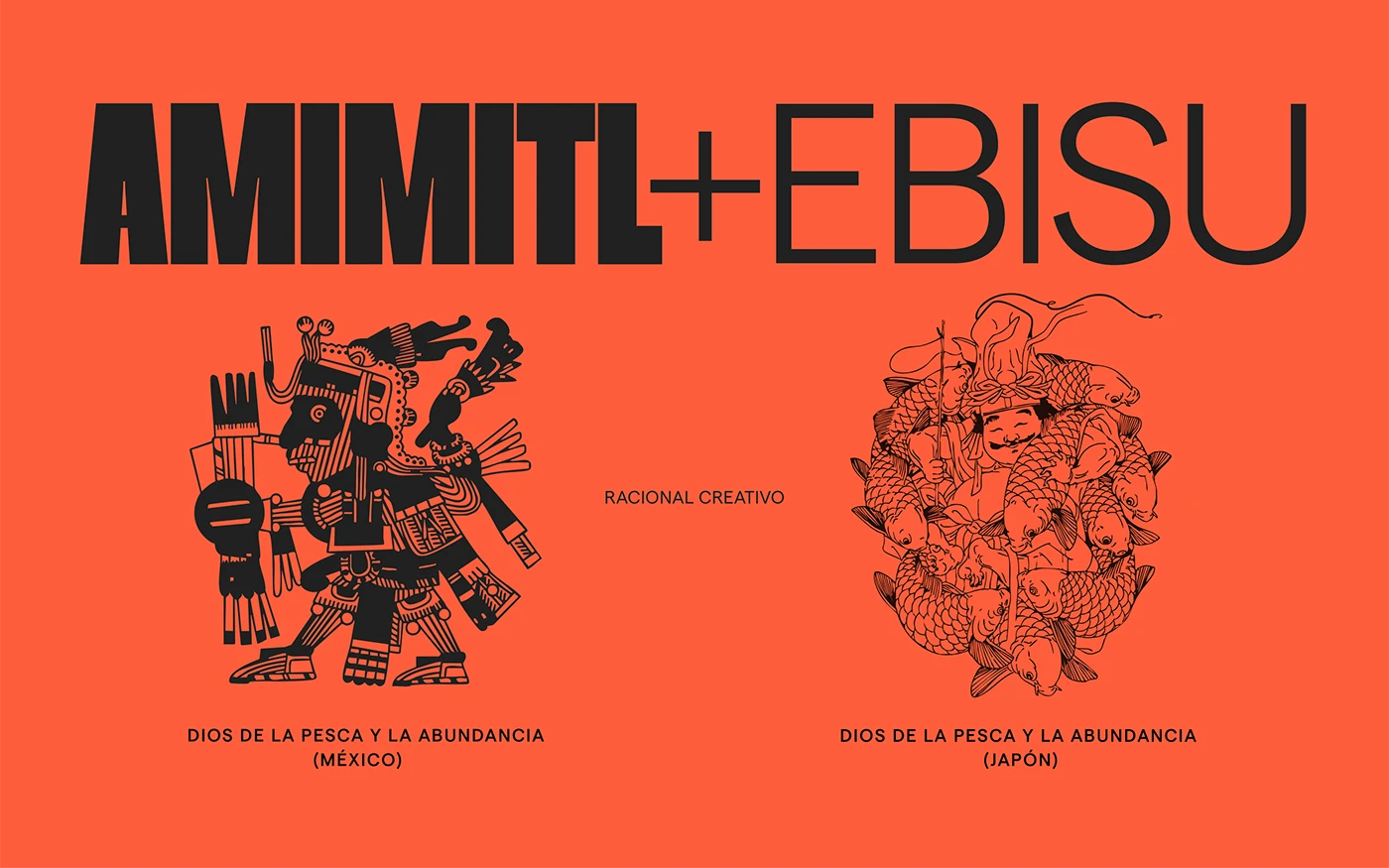
One of the most enjoyable aspects of Ebisumaru is that its identity isn’t just a mix of logo, color, and menu. There’s a narrative being built. The symbol, mascot, names, and cultural references work together as a visual mythology—adding depth without taking itself too seriously.
The Mexican-Japanese blend could have easily slipped into tourist postcard territory or superficial decor. Here, it works because it’s translated into a system: shapes, illustration, typography, modules, fish, graphic gestures, and color. It doesn’t all hinge on a single hero image. The brand can flex across different pieces without losing its pulse.
That’s a valuable lesson for any ambitious sushi restaurant branding: if your food concept is hybrid, your identity needs to hybridize too. It’s not enough to slap on a kanji, a wave, or a fish. You need a visual logic that works across menus, packaging, storefront, social, web, and the in-person experience.
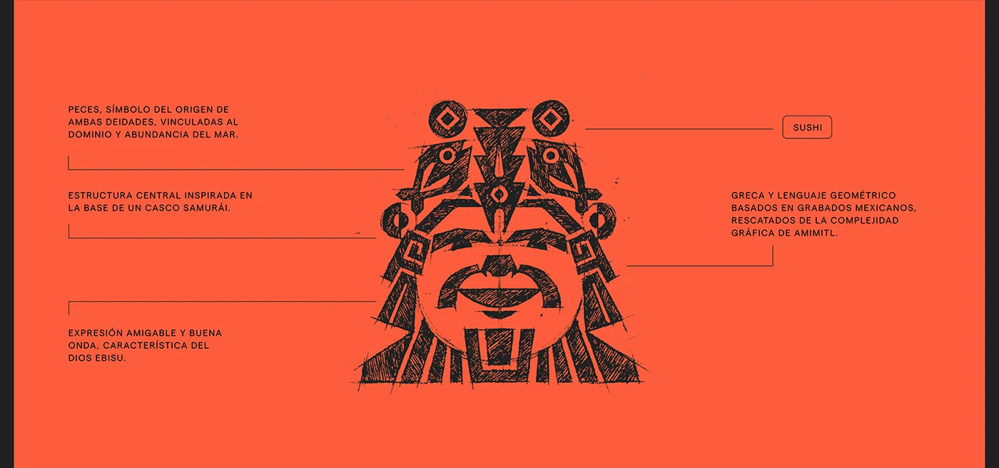
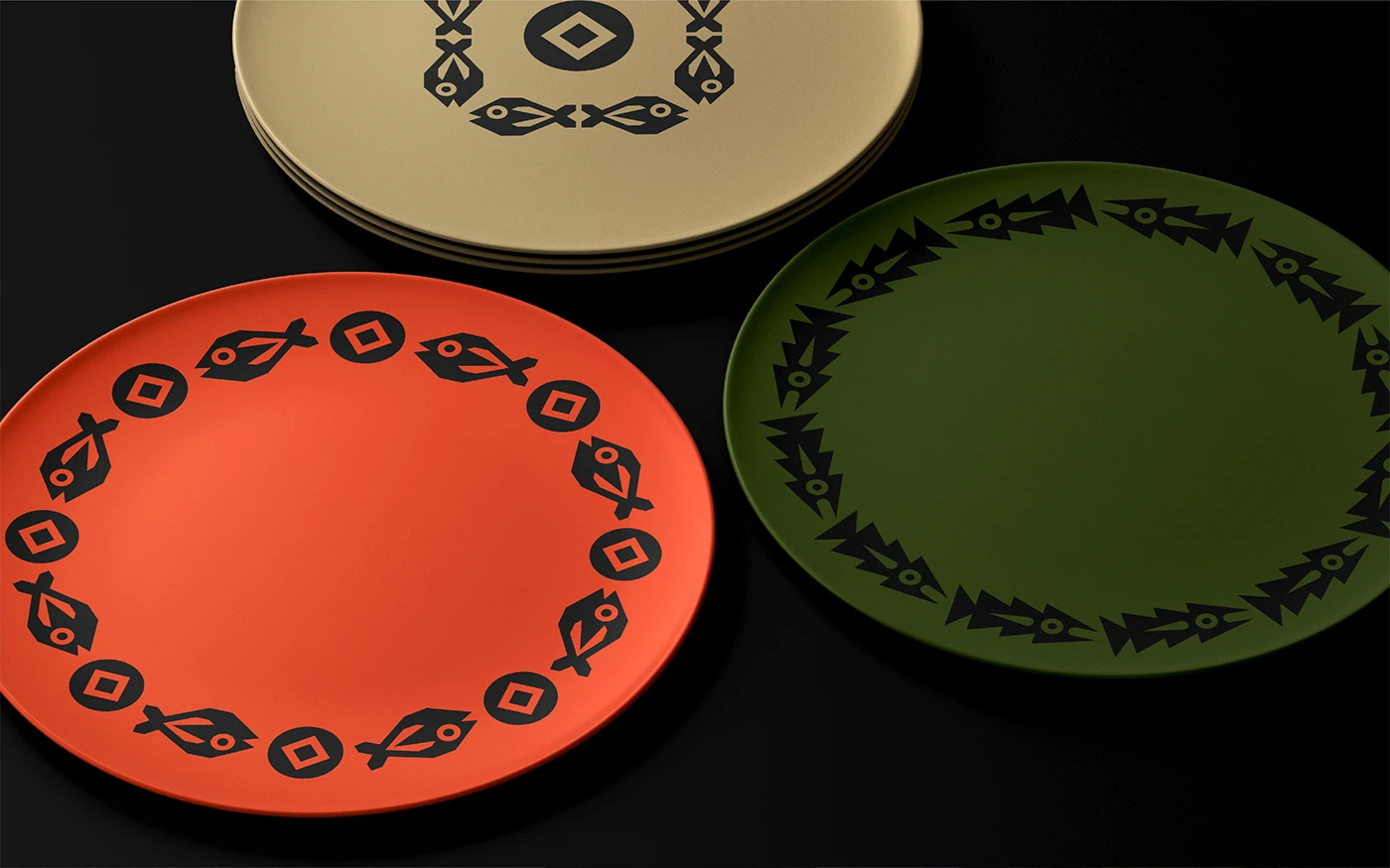
Pattern, illustration, and a set table

Ebisumaru’s patterns are compelling—they don’t feel like filler. They act as a brand skin. This kind of asset is especially powerful in hospitality, letting the identity leap from digital to physical without losing energy. Paper, plates, stickers, placemats, bags, menus, or storefronts all speak the same language.
Fish illustrations, emblems, modules, and collage-style compositions create a sense of abundance. There’s a lot to see. There are layers. There are small visual rewards. That richness can be intense, yes, but in food branding it works when it builds atmosphere rather than covering up a weak concept.
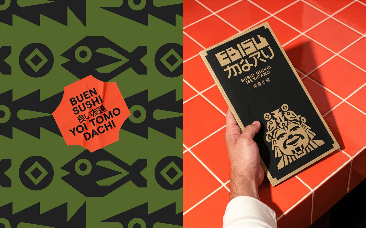
When a visual system makes it all the way to the table, the experience becomes more photogenic—without feeling like it was designed just for Instagram. That difference matters. A brand built only to grab attention ages fast; a brand with a system can grow, adapt, and stay recognizable even as formats change.
There’s even a light touch of UX thinking here, even though this isn’t a digital interface. Visual consistency reduces mental friction. The user—or customer—immediately gets that everything belongs to the same world. That builds trust, and in hospitality, trust translates into curiosity, repeat visits, and recommendations.
Product photography with narrative, not just for show
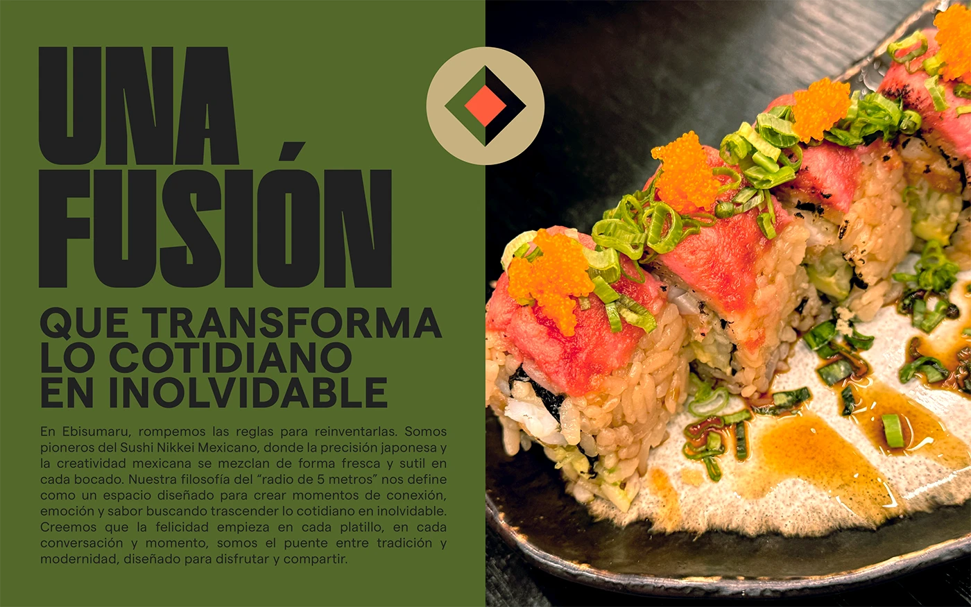
The food isn’t just a pretty photo pasted onto the branding. It’s part of the system. Sushi shares space with headlines, text blocks, color, and composition. This way, the product doesn’t break the atmosphere—it strengthens it.
This is crucial for food brands. A mouthwatering photo can spark desire, but if it doesn’t connect with the identity, it’s just loose content. Ebisumaru weaves the product into a broader visual narrative. The dish isn’t just a dish; it’s a proof of tone, energy, and positioning.
There’s a great tension between appetite and design. The photography keeps the product clear, but the graphic environment turns up the heat. For marketing, this combo is gold when used right: it creates desire, sets the brand apart, and delivers much more recognizable assets for campaigns, social, digital menus, or launch landings.
The only caveat—more a guideline than a criticism—is that such a dense visual language needs breathing room when used as a commercial tool. If a website, online menu, or conversion piece uses this identity, it’s important to balance impact with quick readability: what’s for sale, where is it, how much does it cost, and how do you book. Visual direction draws people in; clarity closes the deal.
Collage and atmosphere: a brand with cultural texture
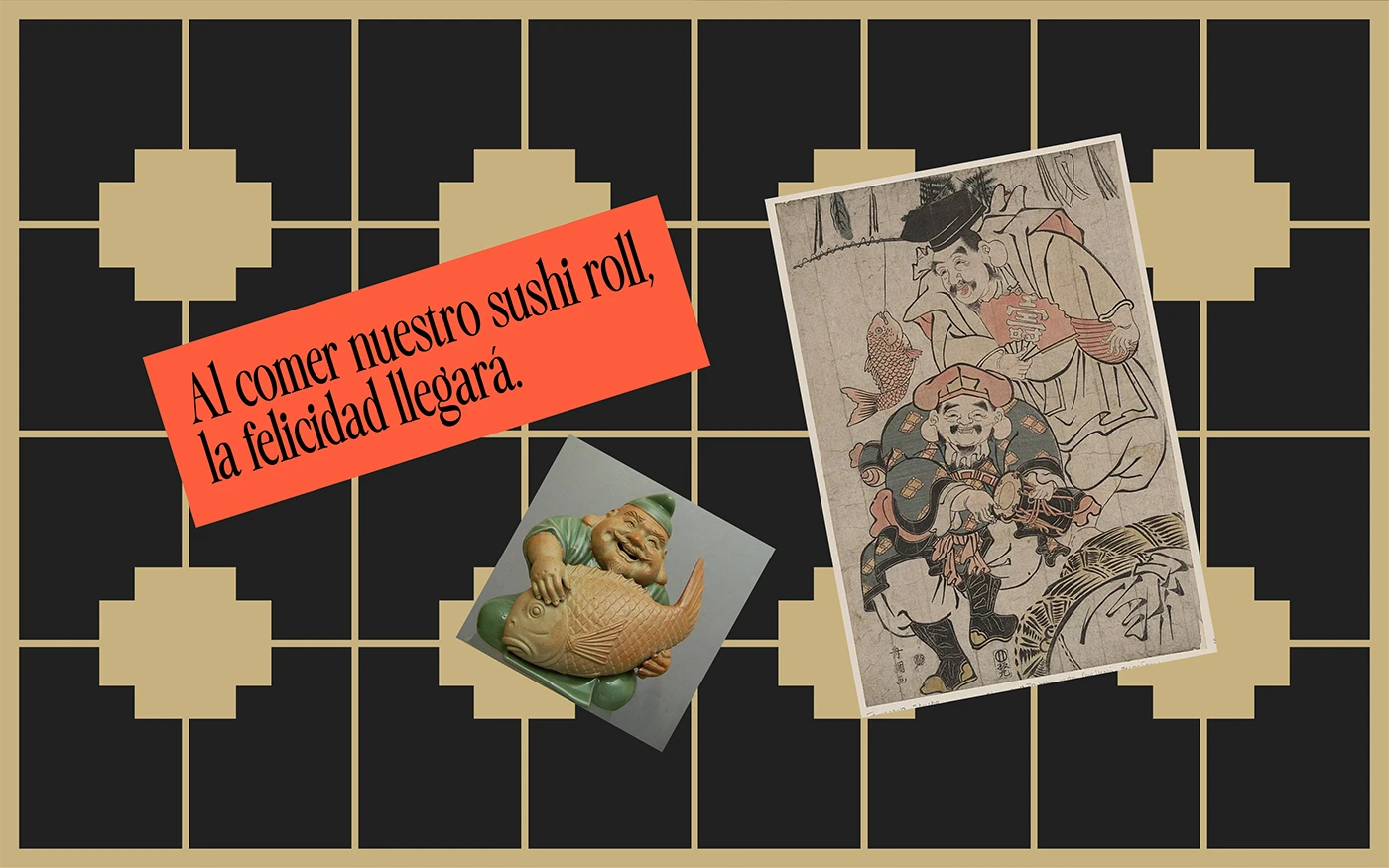
Collage gives Ebisumaru a more editorial layer—more like a cultural publication than a conventional restaurant. References, objects, grids, and text create a sense of visual archive. This texture makes the brand feel considered, not just decorated.
In terms of perceived value, this matters a lot. A brand with layers communicates more intent. And when a brand feels intentional, customers are more likely to believe the food, service, and experience are too. That association isn’t automatic, but design can push it a long way.
The key takeaway: a sushi brand doesn’t have to look like a sushi brand
Ebisumaru works because it doesn’t just use the usual category codes. It builds an identity with its own character: bold typography, a distinctive palette, repeatable symbols, integrated photography, and a cultural atmosphere that feels bigger than the menu.
For any food brand looking to level up, the lesson is clear: branding shouldn’t be an aesthetic layer added at the end. It should be a way to organize the concept, elevate perceived value, and create visual memory. When that happens, the brand doesn’t just look better—it’s easier to remember, easier to recommend, and better positioned to attract press, collaborations, and higher-expectation clients.
If your food project already has a strong idea but doesn’t yet feel this way across your website, menu, packaging, or communications, maybe it’s time to approach it with more intention and less rush. Sometimes, the difference between “just another sushi place” and a desirable brand is right there: turning the concept into a system.


