If you want to stay ahead of the curve and kick off the new year on the right foot, this post covers the top web design trends for 2020: Canvas, 3D, oversized typography, bold contrasts, artificial intelligence, machine learning, voice recognition, and much more.
[superfeatured]7076[/superfeatured]
Another year, another round of preparations for what’s next. With November just around the corner, we’re gearing up for the year ahead—and we want our readers to be ready too. As always, we’ve put together a post to highlight what’s set to make waves in web design for 2020.
Keeping up with the evolution → Web design trends for 2026 bring minimalism, AI, and more human-centered experiences.
This type of post is a cornerstone of our blog, consistently drawing a high volume of visitors and even quote requests throughout the year from users searching for the latest in web, graphic, and marketing design. That’s why, year after year, we invest even more effort, attention, and dedication into creating it. Our goal: to deliver quality content for our audience—whether you’re a design professional or a potential client looking for inspiration for your next website. Plus, producing high-quality content helps us maintain strong search rankings. As the saying goes: Content is king!
WOW! The new post on web design trends for 2021 is live!!!
Previous years’ posts you might find interesting: Web Design Trends 2019 – Web Design Trends 2018 – Web Design Trends 2016
Web Design Trends for 2020: Stay Ahead
Even Bigger Typography

One of the standout trends for 2020 is the use of oversized typography—not just for headlines, but throughout body text as well.
With widescreen, high-resolution displays becoming the norm and prices dropping on screens that were once rare, the days of 12- and 14-pixel body text are long gone. Now, it’s perfectly acceptable to use 20 pixels and up, as long as it suits the project and website.
For headlines, there’s really no upper limit—just your taste and common sense. Don’t be afraid to go huge for maximum contrast. Well-crafted, oversized headlines give any website a bold personality and help it stand out, not just in 2020 but for years to come.
How and When to Use It
Apply this trend to websites that:
- Need a highly visual, impactful design
- Lack strong imagery and need a visual boost—bold, oversized type can deliver the punch you’re after
- Aren’t targeting a very conservative audience
- Have a modern user base, especially those using large screens
Keep in mind:
- You’ll need to adjust font sizes for different screen resolutions. Create responsive exceptions, from 2560px (large screens) down to the more common 1330px (laptops)
- Pay special attention to mobile—make sure your sizes work well there, since most users now browse on their phones
Websites Using This Trend
Rogue Studio

This site is a clear showcase of not just large, but EXTRA large typography—and it looks fantastic.
I’m sure this site will be a contender in our annual roundup of the year’s best web designs.
Granyon Summer Party
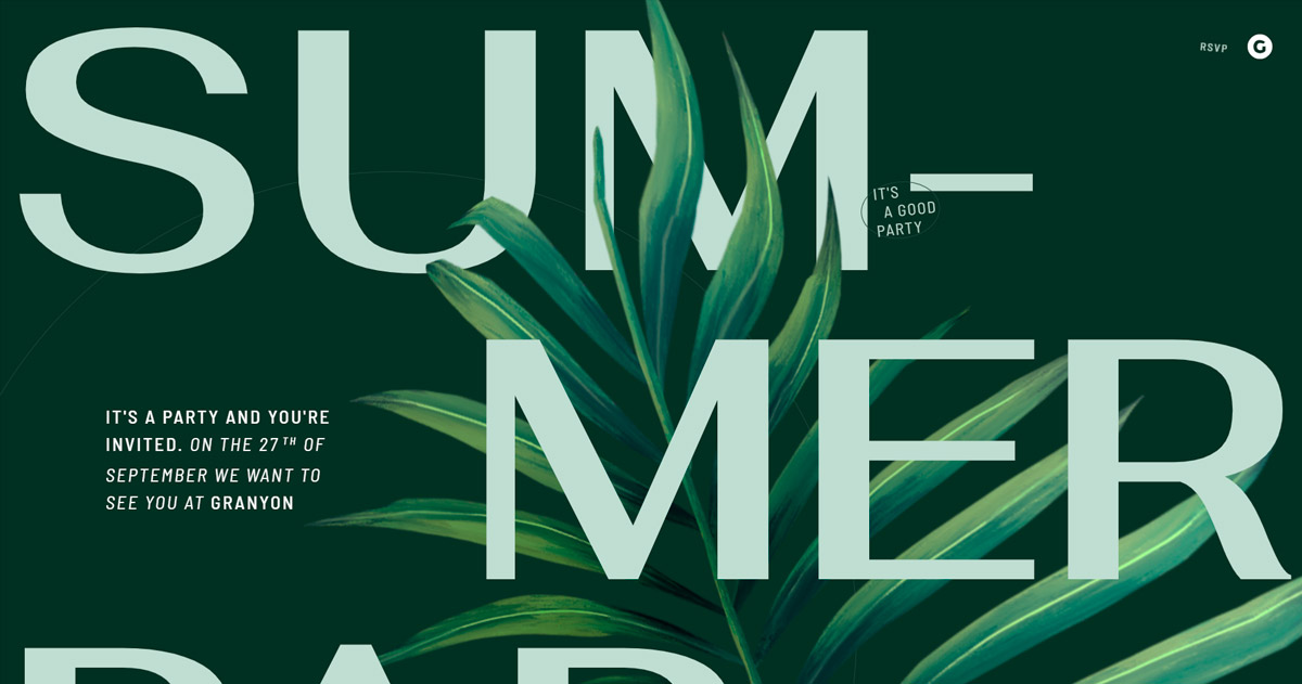
Another great example of this trend done right. Here, not only the main headline but also the body text is set in a large size.
Team Elite Kickboxing
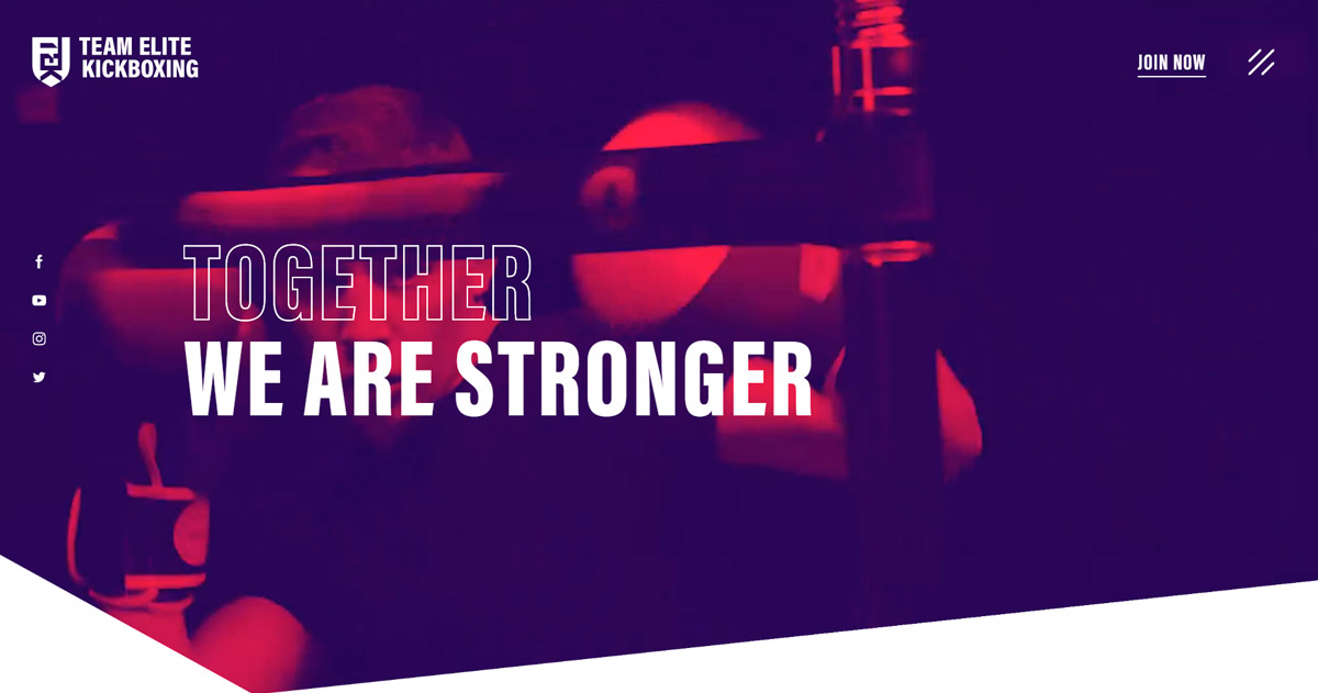
One last example where this trend is on full display. Plus, this site also nails the next trend we’ll discuss for 2020.
Bold Contrasts, Negative Colors, and Vibrant Hues

The use of strong contrasts and negative colors has been gaining traction in web design and development over recent years. For 2020, expect this trend to continue, with more sites making a statement through fearless use of color.
Unleash your bold side with vibrant contrasts and lively colors. Apply filters to images—either in Photoshop or similar tools, or directly in the browser using CSS blending modes or even the canvas element.
How and When to Use It
Apply this trend to websites that:
- Need a highly visual, impactful design
- Aren’t targeting a very conservative audience
- Want to grab attention and leave a lasting impression
Keep in mind:
- For corporate sites aimed at conservative businesses, use this technique sparingly
- Apply contrasts thoughtfully, considering the brand’s visual identity and color palette
- Even with high contrast, maintain visual harmony by creating a coherent color scheme
Websites Using This Trend
Ninja guru
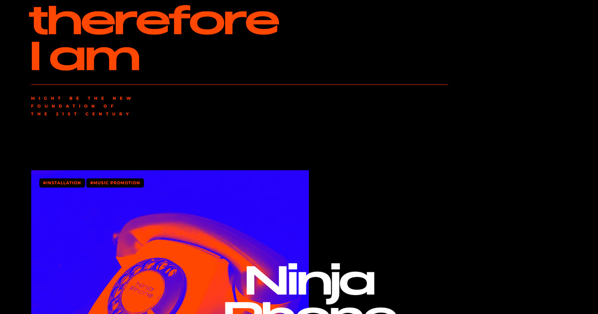
This site takes contrast to the max, using both negative colors (black/white) and striking color pairings (blue/orange).
Festa da Francofonia 2019
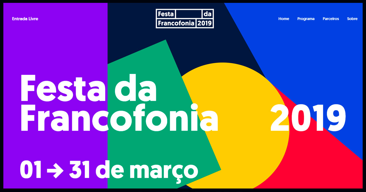
Vivid colors, bold contrasts, moving geometric elements… This site won’t leave visitors indifferent—a perfect example of a key web design trend for 2020.
Kombu
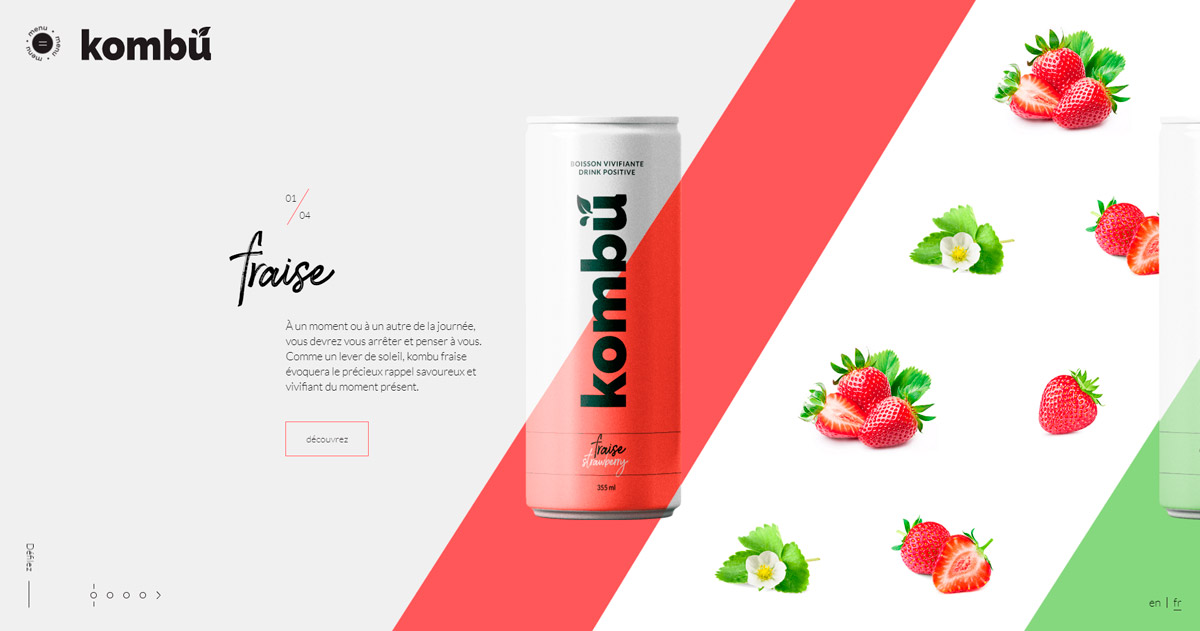
Here, contrast is used in the packaging for each drink, visually representing each flavor. The “wavy” diagonal lines that match the packaging are a brilliant touch. This is a great example of not just contrast, but also meaningful JS effects that reinforce the product’s formal brand message.
Mobile Experience: More Important Than Ever
By now, everyone knows about responsive web design. So, while it may not seem like a “trend” for 2020, at least not in the sense of basic responsive layouts, there’s more to consider.
With the majority of users browsing on mobile devices, it’s essential to deliver a tailored experience that fits both the device and the user’s habits. In other words, responsive design needs to evolve.
It’s no longer enough to just make your site responsive. Now, you need to think beyond that—take cues from mobile apps. If your site’s navigation feels as seamless as an app, you’re meeting users where they are. That’s how you stay ahead.
Another crucial factor for mobile users: lightning-fast load times.
Some Tips
- Avoid autoplay on videos, as it can eat up users’ bandwidth—especially if they’re not on WiFi
- Optimize images by serving device-appropriate sizes to improve loading speed
- Use a burger menu to condense navigation into an app-like format
Websites Using This Trend
Nicholas Munt
This site uses AJAX to load each page, making it extremely mobile-friendly and closely mimicking the navigation style of most apps.
Salmoon & Sons
On mobile, this site stands out for its swipe-enabled slider, which lets you move the full image smoothly with your finger. The burger menu is also well executed, sliding in from the side.
Volia
As you can see, this site uses large typography that’s still well adapted for mobile. The burger menu is also nicely designed, with a smooth, engaging transition.
WOW! Check out our new post on the best web designs of 2019-2020! Click here!
Custom Cursors and Scrollbars
One of the fastest-growing trends is replacing the default browser cursor with a custom one.
These custom cursors often interact with elements on the site—changing size, color, and more. It’s a relatively new trend that’s set to grow even more in 2020.
The same goes for scrollbars. More and more sites are ditching the default browser scrollbar in favor of fully customized, smooth-scrolling versions.
We’re also seeing a rise in sites that don’t display a scrollbar at all, even when there’s more content below. This is becoming increasingly popular, and you can bet it’ll be a big trend in 2020. Users are now so accustomed to scrolling that it’s second nature. This opens the door to more minimalist interfaces. If hiding the scrollbar feels too radical, you can always meet halfway—omit the scrollbar but guide users with a “scroll down” icon.
How and When to Use It
Apply this trend to websites that:
- Want to add extra personality
- Are aimed at advanced or web-savvy users
Keep in mind:
- Test your custom scroll on all major browsers to ensure it works smoothly
- On mobile devices, custom scrolls can behave unpredictably—consider hiding them entirely on mobile
Websites Using This Trend
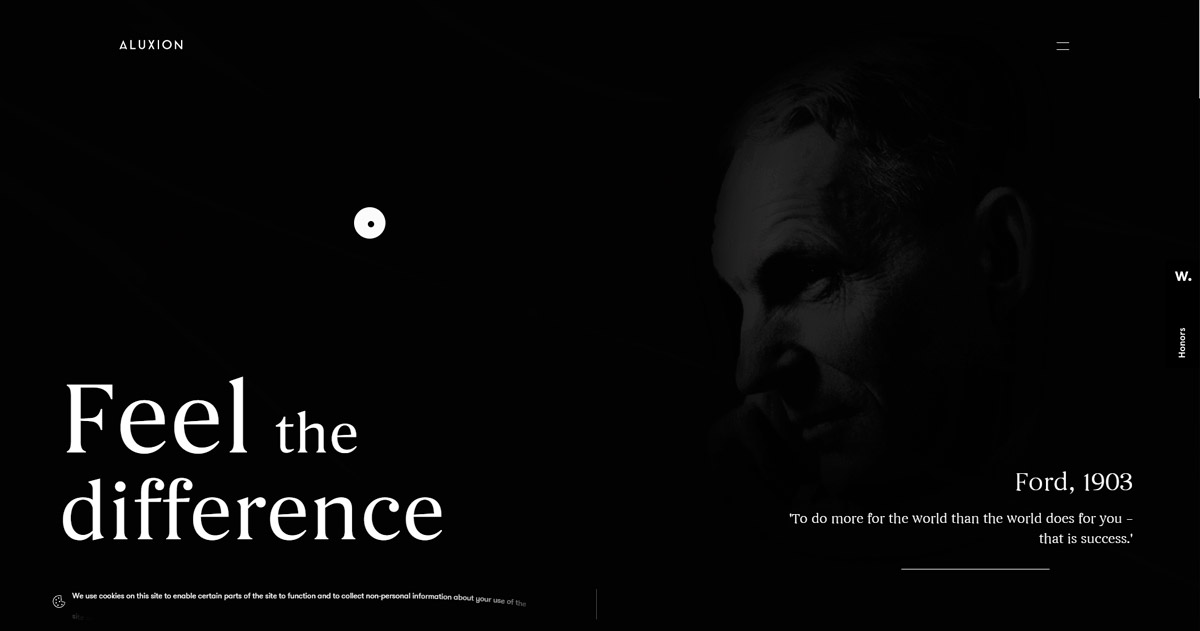
Aluxion
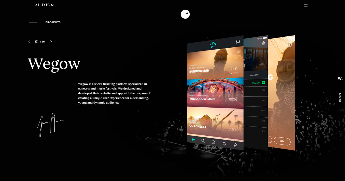
Here, the custom scroll is made up of two circles—one large, one small—that follow your cursor with a slight delay and feature a striking hover effect. There’s also a custom scrollbar, making the whole design feel cohesive.
Joseph Berry
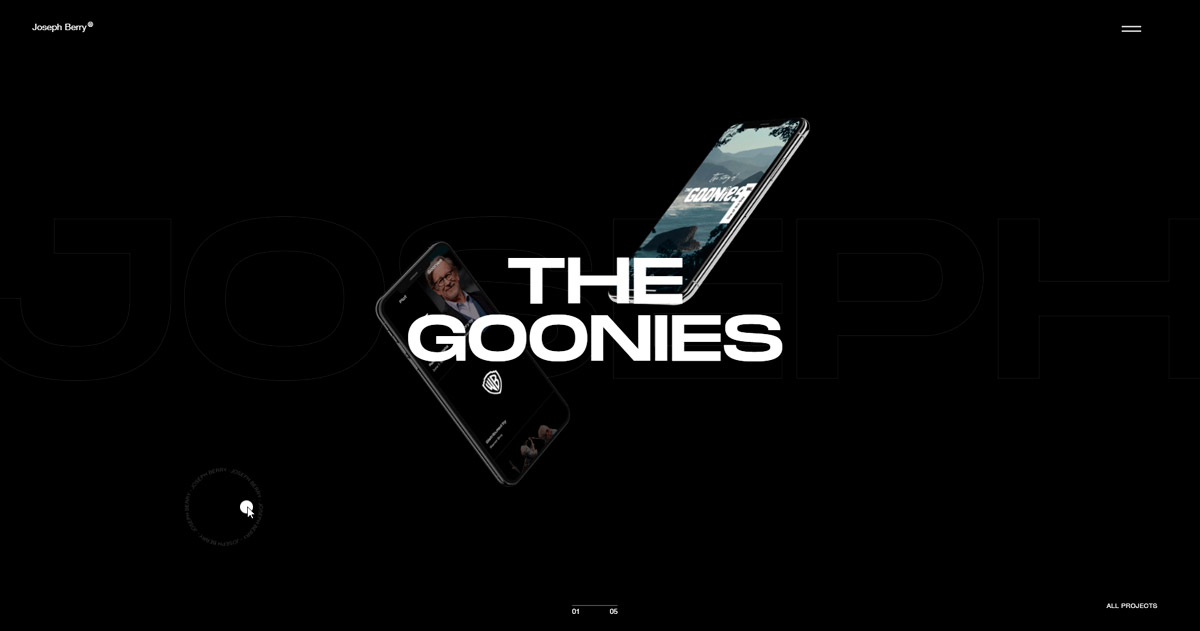
This cursor is similar to the previous example but stands out for its typographic outer circle. As for the scrollbar, they’ve opted not to use one at all—a trend I expect to see more of in 2020, as users are increasingly conditioned to scroll instinctively.
Matt VBRG
On this site, the cursor interacts with all content, changing colors and triggering eye-catching visual effects like a chrome finish on images.
Canvas and 3D Elements with Three.js
The use of Canvas in web design has been gaining momentum for years, and in 2020 it’s set to be a defining trend for cutting-edge websites.
Canvas lets you harness OpenGL to create experiences that go far beyond standard HTML. With Canvas, you’re free to build anything you can imagine.
One of the most popular uses of Canvas is adding depth and interactivity with 3D objects. Some sites are pushing the envelope so far, they feel more like video games than websites.
To create these 3D experiences, there’s the well-known Three.js library. With Three.js, you can build 3D objects or import models from 3D design software. The best part? You can make these elements interactive, delivering truly immersive experiences.
Without a doubt, Three.js-powered 3D will be one of the top web design trends for 2020.
How and When to Use It
Apply this trend to websites that:
- Need a highly creative and visual experience
- Want to make a strong impression on visitors
- Are looking to explore new, innovative ways to communicate messages
Keep in mind:
- With great power comes great responsibility—focus on communication first, then apply design and creativity to serve that message (not the other way around)
- Pay close attention to compatibility across devices and browsers to ensure your experience works everywhere
Websites Using This Trend
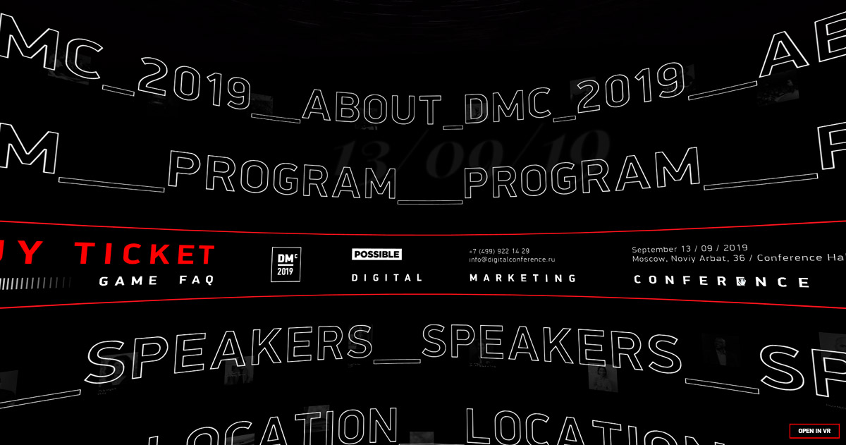
DMC2019