Once again, we’re taking a deep dive into the graphic design trends for 2021. If you want to stay ahead of the curve, don’t miss this must-read article where we break down the 7 graphic design trends set to make a major impact in 2021.
[superfeatured]7076[/superfeatured]
Throughout this article, we’ll explore the graphic design techniques and creative approaches that will be making waves at awards shows worldwide. Each trend is clearly explained, with innovative, cutting-edge examples from projects that are already ahead of their time.
We’ve updated our outlook: check out the 2026 graphic design trends featuring AI, variable fonts, and new visual styles.
As in previous editions, the article follows this structure:
- Graphic design trend
- Explanation
- 3 examples of the trend in action + project links
- Where to use this graphic design trend
- Tips for implementation
[superfeatured]7076[/superfeatured]
Contents:
- Color Contrast
- Lettering & Unique Typefaces
- Die Cuts & Embossing
- Semi-Realistic Illustrations
- Monster Typos
- Abstract Shapes
- Overlays & Shadows
Curious about the graphic design trends for 2021?
Let’s get started!
[nlform]
Graphic Design Trends 2021
1. Color Contrast
Contrast is a fundamental principle in graphic design—it should be at the heart of every project.
Color contrast helps establish hierarchy and structure in your design, guiding the viewer’s eye to the most important elements.
The 2021 graphic design trend is all about bold, high-contrast color palettes—striking a balance between elements is the real challenge.
Expect to see designs this year that push color contrast to the max, with daring combinations that are sure to blow your mind.
Check out these examples of the color contrast trend for a dose of creative inspiration.
Graphic design projects featuring this trend
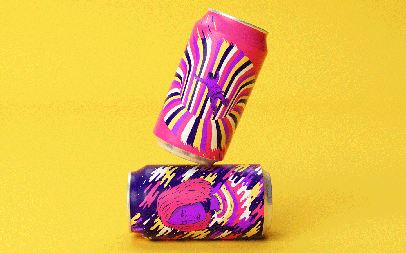
Resonance by Lucas Wakamatsu
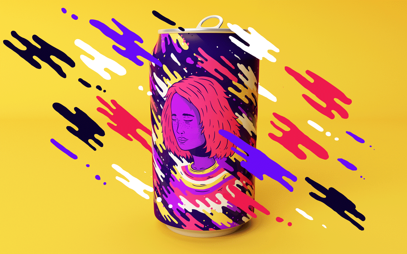
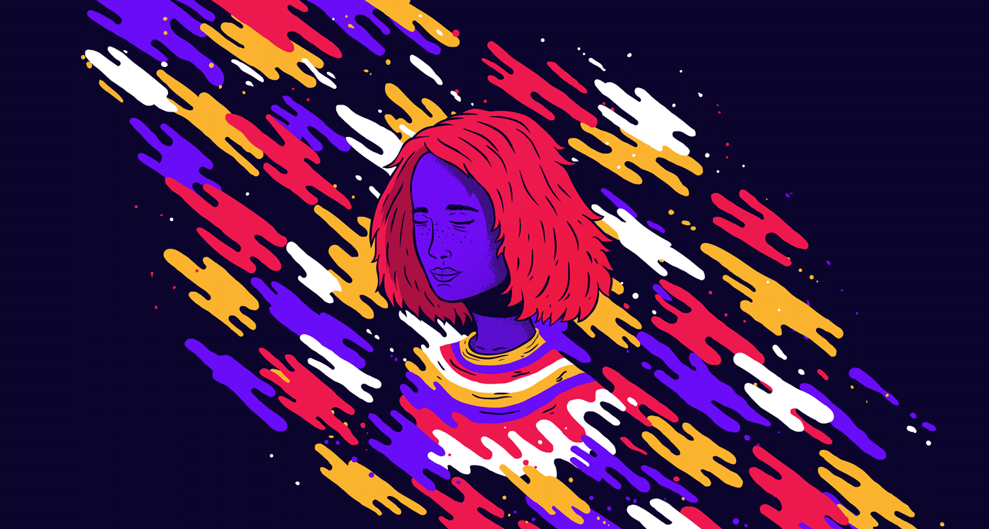
Here, graphic design is applied to a soda can to evoke the sensations of drinking the beverage.
The design features intense color contrast paired with abstract shapes, making it a perfect example of the 2021 graphic design trend.
Typography set V by Rus Khasanov
Another great example of this 2021 graphic design trend, where unrestrained color contrast is combined with handmade typography for a result that feels personal and organic.
Port Typeface by OnRepeat Studio
This project takes a more tech-inspired approach to the web design trend, moving away from the more personal, organic references above and into a sleeker, more modern style.
The use of high-contrast, metallic colors gives the final product a distinctly contemporary edge.
Where you’ll see this trend
This trend will show up across all kinds of graphic design projects, but expect it to be especially prominent in poster design.
You can also apply this trend to:
- Web design
- Posters
- Brand identity
- Landing pages
- Packaging
- Business cards
How to use this trend
- Color contrast is the seasoning of graphic design—don’t shy away from it, embrace it!
- Contrast isn’t just about black and white—experiment with bold color pairings
- Keep your design balanced
- Use color contrast to highlight key elements and guide the viewer’s eye
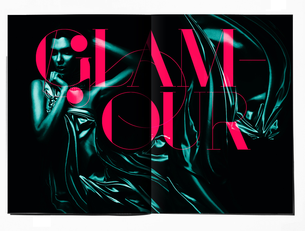
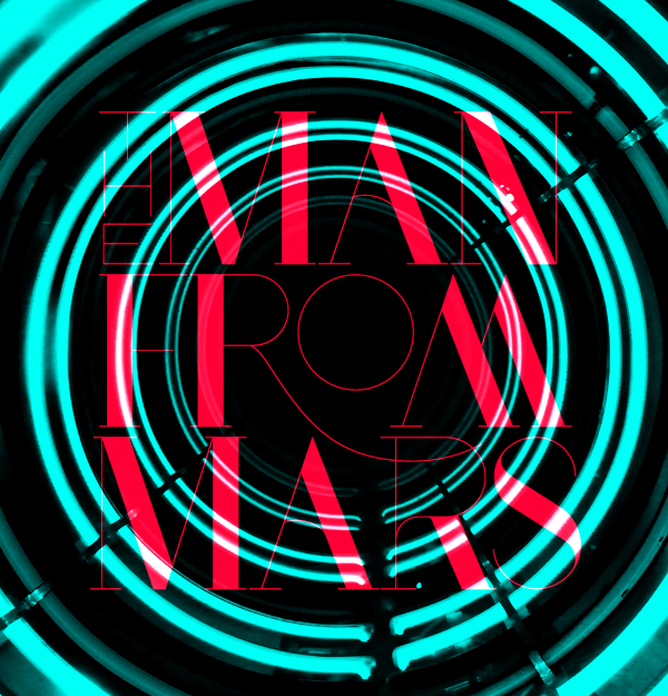
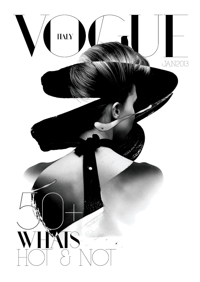
2. Lettering & Unique Typefaces
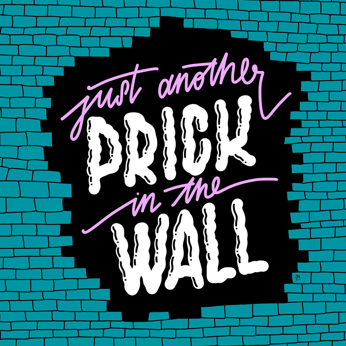
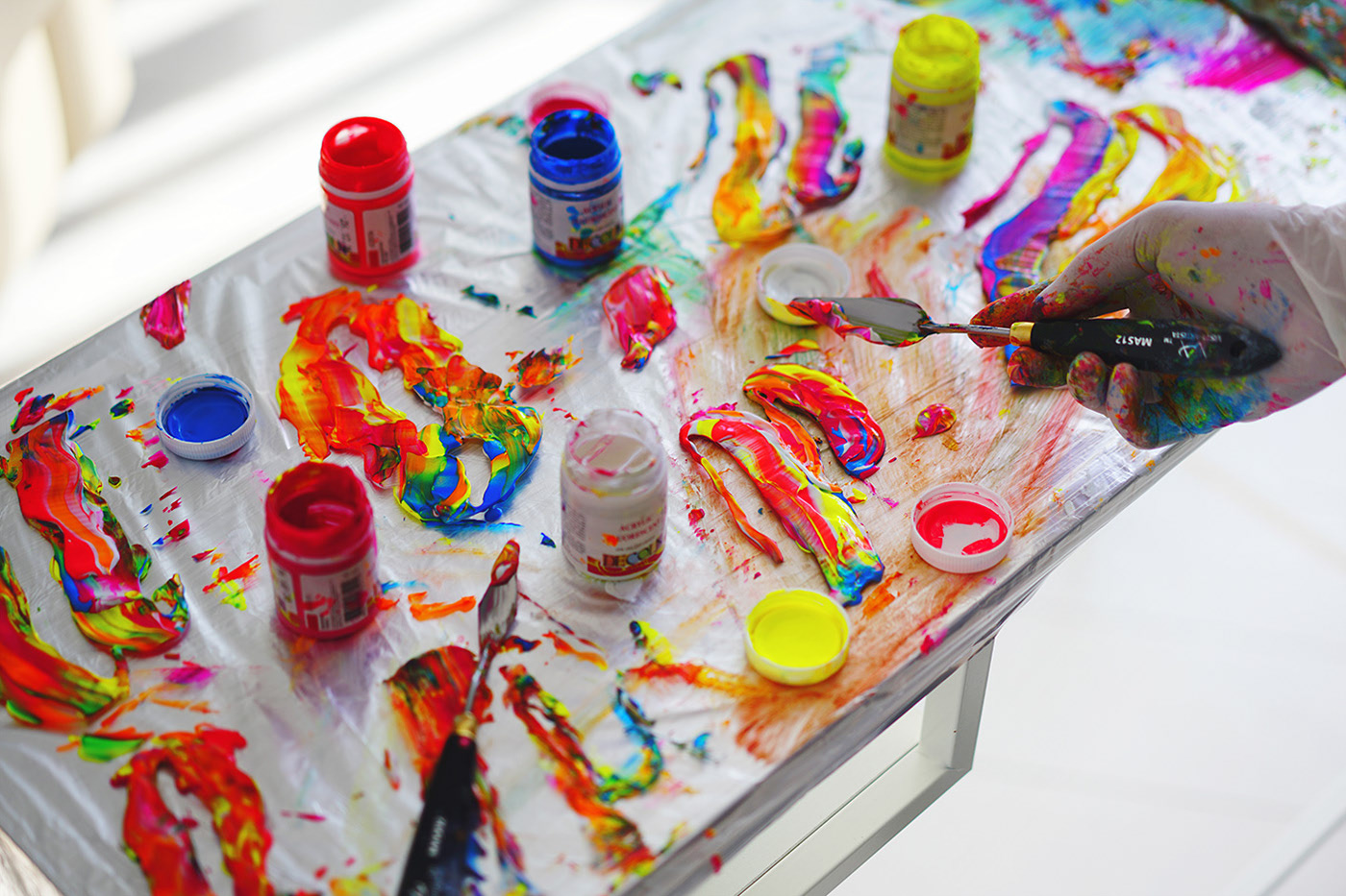
Graphic designers everywhere are passionate about typography, but there are some typefaces that just don’t cut it—especially those that try to mimic handwriting.
Meanwhile, the art of lettering has carved out a special place in graphic design.
The combination of these factors means that hand-drawn type is set to be a major graphic design trend in 2021.
Expect to see graphic designs featuring custom lettering by lettering artists, delivering a powerful visual and creative impact.
Here are three more examples of this graphic design trend to spark your creativity.
Have you checked out the top graphic design courses for 2021? Click here!
Graphic design projects featuring this trend
Ju Schnee Illustrations by Ju Schnee
A series of graphic designs showcasing custom, hand-drawn type for a look that’s both personal and organic.
Grillography Fredrik Melby
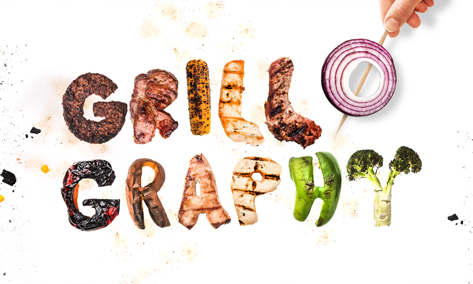
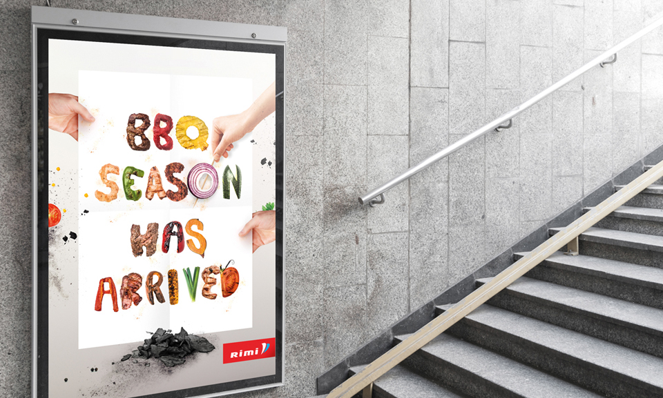
Here, the 2021 graphic design trend is used in poster designs for food advertising.
The type is crafted with realistic, product-inspired textures.
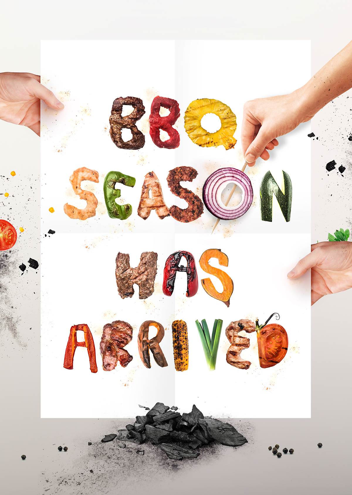
Galeries Lafayette – Démesurément Moi
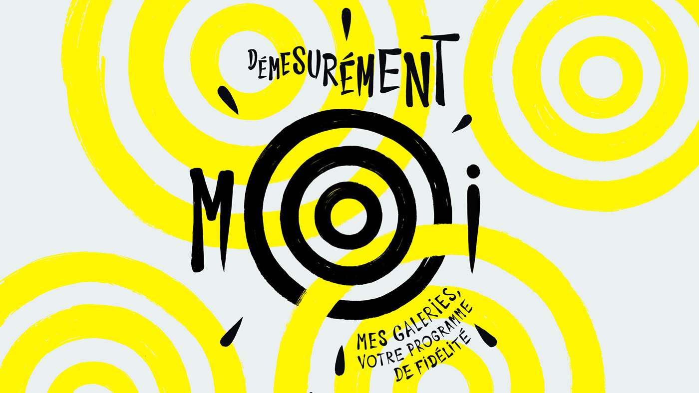
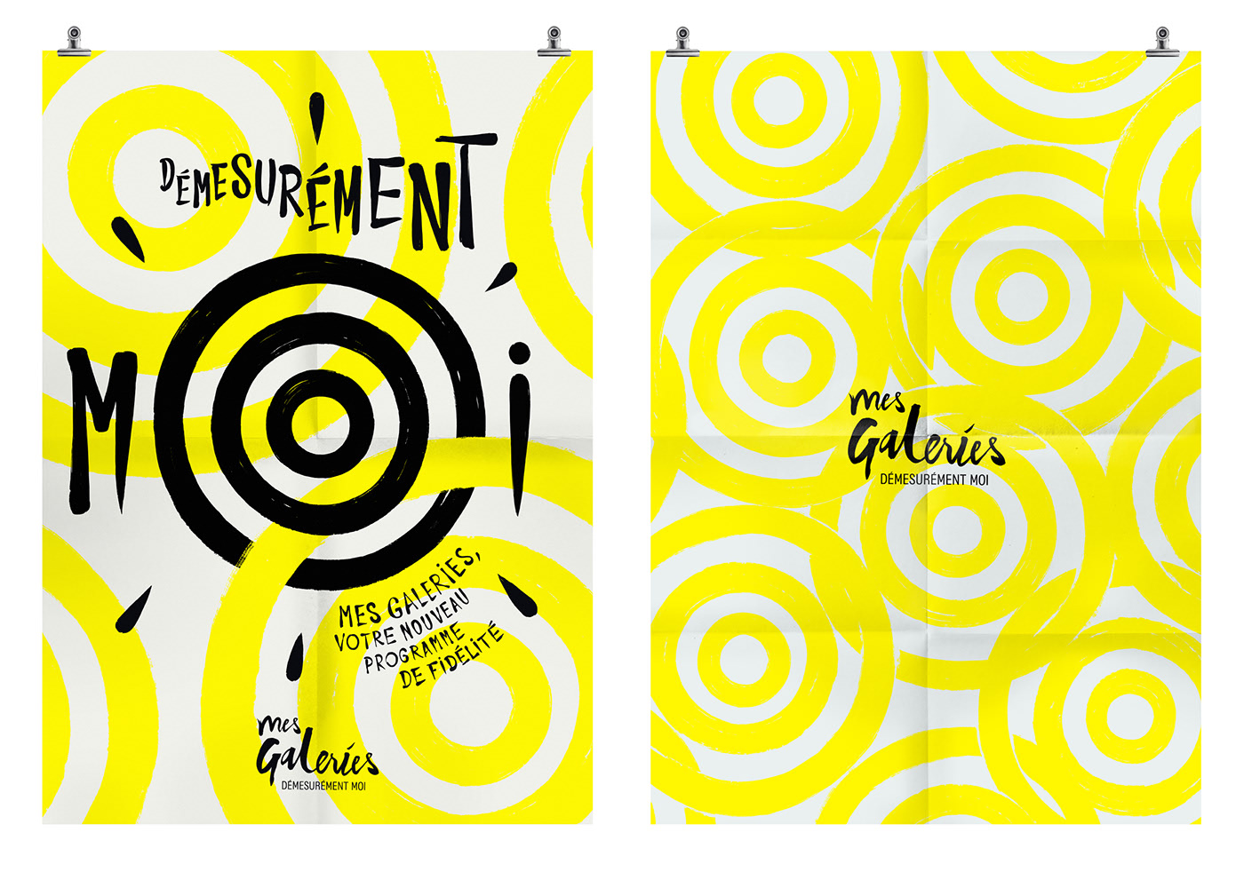
This graphic design project was part of a fashion retail campaign, using unique type to create a personal, dynamic, and modern look.
Where you’ll see this trend
This trend works across all media, as bold, unique typefaces are a cornerstone of 2021’s graphic design trends. Use them wherever you like, but we predict they’ll be especially prominent in:
- Web design
- Posters
- Brand identity
- Landing pages
- Packaging
- Business cards
How to use this trend
- Lettering is an art form—not everyone has the skills, so consider hiring a specialist
- Typography is a graphic element in its own right, not just a vehicle for words
- Don’t overthink it—lettering is personal and subjective, a unique way to express creativity
3. Die Cuts & Embossing
The 2021 graphic design trend is all about embossing and die cuts.
These techniques break the “fourth wall” of design, bringing the product closer to the customer. Designs featuring embossing or die cuts show a real attention to detail.
Traditionally used in print—like tickets, business cards, or posters—these effects are also popping up in web design, where certain elements reveal “cutouts” that show what’s behind the design.
Here are three inspiring examples of this graphic design trend.
Graphic design projects featuring this trend
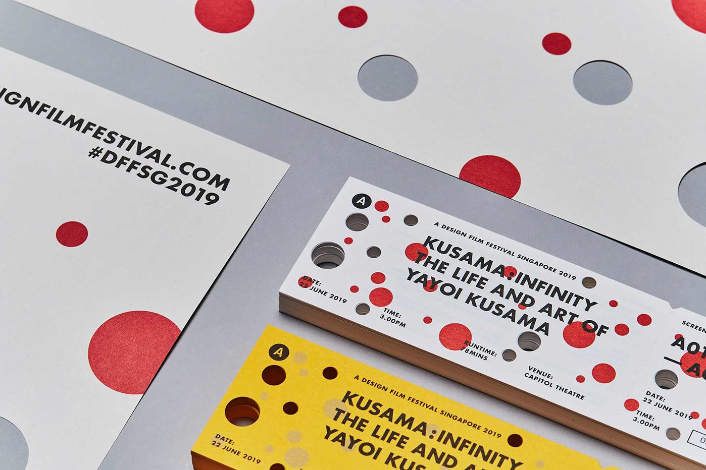
A Design Film Festival: Kusama Infinity
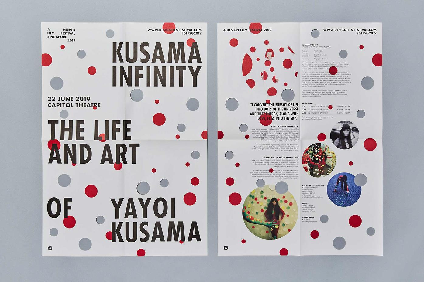
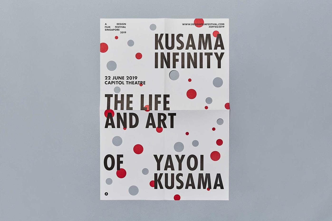
The promotional materials for A Design Film Festival are a great example of die cuts in posters and brochures. The result is fresh, dynamic, and versatile print collateral.
[superfeatured]7076[/superfeatured]
What’s That Sound by Lin-Lung Chen
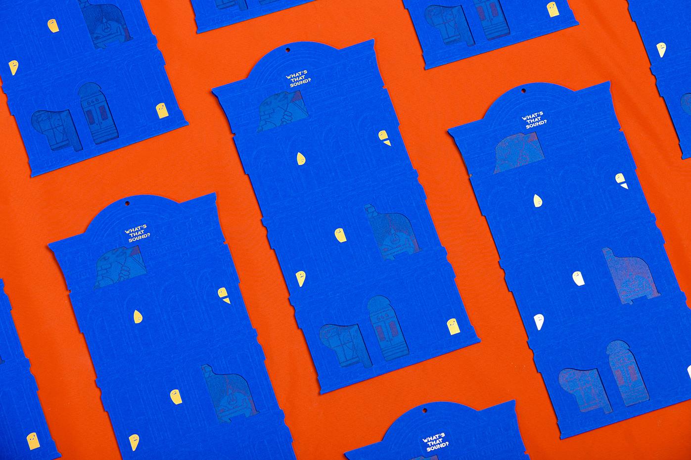
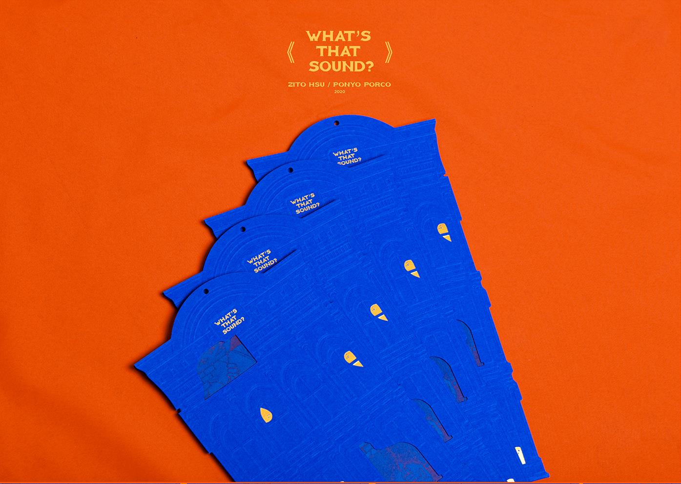
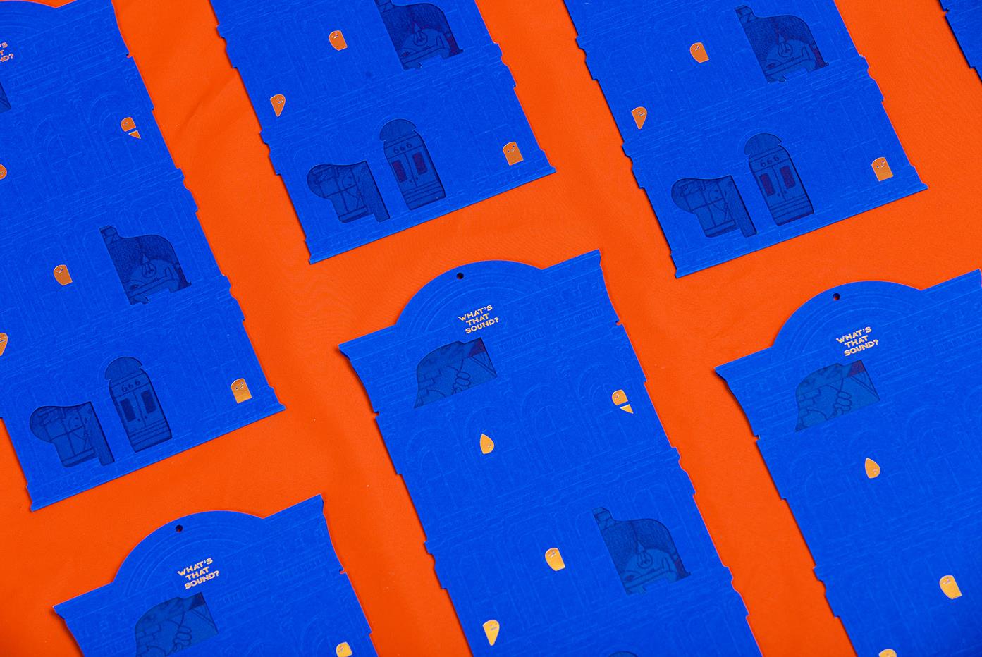
Another example of this graphic design trend, where embossing and die cuts are used in the product’s print production.
The result is a highly engaging piece that appeals to both touch and sight, winning over customers.
Chris + Jessie by Hyela Lee
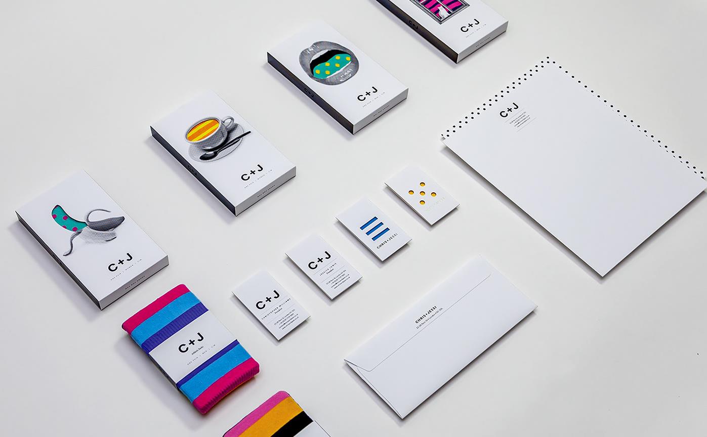
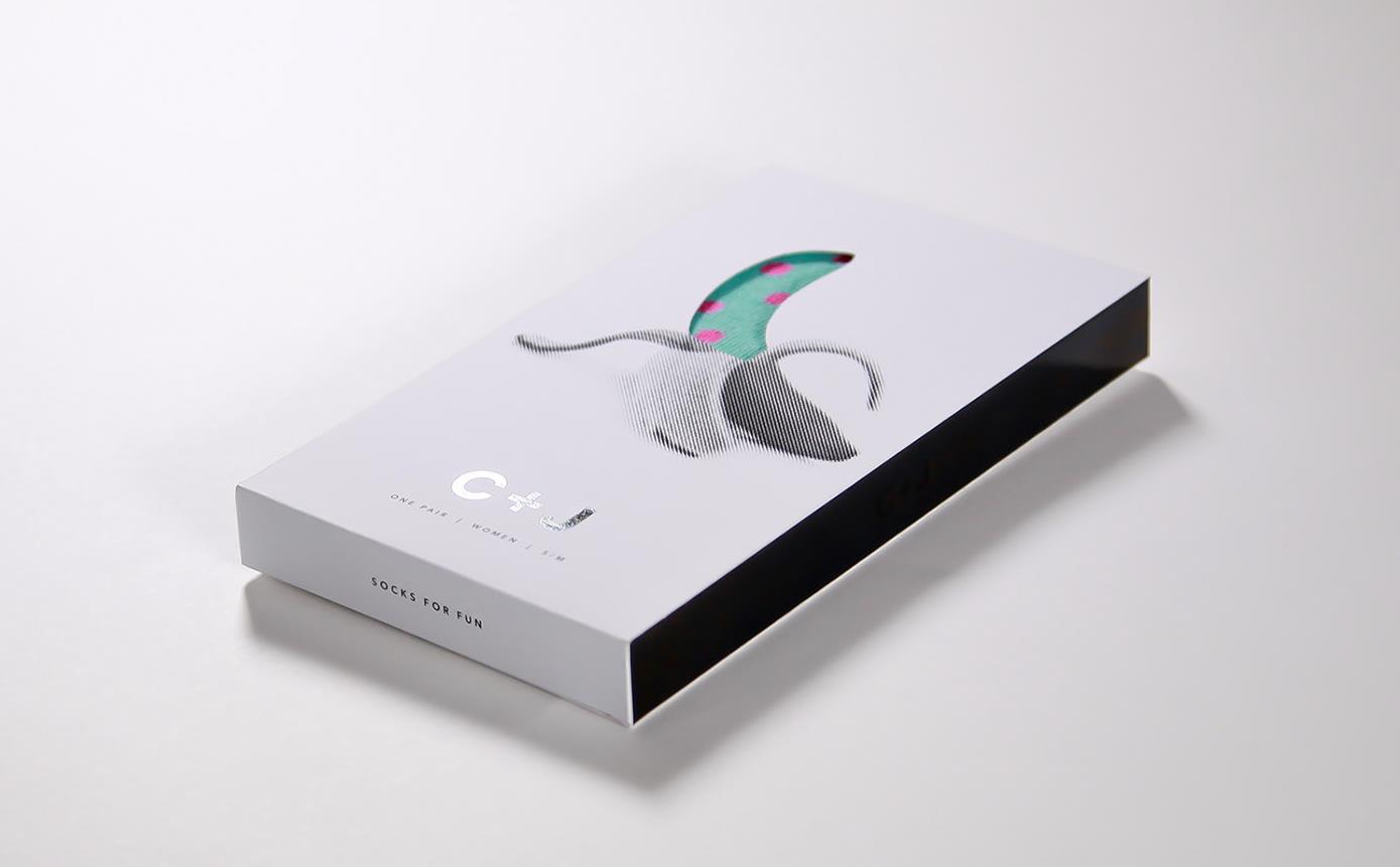
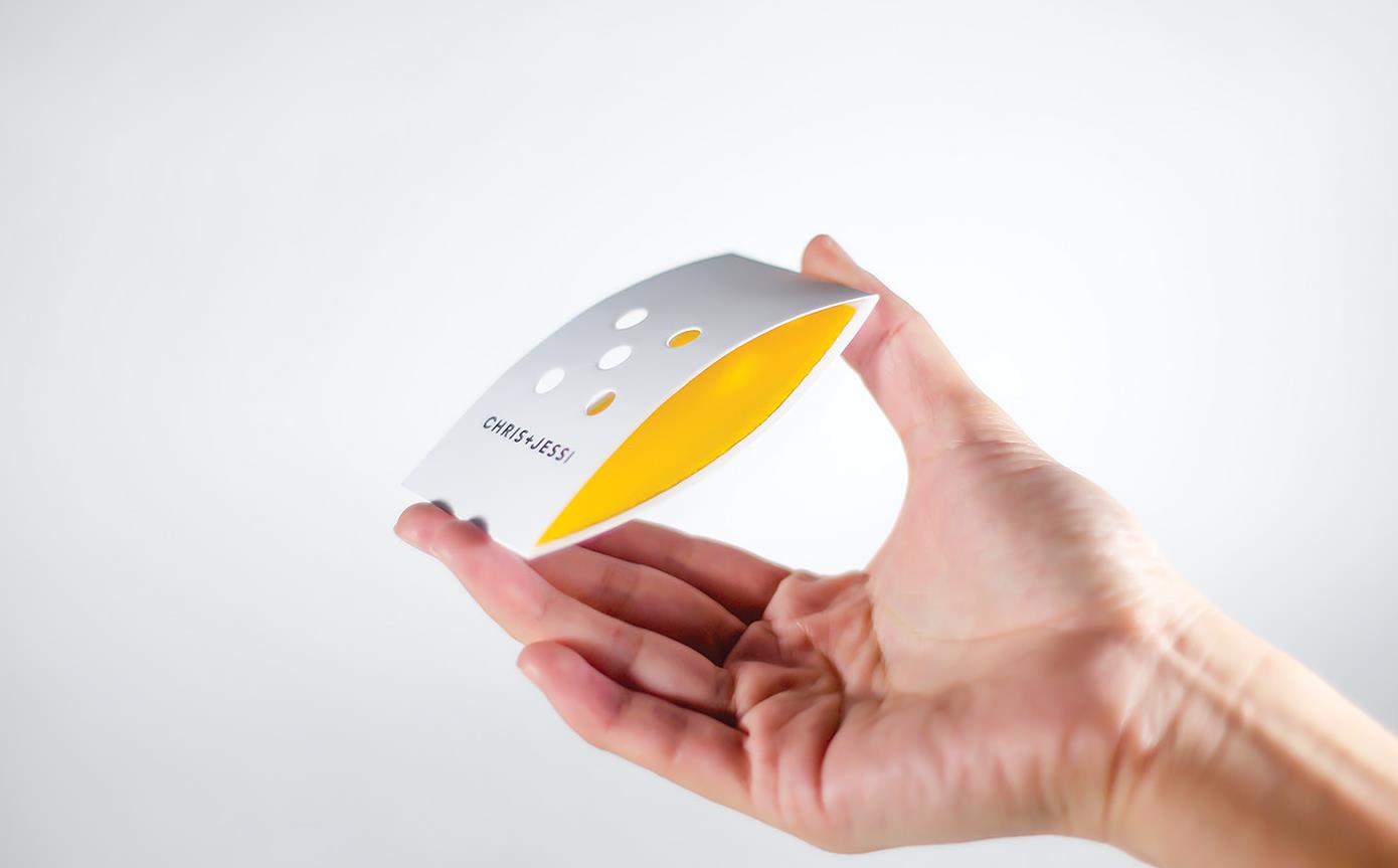
The packaging for these socks is based on the idea that the product should be both visible and touchable. The packaging is die cut on the front and side to achieve this.
This approach builds customer trust in the product.