Whether you’re looking for inspiration to design a new logo or just want to browse, this post featuring the best logos of 2019–2020 is for you. Take a seat—let’s get started.
[superfeatured]7076[/superfeatured]
We’re going all out with our year-end posts this time. Why? Because these articles are the most popular of the year, and the traffic numbers prove it. It’s clear you enjoy them. That’s why we’ve decided to add new categories this year—this is one of them. In this post, we’ll explore the best logos of 2019–2020. True works of art—beautiful and meaningful.
Sticking around? Then get comfortable.
The Best Logos of 2019–2020
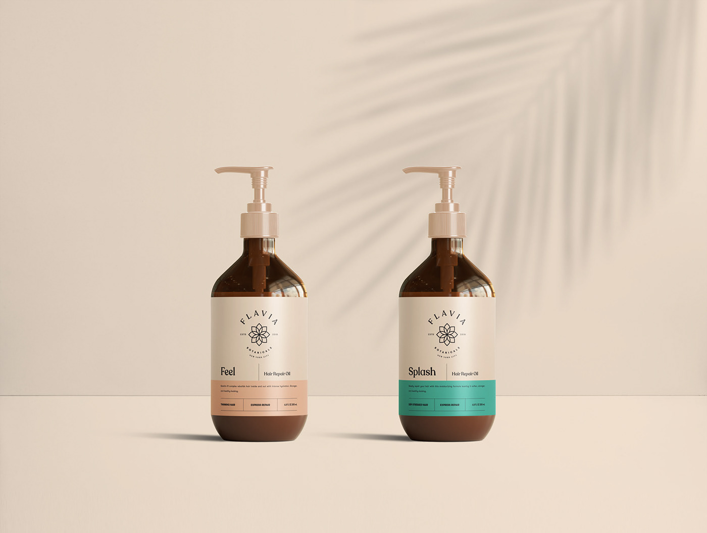
Flavia by Mustafa Akülker & Marka Network
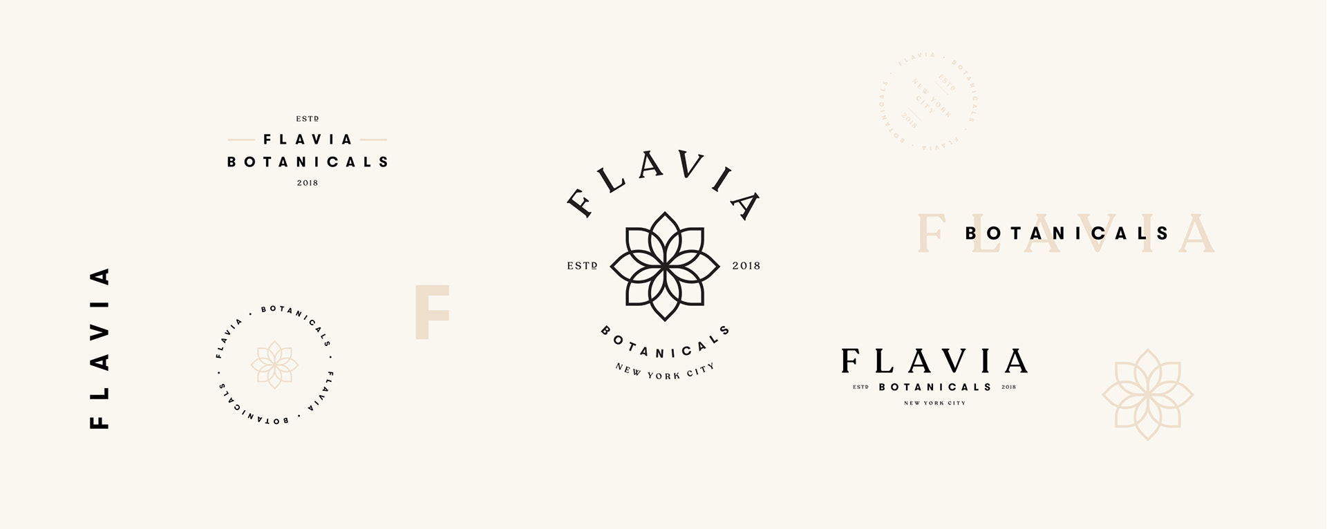
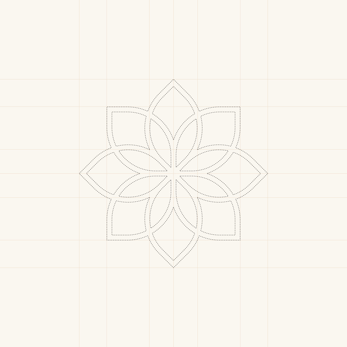
This logo, designed by Mustafa Akülker & Marka Network, features an organic, minimalist, and perfectly symmetrical look in every version.
The type pairing, precise kerning, and the icon itself make this one of the standout logos of 2019–2020.
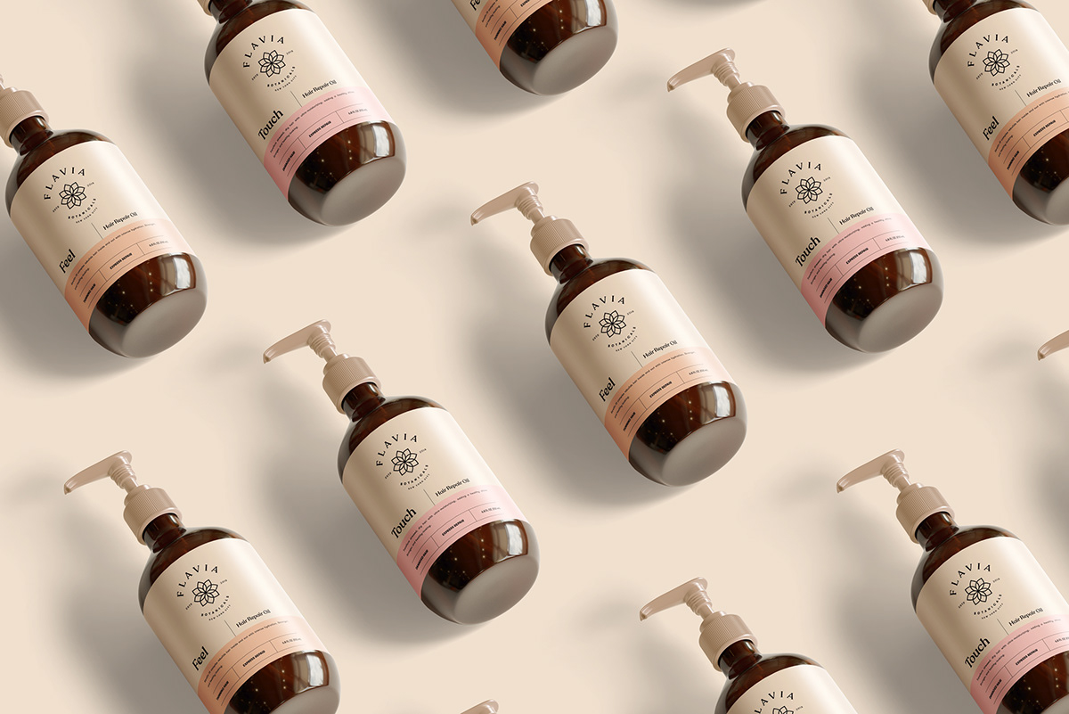
Logo Application
Thanks to the thoughtful design, you can see how effortlessly this logo adapts to every graphic piece. The label, in particular, stands out.
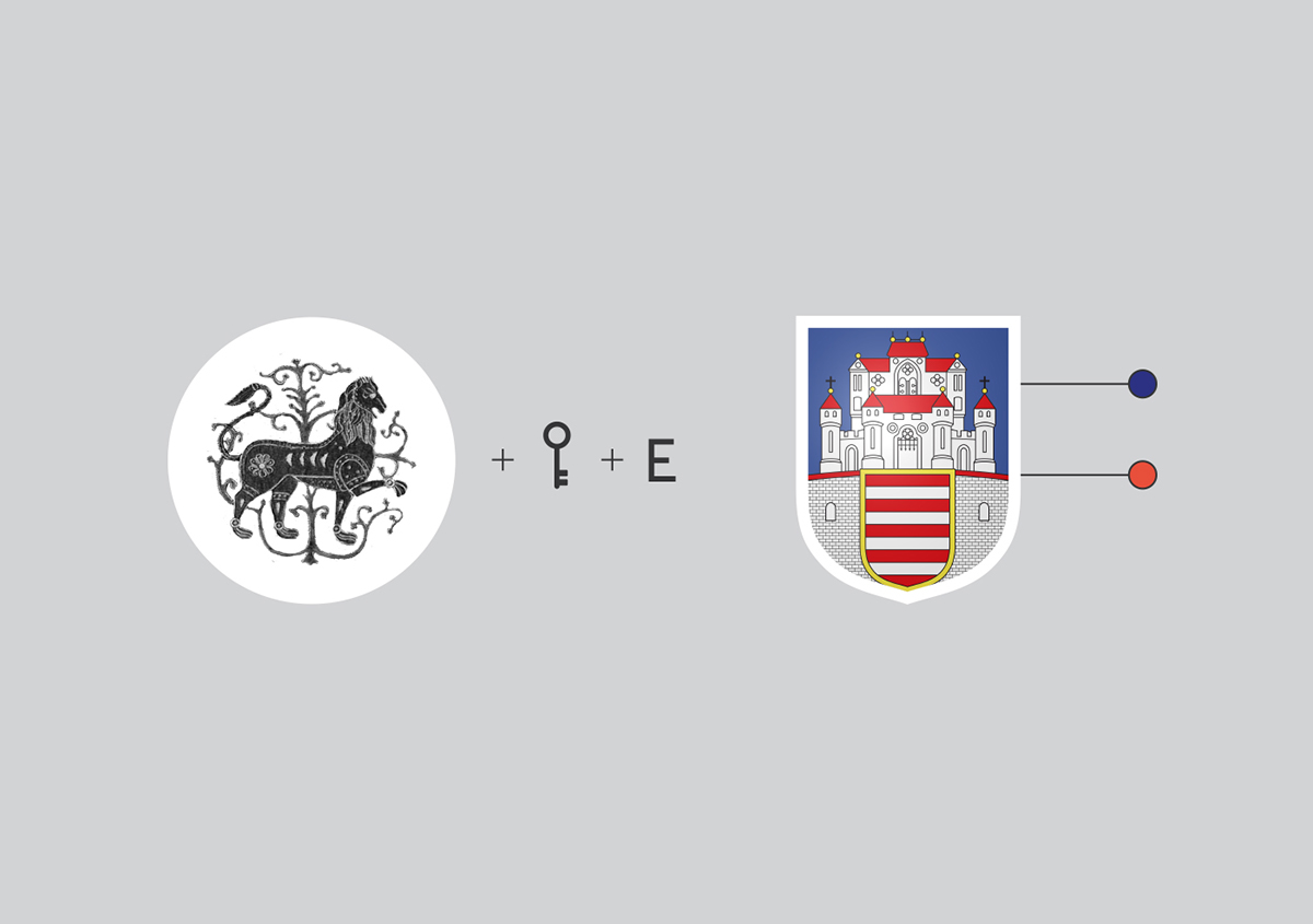
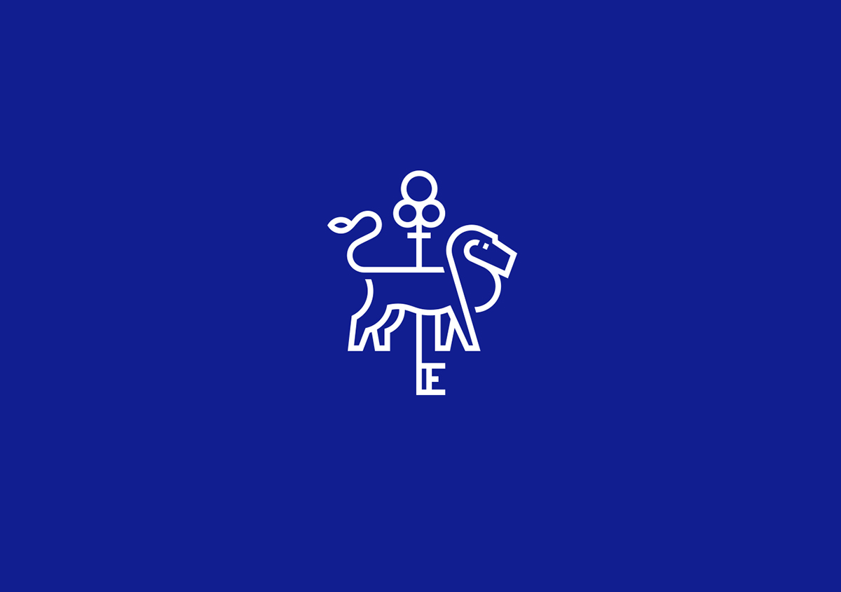
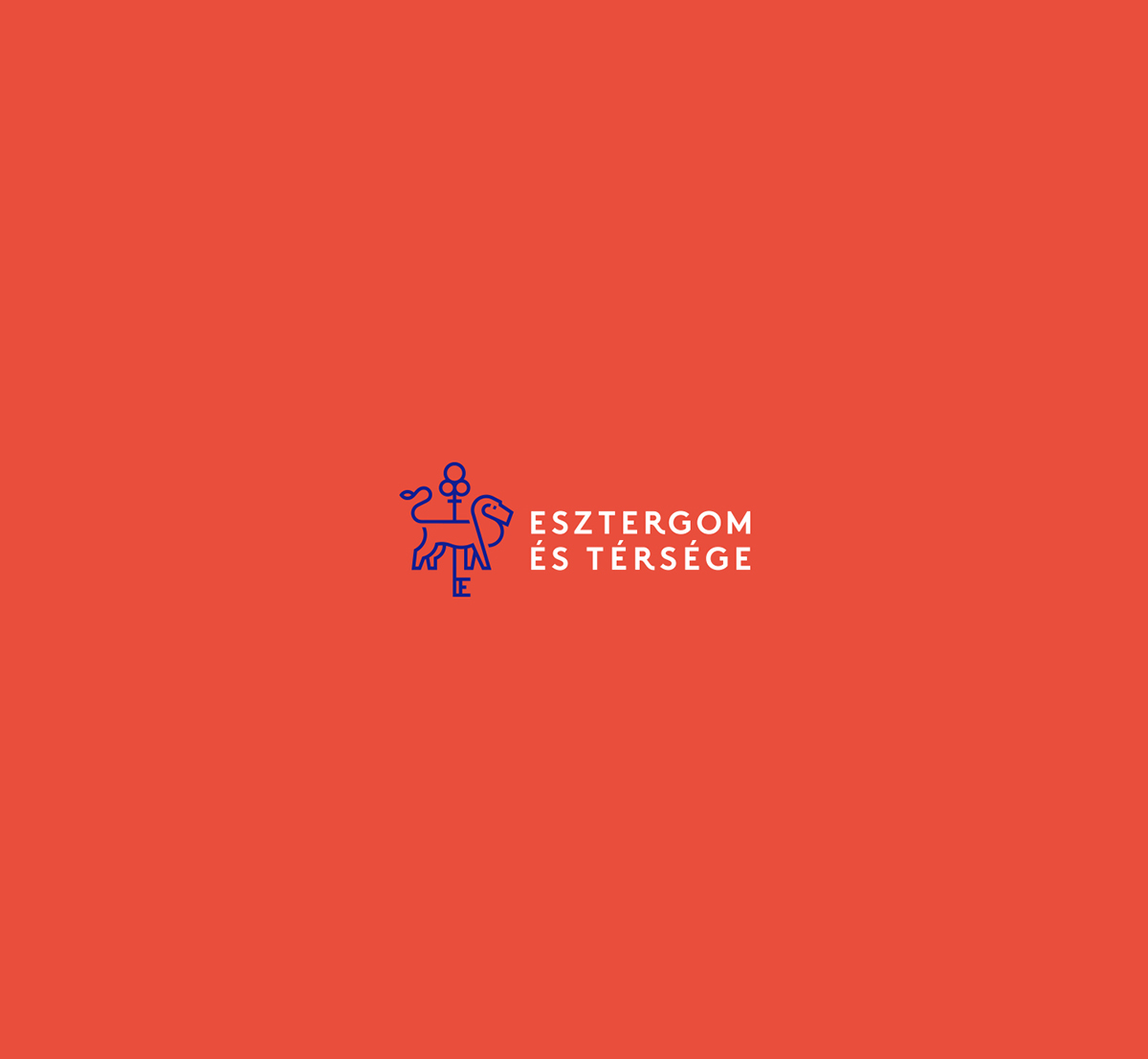
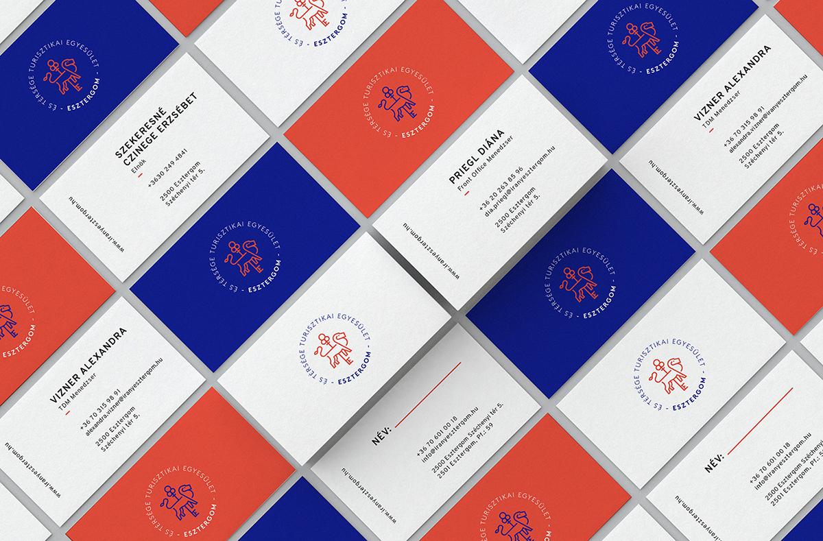
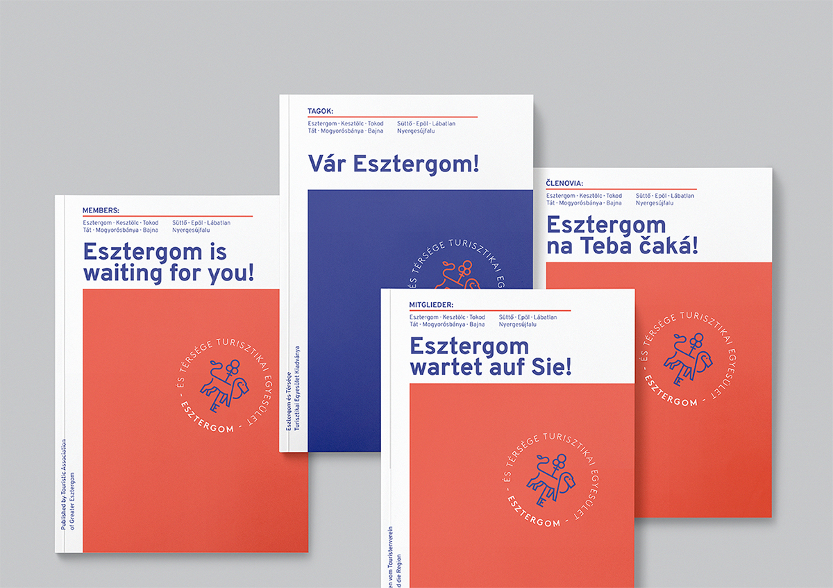
Esztergom by Fruzsina Fölföldi
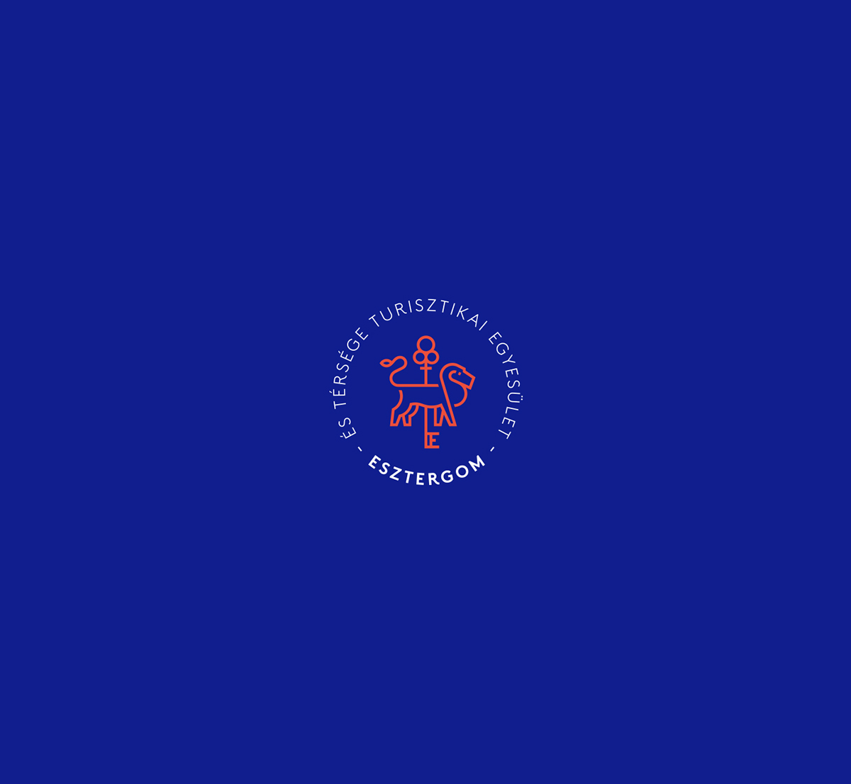 A logo by Fruzsina Fölföldi—elegant, refined, and with a carefully chosen color palette. The sans serif typography paired with the geometric icon creates a perfect blend, resulting in an exceptional logo.
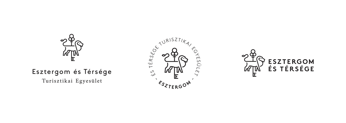
Logo Application
You can see the various applications developed—all well-executed and consistent with the established style.
There’s a story behind the design that’s worth exploring. Every shape and color is intentional—nothing is left to chance.
Applied across different materials, the logo delivers pieces that are distinctive, powerful, and elegant.
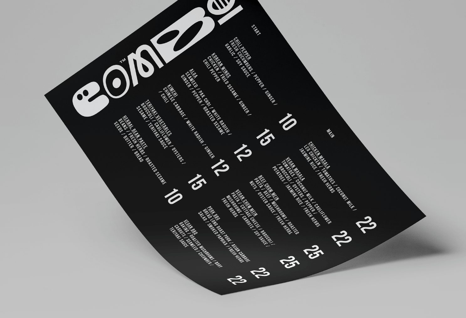
Combo by Redkroft
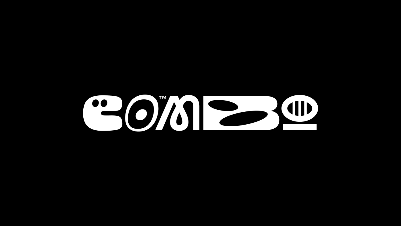 Created by Redkroft, this logo is truly unique. I’m convinced it’s the kind of design you’ll either love or… not so much. Personally, I love it. I think it’s because it brings a breath of fresh air to the usual.
By mixing different styles within the same logo, it follows a graphic line that’s abstract and intriguing. Saying it has personality is an understatement. That’s why I had to include it in this list of the best logos of 2019–2020.
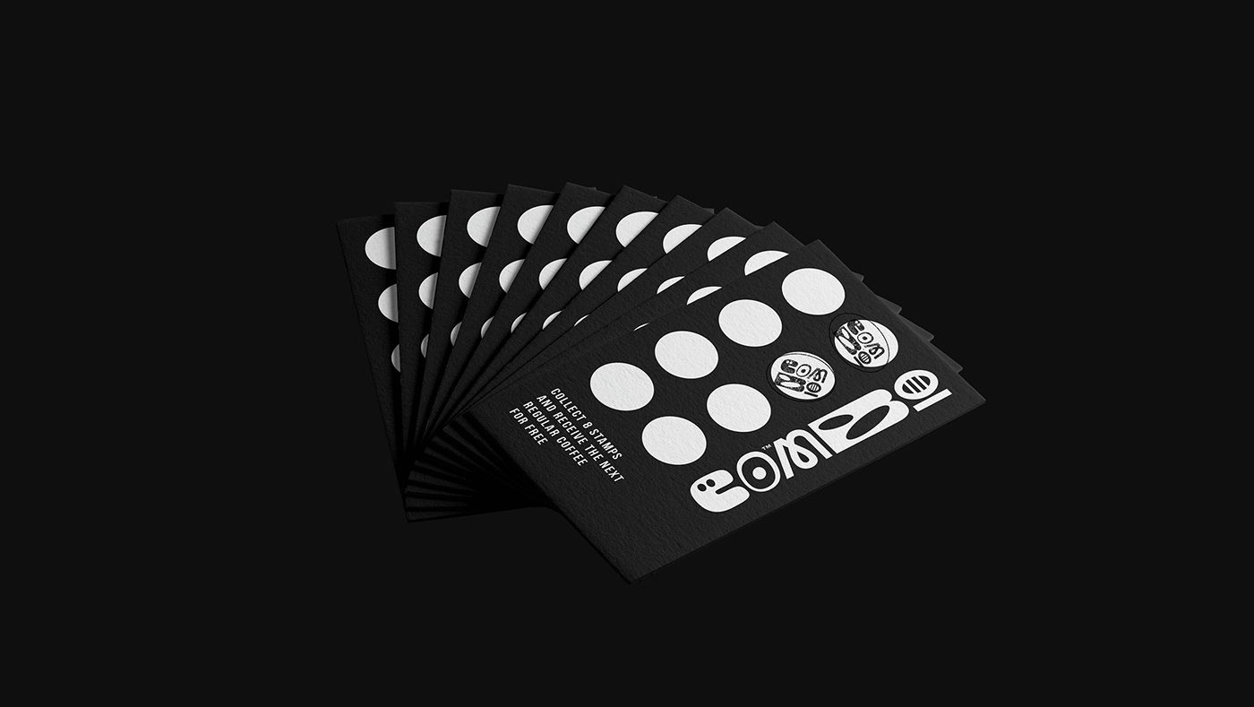
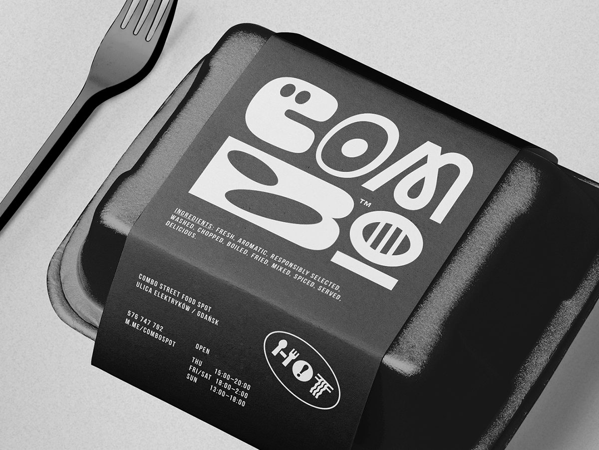
Logo Application
If you weren’t convinced by the flat version, I think you’ll find its charm once you see it in use.
With such a bold and quirky logo, you can apply it to corporate materials without hesitation, creating truly unique pieces.
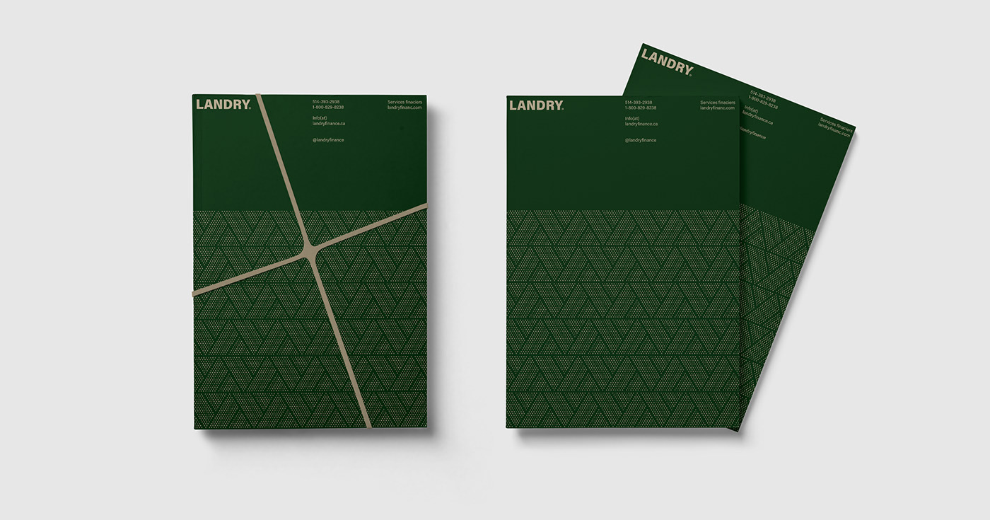
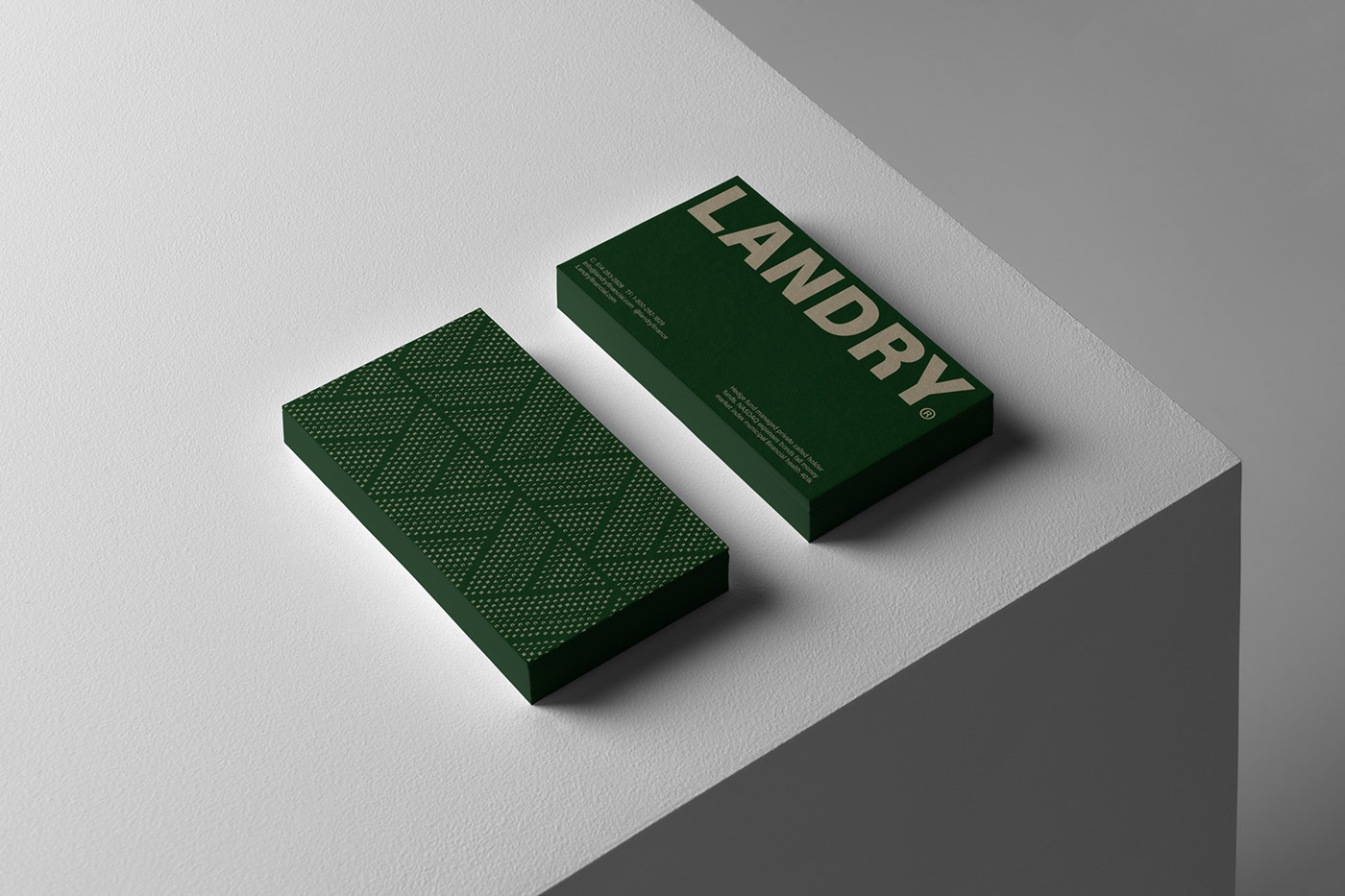
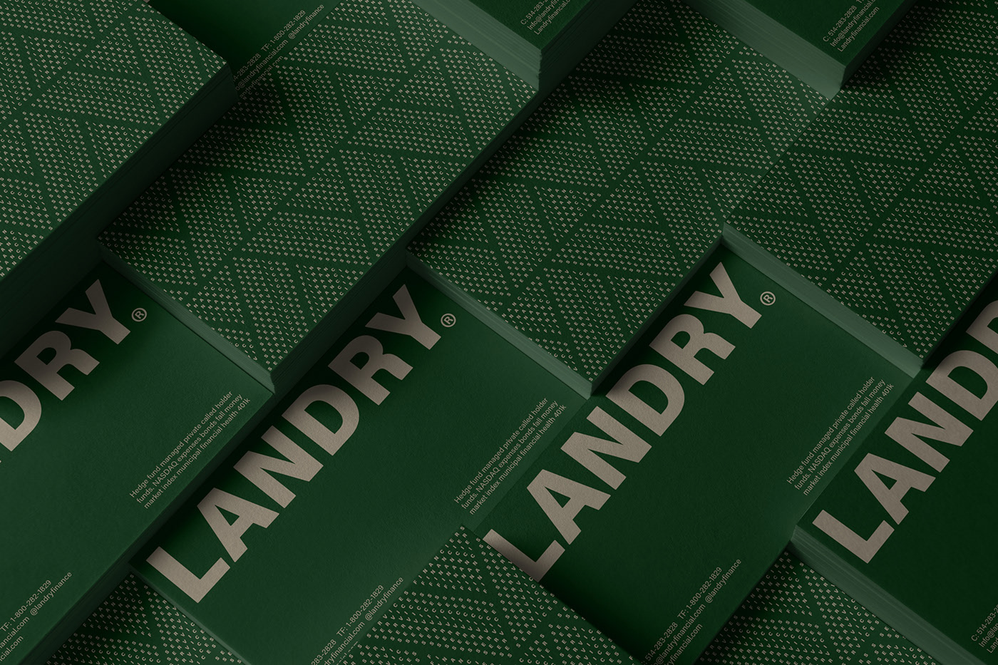
Laundry by Monolith Agency
 Minimalist. Extremely minimalist. For those who don’t know, I’m a big fan of minimalism. This logo by Monolith Agency is simple, refined, and elegant. The chosen color palette gives it a personality that might otherwise be lacking.
Logo Application
Once you start building out the visual system and adding supporting elements, the logo gains real impact, despite its minimalism. In this case, the graphic elements surrounding the logo are crucial and have been expertly crafted by the Monolith team.
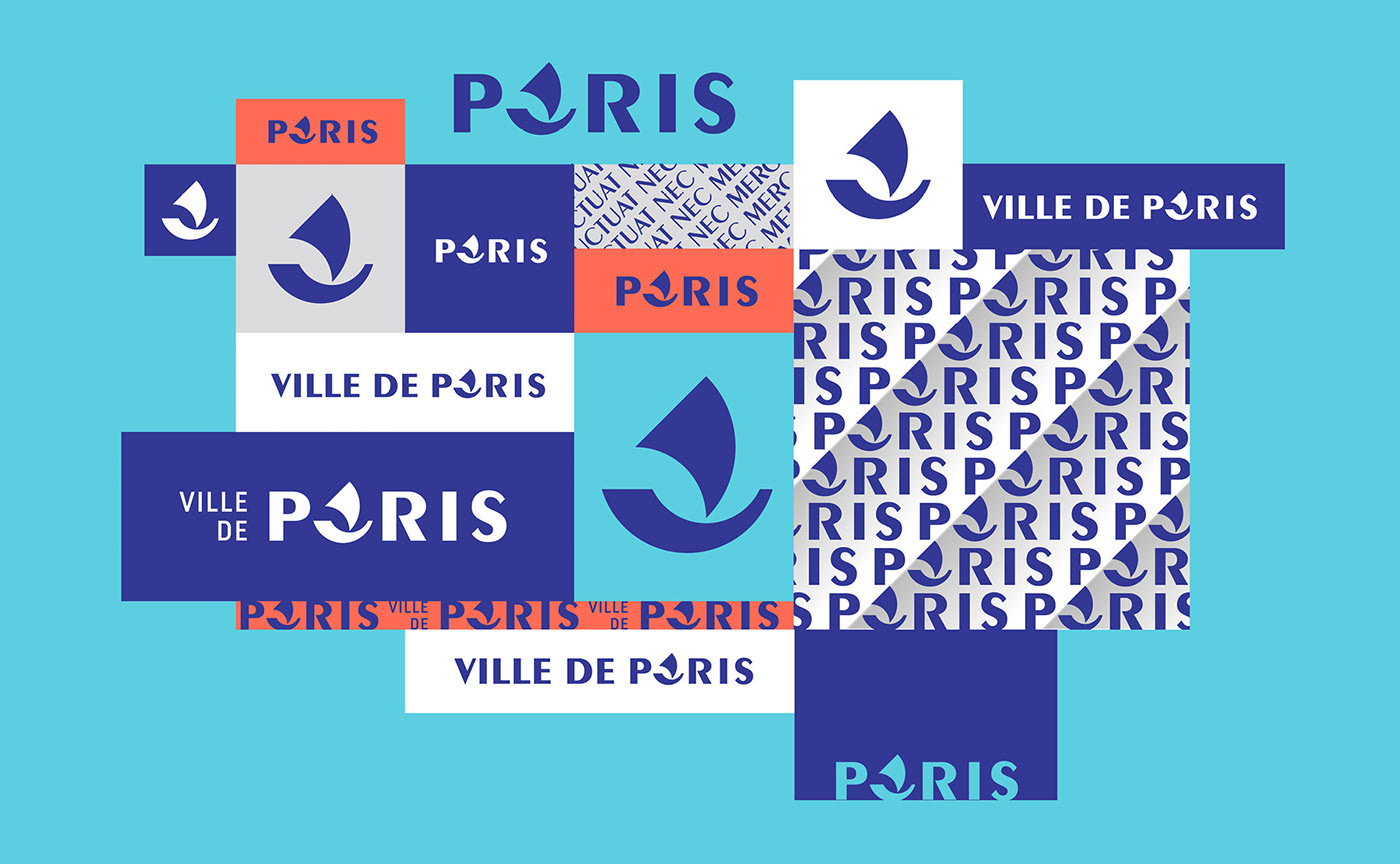
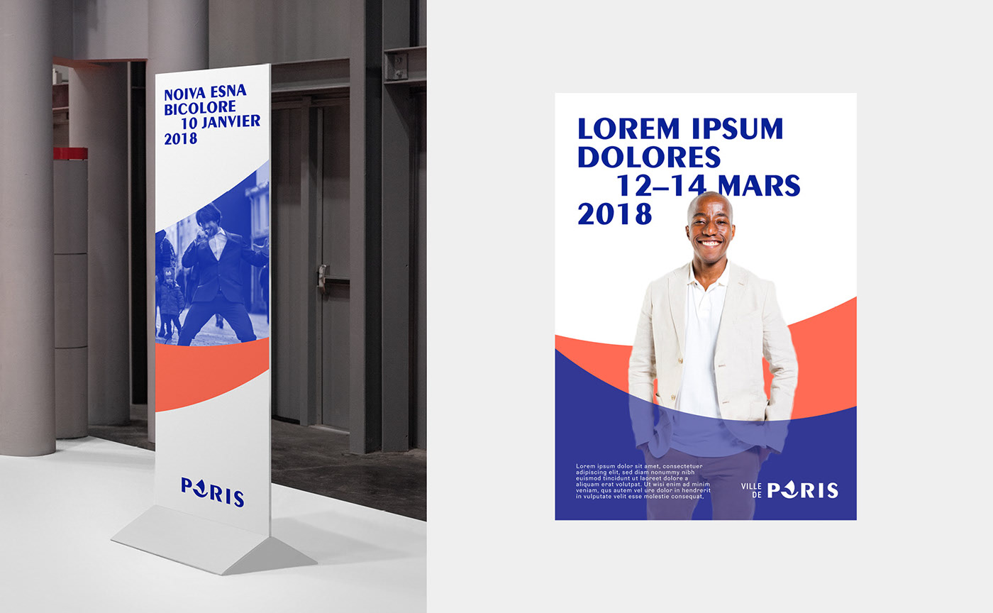
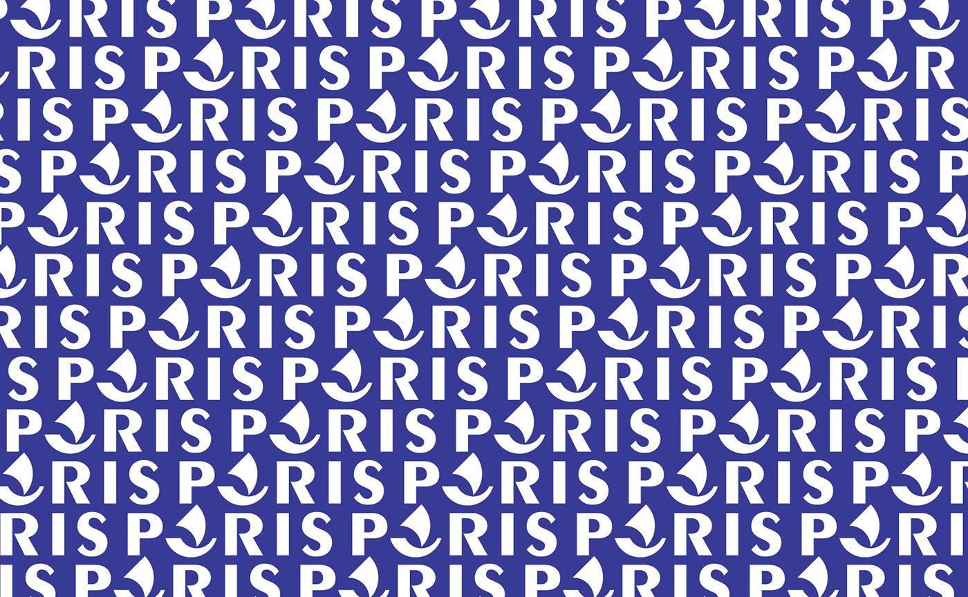
City of Paris by Graphéine
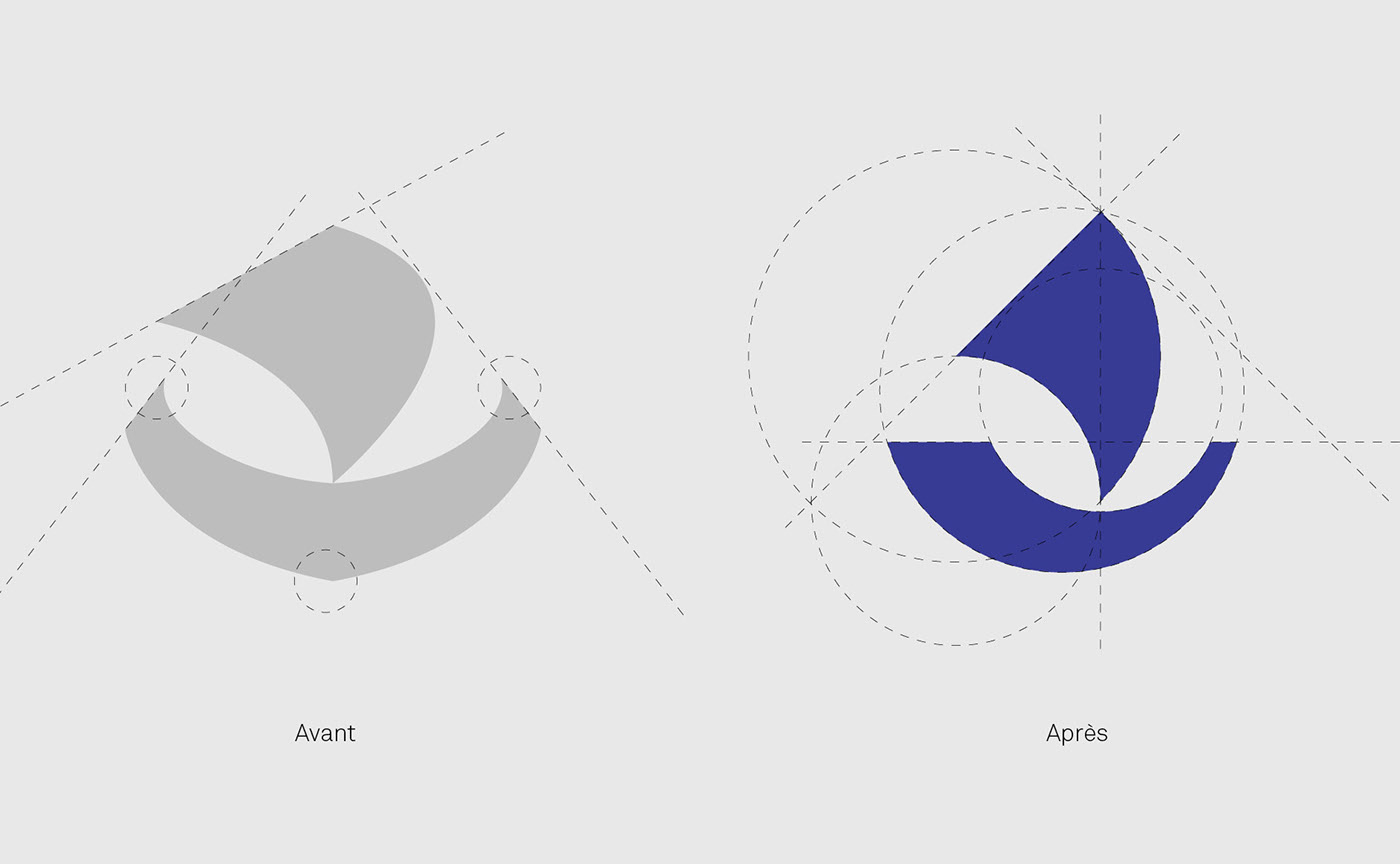
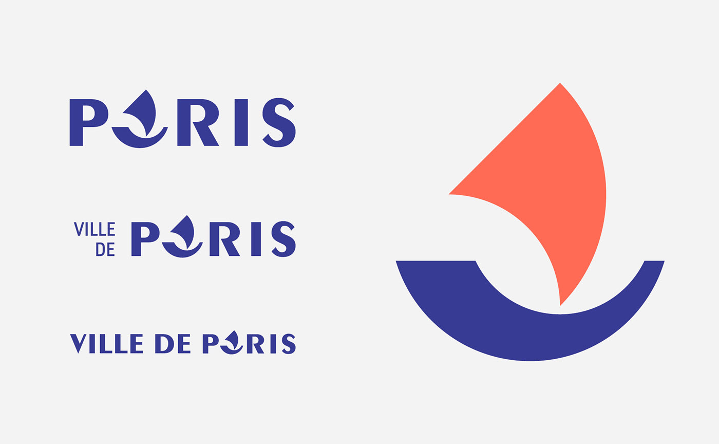 This logo is essentially typographic, with a visually striking play on the letter that serves as the icon—the most important part of the design.
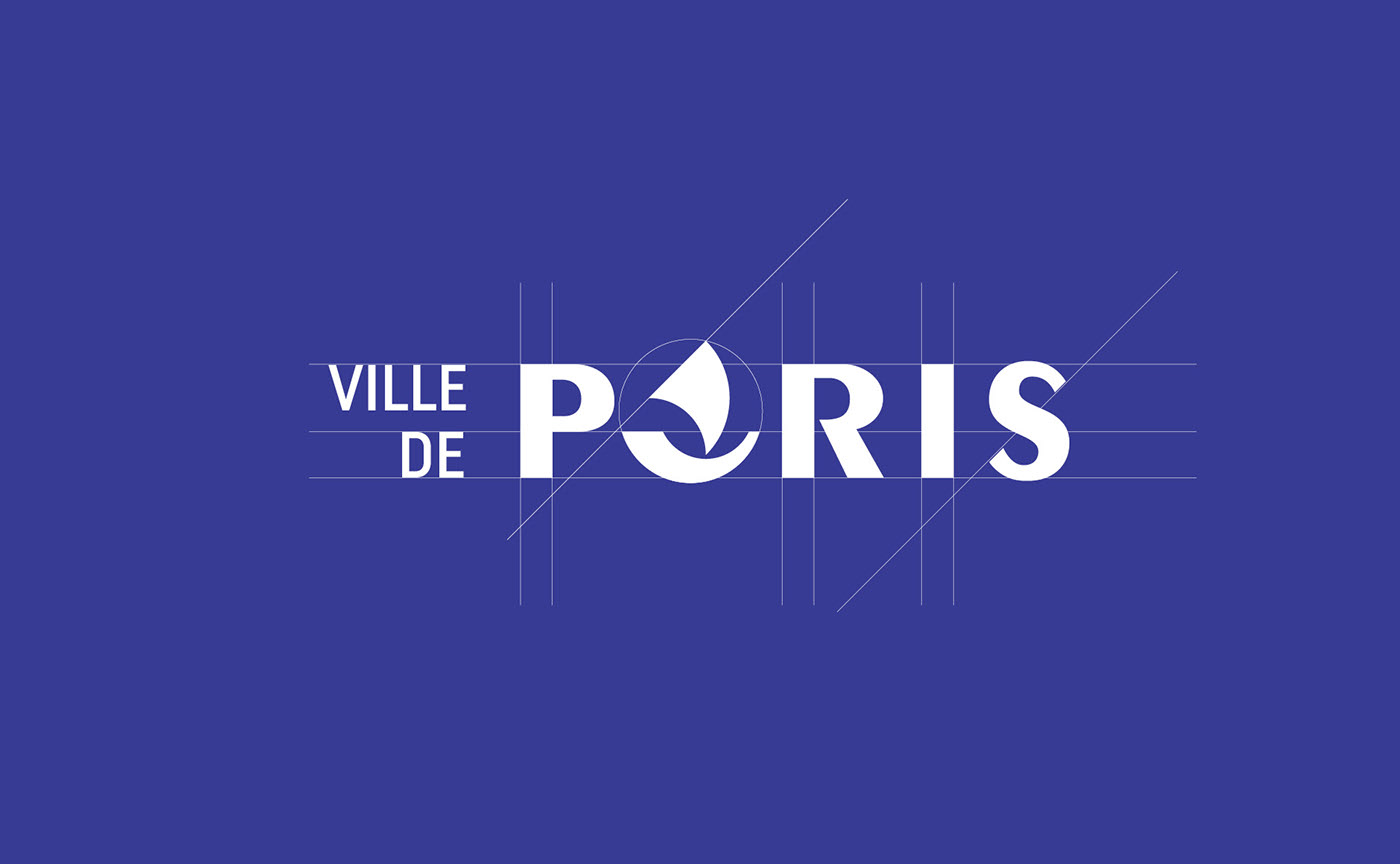
For more complex applications, where the words “Ville de” appear on the left, you can see the masterful use of space.
As for the color palette, they’ve opted for strong contrast—a great choice for this outstanding logo design.
Logo Application
When we talk about one of the best logos, it must work perfectly across every desired format. The use of space and geometric forms must be expertly handled. This logo delivers on all counts—and then some.
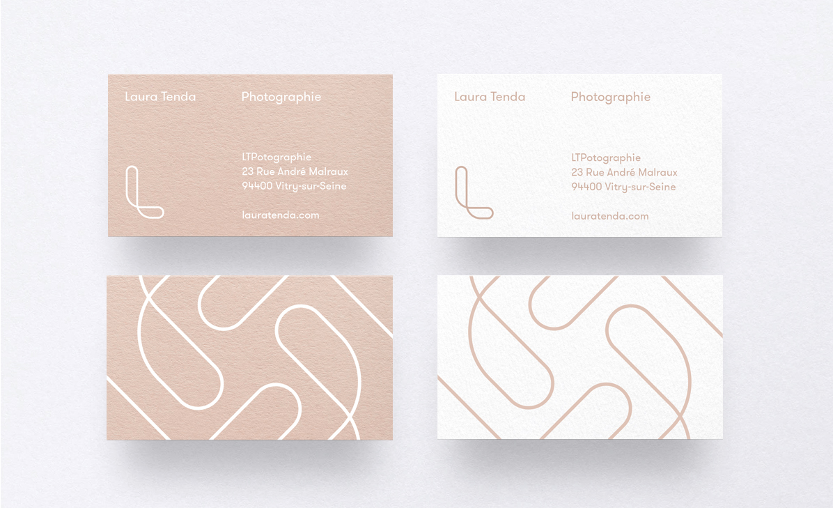
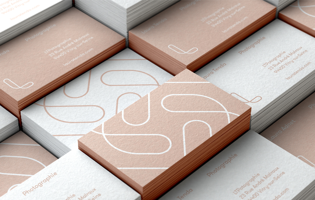
Laura Tenda by Thømas Adnet
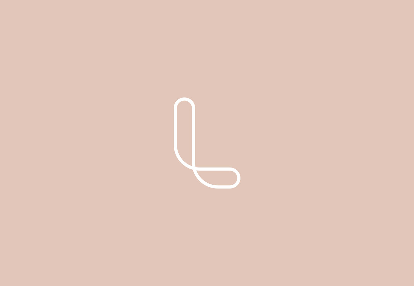
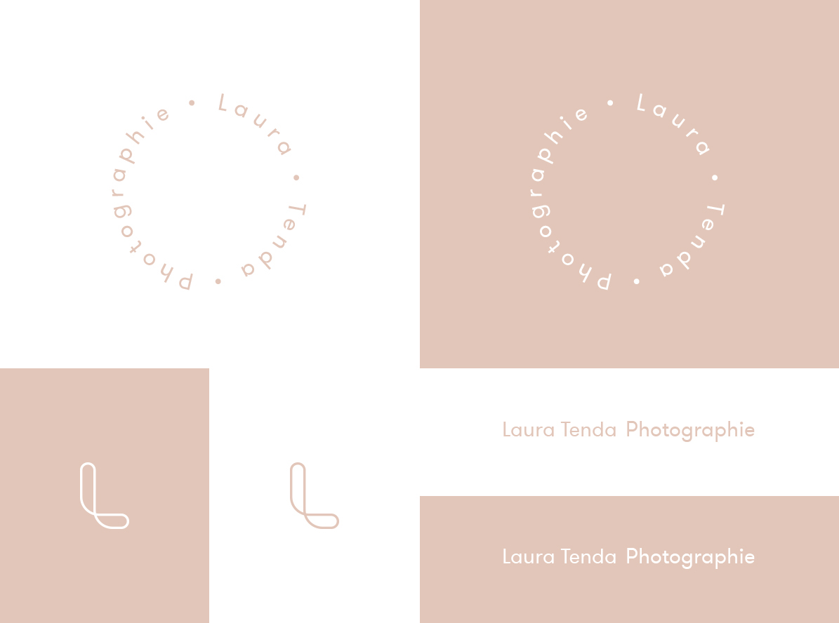
Minimalist and beautifully executed. The soft color palette conveys exactly what the designer and client intended.
Delicate, understated, and clean—a truly impressive piece by Thømas Adnet.
Logo Application
Applied to corporate materials and paired with carefully selected paper stock, the result is a set of refined brand identity pieces.
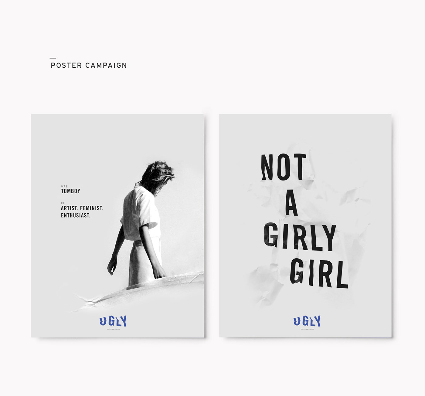
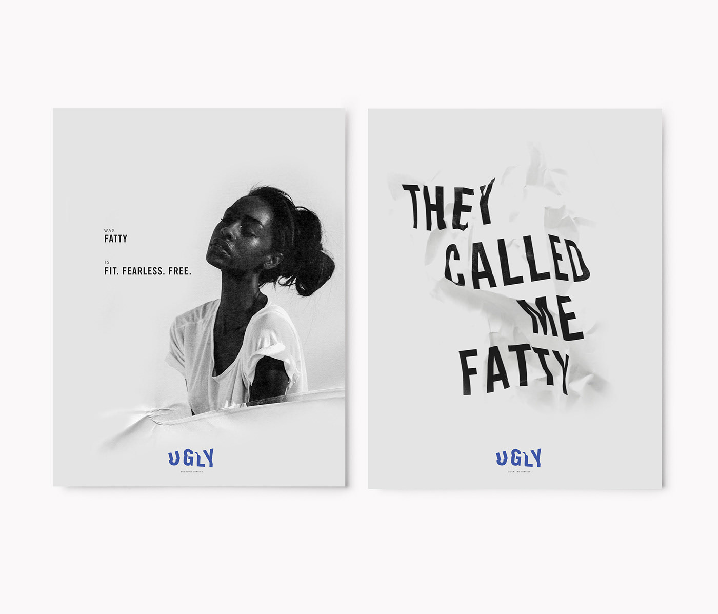
Ugly Duckling by Saxon Campbell
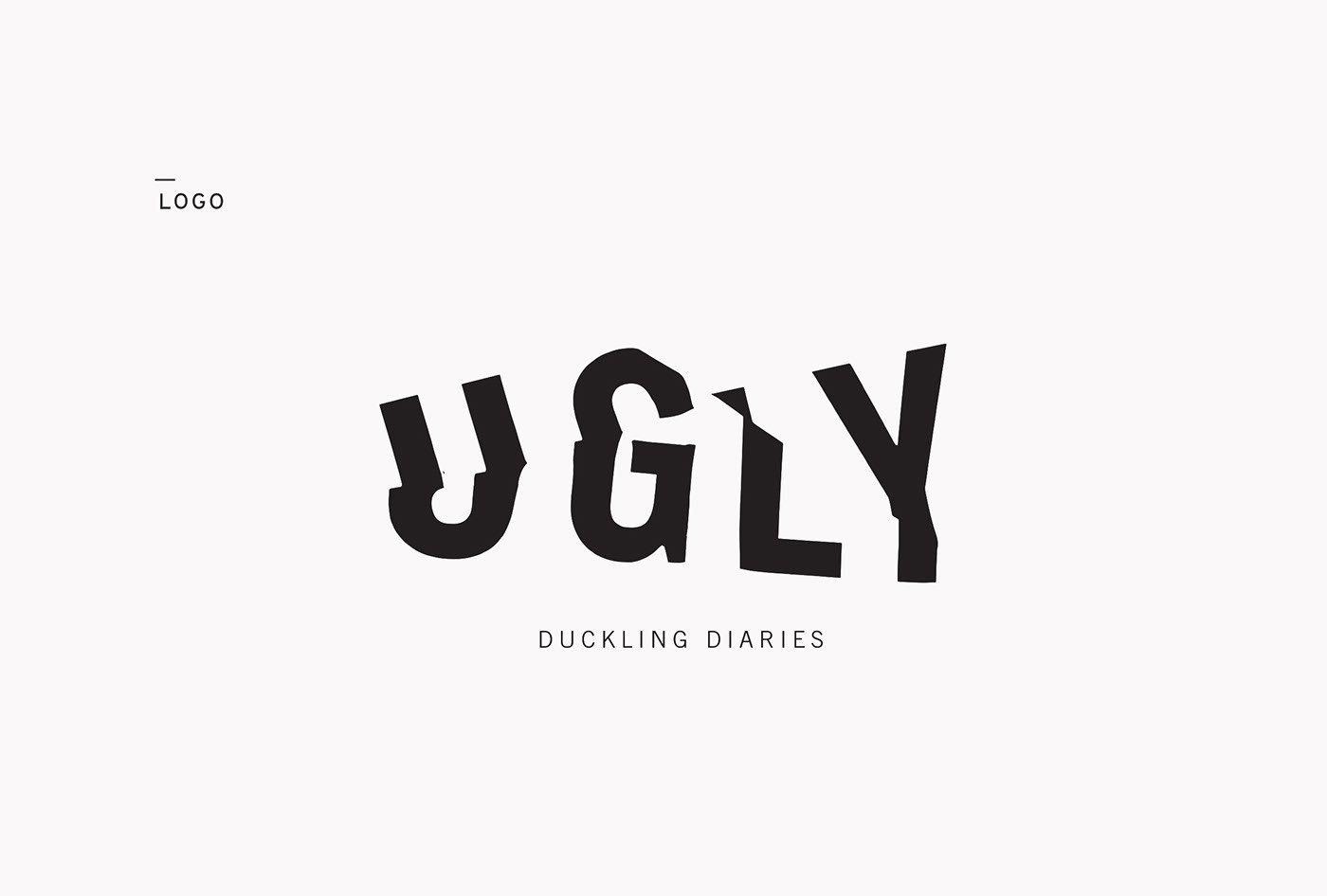
Bold and a bit edgy, this logo by Saxon Campbell is full of character—daring and powerful.
Black is used as the base, which I think is a great choice. The strength of such a pure color, combined with a bold typeface, gives it the impact it needs.
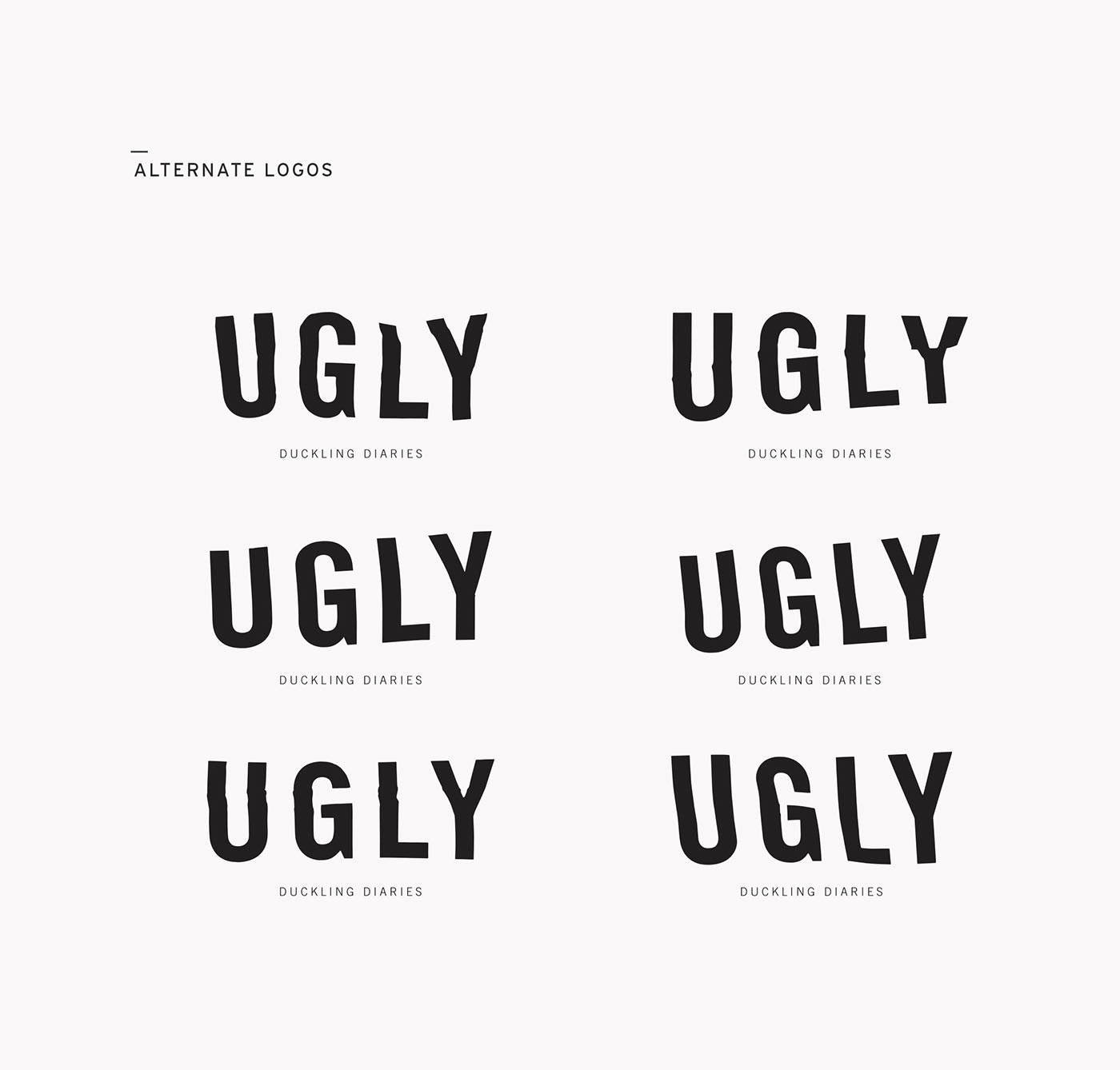
Logo Application
The logo can be used in several alternative versions, allowing for a rich visual language across different materials.
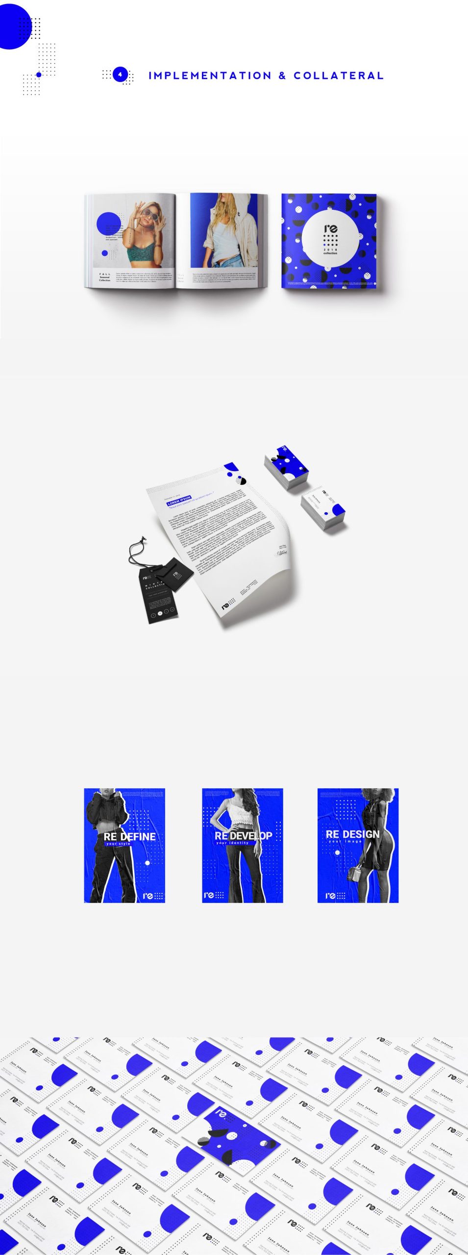
Redot by Anna Iva

With a striking electric blue and classic black, this logo by Anna Iva has a techy, bold, and direct feel.
There’s also an animated version—which, as you’ll know if you’ve read our post on logo design trends, is set to be a major trend in 2020.
Logo Application
You can see how the visual identity uses dots and circles as a central theme. I love the system—it’s full of creative possibilities.
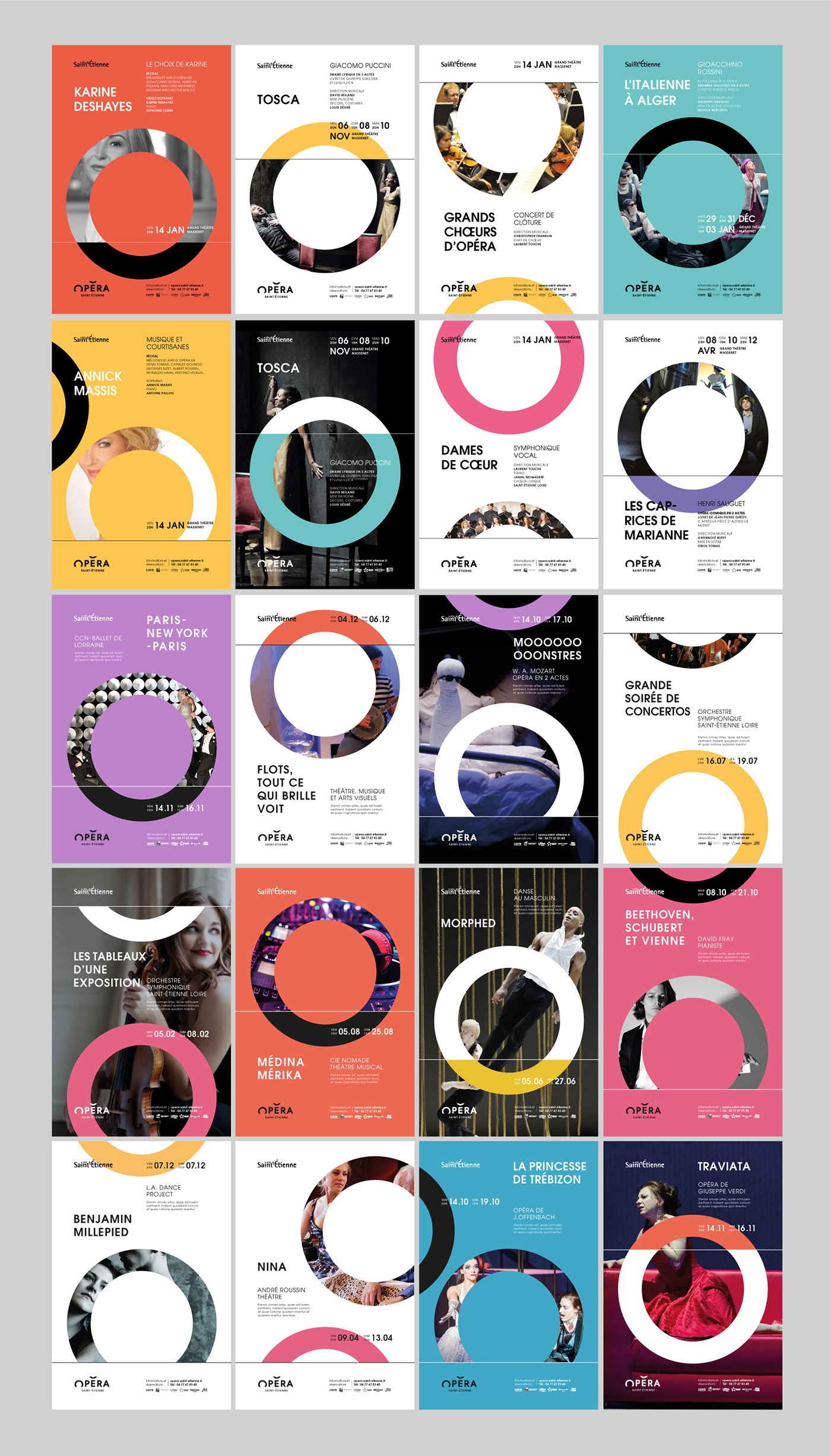
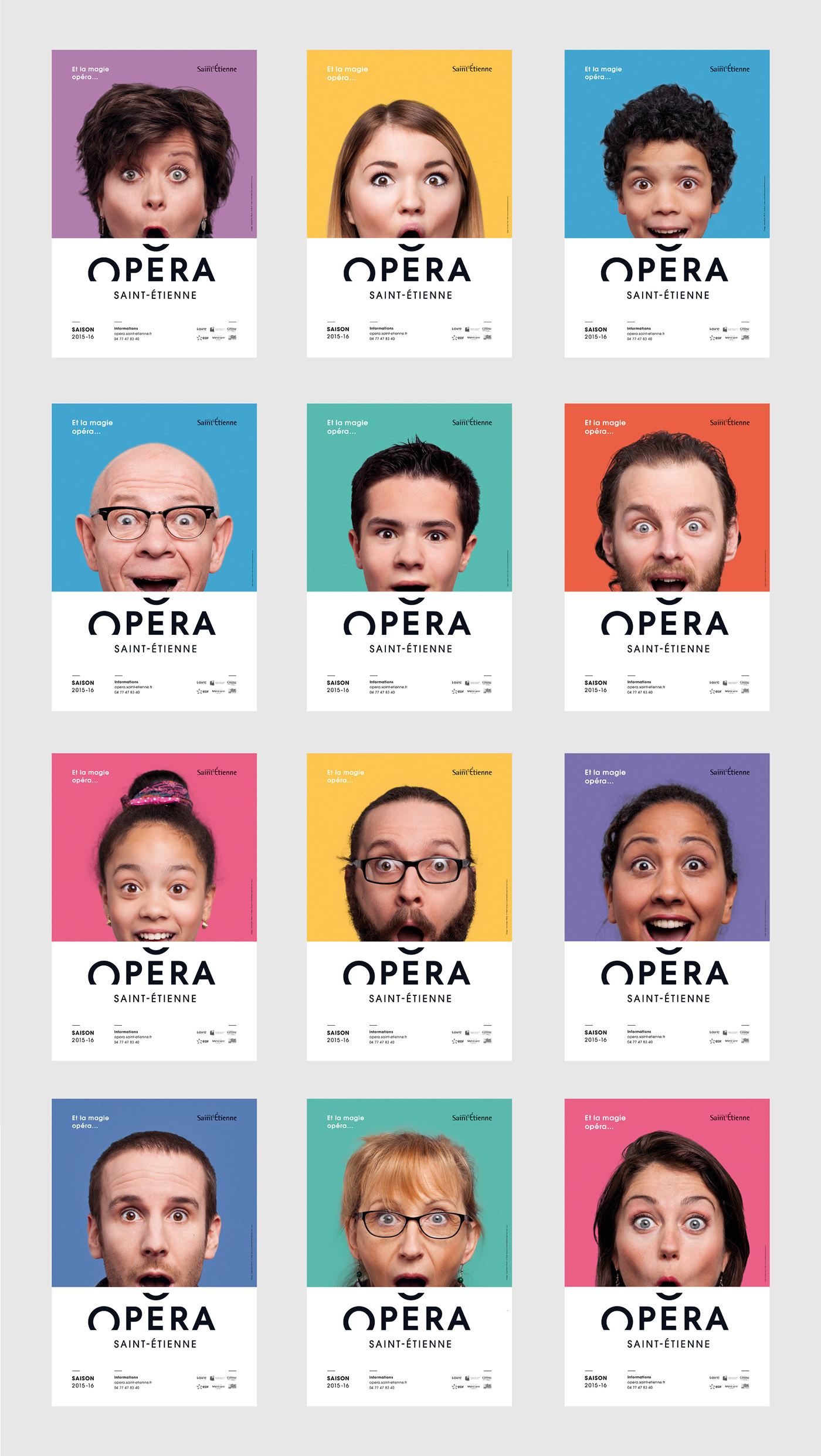
Saint-Étienne Opera House by Graphéine
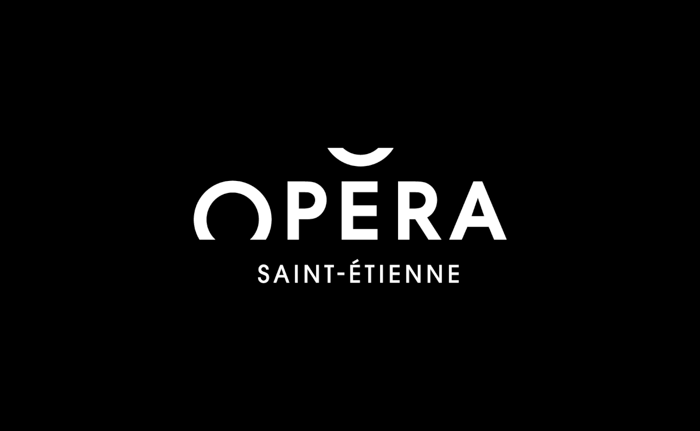
Simple, minimalist, and highly focused on typography—which, by the way, is perfectly chosen.
With black as the base color, it exudes elegance and prestige. An excellent piece of logo design that absolutely deserves its place in this roundup of the best logos of 2019–2020.
Logo Application
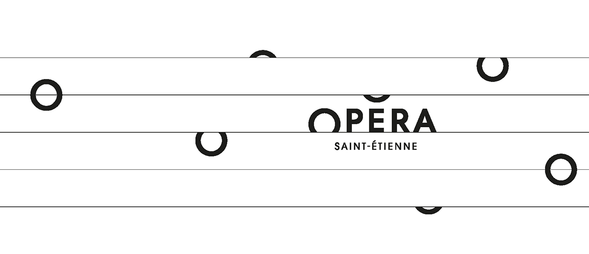
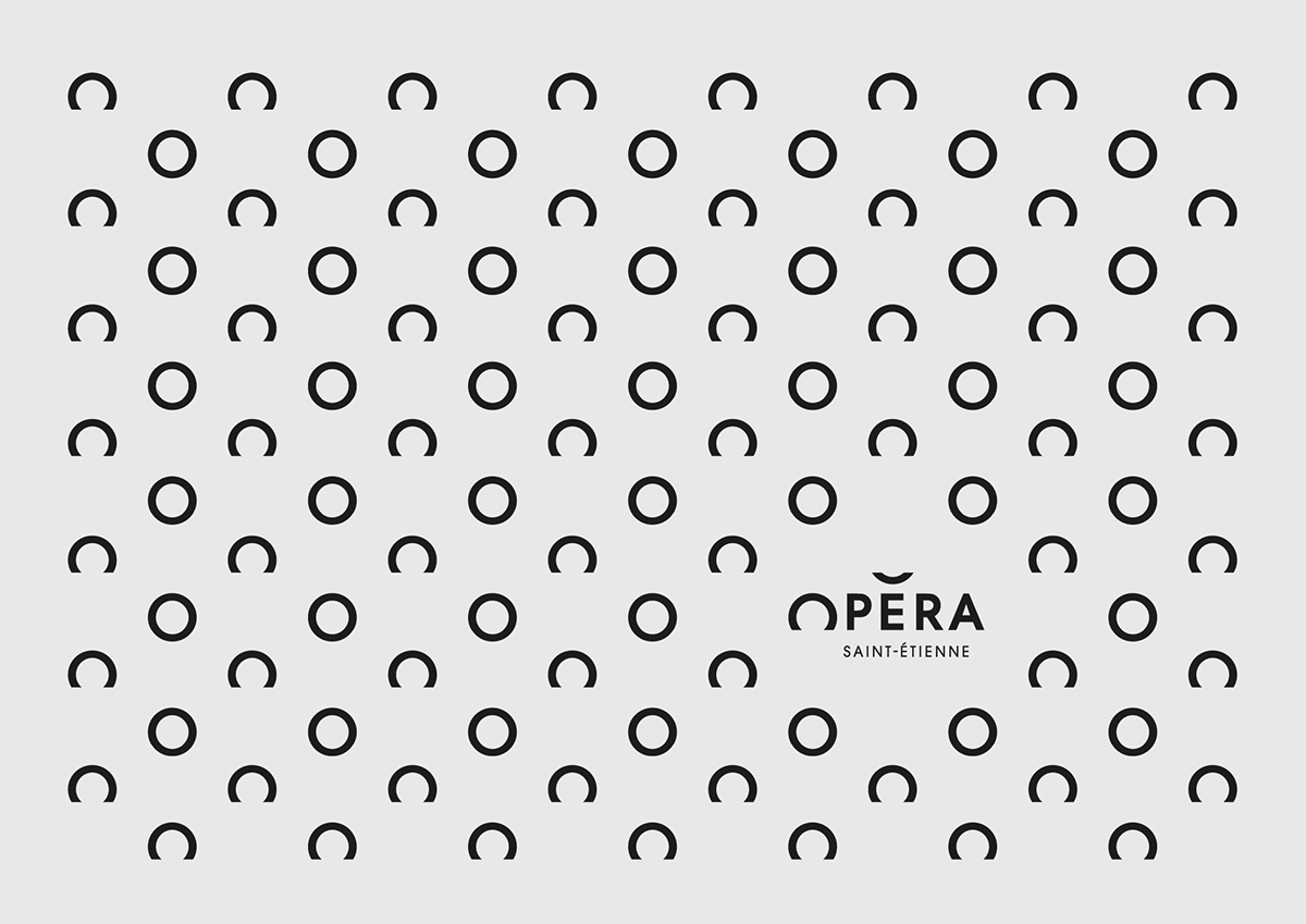
The logo becomes even more impactful when you see the full visual system in action. The broken “O” is a clever device with lots of creative potential.
It also has meaning—it represents musical notes on a staff.
Conclusions
As you can see, most of the references in this roundup of the best logos of 2019–2020 are minimalist or flat. The truth is, this is the most versatile approach when it comes to logo design, making it easy to apply the logo across all kinds of brand materials.
I hope you enjoyed this selection, and I encourage you to check out our post on the logo design trends coming in 2020.
Disclaimer
This list is personal and curated by Code Barcelona. It’s not official, and personal taste plays a key role in selecting one logo over another. The aim is to provide a high-quality source of inspiration for graphic designers.