The world of wine and the culture that surrounds it is pure magic. Whether it’s our country’s deep-rooted wine tradition or the special moments that come with savoring a great glass, there’s an entire universe of design and creativity woven into every bottle—one that simply can’t be overlooked.
This article is dedicated to all the creatives who elevate the allure and mystique of wine through exceptional label design.
Here’s a curated selection of the best wine labels to inspire your own creations—or to enhance those special evenings, whether you’re celebrating alone or in good company.
The Best Wine Labels for Your Inspiration
Pere de Novas
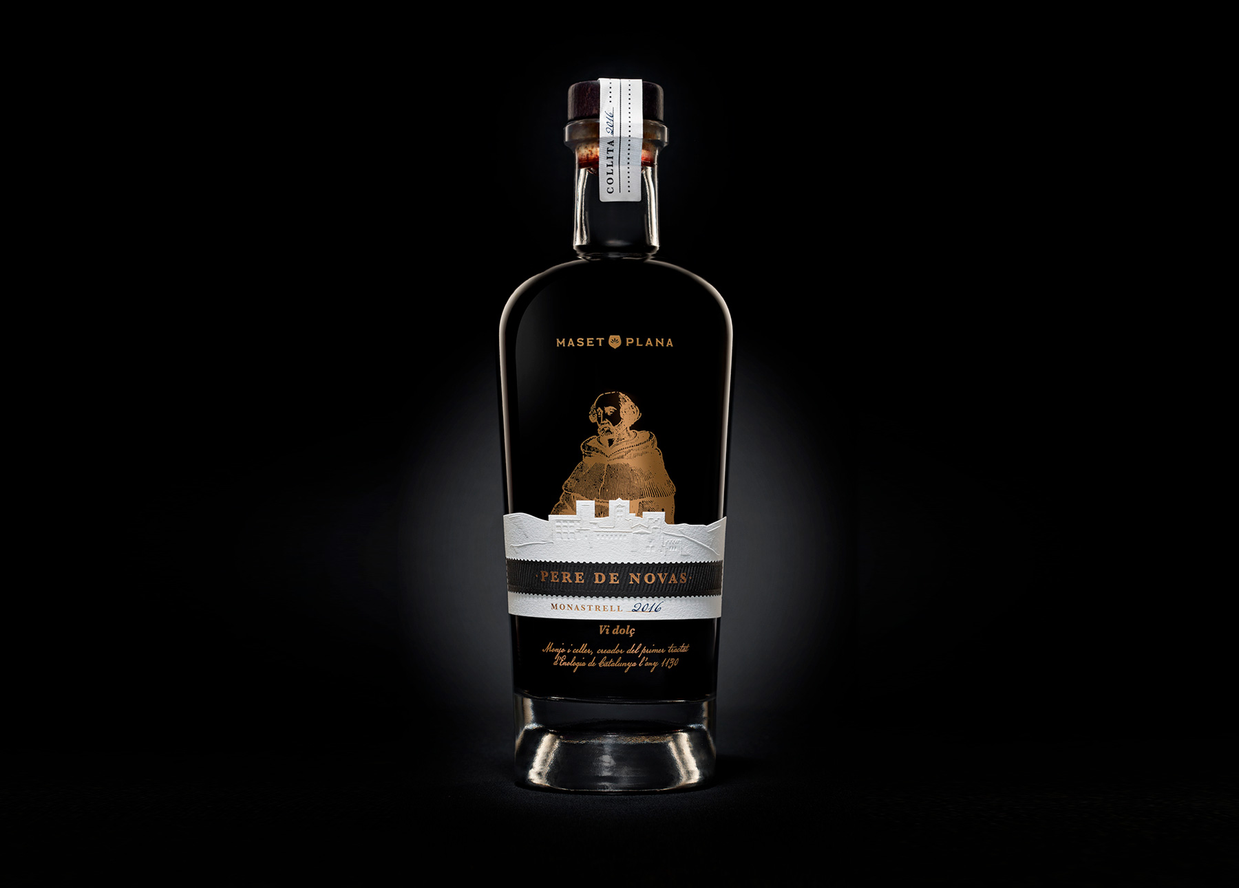
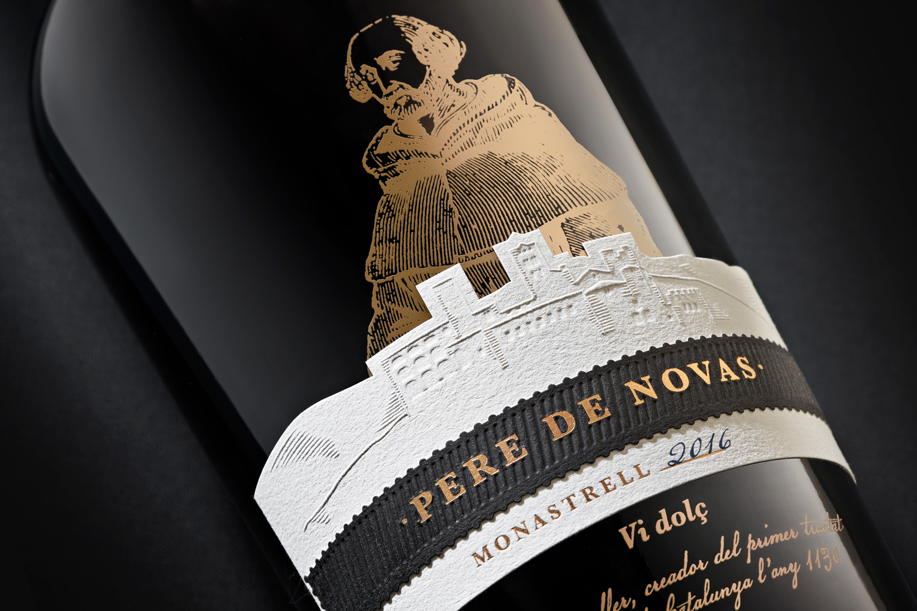
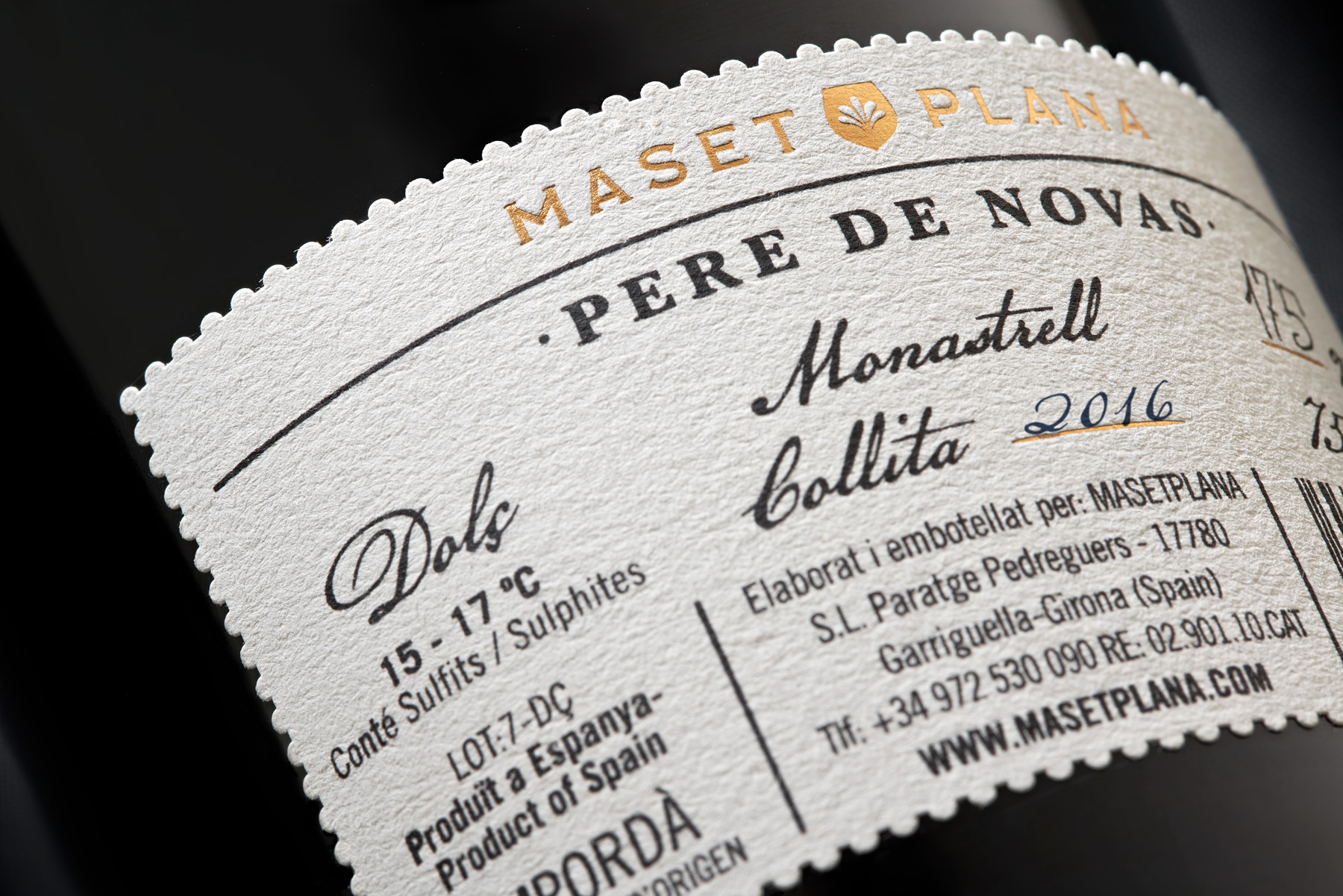
Design by Bulldog Studio.
First on our list is a standout project by Bulldog Studio, led by Carles, who have become a benchmark in Spain for creative and innovative wine label design.
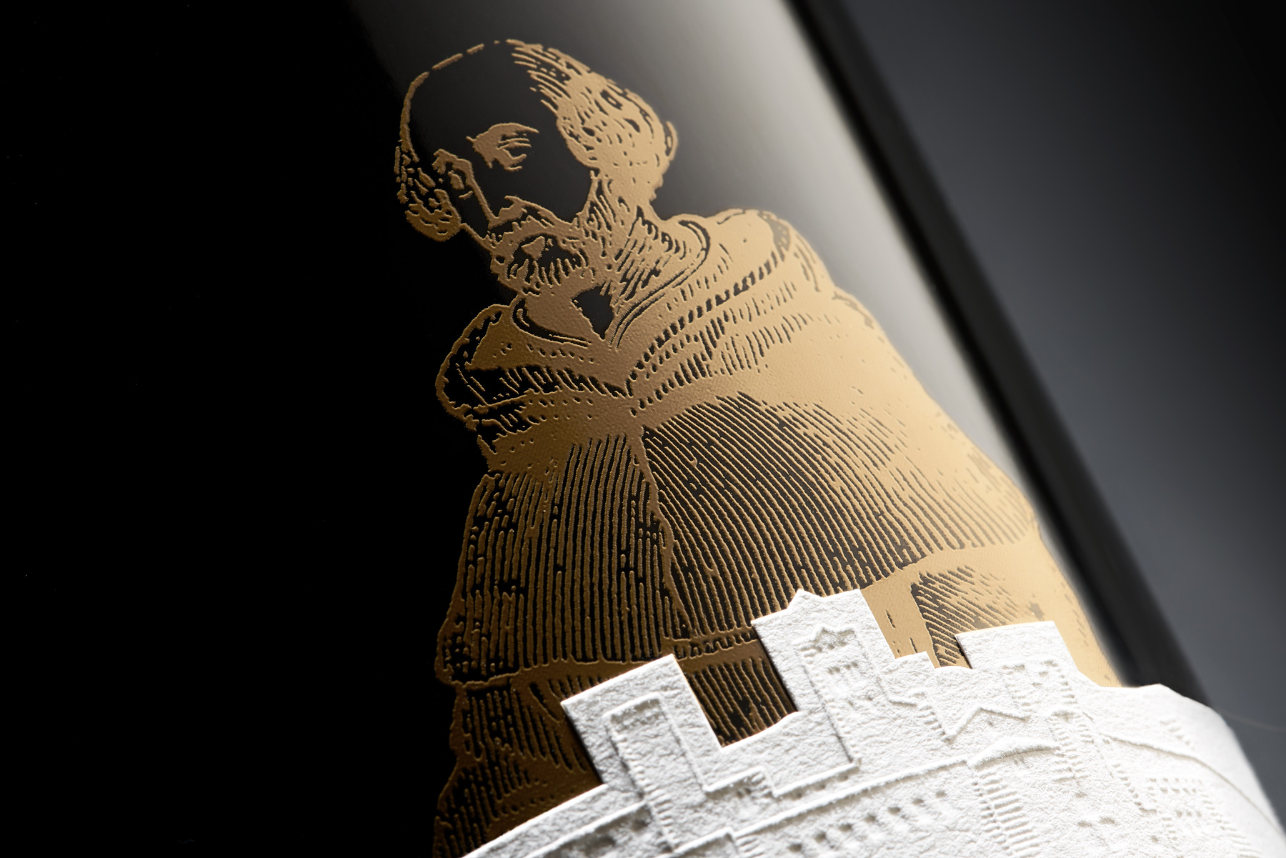
The label draws inspiration from the story behind the wine’s name. Centuries ago, during the Middle Ages, vineyards flourished around the abbeys and monasteries of Empordà. The Sant Pere de Rodes monastery was no exception, and it was here that the monk and winemaker Ramon Pere de Noves lived. Renowned for his mastery in the art of winemaking, he is credited with writing Catalonia’s first treatise on the subject—a truly remarkable legacy.
Building on this rich history, the label itself is a work of art: a unique choice of materials, layered textures, and the silhouette of the monastery set against a golden backdrop featuring the monk.
Taking a bold approach, the studio decided to forgo the capsule found on most modern wine bottles, replacing it with a classic cork in the style of “The Name of the Rose,” allowing you to see the cork through the glass and heightening the anticipation of the wine within.
To view the full project, click here.
Huellas del Tiétar
Design by Épica Branding & Packaging.
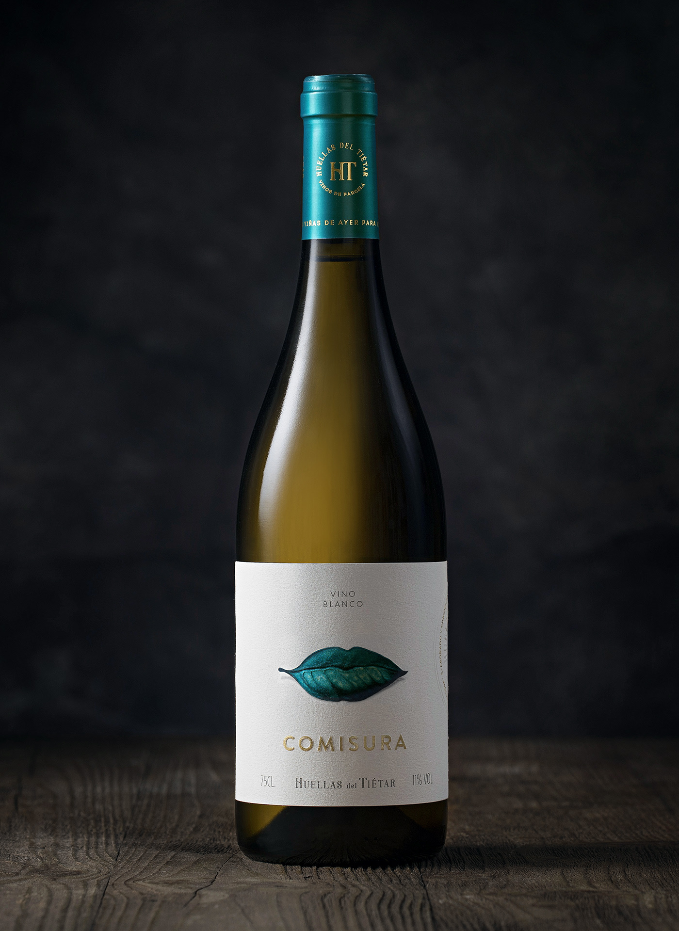
Next up is a design by Épica Branding & Packaging for Huellas de Tiétar, a winery dedicated to reviving old, abandoned vineyards in the Cebreros region.
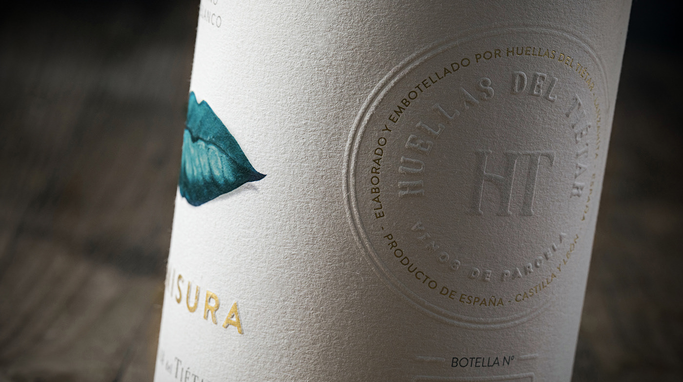
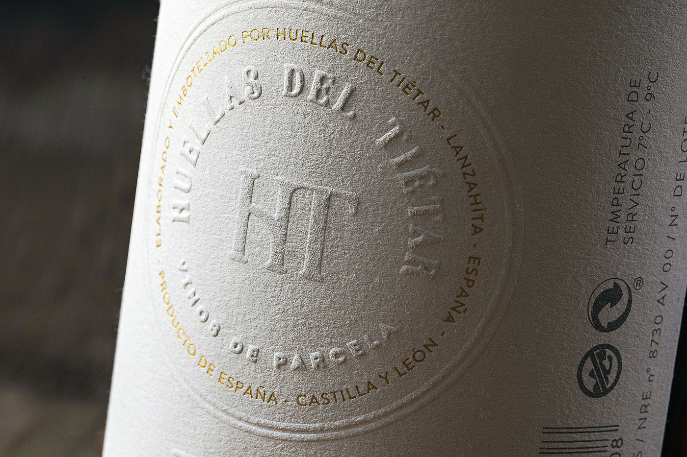
The essence of this label lies in the winery’s commitment to artisanal, hands-on production. The design reflects this with a warm, contemporary identity—featuring textured label paper and an illustration that sits somewhere between a grapevine leaf and a pair of deep purple lips, evoking the sensation of tasting the wine itself.
The word “COMISURA,” embossed on the label, adds an emotional touch—suggesting a smile, a sip, and a conversation.
Typography on both the front and back of the label alternates between embossing and debossing, with the latter highlighted in gold for an elegant, prestigious finish.
The bottle’s capsule is metallic, adorned with the winery’s crest and the label’s primary colors—blue and gold—creating a cohesive look from label to back label.
As the images show, every detail has been meticulously considered for a harmonious result.
To view the full project, click here.
Georgian wine “AKAURI”
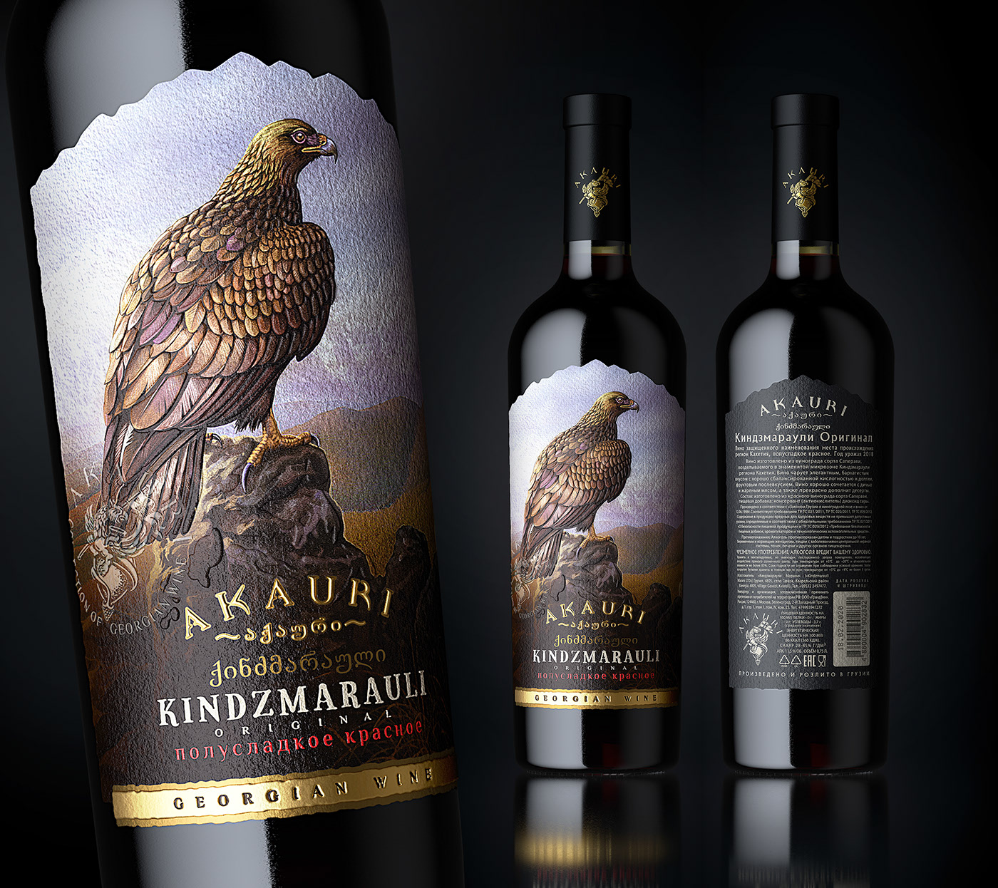
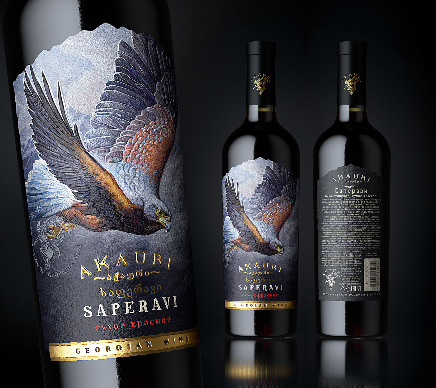
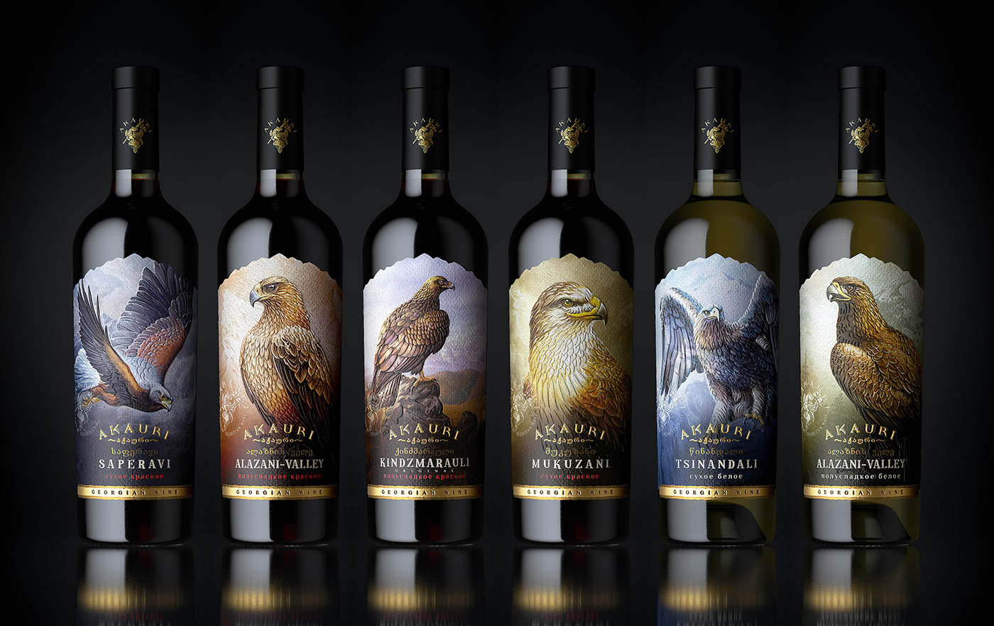
Design by Grand Buro & Maxim Kulikov.
This series of wine labels is a masterclass in meaningful, sophisticated design—eschewing minimalism in favor of rich detail and elegance.
Every element is thoughtfully integrated, resulting in a label that is a true work of art. The label’s shape evokes the silhouette of a hill or mountain, while each bottle is named after the specific region and grape variety it represents. The golden eagle, a central motif, deserves special mention.
Originating from Georgia—one of the world’s oldest wine-producing regions—this label draws on the heritage of the ancient Kingdom of Trebizond, incorporating the eagle from its coat of arms. The eagle symbolizes the elegance and strength of an empire, and by extension, the storied history of these wineries.
The classic typography, textured label, and gold accents all contribute to a majestic, regal feel.
Completing the look, the capsule is metallic black with a gold crest, adding a final touch of distinction.
This is one of the finest examples of classic wine label design we’ve seen in years.
To view the full project, click here.
Anima Mundi – Cantina dei Colli Ripani
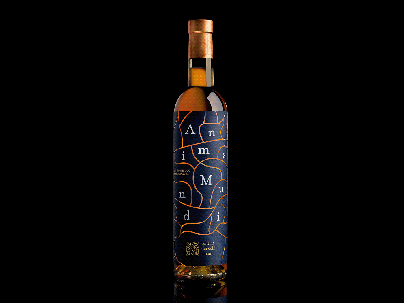
Design by Andrea Castelletti.
In stark contrast to the previous entry, Andrea Castelletti’s design for Cantina Dei Colli Ripani breaks all the conventional rules. The result is a deliberately chaotic label that challenges readability, playing with psychological theories and design principles to create something truly unforgettable.
Noteworthy features include textured printing with debossed metallic finishes, a gold capsule matching the bottle and the topographic lines that represent the vineyard’s varied terrain.
A bold, daring concept that earns its place among the best wine label designs.
To view the full project, click here.
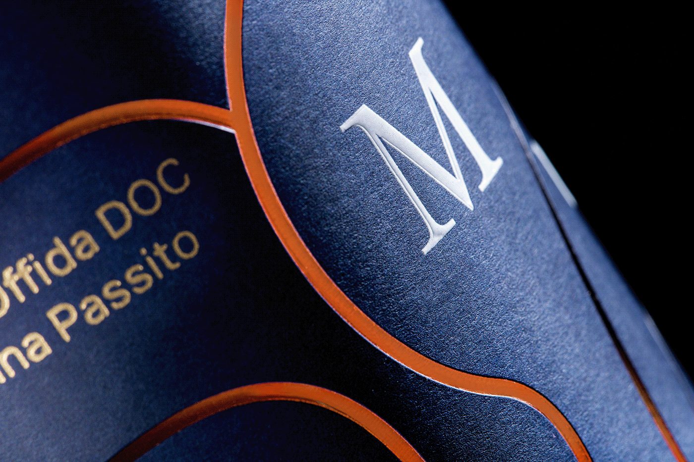
Amarone Wine Label
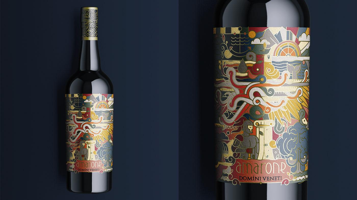
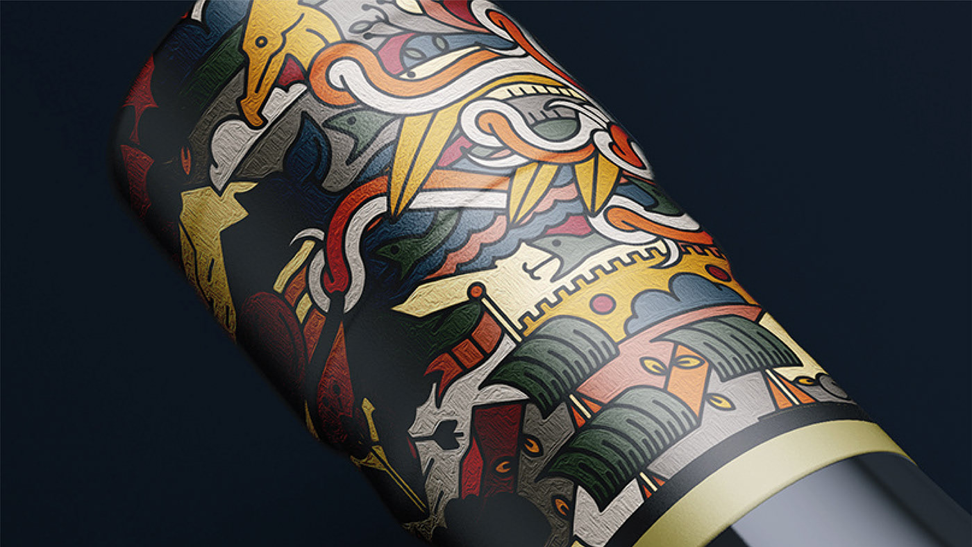
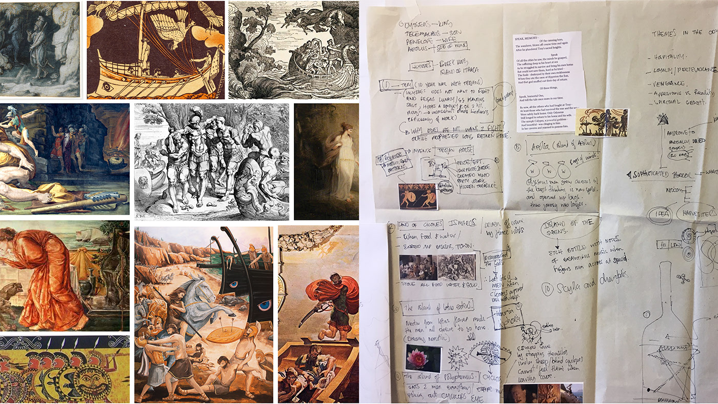
Design by Maciek Michalski.
This is one of my personal favorites, seamlessly blending avant-garde style with classic inspiration—and here’s why.
The label is inspired by the legendary journey of Ulysses, who spent ten years returning to Ithaca after the Trojan War, as recounted in Homer’s Odyssey.
The design channels this mythology, allowing you to relive those epic adventures as you enjoy the wine.
The label is produced with glossy, enamel-like ink, and the bottle is finished with a metallic capsule featuring the label’s signature gold motifs.
A true marvel—sip by sip, you can become a hero of legend.
To view the full project, click here.
Saints & Sinners
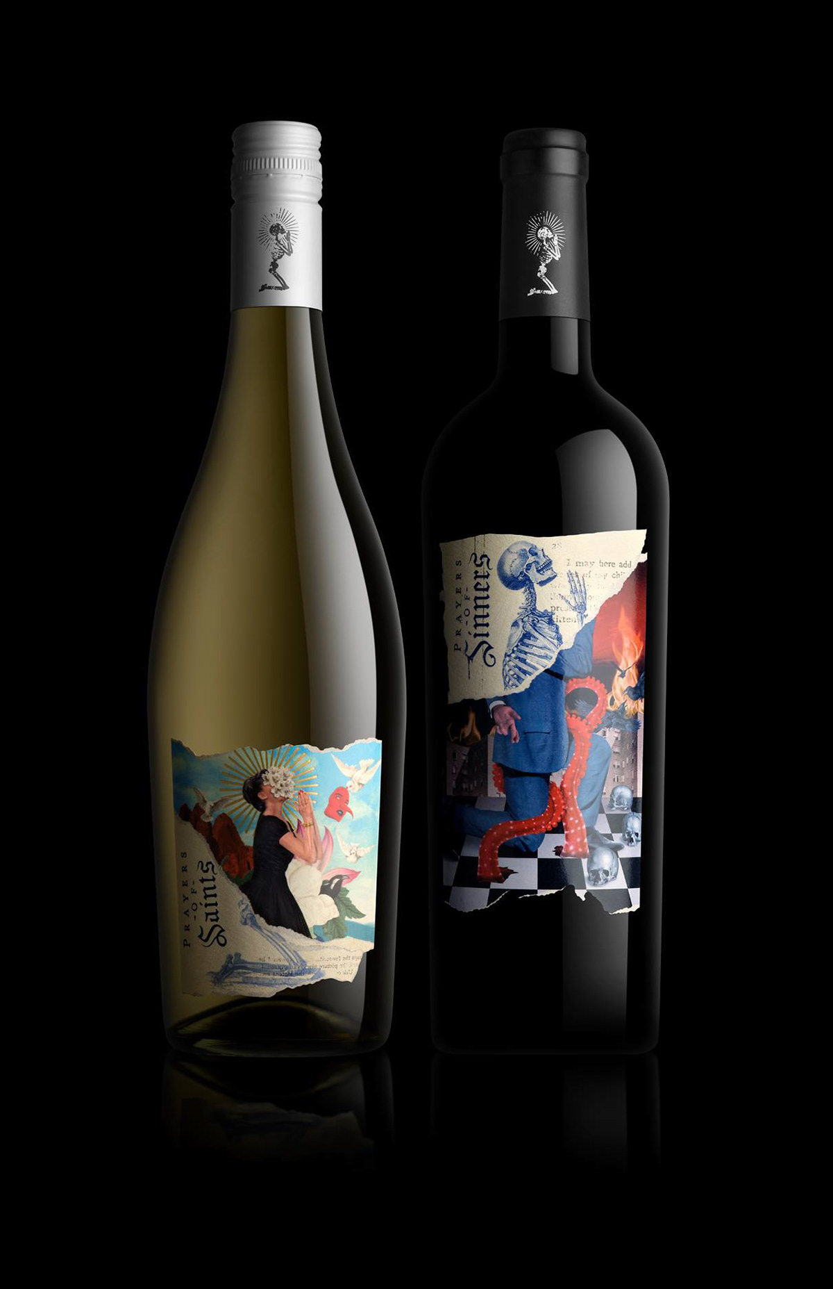
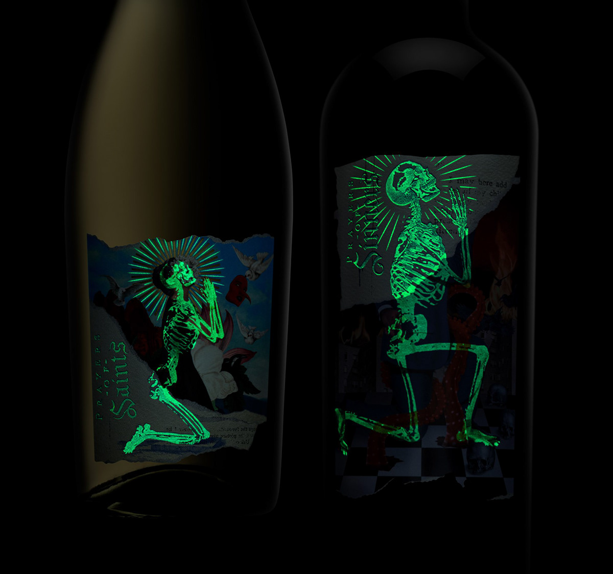
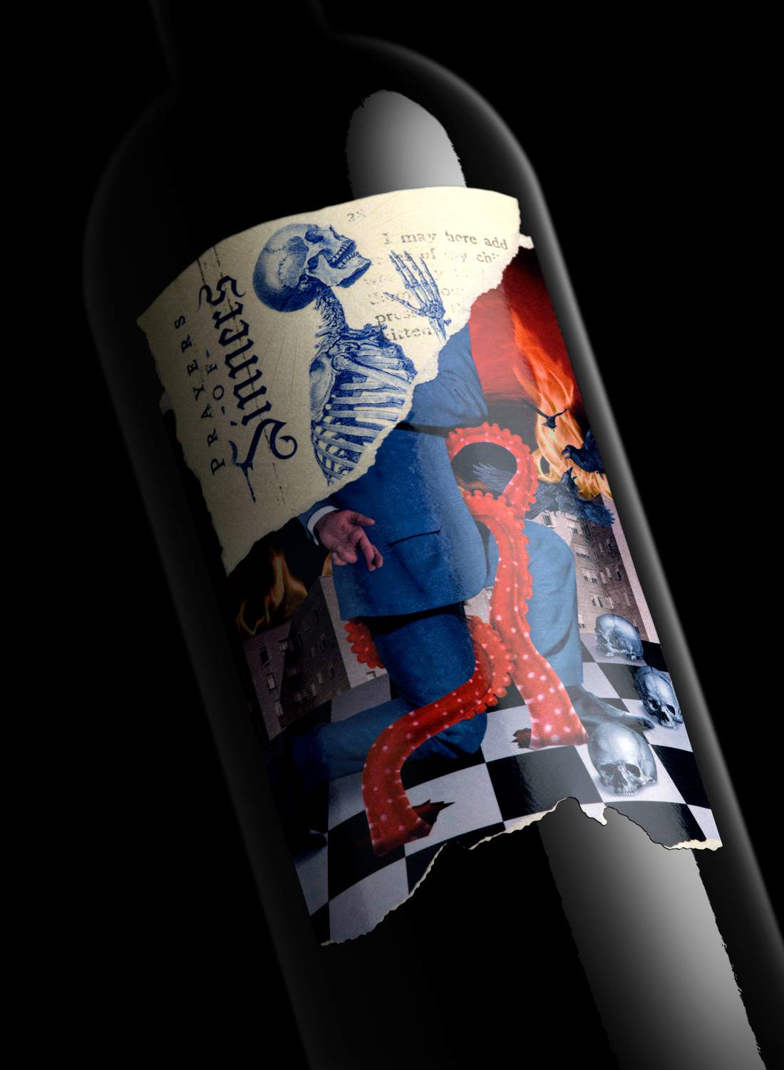
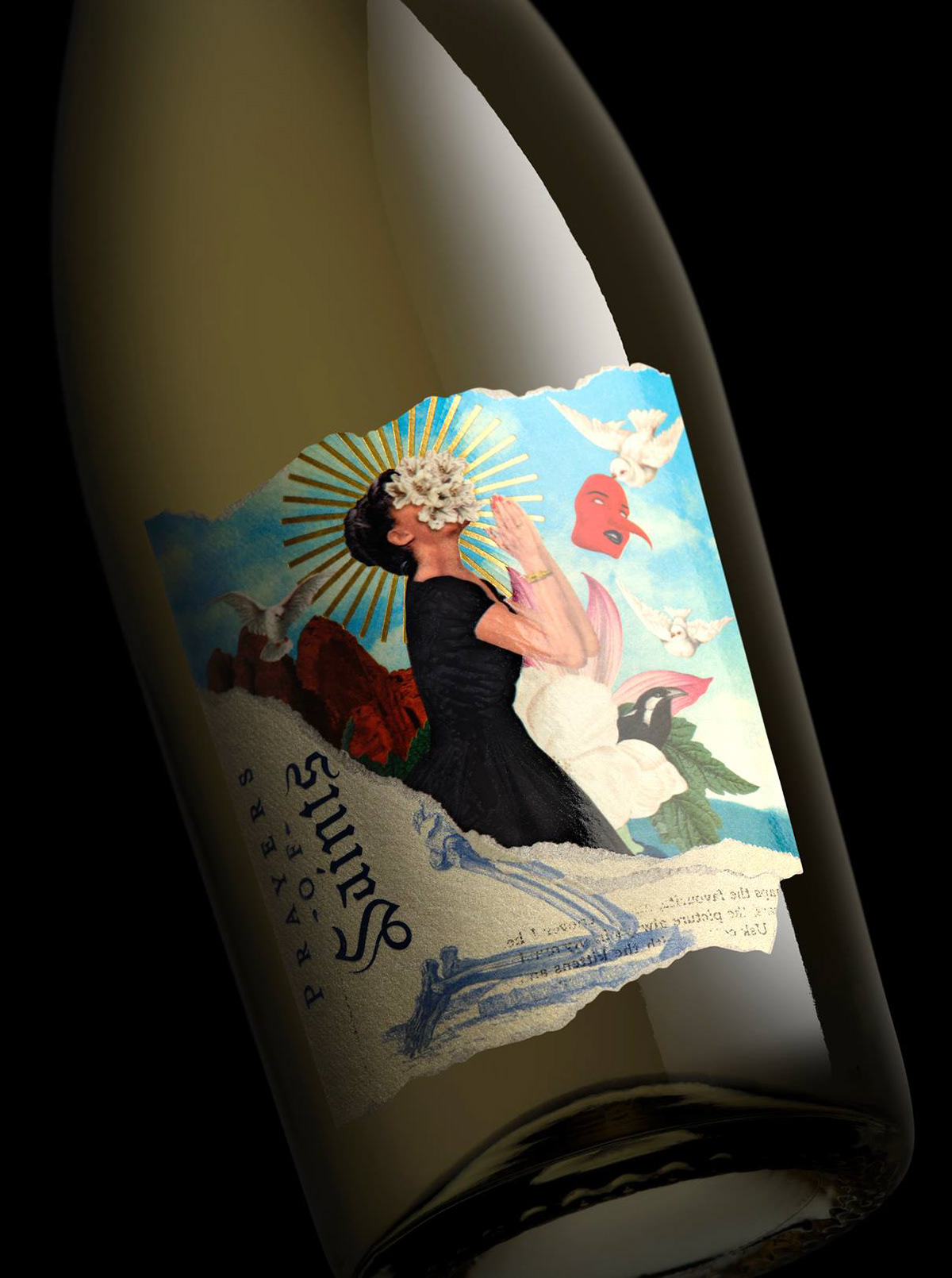
Design by Randy Mora.
This design has truly stolen my heart—it’s the boldest, most rebellious, and contemporary label I’ve seen in a long time.
Capturing the duality present in every aspect of life, the “Saints & Sinners” bottle features an illustration that completely takes over the label, making it the star of the show.
It’s a modern design with a vintage twist, printed with special ink that reveals hidden skeletons when the lights go out. That alone makes you want to get your hands on one of these unique bottles and see for yourself what happens when you take a sip in the dark—will you become a saint or a sinner?
To view the full project, click here.
Le Rose Bleu
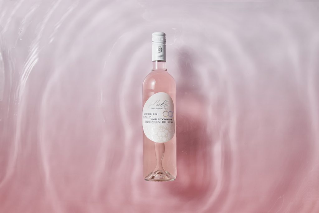
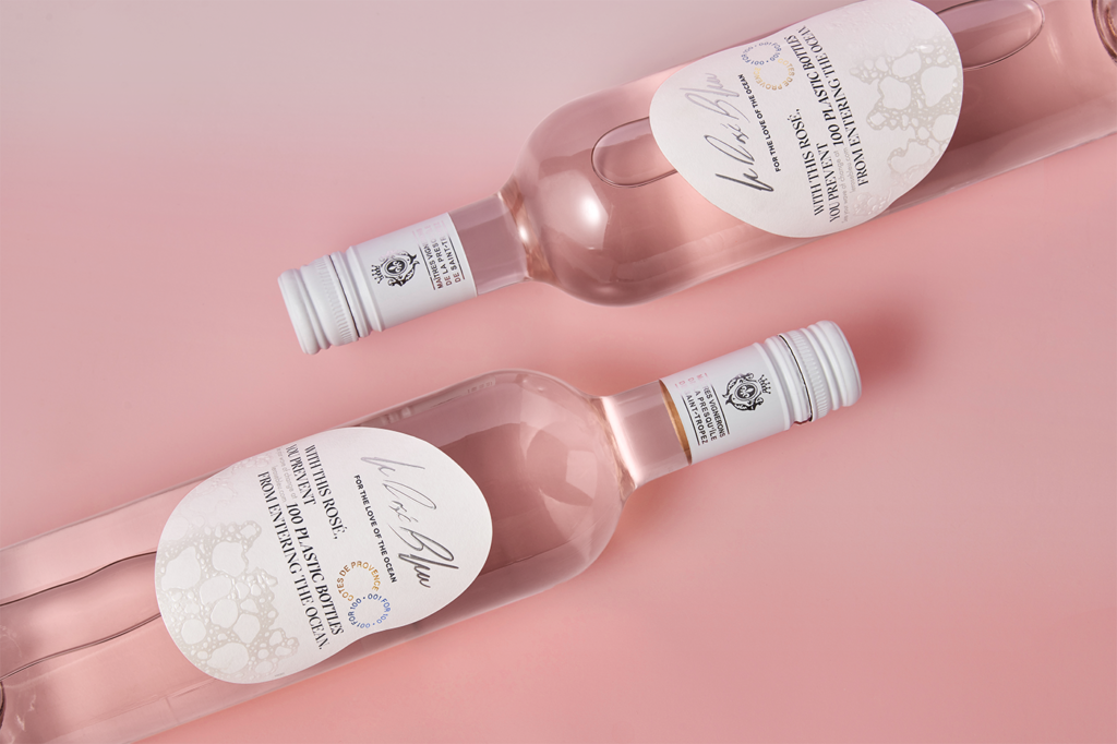
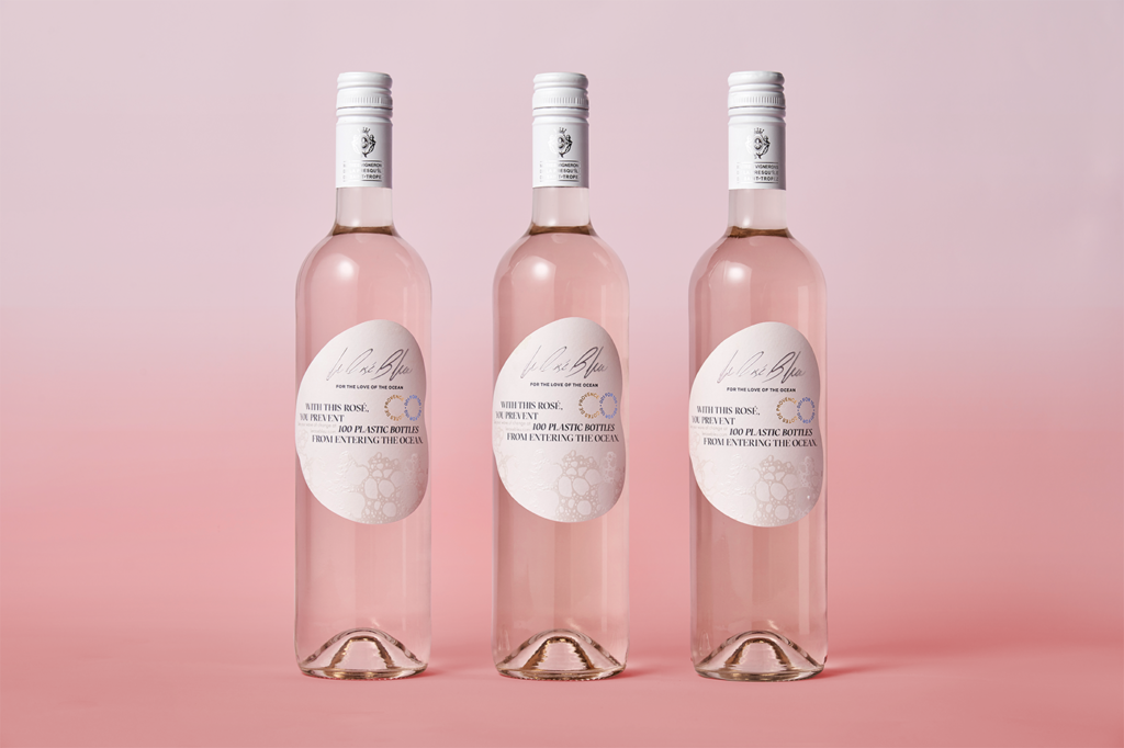
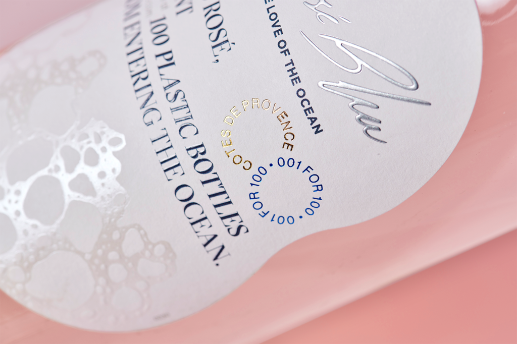
Design by Anagrama Studio.
This rosé wine label is entirely inspired by the need to protect our oceans and environment. The design is delicate and elegant, with clear references to the sea—bubbles, color palette, and even the shape of the label itself.
What’s especially interesting is how the bottle becomes a personal object, featuring a handwritten signature from the winery and individual bottle numbers.
To view the full project, click here.
Viña Enebro Natural Wine
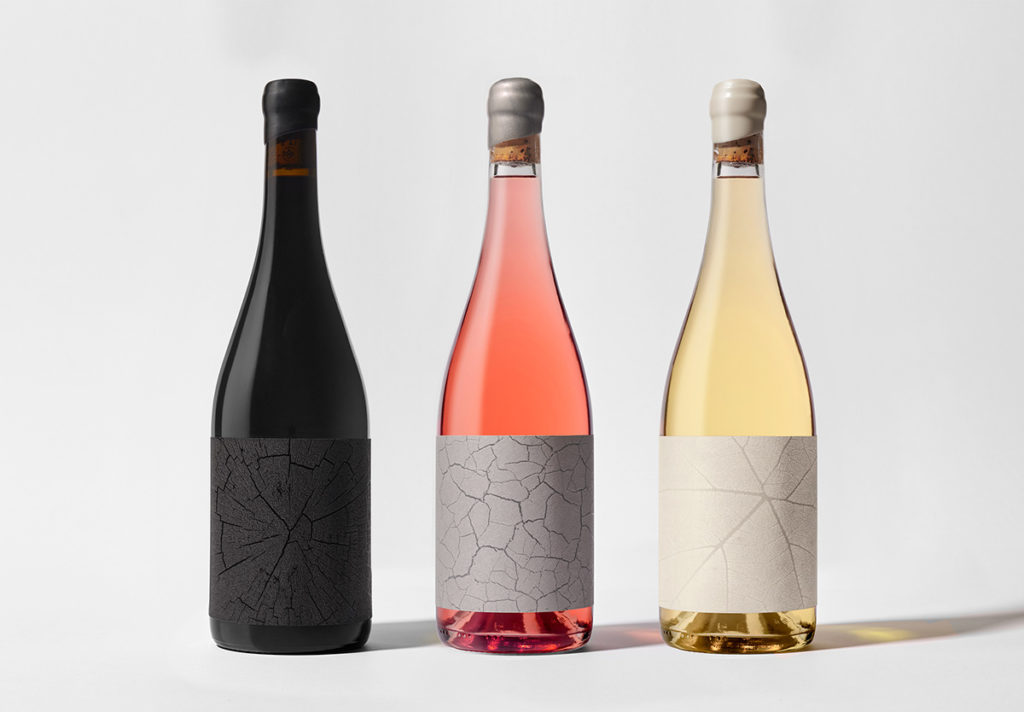
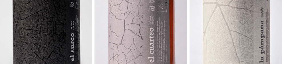
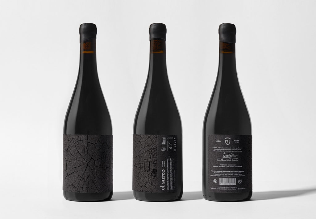
Design by Estudio Maba.
The final entry in our list is a minimalist design that, despite its understated approach, stands out for perfectly capturing the winery’s philosophy.
This small winery isn’t trying to compete with the big brands; it’s a personal project, and that authenticity shines through in the label.
As a counterpoint, the design boldly features a traditional, custom capsule.
The result is strikingly minimalist, elegant, and refined—highlighting three elements that define the magic of winemaking: the earth, the vine’s wood, and the vine leaf, all transformed into the liquid that is the heart of every bottle featured in this article—wine itself.
To view the full project, click here.