How Clemenger BBDO Transformed a Traditional Jeweller into a Contemporary, Accessible Luxury Brand
In today’s world of graphic design and visual identity, few projects capture the evolution of luxury branding as clearly as the new look for Michael Hill Jewellers.
The work by Clemenger BBDO not only revitalizes a brand with over forty years of history, but also redefines how a company can reconnect with its roots and look to the future through an elegant, modern, and deeply emotional visual language.
From Mainstream Brand to Icon of Sophistication
Founded in 1979 in Whangārei, New Zealand, Michael Hill was long associated with accessibility and scale. However, decades of discount-driven strategies and promotional campaigns had eroded its symbolic value.
Clemenger BBDO faced a major challenge: to transform a jeweller perceived as “budget” into an aspirational brand that embodies craftsmanship, authenticity, and heritage.
Their answer was a comprehensive rebranding operation that combined strategy, graphic design, and brand experience.
The goal: to restore romance and emotion to the jewellery category, moving away from a purely commercial approach to embrace a narrative of purposeful luxury.
The project spanned everything from visual identity and logo to the redesign of physical stores, packaging, and digital communications.
Rediscovering the Brand Story
The new narrative is rooted in a powerful idea: returning to origins.
Before becoming an international chain, Michael and Christine Hill were independent jewellers driven by a passion for their craft.
That foundation, long overshadowed by years of promotions and discounts, became the starting point for the new positioning.

The concept of “The Jewellers” distills this essence: a brand that honors its heritage without sacrificing modernity.
The design is anchored in values such as material honesty, functional elegance, and attention to detail—hallmarks of contemporary graphic design that communicates without excess.
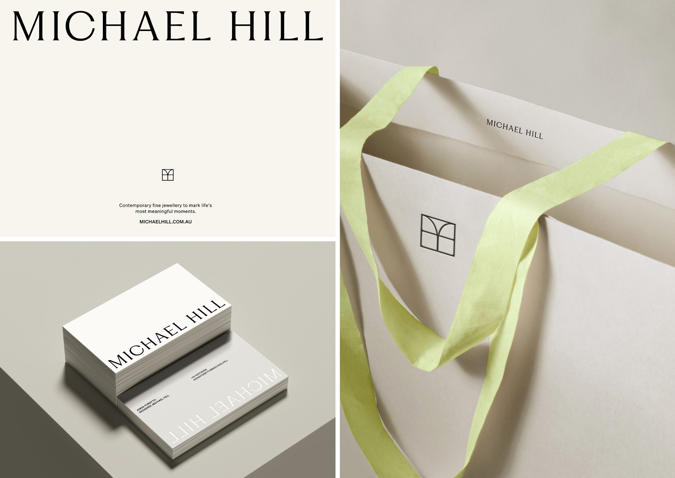
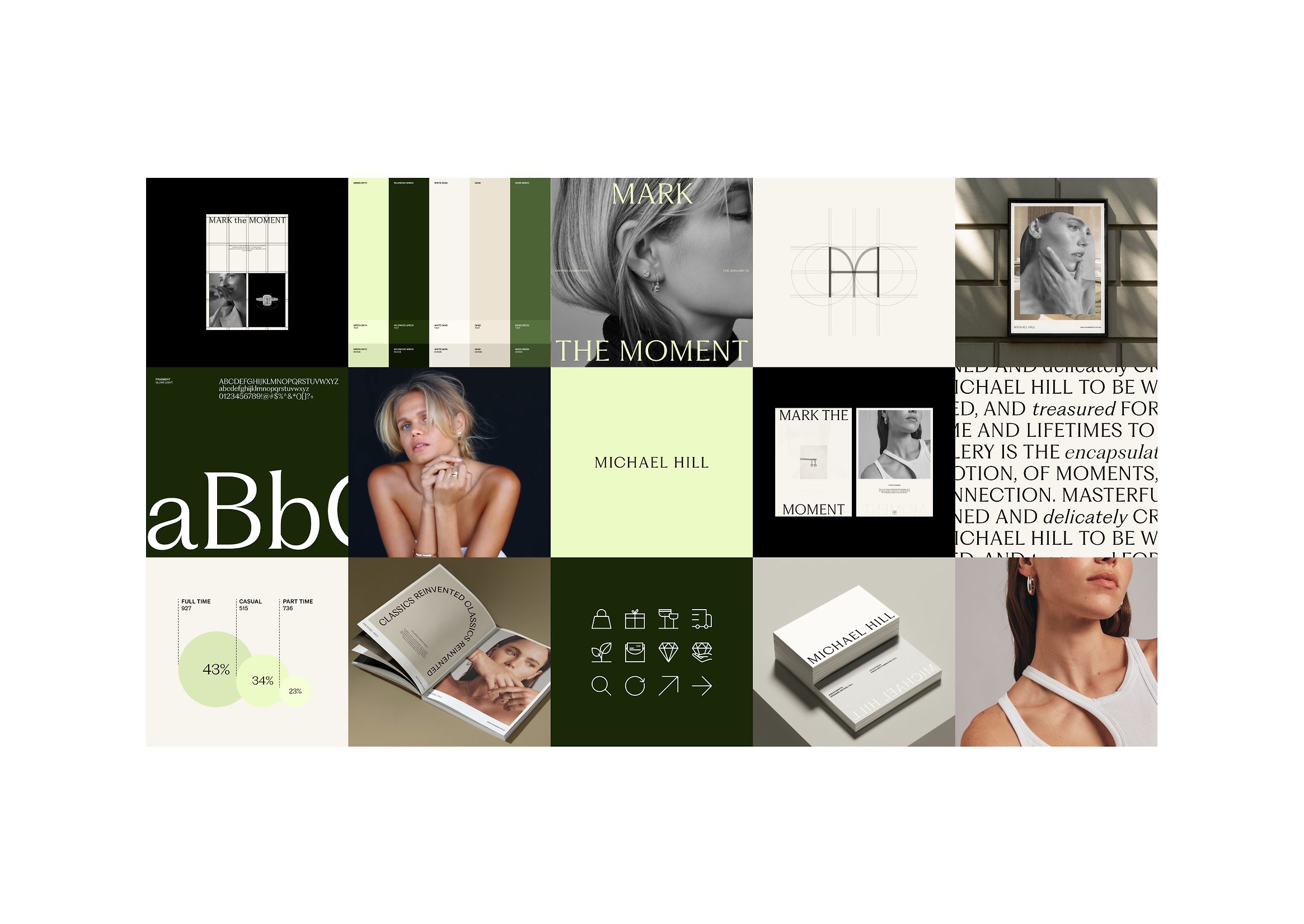
A Refined and Cohesive Visual Identity
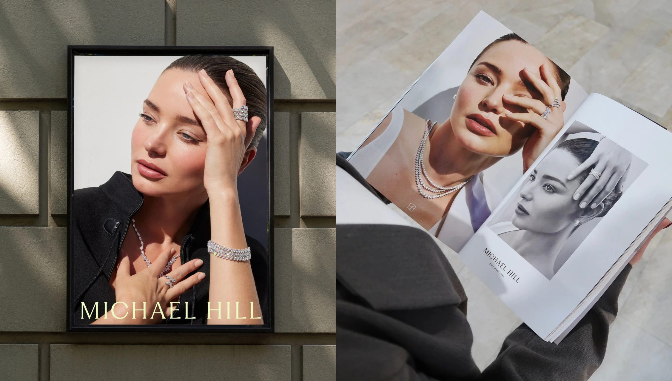
The new logo preserves the recognizable heritage of Michael Hill, but refines it with cleaner lines and balanced proportions.
The result is a lighter, more confident, and sophisticated visual identity that remains true to its legacy.
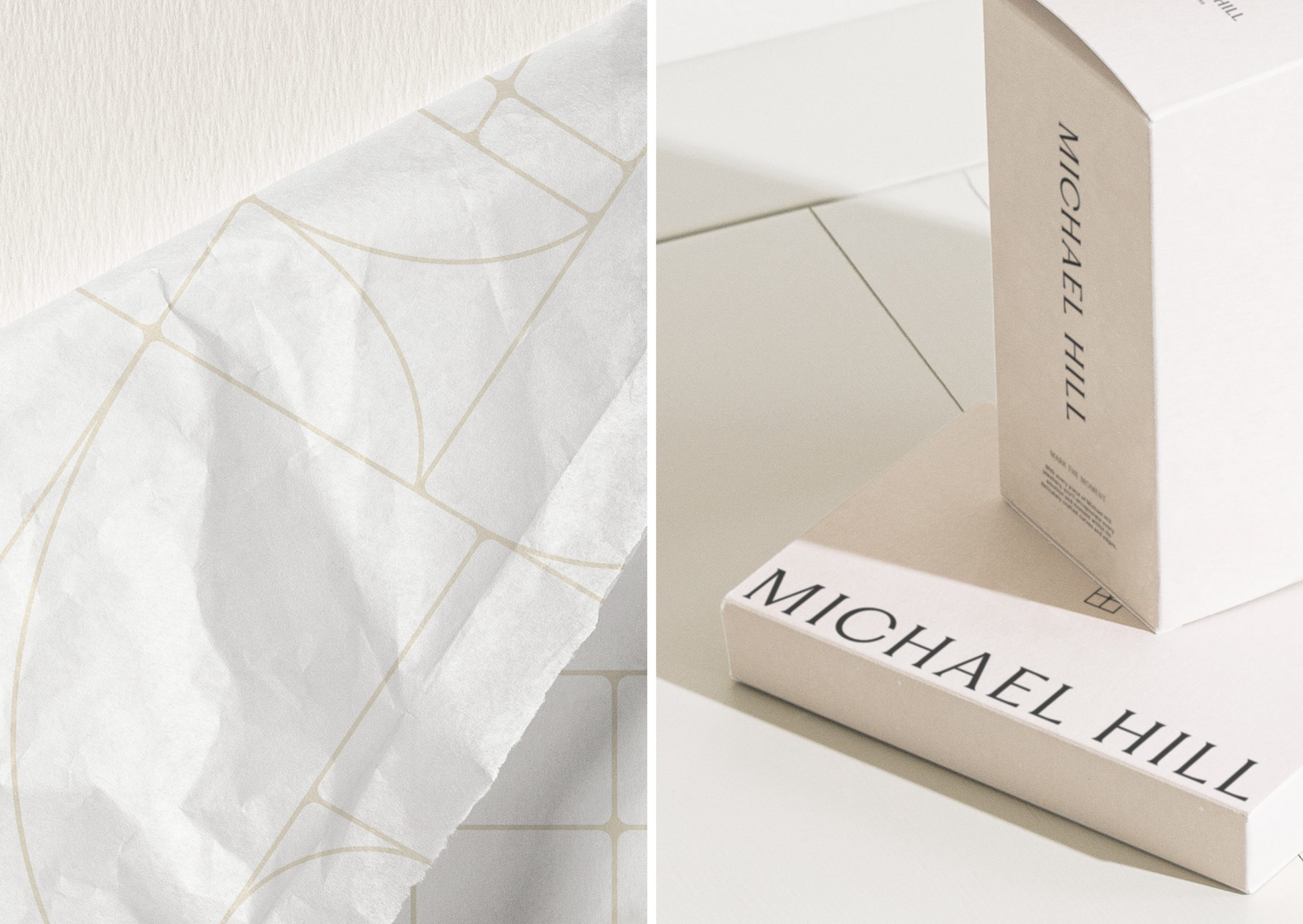
Neutral tones—ivory, silver, pale pink, and charcoal black—evoke understated luxury, where elegance is quietly confident.
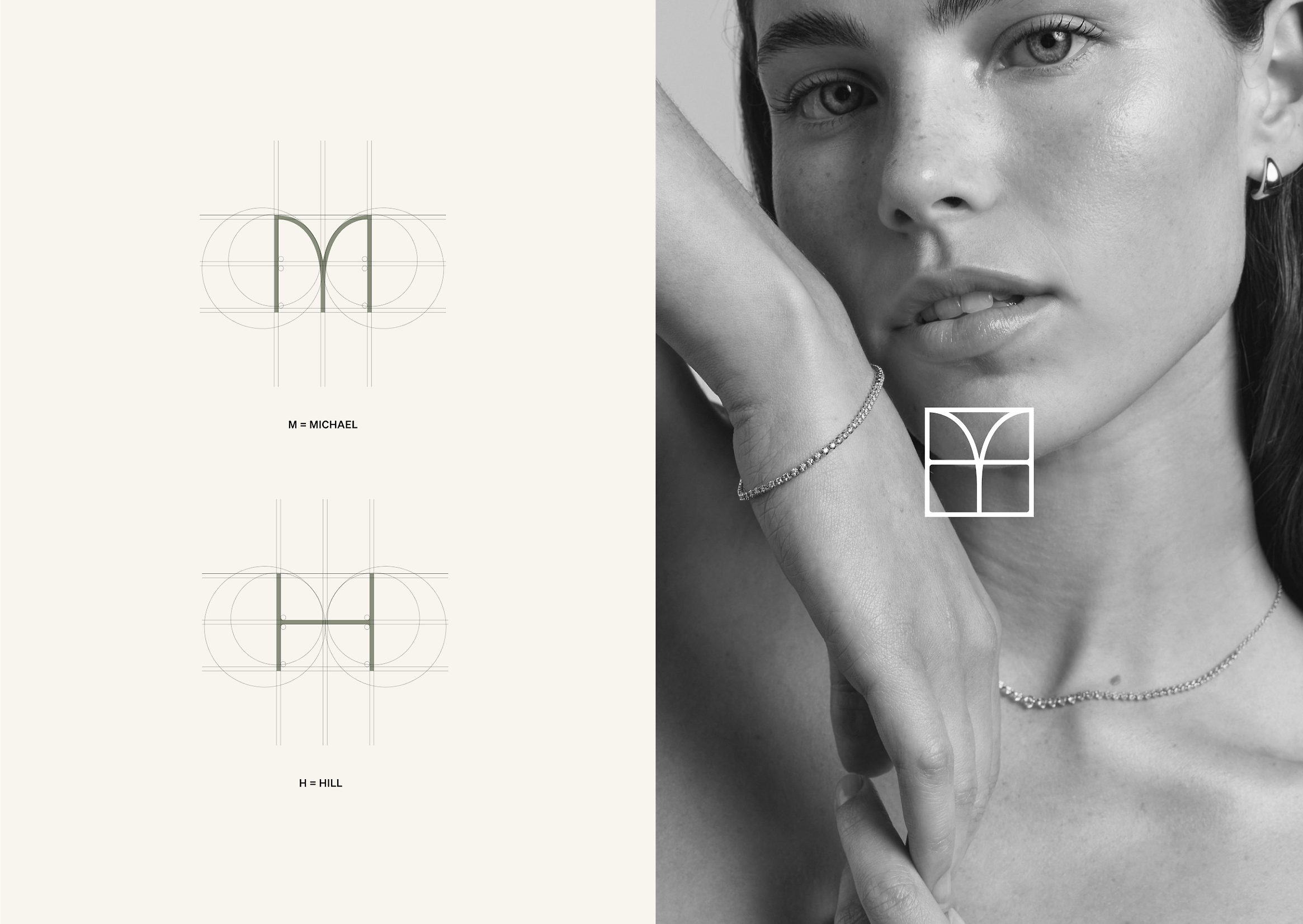
A custom typeface plays a central role in the coherence of the visual system.
Its design balances geometry and warmth—a nod to the precision of the jeweller’s craft and the humanity of the brand.
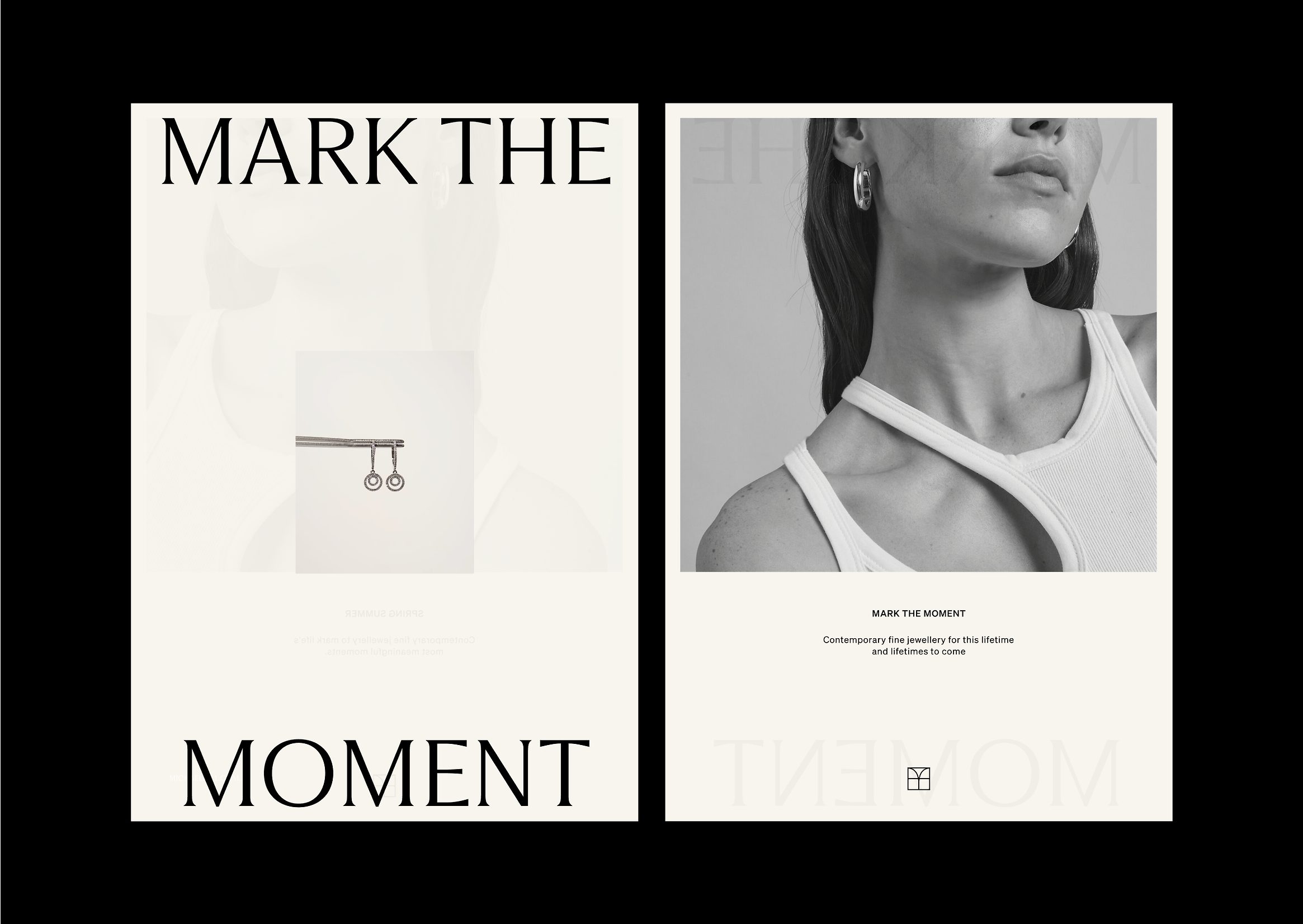
The art direction, featuring Miranda Kerr, amplifies the emotional impact of the rebrand: natural light, soft textures, and an editorial tone that elevates Michael Hill from retail to the world of fashion visual design.
Graphic Design Beyond the Logo
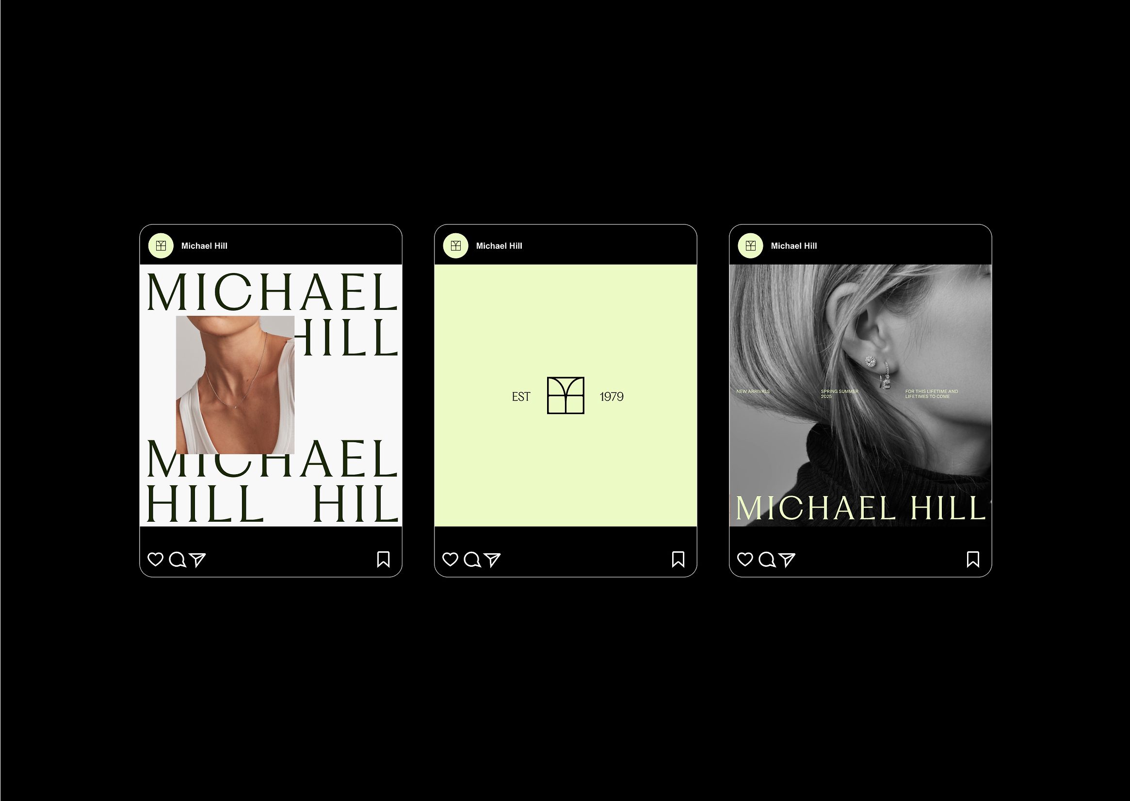
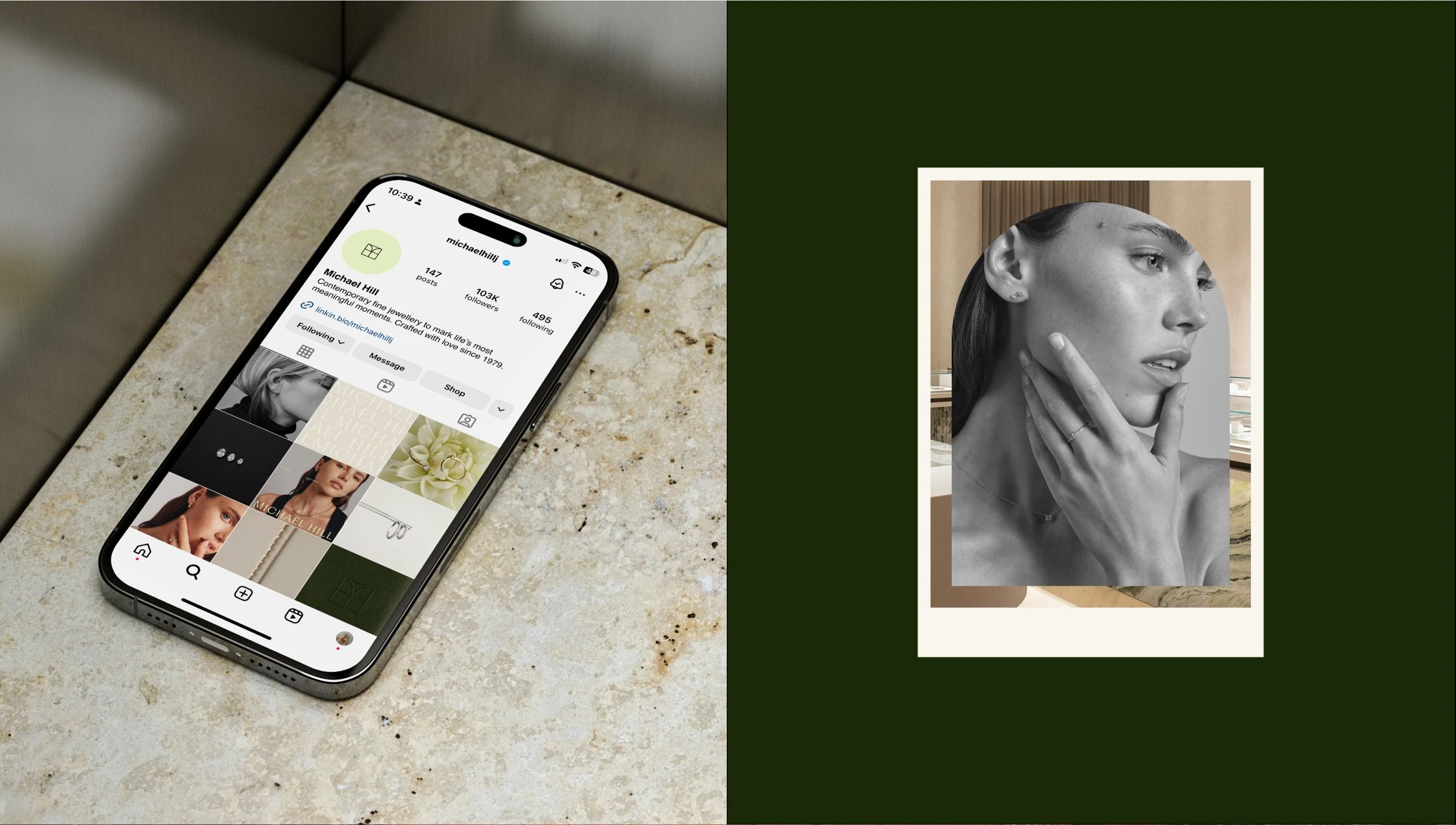
Beyond the brandmark, Clemenger BBDO developed a comprehensive visual system that adapts to every touchpoint: from packaging to window displays, the website, and in-store signage.
This new identity is not just an aesthetic update, but a visual architecture that shapes the user experience around a central narrative: the jewel as a symbol of connection and memory.
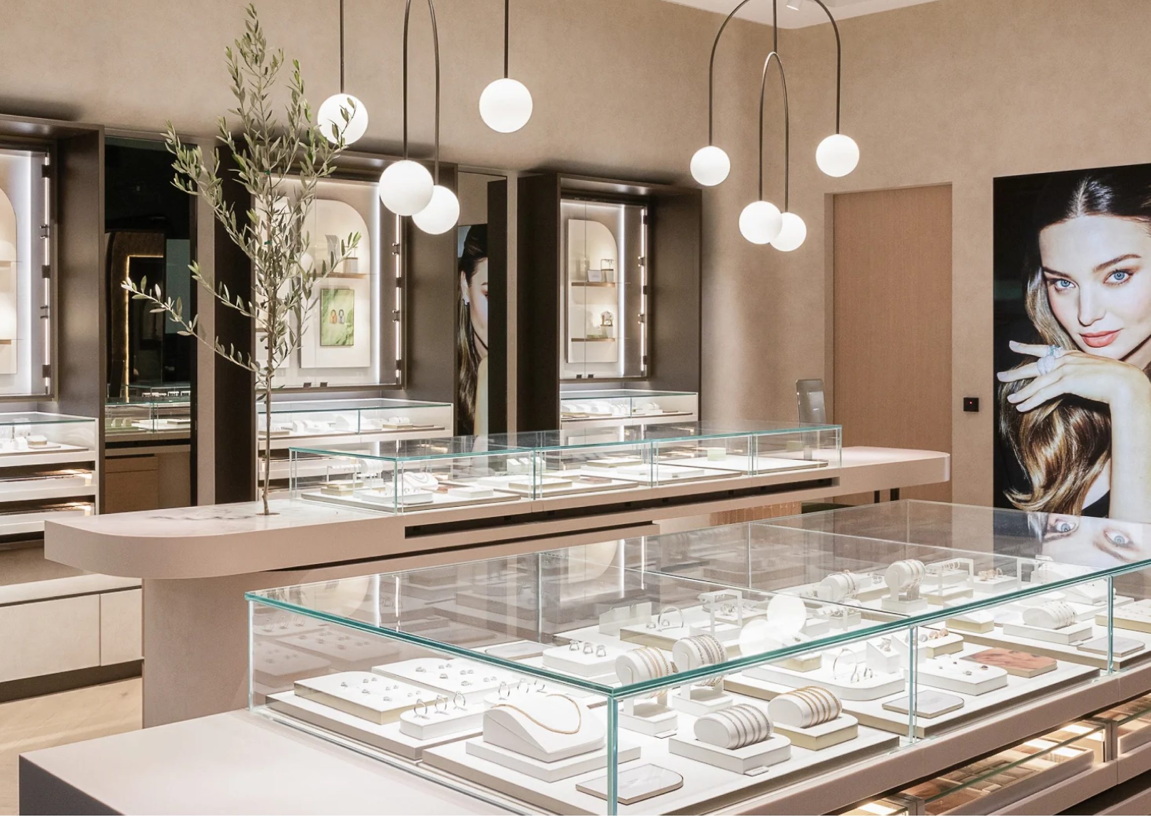
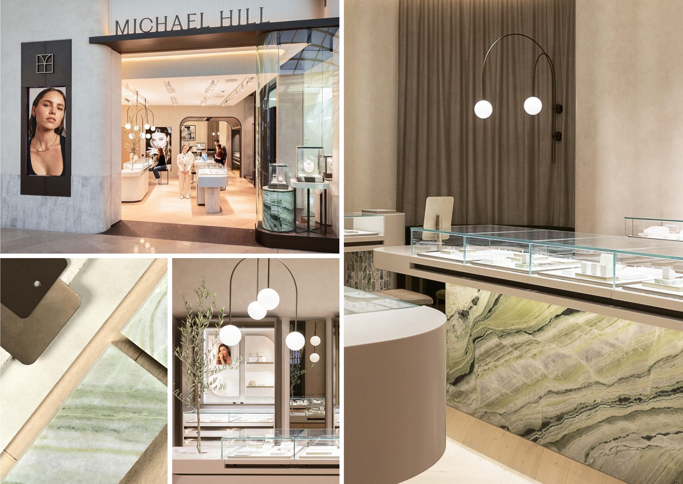
In-store, the interior design adopts a restrained, warm material language: marble surfaces, polished metals, and enveloping lighting.
Everything is designed to spotlight the product, turning the space into an extension of the brand.
The experience design (UX) is seamlessly integrated into the physical environment, just as it is in digital channels.
The Digital Redesign: Luxury UX and Clarity
Michael Hill’s website embodies the same visual philosophy: clean navigation, legible typography, strategic use of white space, and a clear information hierarchy.
Every element is guided by a minimalist UX design approach that prioritizes experience over embellishment.
Interactive elements are subtle, color contrasts are gentle, and animations are used sparingly—reinforcing the perception of a premium graphic design brand.
The purchase journey was also refined to convey a sense of exclusivity: every step of the online process feels like a ritual, not just a transaction.
This attention to detail is what sets a simple redesign apart from a well-executed strategic repositioning.
Photography and Storytelling: The Soul of the Rebrand
The photographic direction, with a palette dominated by warm tones and emotion-driven compositions, reinforces the narrative of a brand that is human, approachable, and feminine.
The images do more than sell jewellery—they build aspiration, trust, and a sense of belonging.

The visual storytelling centers on the idea of “a new era.”
Every image, headline, and texture signals renewal—without breaking the thread of history.
This blend of tradition and modernity is what makes the project work not just as communication, but as a statement of purpose.
Results and Recognition
The project earned multiple international awards for graphic design and branding, including:
- Gold – Large Brand Identity at the Best Design Awards 2025 (New Zealand)
- Distinction and Merit at the AGDA Awards (Australia)
- Gold at BADC Design for brand identity
Beyond accolades, the brand transformation delivered tangible results:
Michael Hill regained market share and, most importantly, prestige.
The public stopped associating the brand with discounts and began to see it as a symbol of quality, sensitivity, and design.

Conclusion: Graphic Design as a Tool for Transformation
The Michael Hill rebrand proves that contemporary graphic design can be a powerful tool for transformation—capable of shifting perceptions, revitalizing businesses, and forging emotional connections with new audiences.
Clemenger BBDO didn’t just redesign a logo: they reimagined a story, a relationship, and a future.
In a landscape where many brands compete for instant attention, Michael Hill has chosen a different path: consistency, emotion, and purpose.
That’s what makes it one of the most significant graphic design projects of 2026—a benchmark that inspires both design studios and brands seeking to evolve without losing their essence.
At Code Barcelona, we highlight this work as a prime example of how strategic branding and intelligent visual design can usher in a new era for brands bold enough to look back in order to move forward.