A symbol born from design that united a nation: the digital campaign “Together for Te Tiriti” transforms visual identity into an act of resistance, unity, and hope.
Some designs go beyond aesthetics. They transcend form to become something deeper: a collective voice. Together for Te Tiriti, the campaign created by Extended Whānau for ActionStation Aotearoa, is a powerful example of how design can serve as a political, cultural, and emotional statement. Winner of the Social Good Award 2025 at New Zealand’s Best Design Awards, this project proves that a symbol can bring an entire country together around a shared idea: defending Aotearoa’s founding treaty, Te Tiriti o Waitangi.
Context: design with a social purpose
The project emerged during a period of political tension. The introduction of the Treaty Principles Bill reopened old wounds and threatened to disrupt the balance between Māori and the State. In this context, ActionStation Aotearoa sought a visual way to defend the spirit of Te Tiriti—one that spoke of unity and mutual respect.
The challenge was clear: how do you turn a historic cause into an emotional language that resonates with everyone?
From the outset, the Extended Whānau team knew this was about more than just creating another logo. It was about building a visual language that conveyed belonging, history, and resilience. The key was to translate ancestral values into simple yet deeply meaningful forms.
Inspiration: the power of the hongi
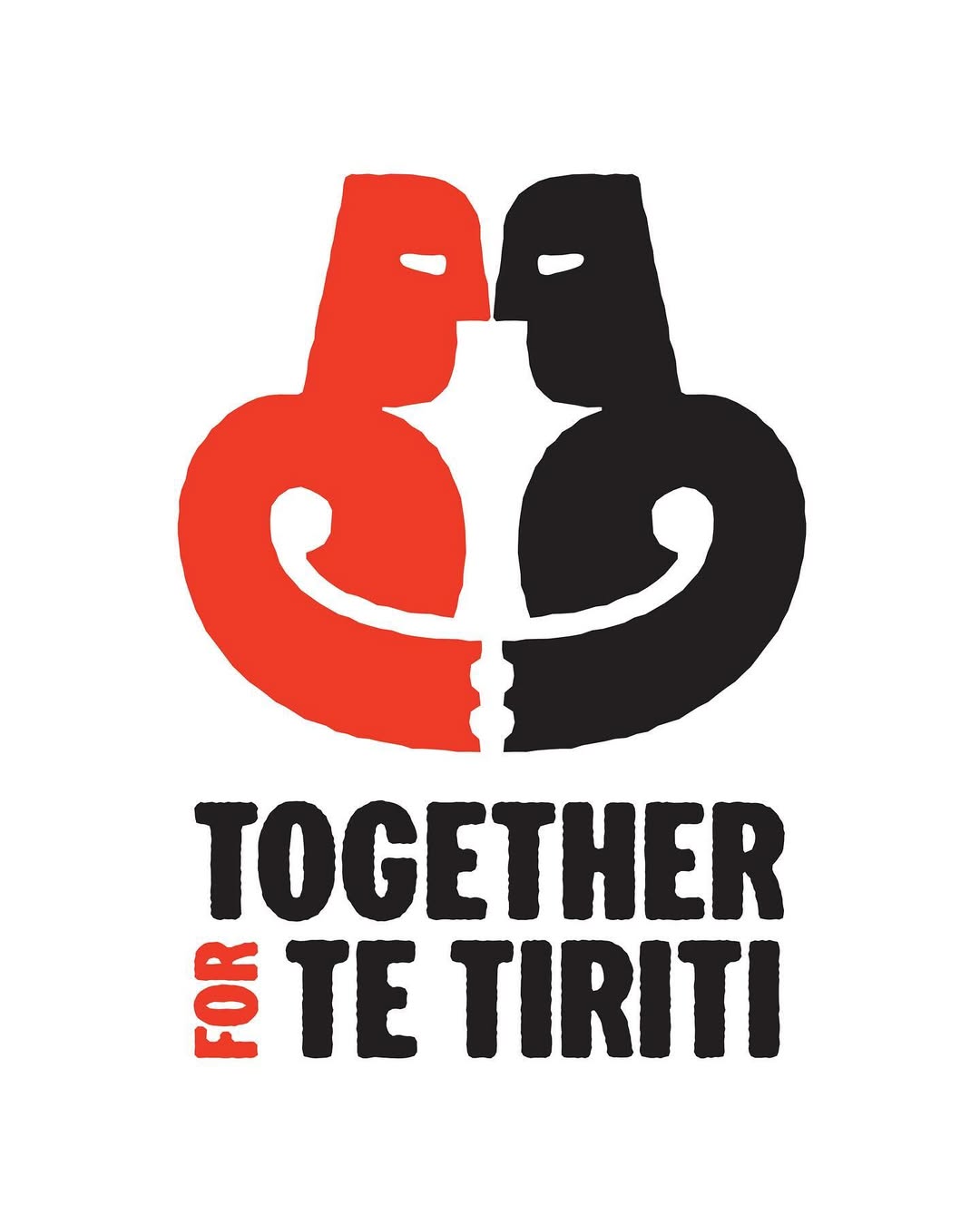
The starting point was the hongi, a central gesture in Māori culture. More than a greeting, it’s an encounter where two people share breath, acknowledging one another. According to tradition, the first hongi took place when Tāne breathed life into Hineahuone. Since then, it has symbolized unity, balance, and shared life.
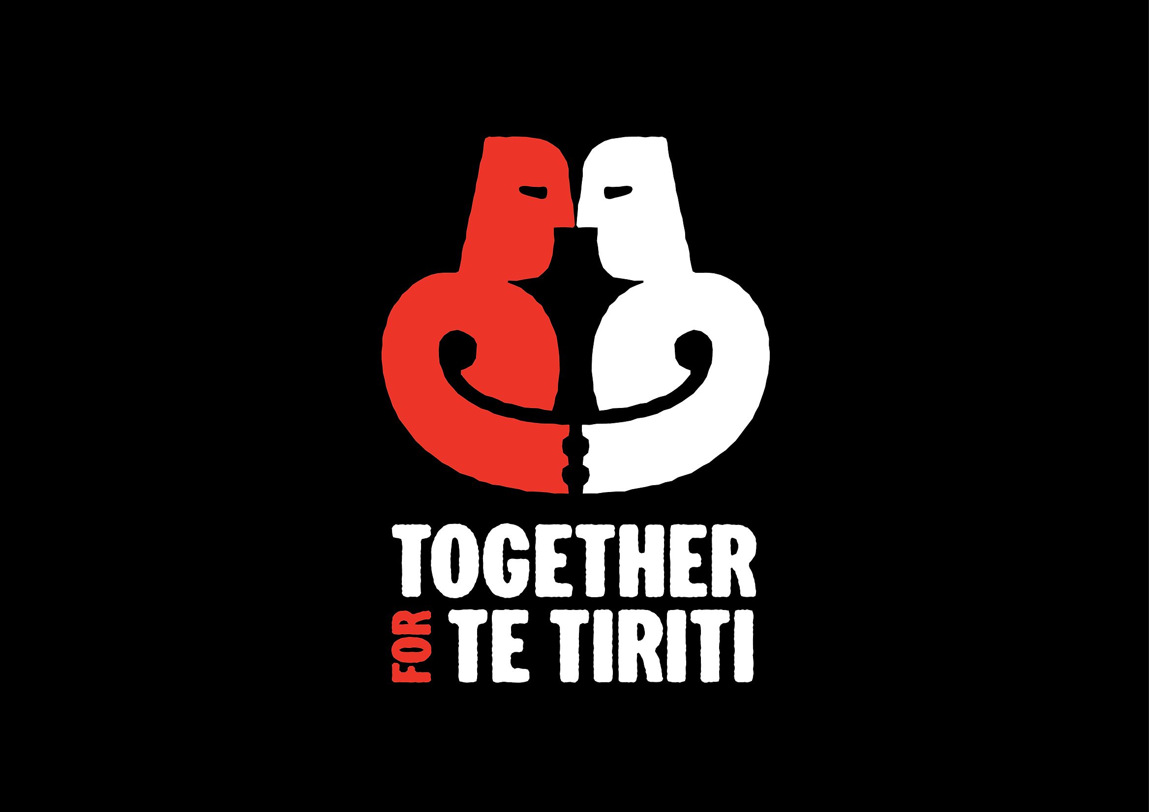
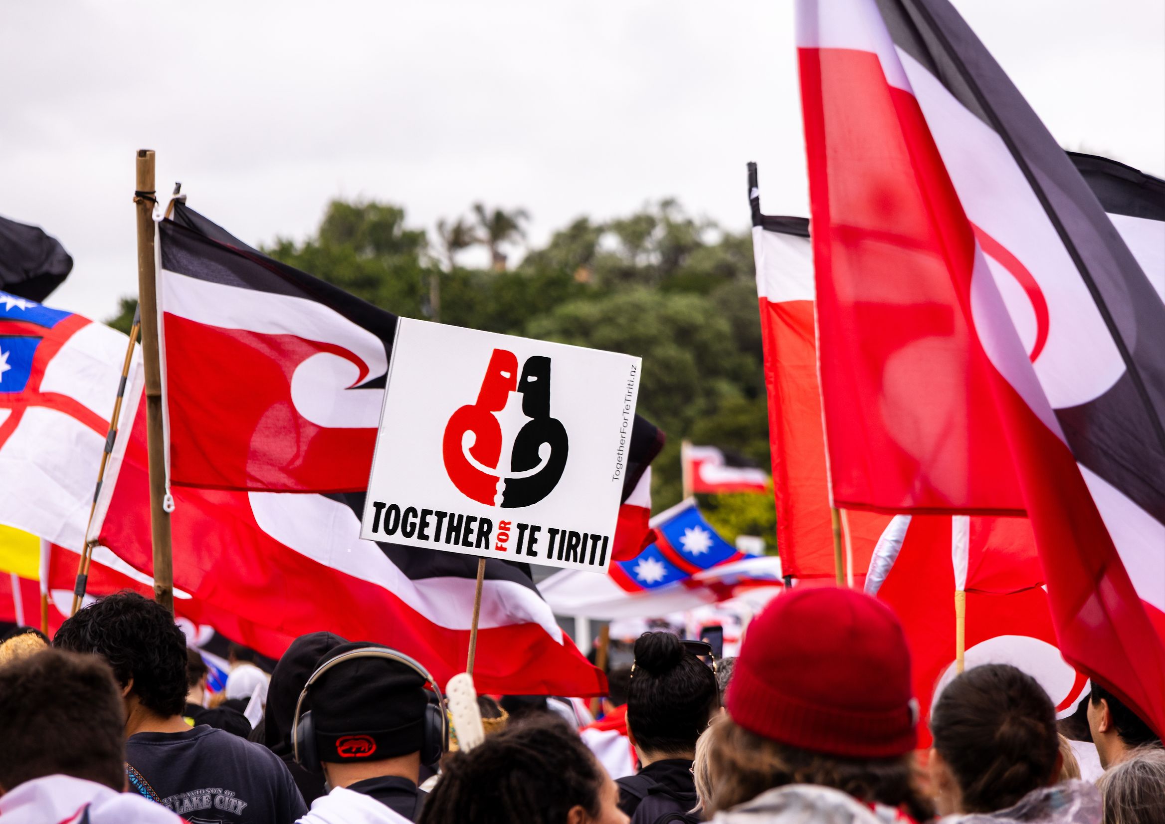
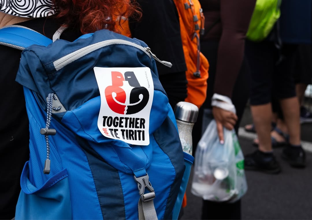
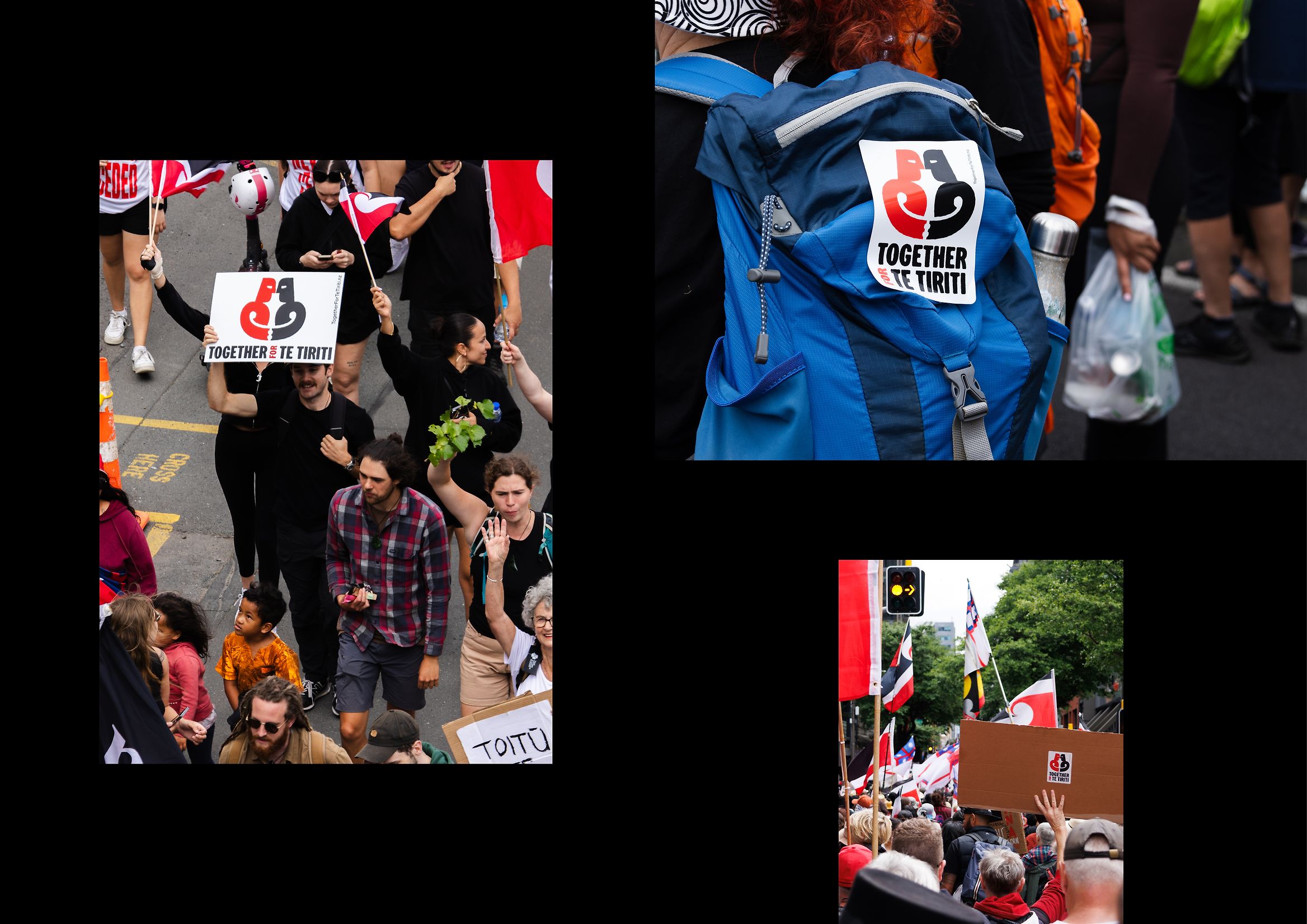
Capturing that idea in a single image was the greatest challenge. Designers Tyrone Ohia and Max Quinn-Tapara sought a form that was simple, instantly recognizable, and emotionally open. The result was the emblem for Together for Te Tiriti: two silhouettes moving toward a point of connection—an eternal hongi.
The design: a form that breathes
The outcome is a clean, tranquil image. No embellishments, no drama. Soft lines evoke meeting and balance. The color palette—earth, skin, light, and shadow—reinforces a sense of humanity and closeness. Every aspect of the design radiates inclusion, respect, and belonging.
The design stands out for its visual simplicity and conceptual strength. There’s no artifice or excess—just soft lines suggesting encounter, communion, and shared breath. The color choices reinforce the message: warm tones evoke earth, skin, and life, balanced by black and white to anchor the composition. Every element communicates inclusion, respect, and belonging.
An open, collective identity
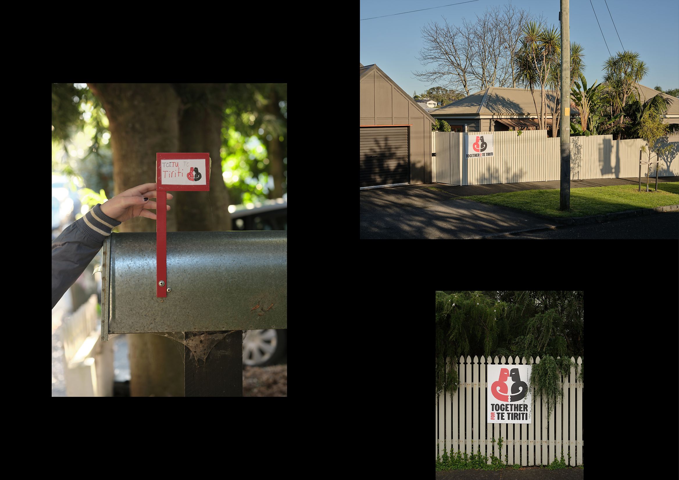
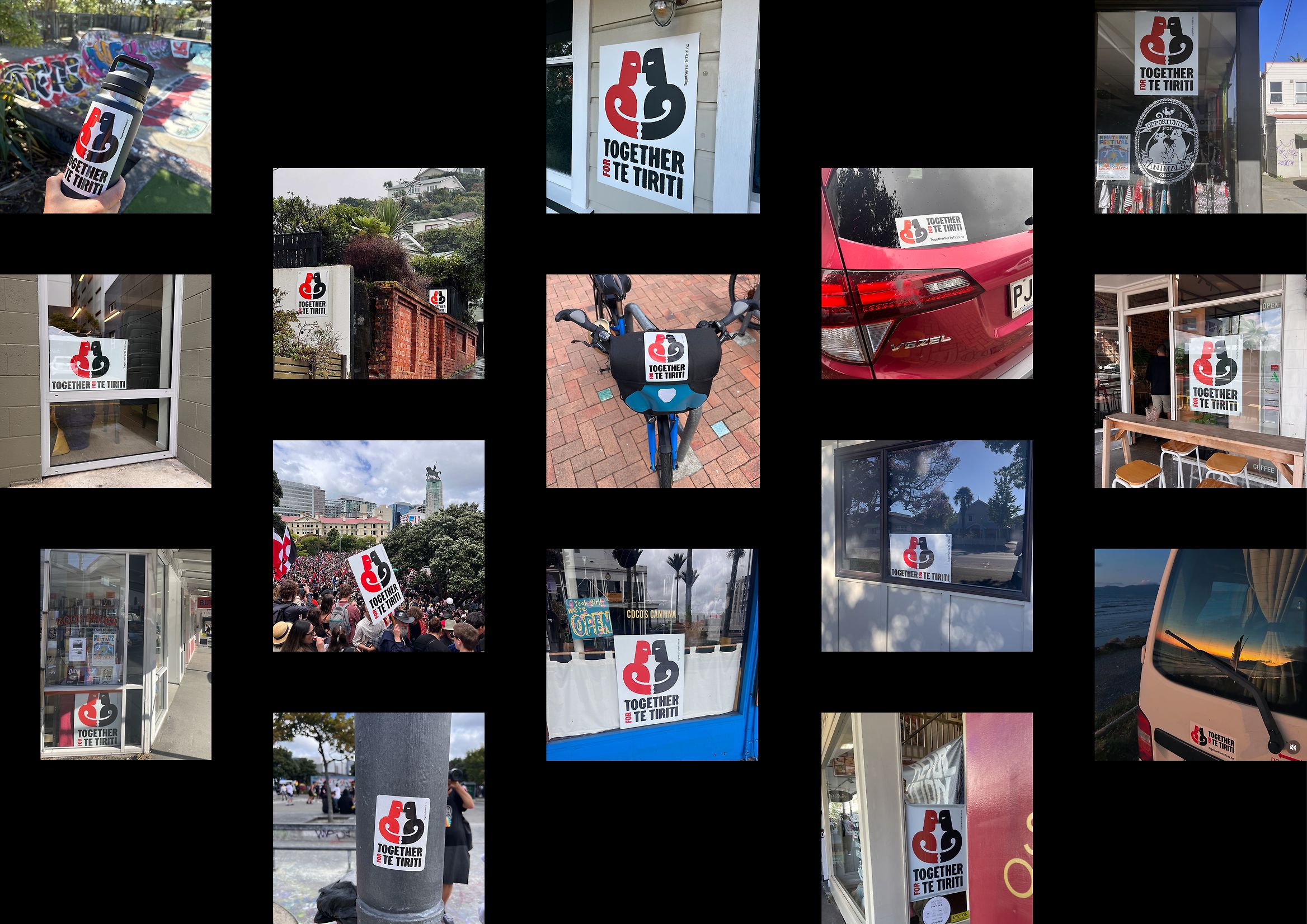
One of the project’s greatest achievements is its democratized nature. From day one, the symbol was never intended as the property of any institution or agency, but as something anyone could use, reinterpret, and adapt to their own context. This openness turned the design into a nationwide movement.
Across the country, personalized versions of the logo began to appear: murals, embroidery, banners, digital posts. Each adaptation was unique, yet all shared the same essence. As the Best Design Awards jury noted, the campaign became “much more than a design: it became a community of shared meaning.”
This participatory approach not only amplified its reach, but also strengthened its cultural legitimacy. Rather than imposing an aesthetic, the project allowed society to make it their own—showing how design can be a tool for social empowerment.
Digital design and communication strategy
The digital dimension of Together for Te Tiriti was key to its success. Through a social media campaign, an accessible website, and downloadable materials, the project invited people to get actively involved. The deliberately minimalist interface served as a platform for action: sharing, personalizing, participating.
The campaign’s tone remained consistent across all channels: respectful, hopeful, and deeply human. Images of the hongi were paired with short, impactful phrases that appealed to cultural pride and collective commitment. This balance of emotion and clarity is a hallmark of Extended Whānau’s work, and a key reason why the campaign resonated with such a broad audience.
A lesson in soulful design
In an era when many social campaigns get lost in the noise, Together for Te Tiriti stands out for its authenticity. It avoids drama and overproduction, relying instead on visual honesty. The power of the gesture, the purity of the forms, and the cultural coherence are enough to spark a genuine emotional response.
The project shows that graphic design, when combined with cultural sensitivity and purpose, can become a true force for change. As the creators put it, their goal wasn’t simply “to make something beautiful,” but to give visible form to unity. And in such a politically and socially charged context, that’s an act of creative courage.
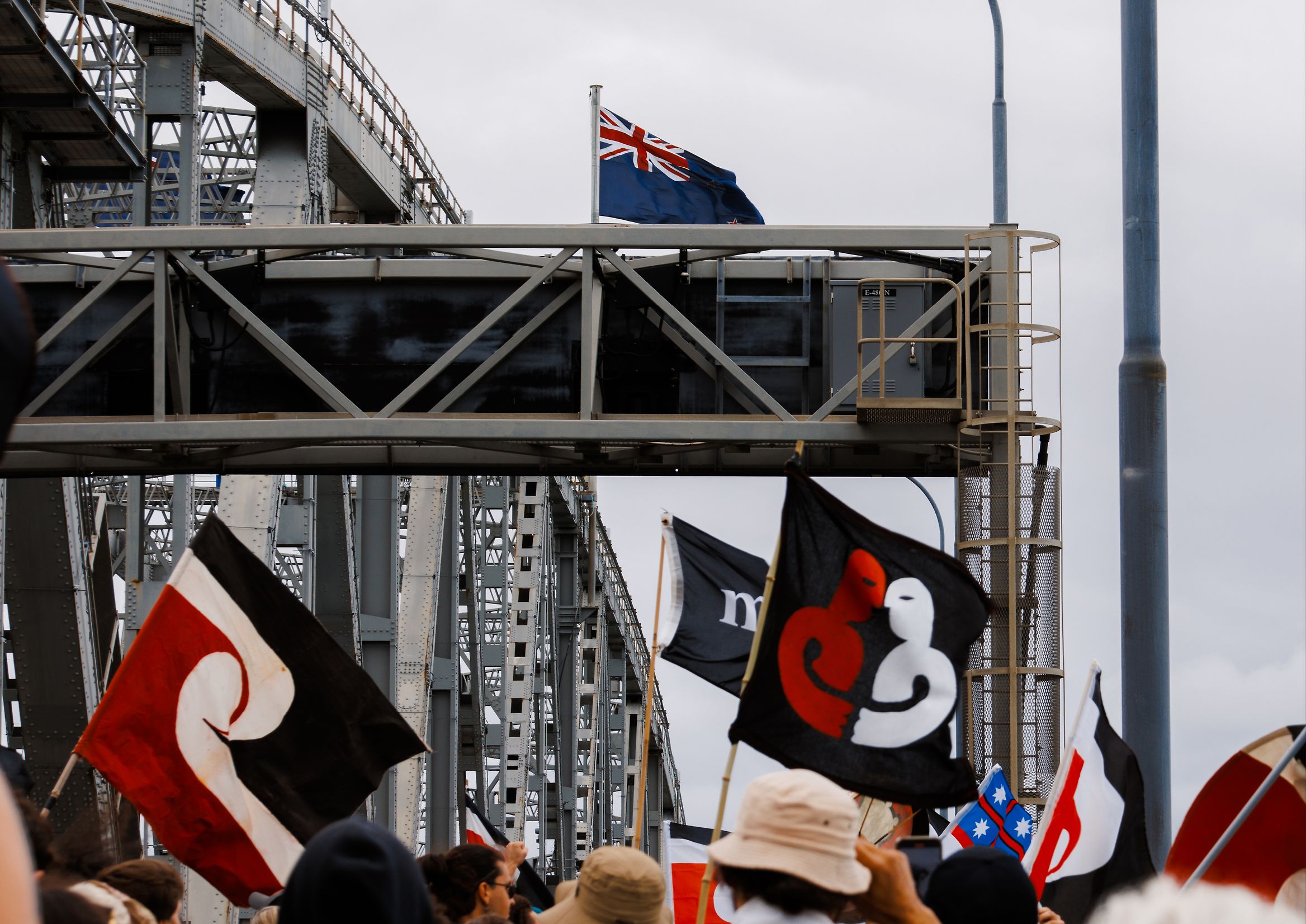
Legacy and impact
The symbol spread across the country. Thousands shared it on social media, and many communities organized gatherings to reflect on the meaning of Te Tiriti. Beyond its viral reach, its impact is emotional: the hongi became a living reminder of hope and respect.
In schools, cultural centers, and public spaces, the image remains ever-present. In a sense, it is a shared breath.
Conclusion: design as collective breath
Together for Te Tiriti is more than a design project—it’s a lesson in aligning form with purpose. Extended Whānau managed to distill the essence of the Māori spirit—reciprocity, shared life, peace after conflict—into a symbol that speaks to everyone.
Its value lies not only in the awards it has received, but in its power to connect a nation with its own breath. In that silent gesture between two faces meeting, design becomes human once again.
Credits
Project: Together for Te Tiriti
Studio: Extended Whānau
Client: ActionStation Aotearoa
Award: Social Good Award 2025 – Designers Institute of New Zealand
Creative team: Tyrone Ohia, Max Quinn-Tapara
Contributors: Kassie Hartendorp, Rangimarie Sophie Jolley, Grace Newton, Joseph Salmon