At some point in our lives, we’ve all endured the ordeal of trying to complete any online process through an official government website.
The real shock comes when you land on the site and see a design that’s truly cutting-edge. Yes, cutting-edge—if you’re at the very back of the line.
And the question that inevitably pops into your head: What did I do to deserve this punishment? Isn’t paying the fine enough—do I really have to do hard labor too?
In this first installment of our “tacky design” series, we’re taking a closer look at the DGT website. We’ve set our GPS so we don’t get lost in its maze of twists and turns.
For the bravest among you, here’s the link: DGT
Why is the DGT website design so tacky?
All it takes is a quick glance to realize you’re facing a website designed to confuse. Maybe it’s part of the DGT’s brand identity—a way to convey the true spirit of “bad driving” to every visitor.
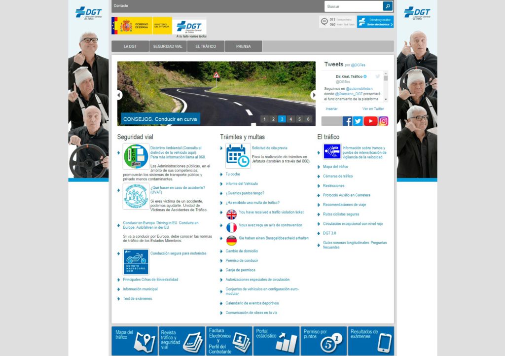
According to web.archive.org, the site was supposedly redesigned four years ago. Yet it looks like something straight out of the early days of the internet.
First impressions
The goal of any website’s first impression should be to make it easy for users to find and read information. Highlight what matters most and present it so the user’s mind can quickly and intuitively navigate the content. Establish a hierarchy to keep things organized.
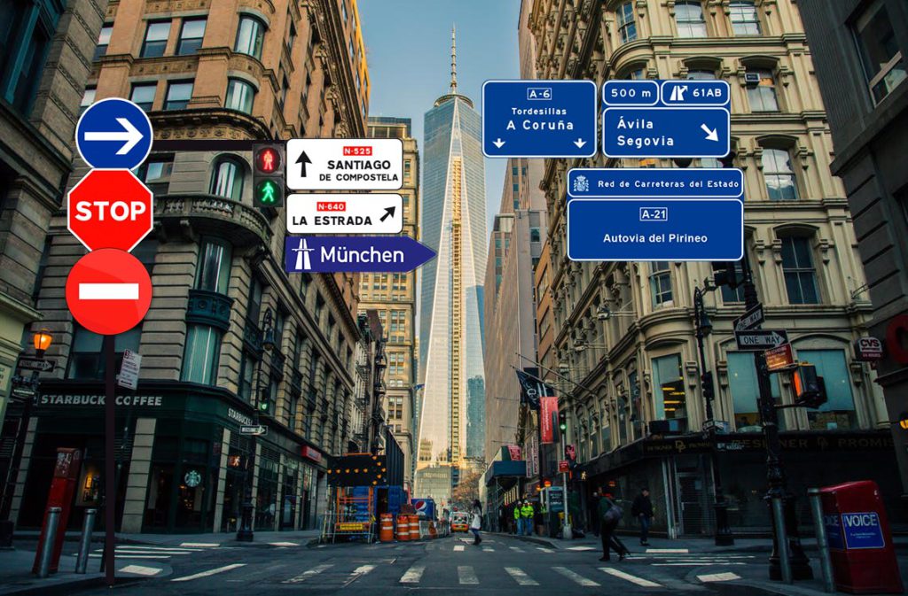
If we stick with the driving metaphor, the ideal user experience would be a one-way street with as few exits as possible—and, above all, clear signage.
Without even getting into the visuals, the first big issue with the DGT site is a real headache. There are over 40 links staring you in the face!
It’s like driving into a city and hitting an intersection with 40 possible exits.
Second impressions
Once you’ve recovered from the initial shock, regained control of your mouse arm, and remembered why you came to the site in the first place, you start at the top.
The very first thing you see is a Contact link. Not that contact info isn’t important, but couldn’t it just be part of the main menu instead of sitting there all alone? And then there’s the font: Arial Regular (yes, it’s outdated, but that’s the least of our problems).
The rest of the links use Arial Narrow, the condensed version of the same font. Why does the contact link have to visually clash with the others?
Typography
As mentioned, the site uses both Arial Regular and Arial Narrow. Not good. This creates a visual clash between typefaces.
If you’re going to use different fonts, at least create some contrast. If you stick to one font family (which is perfectly fine), play with bold or italics—but just switching between regular and condensed versions rarely looks good.
On top of that, there are inconsistent font sizes all over the site. Every image uses a different size, and many are pixelated. It’s all very… nostalgic.
Margins, paddings, and other elements
Just like with typography, there’s no consistency in margins and paddings between elements. Every block does its own thing. Perfect for enhancing the user experience—if you want that experience to be chaos.
Drop shadows went out of style ages ago. Using them is a surefire way to make your site look dated.
And as for the sidebar images, it’s hard to tell what message they’re trying to send. There are three confused-looking men doing a Ronaldinho-style wave. Maybe it’s meant to transport us back in time.
Top banners
We’ve got our beloved Government logo, but there’s a glaring error between the two boxes: a white background line that doesn’t reach the top. Either extend it or remove it, but this visual glitch is just ugly. The Government logo is 60px tall, while the DGT logo next to it is 51px. If both were the same height, that would be a start. Add a bit of space between them, and it’d be even better.
Just below the DGT logo, blatantly ignoring the horizontal line, there’s a comforting message for citizens: “a tu lado vamos todos” (“we’re all with you”). Thanks, DGT.
To the right, there are two more banners—both, for good measure, set at 76.39px tall. Why not just use pi (π) at this point? Both are pixelated and use different font sizes.
Menu buttons
Beautiful. With a hover effect that’s the highlight of the site so far.
It would have been smart to add dropdown submenus on hover to cut down the number of visible links.
Image slider, Twitter, and social media
The image slider doesn’t add much—it looks like something from the 1950s, back when the internet didn’t exist. The text is crammed right up against the image, which is bad for SEO and a pain to maintain in the backend.
If the Twitter feed widget is going to be that tiny, it’s probably better to leave it out.
As for the social media links: every icon is a different size and they’re all on a dark gray background—presumably to match the top menu’s “design language.” Well, it seems we only stick to the design language when it’s guaranteed to look bad.
The three blocks of links
What should be the site’s main feature is just an endless list of links. Some have images, some don’t; some have descriptions, others don’t.
It would have been better to cut down the number of links and standardize the use of images and descriptions.
Scrolling further down
It doesn’t get any better. The same story continues: zero usability and visually overwhelming. I’m not exaggerating when I say my head was spinning after scrolling through this parade of design missteps.
Other points
- It’s not responsive. Maybe that’s their way of discouraging people from using the DGT site on their phones while driving.
- The footer features a headline that reads “For people.” Just in case anyone thought it was for livestock.
- If you browse through the different sections, you’ll see that the maze only gets bigger the deeper you go.
- The site’s source code is quite a spectacle in itself.
- The <!DOCTYPE> tag doesn’t even start on the first line, which is just bad practice.
Conclusions
If you’re planning to visit the DGT website, we recommend you skip the pre-drive drinks and make sure your seatbelt is fastened. And hopefully, you’re only there by accident—not because you need to pay a fine.