Graphic design in 2026 is entering a stage of maturity. After years of visual excess, overstimulation, and technological dependence, the industry is reclaiming a slower, more mindful, and deeply human perspective. The trends emerging this year are not trying to dazzle, but to connect. Brands understand that design is not just an aesthetic matter, but a tool for clarity, empathy, and differentiation in a world where everyone is competing for seconds of attention. The goal is no longer to be seen, but to be remembered.
2026 is redefining the relationship between creativity and technology. Artificial intelligence, automation, and visual accessibility are transforming the way we conceive graphic design. But above the tool is the intention: the designer’s judgment. The future of graphic design is not about producing faster, but about communicating better. In this new landscape, visual styles are becoming more honest, palettes more intentional, and narratives more inclusive. Below, we explore the eight trends that will shape this year’s visual identity and, quite possibly, the rest of the decade.
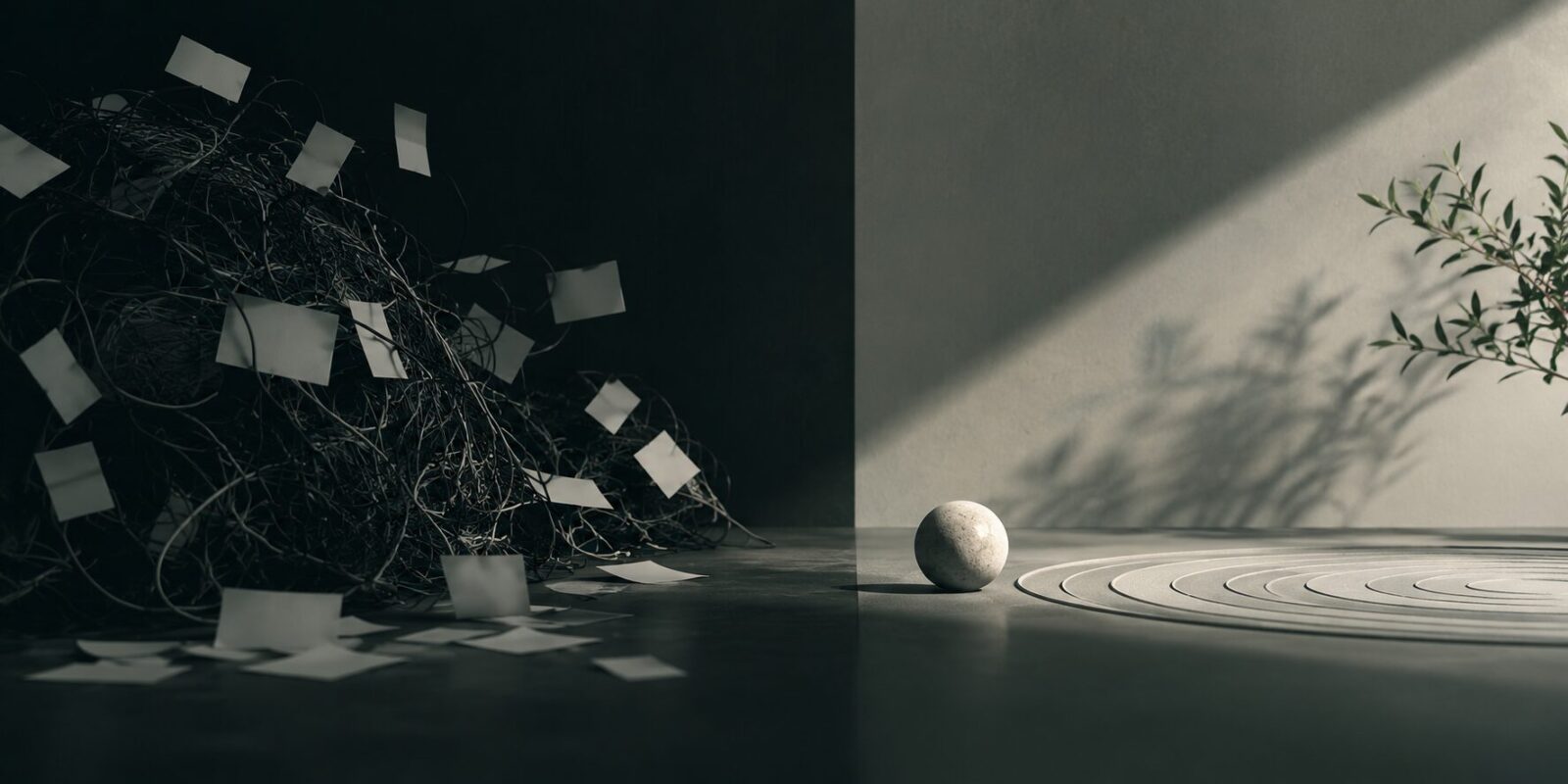
Neo-minimalism: less noise, more meaning
Minimalism never disappeared, but in 2026 it is being reinvented. What was once associated with coldness or aesthetic rigidity has now become a search for calm, balance, and authenticity. Neo-minimalism is not based on absence, but on intention. It is about reducing things to the essentials without losing nuance; about using white space as a pause, not as emptiness. The result is design that breathes, that invites you to pause, that conveys confidence without needing to shout.
This new minimalism is neither extreme nor sterile. It leaves behind harsh contrasts and embraces soft tones, warm neutrals, subtle gradients, and calm typography. It is the natural response to the visual overload of recent years. In place of brightness and saturation comes subtlety; in place of the battle for attention comes serenity. The brands adopting this trend understand that contemporary luxury is calm. Less ornament, more balance. Less impact, more intention.
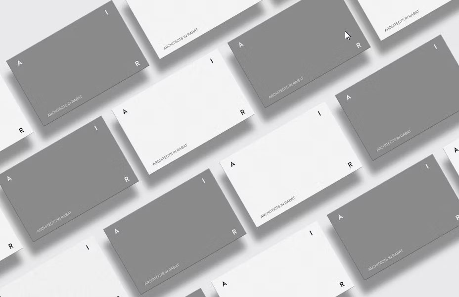
In compositional terms, neo-minimalism relies on generous negative space, typographic precision, and measured contrast. Hierarchy is built through visual silence: what matters stands out because everything else steps back with elegance. Fine details—a faint shadow, a broken line, an almost imperceptible shift in texture—add depth without noise. The goal is not to impress, but to endure.
Discover how we approach web design and branding at Code Barcelona.
The trend also extends to editorial and digital design. Clean interfaces reduce unnecessary stimuli to support reading and intuitive navigation. Logos are simplified, but not stripped bare: they retain a distinctive gesture, a line or curve that preserves the brand’s visual memory. Color is used with purpose; one well-chosen dominant tone can communicate more than a complex palette. In typography, humanist and variable families are leading the way, combining technical precision with visual warmth.
Neo-minimalism is, in essence, a statement of maturity. It reflects brands’ need to present themselves as more honest, less artificial, and more aware of their surroundings. In a context saturated with messages, clarity becomes power. That is why the most influential projects of 2026 will not be the most complex, but the most precise. Design less to say more. That is the new sophistication.
AI-assisted aesthetics: collaboration between mind and machine
If 2025 was the year artificial intelligence timidly entered creative processes, 2026 is the year it becomes established as an everyday, intentional tool. AI is no longer an experiment or a threat: it is an ally. In the world of graphic design, its role is being redefined. It stops being a generator of soulless images and becomes a collaborator that broadens the designer’s perspective. The concept of AI-assisted aesthetics is born from that synergy: the union of human intuition and algorithmic precision.
For years, the relationship between design and artificial intelligence was marked by distrust. There were fears that automation would erase the human uniqueness of the creative process. But time has shown that what changes is not the art, but the way of getting there. In 2026, designers do not use AI to replace their judgment, but to expand their possibilities. The machine generates textures, patterns, or palettes that would be impossible to imagine manually, but the designer decides what deserves to remain. Technology proposes; the human chooses. And that collaboration creates a new kind of aesthetic: hybrid, experimental, and alive.
Visual AI is now integrated into almost every stage of the creative process. It is used to generate mood boards, sketches, style tests, and typographic variations. Generative image systems make it possible to explore visual directions in minutes, whereas this once required days of trial and error. But the most interesting thing is not the speed, but the capacity for discovery. By asking AI for “textures that evoke industrial nostalgia” or “compositions inspired by contemporary Japanese painting,” the designer receives unexpected proposals, often far removed from their own references. Innovation emerges from that collision.
This fusion between mind and machine also changes the language of design. New visual categories appear: impossible compositions, organic geometries, quantum gradients, generative typefaces that evolve over time. AI learns from past styles, but reinterprets them with millimetric precision. The designer, meanwhile, contributes context, emotion, and direction. This dialogue gives rise to an aesthetic that is difficult to classify: between the human and the synthetic, between the rational and the poetic.
However, AI-assisted aesthetics also raises an ethical challenge. If we all use the same tools, how do we avoid homogenization? How do we ensure that brands maintain a voice of their own rather than a texture generated by the same algorithm everyone else uses? The answer lies in conscious use. It is not about letting AI design, but about using it as a starting point. The agencies and designers that stand out are those who apply judgment, edit, combine, reinterpret, and personalize what the machine offers. AI delivers raw material; the designer creates meaning.
Another consequence of this trend is the democratization of creativity. Accessible tools allow small brands, freelancers, and startups to produce visual materials of professional quality. But far from diminishing the designer’s value, this raises the level of demand across the sector. If anyone can generate a good image, the professional must offer something more: direction, coherence, and sensitivity. The value no longer lies in execution, but in vision. AI can produce beautiful images; only humans can produce identity.
In this new landscape, the most interesting projects of 2026 are not those that merely use AI, but those that engage in dialogue with it. Designs where the algorithm is felt, but does not dominate. Where digital texture merges with the tactile, the human, the imperfect. AI-assisted aesthetics is not about replacing creativity, but expanding it. The machine extends the hands, but intention still resides in the heart. Ultimately, the real challenge is not learning to use AI, but learning to think with it.
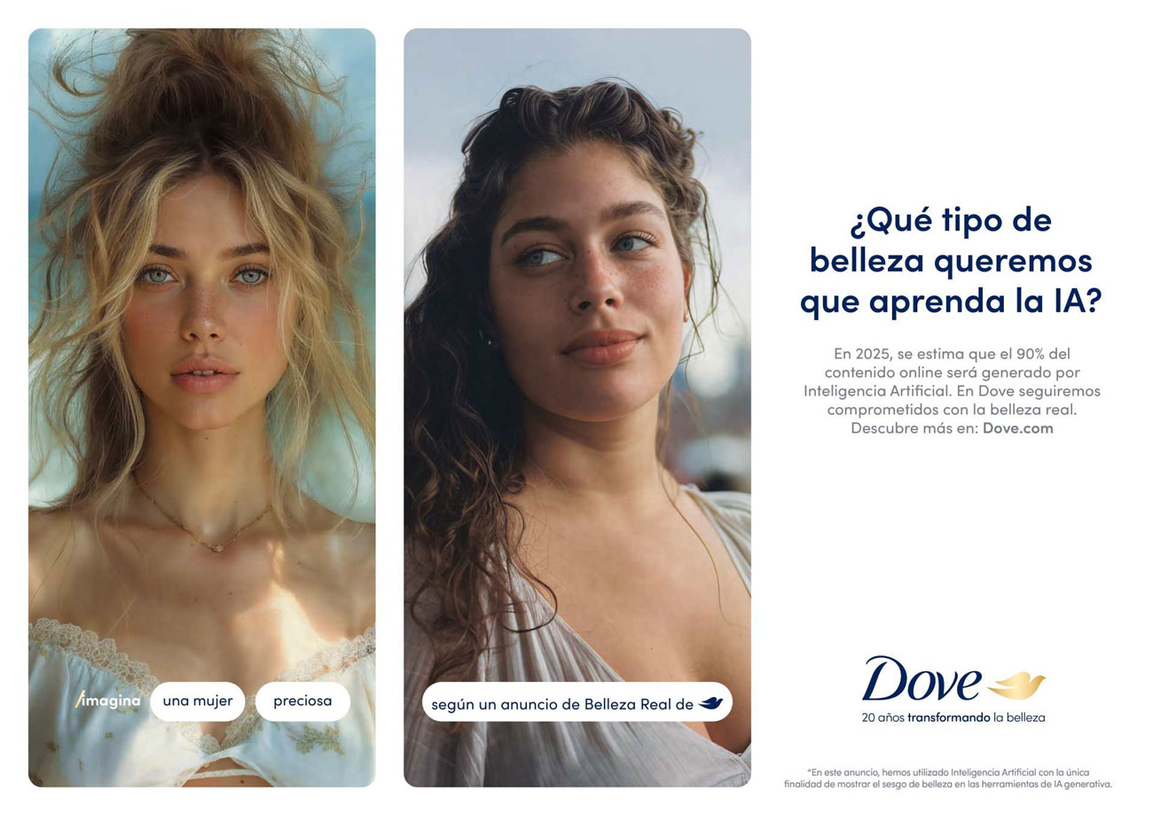
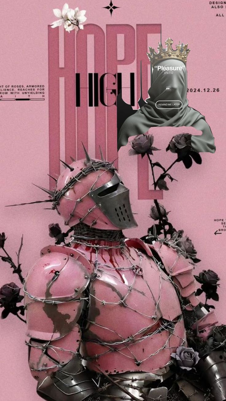
Inclusive and imperfect imagery: the beauty of the real
For a long time, visual perfection was the standard in graphic design. Poreless skin, measured smiles, exact geometry. Everything polished to the point of feeling artificial. But in 2026, that laboratory aesthetic is losing relevance in the face of a new sensibility: authentic imperfection. Brands and designers are embracing diversity, irregular strokes, the texture of error. Because beauty today is found in the human, not in the polished.
The trend toward inclusive and imperfect imagery does not come from fashion, but from a cultural need. We live in an era in which users distrust the unattainable. Social media, generative AI, and filters have created a saturation of images so perfect that they no longer move us. In response to that glossy homogeneity, a reaction is emerging: to show what is real. To show who we are. Instead of aspiring to the ideal, brands seek to reflect the everyday, the diverse, the honest. And graphic design translates that shift into warmer textures, more natural portraits, and more human compositions.
Visually, this trend manifests in many ways. Hand-drawn strokes are reappearing as a symbol of authenticity. Illustrations once again reveal the creator’s gesture, with irregular lines, smudges, and marks that would previously have been “corrected.” In photography, real faces, wrinkles, imperfect gazes, and accidental lighting are prioritized. Spontaneity has value again. Error becomes style. Visual noise becomes emotional texture.
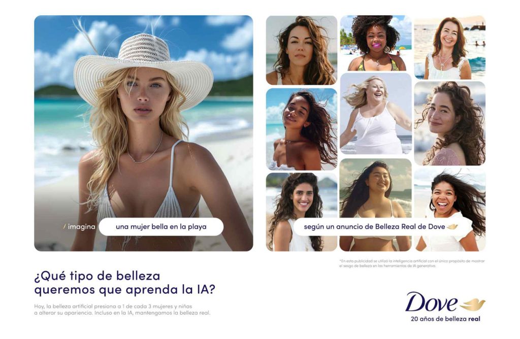
Inclusion, moreover, is broadening its meaning. It is no longer just about representing ethnic or gender diversity, but about showing the plurality of human experiences. Designs that reflect different bodies, ages, lifestyles, and environments. Campaigns in which difference is not highlighted as a political gesture, but presented as normality. This visual normalization creates connection, empathy, and trust. Because when a person sees themselves reflected in a brand, they stop being an audience and become part of the story.
The rise of this aesthetic also responds to fatigue with AI-generated content. Generative images, though fascinating, often share a cold perfection. By contrast, imperfection has soul. Imperfections act as reminders that there is a human mind behind them. That design is not an algorithm, but an emotion translated into form. That is why more and more designers are combining digital resources with analog gestures: paper scans, digital painting, charcoal strokes, hybrid collages. In that mix of media, design regains texture, history, and tactility.
In terms of composition, the trend favors more organic and less symmetrical structures. Elements do not always fit together perfectly, and that is part of their appeal. The natural movement of the eye becomes part of the design. Colors, instead of becoming more saturated, are softened or blended into gradients. Extreme contrast gives way to visual harmony. And the message, far from shouting, whispers: “this is real.”
The impact of this movement goes beyond the visual. It represents a profound shift in design culture. If the 20th century celebrated perfect form, the 21st celebrates intention. What moves us is not the flawless image, but the story it conveys. Authenticity has become the new elegance. In 2026, the most powerful projects will not be the most spectacular, but the most sincere. And that, in a world designed by algorithms, is pure rebellion.
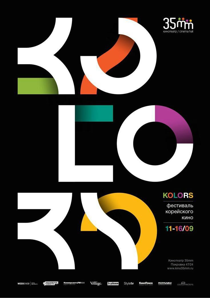
High-contrast color blocks: visual energy with purpose
Color is once again taking center stage, but not as ornament. In 2026, designers are rediscovering its strategic power: color no longer merely beautifies, it structures, guides, and evokes emotion. The trend of high-contrast color blocking —or hyper-contrast colour blocking— is emerging as a way to create immediate impact in a saturated visual environment. Its goal is not to shout louder, but to direct the eye with precision. In an era where each scroll lasts only seconds, color becomes the first word in a silent visual language.
This movement arises as a reaction to the monochromatic minimalism of previous years. After a period of restraint and neutral tones, graphic design is once again embracing color boldly, but with control. Contrasts are no longer random: they are built with narrative intent. A dark background can amplify vibrant typography; a warm block of color can draw attention to a point of interaction. Every shade has a purpose. Every combination, a message. What matters is not the amount of color, but its internal dialogue.
Color blocks make it possible to divide information visually without relying on lines or borders. The composition is organized through chromatic masses that define hierarchies and rhythms. A cobalt blue next to a warm ochre conveys balance; a deep green against an electric coral creates dynamic tension. This kind of contrast not only attracts attention, but also communicates energy, direction, and character. In 2026, the boldest brands are not afraid to combine the unthinkable: earth tones with neons, grays with turquoise, blacks with citrus yellows. Harmony emerges from audacity.
The key lies in intentionality. Color is no longer applied as decorative filler, but as a functional tool. In digital interfaces, strong contrasts help guide attention and improve accessibility. A call-to-action button stands out more when the background provides the right counterbalance. In branding, strategic colors reinforce visual recall and emotional identity. The palettes of 2026 are designed to be recognizable, but also versatile. They do not seek homogeneity, but personality.
Color psychology is also evolving. In a changing social context, colors no longer have fixed meanings. Blue is no longer only corporate; it can be introspective or digital. Red does not always evoke danger; it can symbolize vitality or empathy. Designers are reinterpreting traditional codes to build new emotional associations. The unexpected combination of tones —for example, olive green with neon magenta— becomes a statement of visual independence. Rather than conveying perfect balance, it conveys authenticity and courage.
On the technical side, advances in OLED and HDR displays allow for unprecedented color fidelity. Digital printing also benefits from more precise inks and sustainable pigments, expanding the range of expression. As a result, intense contrasts can coexist with natural finishes or recycled materials. Contemporary graphic design no longer has to choose between impact and sustainability: now it can have both.
High-contrast color blocking is not just a visual trend, but a reflection of the times. It is the aesthetic translation of a society that needs clarity amid the noise. Color, used intelligently, brings order to chaos. It gives structure to emotion. In a world where every screen competes for attention, contrast becomes an act of conscious communication. And that energy, when mastered, transforms design into a complete sensory experience.
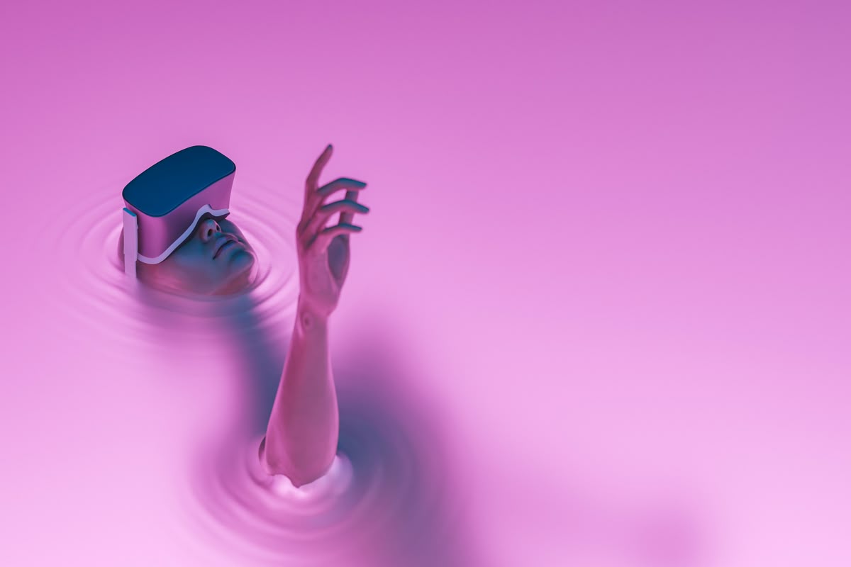
Motion-centered design: when the image comes to life
For years, graphic design was static. Images were created to be looked at, not to move. But the visual ecosystem of 2026 is completely different: screens, gestures, and digital environments call for fluidity. Brands are no longer designed for a single frame, but for a moving experience. Motion-first design, or design centered on movement, is no longer a specialty and has become the new visual standard. The message is no longer just read: it is felt, explored, experienced.
The rise of audiovisual content on social media, vertical formats, and interactive interfaces has changed the way we communicate. Today, a logo must be able to animate naturally; a typeface must flow without losing legibility; a banner must tell a story in three seconds. Graphic design is no longer measured only by its composition, but by its behavior. The question is no longer “what does it look like?” but “how does it move?” And in that transition, movement becomes the new visual rhetoric.
The trend toward movement-centered design is not about filling screens with effects, but about using animation with purpose. Every transition, every shift, every microinteraction has a narrative function. A subtle text slide can guide the eye. A button that gently vibrates on hover reinforces the feeling of an immediate response. A typeface that expands or dissolves can convey emotion. When movement is thoughtfully designed, it does not distract: it guides and moves.
In 2026, graphic designers work increasingly closely with animation and development teams. Tools now make it possible to prototype animations directly within design environments, reducing the distance between the idea and the experience. Programs such as After Effects, Figma Motion, and new generative animation engines integrate creativity in real time. Animation is no longer the final stage of the process: it becomes the starting point. First, you design how something behaves; then, how it looks.
The most advanced brands are creating kinetic identities: visual systems that live in constant transformation. Logos that change shape depending on the context; typefaces that adapt to the reading rhythm; backgrounds that react to user interaction. This capacity for movement gives brands something essential in the digital age: presence. It is no longer enough to be recognizable; you have to be memorable. And movement is visual memory in action.
In UX terms, movement-centered design also improves understanding. Functional animations serve as invisible guides: they indicate hierarchies, transitions, and outcomes. Rather than overwhelming, they orient. A classic example is the microgestures in mobile interfaces—such as the bounce on refresh or the shading on tap—which confirm actions without words. In 2026, these microanimations evolve into more expressive experiences, capable of communicating tone, emotion, and identity.
Of course, motion design is not without its challenges. Accessibility is one of the major ones: excessive movement can affect sensitive users or distract attention. That is why the new moving design is modular and mindful: it allows users to adjust speed, reduce effects, or disable animations according to their preferences. The future lies not in animating everything, but in animating with empathy.
Ultimately, motion-first design represents a natural evolution of visual language. Just as typography defined the identity of modern design, movement defines that of the digital present. Design that moves us is no longer printed: it plays, it glides, it breathes. In 2026, the projects that set trends are not the ones that display perfect images, but the ones that know how to tell stories in motion.
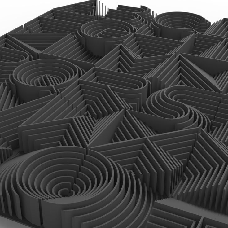
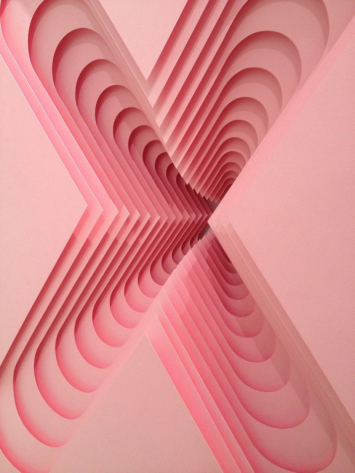
Overlapping dimensions: the art of creating depth
Graphic design in 2026 seeks to break free from flatness. For years, the “flat” aesthetic dominated screens, interfaces, and branding. Everything had to be clean, geometric, weightless. But the new visual era calls for something different: depth. This is not about returning to the excessive three-dimensionality of the past, but about building layers of visual meaning. The trend of layered dimensions combines photography, illustration, texture, and typography to create hybrid compositions that breathe, move, and tell stories on more than one plane.
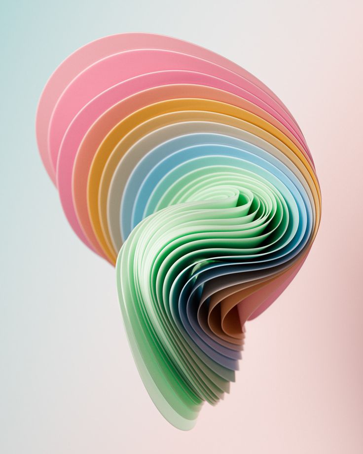
Layering becomes a language. Each layer adds a level of interpretation, a nuance, an emotion. The result is a tactile sensation within a digital medium. Backgrounds that seem embossed, shadows that suggest presence, cutouts that imply movement. Design no longer aims to imitate reality, but to reinterpret it through visual complexity. In a culture where everything is consumed in seconds, layered compositions invite a second look. To pause. To discover.
This trend connects directly with the rise of digital collage and mixed-media design. Creators combine photographic assets, 3D renders, vector illustrations, and analog textures in a single piece. It is the rebirth of collage, but with twenty-first-century tools. A portrait can coexist with a scanned paint smear; a paper background can be transformed with parallax effects; a typeface can cut through a layer of digital fog. The result is a sensory and narrative aesthetic that communicates as much through form as through materiality.
The value of the tactile becomes fundamental. In a world dominated by smooth screens, visual texture becomes the new luxury. Designs that evoke the feel of paper, canvas, or ceramic. Layers of noise, grain, or distortion add authenticity to the image. Designers are rediscovering the power of the imperfect and the material, even within the digital environment. The physical becomes inspiration, not a limitation. In this way, the visual regains something technology had diluted: a sense of presence.
In compositional terms, layered dimensions also break with the idea of rigid hierarchy. Elements intertwine fluidly, generating a dynamic visual narrative. Depth is not only aesthetic, but conceptual: what matters may be partially hidden, inviting exploration. The user’s gaze becomes part of the design, as if the viewer were participating in the construction of the image. This participatory dimension defines the new language of narrative design.
The trend also finds resonance in editorial and brand design. Digital magazines and visual campaigns use layered compositions to tell richer stories. A headline can coexist with a portrait and a texture that, together, evoke an atmosphere. Visual identities, meanwhile, become more dynamic, with modular systems that allow different layer combinations depending on the context. It is a flexible aesthetic that adapts to change without losing coherence.
On the technical side, advances in tools such as Figma, Photoshop, and integrated 3D engines allow layering to move beyond decoration and become part of the workflow. Files are no longer flat: they are visual ecosystems in which light, movement, and texture interact. Even on the web, the implementation of parallax effects and dynamic scrolling brings a real sense of depth without compromising performance. The experience becomes immersive, yet controlled. Complex, yet harmonious.
Layered dimensions sum up one of the strongest impulses in contemporary graphic design: the desire to feel again. In an increasingly digital, cold, and automated visual culture, layers bring back human warmth. Every texture tells a story. Every shadow has intention. And every overlap reminds us that design, when done well, is not only seen: it is touched with the eyes.
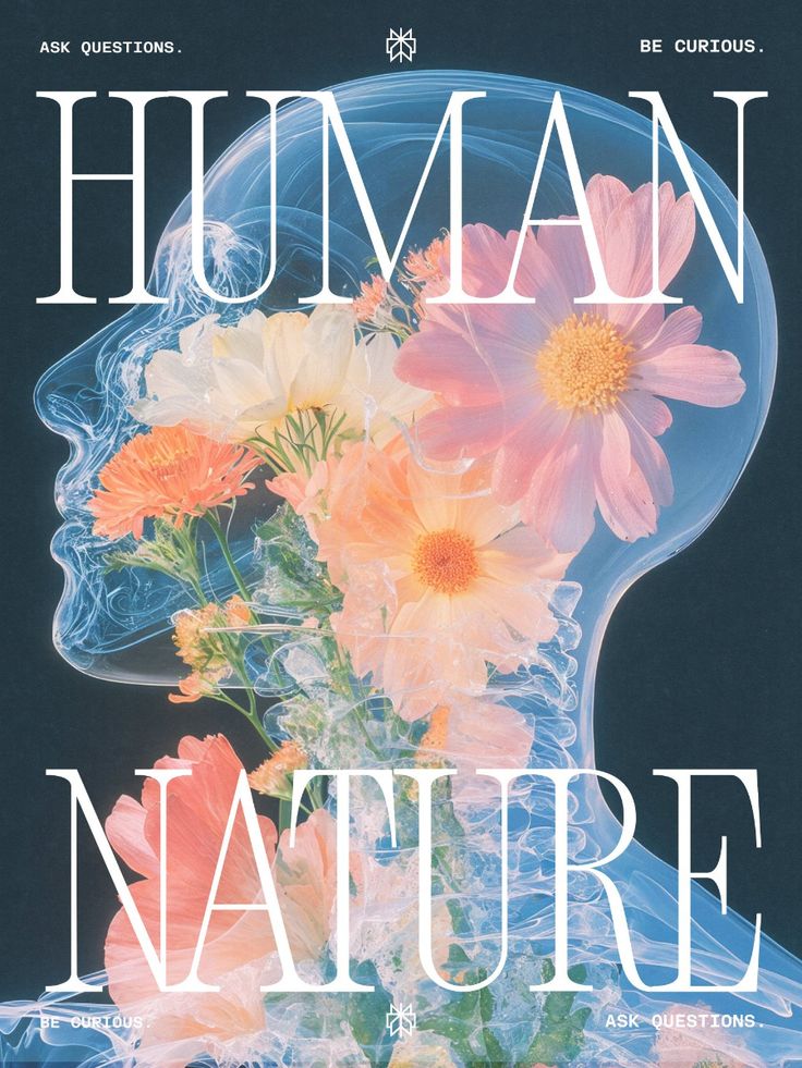
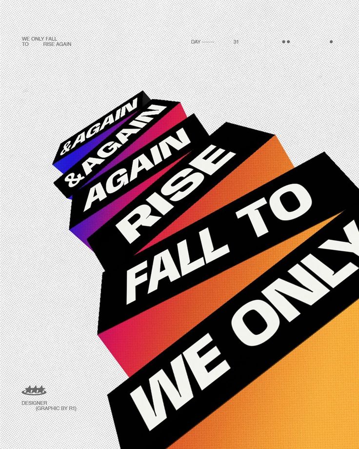
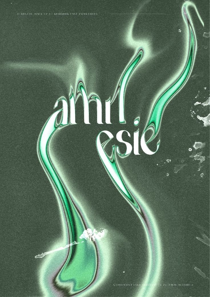
Typography as identity: the visual voice of brands
Typography has always been a communication tool, but in 2026 it has become something far more powerful: an extension of identity. In a landscape where brands are trying to stand out in an ocean of visual stimuli, type becomes the new logo, the new symbol, the new tone of voice. It is no longer enough to choose a typeface “that fits”; now it is designed to speak, to breathe, to move people. Typography stops supporting the message and becomes the message itself.
For years, graphic design relied on neutral typefaces—clean, legible, functional—that served as the invisible framework for content. But that anonymity is no longer enough. Brands in 2026 understand that their voice must be unique in every detail, and that typography is their purest form of expression. A curve can convey warmth, a serif can evoke tradition, an asymmetrical stroke can suggest rebellion. In its most basic structure, the letter carries enormous emotional weight. And designers are once again treating it that way: as living matter.
The rise of custom fonts is one of the clearest signs of this shift. More and more brands are commissioning their own typefaces, tailor-made to distill their visual character. It is no longer just about having a distinctive logo, but a coherent typographic system that supports every touchpoint. From packaging to digital interfaces, letters build a consistent, recognizable, and authentic tone of voice. This approach is giving rise to a new generation of stronger identities, where coherence comes not from repetition, but from intention.
At the same time, variable fonts are redefining design flexibility. They make it possible to adjust weight, slant, width, and contrast without losing coherence. Thanks to them, a brand can have a typeface that subtly transforms depending on the medium or the mood of the communication. A lighter version for a digital interface; a heavier one for a print headline; a narrower one for a tight space. This adaptability brings identity to life, making it more dynamic, more human. Typography is no longer fixed: it breathes with the context.
Experimentation is also gaining ground. Graphic designers and motion designers are exploring kinetic typography—letters that move, vibrate, and react to sound or the cursor. On social media, an animated word can say more than a static image. In branding, a typeface that changes through interaction reinforces the sense of presence. In 2026, text is not read: it is experienced. The boundary between word and form dissolves, and typographic language enters an unprecedented emotional dimension.
But beyond the technical side, the trend of typography as identity responds to something deeper: the desire for authenticity. In a world where image banks and templates have homogenized visual aesthetics, custom-made lettering represents a declaration of independence. It is a gesture of authorship, of personality. Designing a typeface is, at its core, designing a voice. And every brand bold enough to do it shows that it has something to say.
This approach also redefines the relationship between graphic design and communication. Text stops being a container for information and becomes a visual act. Typographic composition becomes rhythm, texture, space. Large letters once again dominate layouts, whether in advertising campaigns, covers, or interfaces. Designers experiment with disproportionate scales, free alignments, and extreme spacing to provoke physical sensations, not just visual ones. What used to be legibility is now emotion.
Typography as identity embodies the spirit of contemporary design: coherence, expressiveness, and authenticity. In 2026, the most memorable brands are not the ones that shout the loudest, but the ones that find their visual voice and refine it with precision. Because, in the end, every identity begins with a word. And every word has a form. The difference lies in knowing how to design it.
Retrofuturism redux: tomorrow seen from yesterday
Graphic design has always been a mirror of its time. Every era projects its vision of the future through shapes, colors, and textures. In 2026, that futuristic gaze takes a nostalgic turn: retrofuturism redux. A movement that revives the aesthetics of the 70s and 80s—metallic finishes, technological typefaces, neon effects, digital grids—and reinterprets them with contemporary tools and sensibilities. It is not about imitating the past, but about reimagining it from the present. A way of reconciling nostalgia with innovation.
The rise of this trend responds to an emotional and cultural need. After years of technological uncertainty, nostalgia offers a sense of familiarity and refuge. But retrofuturism does not seek to go backward; rather, it aims to recover the optimistic vision of the future that defined those decades. A future in which technology was seen as a promise, not a threat. Designers reinterpret that spirit using current resources: glossy materials that evoke chrome and steel, soft lighting that mimics the glow of neon tubes, gradient backgrounds reminiscent of early personal computers or 8-bit video games.
The result is an aesthetic that plays with paradox: the old feels new again. Vibrant colors coexist with grainy textures; geometric typefaces interact with subtle digital effects; layouts recall science fiction posters, but with a modern, clean execution. In 2026, this visual language finds a privileged place in fashion, music, and tech brands seeking to convey energy, innovation, and a playful identity. It is an aesthetic that is not afraid to be seen, yet also knows how to be interpreted with irony.
Retrofuturism redux is not just a simple aesthetic exercise. It is a reflection on how we perceive time and innovation. By combining analog and digital elements, it reasserts the value of visual memory in the age of artificial intelligence. It reminds us that technology has a history, and that nostalgia can also be a creative force. In a world moving at great speed, looking back becomes a way of finding meaning. Not to copy, but to reconnect with the emotion of a future we once dreamed of.
In technical terms, designers achieve this blend through the use of grain effects, monospaced typefaces, retro vector illustrations, and three-dimensional compositions with a “synthetic” aesthetic. Metallic gradients, grid patterns, and soft glows are also proliferating. However, the difference from original retrofuturism lies in control: what was excess in the 80s is now balance. The challenge is to evoke without imitating, to stir emotion without slipping into parody. It is a stylized tribute, not a literal recreation.
This return of the future also reflects a transformation in brand storytelling. Companies that adopt this aesthetic are not trying to appear modern in the conventional sense, but rather timeless. They connect with a collective imagination that blends past and possibility. A clear example can be seen in campaigns that combine digital illustration with analog photography, or in interfaces that incorporate controlled glitch effects to recall the charm of technological imperfection. Design thus becomes a conversation between generations: the yesterday that imagined tomorrow.
Ultimately, retrofuturism redux symbolizes the maturity of contemporary design. A maturity that understands that innovation does not always imply rupture, but also memory. That the future can be built on fragments of the past. At a time when artificial intelligence is redefining the visual landscape, this trend returns control to the human gaze: the one that blends, remembers, and reinterprets. The future of design, perhaps, has always been this: a round trip between nostalgia and imagination.
Conclusion: graphic design that looks inward again
The journey through the trends of 2026 leaves one clear idea: graphic design has stopped being a race to impress and has become a quest to connect. After years of speed, automation, and visual saturation, the industry is rediscovering its essence: communicating with intention. Technology is no longer perceived as a threat or as decoration, but as a medium that amplifies the designer’s sensitivity. At the center, once again, is the human gaze.
Minimalism becomes emotional, artificial intelligence becomes collaborative, imperfection becomes authenticity. Color is used with purpose, movement with empathy. Depth, typography, and nostalgia serve to build meaning, not just impact. Every trend responds to the same impulse: reconnecting design with its original purpose. It is not about creating more, but about creating better. About reducing noise to make room for the message. About designing with the mind, but above all with soul.
In this new landscape, the designer is not an executor, but an interpreter. Their value does not lie in the tool they master, but in the perspective they bring. In knowing when to let technology speak and when to remain silent. In understanding that behind every color, every letter, and every texture there is a story that can inspire, move, or transform. Design in 2026 does not seek to please: it seeks to resonate.
The brands that understand this shift are the ones leading the way. They do not compete for attention, but for meaning. They know that true innovation is not in what changes from year to year, but in what remains: design’s ability to generate emotion, create bonds, and translate the invisible into form. In times when everything can be generated in seconds, what will be valuable is what cannot be copied: the intention behind every stroke.
At Code Barcelona, we believe that the future of graphic design will not be measured by the number of trends that are followed, but by the coherence with which they are chosen. Designing will increasingly be an act of awareness: choosing what matters, omitting what is unnecessary, and building with purpose. The future of design is not a collection of styles, but an attitude. A way of looking at the world and deciding how to tell its story. Because in the end, designing is exactly that: giving shape to what we feel.