identidad corporativa
Shido Hàbitat
Identity design for Shido Hábitat, an interior design store from Barcelona.
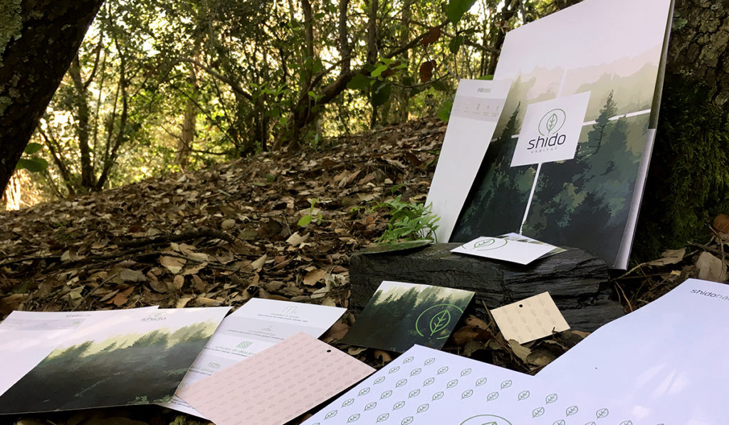
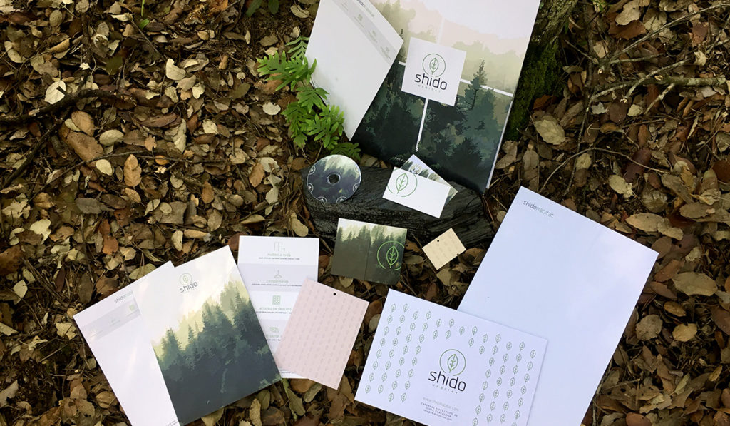
This was a full branding project. We designed all corporate elements needed for Shido Hàbitat.
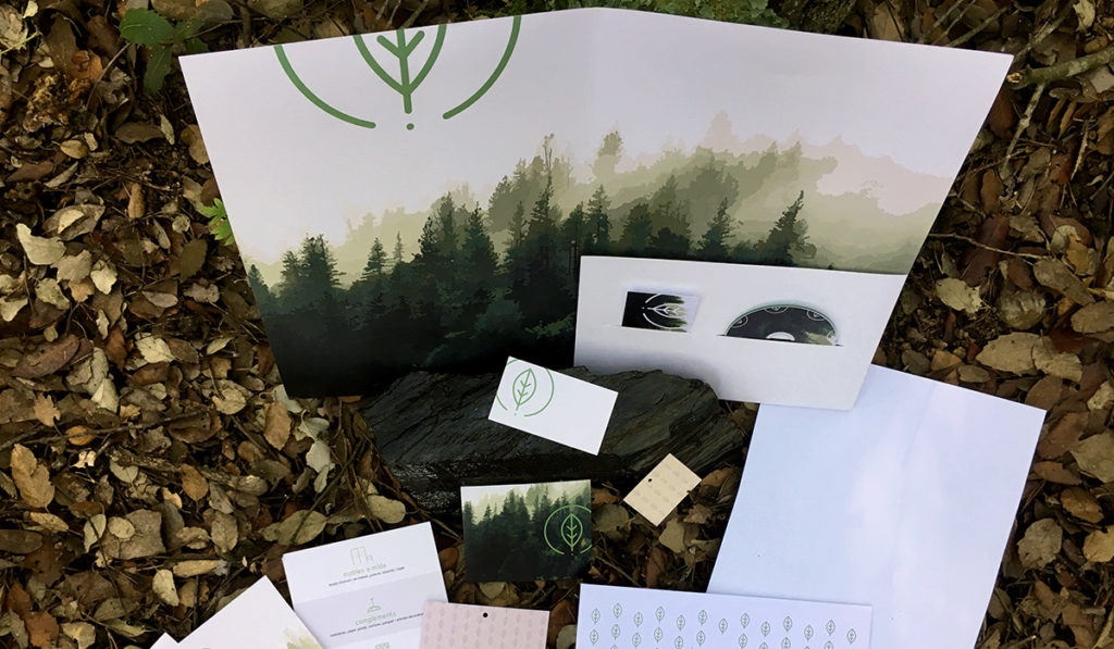
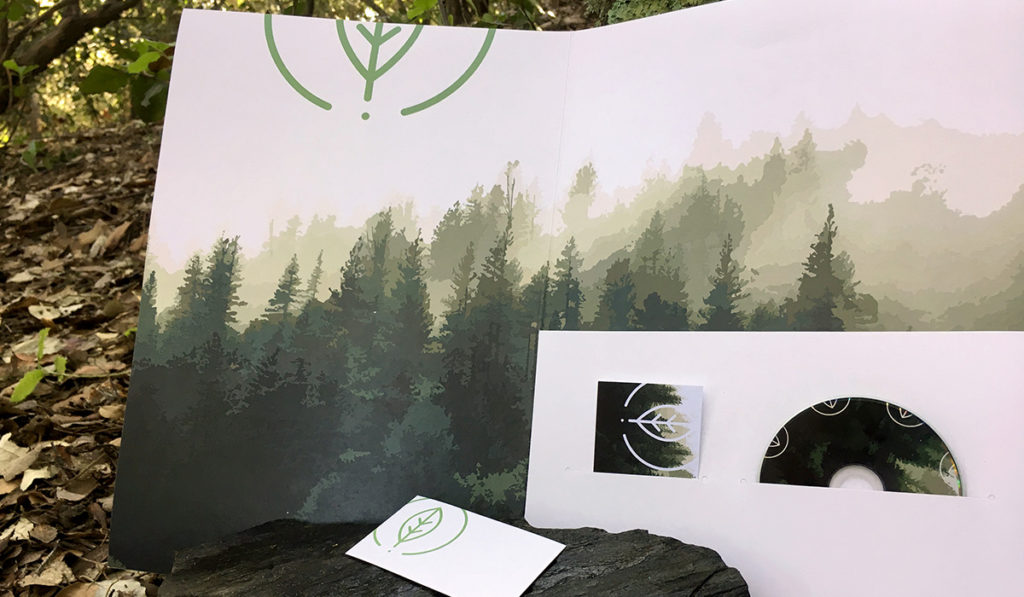
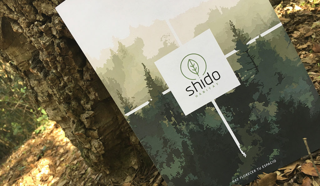
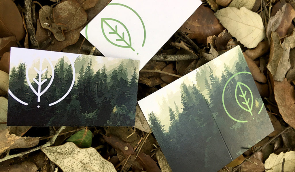
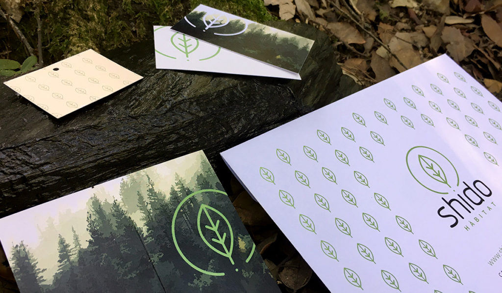
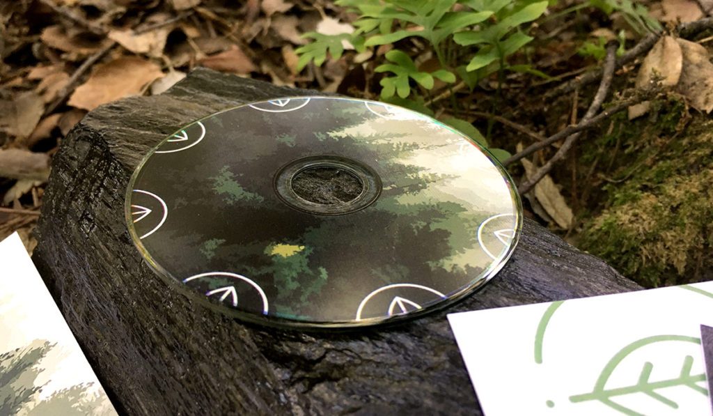
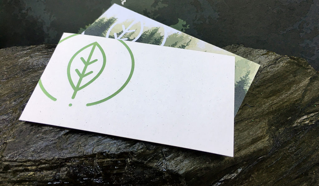
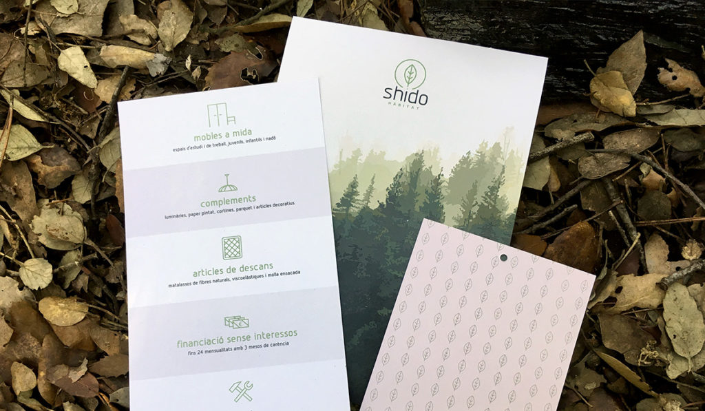
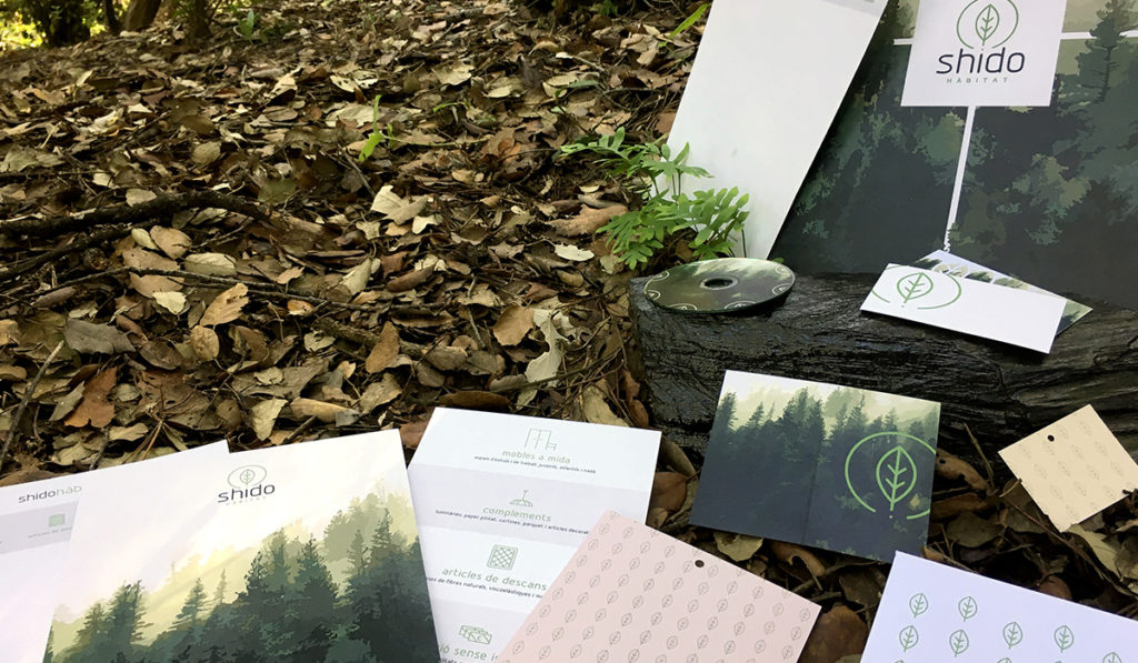
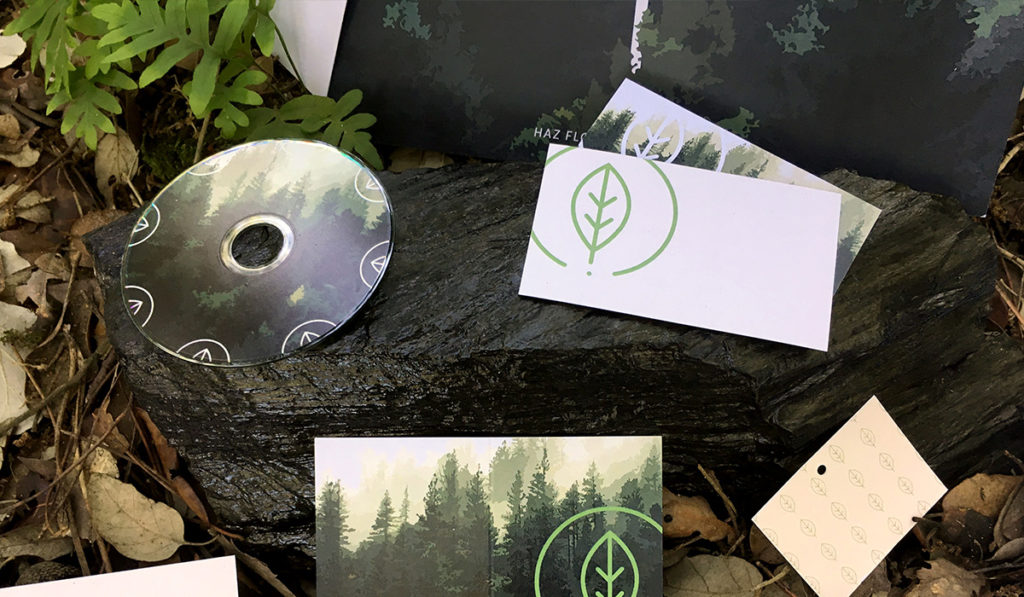
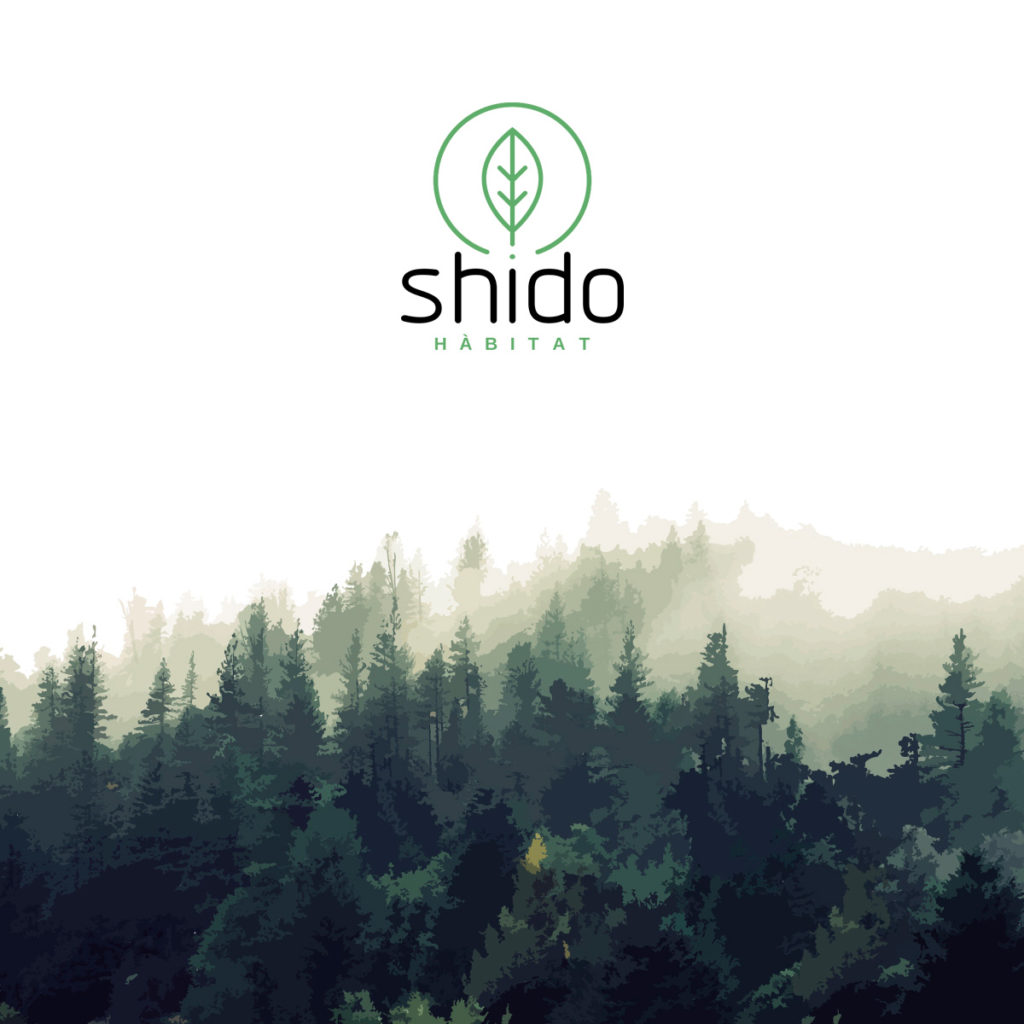
The nature as the main element to obtain an organic look and feel. The choice of the images and also the materials of every one of the stationery elements are finely selected.
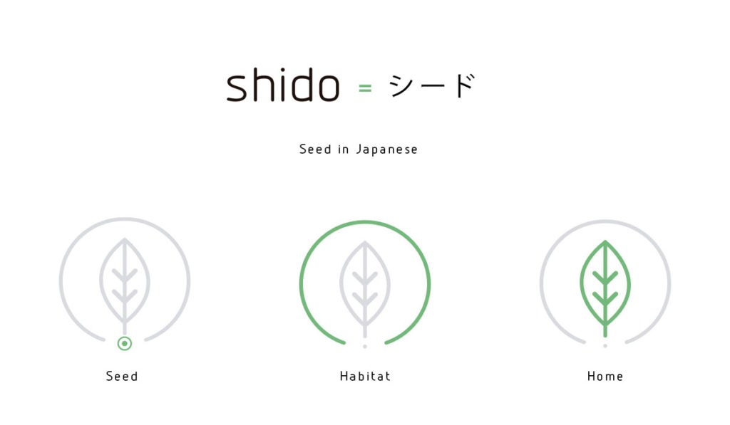
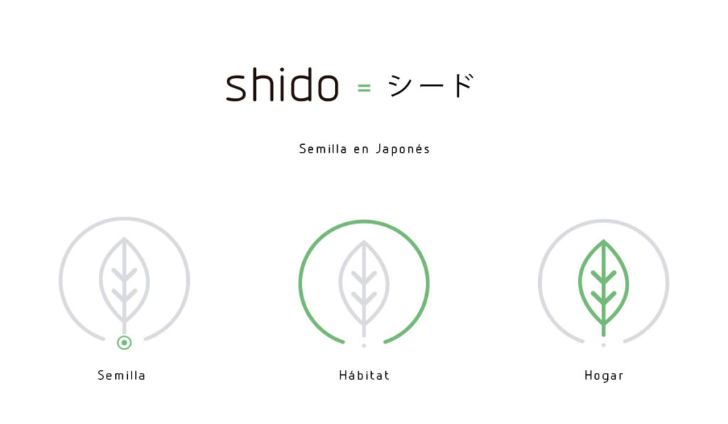
Shido means seed in Japanese, and so we used the dot of the i letter, which is placed just in the middle of the logo, as a the seed representation. From the seed grows the leaf as a home representation and later we surrounded it by a circle standing for the Habitat.
We designed the following materials and visual elements: Logo design, Business cards, label design, flyers, big card, folder design, enevlope design, mini cd, web design, commercial bags.
I like it but...
Do you want to begin
a project but don't know how?
a project but don't know how?
150
More than 150 clients
100
(Es) Hemos trabajado para más de 100 clientes en proyectos de diseño web y diseño gráfico.
Our projects
Our projects
40
More than 40 awards and mentions
40
(Es) Hemos sido mencionados, nominados o premiados en más de 40 medios del sector del diseño web y gráfico.
Our mentions
Our mentions
1
Best web design company Spain 2019
1
We are the best web design company of Spain 2019 according to Global Business Insight Awards.
Learn more
Learn more
Take a step forward. Tell us about your phone or email and we will reach you
to help you lay the ground of your project.
to help you lay the ground of your project.
Cheers! We will get in touch with you in no time!

I like it but...
Do you want us to contact you?
Take a step forward. Tell us about your phone or email and we will reach you
to help you lay the ground of your project.
to help you lay the ground of your project.
Cheers! We will get in touch with you in no time!
